
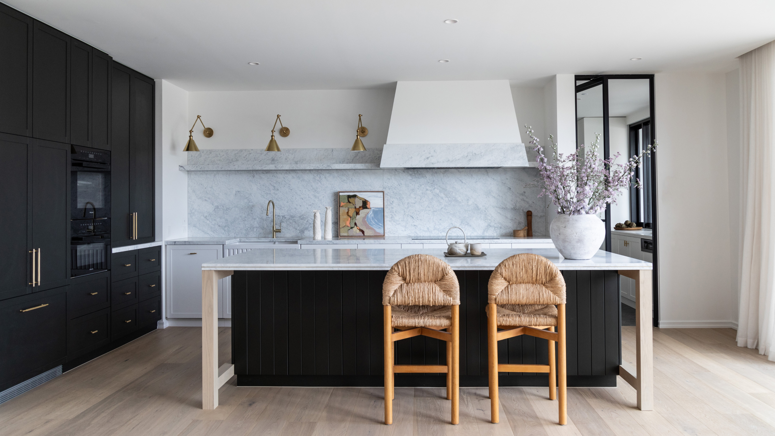
There is a timeless appeal to using white in the kitchen that to some extent will always be there. There is no denying it's a safe choice — it's classic, and will never really go out of style. But where it can fail us is in its expression of character. While elegant and pure, it can lack warmth, so you might want to consider what colors are replacing white in the kitchen in 2025; colors that inject more personality and joy into the heart of your home.
"Shades of white in the kitchen will always reign true because of the emotional purity and sense of cleanliness they produce," explains interior designer Beth McMillan. "White is very timeless, but the eye wearies of seeing that repeatedly, and begins to crave something more. I see this especially when the seasons begin to turn cold in the winter months. One naturally craves warmth, coziness, depth, and a more festive, richer atmosphere."
If I've convinced you to consider other kitchen color ideas — be that on your walls, cabinets, or tiles — here are five warm and sophisticated shades that designers say will replace white in the kitchen in 2025.
1. Earth-Inspired Tones

We're going to see the pureness and minimalist look of white replaced by warmer, more earthy tones in the kitchen. There is nothing more sophisticated right now than a soft palette of taupe or clay.
"Homeowners are leaning into warmer and richer hues to create kitchens that feel both modern and timeless," interior designer Vyanca Soto, founder of Market Studio Interiors, tells me. "Decorating with earth tones, such as soft taupe, clay, and warm greiges add an inviting and organic touch. Pair these with natural wood stains and flat-panel cabinetry to bring a tactile, lived-in feel to your kitchen."
When thinking about adding a touch of color to your white kitchen, your choice of tiles is a perfect place to start. "We expect earthy palettes will continue to be on the rise in 2025," says tile expert Kiara Perdomo, from Nemo Tile. "Calm, muted tones of clay help create a sense of atmosphere."
2. Bright Blue

Blue kitchens are on their way back. In its deeper forms, it's a shade that can be bold yet sophisticated and timeless, all at the same time, making it much easier to live with long-term. "Go big and go monochromatic throughout the kitchen," says Beth McMillan. "You could do this with a lighter shade, and not a darker choice if so desired."
And it's true — we're starting to see a lot more light blue kitchens, outside of just coastal or Hamptons-style interiors. One of Beth's favorite hues is Farrow & Ball's 'Selvedge', a beautiful gray-blue that feels fresh and calming.
"The key is using the same color everywhere, and try changing the strengths of the hue on the ceiling," she says.
3. Coffee Cream

Velvety tones of coffee and cream are the ultimate signpost of chic right now. There are so many shades to choose from, starting from lighter, milkier tones with just a touch of brown, to richer mocha (Pantone's 'Mocha Mousse' makes for a great kitchen color) or espresso options.
"My favorite white kitchen alternatives are warm greige colors that emulate the cozy tones of coffee with cream," interior designer Ashley Macuga, the principal of Collected Interiors, tells me.
Not only are they the perfect modern neutrals that look beautiful in most types of light, but Ashley adds that "they are also super forgiving of life’s little fingerprints that are inevitable in places where families reside". Ashley's favorite greige paint shades for kitchen cabinets are Benjamin Moore's 'Revere Pewter' and 'Edgecomb Gray'.
But when thinking of color, don't just think about paint. "I love warm, soft grays matched with the texture and depth of an espresso-stained wood for contrast," says interior designer Rebecca Roberts, the founder and principal of Manhattan-based architectural interior design firm, Method + Moxie. "The mix of materials provides subtle interest while allowing the eye to move seamlessly throughout the room."
4. Soft, Dusty Green

Green kitchens have become a modern classic thanks to its natural, calming look. It’s a great alternative to white, especially in a light, soft hue like sage or dusty green, which won’t feel overpowering in time.
"A timeless kitchen doesn't need to be all white," says creative director Dan Mazzarini of BHDM Design. "In our Austin home project, we went with a dusty green inspired by the surrounding landscape. The understated hue adds lasting interest without being too in your face."
Interior designer Thea Bloch-Neal of Curated by Thea, agrees: "Warm tones of sage green are taking center stage in kitchens right now. Pair these hues with natural wood tones and warm countertop accents for a kitchen that's both beautiful and inviting!"
5. Contrasting Two-Tone

If you love the look of crisp white but are finding it a bit flat, designers have a clever trick to make your white kitchen look better — two tone.
"Try painting your upper cabinets in creamy off-whites like Sherwin Williams' Alabaster or Dunn-Edwards Miner's Dust, balanced with lower cabinets in deep greens, warm browns, or rich charcoal tones to create visual interest," suggests Vyanca.
Beth McMillan thinks two-tone kitchen ideas are a great way to maintain a white kitchen, while giving it a fresh (and affordable) update.
"I would suggest keeping the top cabinets and walls the lighter color (shade of white) and using a darker color on the bottom cabinets and maybe the island if one exists in the kitchen," she adds. "This could be any color that you choose to work especially with the safety of the larger amount of existing white that will stay intact. Personally, I’m always drawn to a more dramatic shade of darker or moody colors on the spectrum."
What textures are replacing white in the kitchen?
We talked about colors, but what about textures? They can make or break a color scheme, so here’s the expert’s advice: "Matte finishes and wood grain textures are dominating over high-gloss surfaces, adding warmth without overwhelming the kitchen’s aesthetic," explains Vyanca.
Don’t be afraid to mix textures to add interest and create a feeling of depth. Sometimes a subtle change is all you need to update a white-washed kitchen that is starting to feel dated.
-
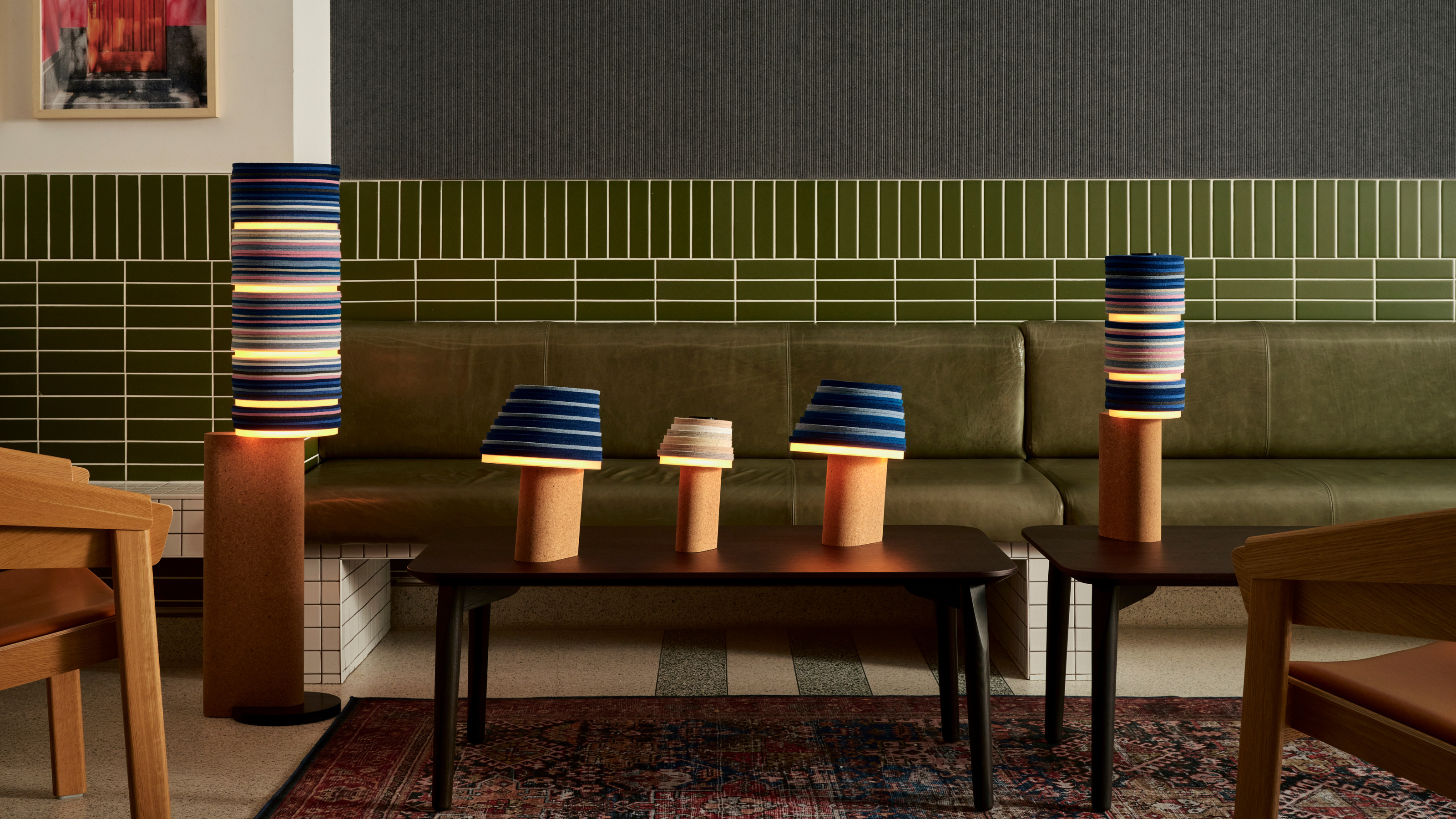 7 Sustainable Product Designs That Are Setting the Agenda for Environmentally-Conscious Homes in 2025
From pillows made from textile waste to sanitaryware made in the world's first electric kiln, these brands are revolutionizing sustainable design — for the better
-
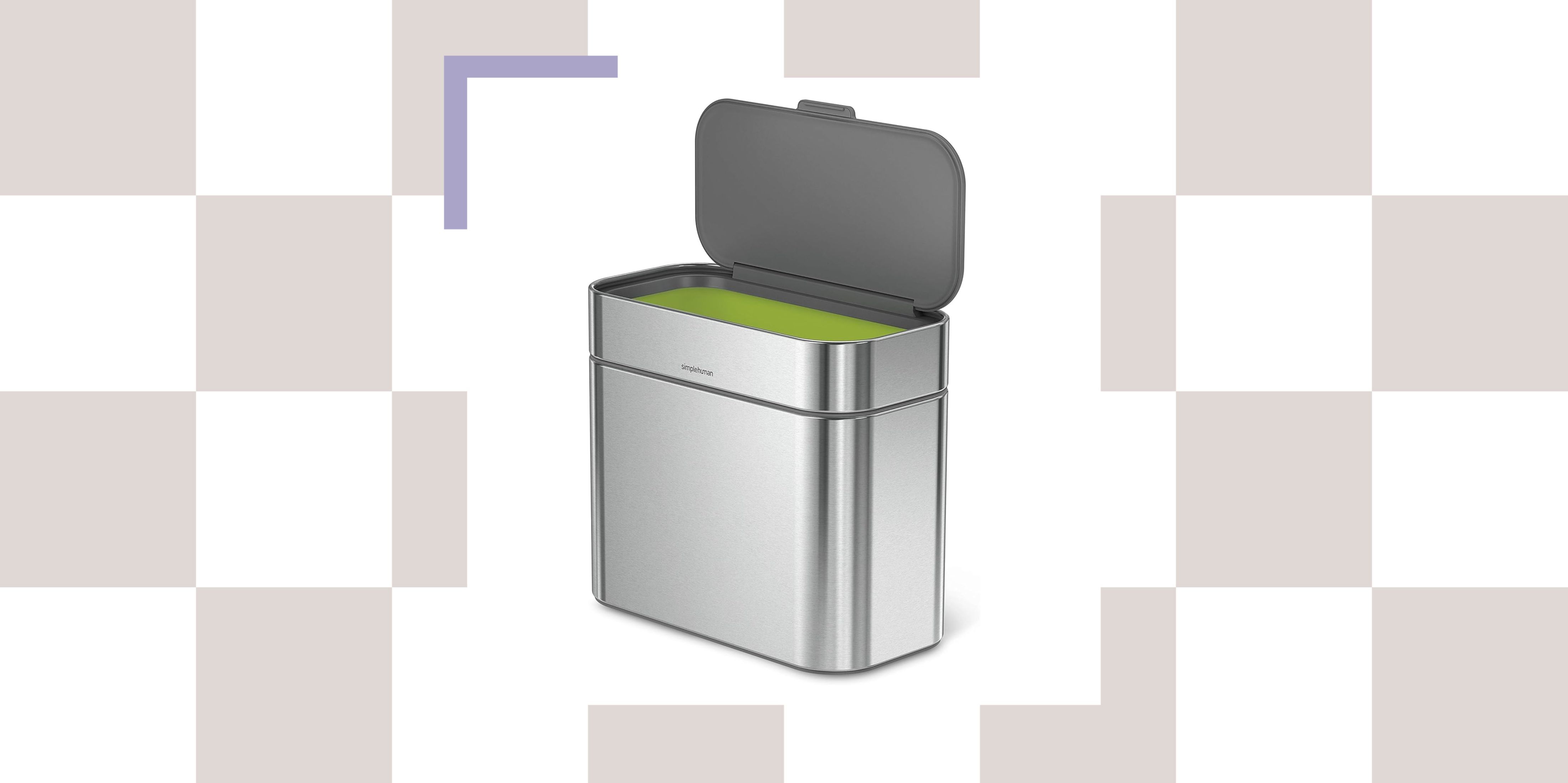 NYC's New Rules Forced Me to Find a Chic Compost Bin — Here's 7 Options Significantly Cheaper Than the $300 Fine
Composting is now mandatory in NYC. Here’s how to do it stylishly


-
 6 Mistakes That Are Making Your Kitchen Tiles Look Cheap and Not Elevated — And What You Can Do Instead
From size and grout to color and configuration, here's where you're going wrong with your kitchen tiling
-
 3 Things I Wish I Knew Before Renovating My Small Kitchen — Number One? Always Be Prepared...
After taking on my own small kitchen project recently, here are the main takeaways I've learned for the next time I renovate one
-
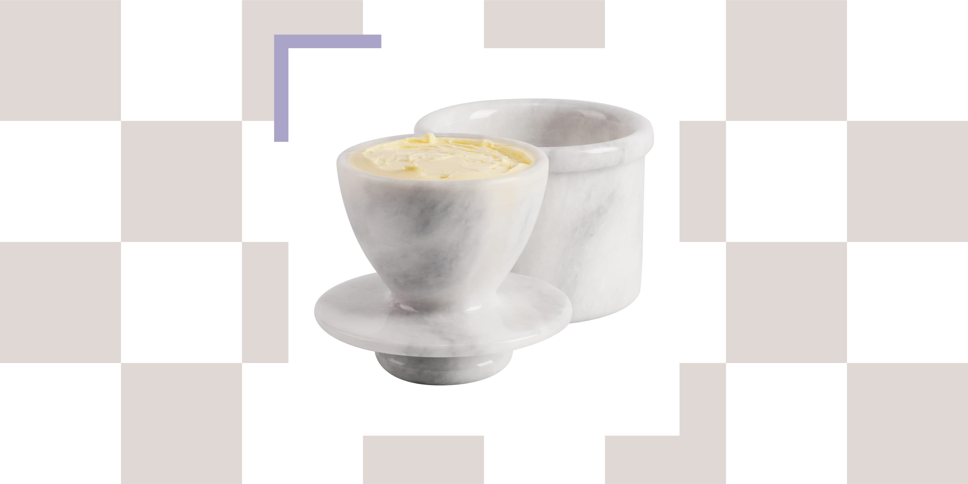 Good Cooks With Even Better Style Are All Putting 'Butter Bells' on Their Kitchen Counters — Here's Why
The French way of storing butter will guarantee soft, spreadable deliciousness at any given moment. I present to you, the butter bell.
-
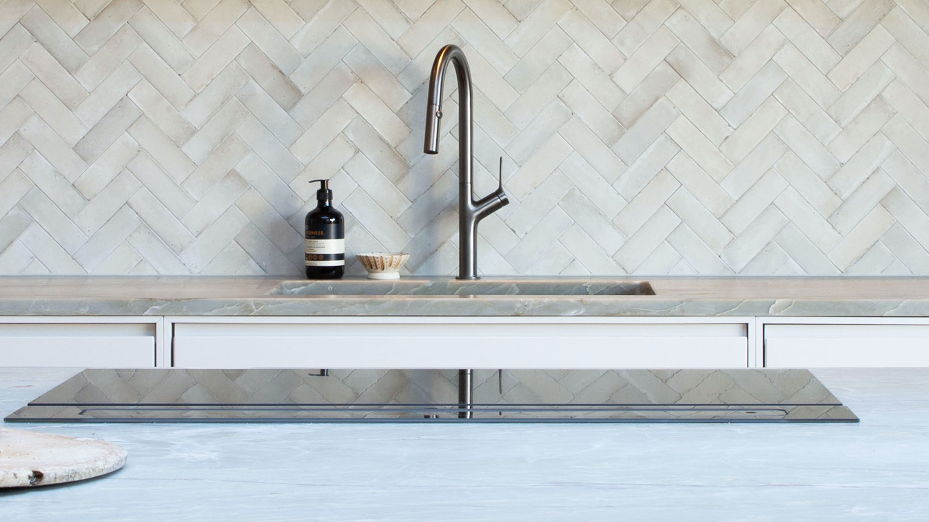 7 Kitchen Tap Mistakes You’re Making That Can Make Your Space Look Outdated — And What to Do Instead
Could it be that your choice of kitchen tap is causing your kitchen to look old-fashioned? Here's what the experts say
-
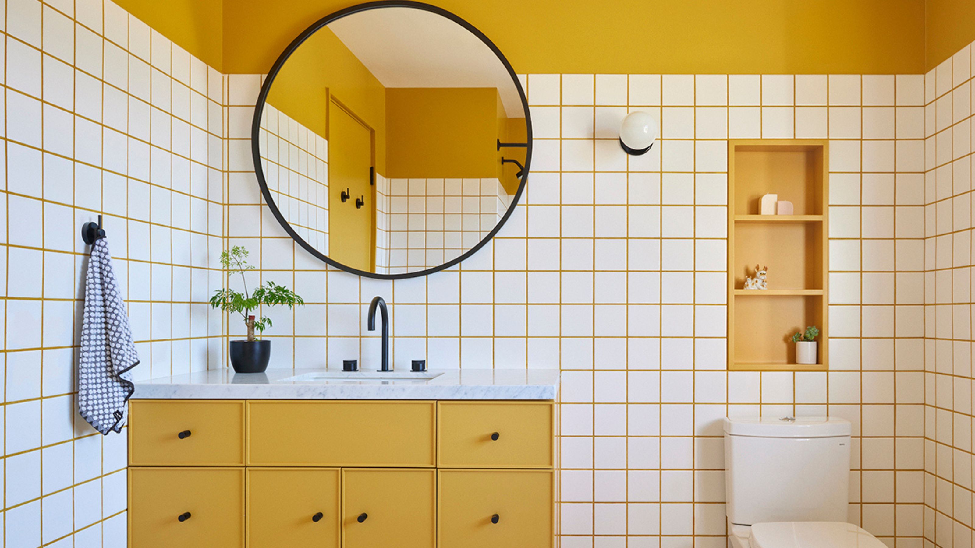 10 Yellow Bathroom Ideas That Vitalize Your Mornings and Look Unexpectedly Sophisticated While Doing So
Yellow is a color that by its very nature is energetic and full of life, and these designers have proved it's ideal for a bathroom
-
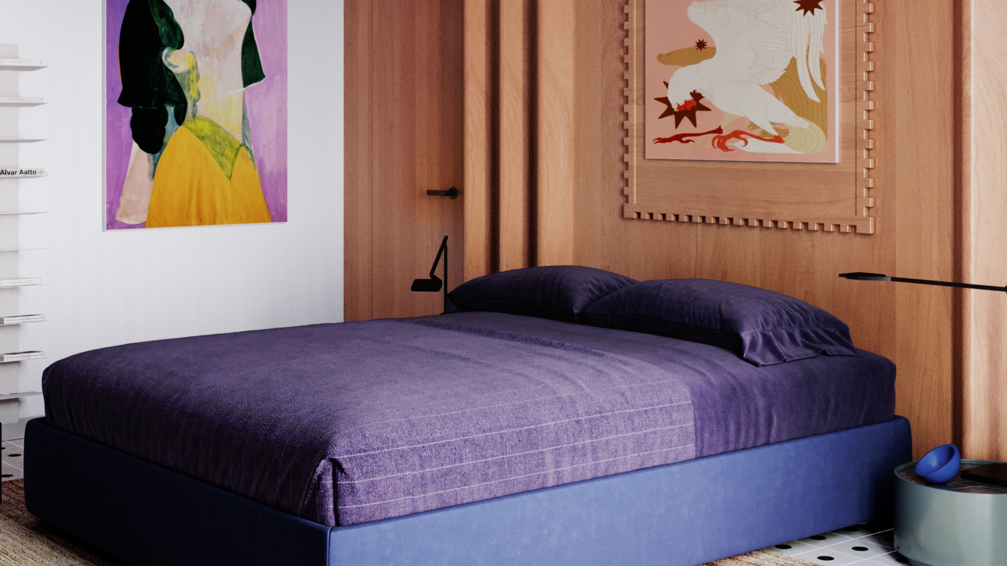 It's a Color Symbolic of Dreams, so These Purple Bedroom Ideas Almost Guarantee a Good Night's Sleep, Right?
Not always an obvious choice for the bedroom, these designs prove that purple has restful and calming qualities, making it perfect for the bedroom
-
 3 Kitchen Island Measurements That the Best Designers Always Use When Planning Spaces
Your cheat-sheet guide to getting clued up on all the basics of island measurements, straight from the experts.
-
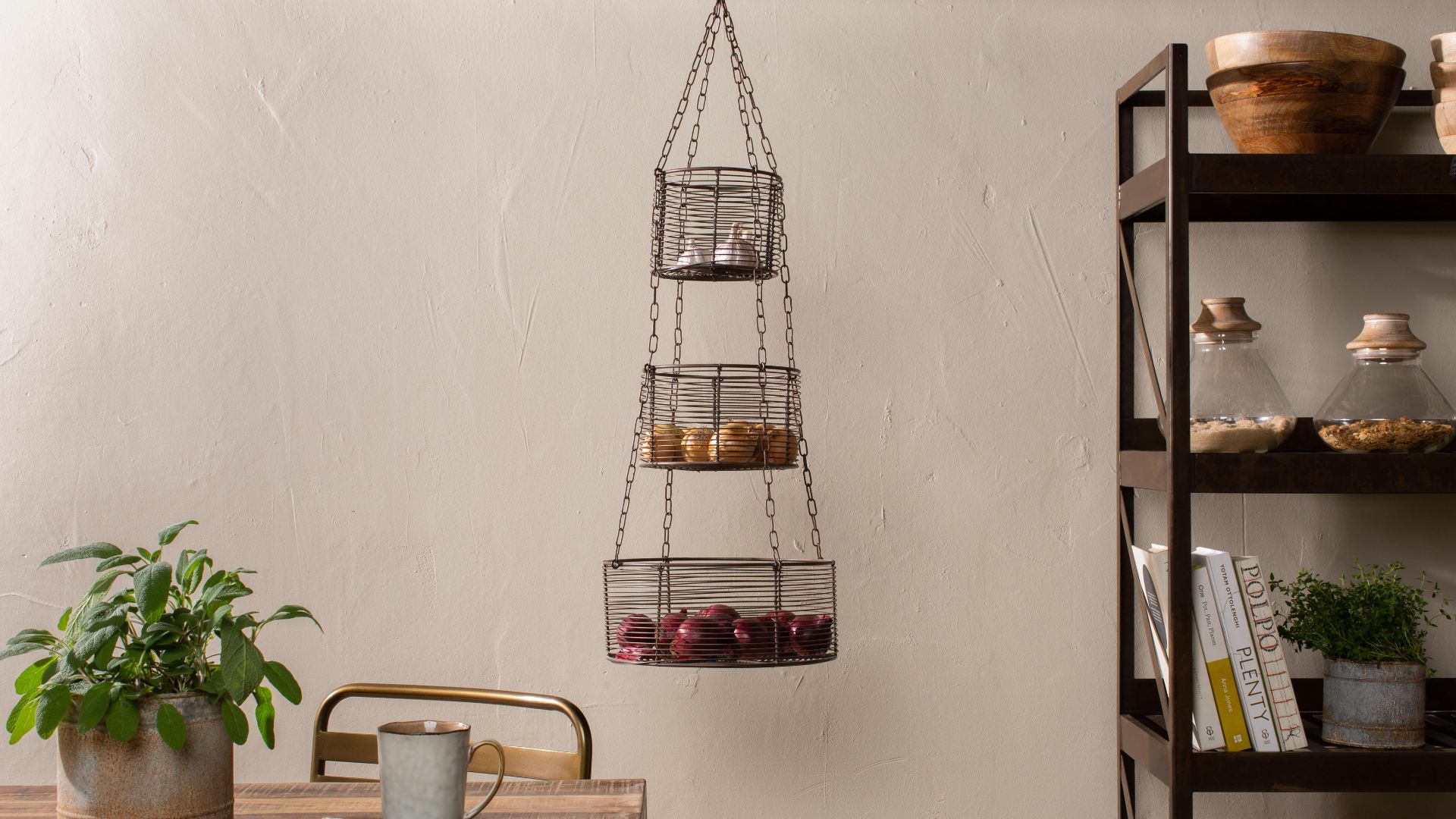 These Hanging Kitchen Baskets Have a Cool, Casual Energy That Give Your Produce Storage Serious Style
There are a couple of popular produce items that just aren't meant to be refrigerated. In that case, this hanging basket display is the perfect alternative.


