
Lola Houlton
As we move into 2025, blue continues to be a timeless favorite among interior designers, celebrated for its versatility and enduring appeal. It's also easy to layer within interior schemes, as there are plenty of colors that go with blue — both classic neutrals and bold, statement hues.
Additionally, as holistic and natural-toned interiors gain even more traction, blue will continue to solidify its role as the go-to color for creating harmonious, balanced spaces that are both inviting and easy to live in.
When paired with the right complementary hues, blue adds depth and richness while maintaining a calming, grounded atmosphere. And while there are so many colors that go with blue, which shade should be your first choices when coordinating blue paint, fabrics, or flooring in your interiors? We asked interior designers to share their top recommendations for the most successful color pairings whether for living rooms, kitchens, or blue bedroom ideas. Here’s what they had to say.
1. Terracotta

If you love blue for its connection to nature, terracotta is an excellent choice to bring a grounding warmth to a space. The combination of a bright blue and terracotta creates a striking balance, making it one of the best colors that go with terracotta. This pairing is ideal for light blue living rooms that are both cool and cozy, blending the calmness of light blue with the earthy warmth of terracotta to create a welcoming atmosphere.
"A classic terracotta can help temper and bring warmth to blue, especially the more steel or gunmetal shades of blue — be it on a linen block print or a woven cloth — the added warmth will be gratefully received," says Patrick O'Donnell, paint expert and brand ambassador at Farrow & Ball. He recommends, in particular, Farrow & Ball's Red Earth, Menagerie, and Fake Tan paint shades.

Price: $8.50/sample

Price: $5.99/sample; $2.50/swatch

Price: $5.99/sample; $2.50/swatch
2. Cream

If you want to create a space that remains neutral but avoids the cool, crisp aesthetic often associated with blue, cream is an excellent choice to inject some subtle warmth into the space. As one of the best colors that go with cream, blue pairs effortlessly with this soft, creamy hue, offering a balanced atmosphere.
Patrick O'Donnell advises: "Nothing too buttery here, but essentially a warm white — perfect for a more traditional scheme with more nuanced, mid-weighted blues." Partick recommends Farrow & Ball's shades such as New White, Cord, or White Tie.

Price: $5.99/sample; $2.50/swatch

Price: $5.99/sample; $2.50/swatch

Price: $8.50/sample
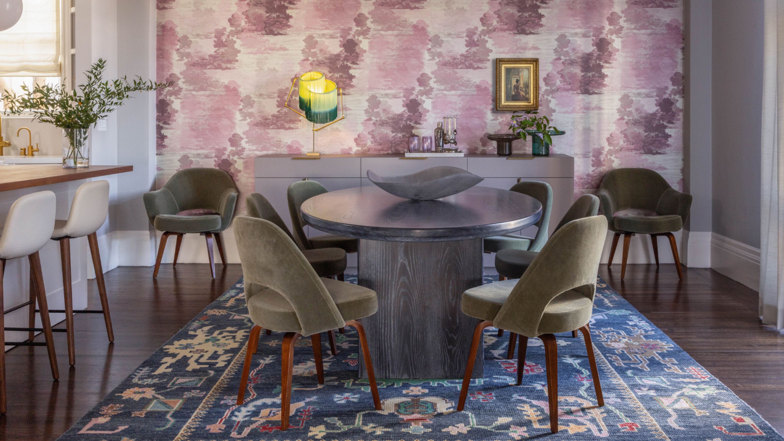
3. Yellow

Yellow is a color that goes with navy blue particularly well, but also other versions of blue, too. And no, this combination doesn't always have to create a taxi-like visual. With the right iterations of both tones, blue and yellow color palettes can take a room from rich and luminous to soft and subtle.
If you have a living room with shades of blue and are worried about that yellow furniture would introduce too much contrast, then a great way to add this pop of color is with smaller accessories, such as in the chair and laburnum plant in the example above.
"The introduction of deep yellow velvet chairs, positioned opposite blue on the color wheel, was a strategic choice that beautifully complements the room," says JC Riccoboni, founder & principal designer at The Journey Home. "The colors of the room seamlessly tie in together."

Price: $56/gallon

Price: $56/gallon

Price: $56/gallon
4. Red

You'll be surprised that amongst the colors that go with red is the bold and beautiful blue. This is a great pairing to try if you want to turn up the volume in a room a bit. The two colors are almost opposites on the color wheel, creating the sharpest contrast, but injecting a room with energy and personality.
If a stark red and blue feels a bit too out there, there are other iterations of red you can play with. Think brick red, burgundy, or even cherry pink-red tones. "If you're going ahead with burgundy and blue, consider adding in grays as base tones, so that the scheme is balanced," says Jasmin Reese, founder of Jasmin Reese Interiors. "Then choose an eclectic mix of materials like brass, wood, and fabrics to make the color stand out."

Price: $5.99/sample; $2.50/swatch

Price: $5.99/sample; $2.50/swatch

Price: $5.99/sample; $2.50/swatch
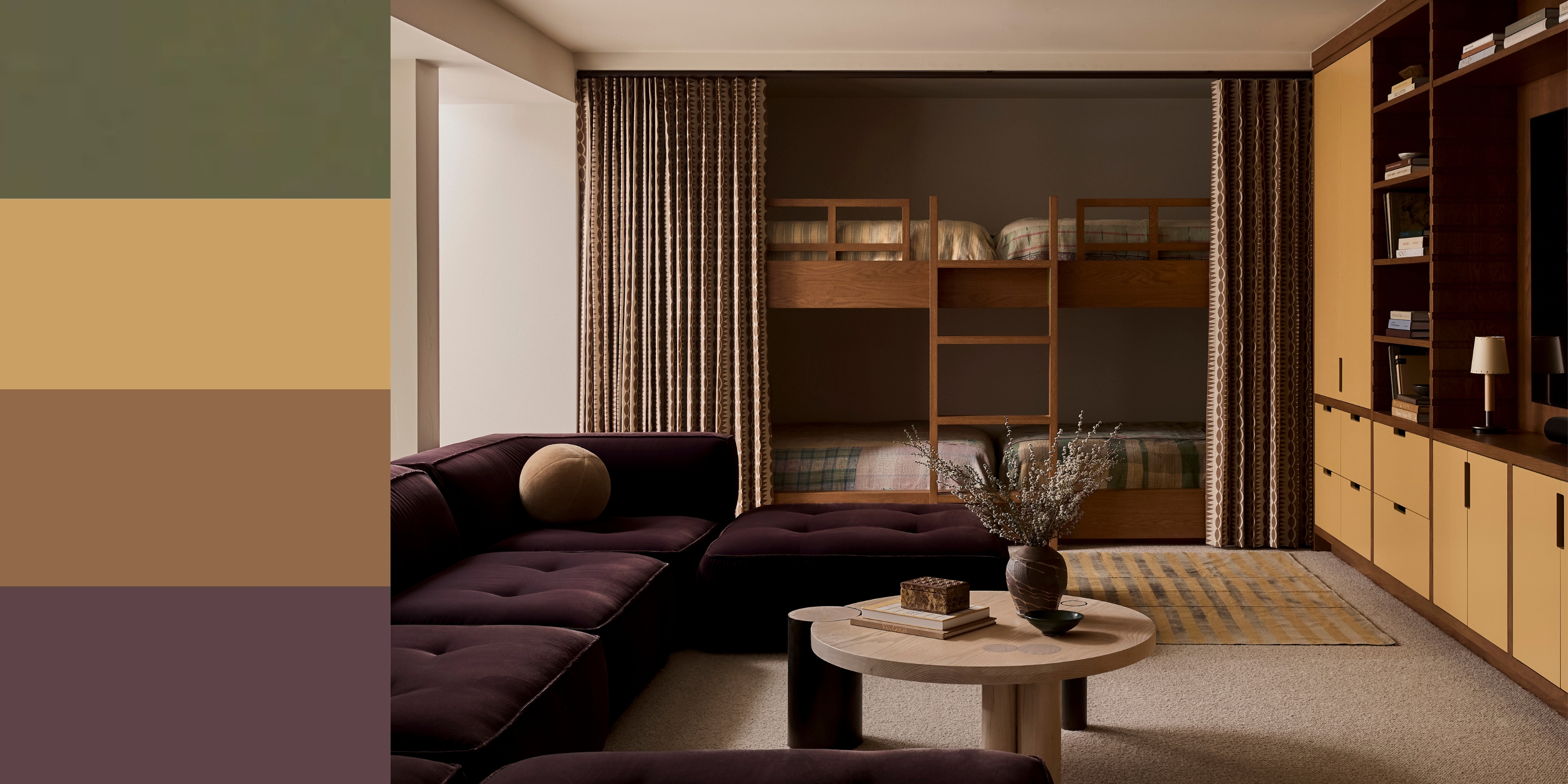
5. Purple

Blue makes for a lovely color that goes with purple as the two tones are visually complementary, and are imbued with natural richness. In small media or lounging rooms, these colors work perfectly, endowing the space with personality and coziness.
"For this room we went tonal and used more blue," says Shona McElroy, principal at Smac Studio. "This is a windowless basement we turned into a cinema. Lots of people paint rooms like this white to try to make them look bigger, but we decided to lean into the moodiness of the space with dark hues.

Price: $5/sample

Price: $5/sample

Price: $5/sample
6. Peach

In this living room, the color clash of the blue sofa and the peach décor look eye-catching and modern. In fact, this paint color combination has been one of the more loved ones this year. These bright tones are balanced against a backdrop of white walls and floors.
"I wanted to give a touch of warmth and I did that using color and volumes," says Luca Nichetto, founder of Nichetto Studio. "I particularly love materials culturally connected with the south of Europe and very deliberately mixed them with Scandinavian features."

Price: $5.99/sample; $2.50/swatch

Price: $5.99/sample; $2.50/swatch

Price: $5.99/sample; $2.50/swatch
7. Green

Blue and green are both cooling shades that belong on the same side of the color wheel, so tread with caution when using these colors together. 'Blue and green should never be seen,' goes the age-old myth, but their contrasting nature can in fact work. They both have heavy associations with nature that can look great together if you embrace their clashing tones.
In this example by interior designer Nicola Harding, the blue hallway paint is a great contrast to the green console. "Blue is a wonderful color to use in rooms where there are low levels of natural light and it is brought to life by layering it with highly contrasting colors," she explains.
Farrow & Ball's Patrick O'Donnell adds, "Playing to the color family, the added note of green through these colors will bring a delicate harmony to your room whilst keeping the palette controlled with their underlying blue. Perfect to bring softness to an airy bedroom or light-filled living room." He particularly recommends using Farrow & Ball's Pale Powder, Cabbage White, or Dix Blue.

Price: $2/sample

Price: $2/sample

Price: $2/sample
8. Gray

Blue is one of the colors that goes with gray. It's a well-loved pairing that's perfect if you are a neutral lover who wants to introduce just a touch of color. Paired with the right gray — particularly one that's warm and close to taupe in color — blue almost becomes neutral.
"A light gray, either warm or cool, will work well in any size space as long as there is adequate natural light because gray in a room without natural light will look dingy and gloomy," says Amy Krane, architectural color consultant and founder of Amy Krane Color. "Adding other colors to a gray backdrop will always help enliven and elevate the space. Gray is not a color to create a monochromatic environment with."
As just a general rule, pair warmer, more muted blues with warmer grays for almost a tonal look. And for bolder or more primary blues opt for cooler, light grays to add contrast.

Price: $5/sample

Price: $5/sample

Price: $5/sample
9. Gold

Pairing gold with blue creates a wonderful contrast. By combining the calm elegance of blue with the rich warmth of gold you will create a sophisticated and luxurious finish. This combination works especially well in spaces where you want to balance tranquility with opulence, such as living rooms, dining areas, or light blue kitchens.
Gold accents — whether through fixtures, furniture, decor, wallpaper, or paints — enhance blue’s muted tones, adding a touch of warmth and luxury without overpowering its calming effect.

Price: $5.99/sample; $2.50/swatch

Price: $5.99/sample; $2.50/swatch

Price: $5.99/sample; $2.50/swatch
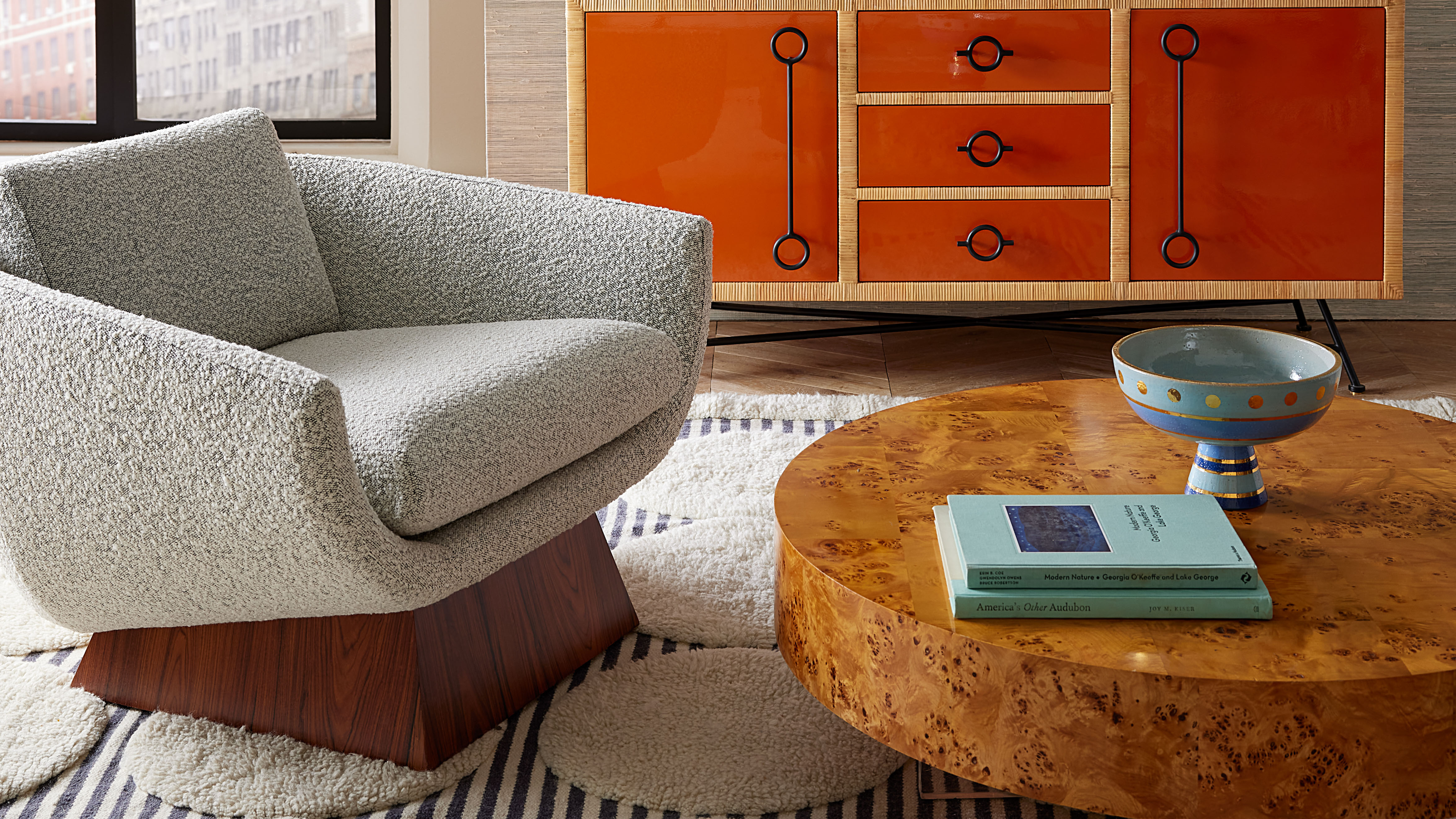
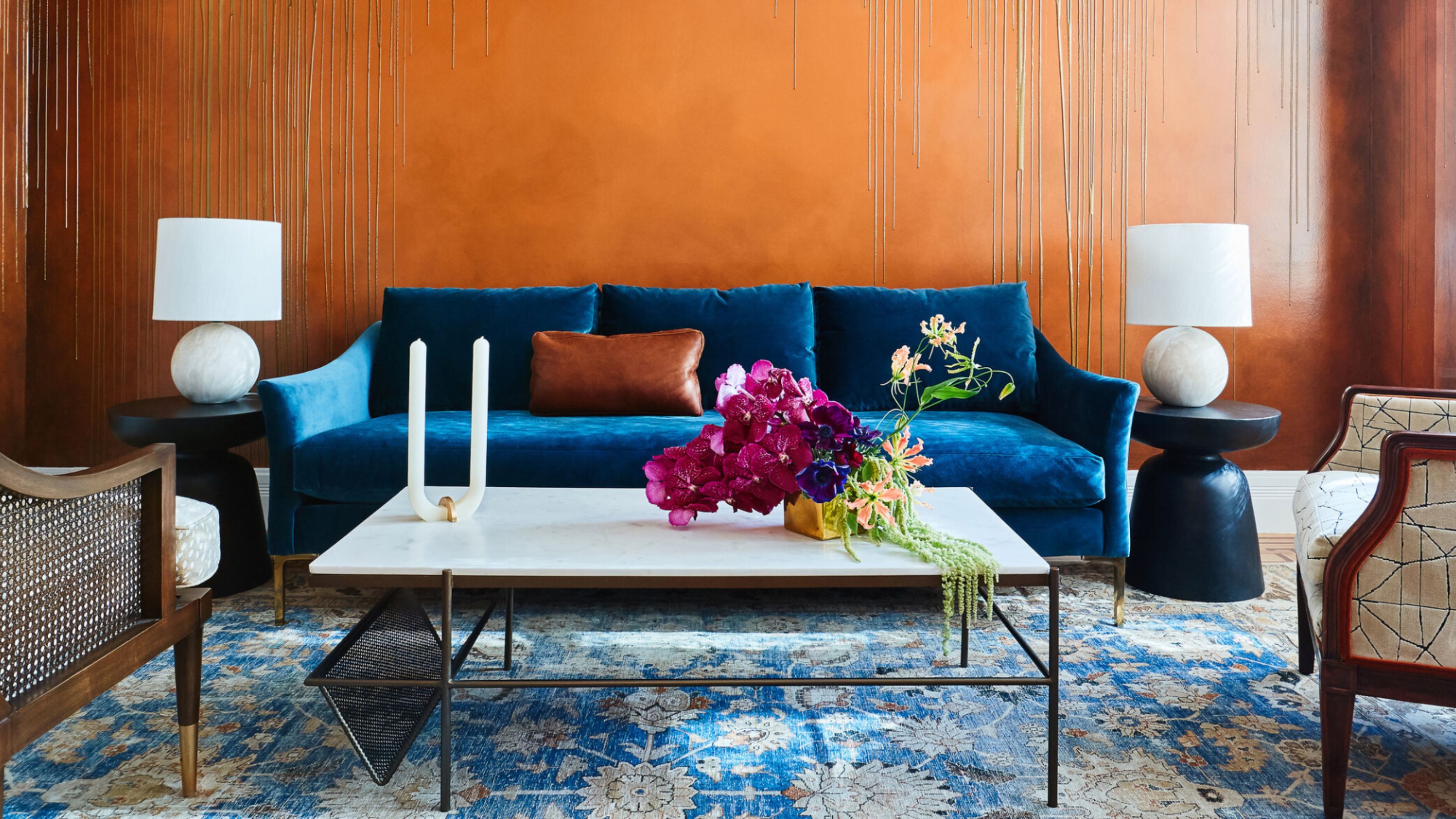
10. Orange

Amongst the colors that go with orange is surprisingly blue, and this pairing can be impactful and full of life. But if the two create too much of a contrast, it's wise to introduce a third tone such as gray, to balance them out.
"Gray and light orange work beautifully together due to their contrasting personalities," says Juliette Thomas, founder & director of Juliettes Interiors. "The gray will work to ground the room, whereas the orange will help to make the room pop."

Price: $3.95/peel-and-stick sample; free color chip

Price: $3.95/peel-and-stick sample; free color chip

Price: $3.95/peel-and-stick sample; free color chip
11. Maroon

Sure, blue might feel like a bold choice for a color to go with maroon, but it's a color block that works well when done in small doses. Think furniture combinations, in small nooks, or even in accessories. It's also advisable to balance these two strong tones with earthy, muted backdrops.
Ophélie Doria and Édouard Roullé-Mafféis, founders of Space Factory, explain the intention behind their design above: "Our goal was to choose a complementary hue that would accentuate the kitchen's boldness and blend well with the natural warmth of the wood of the table and wooden panel. By selecting a color that complements blue while considering the wooden elements, we achieved a balanced and dynamic interaction between these two key areas."

Price: $3.95/peel-and-stick sample; free color chip

Price: $3.95/peel-and-stick sample; free color chip

Price: $3.95/peel-and-stick sample; free color chip
12. White

Decorating with neutrals is easy, as almost any color can easily slip onto a scheme of all white or cream. In fact, white and blue is evocative of Hamptons style décor, beach houses, and Greek islands, and has the power to transport you to a completely different time and place.
"Combined with white you’ll stay a little longer in bed dreaming you’re on a Greek island," agrees designer Dirk Jan Kinet.
It's a calming combination, and works well in this elegant kitchen to create a peaceful feel. With white as your base, you can use various tones of blue and build up from pale hues to deep tones used as accents.

Price: $2/sample

Price: $2/sample

Price: $2/sample
13. Other blues

Go blue on blue and layer the color for a wonderful monochromatic scheme. To make sure the combination sits well together, look for blues with similar undertones, such as a blue-green turquoise and dark teal. You can also create layering with textures, and materials for an elegant living room.
"I find the variation in reflectivity while keeping a consistent color can animate a space without overwhelming the palette," says Cameron Carcelen of Connecticut’s Ridge Architecture. "And it can feel authentic in both modern and traditional spaces."

Price: $5.99/sample; $2.50/swatch

Price: $5.99/sample; $2.50/swatch

Price: $5.99/sample; $2.50/swatch
14. Brown

For a moody pairing that feels rich and luxurious, blue is one of the best colors that goes with brown, especially a deep blue. Brown is a variation of orange, which sits opposite blue on the color wheel, so it's no surprise that our eyes are drawn to this combination.
"Pairing blue with earthy neutrals creates a harmonious and grounded aesthetic," explains Sarah Brady, founder and principal designer at Salt Design Company. "Shades like warm beige, soft taupe, clay, and chocolate brown provide a natural complement to blue’s cool tones. This combination draws inspiration from the natural world — think of the interplay between the sky, sea, and earth.
"A soft, dusty blue paired with a warm tan creates a serene coastal vibe. Navy blue combined with rich chocolate brown adds depth and sophistication to a room. Pale blue accented with clay tones offers an understated and modern take on rustic design.
"This palette is ideal for spaces where you want to evoke warmth and comfort while maintaining a fresh and contemporary feel. Incorporate these colors through textiles like linen or jute rugs, terracotta planters, and wooden furniture to fully embrace the organic aesthetic."
Priscilla Elasi of The Stylesmiths adds: "Layering different shades of blue and brown, and mixing in textiles enhances the impact of an uncomplicated yet sophisticated color palette in a small space."

Price: $8.50/sample

Price: $8.50/sample

Price: $8.50/sample
15. Moody jewel tones

"The combination of blue and moody jewel tones is bold, dramatic, and luxurious. Deep shades of emerald green, plum, or teal paired with blue create a layered, opulent look that feels modern yet timeless," says Sarah Brady. "This pairing works especially well in spaces where you want to make a statement, such as dining rooms, libraries, or intimate lounges. Layering multiple jewel tones, such as navy, amethyst, and amber, with subtle blue undertones can result in a multidimensional, curated aesthetic.
To bring this palette to life, use velvet textiles, metallic accents like brass or gold, and bold artwork. Jewel-toned glass or ceramic pieces can further enhance the richness of this pairing while maintaining a sense of depth and intrigue.

Price: $8.50/sample

Price: $5.99/sample; $2.50/swatch

Price: $8.50/sample
16. Pink

Pink is a color that goes with light blue, dark blue, and other mid-tone blues. But if these combos feel too daunting, the easiest way to combine these two shades is by choosing the light or pastel shades of both.
"For me, pink is a natural color which you can use a lot," says Nicole Dohmen, co-founder of Atelier ND. "I use it as a base coat and base color in all my designs. It makes the room soft and special. It goes very well with dark tones such as blue and dark greens but also in lighter interiors."
Christine Jahan, principal interior designer at Christine Jahan Designs opts for a bold approach when decorating with pink and light blue: "I love placing blue next to fuchsia and watching how they complement each other beautifully. Rather than competing, they come together in bold, unapologetic harmony. This combination of fuchsia and blue works equally well in high-end spaces, like a luxury entryway, or more casual settings, such as a playful kid’s room.
"Fuchsia is a vivid, fearless showstopper that demands attention the moment it enters a room. It’s the life of the party. Pair it with light blue, and the dynamic shifts; fuchsia becomes the confident partner that lifts blue out of its serene depths, coaxing it to dance, to dazzle, to be a little bolder."
Tip: If you want to first test drive this combination in your bedroom or living room, consider first adding bright pink flowers to the area. This way you'll be able to see what kind of effect the combination creates in the room.

Price: $8.50/sample

Price: $8.50/sample

Price: $8.50/sample
FAQs
Are there any colors to avoid pairing with blue?
While coming up with color combinations all depends on how brave you are, there are some colors that don't go with blue that you should steer clear of, including certain shades of yellow, orange, and red.
Which color matches with dark blue?
Several colors can pair with dark blue, such as dusty purples, teal, mustard yellow, to bright pink, cherry red, and gold. Do ensure, though, that the room is well-lit, as a dark color scheme can make it feel quite closed in.
Where to use blue in the home?
When decorating with blue, think about the intention of each room, and pick your tone of blue based on this. A light, pared-back blue can be relaxing and peaceful, making it work for a room like a bathroom or bedroom, where your goal might be to create a relaxing space.
When decorating a space like a living room or snug, a deeper, moodier blue might work to create an intimate and cozy feel. And for accent color inspiration, bright blue pops can be used beautifully as accents around the home to bring more energy into a space.
Which complements light blue better: gold or brass?
Both gold and brass work beautifully with blue, but the choice depends on the mood and style you're aiming to create.
Gold adds a luxurious and warm contrast to blue's cool tones, creating an elegant and sophisticated look. This combination is best for glamorous, formal, or classic interiors, like a chic living room or a polished dining space. When using gold with blue, opt for bright or polished gold finishes for a striking effect, especially in light fixtures, mirrors, or accents.
On the other hand, brass has a slightly muted, warmer tone compared to gold, giving a more understated and vintage appeal. Ideal for relaxed, modern, or eclectic interiors, such as a cozy bedroom or a stylish office, matte or brushed brass finishes can blend seamlessly with light blue for a more casual and grounded look.
So, if you want a glamorous and bold statement, go with gold, but for a subtle and timeless vibe, brass is the better choice. Both are stunning, so the decision comes down to your preferred style.
If you're ready to fully commit to a blue scheme in a room, consider going monochromatic by color-drenching the entire space. Extend the blue across your walls, ceiling, and skirting boards to create a seamless, enveloping atmosphere. This approach not only enhances the room's sense of continuity but also adds warmth to the cooler tones of blue, making the space feel inviting and cohesive.
-
 Burl Wood Decor Is 2025’s Most Coveted Comeback — Here’s How to Get the Storied Swirls for Less
Irregularity is the ultimate luxury, but you don’t need an antiques dealer to find it
-
 5 Garden Features That Instantly Add Value to Your Home — While Making Your Outdoor Space More Practical, too
Get to know all the expert tips and tricks for making your backyard a standout selling point for your home.


-
 The Combination You Weren't Expecting to Love — 8 Blue And Orange Living Room Ideas That Feel Surprisingly Elevated
A blue and orange scheme for living rooms may sound jarring, but these spaces prove they're striking, vibrant, and certainly unforgettable
-
 Smeg Says Teal, and We’re Listening — The Kitchen Shade of the Year Is Here
Designers are already using the soft, sea-glass green everywhere from cabinetry to countertops
-
 Do Yellow and Purple Go Together? Designers Reveal How to Make This Unexpected Pairing Feel "Totally Intentional"
In an era where unexpected combinations have become cool, we've done a deep-dive to discover how to pair yellow and purple in a space
-
 5 Unexpected but Seriously Stylish Spring Color Palettes to Shake Up the Season — "It's Pastel, but Punchy"
Spring color palettes are notorious for their use of pretty pastels, but that doesn't mean they have to lack variation
-
 The 'Red Table Trick' Is the Easiest and Most Expensive-Looking Trend to Hit 2025 So Far
A red dining table makes a seriously stylish statement; the beloved pop of red trend just got an bold and expensive-looking upgrade
-
 Everyone's Going Crazy for This One New Shade From Farrow & Ball Online — So What's the Big Deal With 'Scallop'?
It's a classic beige, but with a hint of blush — and it's the shade we're expecting to see in every minimalist's home this year
-
 4 Bathroom Colors That Are Going Out of Style in 2025 — Don't Say We Didn't Warn You
If you're redecorating your bathroom this year, our design experts suggest you avoid these outdated colors
-
 70s Color Palettes That Work for 2025 — 4 Designer-Approved Color 'Recipes' That Feel Modern Enough for Homes Today
It's time to bring out your paisley print and disco shoes — the golden yellows, olive greens, and deep purples of 70s color palettes are making a comeback


