What Colors Go With Cream? 10 Crème de la Crème Pairings That Go Perfectly With the Warm Neutral
Not too stark or too staid, cream strikes a perfect balance, pairing beautifully with both dark and light tones without losing its charm
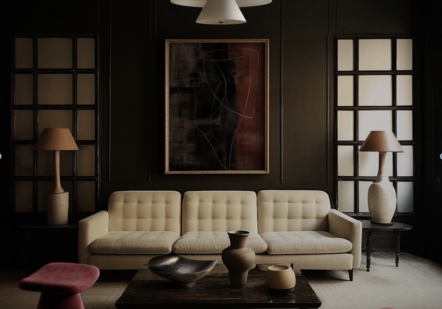

You'll be surprised to discover that the neutral color spectrum offers a wide and varied selection. One tone that stands out for its universally loved warm and calming appeal is cream. This color often features undertones of yellow, but can also lean toward beige or even peach. Elegant and sophisticated, cream eliminates the harshness and starkness of white. In natural light, it feels soft and soothing; when paired with other tones, it creates a timeless look. So, what colors go with cream?
Cream pairs beautifully with any color, adding vibrancy without ever feeling over the top. It’s a soft, subdued neutral that complements every palette. It has an inherent textural richness — spaces adorned in this hue never feel flat. Its subtle dimensions, especially in deeper shades, and can feel downright sumptuous. Versatile and adaptable, cream works effortlessly in any room. Cream kitchen cabinets feel fresh and contemporary, while cream-painted bedroom walls or reading nooks provide a serene ambiance.
Now is the perfect moment if you're ready to craft memorable interior schemes with this timeless shade. Explore these expert-designed spaces and gather all the inspiration you need! These are the best colors that go with cream.
1. Dark Green
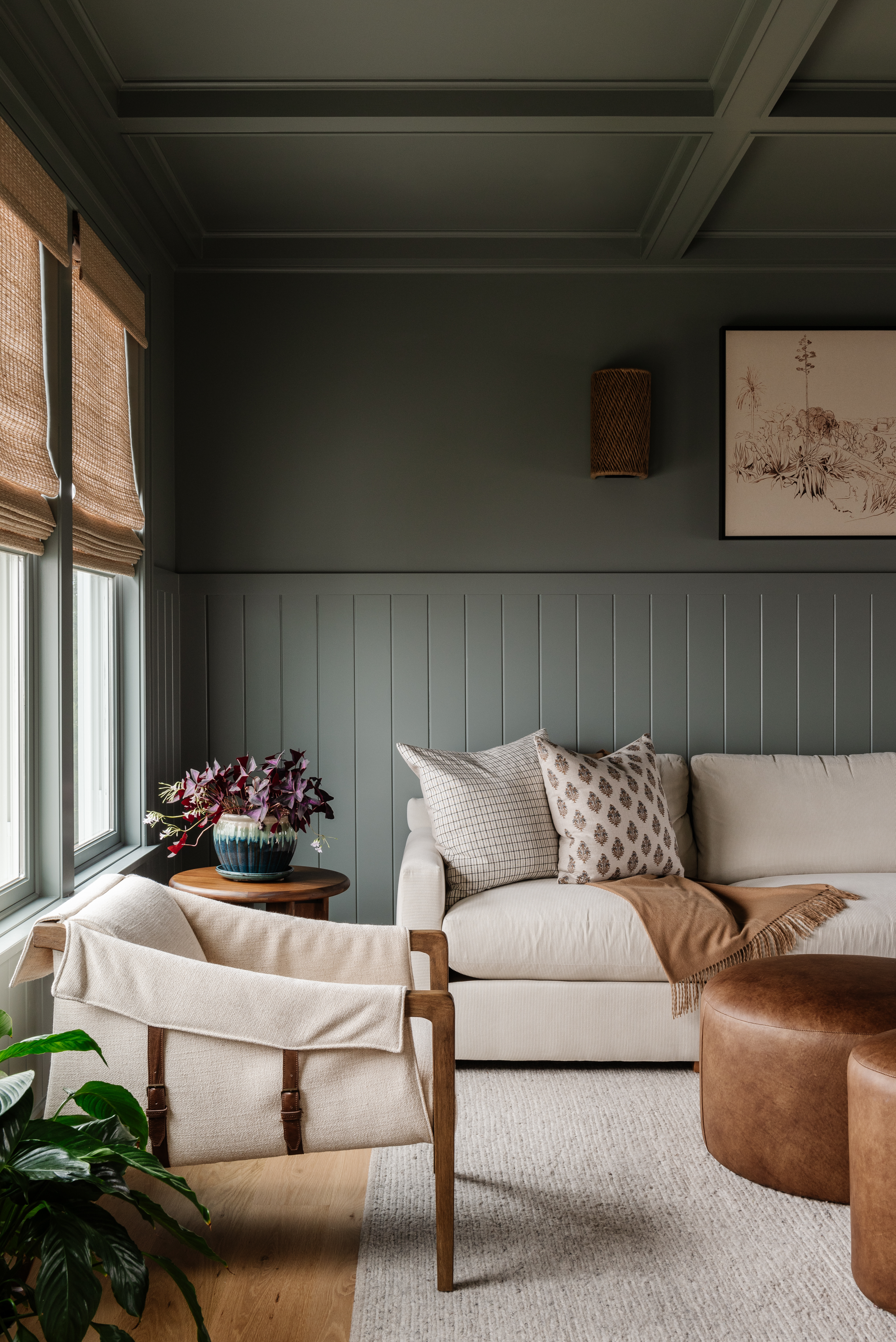
Cream is a color that goes with green, and the two can create a wonderfully earthy setting that instantly feels calming. Since cream is on the same spectrum as other earthy tones, you can pair it with other greens as well, like olive, forest, or moss green. Want to add a third tone? Consider the grounding shade of brown or beige to complete the palette.
“The interplay of cream and off-white tones with earthy greens and rich textures creates an inviting warmth in this space,” shares Sarah Brady, founder and principal designer at Salt Design Company. “The soft contrast between the light upholstery and deeper hues, like the muted green wall paneling, adds depth while maintaining a calming balance. Natural materials — such as woven window shades, the leather ottoman, and the wood accent chair — layer in texture, enhancing the tactile and visual coziness. It’s a timeless palette that feels both serene and grounded, perfect for creating a welcoming, soothing space.”
2. Brown
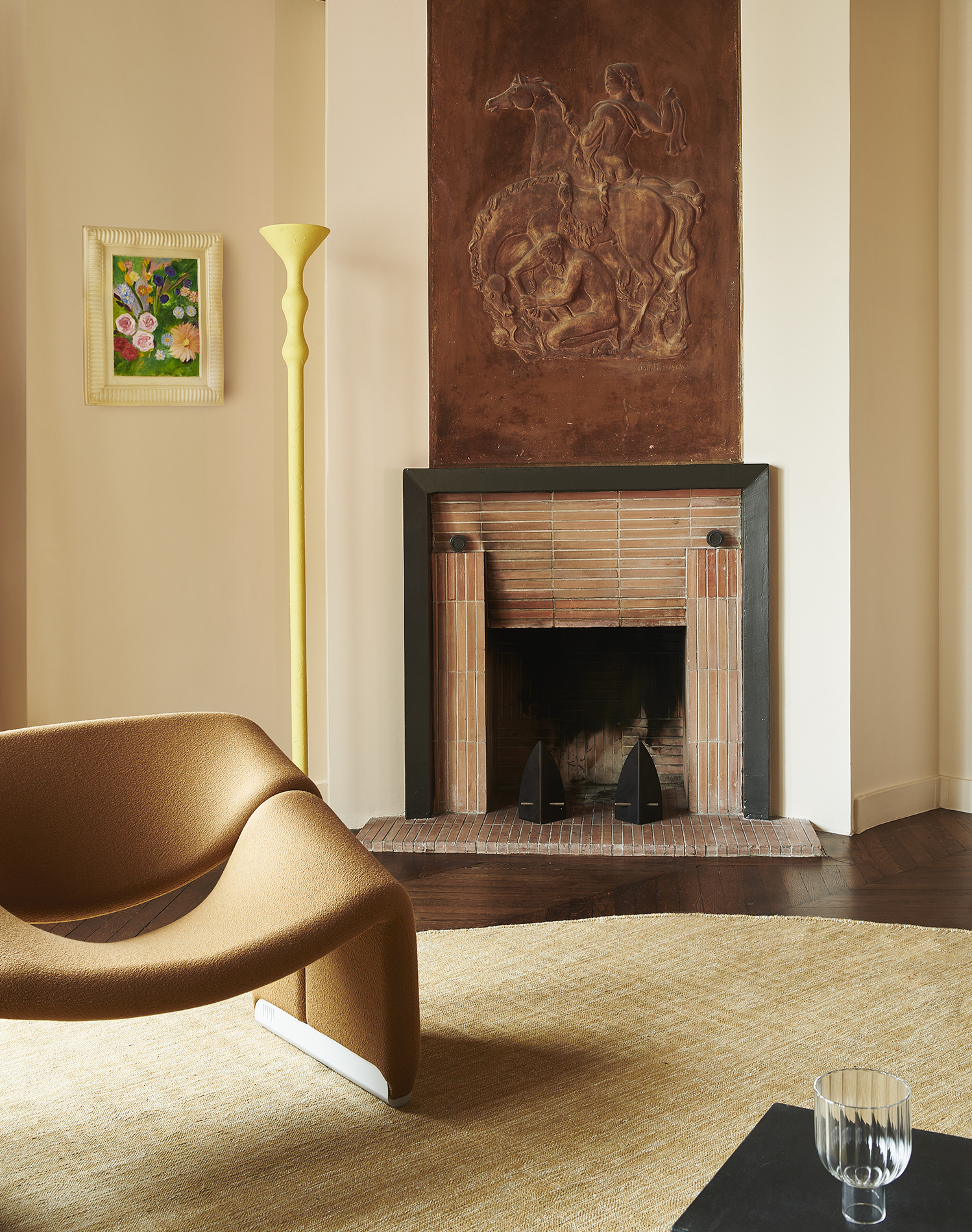
Because cream can sometimes take on a rosy hue in warm, yellow light, it makes for a wonderful color that goes with brown or pink. In this setting, the blush and cream walls create a charming canvas. While all the tones lean slightly earthy, the overall interior still feels fresh and modern.
“If you want a more grounded and serene look, dusty blues, warm grays, or taupe complement cream perfectly, adding depth and sophistication,” shares Burcu Garnier of Color Atelier. “If you're looking for a natural and earthy palette, colors like terracotta and sand harmonize beautifully with cream, evoking a sense of calm and warmth.”
3. Emerald Green
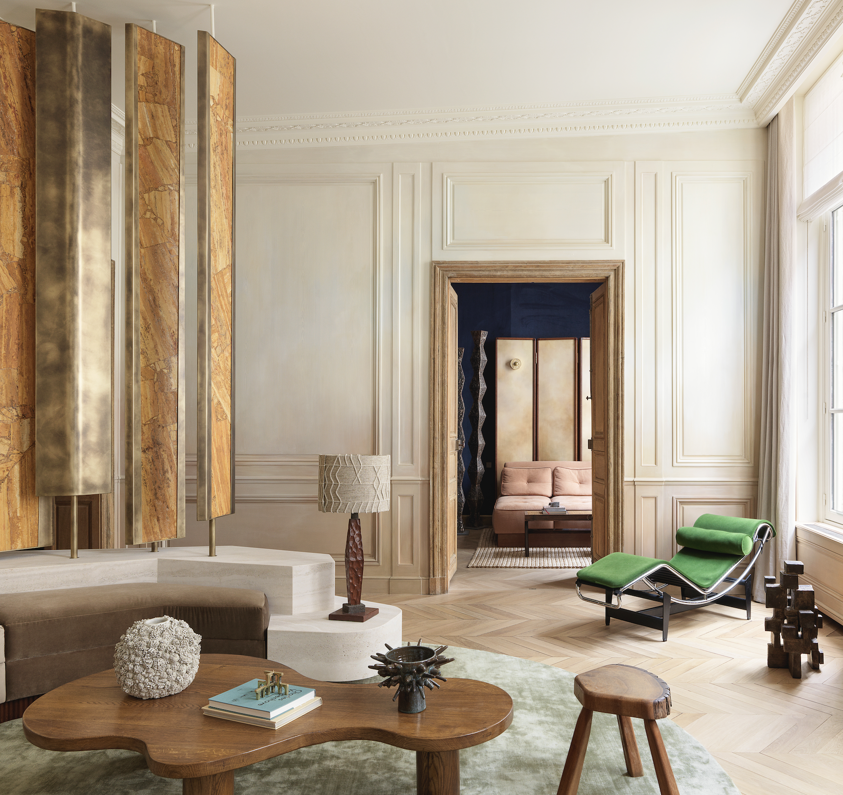
Earthy, moody settings aside, cream can also help create a modern, crisp, and elegant living room or bedroom scheme. Take this space for instance. The light cream walls, wooden furniture, and the sculptural screen with four rotating panels create a grounded setting, but the emerald chaise adds a lovely pop of color to the room without looking too over the top.
“These are all strong stylistic statements, which are enhanced with pieces of furniture designed and sourced — from leather to wood to brass,” shares architect and interior designer Hugo Toro. “The result is an astonishing balance.”
4. Plum

From lilac and dusky purple to claret and plum, cream pairs effortlessly with a wide range of luscious tones. If you're dreaming of a purple living room but want to avoid overwhelming the space with the color, balance it out with cream. This warmer, friendlier neutral offers a softer alternative to stark white.
“Cream is a wonderfully versatile and timeless color that pairs beautifully with a wide range of hues to create soothing or striking combinations,” says Burcu. For a more eye-catching combo, “consider colors with clear contrast or harmonious undertones that enhance cream's elegant and versatile nature,” adds Burcu.
5. Charcoal Gray
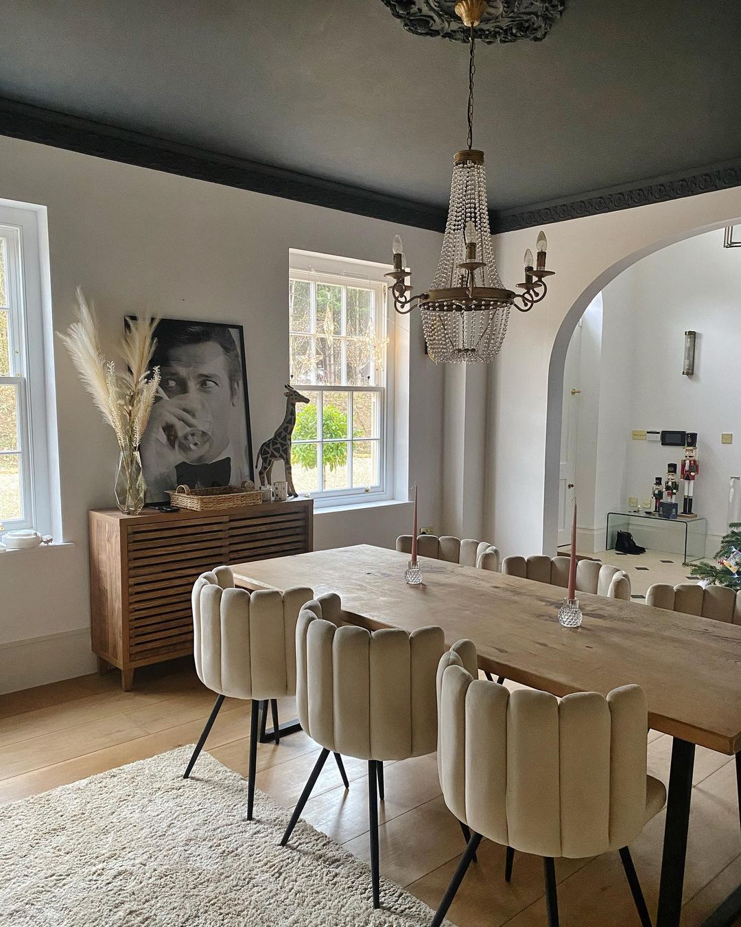
For the perfect yin and yang scheme, use cream as a color that goes with gray. When it comes to what colors go with cream, neither of these shades are stark neutrals, which helps them create more serene palettes.
"Using darker colors on the spectrum such as black and gray can be used in a number of fun and unique ways, such as on a ceiling,” advises Paula Taylor of Graham & Brown. “To complement darker shades, use neutral colors such as cream and whites to create balance and complete the full room look. The darker color of Graham & Brown's Herbert paint perfectly partners with the off-white color of Angel Dust; the ideal neutral tones create a soft liveable atmosphere. You can also bring in neutral soft furnishings touches through blinds, curtains, and pillows to create a perfectly balanced room palette."
6. Light Olive

Light olive or golden-beige is a cocooning shade, and when paired with a warm white or cream can actually create quite a comfortable and uniquely modern atmosphere. Take this space, for instance, designed by interior and furniture designer Tatjana von Stein. The painted ceiling adds a touch of liveliness to the room, while the cream walls ensure timelessness.
“For the bar, raw materials like wood and metal were considered as neutrals that neatly complement one another,” shares Tatjana von Stein. “Deep green velvet stools are paired with the warm tones of geometric wood panels, and the refined coolness of marble surfaces and stainless steel make up the wider modernist tones of the design concept.”
7. Blue
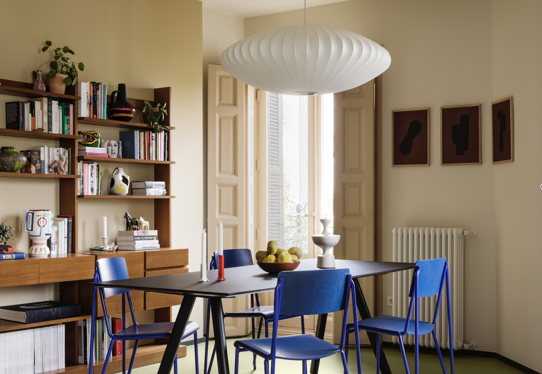
Cream is a wonderful choice and color that goes with blue; adding a nautical or outdoorsy influence to your interiors can easily be achieved with both these tones. In this space designed by Estudio Recente, cream subdues the electric and bright cobalt blue hue and sets the tone for a more livable, and useable dining room — a space that is one of the most frequently used ones.
8. Yellow
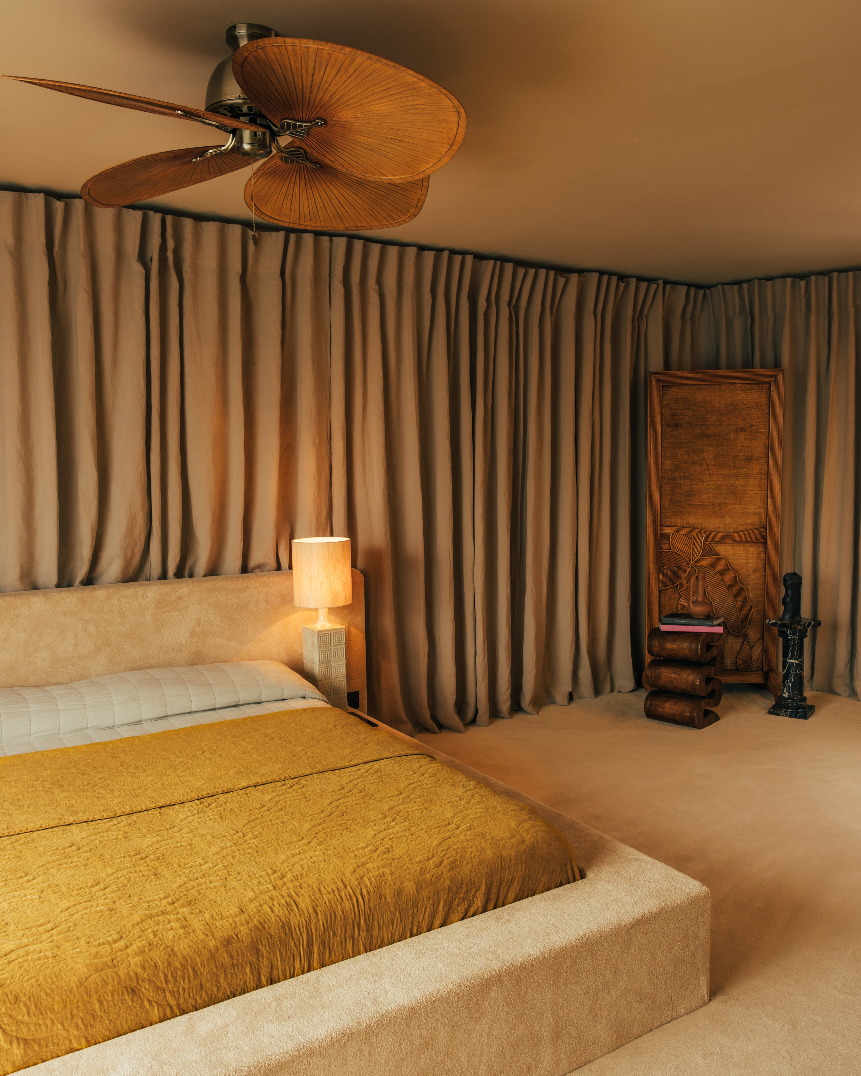
Cream is a color that goes with yellow because it can lend a lovely, sun-kissed effect to a space.
“For the main bedroom, we wanted to create a light, zen, and peaceful retreat, offering a contrast to the more playful color combinations seen elsewhere in the apartment,” explains Tatjana von Stein. “Using tonal variations across different textures, we evoked the comforting embrace of a womb, with shades of yellow paired with soft, enveloping materials. Golden curtains, Élitis silk paneling on the integrated wardrobes, and plush pile carpeting extend seamlessly to a bespoke carpeted bed.”
9. Black
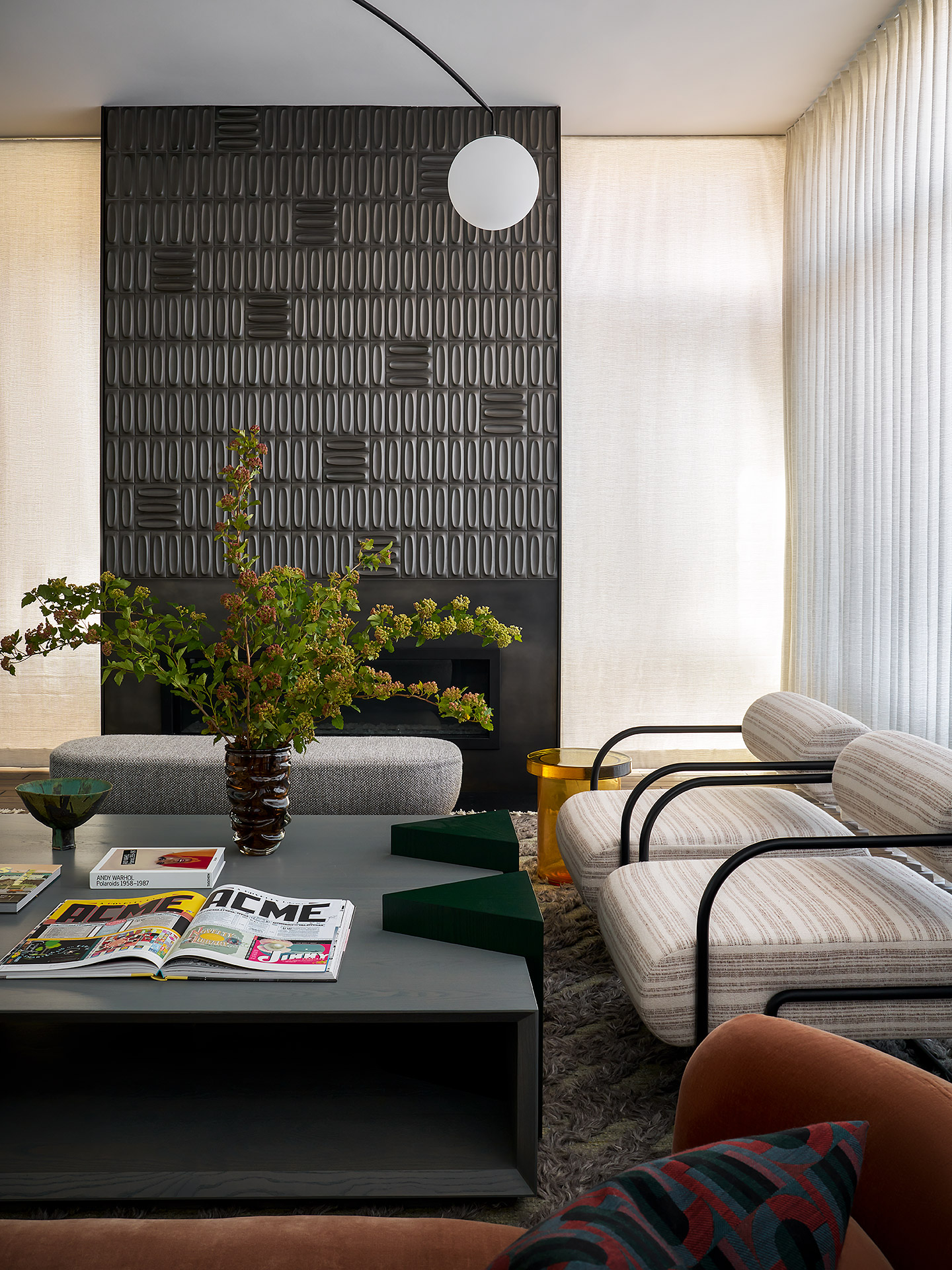
While black and white is a classic combination, when it comes to what colors go with cream, black also provides a classic pairing. In fact, cream helps subdue black, while dialling down its sombre look. Together, the two can conjure a more calming space that can last years.
In this living room by Studio Gild, the two work perfectly in tandem. The cream walls create a light and airy feel, while the black fireplace and coffee table add a touch of drama and contrast. Perfect for a stylish and chic home.
10. Red

Amongst the neutral colors that go with red are cream, warm white, and off-white — all tones that are far from clinical and sharp. While red can feel quite overpowering, you need to balance it with a grounding cream to make it feel more visually appealing.
Living room and bedrooms aside, "try this combination in spaces like bathrooms or kitchens, where neutral walls can provide a backdrop to tomato red accents, such as towels, cabinets, or a bright red statement door," advises interior designer, Nina Lichtenstein.
FAQs
What colors don't go with cream?
While cream is such an accommodating and easy-to-use color, there are a few combinations that experts warn against. “Neon or overly saturated colors can clash with cream’s subtle, warm tones, overpowering its softness,” says Burcu. “Additionally, pairing cream with shades that are too close in tone but slightly off — such as a muted yellow or certain beiges — can sometimes create a muddled or unbalanced look.”
Does cream color go with dark blue?
Yes, when it comes to what colors go with cream, blue offers a fantastic combination as the warmth of cream can balance the depth and richness of dark blue. The result is a sophisticated and balanced space. This combination works well in various design styles too, from classic to modern For a timeless look, consider cream walls or furniture with bold navy blue accents.
Do cream and gray go together?
Absolutely. The softness of cream offsets the cool undertones of gray, making the combination feel harmonious and inviting. This pairing works well in various design styles, from modern and minimalist to classic and cozy. For an elegant setting, consider light gray furniture upholstery with cream walls to maintain a neutral and airy feel. For a more dramatic effect, use darker grays with cream accents to create contrast while still keeping the overall scheme balanced.
Does silver go with cream?
This is a combination that speaks of elegance and a high-end look. The warm undertones of cream balance the cool, metallic sheen of silver. Cream walls add dimension to silver-toned furniture — think floor lamps, mirrors, or decorative pieces. In textiles, cream fabrics with silver threads or embroidery can create a luxurious feel.
Be The First To Know
The Livingetc newsletters are your inside source for what’s shaping interiors now - and what’s next. Discover trend forecasts, smart style ideas, and curated shopping inspiration that brings design to life. Subscribe today and stay ahead of the curve.

Aditi Sharma Maheshwari started her career at The Address (The Times of India), a tabloid on interiors and art. She wrote profiles of Indian artists, designers, and architects, and covered inspiring houses and commercial properties. After four years, she moved to ELLE DECOR as a senior features writer, where she contributed to the magazine and website, and also worked alongside the events team on India Design ID — the brand’s 10-day, annual design show. She wrote across topics: from designer interviews, and house tours, to new product launches, shopping pages, and reviews. After three years, she was hired as the senior editor at Houzz. The website content focused on practical advice on decorating the home and making design feel more approachable. She created fresh series on budget buys, design hacks, and DIYs, all backed with expert advice. Equipped with sizable knowledge of the industry and with a good network, she moved to Architectural Digest (Conde Nast) as the digital editor. The publication's focus was on high-end design, and her content highlighted A-listers, starchitects, and high-concept products, all customized for an audience that loves and invests in luxury. After a two-year stint, she moved to the UK and was hired at Livingetc as a design editor. She now freelances for a variety of interiors publications.
-
 The Weighted Blanket That Doesn’t Make You Sweat (and the Eye Mask to Match)
Luxury has weight. And apparently, volcanic minerals
By Julia Demer
-
 What Is Biophilic Interior Design? I'm an Actual Biophilic Designer, and This Is How to Apply It to Your Home
A biophilic designer explains the core principles of this practice, and the easy ways you can apply it to your home's design
By Marianna Popejoy
-
 What Does the Color Yellow Mean in Interior Design? A Color and Design Psychology Expert Explains
Whether you love or hate it, yellow always seems to elicit a strong reaction from people — here, we explain why
By Karen Haller
-
 10 Yellow Bathroom Ideas That Vitalize Your Mornings and Look Unexpectedly Sophisticated While Doing So
Yellow is a color that by its very nature is energetic and full of life, and these designers have proved it's ideal for a bathroom
By Oonagh Turner
-
 It's a Color Symbolic of Dreams, so These Purple Bedroom Ideas Almost Guarantee a Good Night's Sleep, Right?
Not always an obvious choice for the bedroom, these designs prove that purple has restful and calming qualities, making it perfect for the bedroom
By Oonagh Turner
-
 Amethyst, Heather, Pansy, Plum — Turns Out Decorating With Purple Opens You Up to a World of Possibilities
Purple certainly isn't a color for the faint hearted, it's a shade that can smell your fear. Here's how to conquer it through your interiors
By Amy Moorea Wong
-
 The Combination You Weren't Expecting to Love — 8 Blue And Orange Living Room Ideas That Feel Surprisingly Elevated
A blue and orange scheme for living rooms may sound jarring, but these spaces prove they're striking, vibrant, and certainly unforgettable
By Camille Dubuis-Welch
-
 Smeg Says Teal, and We’re Listening — The Kitchen Shade of the Year Is Here
Designers are already using the soft, sea-glass green everywhere from cabinetry to countertops
By Julia Demer
-
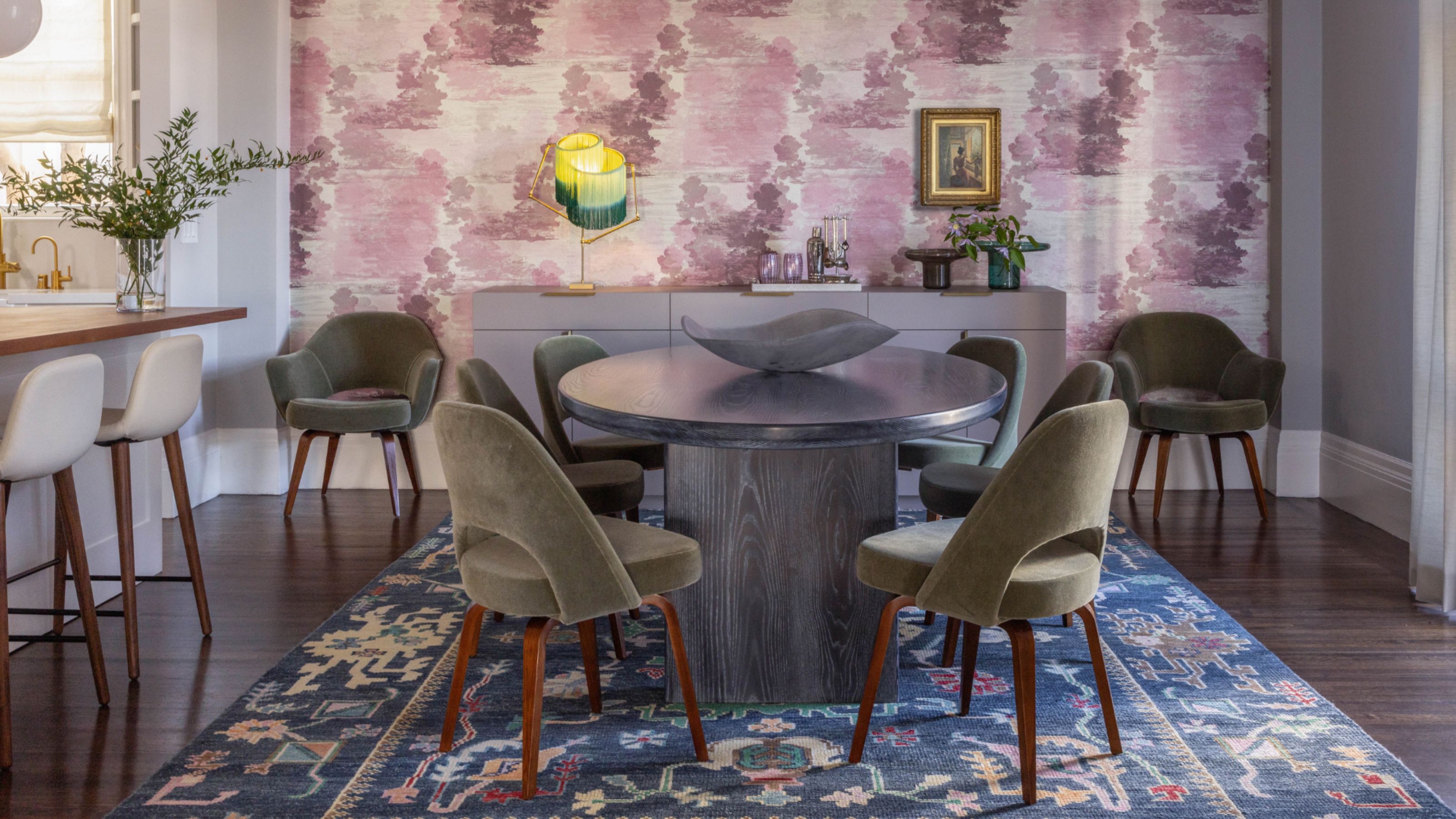 Do Yellow and Purple Go Together? Designers Reveal How to Make This Unexpected Pairing Feel "Totally Intentional"
In an era where unexpected combinations have become cool, we've done a deep-dive to discover how to pair yellow and purple in a space
By Camille Dubuis-Welch
-
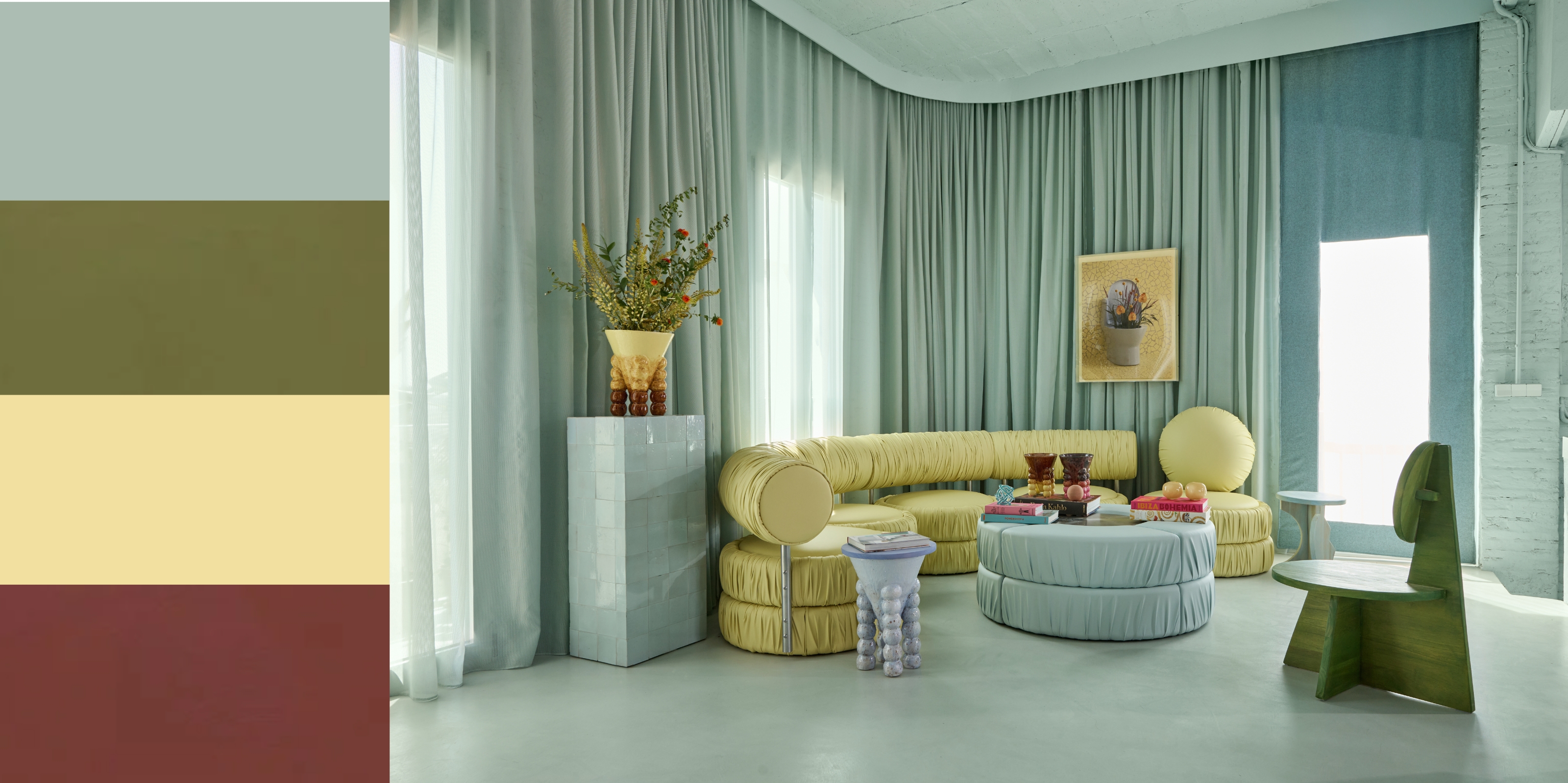 5 Unexpected but Seriously Stylish Spring Color Palettes to Shake Up the Season — "It's Pastel, but Punchy"
Spring color palettes are notorious for their use of pretty pastels, but that doesn't mean they have to lack variation
By Olivia Wolfe


