What Colors Go With White? Design Experts Share 10 Pairings That Won't Feel Too Stark in Your Space
Most people believe that all colors go with white, but it's not always the case — these combinations look especially calming and statement-making

The Livingetc newsletters are your inside source for what’s shaping interiors now - and what’s next. Discover trend forecasts, smart style ideas, and curated shopping inspiration that brings design to life. Subscribe today and stay ahead of the curve.
You are now subscribed
Your newsletter sign-up was successful
White is timeless, crisp, and clean, and embodies simple elegance. It’s the perfect foundation for any space, acting as a fantastic backdrop that lets other colors, textures, and shapes shine. But what colors go with white the best? What many people might not realize is that white is incredibly versatile. It comes in a wide range of shades — there are hundreds to choose from — ranging from warm to cool tones, and the same shade of white can even appear different in various parts of the world or different areas of the same home.
“It creates a calming, clutter-free canvas that’s perfect for relaxation,” says interior designer Nishtha Vashist. “White reflects light beautifully, making spaces feel larger, brighter, and more open — especially useful in small or dimly lit rooms. Its neutrality also means it pairs effortlessly with any style, from minimalist and Scandinavian to boho and classic.”
And while it's commonly accepted that the colors that go with white are infinite, it's not actually the case. It's important to choose the best white paint for interior walls that have the right undertones and tints to create beautiful pairings, but some combinations will feel too stark, or the contrast too jarring.
Article continues belowSo, to ensure you're selecting the right colors that go with white, we've asked the design experts to do the hard work for us. Below, we've shared 10 spaces that demonstrate how to balance and pair white with other colors, to a flawless effect.
1. Blue

So many colors go with blue but the most charming combination is alongside white. The pairing evokes images of the outdoors; a beautiful Mediterranean or coastal scene. If you want to add more dimension, bring in a printed wallpaper, or choose textural paints to give the area more depth. Choose a lighter tone of blue, like a baby blue or pastel, to create a soothing setup, ideal for a bedroom or an entryway idea.
“The star of this room is the accent wall of blue floral Gucci wallpaper," says interior designer Mary Patton. "The walls are painted a bright white everywhere else, to create an overall clean, modern look."
2. Yellow

Yellow can sometimes feel a bit stark, but if you choose a warmer iteration, say ochre or an Indian yellow, you could have a more mature and timeless-feeling space. Plus, warm white is one of the colors that go with yellow, and together, can create a welcoming and inviting setting. To further layer the look for added coziness, consider warm lighting and plants to evoke freshness and movement.
The Livingetc newsletters are your inside source for what’s shaping interiors now - and what’s next. Discover trend forecasts, smart style ideas, and curated shopping inspiration that brings design to life. Subscribe today and stay ahead of the curve.
“In this room, I chose a warm off-white (Grandma’s China by Benjamin Moore) for the walls because the room is flooded with natural light by the Crittal glass doors,” explains Bethany Adams of Bethany Adams Interiors. “Painting the ceiling and beams in the same hue (the trim has a slightly higher sheen) envelopes the room in warmth. The pale yellow Schumacher velvet on the sofa completes the sunny atmosphere.”
3. Plum
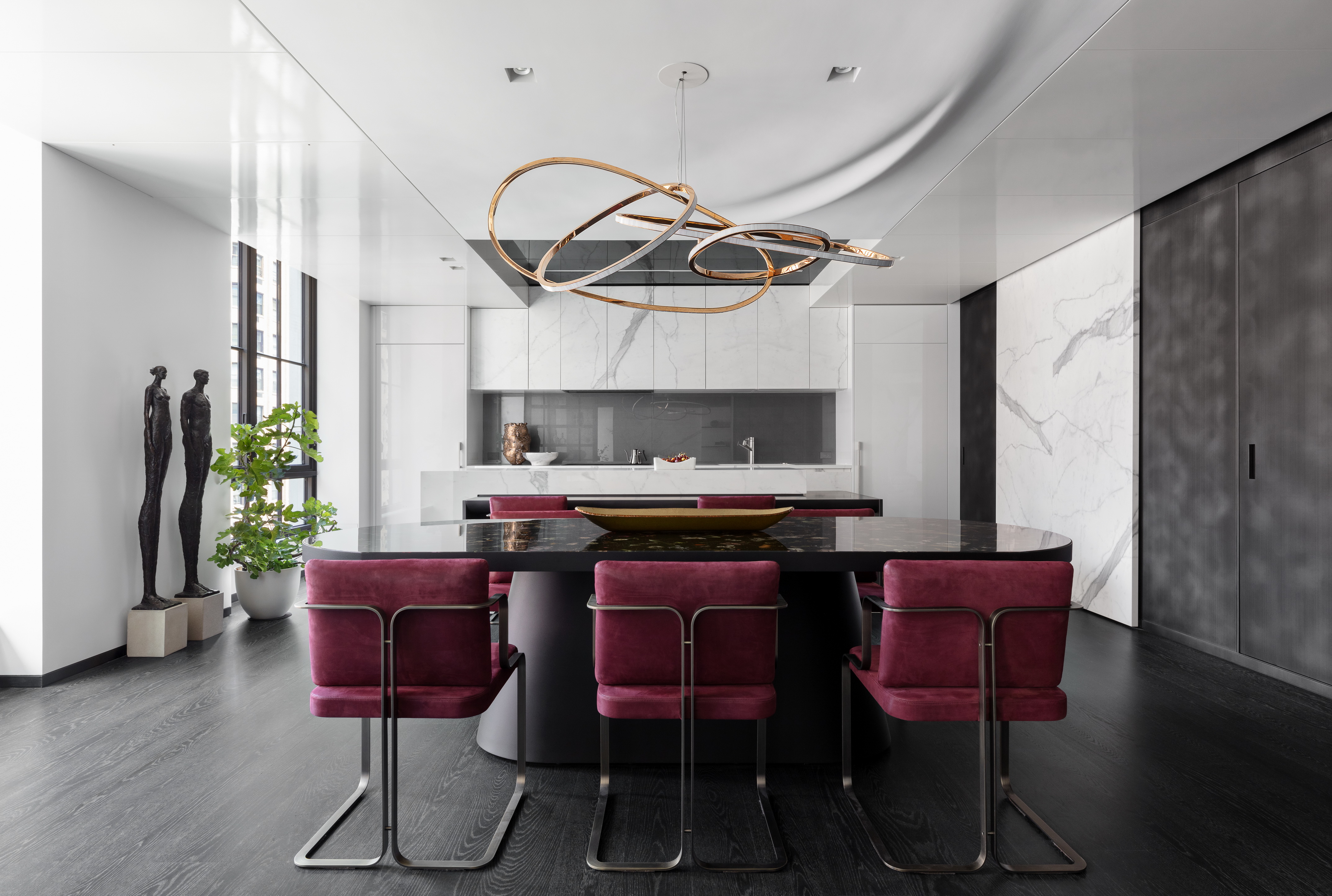
Wondering what colors go with white that will create an impactful, eye-catching interior? Nothing works better than color blocking, as seen in this kitchen-cum-dining room paint idea. The space, designed by Workshop APD uses the magic of cool white to lift the wine-toned dining chairs. This color pairing is a great way to pull focus towards a particular piece; against the crisp white walls, the chairs truly stand out.
“The pop of color is imbued by these Lazzarini Pickering chairs, upholstered in Nella Vetrina suede,” says Matt Berman of Workshop APD. “Dark floorboards pull on the ribbons of gray in the marble finishes on the walls and cabinets.” A beautifully layered scheme.
4. Brown
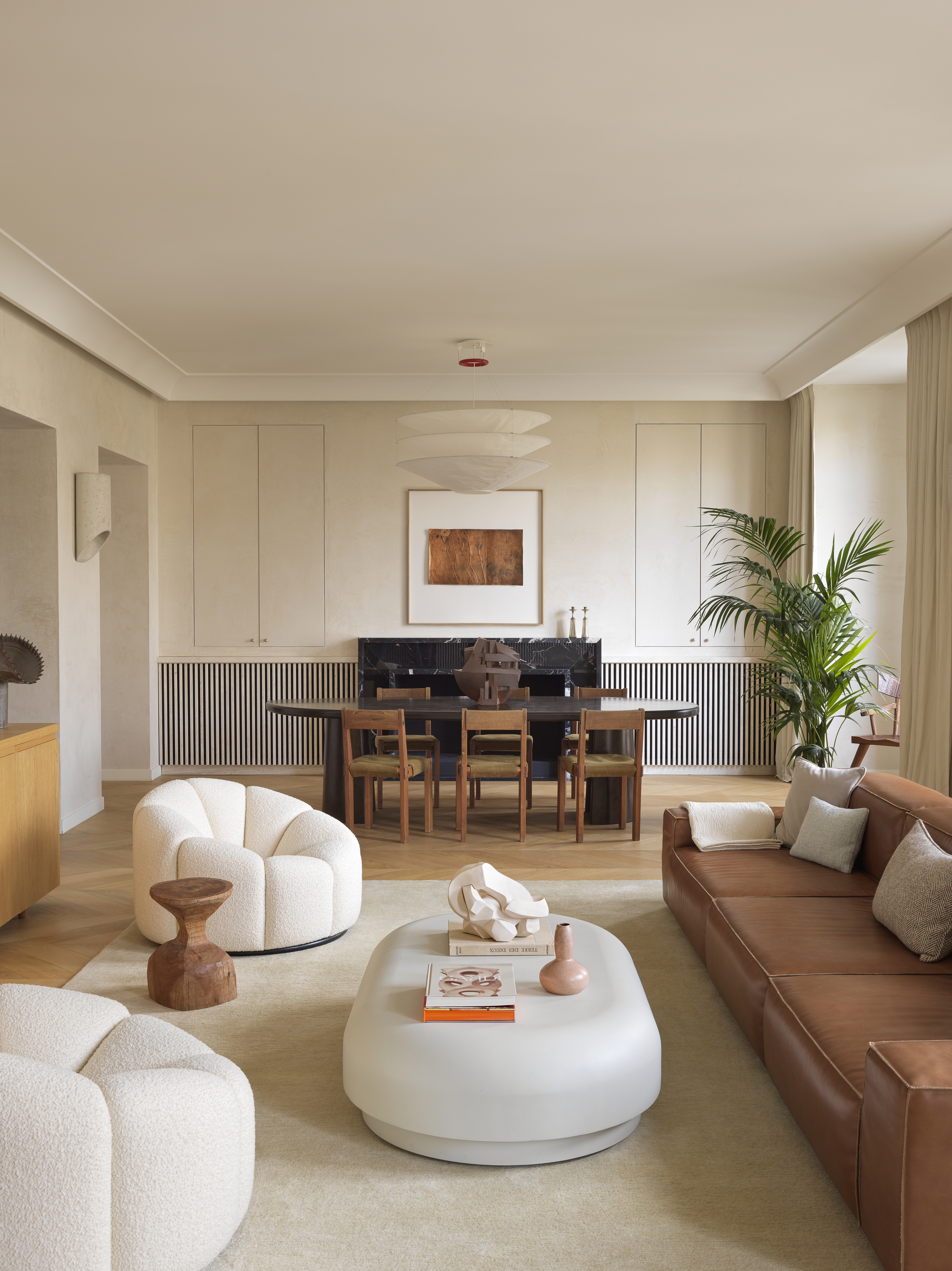
White is the most crisp and modern color that goes with brown, as the two can create a sophisticated setting that doesn't feel overly earthy, yet has a real sense of warmth to it. Take this scheme by Studio Haddou-Dufourcq for instance. The living room balances earth tones of brown and beige, against the cool white armchairs, for a soothing effect; the curving pieces further add softness to the scheme.
“You can incorporate brown through soft furnishings like bedding, curtains, or a textured area rug," says interior designer Nishtha Vashist. "It bridges the gap between modern minimalism and cozy traditionalism, making it ideal for bedrooms or living rooms. It softens the starkness of white and gives the room a timeless, inviting atmosphere — perfect for a restful retreat.”
5. Rust
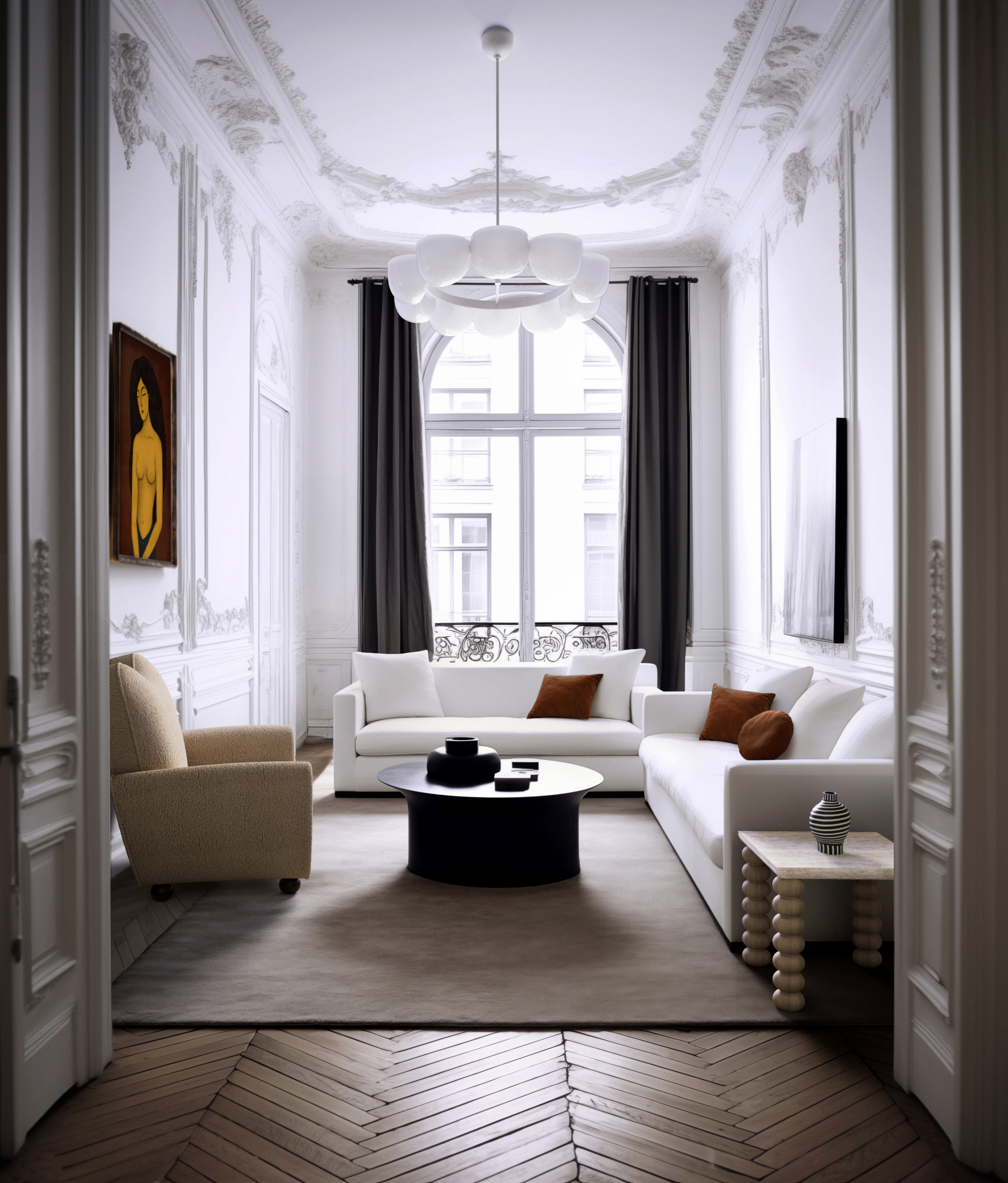
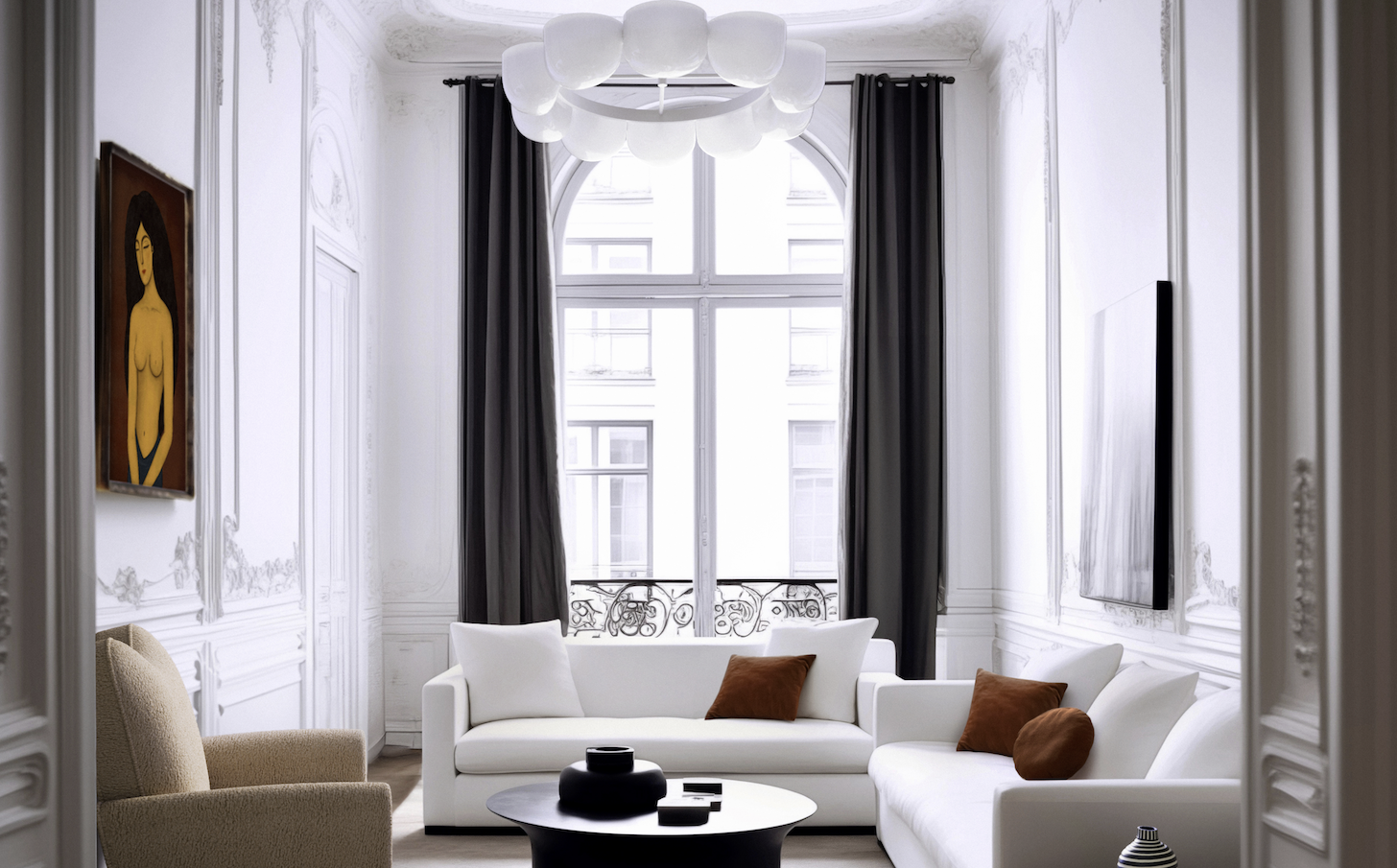
If you're looking to create an earth-tone living room or bedroom without too many "dusty" colors, consider one with a more neutral backdrop, by including a peppering of taupe tones. Take the above space for instance. The white walls and ceiling cornices add a decorative touch, while the dark taupe and rust furnishings add warmth.
“Rust is a versatile, warm neutral that adds sophistication and coziness to a white space,” adds Nishita. “Its earthy undertones complement white beautifully, creating a serene and balanced palette. Pairing dark taupe or rust accessories like pillows or lamps with white paints introduces a sense of depth and warmth without overpowering the light, airy feel of the space.”
6. Dark green
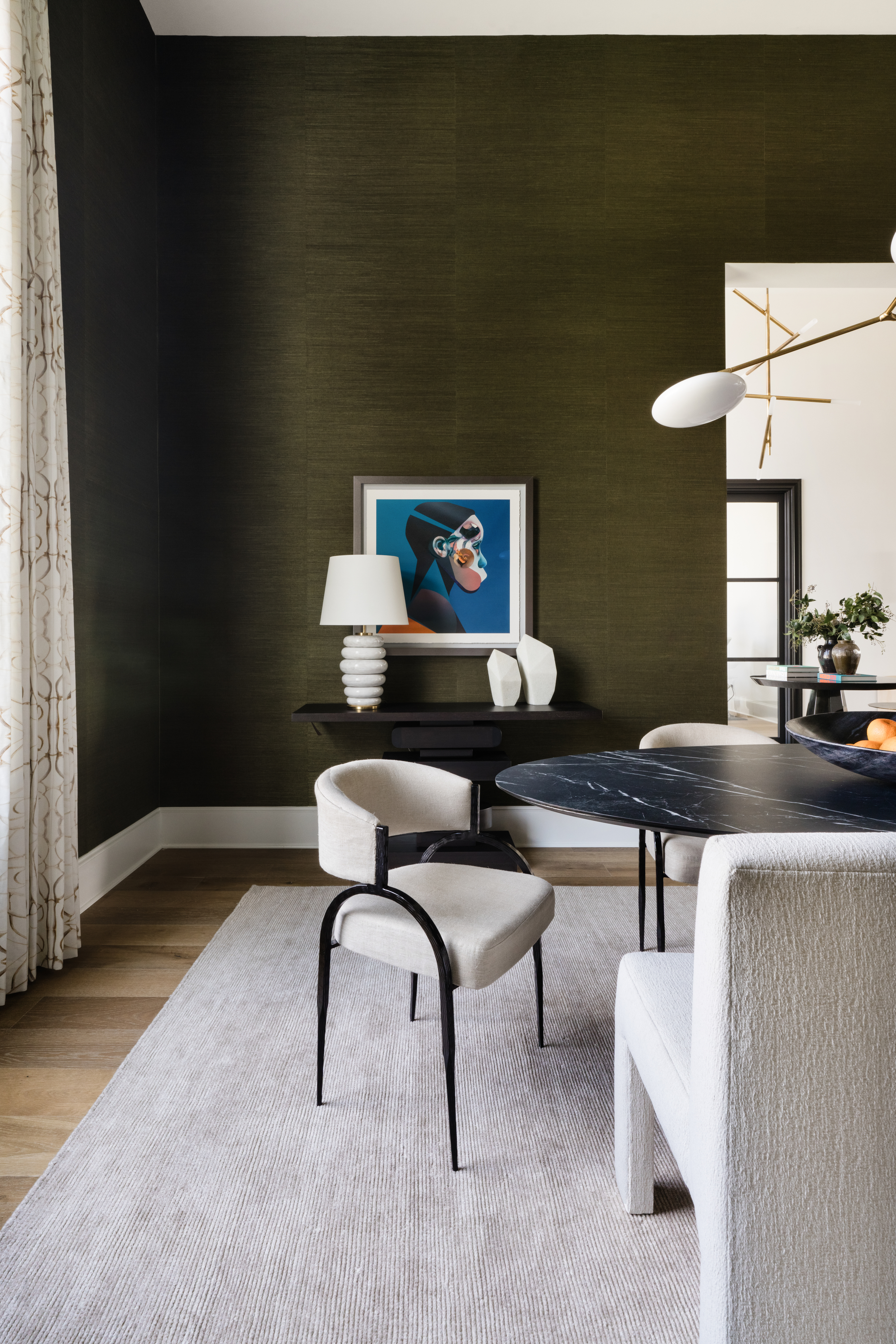
Searching for colors that go with green? If you have a dark shade, and if your space is primarily enveloped in it, it's a good idea to create a sense of relief with a crisp white contrast.
“You can pair green with white to create a beautiful, soft contrast,” says Shelby Van Daley of Daley Home. “Pale sage tones pair best with creamy whites; this is a great color combination for any space. For a higher contrast, you can go with a deeper green with brown undertones, like a hunter green, and use a white to balance out the deep, bold color in a room.”
7. Black
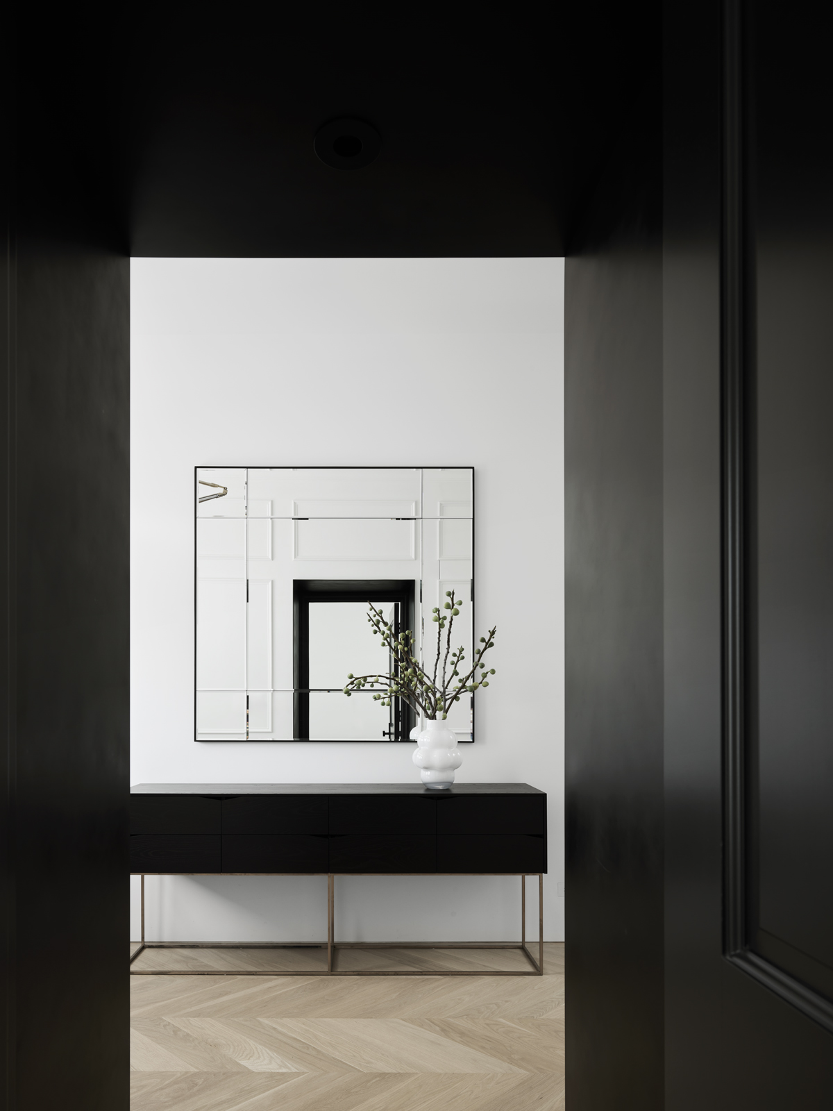
Much like what colors go with white, almost all colors go with black, and together, this combination is timeless and always on trend. In fact, you would be hard-pressed to find another wall color combination quite as effortlessly cool as black and white.
This monotone scheme, whether used in the form of a graphic wallpaper pattern, photography, or paint can add elegance in an instant. Plus, it allows you to layer more colors without making the scheme feel overwhelming. While the two neutrals sit at either end of the spectrum, together they can create a powerful pairing. Don't want to add more colors within it yet want to instill warmth? Try introducing a tall verdant houseplant for a subtle pop of color.
8. Light Gray

Two neutrals can also create a wondering pairing, as proven already. But if you don't want a combination that feels too sharp or contrasting like white and black, think of white and gray. A warm white is a great color that goes with light gray, and the two can feel instantly appealing.
“For this project, we used Tikkurila Perfecta H486 to bring in warmth and coziness,” shares Diana Musakulov, co-founder of sdelaemremont. Together, the palette feels warm and inviting, without being too bright or clinical.
9. Pink
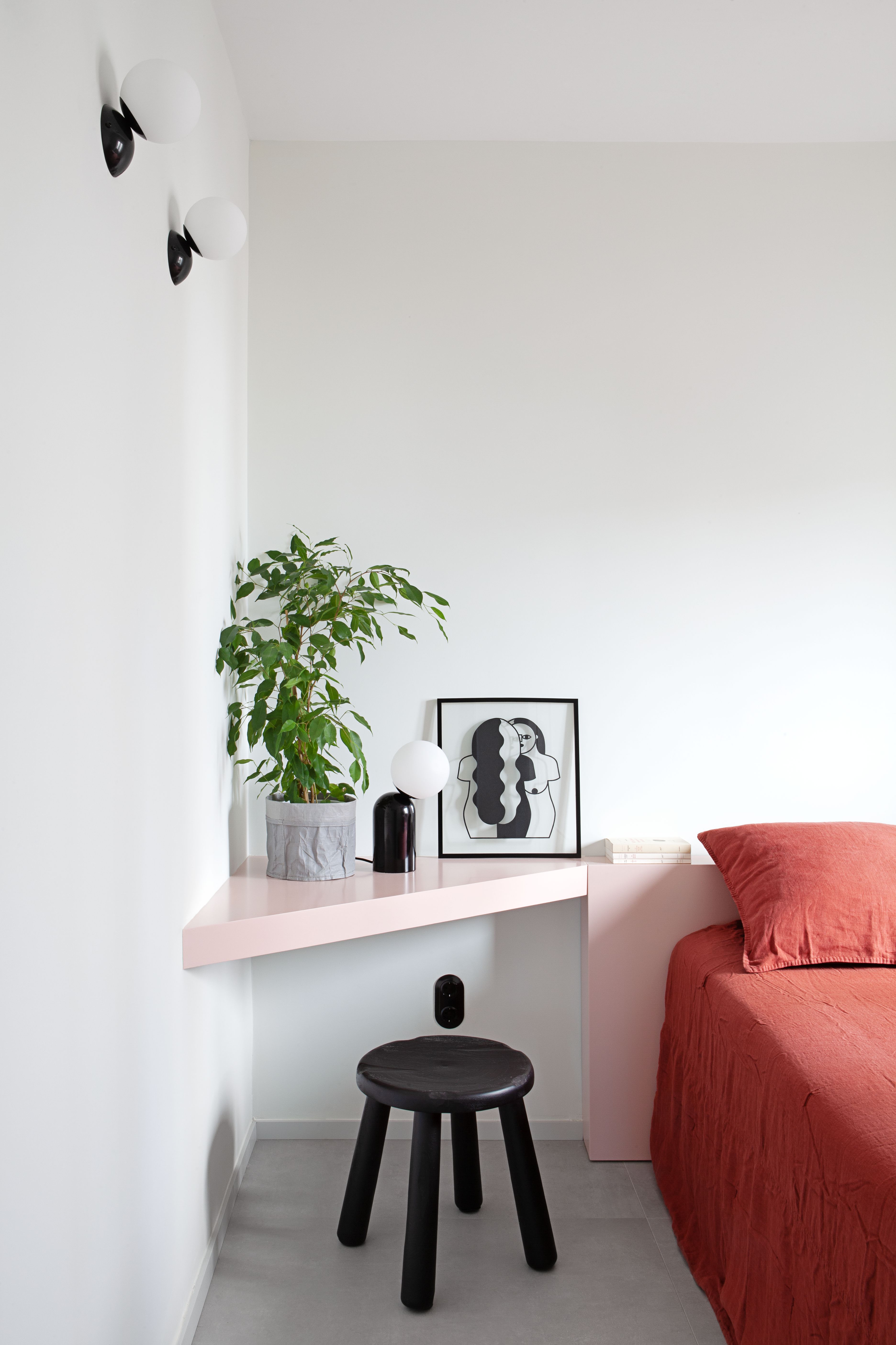
“Muted pastels like blush pink, powder blue, or sage green add a gentle touch of personality while maintaining the calming essence,” says Nishtha. “These colors complement white’s purity without overwhelming the space, creating a dreamy, spa-like atmosphere. Think pastel accents in cushions, throws, or even a painted accent wall to add dimension and charm.”
This subtle white and pink bedroom is a great example. The two tones of pink work well against the white walls. The neutral tone prevents the pastel pink shelf and dark pink bedding from making the room feel too saccharine, while the overall vibe is smart, livable, and charming.
10. Red
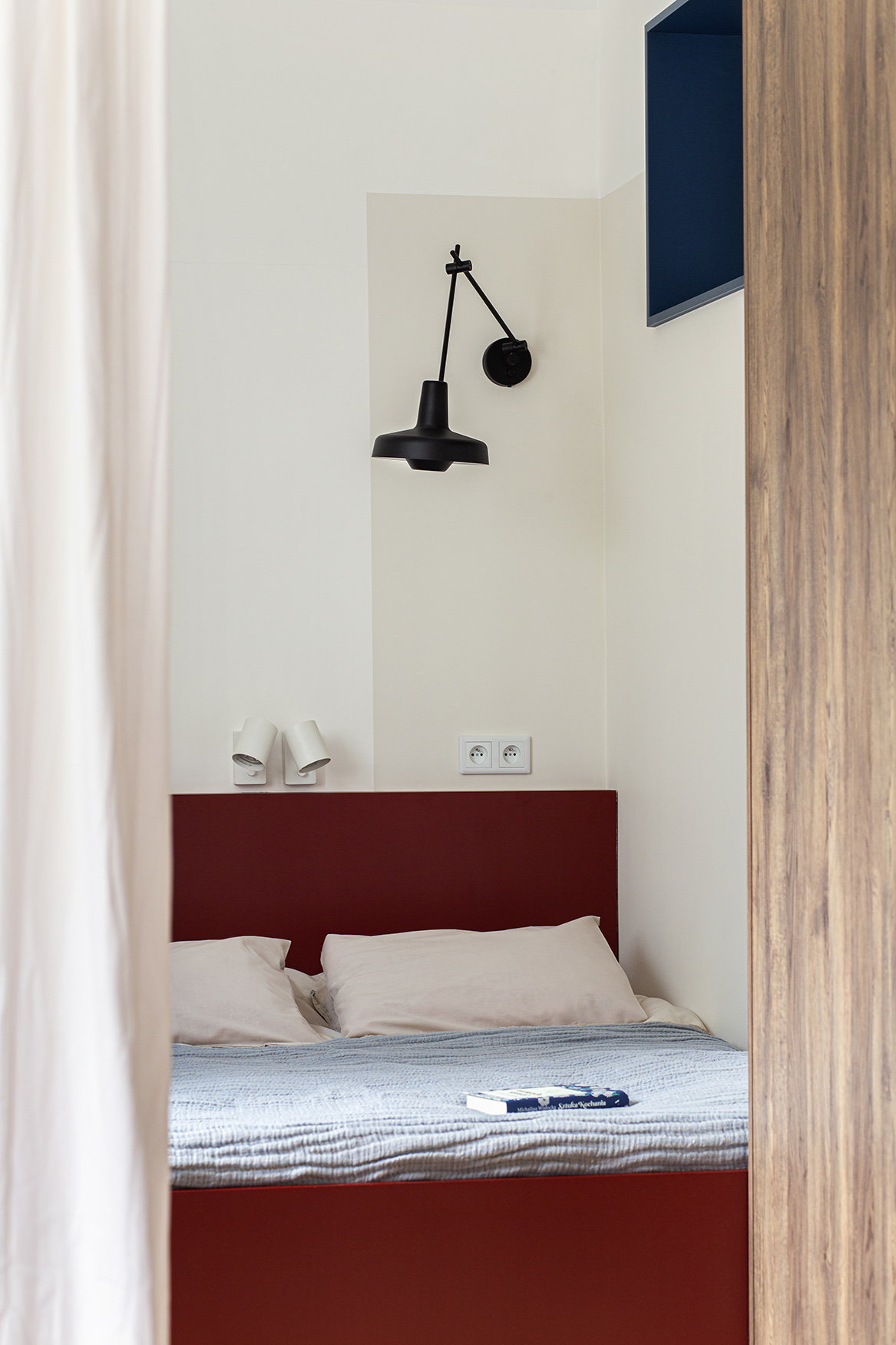
And finally, when it comes to what colors go with white, pairing it with red is a classic color story reminiscent of old Hollywood. This dramatic and daring color combination can be balanced by adding another color that goes with red; say a light gray, beige, or black to soften it.
You can also complement the scheme using patterns and textures for an aesthetic that has depth and movement. Think abstract and nature-inspired motifs on wallpapers, accessories, or furnishings.
FAQs
What color pairs well with natural white?
When working out what colors go with white, a natural shade is generally easier to use and more versatile. Consider pairing it with grays, blues, greens, or even beiges for a warm and inviting feel. For a more lively and upbeat setting, pair it with pastel shades like pink, mint green, lavender, or baby blue.
To further enhance the warmth of natural white, focus on your choice of lighting and specifically its temperature. Warm yellow lights can give it a cozier and more livable vibe.
What color pairs well with pure white?
While pure white is a universal neutral, it's important to be mindful of how you pair it. Bright colors can sometimes appear too stark against pure white (which lacks undertones).
To create a balanced look, consider warmer colors such as brown, taupe, beige, or dark gray. These tones help tone down the brightness of pure white, making a room feel warmer and more inviting.
Other warm shades, like soft pinks and terracotta, are also excellent choices. Alternatively, cool tones such as navy blue and sky blue can work beautifully for a more refreshing contrast.
What pairs well with a warm vs cool white?
Warm whites typically have undertones of yellow, cream, or beige. To complement these, consider tones like tan, taupe, sandy beige, or terracotta. Soft pastels such as blush pink, peach, or coral also work beautifully. For a more personality-filled space, opt for bold colors like emerald green or deep maroon. Warm whites pair exceptionally well with natural textures and finishes like wood, brass, and gold.
Cool whites, on the other hand, have blue, gray, or green undertones. They pair well with charcoal gray, slate, or steel blue. For a refreshing touch, consider mint green, aqua, cobalt blue, or icy blue. If you want a striking contrast, bold black or chrome accents are excellent choices. Textures that complement cool whites include glass, marble, and polished surfaces.

Aditi Sharma Maheshwari started her career at The Address (The Times of India), a tabloid on interiors and art. She wrote profiles of Indian artists, designers, and architects, and covered inspiring houses and commercial properties. After four years, she moved to ELLE DECOR as a senior features writer, where she contributed to the magazine and website, and also worked alongside the events team on India Design ID — the brand’s 10-day, annual design show. She wrote across topics: from designer interviews, and house tours, to new product launches, shopping pages, and reviews. After three years, she was hired as the senior editor at Houzz. The website content focused on practical advice on decorating the home and making design feel more approachable. She created fresh series on budget buys, design hacks, and DIYs, all backed with expert advice. Equipped with sizable knowledge of the industry and with a good network, she moved to Architectural Digest (Conde Nast) as the digital editor. The publication's focus was on high-end design, and her content highlighted A-listers, starchitects, and high-concept products, all customized for an audience that loves and invests in luxury. After a two-year stint, she moved to the UK and was hired at Livingetc as a design editor. She now freelances for a variety of interiors publications.


