How to elevate your 'pass-through room' - experts make more of that unloved space you're ignoring
If you have a pass-through room in your home and have never really bothered to give it some love, then this is your chance to change things around
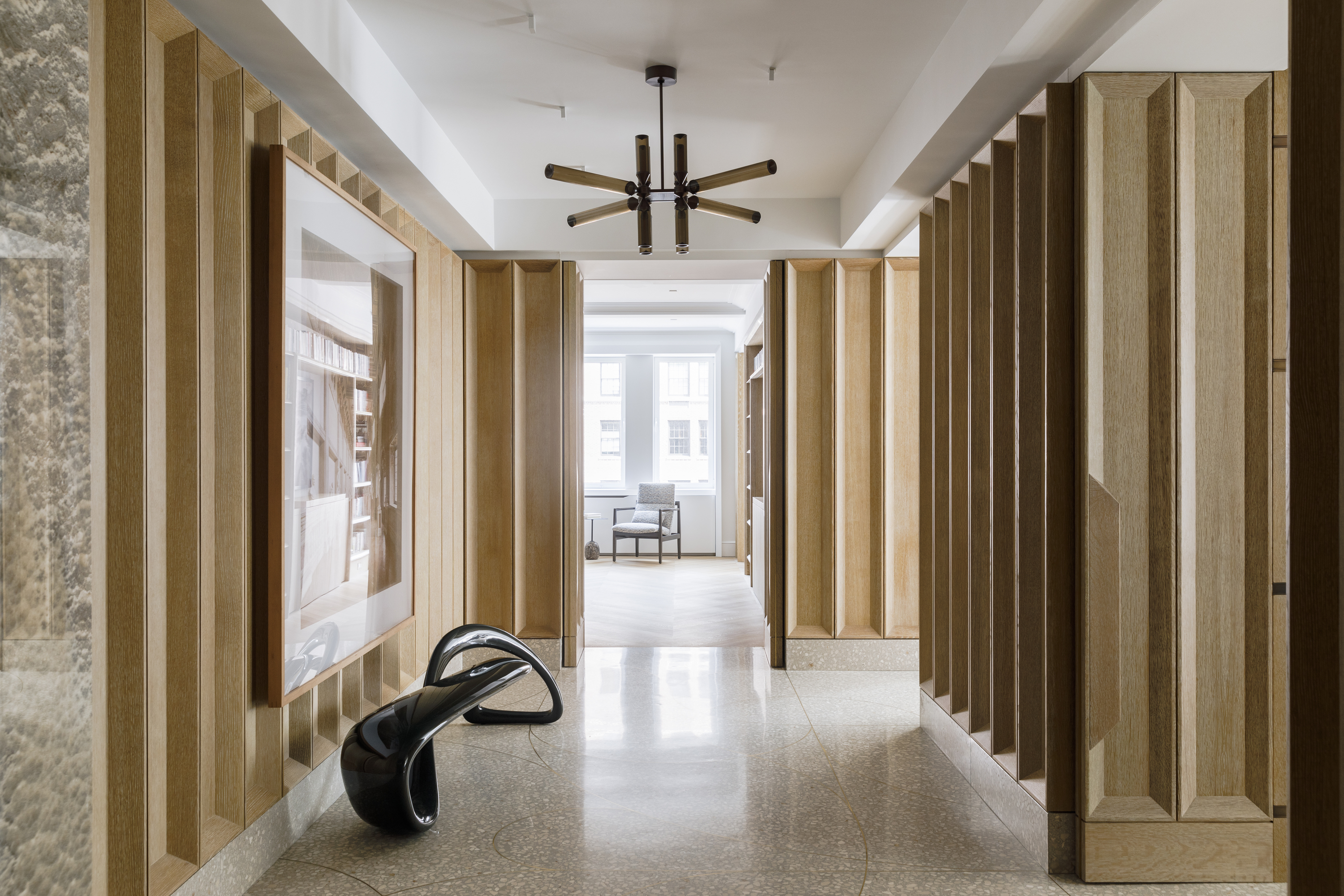

We're all familiar with awkward nooks, alcoves, and corners but a pass-through room can be a layout and design nightmare for homeowners and even experts. How can you decorate a space that is used to transition or just 'pass through'? Should you really put in the effort?
'If you live in a house or apartment that has a room or a space with multiple doors, leading to other spaces, it’s called a pass-through space and, with some thoughtful planning, it can become the jewel of your home,' says Julia Mack, founder of Julia Mack Design. 'With the right paints, furniture pieces, and more, the in-between room can be turned into a usable, inspiring, and alluring new space.'
To help you ideate, we asked experts to offer suggestions on how this oft-ignored space can be made beautiful and functional. Take a look at these in-between hallway ideas and transform your home.
What is a pass-through room?
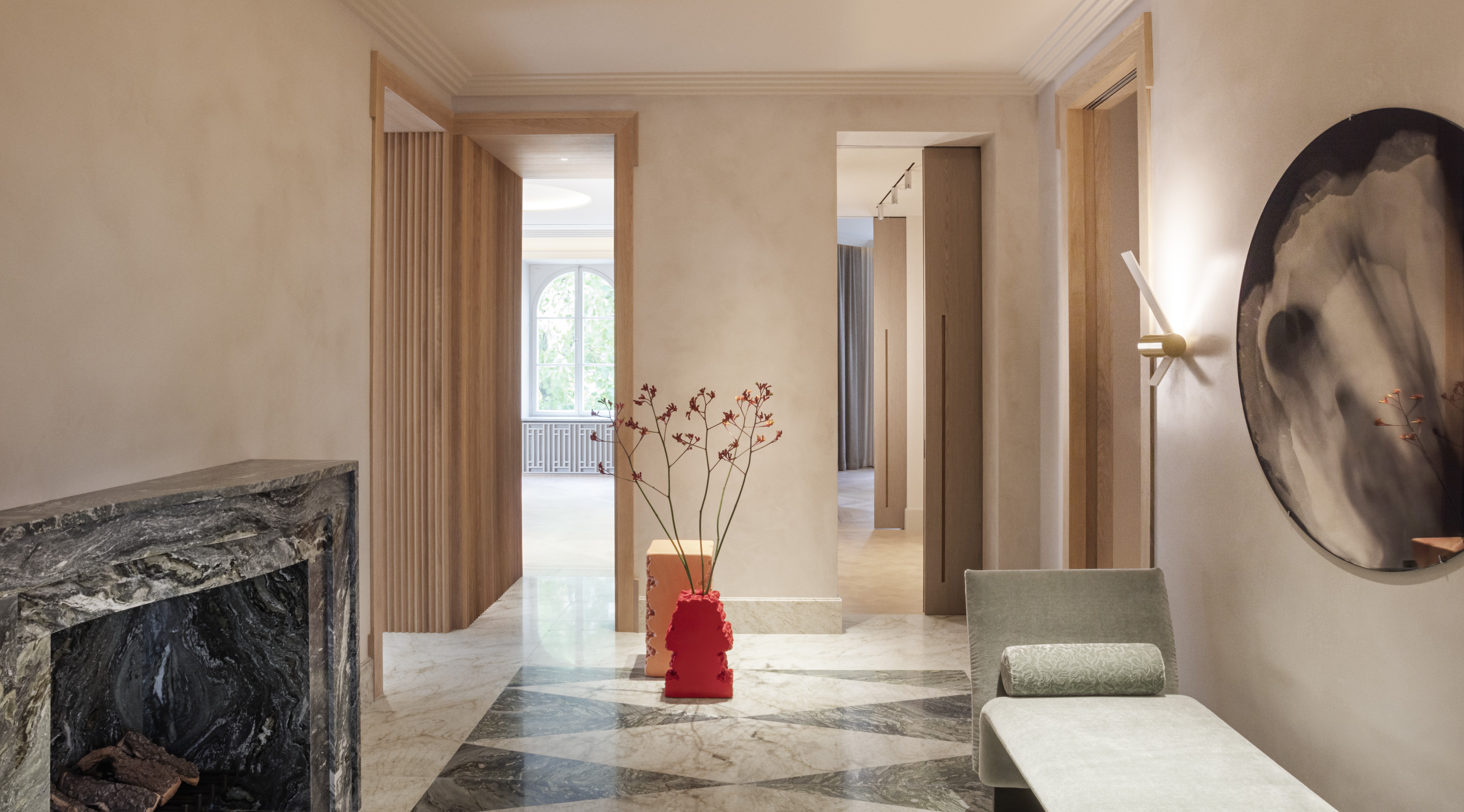
Pass-through rooms are spaces in between the house that serve no function other than leading you to the next space. These can be areas in between interiors and exteriors, upstairs and downstairs, or room to room. Sometimes these could be situated in between two major rooms such as the dining or living room; at other times they can look much like small hallways, (but wider and with more walking area). They're often cramped, cluttered, overlooked, or simply uninteresting.
'This is a room or a space that seamlessly blends one room to the next, giving guests an indicator of the flow of the space and the easiest way to get from one part of the house to another,' says Guillaume Coutheillas, founder & creative director of frenchCALIFORNIA.
But these don't have to be characterless, boring spaces. There's a huge design opportunity hidden in these areas and with the right built-ins, furniture and colors can expand the home's functionality.
How to design a pass-through room
1. Choose clever furniture pieces
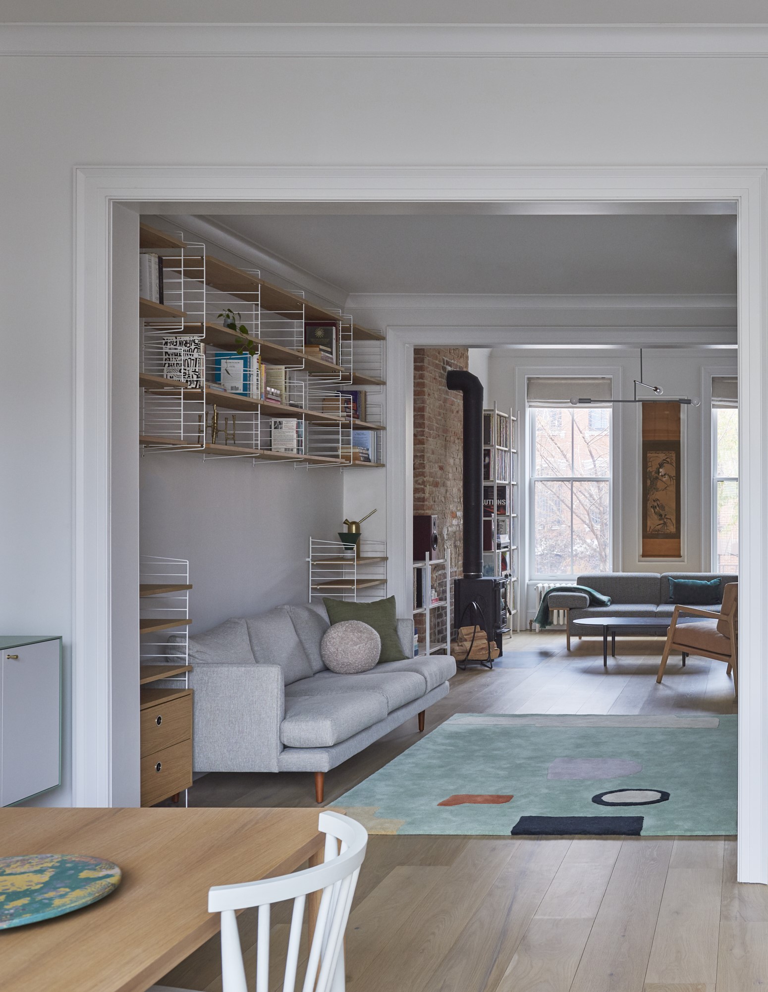
'The pass-through room requires an unobstructed area for people to move through without needing explicit instructions,' says Kashi Shikunova, director at Yam Studios. 'Therefore, furniture with long, rectangular shapes is ideal, as it doesn't take up too much depth in the room and facilitates easy navigation as well as efficient use of the non-walk through section.'
If you want to increase the home's functionality, you could consider adding a storage piece here. 'A console is an important piece for a pass-through room, functioning as a connector that extends between the doors from one space to the other,' says Guillaume. 'For console table decor ideas, you can hang a piece of art above it, stack some books or decorative objects on top, or use it as a space to allow guests to put their belongings as they walk through the home.'
'If the space is too slim or small, consider furniture that ‘floats’ in the middle, allowing easy access to all of the room’s openings,' says Julia Mack.

Material: Metal
Price: $100
Add functionality and an effortlessly on-trend look to your pass-through room with this console. The solid hue and slim shape will blend in any type of decor.
2. Convert it into a functional room
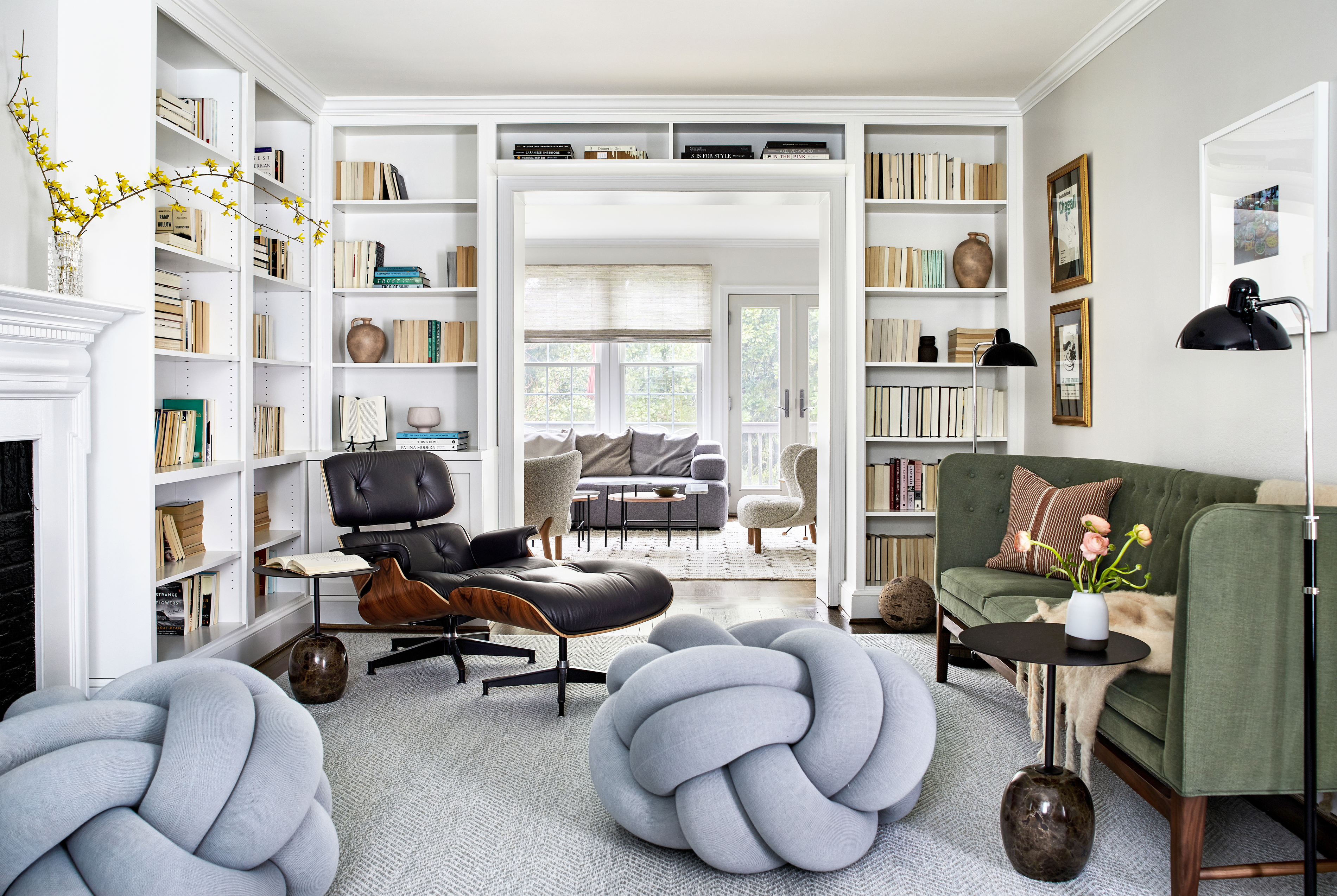
On those rare times when the pass-through space has substantial area, eke an entirely usable room out of it. Perhaps a den room, a reading room, a small dining room, or even an informal lounging area could be the best bet.
'In this home, the living room ended up being a pass-through space because of the narrow center hall,' says Kate Ballou of Hendrick Interiors. 'My clients requested that the room not feel overfilled with furniture, but still function as an occasional sitting room. Because of the constant circulation through this space, we kept the sofa at a smaller scale and chose the very fun floor knot ottomans as an unexpected element with a small footprint.'
3. Paint it to give it personality
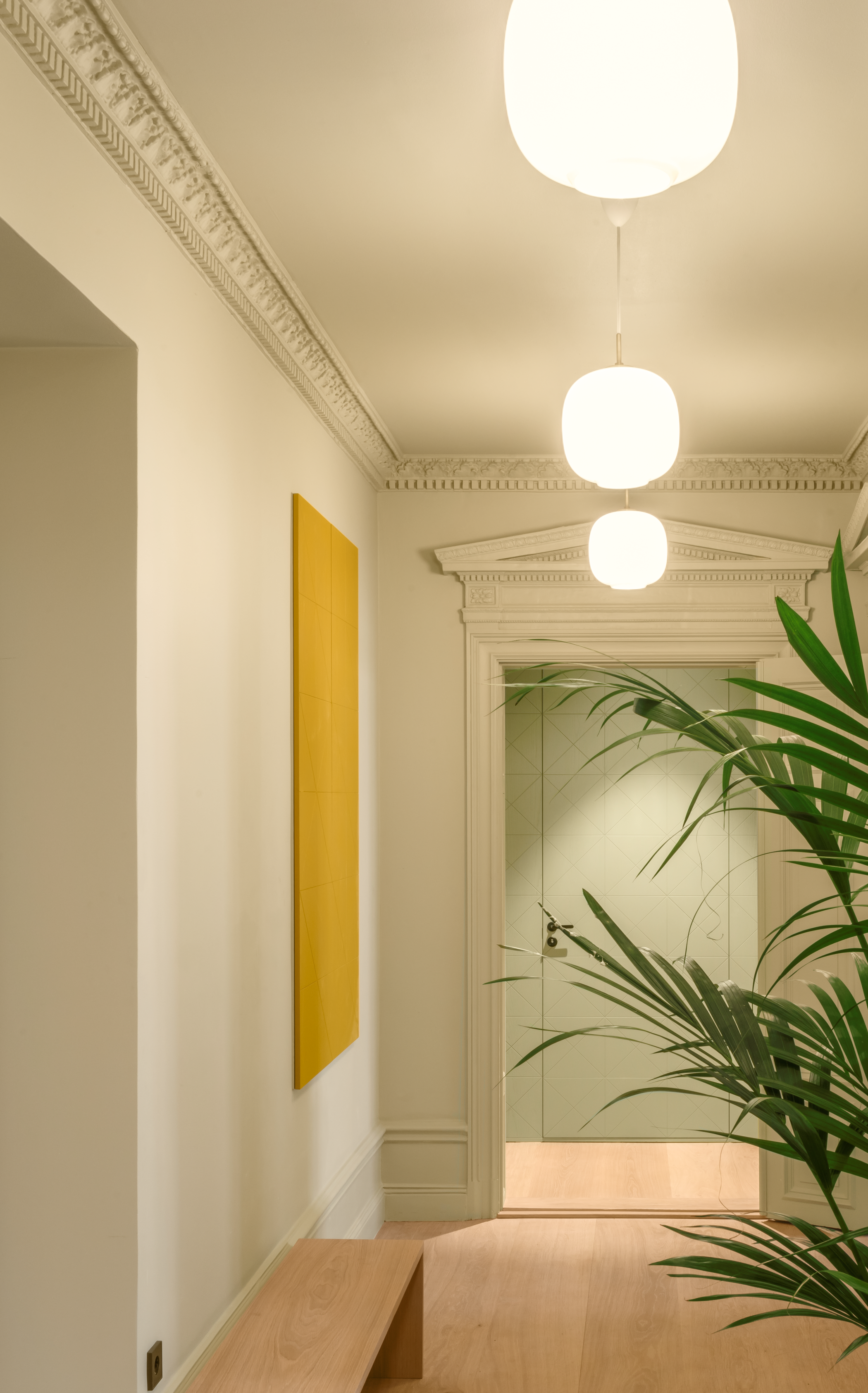
If your home mostly sports a neutral palette and soft tones, and your aim is to blend this space with the rest of the house, then muted tones would be ideal. 'I think pass-through spaces should be very subtle, as to not draw attention away from the main rooms of the space,' says Guillaume. 'A neutral color palette with minimal furniture would be best.'
But if you'd love to make this space stand out, and give it a personality of its own, then think of bold hallway paint ideas that truly make the room feel like the heart of the home. Make sure that the rooms connecting to this space do not have a stark opposite wall color as that could throw off your home's aesthetic. You could consider similar tones for the other adjoining spaces.
'I'd go with a very dark paint color; one that stands out from the other spaces,' says Julia. 'I am partial to black or dark inky blue. Consider painting the walls and ceiling, keeping all of the trim white. Finally, if possible, drop an interesting ceiling-mounted pendant light to add drama and a brilliant glow to the room.'

Recommended Primer & Undercoat: White & light tones
Price: $40 for 3 liters
This muted yet versatile tone has a touch of black and showcases a neutral timber tone; full of warmth and a creamy appearance.
4. Add soft furnishings
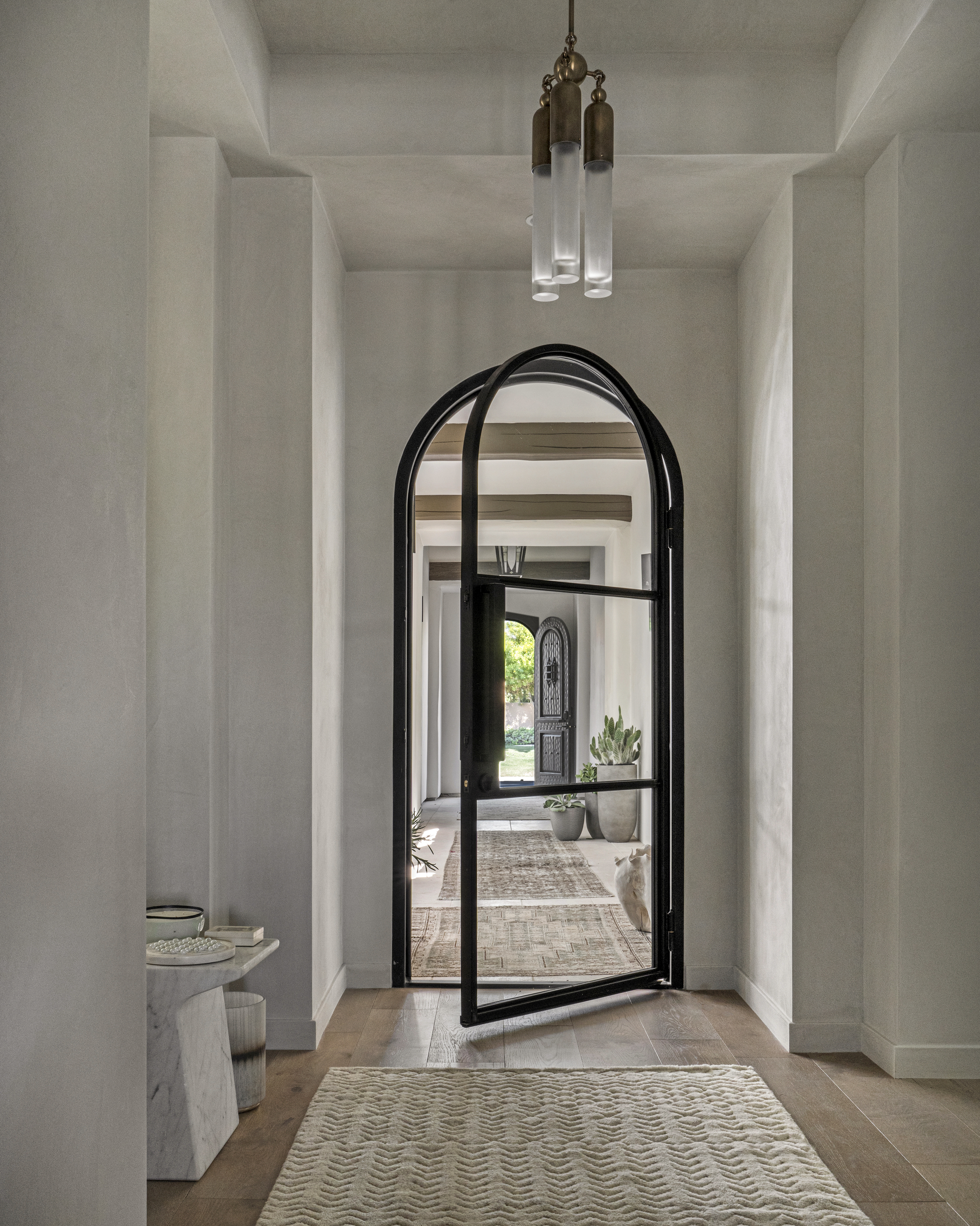
And finally, you want this space to feel welcoming, cozy, and always a delight to transition through. Apart from colors, another way to add tactility and comfort is with well-chosen furnishings.
'I think the ideal 'hero piece' in a pass-through is a rug,' says Lucie Ayres, founder and principal designer at 22 Interiors. 'A rug defines the part of the room that is anchored and this is key. The walkways should be clear and ideally, you're not stepping half on the rug, half on the floor while passing through.'
Consider a shaggy wool or a natural fiber piece drenched in soothing tones; a big rug trend at the moment.
'The idea behind designing a pass-through room is to not make it feel like one at all,' says Lucie . 'It should have pieces that grab the eye, add comfort, and have a function to it.
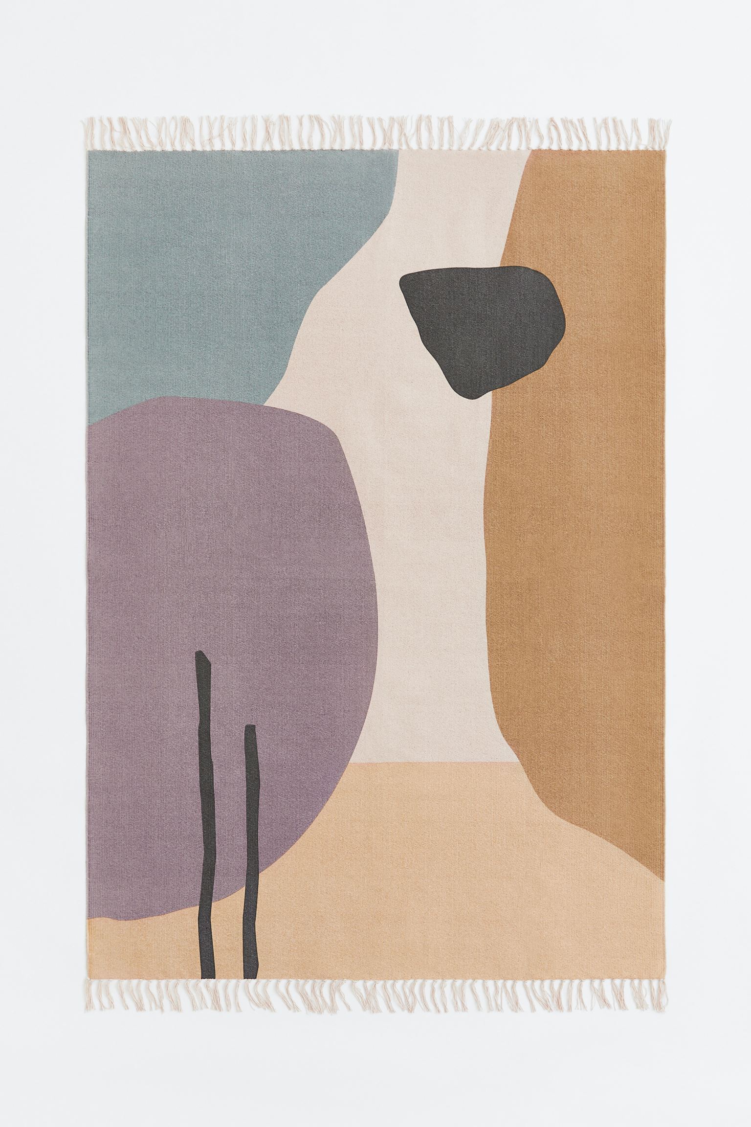
Material: Cotton
Price: $32
Want to inject color and softness into the pass-through space? Consider this rug in woven cotton fabric with a pattern at the front.
What should you keep in mind before designing a pass-through room?
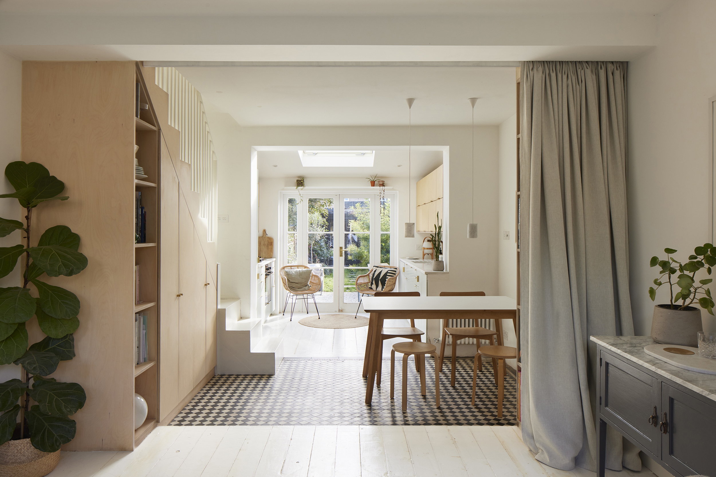
Whether it's a modern hallway, a tiny room, or the entrance space, you want to ensure that the room looks presentable, and tasteful but not too crowded.
'It's essential to ensure there is sufficient space both for people walking through and for utilizing the room effectively,' says Kashi. 'For instance, in a living room scenario where the pass-through area is just outside the room, it can become uncomfortable if someone is constantly passing through while others are trying to watch TV. To maintain a pleasant living experience, it's crucial to confine the room's primary use to the non-walkthrough section so that the traffic in the walkthrough area doesn't disrupt the overall enjoyment of the space.'
Be The First To Know
The Livingetc newsletters are your inside source for what’s shaping interiors now - and what’s next. Discover trend forecasts, smart style ideas, and curated shopping inspiration that brings design to life. Subscribe today and stay ahead of the curve.

Aditi Sharma Maheshwari started her career at The Address (The Times of India), a tabloid on interiors and art. She wrote profiles of Indian artists, designers, and architects, and covered inspiring houses and commercial properties. After four years, she moved to ELLE DECOR as a senior features writer, where she contributed to the magazine and website, and also worked alongside the events team on India Design ID — the brand’s 10-day, annual design show. She wrote across topics: from designer interviews, and house tours, to new product launches, shopping pages, and reviews. After three years, she was hired as the senior editor at Houzz. The website content focused on practical advice on decorating the home and making design feel more approachable. She created fresh series on budget buys, design hacks, and DIYs, all backed with expert advice. Equipped with sizable knowledge of the industry and with a good network, she moved to Architectural Digest (Conde Nast) as the digital editor. The publication's focus was on high-end design, and her content highlighted A-listers, starchitects, and high-concept products, all customized for an audience that loves and invests in luxury. After a two-year stint, she moved to the UK and was hired at Livingetc as a design editor. She now freelances for a variety of interiors publications.
-
 How Can I Make My Small Garden Look Expensive? 6 Luxurious Little Details That Make a Difference
From little things that add a touch of luxury to big things that make a grand statement, these are the best designer tricks to give your garden a high-end feel
By Sarah Wilson
-
 It's a Color Symbolic of Dreams, so These Purple Bedroom Ideas Almost Guarantee a Good Night's Sleep, Right?
Not always an obvious choice for the bedroom, these designs prove that purple has restful and calming qualities, making it perfect for the bedroom
By Oonagh Turner