What Kind of Vanity Makes a Bathroom Look Bigger? 4 Ideas That'll Flatter a Small Space's Size
If you're designing for a small bathroom, choose one of these vanities that will help emphasize your room's dimensions

In a small bathroom, there are certain elements that can end up monopolizing your space. The bath (if you're lucky enough to squeeze one in) is undoubtedly one of the biggest, but a vanity can also eat up a lot of your visual real estate. A vanity with storage is valuable to a bathroom, so it's worth trying to use one where you can, even though floating vanities or sink stands may work better for a small space.
However, there are little tricks you can use which can stop it feeling imposing. There is, I'd say, 3 main ideas you can try to minimize your bathroom vanity. One, try to make it disappear; two, avoid it adding to the visual clutter; and three, choose a style that doesn't add bulk to the room.
But what exactly does that look like? I've collected up 4 examples of vanities that work with, not against, bathrooms with small footprints, to inspire your own compact space.
1. Play with height and shape
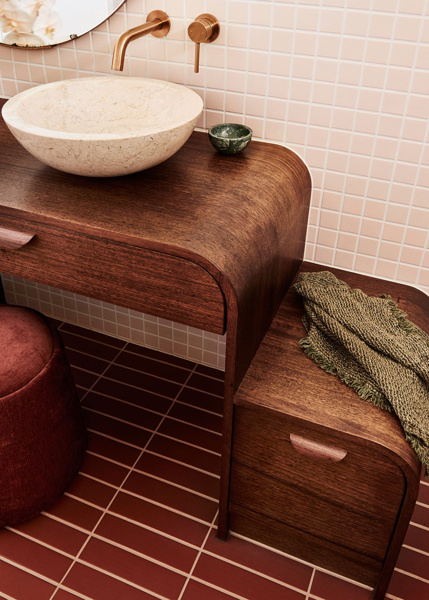
The standard bathroom vanity is large and blocky, a rectangle of cabinets that stretch from floor to bathroom countertop. This is the best way to get as much bathroom storage in as possible, but it's not a design that downplays the size of the vanity.
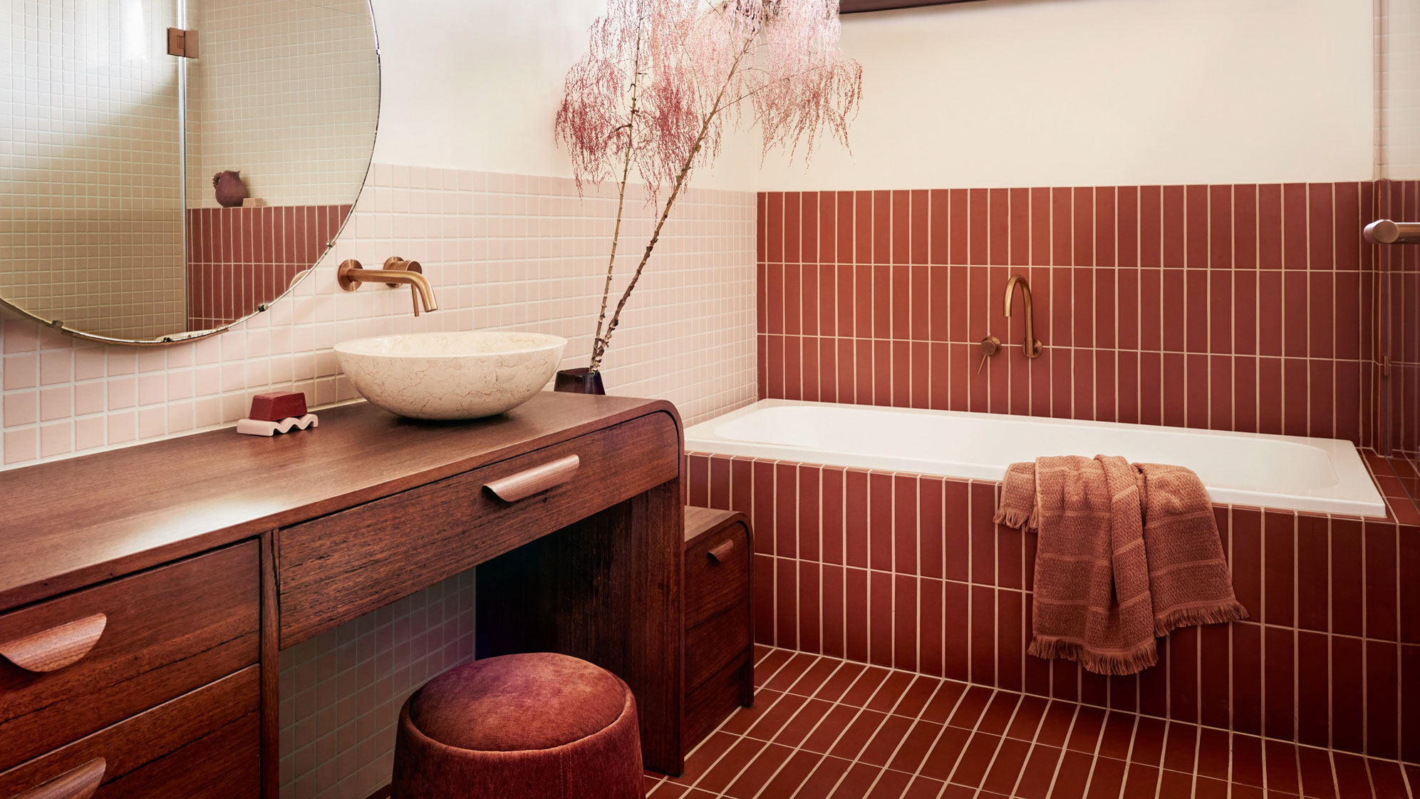
Instead, playing with scale, height and adding curves into the design can make all the difference. In this design by Kim Kneipp, the bathroom vanity is a workhorse for their space, without feeling dominating.
'With only one bathroom in a three bedroom home, and a young couple preparing to have their first baby, we designed their bathroom vanity to be future-proof for family life,' Kim says. 'Drawing inspiration for our shared love of Art Deco forms, the vanity is a functional nod to the dressing tables of olde with contemporary storage and consideration for the young. The tiered levels of the joinery provide a step for small children to climb up on to reach the basin, whilst also offering a low seat for parents to perch on during bath time.'
'The basin is offset to be closer to the step and allows for a shared use of the mirror at the busy bookends of the day,' Kim adds. 'Narrow top drawers provide storage for make-up and daily use items, with lower deeper drawers for towel storage. We compromised on having even more storage in this vanity, instead favoring an opening, where a seat can tuck under if applying makeup and future containers of bath toys and a small bin can be stored.'
2. Make use of vertical space
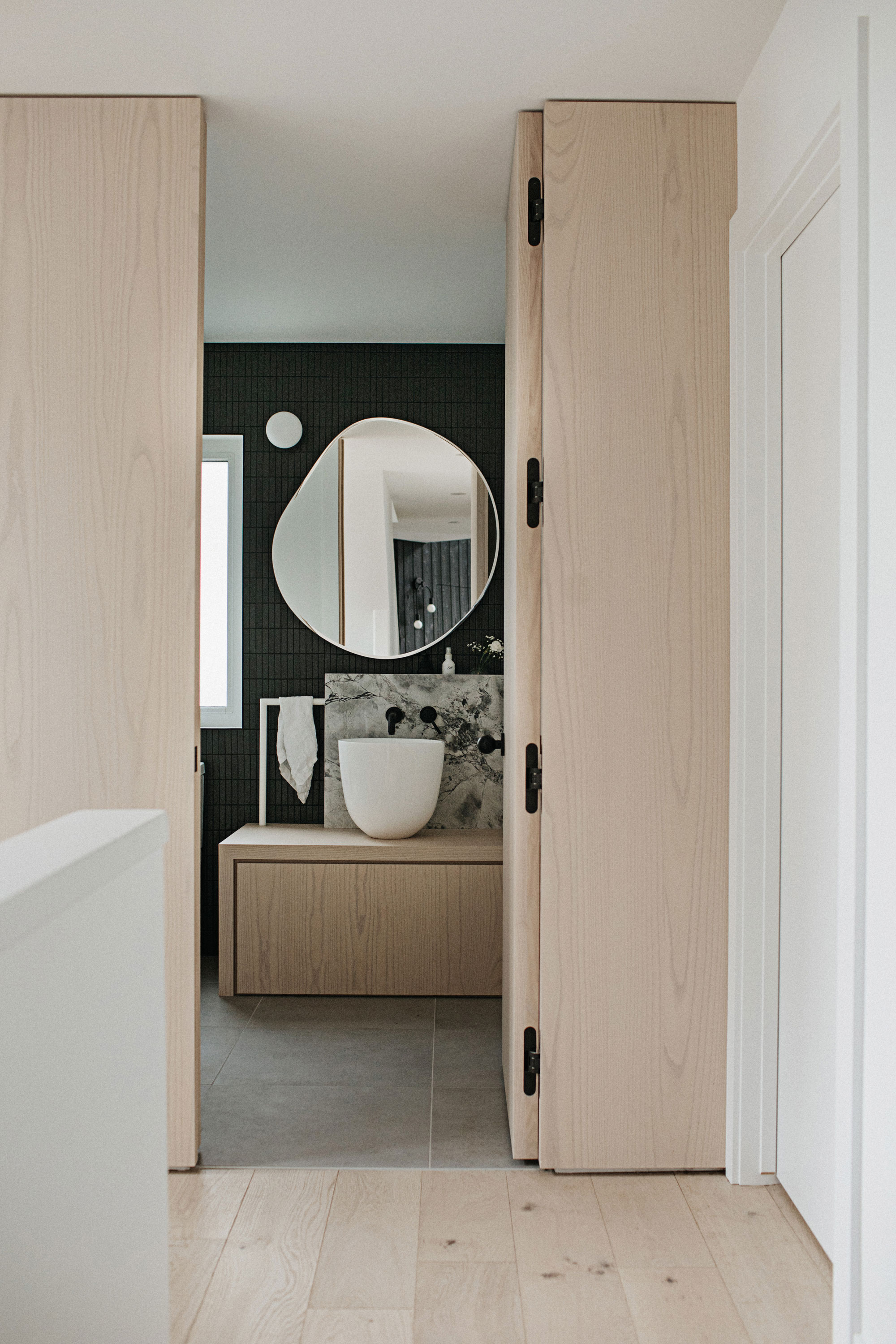
This unusual bathroom design plays with proportions in the space to marry practicality with a design that helps the small scale of this room feel more spacious.
'This powder room was so much fun to design,' Nancy Surby, founder of NAKO Design tells me. 'Our "design rules" for the house really came into play here. A push to open drawer below a large vessel sink hides the necessities that come with a bathroom while a recessed shelf out of the natural stone tucks messy soap and lotion bottles out of sight.'
'We didn’t want to conform to traditional methods of a bathroom, and this informed the design of integrating a custom metal rod into the vanity to act as the hand towel holder,' Nancy explains. 'It becomes a piece of the design but also accentuates the height of the standalone vessel sink. We continued the color palette of whitewashed wood, organic forms, natural stone, and a punch of black for a seamless connection to the home.'
3. Match in with its backdrop
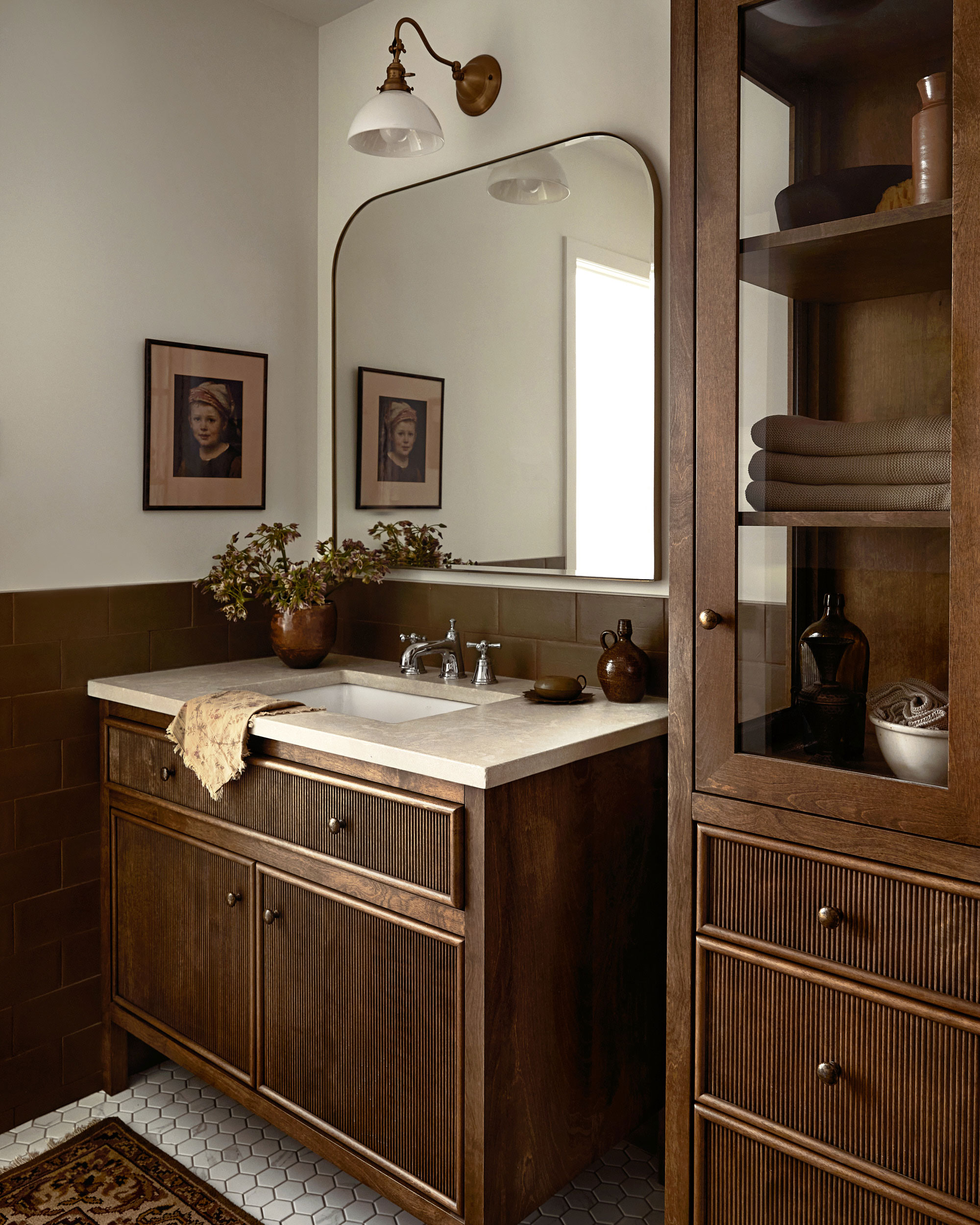
One of the tricks of the "color drenching" phenomenon is using the same color furniture against a wall painted, or in this case tiled, in the same color. In this bathroom, designed by Blanc Marine Intérieurs, the dark, rich wood used for the vanity and cabinetry might not feel like the obvious choice for a small bathroom, but combined with tiling and white walls, it works in this space.
'The dark wood toned vanity; the khaki glazed terracotta tiles on the wall combined with the white elements in the room bring that strong contrast we love,' Mélanie Cherrier, founder of Blanc Marine Intérieurs, says. The tone on tone of the wood and tiling helps the vanity recede into the background, and make the bathroom feel less cramped.
4. Create a floating effect
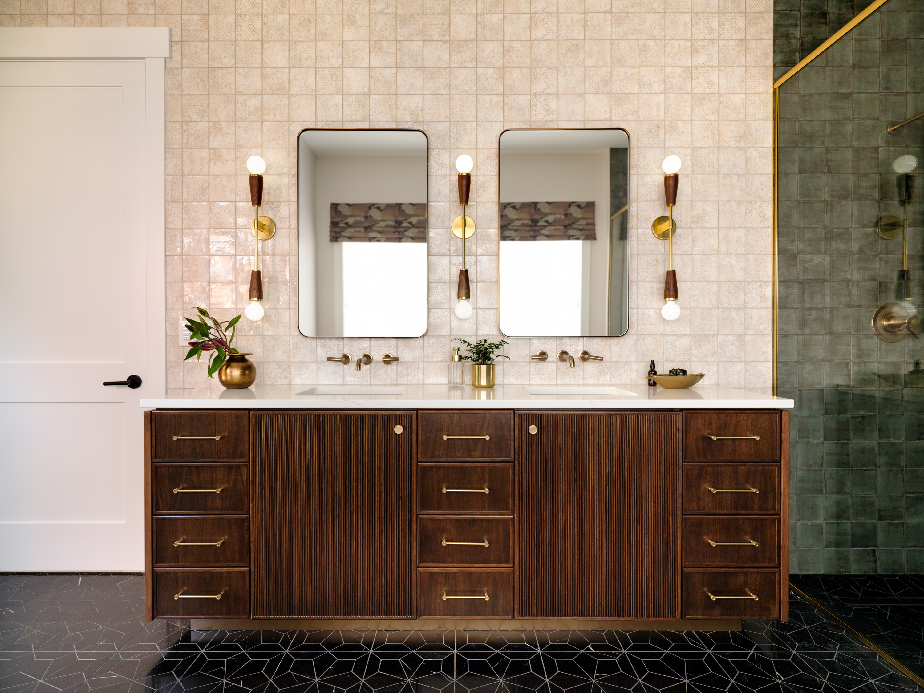
A floating vanity, or one on legs, will help your bathroom look larger by ensuring you can always get a real sense of the depth of the room. They're commonly seen, but they're not always the most practical. You'll find you need to clean underneath them, and it does, of course, steal some of the size of your vanity's storage.
As a compromise, a floating-effect vanity offers the best of both worlds. This bathroom vanity, for example, designed by Stephanie Waddell of Istoria Interiors, has a brass base recessed from the edge of the vanity. It creates a floating look, without any of the issues associated with it.
'The bathroom illustrates how layered interior details can yield stunning results,' Stephanie says. 'The custom-designed walnut vanity has a tambour door panels and a brass toe kick which gives the effect that the vanity is floating.'
It's a design that allows for plenty of storage to be packed into the room, and that's what we're looking to achieve in all of these bathroom vanities. Losing out on storage isn't always an option, but with the right tricks, you don't have to worry about your bathroom feeling even smaller.
Be The First To Know
The Livingetc newsletters are your inside source for what’s shaping interiors now - and what’s next. Discover trend forecasts, smart style ideas, and curated shopping inspiration that brings design to life. Subscribe today and stay ahead of the curve.

Luke Arthur Wells is a freelance design writer, award-winning interiors blogger and stylist, known for neutral, textural spaces with a luxury twist. He's worked with some of the UK's top design brands, counting the likes of Tom Dixon Studio as regular collaborators and his work has been featured in print and online in publications ranging from Domino Magazine to The Sunday Times. He's a hands-on type of interiors expert too, contributing practical renovation advice and DIY tutorials to a number of magazines, as well as to his own readers and followers via his blog and social media. He might currently be renovating a small Victorian house in England, but he dreams of light, spacious, neutral homes on the West Coast.
-
 Hidden Trails — TikTok's Favorite Interior Designer, Bilal Rehman, on Houston, the City That Made Him
The Texan design phenomenon shares the places that inspire him most around his home
By Gilda Bruno Published
-
 8 Design Tricks That'll Make a Kitchen Extension Feel More Private — Even If You're Overlooked
Create a light-filled, airy extension that still feels secluded (but in the best way)
By Natasha Brinsmead Published
