I Asked Color Experts Which Neutral They Think Is Replacing White in 2025 — This "Futuristic" Shade Caught Me by Surprise
Bored of white? Here are the shades to consider instead for the year ahead
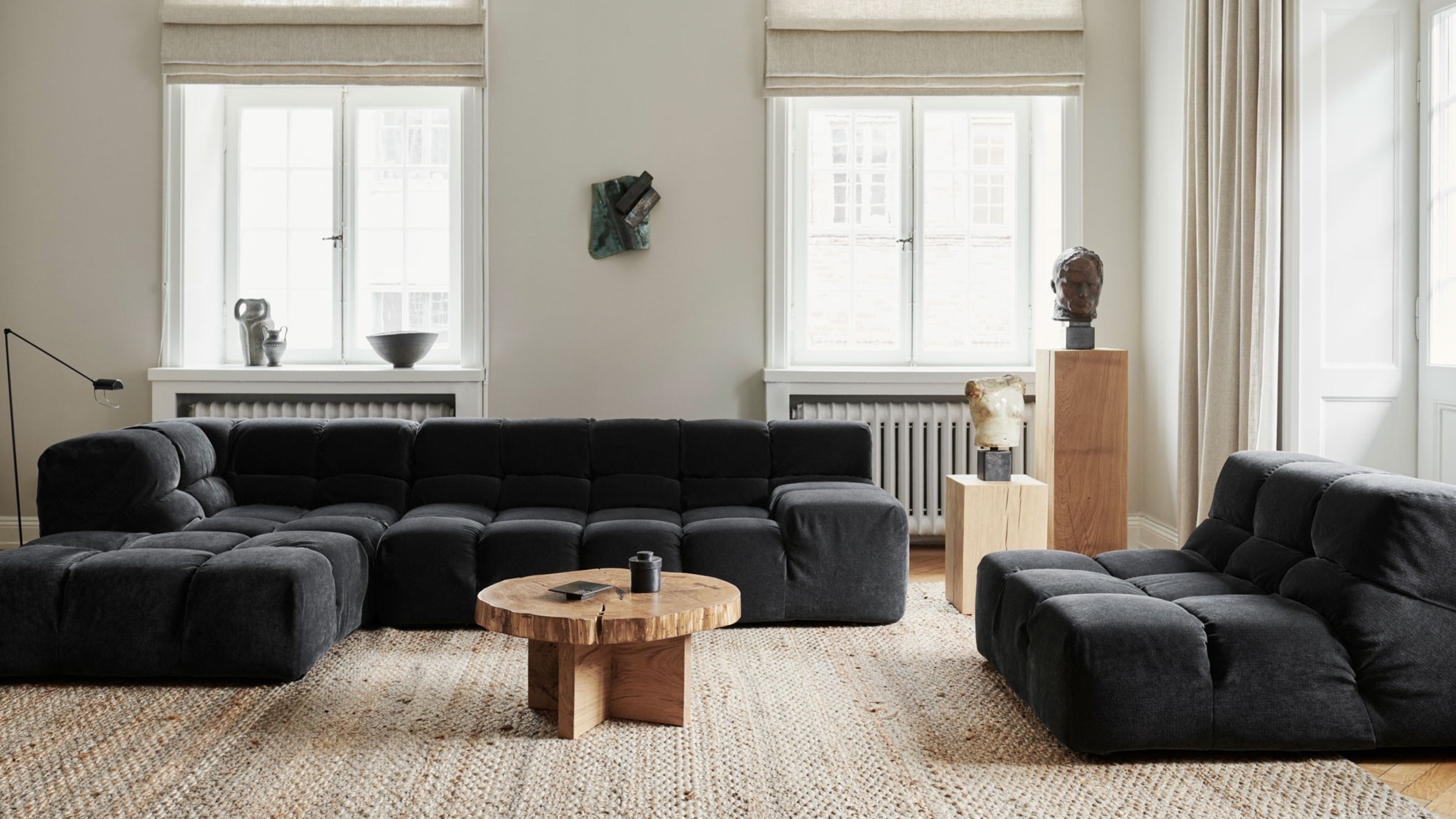

While white will always be a safe shade to use in your home, it is certainly not the only route to fresh and calming neutral color schemes.
Personally, I've lost count of how many times a tin of fresh white paint has come to the rescue for me. It's perfect for slathering over the walls of a tired fixer-upper after you first move in and are still deciding what to do with it. Plus, it requires very little in the way of thought when it comes to color pairings.
That said, while bright white has its time and place, there are so many other neutrals out there to consider, many of which offer far more design versatility. With that in mind, we asked design and color experts which neutral shade they expect to replace white in 2025, and how it would be best used in our homes. Here's what they said.
Are White Walls Still in Style for 2025?
While white walls will always have their place, with so many other neutrals out there to choose from, most of the designers I spoke to agreed that, for 2025, we should be exploring the range of warmer neutral paint color ideas on offer.
"It’s all about stepping away from that bright, stark white and welcoming in deeper, warmer tones," says Steven Mena, CEO at AAA Fence and Deck Company.
So just which shades should we be turning our attention to stepping into the year ahead?
1. Grounding Khakis
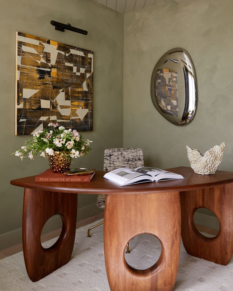
Yes, you could of course go in the direction of off-whites, but if you're brave enough to try something different, why not push yourself a bit further. A notable color trend for 2025? Khaki.
"Khaki is emerging as a fresh alternative to white, offering a warm and grounding backdrop that helps transform homes into inviting sanctuaries," says Ashley Banbury, color marketing manager at HGTV Home by Sherwin-Williams. "With a subtle nod to the minimalism of the 1990s, khaki allows homeowners to focus on simplicity and comfort, replacing starkness with warmth and purpose."
But if drenching your walls in this earthy green seems like a step too far, there are other, less daunting ways, of introducing it — begin by looking into the materials and colors that go with khaki.
"Focus on natural elements like blonde wood and lighter colors that help reflect natural light," says Ashley. "This creates a serene and airy environment, making rooms feel larger and more connected to the outdoors. Khaki works beautifully in spaces designed for relaxation, whether you’re unwinding with a cup of tea, sinking into a soft pillow, or curling up with a good book. Khaki provides a versatile foundation that combines modern minimalism with a welcoming sense of comfort."
2. Cooling Blues
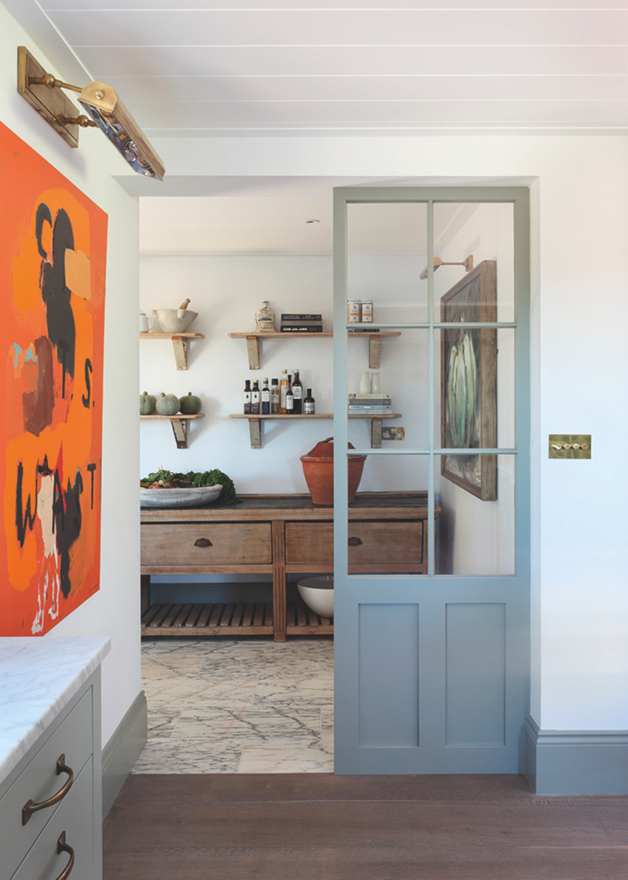
Blue is never far from the top of the most popular color lists, whether in its jewel-like sapphire form or as a moodier navy shade. While blue paint is usually thought of as a complementary shade to white, as opposed to an alternative, this need not always be the case.
"We're always keeping an eye out for trends dictating the way we design interior spaces, and one that is growing increasingly prominent is the shift toward a new neutral — blue," reveals Katherine Cohen, associate creative director at rug brand FLOR. "And we're seeing designers opt for a variety of blue hues — from navy to cobalt to indigo. Why? Because these cooling tones cultivate a sense of calm and comfort. These hues pair well with other colors while also helping to ground a space."
Again, in order to create an overall neutral palette, be smart with the way you use blue and be sure to consider the colors that don't go with blue when layering this shade within your space.
"We're seeing designers utilize the color in wallpaper, accent pillows, furniture, rugs,and more," adds Katherine. "An easy way for homeowners to refresh their spaces while keeping a neutral tone is to add an area rug with a calming blue hue."
3. Warm Grays
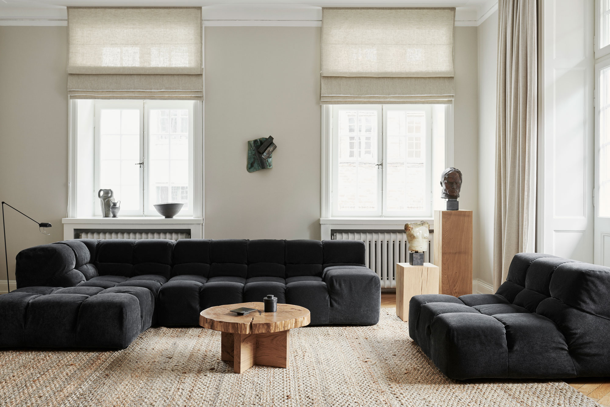
Gray needn't be a cold, stark color — there are plenty of warmer hues out there, and these are the shades that you want to explore in 2025. Forget snow-sky grays and instead think of those infused with richer earthy tones.
"While cooler grays have become less popular, I have been seeing more of these types of warmer gray tones being used in place of white or other neutrals," says Carr Lanphier, CEO of Improovy. "They can help bring in some nice cozy atmosphere without being too in your face."
"Imagine using shades like greige paint, which is a blend of gray and beige, or even mushroom taupe," adds Steven Mena. "They create a much more inviting and versatile palette compared to plain white. Greige makes a lovely backdrop that works well with natural textures like raw wood, stone, and brass. These tones also work really nicely with bold accents like deep blues, warm mustard yellows, or soft pastels."
And remember, you don't have to use any of these shades to paint your walls — there are plenty of other ways of creating a pared-back palette. "Switching out bright white for a softer neutral cabinet color can really change the vibe of your kitchen, making it feel much more inviting and friendly," suggests Steven Mena. "Or think about using taupe-colored tiles or a greige stone backsplash. They pair really well with dark walnut cabinets and brass hardware, giving you that upscale but cozy vibe.
"When it comes to furniture, think about choosing warm neutrals for those standout pieces like armchairs, side tables, or even throw pillows," adds Steven. "A greige ottoman or sofa can really be the perfect anchor in a room. It offers a neutral base but still brings a touch of elegance and timelessness to the space."
4. Earth-Inspired Tones
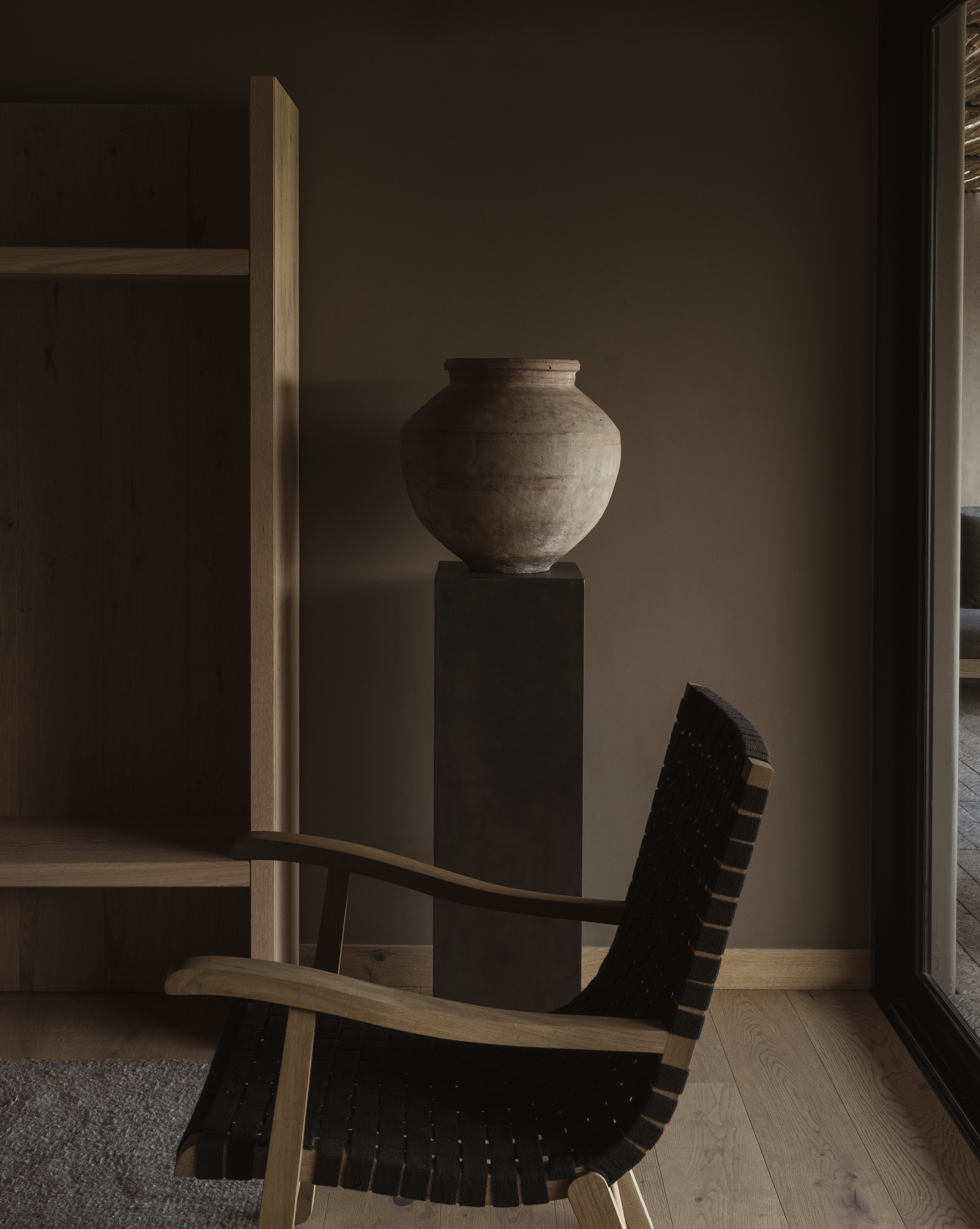
This is a trend we started to see emerging towards the latter half of 2024 — it's perfect for anyone wondering how to make a neutral living room feel cozy — and it seems to really be gaining traction, with browns taking the lead.
"As the desire for sustainable and calming spaces continues to grow, earthy tones of colors will emerge as the dominant neutral in 2025," says Avalana Simpson, creative director of Avalana Design. "Less clinical than white and more intense than muted neutrals, we’ll see mid-tone browns such as chocolate and caramel shine through. Not all browns are equal but it can work really well as a foundation color to be toned down or levelled up.
"For me, maximalists and minimalists alike will adore pairing these mid tone browns with a co-ordinating, warm, leopard print," suggests Avalana. "You can really have fun with this using either subtle upholstery touches and tactile fabrics or bring out your wild side with accessories, shimmering metallics, and oversized animal print designs for walls."
But earthy tones are in no way restricted to brown alone. "Overall, we’re seeing an industry shift towards earth-inspired tones, like terracotta, rust, beige, and light green," reveals Morgan Blinn, lead designer at Rumor Designs. "I predict these shades will replace white as the new neutral — they play well together and make a space instantly more warm and inviting. Sophisticated and elevated, you can truly apply these colors to any space: kitchen cabinetry, creating a contrasting ceiling, or highlight molding throughout your home.
"A few specific colors I would use instead of white are Redend Point and Svelte Sage by Sherwin Williams," adds Morgan.
5. 'Futuristic' Neutrals
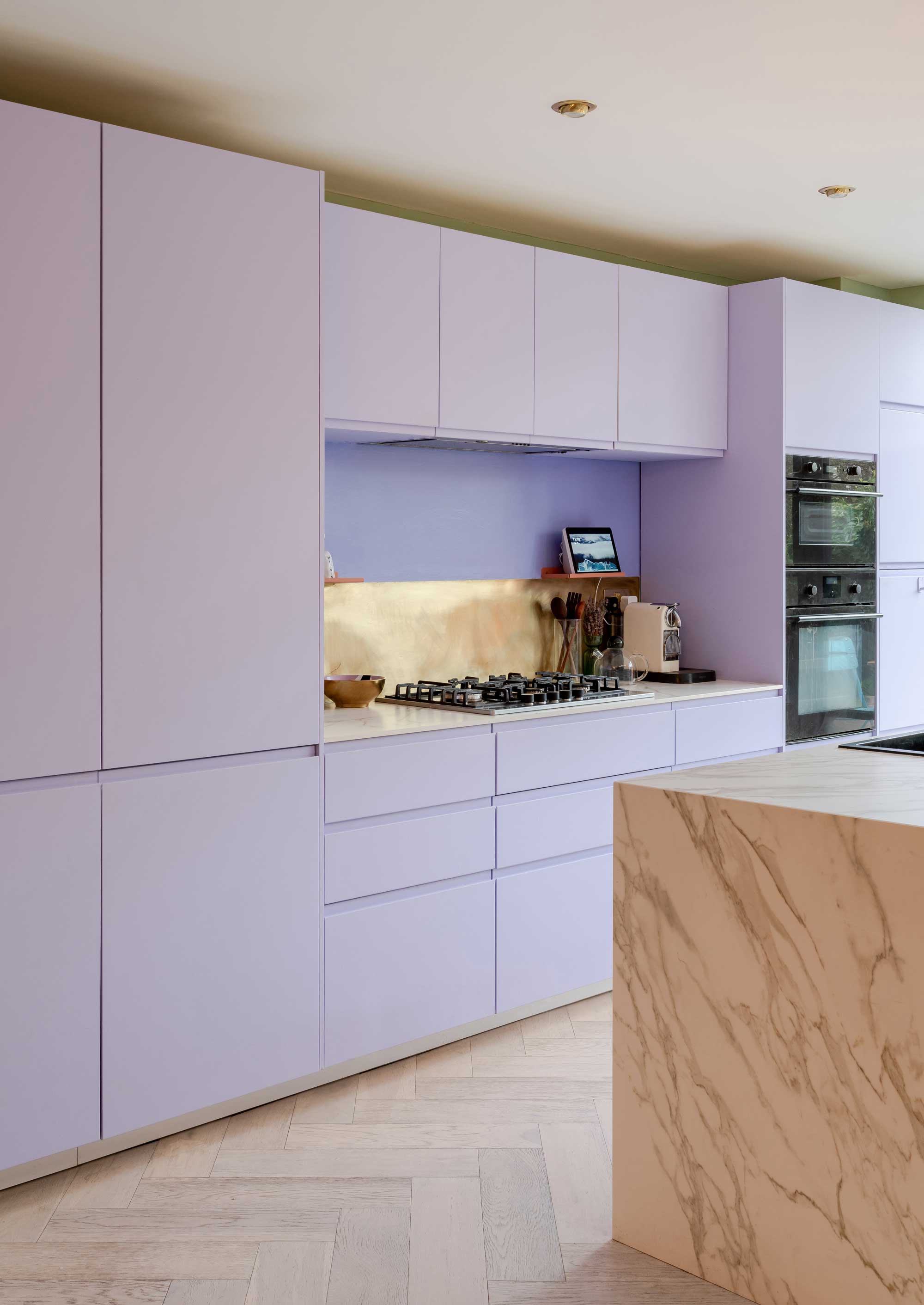
If you are keen to avoid your neutral interiors looking too traditional, and want a fresher, more contemporary finish, then take note of the emerging trend for digital colors. You might already have heard of Digital Lavender after it was named color of the year in 2023 by trend forecasters at WGSN and color experts at Coloro. Since then, it seems it has inspired a slew of other technology-inspired shades.
"The rise of technology and digital spaces will influence interior design with Digital Lavender still emerging as a key trend for 2025," says Avalana Simpson. "This soft, holographic lavender has futuristic undertones and will be used in modern, tech-savvy homes. It evokes a sense of calm and creativity, making it an ideal choice for home offices or creative spaces where innovation is key.
"In addition to Digital Lavender, other futuristic neutrals like frosted silver and pale lilac will be used to add a sleek, contemporary vibe to homes," continues Avalana. "These colors will work well in minimalist interiors, where their subtlety and cool tones can create a space that feels both cutting-edge and serene."
To avoid things getting too Barbarella, rather than splashing these shades all over your walls, look at introducing them in smaller quantities, through accessories such as a vases and artwork, as well as pillows and blankets.
FAQs
What color is a good substitute for white?
If white has been your go-to for as long as you can remember, but you're trying to climb out of a style rut, you might be wondering which colors would best replace your beloved shade.
"All-white rooms are beginning to feel a bit predictable, but color drenching with nuanced neutrals is a trend that will remain strong for the foreseeable future," says Dallas-based interior designer Jessica Maros of Maros Designs. "There is a stunning desert camel stone color called Ethereal Mood from Sherwin Williams that I’ve been working with recently, especially for hallways and bathrooms. It creates a rich, enveloping atmosphere that pairs beautifully with wallpapers and neutral tiles.
"Colors like Farrow & Ball’s London Stone offer the same clean and soothing effect as white, but bring warmth and depth to a space," continues Jessica. "These tones work particularly well in spaces where you want a serene yet sophisticated vibe.
"To complement these hues, I suggest accenting with a creamier white like Sherwin-Williams’ Shoji White. One technique I love is painting baseboards and doors in a darker neutral shade to elevate the space and highlight architectural details," continues Jessica. "For example, pairing Shoji White with Farrow & Ball’s Bone creates a timeless palette, while Sherwin-Williams’ Greek Villa can serve as a brighter complement for lighter accents."
Now you know the shades to be on the lookout for you can begin to get started creating the neutral living room ideas of your dreams.
Be The First To Know
The Livingetc newsletters are your inside source for what’s shaping interiors now - and what’s next. Discover trend forecasts, smart style ideas, and curated shopping inspiration that brings design to life. Subscribe today and stay ahead of the curve.

Natasha Brinsmead is a freelance homes and interiors journalist with over 20 years experience in the field. As former Associate Editor of Homebuilding & Renovating magazine, Natasha has researched and written about everything from how to design a new kitchen from scratch to knocking down walls safely, from how to lay flooring to how to insulate an old house. She has carried out a number of renovation projects of her own on a DIY basis and is currently on the lookout for her next project.
-
 The 'New British' Style? This Victorian London Home Embraces Its Owners' Global Background
Warm timber details, confident color pops, and an uninterrupted connection to the garden are the hallmarks of this relaxed yet design-forward family home
By Emma J Page
-
 Muji Living Room Ideas — 5 Ways to Harness The Calming Qualities of This Japanese Design Style
Inspired by Japanese "zen" principles, Muji living rooms are all about cultivating a calming, tranquil space that nourishes the soul
By Lilith Hudson
-
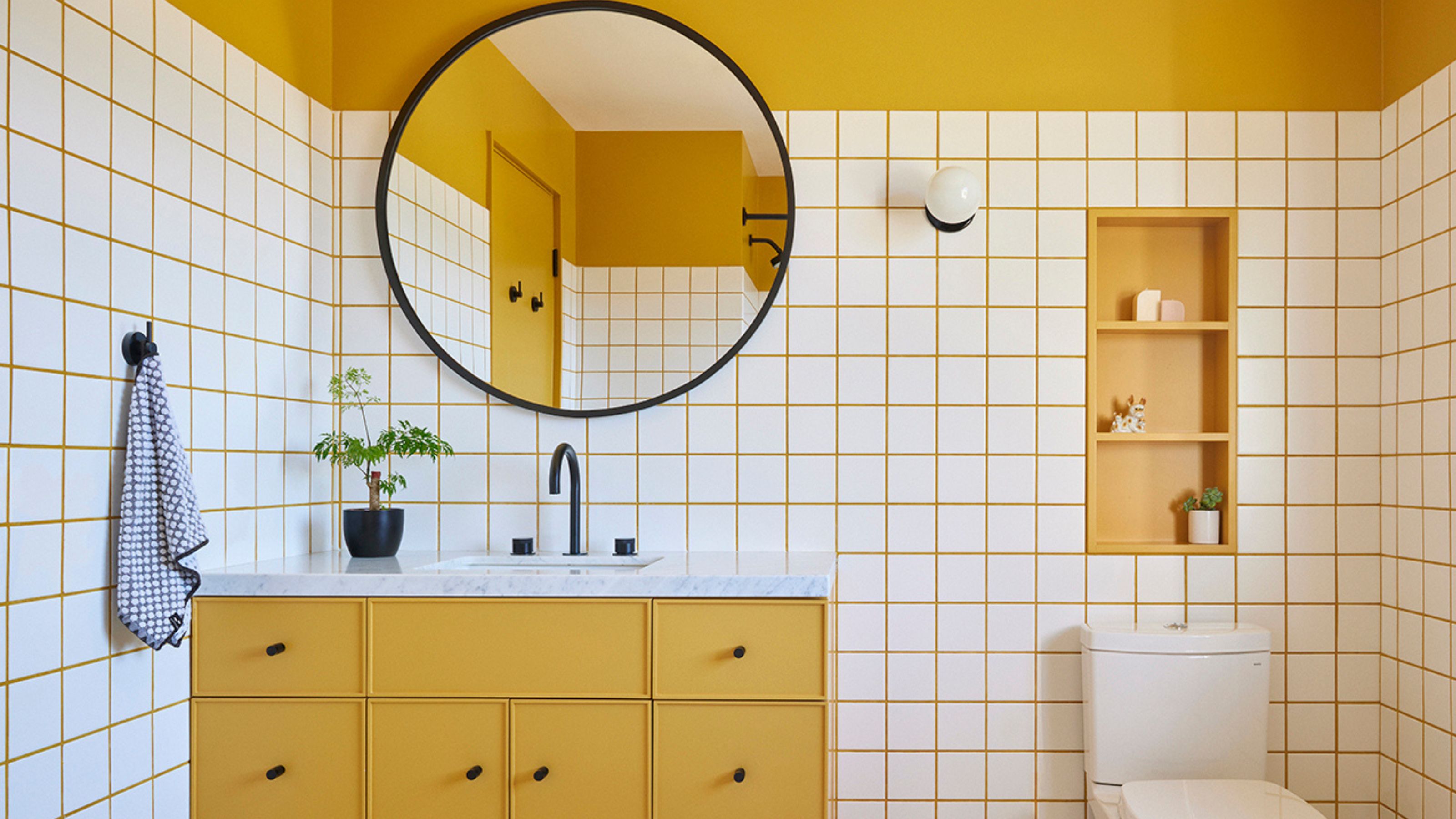 10 Yellow Bathroom Ideas That Vitalize Your Mornings and Look Unexpectedly Sophisticated While Doing So
Yellow is a color that by its very nature is energetic and full of life, and these designers have proved it's ideal for a bathroom
By Oonagh Turner
-
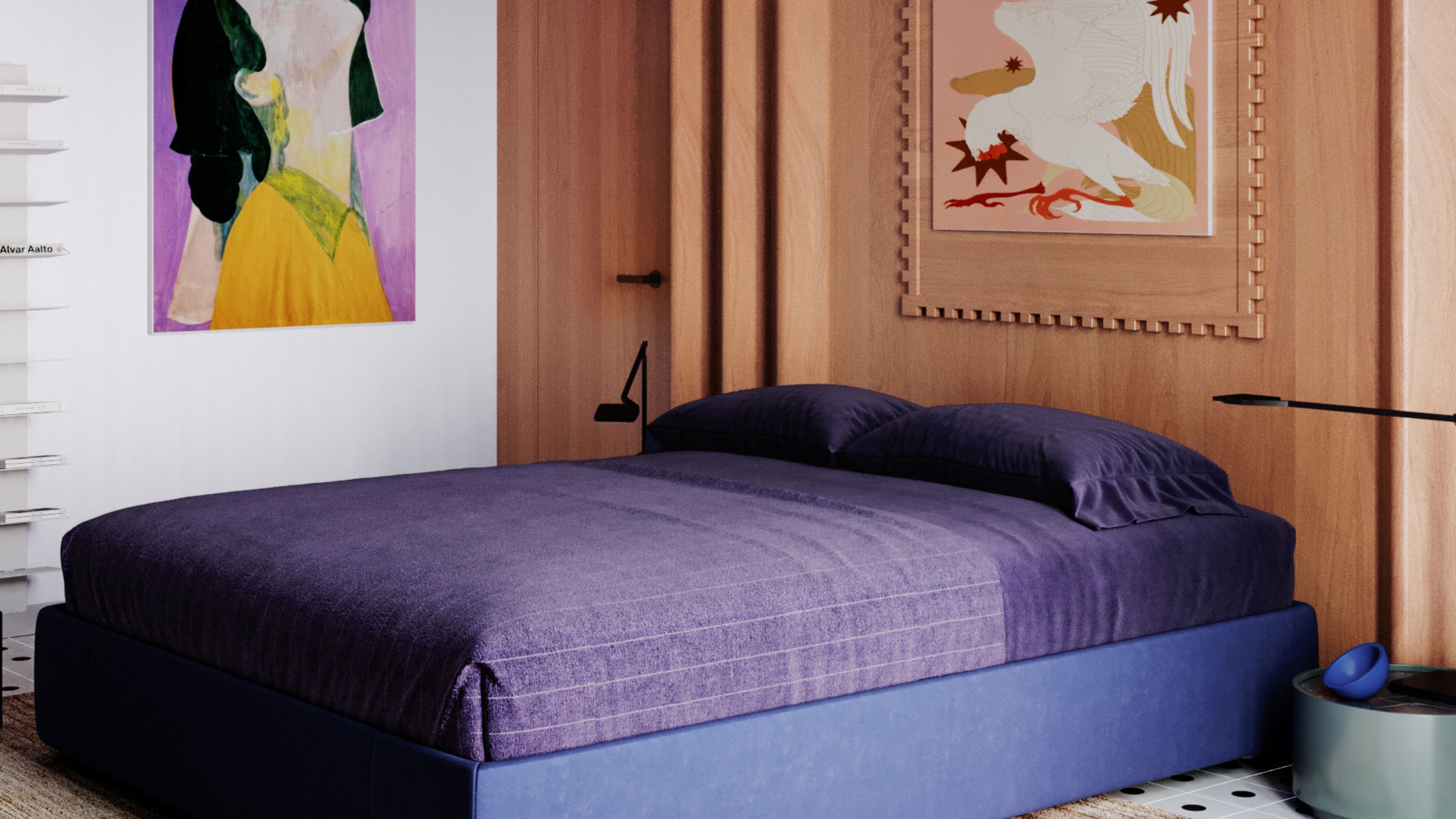 It's a Color Symbolic of Dreams, so These Purple Bedroom Ideas Almost Guarantee a Good Night's Sleep, Right?
Not always an obvious choice for the bedroom, these designs prove that purple has restful and calming qualities, making it perfect for the bedroom
By Oonagh Turner
-
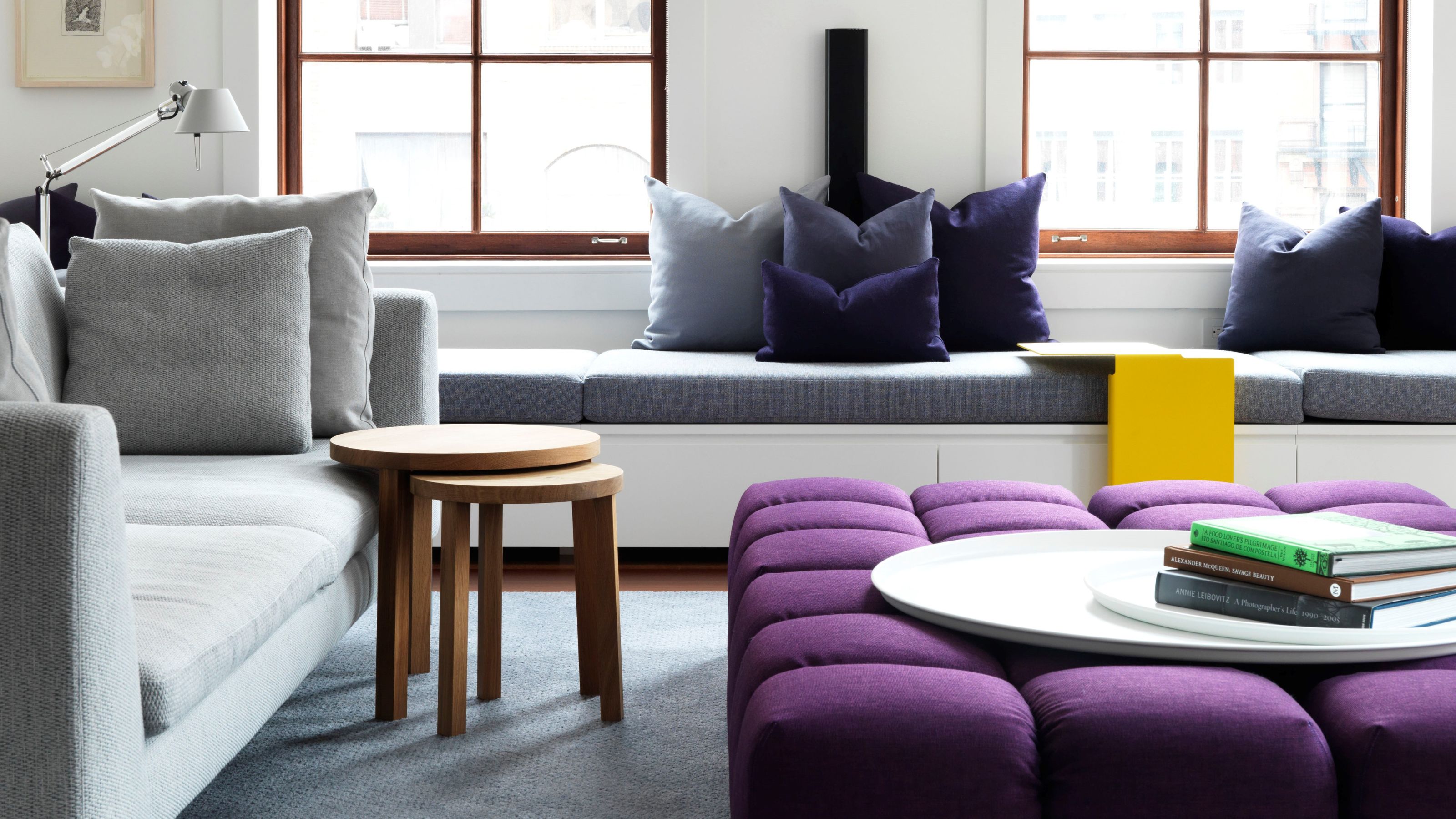 Amethyst, Heather, Pansy, Plum — Turns Out Decorating With Purple Opens You Up to a World of Possibilities
Purple certainly isn't a color for the faint hearted, it's a shade that can smell your fear. Here's how to conquer it through your interiors
By Amy Moorea Wong
-
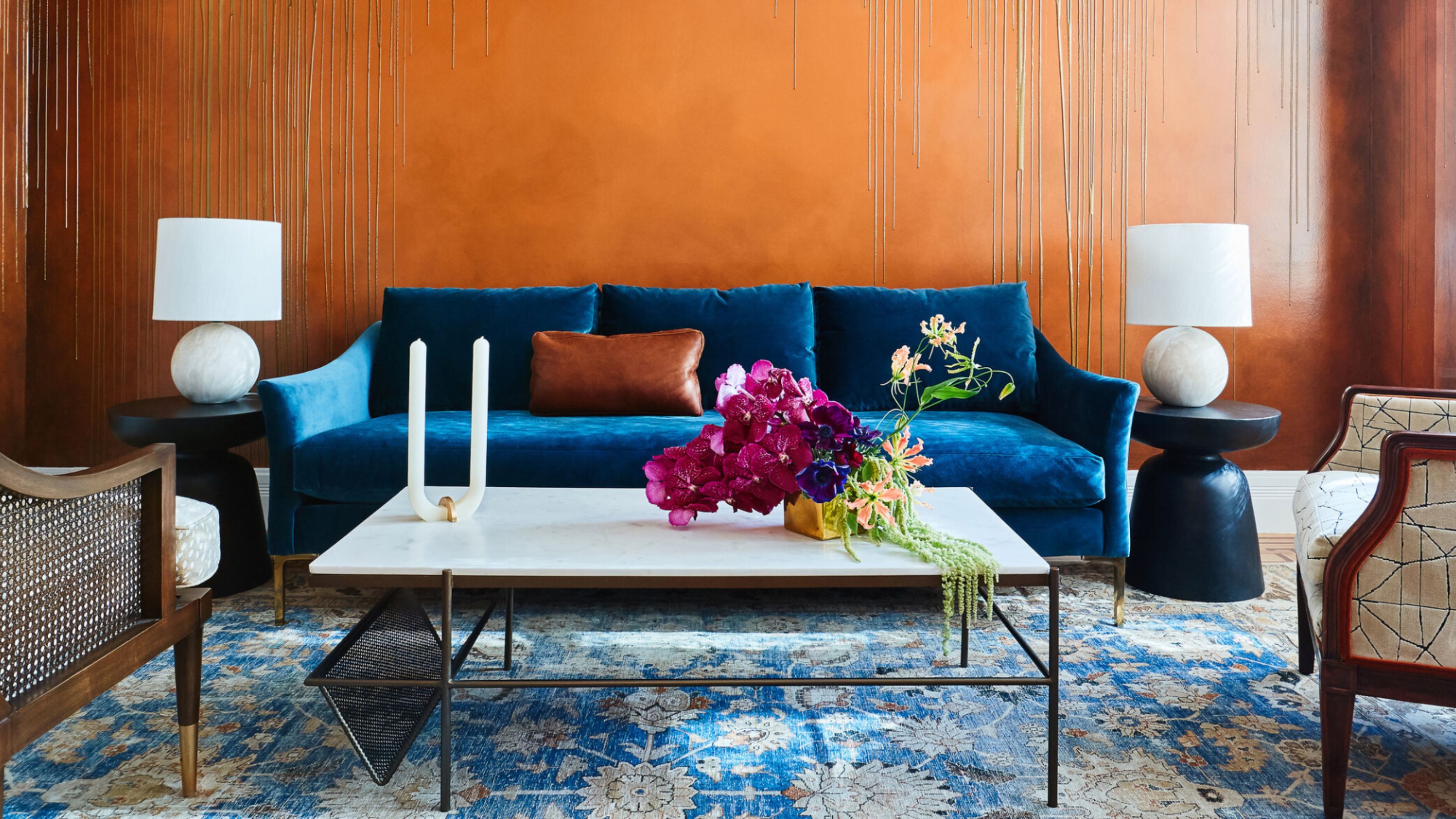 The Combination You Weren't Expecting to Love — 8 Blue And Orange Living Room Ideas That Feel Surprisingly Elevated
A blue and orange scheme for living rooms may sound jarring, but these spaces prove they're striking, vibrant, and certainly unforgettable
By Camille Dubuis-Welch
-
 Smeg Says Teal, and We’re Listening — The Kitchen Shade of the Year Is Here
Designers are already using the soft, sea-glass green everywhere from cabinetry to countertops
By Julia Demer
-
 Do Yellow and Purple Go Together? Designers Reveal How to Make This Unexpected Pairing Feel "Totally Intentional"
In an era where unexpected combinations have become cool, we've done a deep-dive to discover how to pair yellow and purple in a space
By Camille Dubuis-Welch
-
 5 Unexpected but Seriously Stylish Spring Color Palettes to Shake Up the Season — "It's Pastel, but Punchy"
Spring color palettes are notorious for their use of pretty pastels, but that doesn't mean they have to lack variation
By Olivia Wolfe
-
 The 'Red Table Trick' Is the Easiest and Most Expensive-Looking Trend to Hit 2025 So Far
A red dining table makes a seriously stylish statement; the beloved pop of red trend just got an bold and expensive-looking upgrade
By Olivia Wolfe


