What to avoid in a small home office – 9 common mistakes designers beg you not to make
Knowing what to avoid in a small home office means you can get your WFH space right (no matter how tiny)
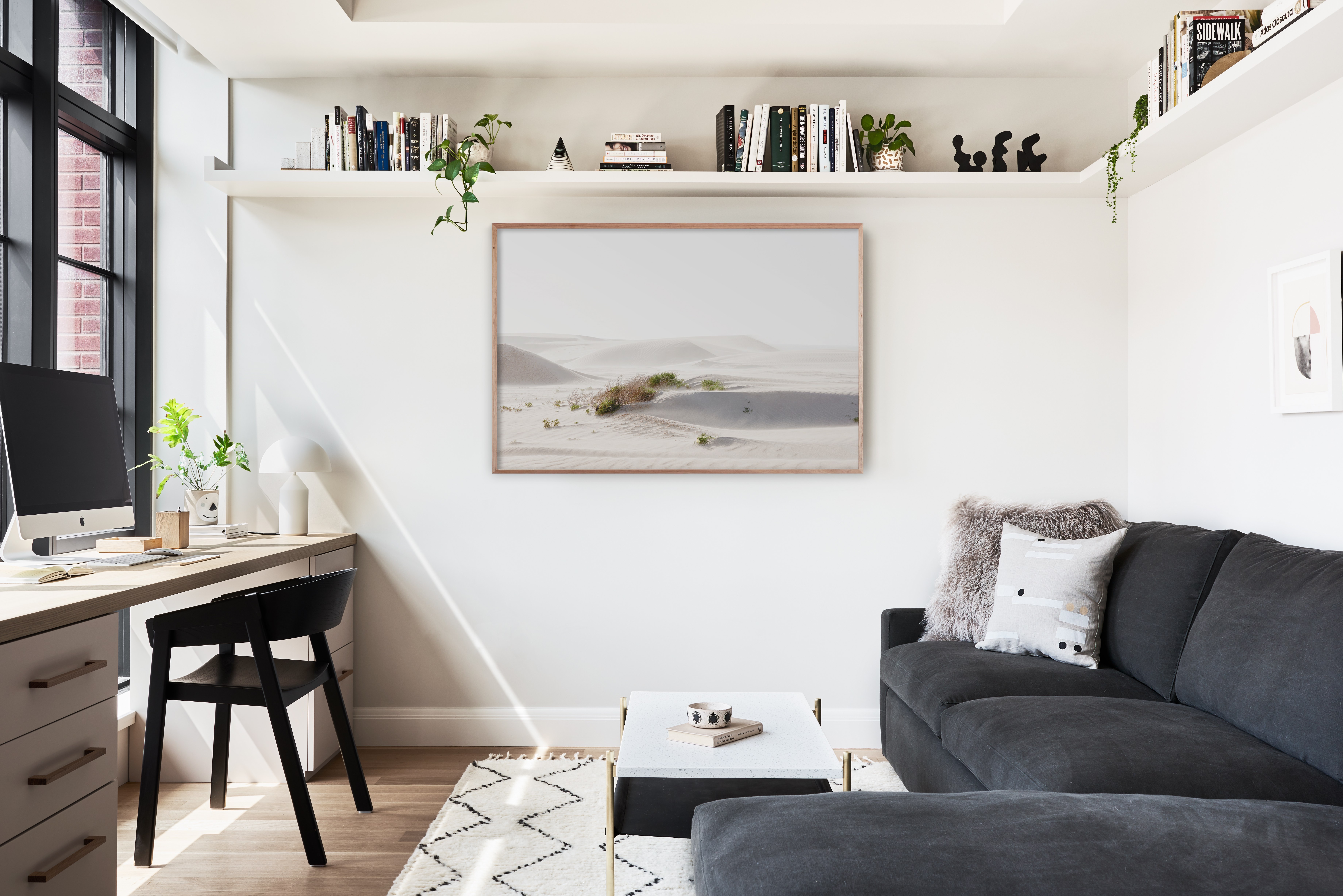

For most of us, the home office is the smallest room in the house. It was probably cobbled together back in 2020 when working from the sofa was no longer acceptable and you needed a nicer backdrop for your zoom calls. But two years later, working from home is now the norm and we are all trying to improve our workspaces no matter how tiny they may be.
We are constantly seeing fabulous new ways to make the most of this often multifunctional space, and in fact, the home office has become as important in the world of interior design as kitchens and living rooms. But while it's wonderful to have so many gorgeous home office ideas to be inspired by, we think it's equally useful to know what to avoid when designing this hardworking space. What common layouts should you steer clear of? What colors are a no go? What furniture choices are we wrongly making? We asked the experts for their top tips to you can avoid making any mistakes and create the dream WFH set up.
What to avoid in a small home office
1. Choosing freestanding storage over built in
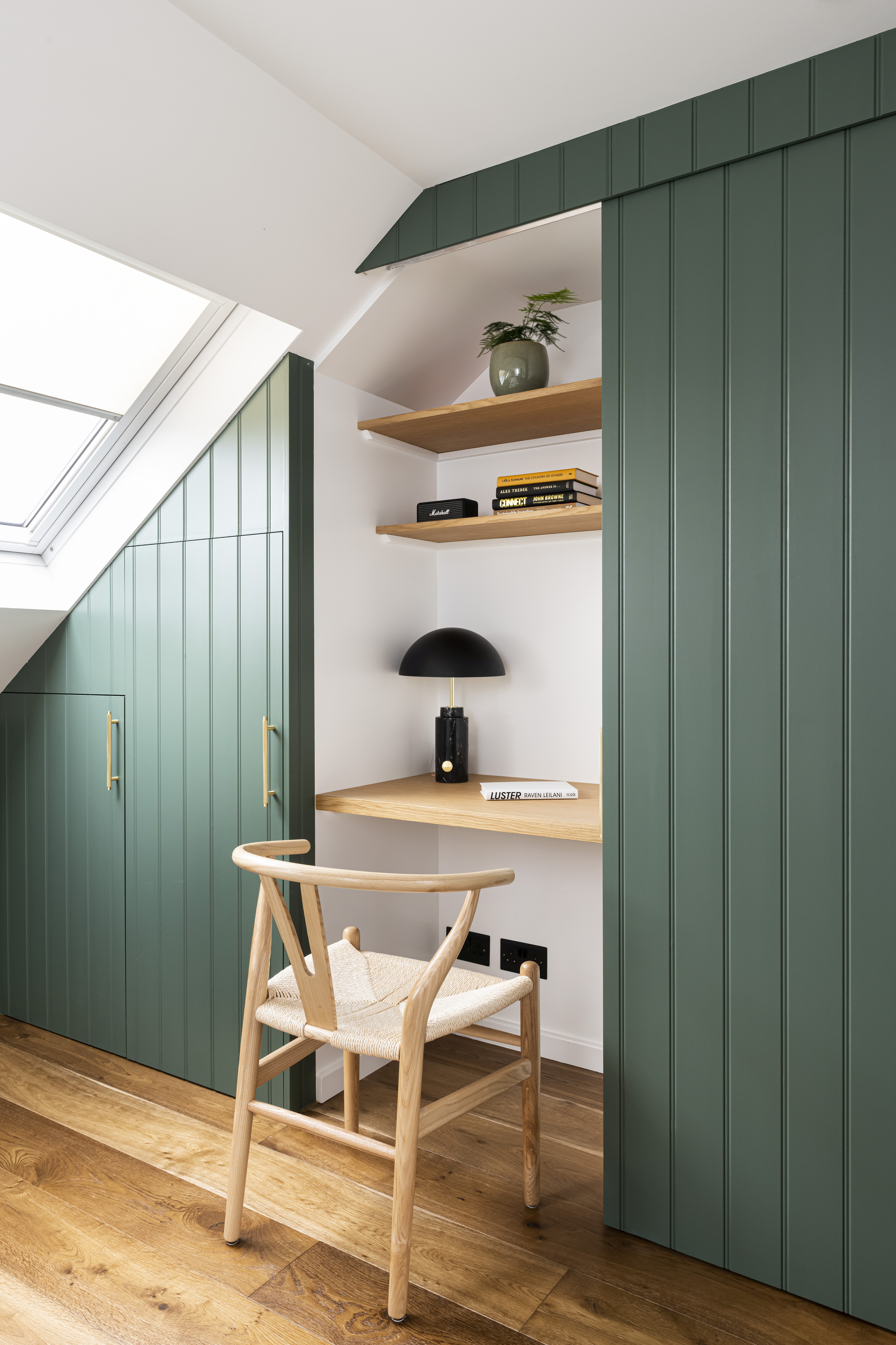
Our top tip for small spaces is to always go built-in if you can. Choosing bespoke storage makes the most of every inch of space, no matter how tiny or awkward. So forget bulky filing cabinets and freestanding shelving and build it all into one neat line of cabinetry that perfectly suits your space and style.
This attic home office designed by Interior Fox, is not only small but has the... novelty of a slanted ceiling so those eaves are never going to be used to their full potential with just freestanding pieces. Adding under eaves storage clears the room of clutter and makes the proportions feel less awkward and makes this small home office look bigger too.
'Freestanding storage which tends to take up more space and provide less efficient storage. It's also important to consider how pieces can be multifunctional and how smart storage can work for you.' explains Sheena Murphy founder of Nune.
Andrew Griffiths, founder of A New Day adds 'The main thing to avoid in a home office is clutter, which means making sure you have some good storage. Without it, a small home office will quickly become an unproductive space where you struggle to focus or relax.'
2. Playing it safe with pattern
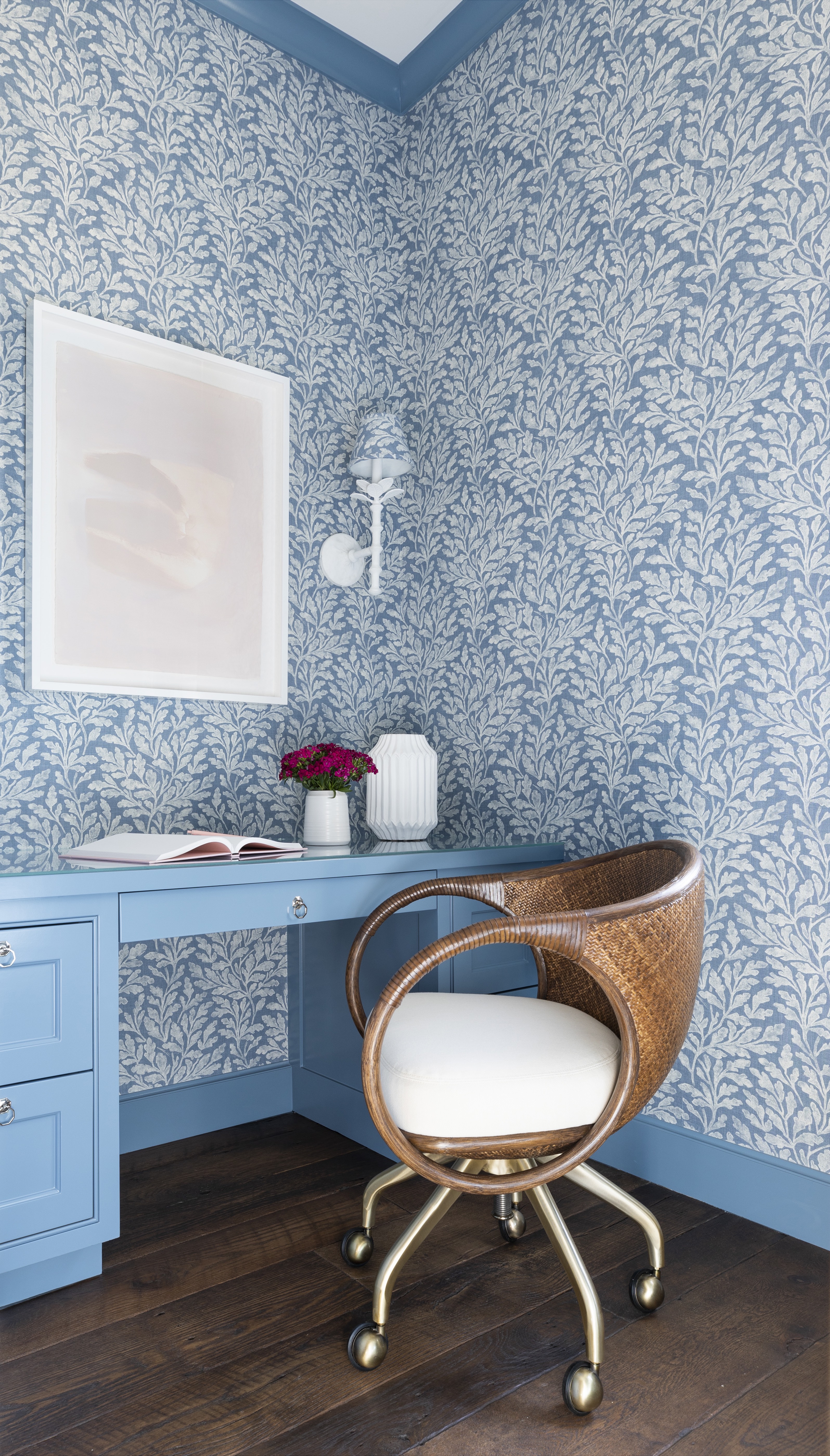
Small busy patterns in a small (and often busy space) space shouldn't work, however, a common mistake in a tiny room is to play it safe – zero pattern and zero color. However, as this gorgeous modern home office proves, pattern can in fact add so much to a small space. And commit to the look, take a wallpaper across all the walls, and paint the architrave to match. This can help blur the edges of the room and create the allusion of more space.
'Small spaces are a chance to have fun! I love incorporating a wall covering that adds a bit of levity and whimsy. Also, lighting is also a great way to add character and interest. Sconces can be a great option for a small office.' suggests interior designer Marie Flanigan.
'This office was a sweet space designed for one of our homeowners. She desired a command center for all of her organizational and household needs. It’s perfect because the space is small but incredibly functional with storage and a surface to spread out.'
3. Ignoring the ceiling
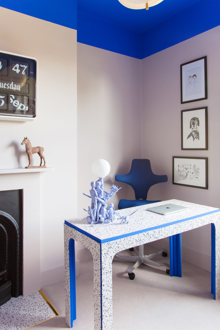
Ceilings are such an afterthought when it comes to painting a room, and it's only recently we are seeing a shift in interior design trends to give the fifth wall more attention. And a bold ceiling color makes so much sense in a home office, you might not want too much visual excitement on the walls so you aren't distracted, but the ceiling is where you can have the fun. Case in point, this gorgeous cobalt blue ceiling. If you are looking few new ways to use paint in a home office, this is it.
'We would say there are no colors to avoid in a home office. Color should be meaningful to YOU, after all, it’s you who will be using the space.' suggests Russel and Jordan of 2LG Studio.
'Truly embrace color that you love and use it however you wish! In our home office, we chose to use a bright Yves Klein blue on the ceiling and paint down the wall to the height of the picture rail we have in other spaces. It feels joyful and energizing to work in this space.'
4. Picking furniture that isn't to scale
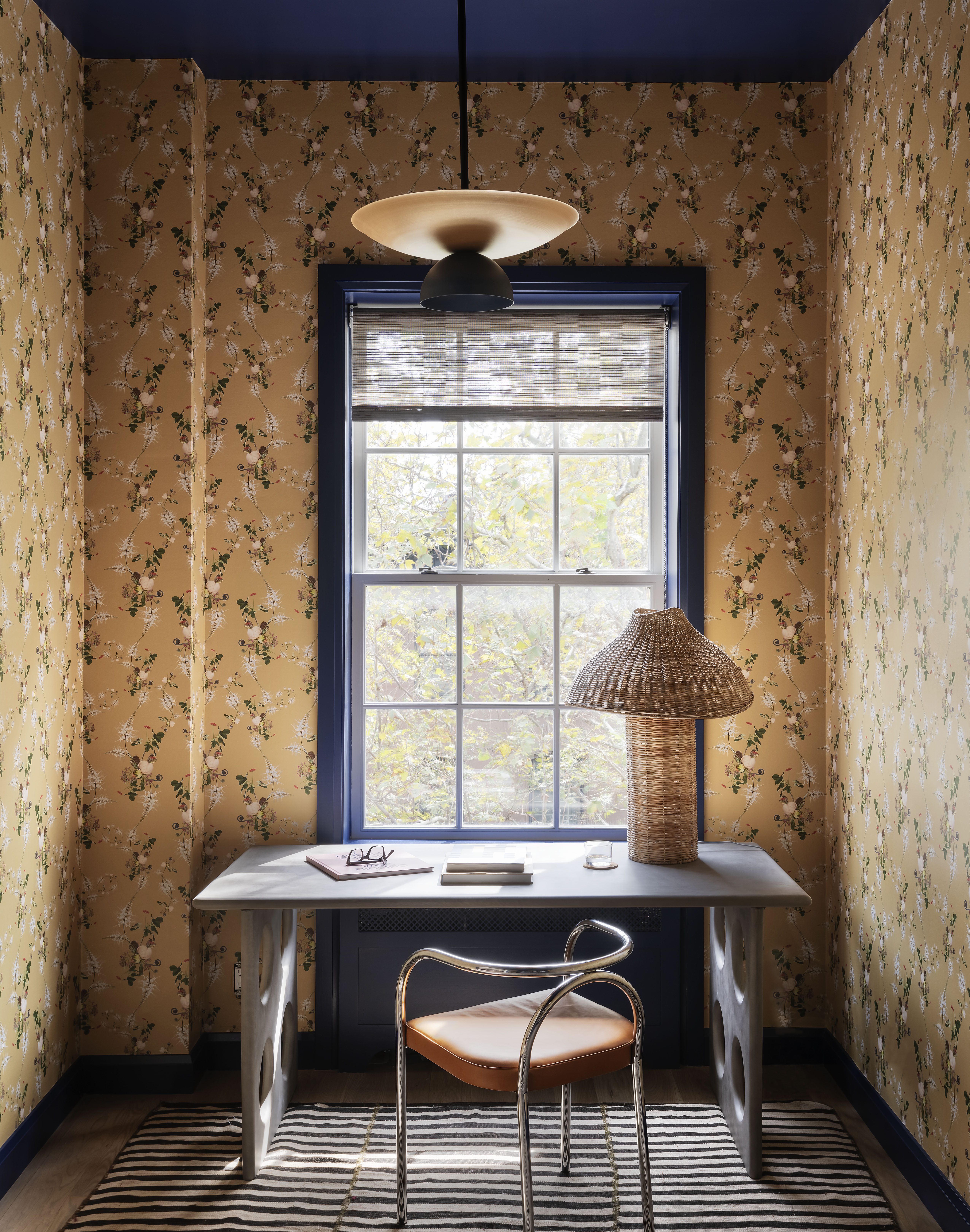
In a small home office, you don't want to crowd the room with furniture. Look at what exactly you need (and can go without) and plan what designs, sizes, and shapes to go for from there. If you work from home full time so need plenty of storage, there's likely to be more furniture in the room. In this instance, we'd recommend keeping it all in scale with the size of the room. So small room + lots of individual pieces of furniture = smaller pieces of furniture. Easy enough.
However, if you just need a desk to work from and an office chair, you almost want to do the opposite. A tiny desk sat alone in a room might make the room feel larger but not in a good way, more in a cavernous way. So invest in something larger, that's not going to overwhelm the room, but will be dominant within it. This gorgeous home office wall decor is a decorative take on this approach by Studio DB .
5. And only using 'office' furniture
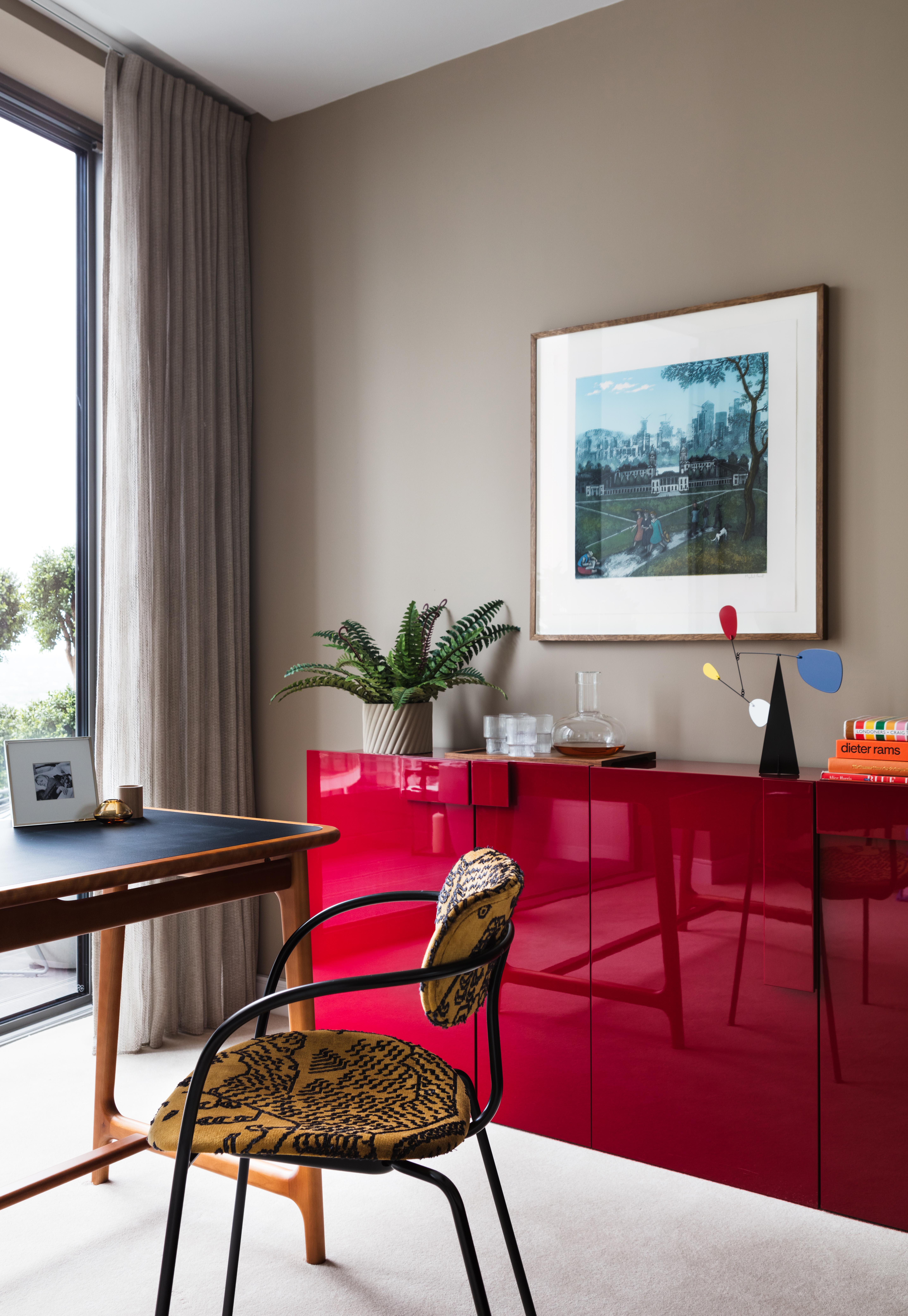
The nicest home offices we come across are ones that don't feel too... officey. Treat choosing your office furniture like you would any other room, of course, you want it to be functional but it should also suit your home and style. And most importantly in a small home office, it should all be to scale. Desk ideas for home offices need not to be bulky, shelving shouldn't impose. Keep pieces light and slimline so they don't add too much visual bulk and darken the room.
'Most “office furniture” should be avoided in the home as it tends to be much larger and out of scale with other pieces in the home. Look for more residentially sized pieces by comparing the dimensions against other items in the home, dining chairs, and tables for example.' explains Samuel Pye Creative Manager of Echlin. 'A standard office desk is roughly 80cm x 140\160cm which is almost the size of a six-person dining table, which will be far too large for most home offices.'
6. Getting the lighting wrong
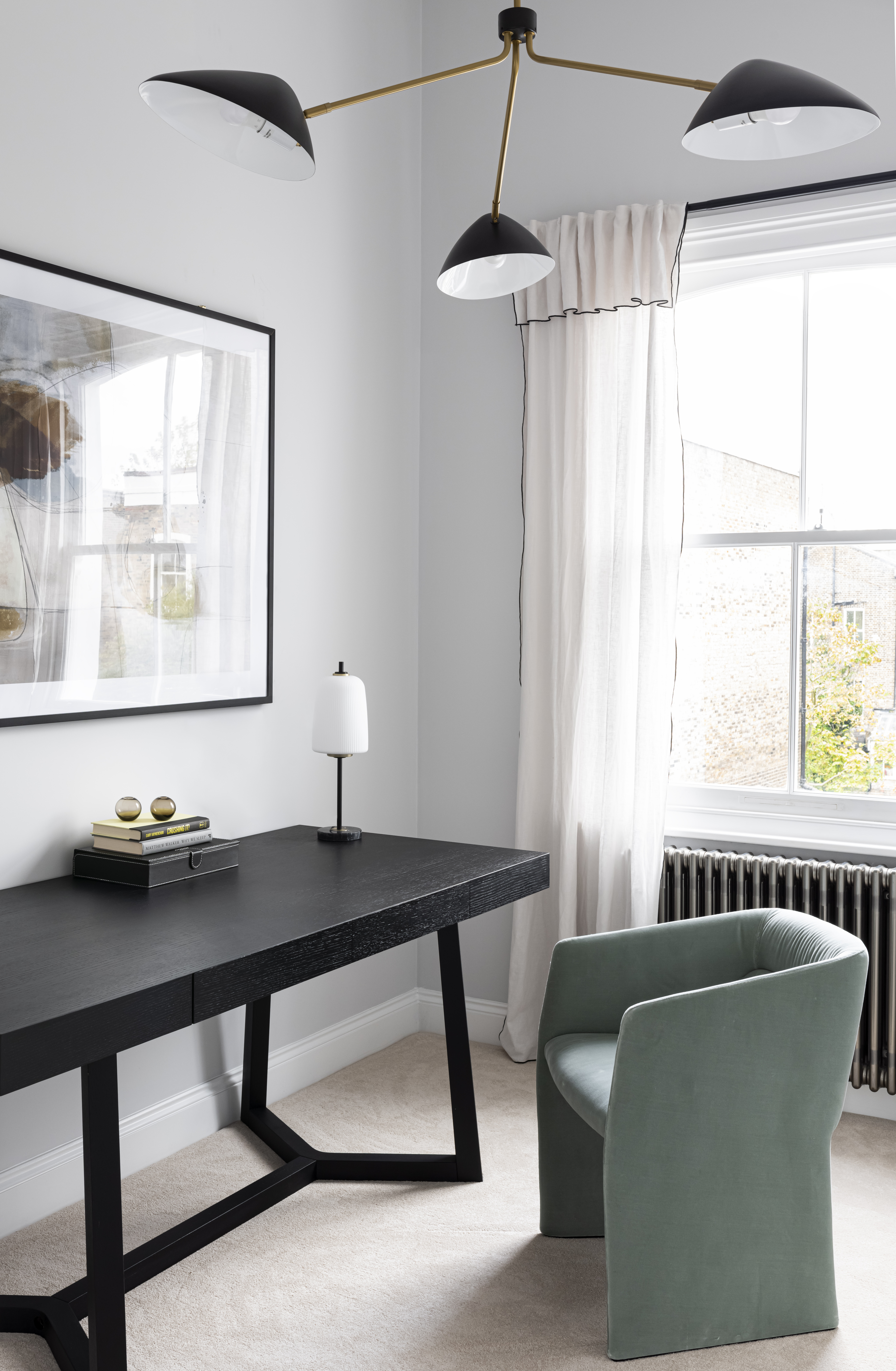
Home office lighting may not be the most thrilling part of the design process, but in a room that has to be so functional, it's key. Spend the time getting it right. Really consider how you use the space, what times of day, where your desk is positioned, and what kind of work you do.
'Lighting is key in every office, but especially a compact space. It’s best to avoid bright overhead lights, instead choose a task table lamp to place on the desk, the directional light will allow you to play around with the lighting and ambiance.' explains Jen and Marr, founders of Interior Fox. 'Pay attention to the bulb type, bright white can feel stark and make you feel burnt out quicker. Instead, look for warm light bulbs, they give a much softer illumination.'
Sheena Murphy adds, 'We don't recommend recessed lighting in many areas in a home but this is often an area that you can eliminate visual clutter above the eye level by only using architectural/recessed lighting.'
7. Shying away from darker colors
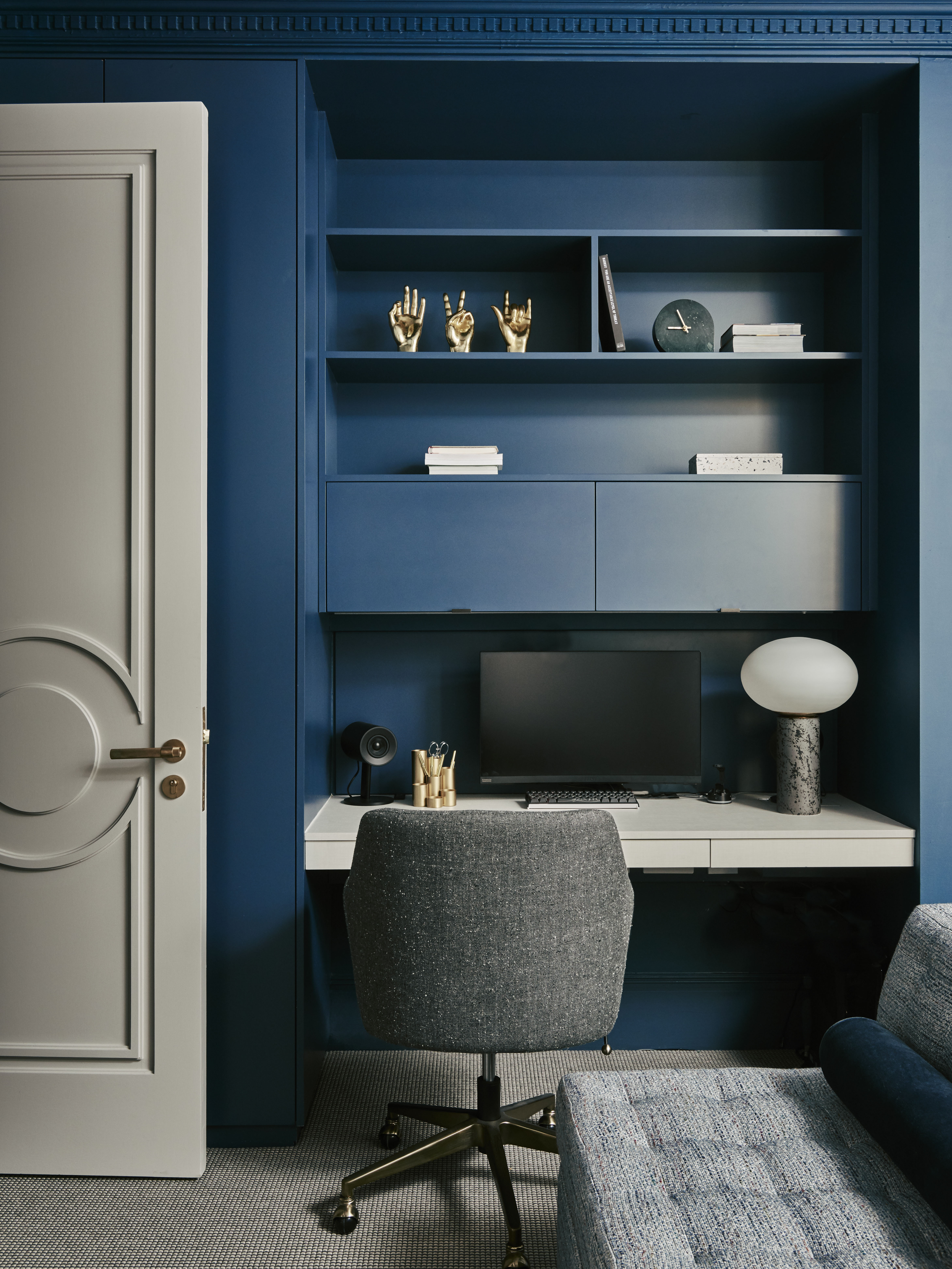
Much like using lots of pattern in a small space, it's often thought you are best to avoid darker colors. However, not only can darker colors make a space feel larger, they can be a great choice for a home office. Soft, velvety dark blues, blacks, and greens create a very soothing cocooning feel that feels welcoming and encouraging and very different from an office setting – which is personally what we want when WFH.
‘Darker colors are often shied away from, the old sensibility being that dark color makes rooms look smaller, however when there is ample ceiling height then we find the opposite to be the case and that a deeper color, especially with a little sheen to it, can enhance the feeling of space.' explains Deborah Bass founder of Base Interior.
'This alcove-shaped study is neatly placed and storage is maximized through open and closed options, the shelf-style desk and open shelving allows a longer view which gives ground and perspective to the forms of the furniture. The interplay between two cool shades brings a simplicity that avoids a crowded feel.’
8. Not keeping things simple

Make a list of the essentials. What do you really need in your home office? When space is tight you don't want to crowd the room with too much furniture and decor. Be inspired by this lovely, light space designed by Nune and free up the floor space with subtle floating shelving ideas – hanging them above the eye line keeps the walls free of fuss and alludes to more ceiling height.
'This project example of how we created 17 linear feet of book storage and object display without using floor space or even visual space because the shelf used was installed above eye level and painted the same color as the walls to make it blend in as much as possible.' explains Sheena Murphy, founder of Nune.
'With smaller spaces, you have to be incredibly intentional about what you bring into the space. Don’t overcrowd your office with furniture or accessories. Think through how the office should function and what you need to stay efficient. Do you need to store items? Make sure you account for appropriate cabinetry. Do you need to have books or supplies at the ready? Shelving is typically a great solution.' suggest Marie Flanigan.
9. Failing to add personality
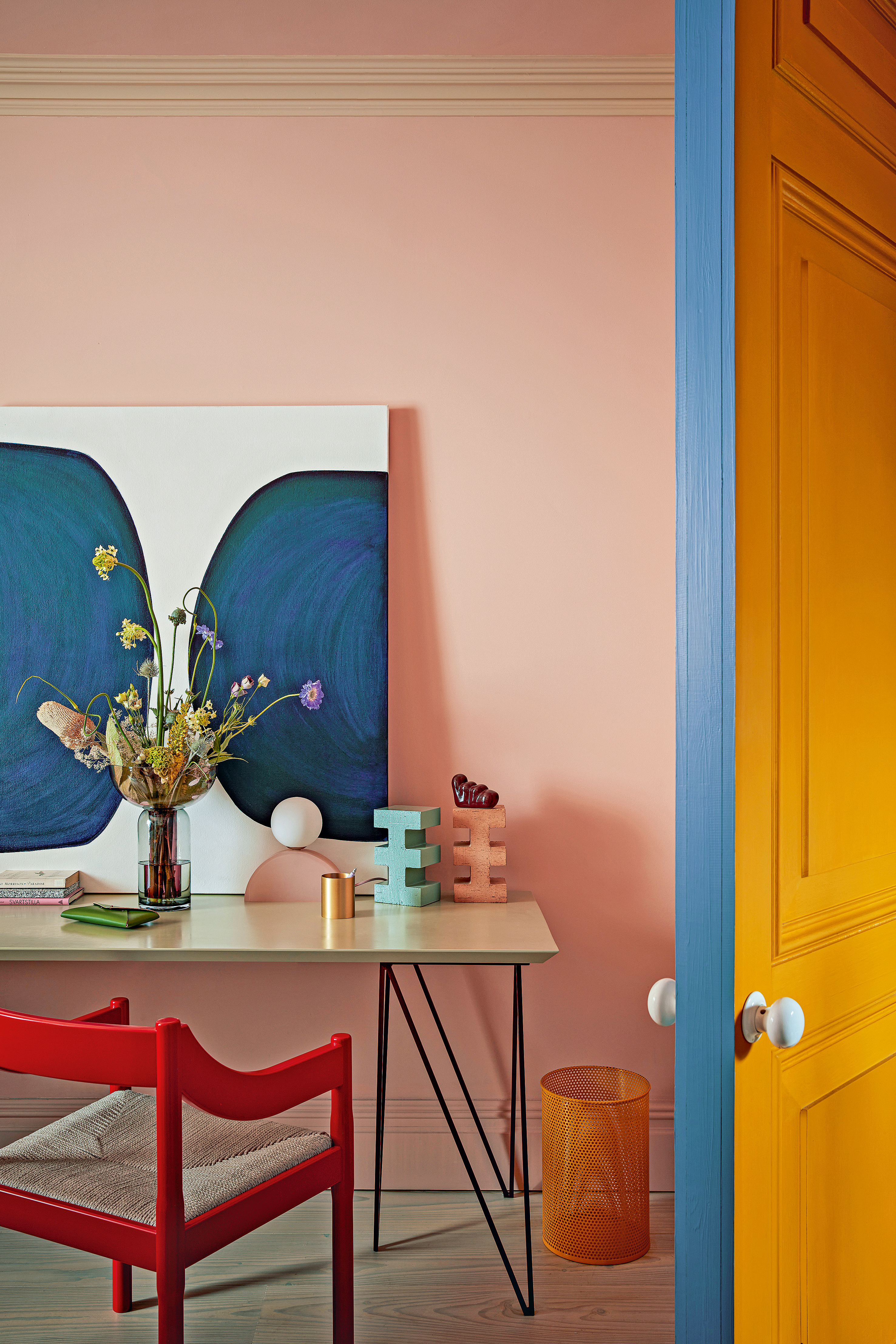
With such a focus on avoiding clutter, it can be tricky to incorporate decor into a small and functional space. But adding some of your personality and style into a home office is what takes it from being the box room you work to a space in your home you want to spend time in.
Just keep it simple, as interior designer Raili Clasen explains, 'In a small space, avoid too many knick-knacks and clutter. Express your personality through larger statement pieces, such as a bold piece of art or a playful rug. Don't go overboard on the little accents that may make the space feel messy or cluttered.'
Echlin's Samuel Pye adds, 'Unique artwork is essential in a small home office, to separate it from any type of cold or corporate office environment. There are studies that show it increases productivity but, whether you agree with that or not, it will add emotional and creative depth to the space and hopefully be inspiring.'
What should you always consider in a home office?
The best place to start is to consider how you use the space. Is this your only office so needs to house everything work related, or do you go into an office too so there might be less pressure on the storage situation?
What work you do in there should be considered too. Are you in and out of meetings all day or is it more of a solo gig where you sit and work alone? If you spend a lot of time on video calls for example you will want to consider a spot that gets good lighting at all times of day, and looks professional in the backdrop. If you work mostly alone, you will still want to find the best spot for your desk, but things like good task lighting and plenty of desk space will be important too.
Think about the very basics. Is your home office quiet enough? Is the WiFi connection good? Can you add privacy when you need to? What's the heating situation like, will you be warm enough in the cooler months and not overheat when summer comes around?
How can you make a small home offer feel nicer?
Keep things simple. Don't overcrowd the room and invest in pieces that you really love. Better to have the perfect desk that suits your style and way of working than lots of cheaper pieces of furniture that don't work. And look around the rest of your rooms, you don't want your home office to feel too isolated and different in style from the rest of your home, it should feel almost like walking into your bedroom or living room – soothing and welcoming.
Give it a more lived-in feel by bringing in pieces you'd expect to find in other rooms of your house, a mirror for example (helps the space feel larger too), or an ottoman if you have room. Add some statement prints and throw down a rug for extra coziness.
Be The First To Know
The Livingetc newsletters are your inside source for what’s shaping interiors now - and what’s next. Discover trend forecasts, smart style ideas, and curated shopping inspiration that brings design to life. Subscribe today and stay ahead of the curve.

Formerly the Digital Editor of Livingetc, Hebe is currently the Head of Interiors at sister site Homes & Gardens; she has a background in lifestyle and interior journalism and a passion for renovating small spaces. You'll usually find her attempting DIY, whether it's spray painting her whole kitchen, don't try that at home, or ever-changing the wallpaper in her entryway. She loves being able to help others make decisions when decorating their own homes. A couple of years ago she moved from renting to owning her first teeny tiny Edwardian flat in London with her whippet Willow (who yes she chose to match her interiors...) and is already on the lookout for her next project.
-
 This Outdoor Lounger Is the Color of the Season for Garden Furniture — And It's on Sale This Weekend
This year, it's all about the contrast, and this bright, sunny hue is the perfect foil to your green outdoor spaces
By Hugh Metcalf
-
 Kelly Wearstler Designed an Animal Hospital Where "Anxiety Just Melts Away", and I'm Taking Notes for My Own Home
The renowned designer's foray into healthcare demonstrates have even the most functional of spaces can still be design-forward
By Devin Toolen