Modern Kitchen Ideas — 27 of the Most Inspiring Spaces for Contemporary yet Characterful Design
Dynamic schemes for every element of the modern kitchen, from flooring and cabinetry to countertops and how to style

The Livingetc newsletters are your inside source for what’s shaping interiors now - and what’s next. Discover trend forecasts, smart style ideas, and curated shopping inspiration that brings design to life. Subscribe today and stay ahead of the curve.
You are now subscribed
Your newsletter sign-up was successful
What do you think of when you hear 'modern kitchen'? It might call to mind sleek, glossy, handleless cabinetry that looks like it could be from a science fiction film set, but in reality, modern kitchen ideas look a little different.
In relation to both traditional and transitional (a description of style that sits between classic and contemporary) kitchens, modern design is more about the innovative forms you'll find in cooking spaces today, combining intriguing colors, materials, forms and more.
Yes the modern kitchen tends to be a little sleeker, with a little less ornament, but as these ideas will come to prove, contemporary kitchens are anything but characterless. Here are 27 of our favorite kitchen ideas right now, and the lessons to learn from their modern design stories.
1. Introduce a clever cantilever
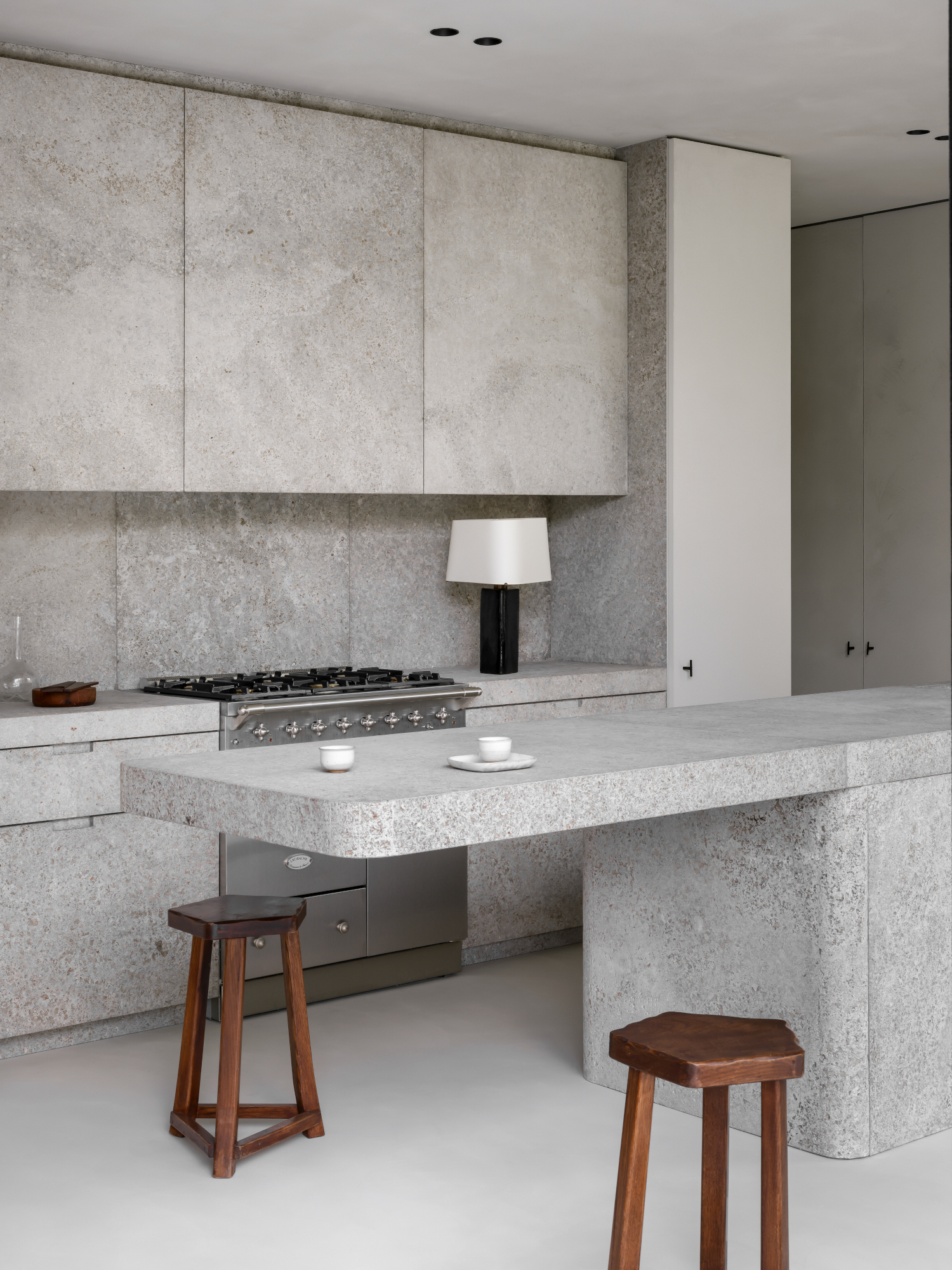
One rather dramatic kitchen island idea is the cantilevered edge, where counters extend beyond the food prep area to create a tabletop that ‘hovers’ in the air. Designing this style of seating is something of a technical feat that requires secret hardware. "When it comes to cantilevered edges, structural integrity is key," says Brussels architect Nicolas Schuybroek, who floated a travertine slab from this island’s base for a striking minimalist effect. "Hidden steel brackets or reinforcements embedded within the countertop or base cabinetry are needed, which allowed us in this case to keep the look clean while ensuring safety and stability."
And while it may look like there’s endless room beneath the cantilevered edge, the amount of space was deeply considered. “For comfortable seating, height and clearance are essential to create an inviting space at the kitchen island,” adds Nicolas. “To ensure comfort, plan for at least 12 inches of knee clearance under the countertop. For a cantilevered seating area, aim for 15-18 inches of depth to allow enough room for the legs without feeling cramped.”
2. Contrast classic and contemporary materials
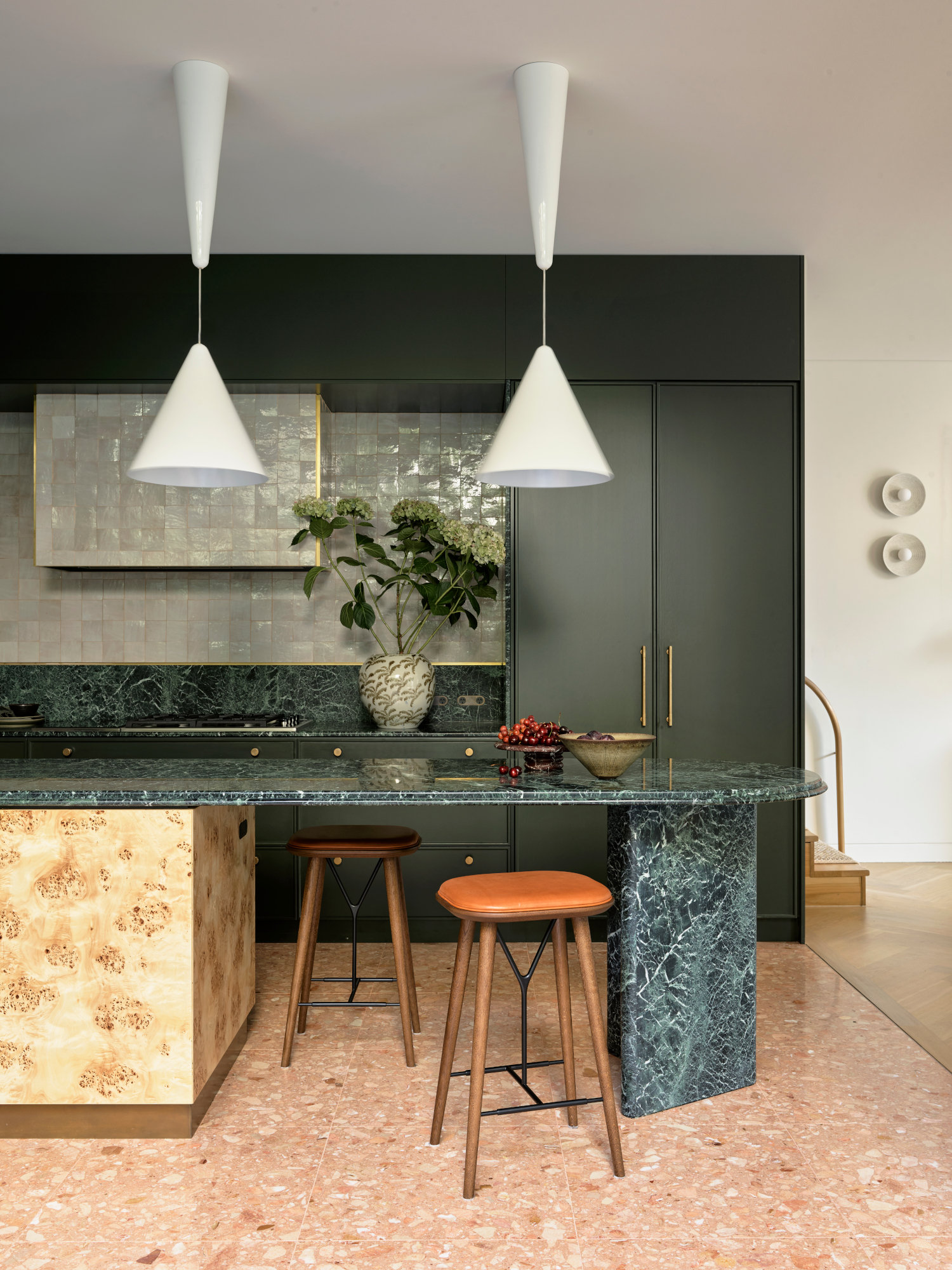
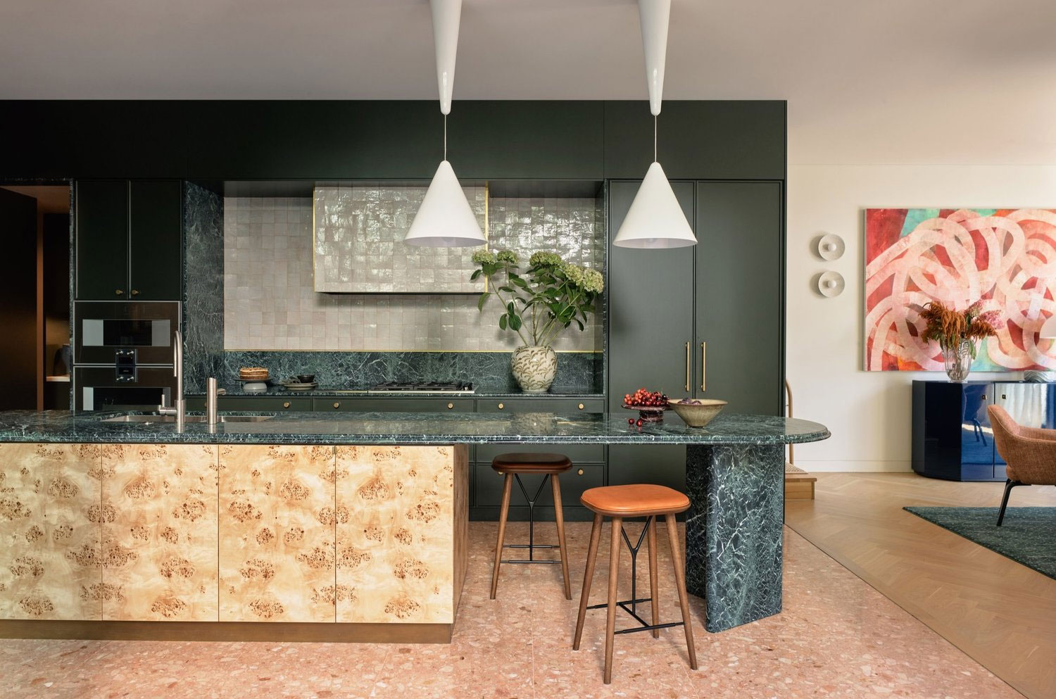
A floating edge can be borderline hypnotic, while adding an attractive pedestal or support can also be easy on the eyes. Playing with shape and material, the arrow-head pedestal pictured here, carved in Verde Guatemala marble, creates a sensational and airy look that compliments the burled wood veneer under-counter joinery on the island’s far end. "This design meets two requirements: under counter storage at one end with drawers facing the stovetop area, plus space for stools and more importantly, leg room, at the other," says Juliette Arent, principal at Sydney-based design practice Arent&Pyke. "Balancing the design this way, the kitchen doesn’t feel ‘base heavy’ either."
The stone surface plays into the multipurpose nature of the island, allowing the seating area to serve many functions. “Needing to serve myriad purposes and occasions, we favour stone – both granites and dark, patterned marbles that can weather food preparation yet equally elevate gatherings,” adds Juliette. “For this reason, we avoid setting sinks within their surface, relegating them to a nearby counter.”
The Livingetc newsletters are your inside source for what’s shaping interiors now - and what’s next. Discover trend forecasts, smart style ideas, and curated shopping inspiration that brings design to life. Subscribe today and stay ahead of the curve.
3. Introduce curve appeal
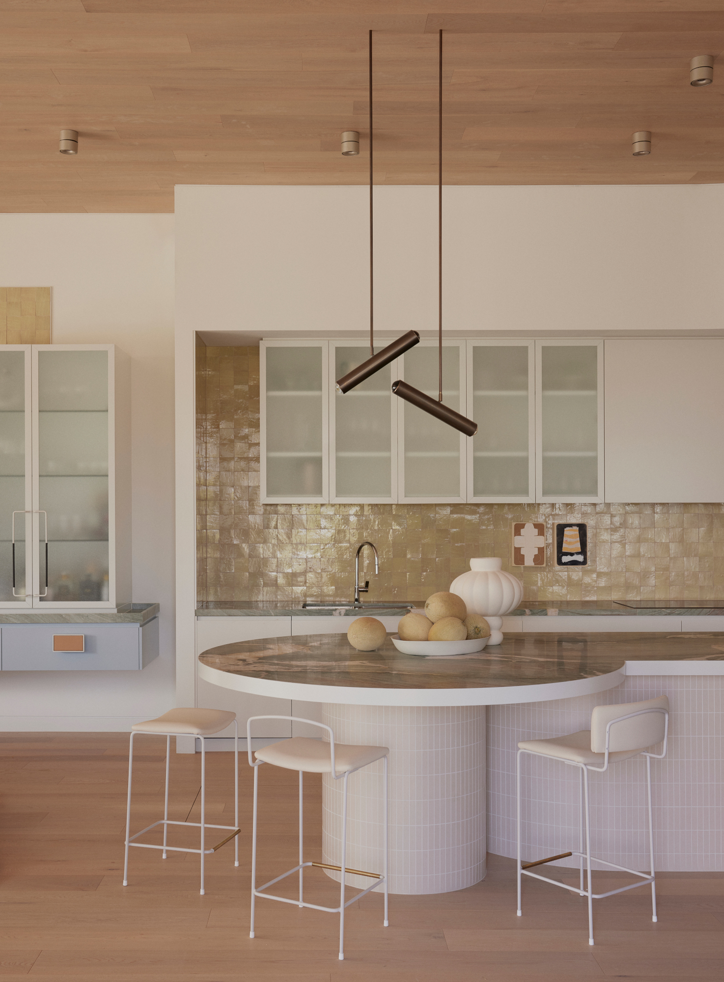
Especially in open-plan kitchens, integrated seating can blur the lines between adjacent spaces – they flow into one another. "We designed this island to feel like a natural extension of the living space, not just a functional kitchen feature," explains Mardi Doherty of Studio Doherty. Leaning into the transition, the studio added a circular table at the end of the counter, creating a softer layout that anticipated how homeowners would navigate the kitchen. "We find that introducing a subtle curve to both the countertop and base is not only aesthetically pleasing but also functional, allowing for better circulation and flow within the kitchen."
One obvious element to keep in mind is what lies beneath: sufficient space. “One practical tip when incorporating island seating is to allow at least 30 cm of countertop overhang,” adds Mardi Doherty. “This ensures stools can tuck in neatly and won't clutter the surrounding space when not in use."
4. Play with angles
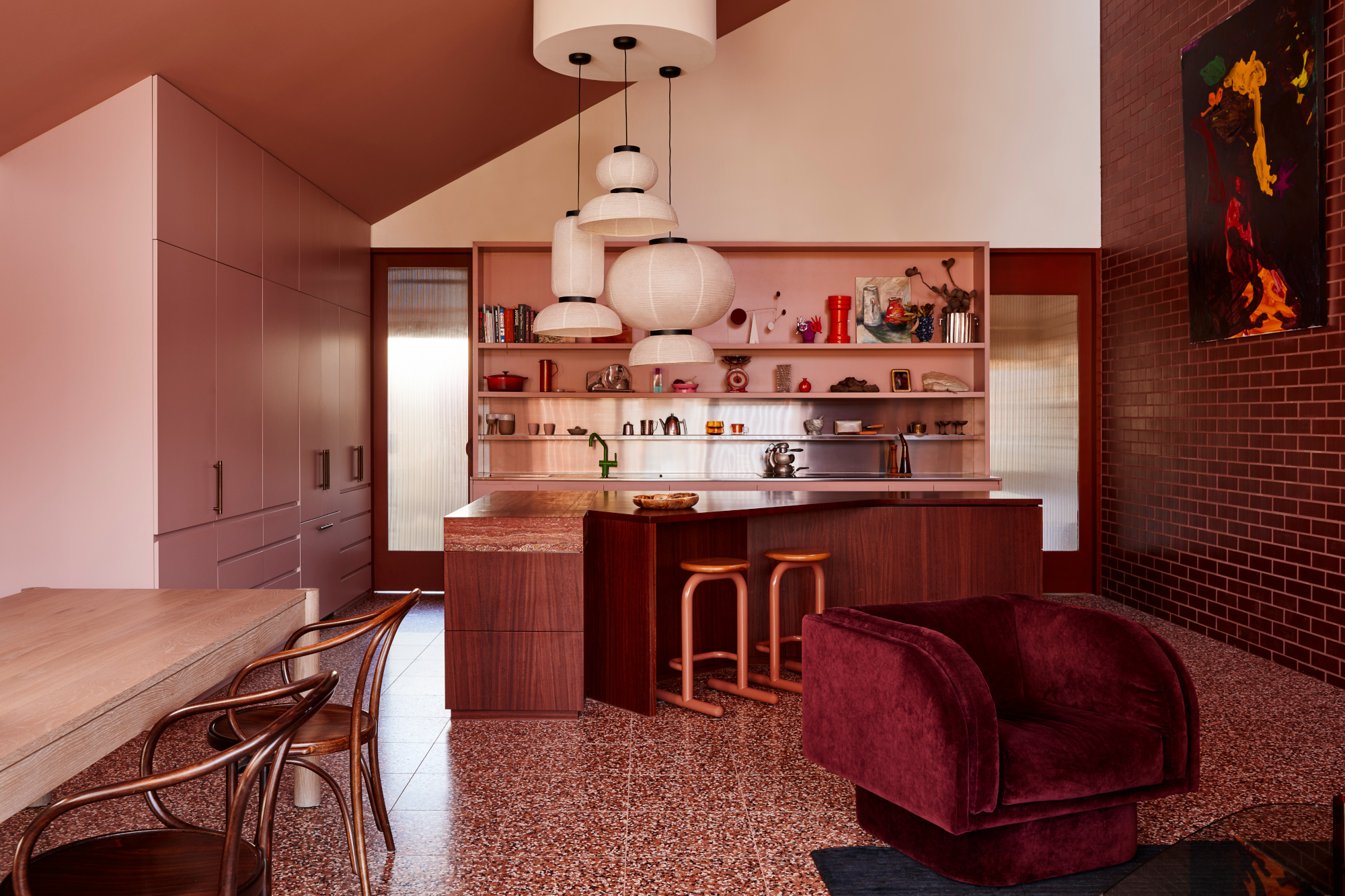
While most islands are rectangular, this kitchen takes advantage of an L-shaped layout, extending the counter at the joint to create an angled, wedge-like bench. "The seating is in its own hub in an irregular shaped area with stools that can easily be tucked in under," says Monique Woodward, Director of WOWOWA, who designed this kitchen for her own home in the shape of a grand piano. Topped with maroon jarrah timber on one wing and a pink-orange travertine on the other, it’s the latter that extends to form the bench, introducing a fascinating shape and flow to the kitchen.
Carving out room for seating in your kitchen island, according to Monique, brings a new meaning to the space, truly making it the heart of the home. “It’s the breakfast bar and the soiree centre with the cheese board laden with delightful assortments and the champagne flowing,” she adds. “I find myself standing and chatting, drink in hand, while our guests sit opposite grazing and talking. Artfully arranged seating facilitates this joyousness.”
5. Split the difference
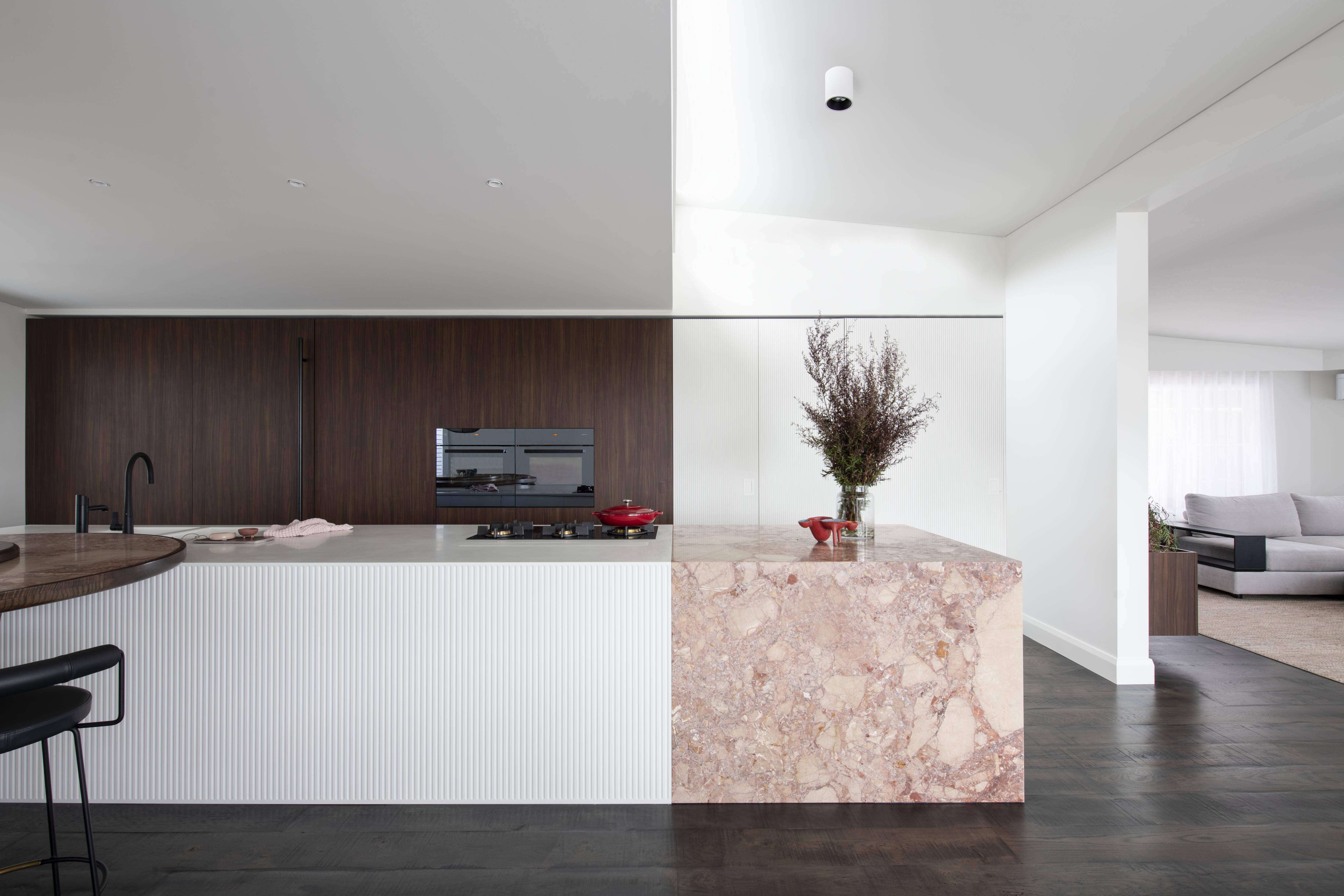
Splitting materials across kitchen countertop ideas and cabinets is an effective way to zone a space, and introduce different functions, while keeping the design clean-lined and modern.
In this kitchen by Studio Minosa, matching the lines across both the island and bank of cabinetry makes the effect even more dramatic. "The kitchen countertop's unique veining patterns and soft hues add depth and character to interiors, creating a visual focal point that effortlessly elevates the ambiance of a room," says Darren Genner of Studio Minosa. "Its popularity stems from its ability to evoke both playfulness and sophistication simultaneously, making it a versatile option for various design schemes. In recent years, pink has emerged as 'the new neutral' due to its ability to serve as a subtle backdrop while still injecting personality into a space."
6. Design an all-black kitchen
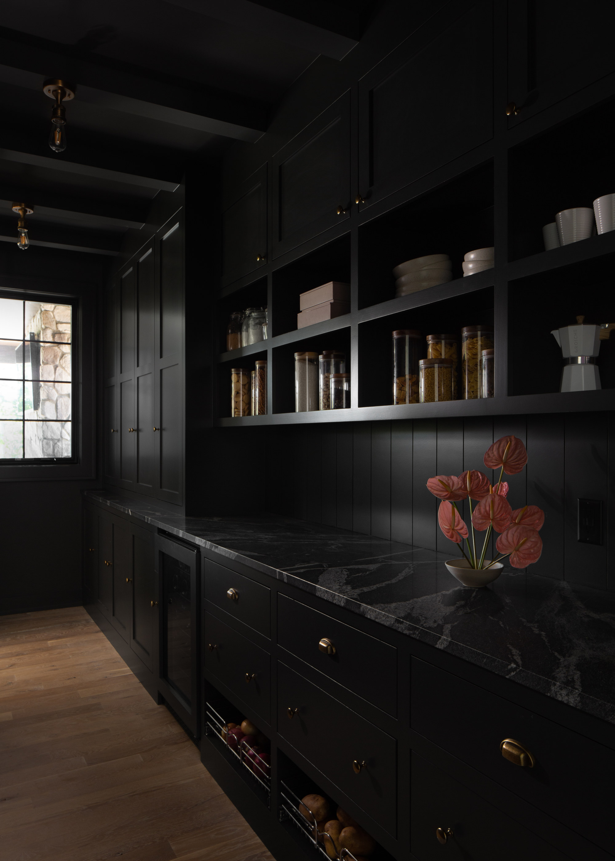
When it comes to kitchen color ideas, most spaces are drenched in white, cream, or wood tones. But nothing says bold like a black kitchen. Cabinets and counters painted in this deep, delicious, magnetic tone add a sophisticated touch to the home. Also, black helps hide stains, scratches, and more easily, so a great choice for busy kitchens.
2When homeowners are craving some dramatic impact or glam in their kitchen design, they are going to gravitate towards black kitchens," says Laura Williams of ATX Interior Design. "It's bold, it's beautiful, and can be timeless if done right."
7. Choose a statement-making flooring
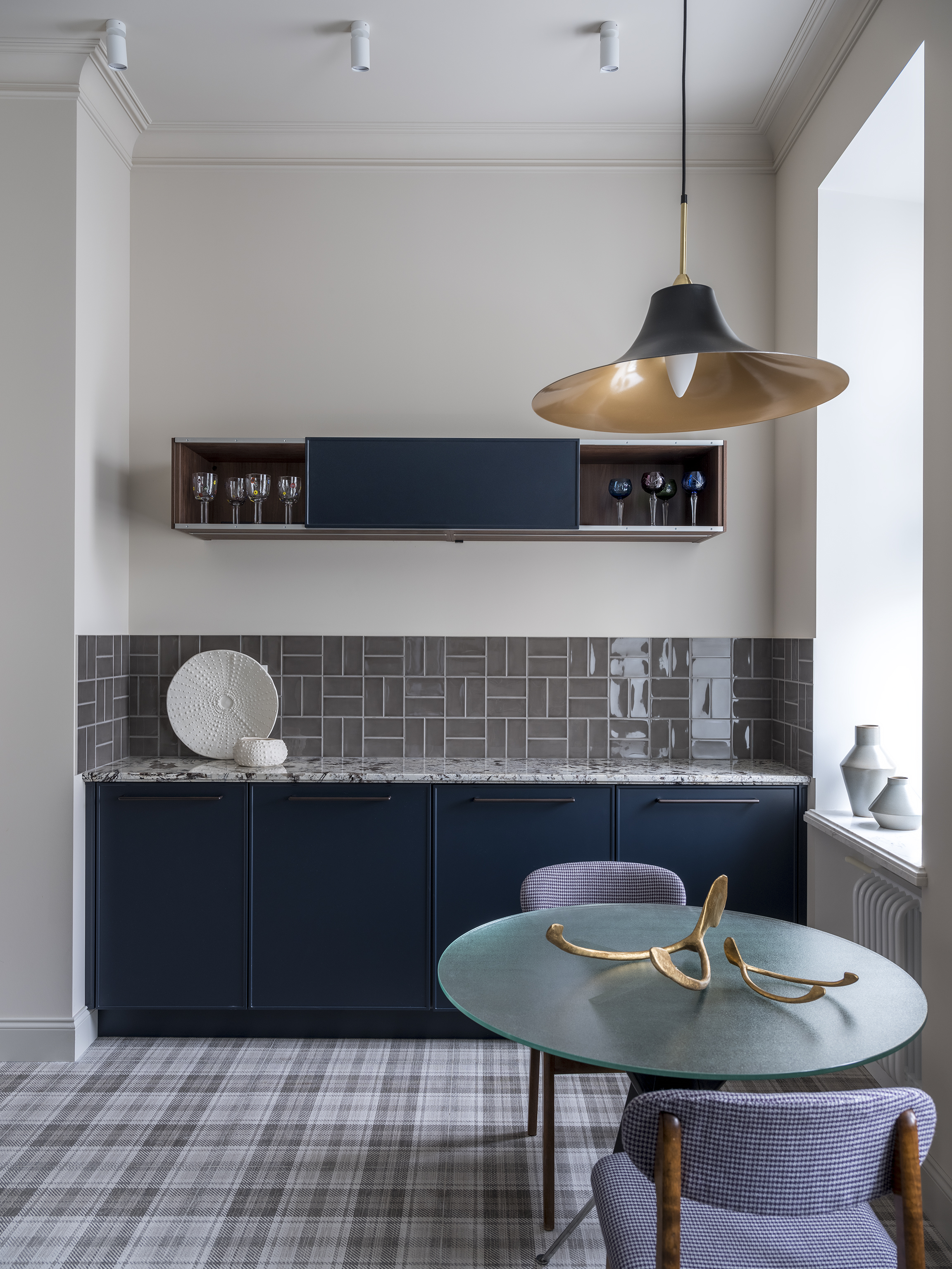
This space designed by House of Clark features an interesting kitchen flooring idea, using ceramic tiles that look like wall-to-wall carpeting for a cozy kitchen look.
"My main focus in the space was deep blue tones of the kitchen," says Anna Clark, interior designer and founder of House of Clark. "In order not to distract attention from it, I decided to paint walls, ceiling, and skirting boards in complementing shades of beige, which makes the deep blue color stand out. The tartan ceramic tiles on the floor gave a homey and cozy touch to the kitchen, making it warmer and friendly. The tartan tiles combine the shade of the walls and tiles on the backsplash."
8. Consider a dual material island
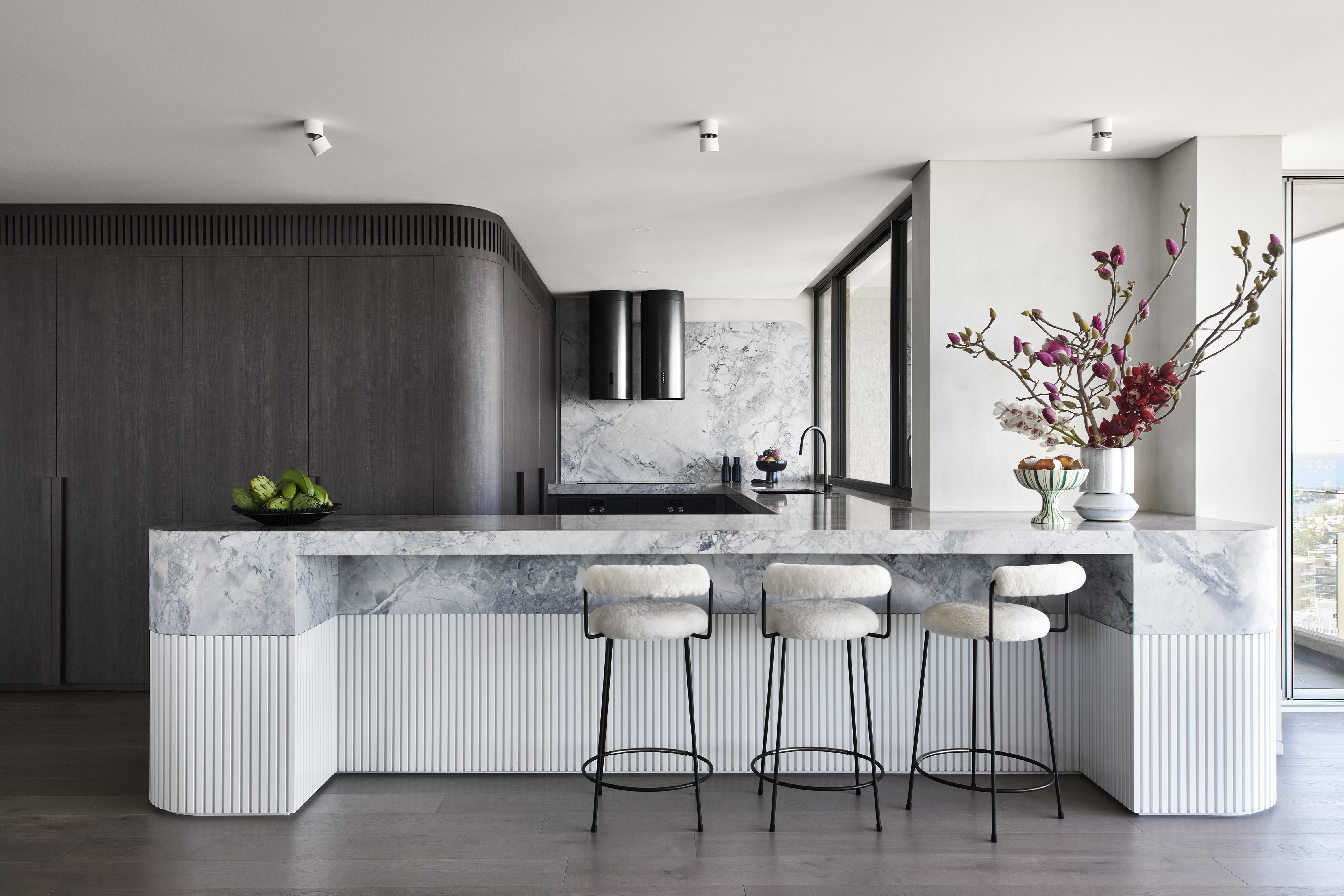
A large kitchen island in a solid material can feel imposing and monolithic, so this design by The Stylesmiths offer a welcome relief by combining materials, reducing the visual bulk.
"This island stands as a crescendo, orchestrated with a fluted base, a marble top, and the poetry of curved edges," says Emilija Hopenaite of The Stylesmiths. "Each element harmoniously whispers the tale of thoughtful design, crafting not just an island, but an invitation to linger in the artistry of space and form. This sculptural island creates an ideal setting for gathering and partaking in culinary rituals, where the elegant contours facilitate a seamless flow of interaction and entertainment."
9. Use obscured glass for cabinets fronts
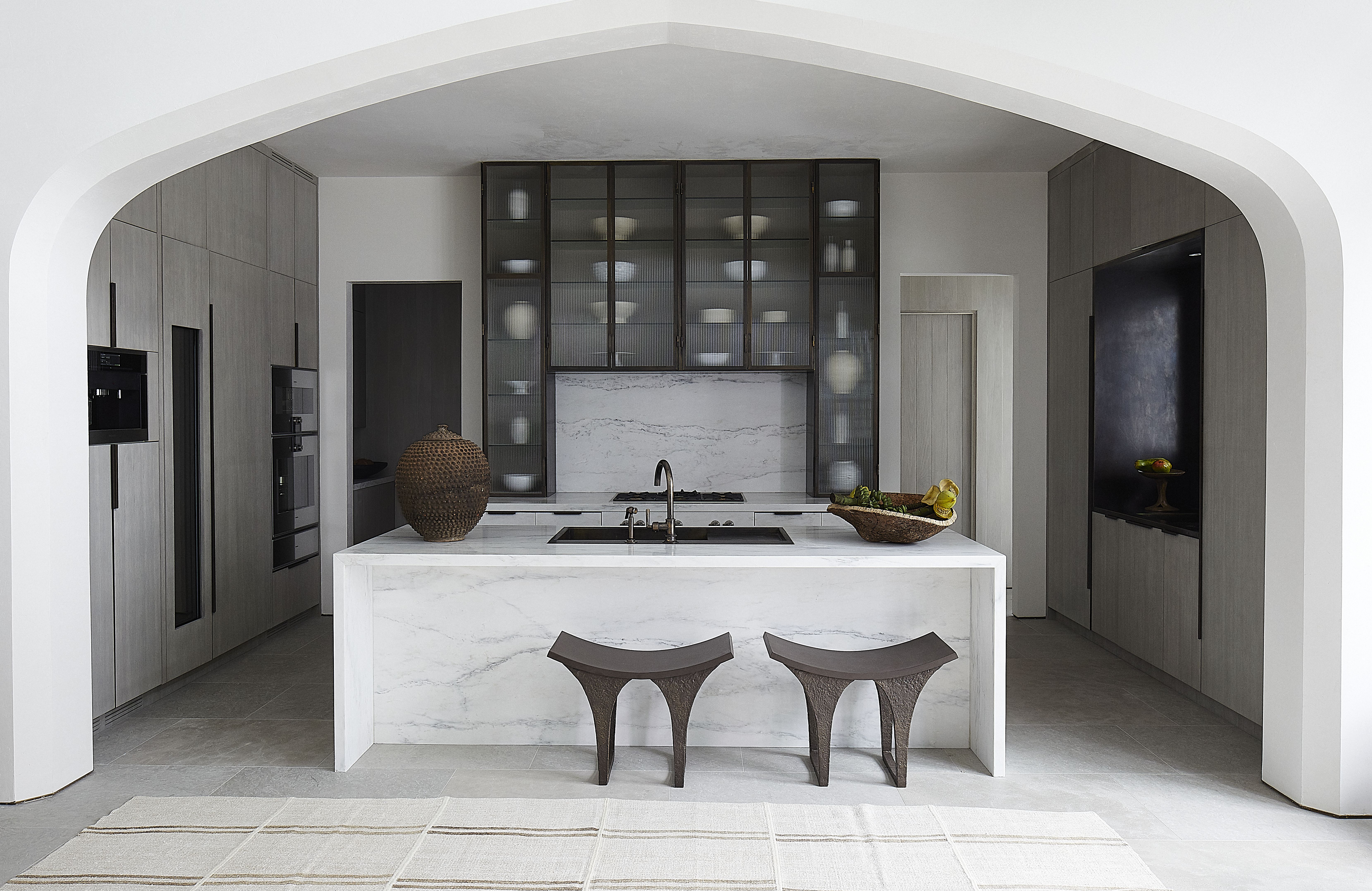
Glass-fronted cabinets bring depth to a scheme that solid-front doors can't, and they are often preferable to open shelving for kitchen storage that's easy to maintain. However, a view into all of your cabinets isn't a minimalist's dream.
This design by Jeffrey Dungan creates a feature of glass cabinets, but keeps it modern by using a reeded glass, and only displaying the kitchen's most decorative objects. "There is a need for space to store things, and at the same time we are driven by the need for making elegant solutions," Jeffrey says. "We want to design kitchens that are visually pleasing, yet still allow those wonderful humans who cook for us to have access to their tools"
"In this case, we had a smallish space for the kitchen and wanted to not allow the hood too much precious real estate, so we created a steel enclosure that surrounded the cooktop instead of the hood enclosure and went with a down draft cooktop."
10. Paint the entire kitchen to give it a jewel-box feel
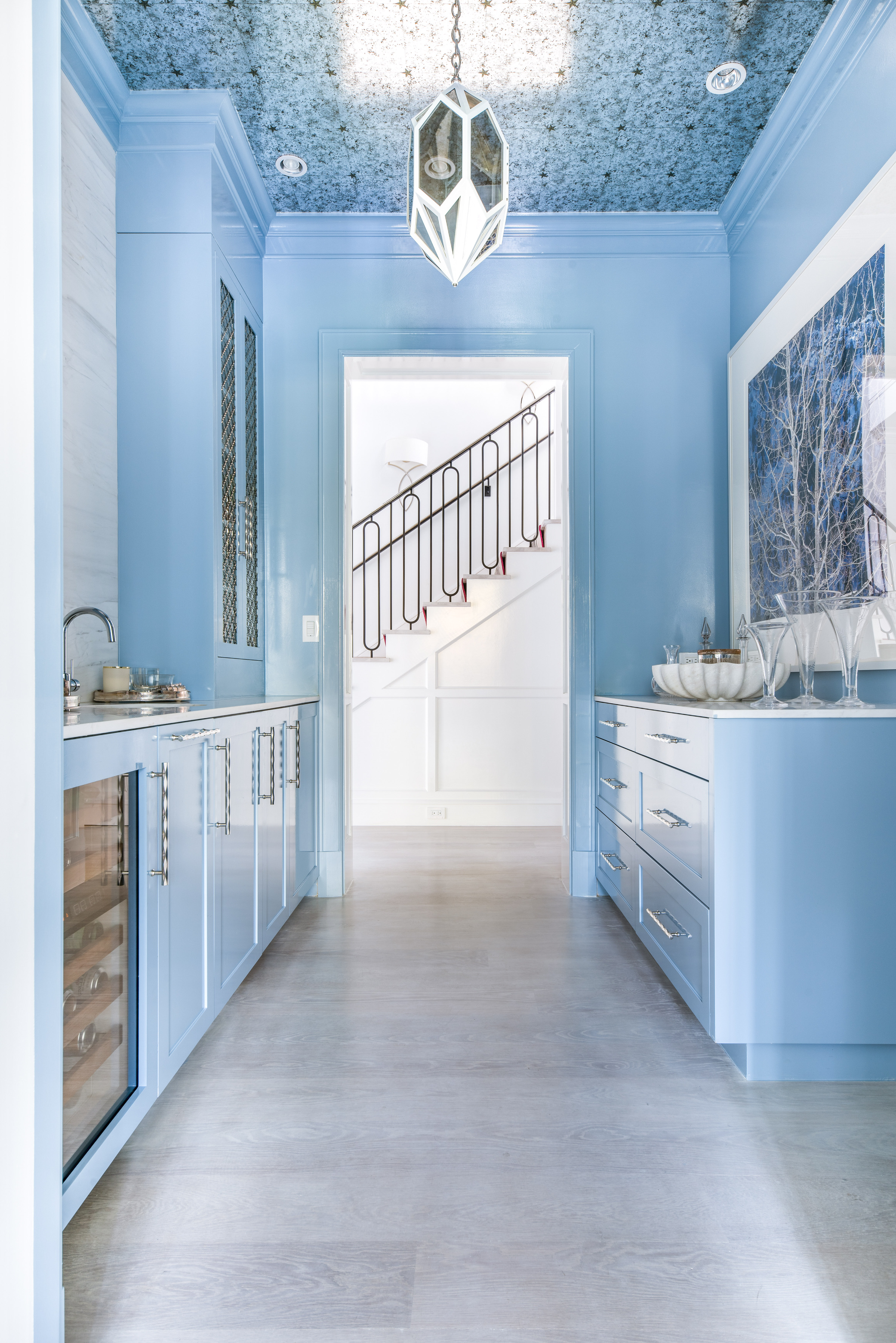
The paint technique of color drenching will not only give the space a cozy, warm, and enveloping feel but also make the kitchen look like a jewel box. "Color drenching is a trending idea for reducing the contrast in spaces, making for modern schemes that are cohesive and easy on the eyes," says Livingetc's Interiors Editor Emma Breislin.
"For this kitchen, we used Lulworth Blue No. 89 by Farrow & Ball, and chose a high gloss finish to give the room depth and a sense of wonderment," interior designer, Meredith Steinhart, tells us. Light blue is a color trend that's captured our attention for modern spaces this year, too.
11. Include a coffee station next to the kitchen
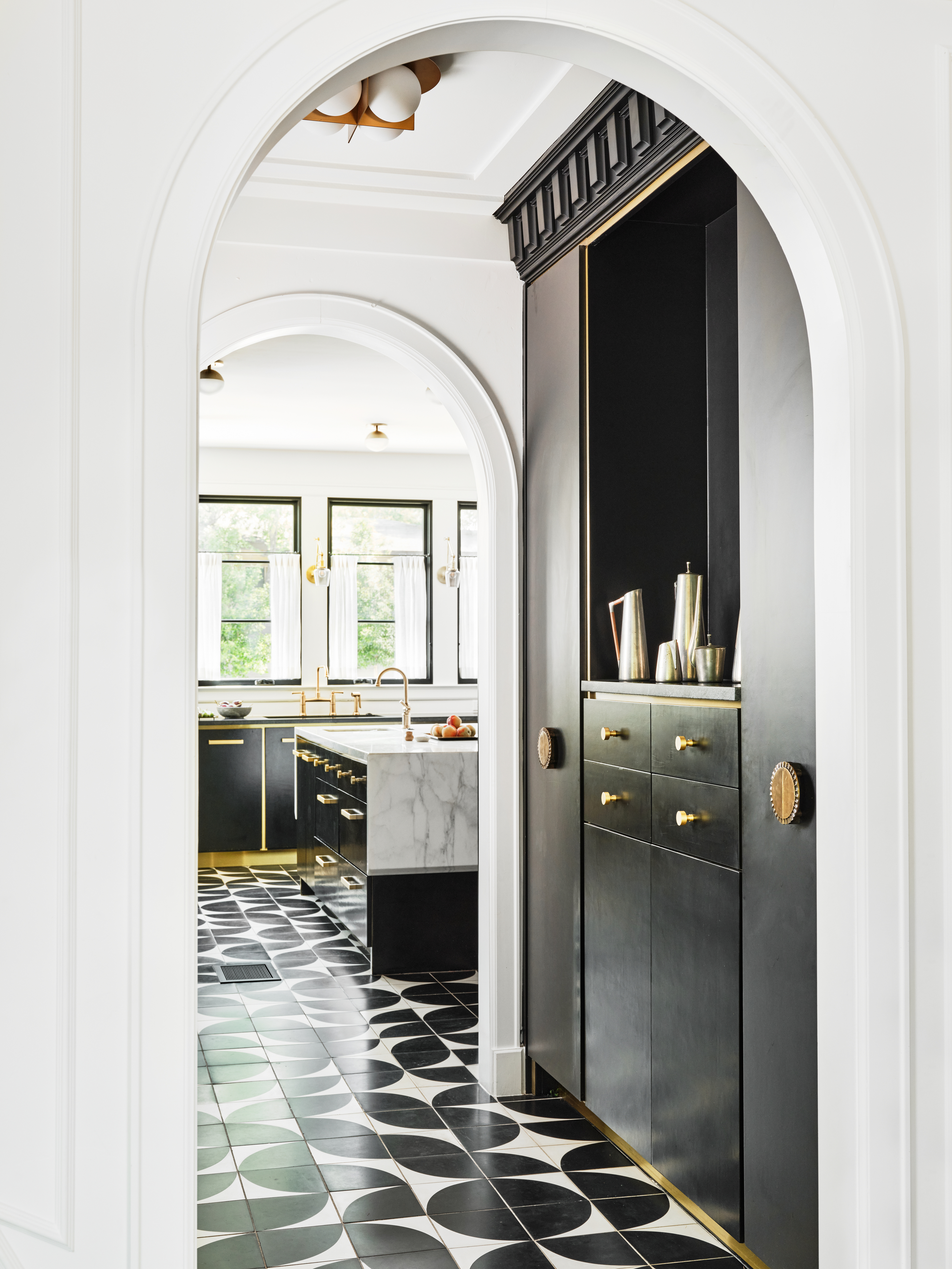
A coffee bar next to or inside your kitchen can go a long way in ensuring that this space is functional and also fun. These tiny yet significant nooks help create a socializing area, thereby redeeming a kitchen from its otherwise utilitarian look and feel.
"While designing a kitchen, functionality is the main thing to keep in mind," says Lindye Galloway, founder of Lindye Galloway Studio + Shop. "For a grab-and-go eating space, consider adding a small coffee station. If it's a more gathering space you wish, add a banquette. These spaces can lend themselves to being the main design features of the home. Be sure to tie in elements showcased throughout the home to ensure this space is cohesive."
12. Add recessed lights to create a soft mood
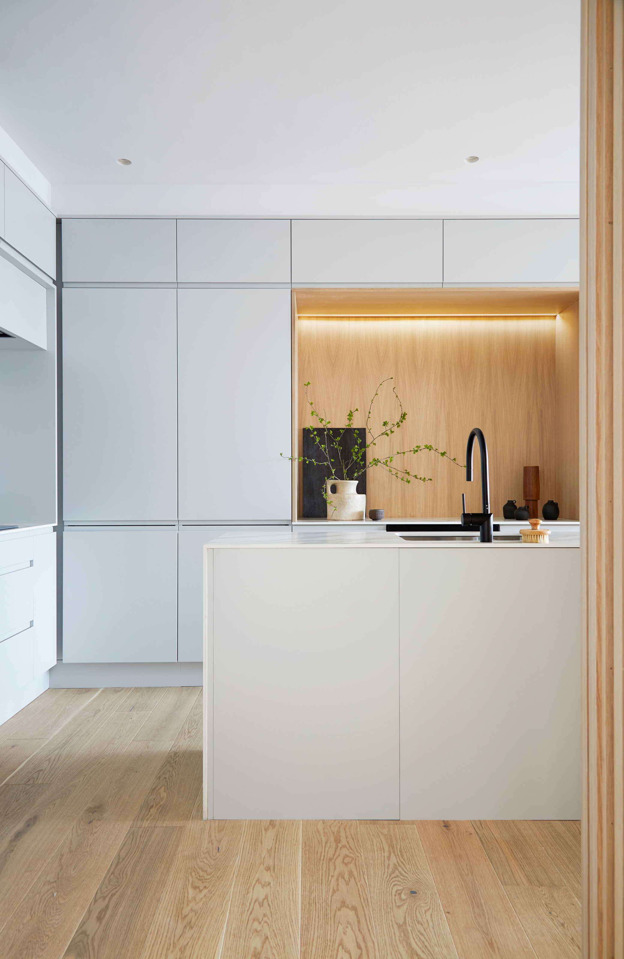
The trend of recessed lighting is a way to make kitchen cabinet lighting more minimalist and modern. Sleek, LED strips and recessed spots create atmospheric ambience and give the space a modern, on-trend look.
"LED spots are a great solution as they are functional and minimalistic," say Alexander Ivasiv and Yuliya Tkachenko, founder of ater.architects. "They dim well so that you can create a soft relaxing light. Or on the contrary, make the light as bright as possible. Also, these lights do not attract unnecessary attention by blending in with the ceiling."
13. Add a concealed pantry
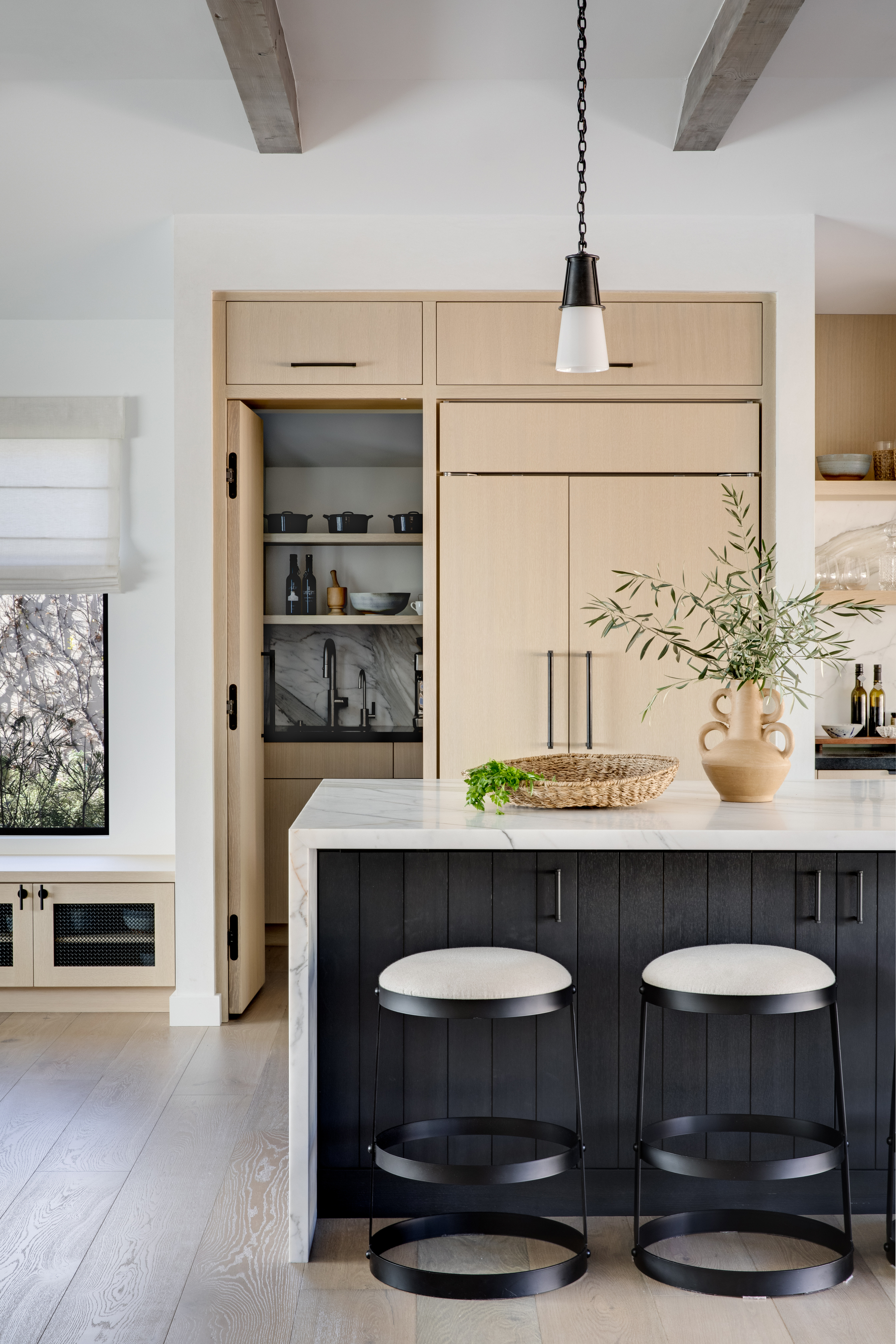
A pantry is a much sought-after modern kitchen idea. It's that very important room that hides all the mess and supplies, away from the main kitchen.
While adding this important element to the kitchen, do consider giving it a design touch as well. "The pantry is a great opportunity to have a little more fun and implement bolder or darker colors that might not work in an open, light-filled kitchen space," says Mindy O'Connor, principal of Melinda Kelson O'Connor Architecture & Interiors. "Most decisions regarding depth and range of color in a kitchen or pantry should be made in consideration of the specific context that includes the light, the scale and design intent of the room and the millwork."
14. Incorporate textured marble
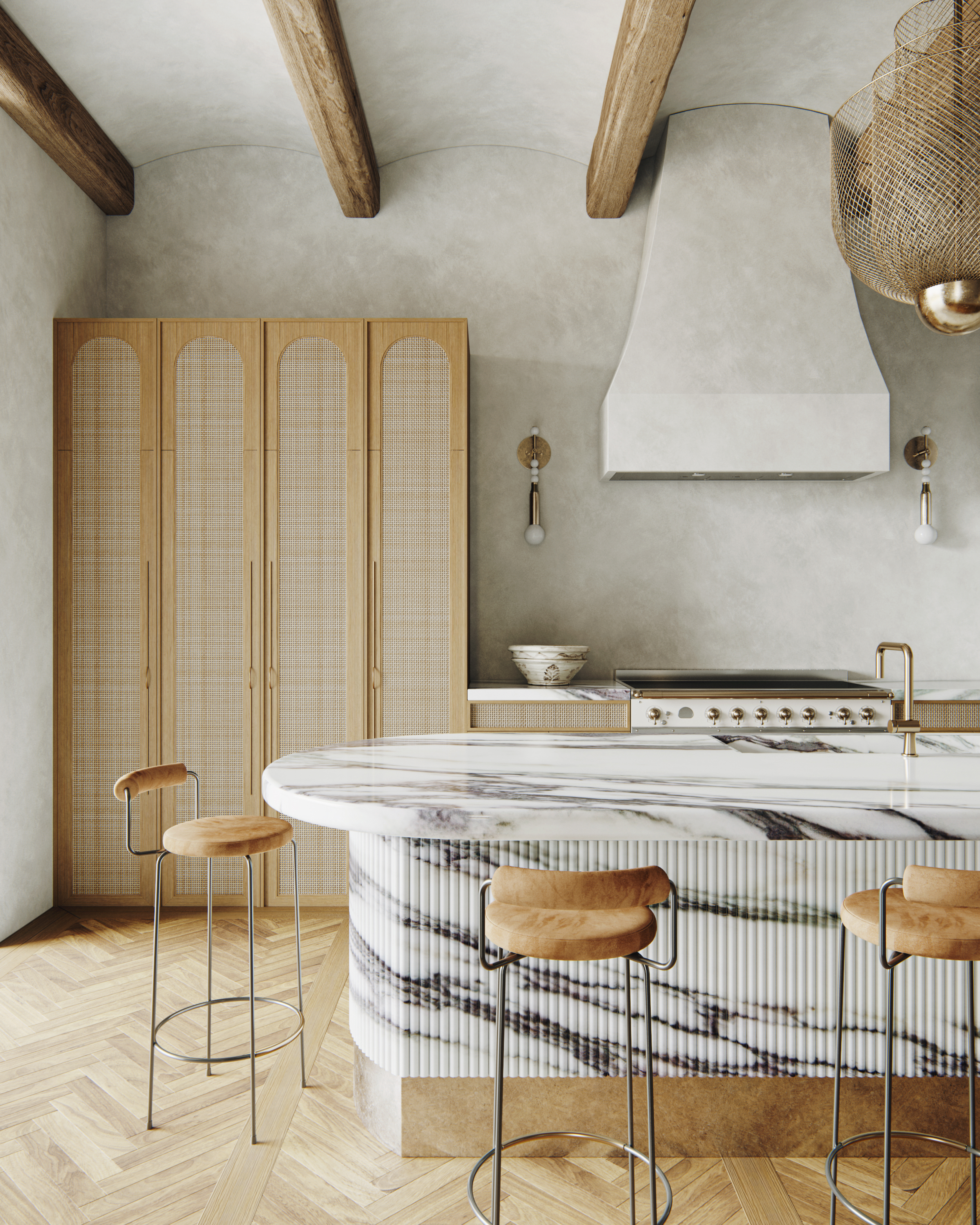
There's no doubt about it. One of the most elegant and refined materials on the market is marble. This material has an inherent charm and luxuriousness to it, and a huge range of variety. For a marble kitchen, consider this textured, fluted marble created for this kitchen by interior designer Noa Santos of Nainoa. It's a showpiece in craftmanship that goes to show there are plenty of options to be explored when designing with marble.
"Marble stands as an eternal material, and when paired with an added texture, it ascends to a new level of sophistication and modern charm," says Kashi Shikunova, director at Yam Studios. "The intricate textures breathe life into the space, creating a feeling of luxury with a touch of natural elegance, creating an environment that is both opulent and grounded in its beauty."
15. Elevate industrial style with stainless steel
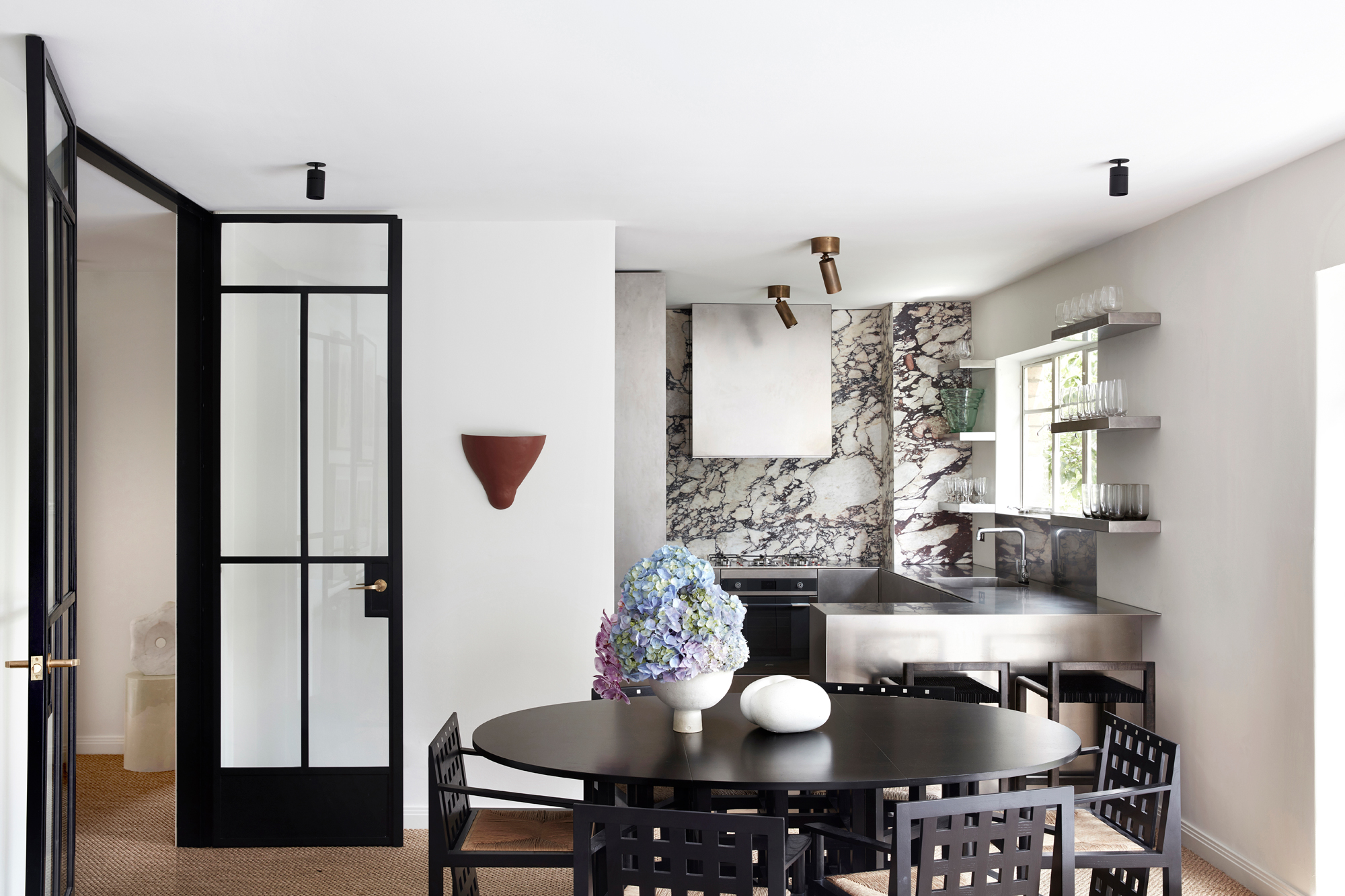
Traditionally industrial materials don't have to mean an industrial style, as the revival in stainless steel kitchens goes to show. A sleeker, more elevated style has emerged using this material usually found in professional kitchens.
Unexpected combinations with luxurious finishes help to re-position stainless steel for the modern home. "We had the entire kitchen handmade with a local metal worker who is an artist in himself," says interior designer Tamsin Johnson. "I love that brushed matte and industrial finish against the glamour of the dramatic Calacatta viola marble."
16. Contrast sleek and raw textures
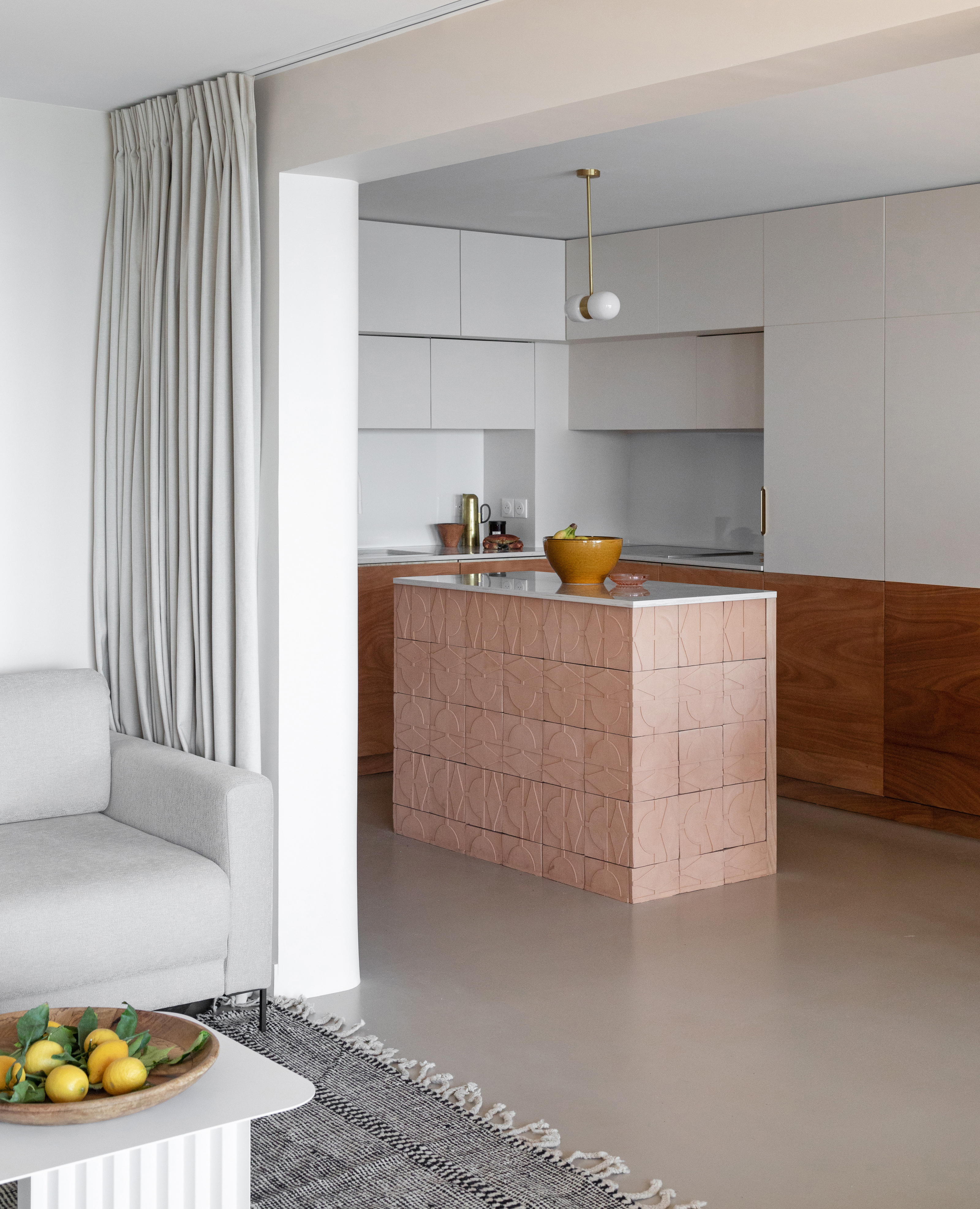
In this kitchen, the sleekness of slab doors and concrete floors with an earthy rawness of unglazed ceramic tiles that delights in its contrast. "The tiles of the island are in terracotta, untreated," says Marie-Sarah Burckel of Oud Architecture. "We were looking for a rough and irregular effect to contrast with the relatively smooth and contemporary look of the kitchen. The pattern carved into the tiles is reminiscent of Berber motifs, as an invitation to travel, in this apartment at the foot of the 'desert' of the famous Dune du Pyla."
17. Try a modern take on the checkerboard floor
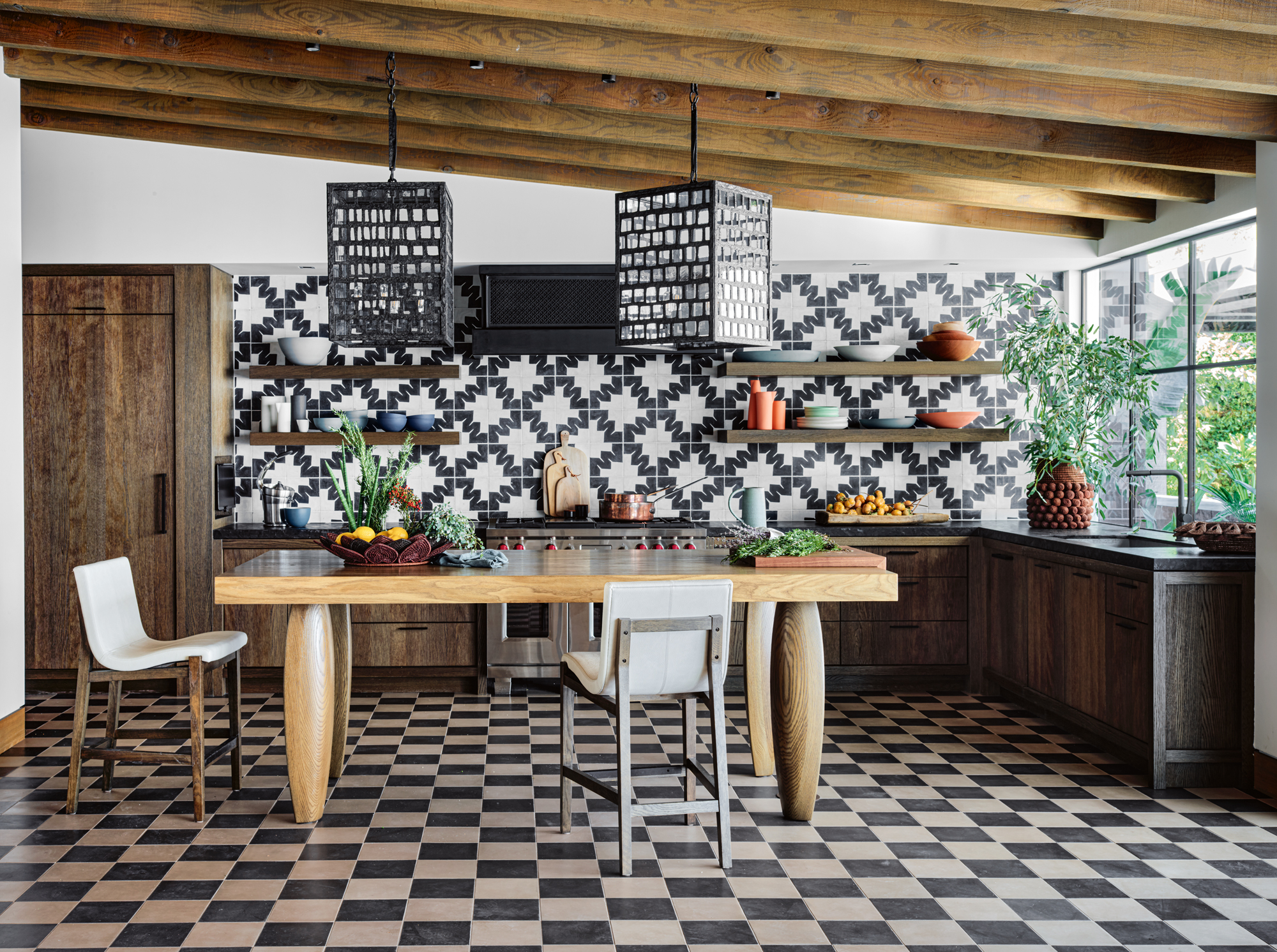
Checkerboard flooring might be more associated with traditional spaces but having incarnations in both period homes and mid-century styles, these can still fit into modern kitchen ideas. This kitchen trend has returned with a vengeance this year in the past few years, but in a different application to transitional style kitchens.
"Using eclectic tiles in this home was a way to bring interesting patterns and colors into the palette," says David Lucas, creative director at Lucas Interior. "We purposefully set up this type of opportunity throughout this home so that we could explore different patterns and color combinations in an organized and cohesive way."
18. Or this alternative take on patterned flooring
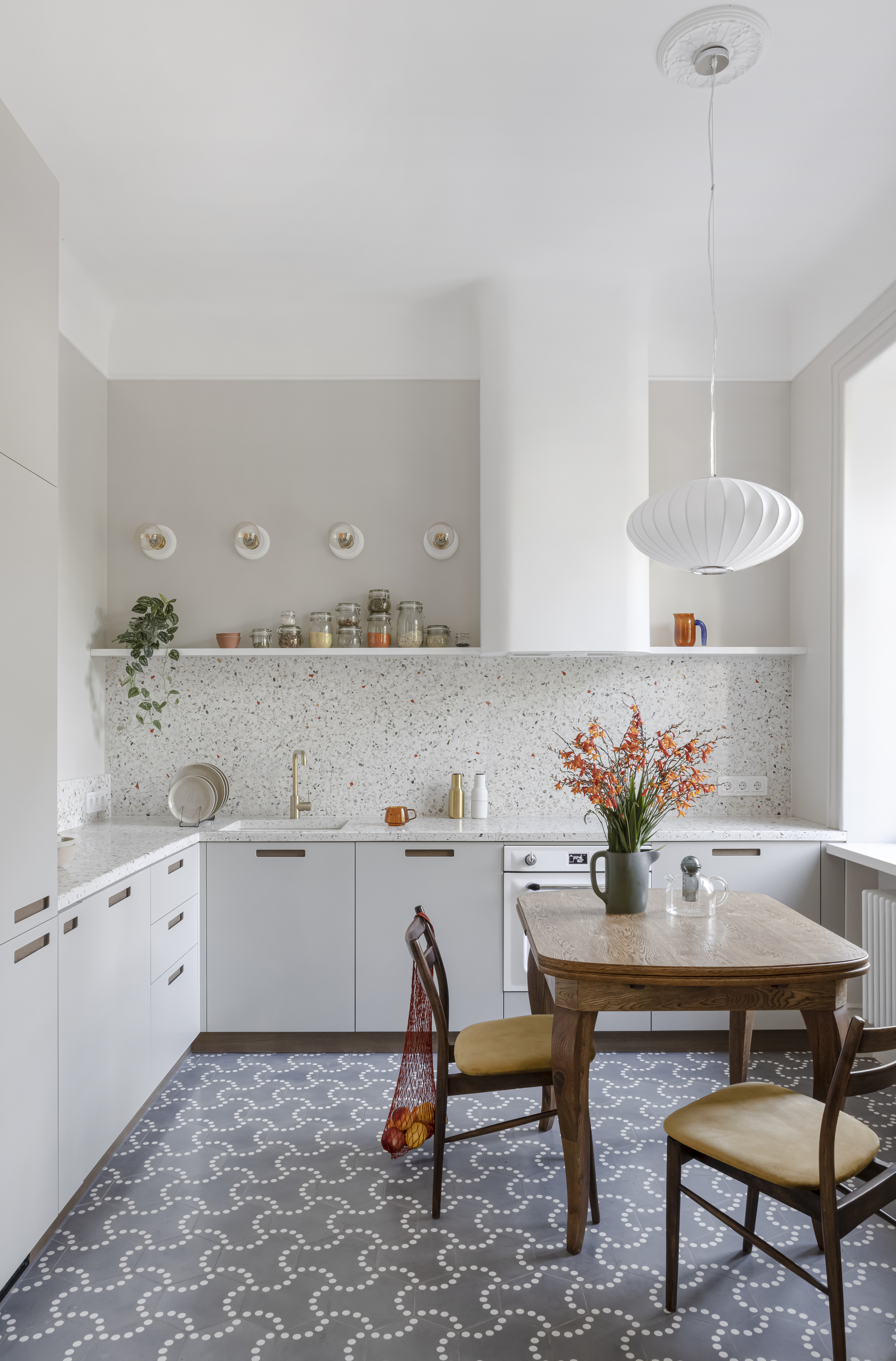
Poured concrete floors are popular with a luxe yet industrial style. However, they're notoriously difficult to install, compared to alternatives like tiles. When it comes to your kitchen floors, if you love the poured concrete look, why not consider an alternative like this concrete flooring, which also introduce patterns into the mix?
"These concrete floor tiles were produced in the Bisazza factory – part of the Lunas Bilbao A collection," says Jenya Lykasova, founder of JL STUDIO. "While Bisazza specializes in glass mosaics, they released this special concrete collection. Each drawing has its character and looks unique."
19. Include oversized lights in your modern kitchen ideas
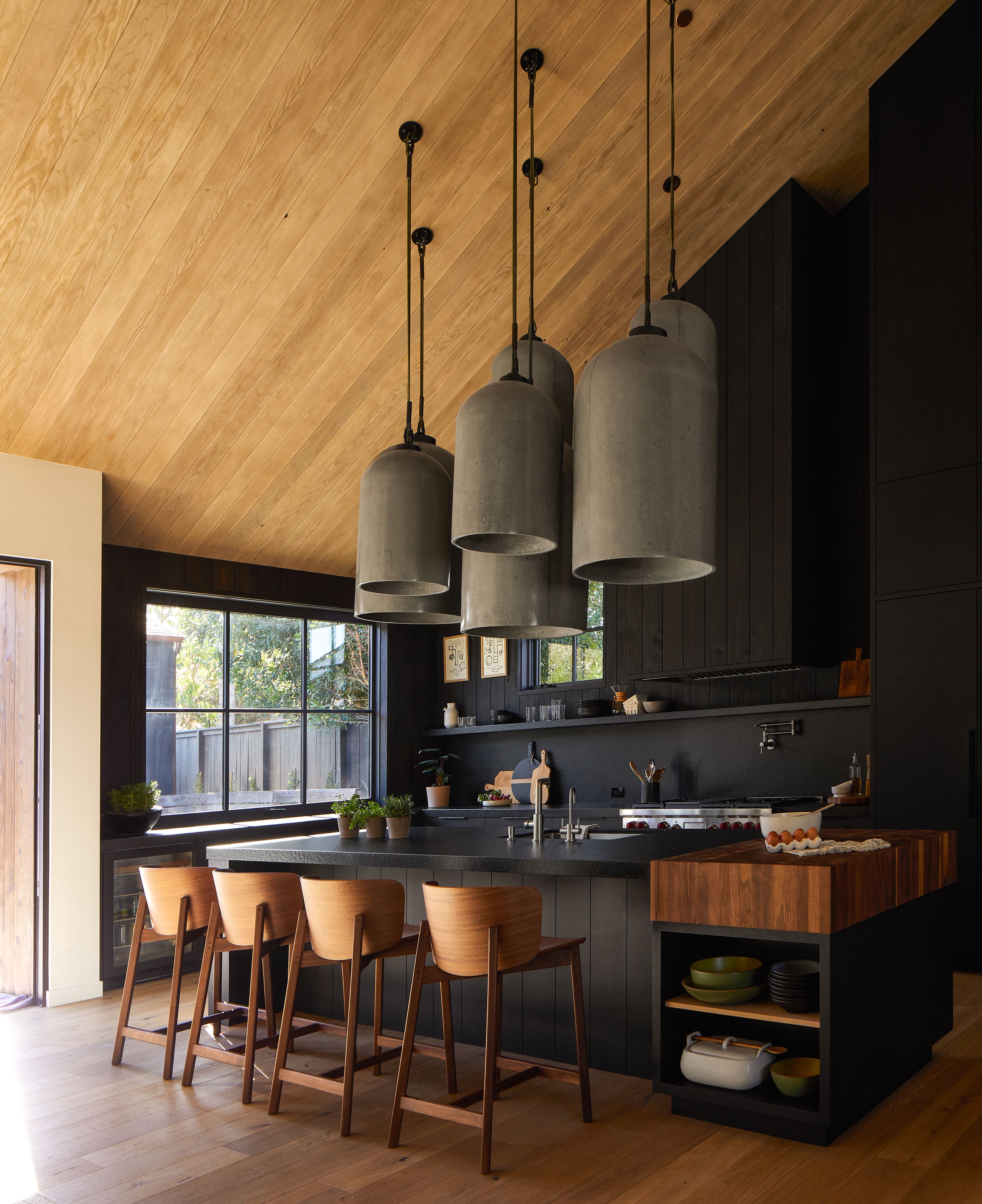
Kitchen pendant lighting ideas might be a finishing touch for your space, but they can certainly set the tone, and nowhere is this more apparent than in the kitchen design of this Californian home.
"We wanted our clients to walk in through the front door and have something wow them," says Raili Clasen, principal designer at RailiCA Design. "Our inspiration for the oversized pendants came from a much smaller light fixture that we asked Buzzell Studios to supercharge. The dark and moody palette of the kitchen begged for a dramatic, strong light installation."
20. Go graphic with paint
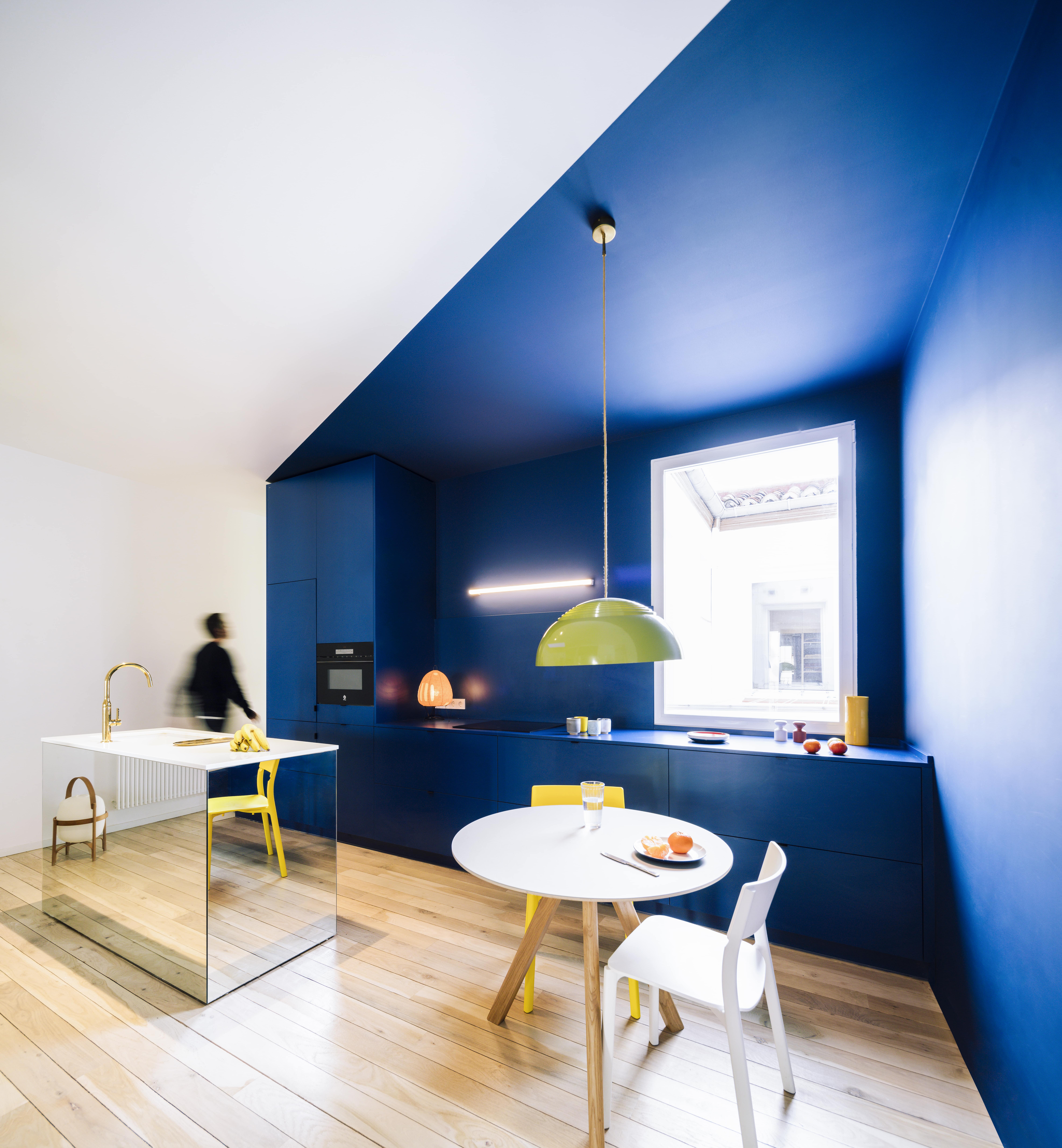
Sometimes a complete remodel may not be on your mind, in which case, a fantastic paint job can do all the work for a stunning refresh. Use color to demarcate areas if you have an open plan. Experiment with kitchen cabinet color ideas to make your storage units look new. Consider palettes that are reflected around your home to create cohesion and a theme.
"In this traditional Madrid flat, a system of load-bearing walls run parallel to the facade," say Gonzalo Pardo and Ana Torres, principal designers at Gon. "Enclosed within is a set of rooms of different sizes that are isolated and at the same time connected by a corridor. The home's most unique characteristic is the length of the house – nearly 70 feet of free and fluid domestic space. To design it we created marked different areas for cooking, sleeping, resting, working, and socializing through visual elements of color and lighting."
21. Color block across materials

This color-blocked design matches floor coverings with wall paint, cabinetry and countertops in a modern terracotta shade.
"Terracotta is a key trend as we continue to look to our homes for comfort and sanctuary,' says the designer Kelly Wearstler. 'The shade is not only versatile but is inherently warming and effortlessly complements handcrafted objects made from natural materials, such as rattan, seagrass, and linen. I love using terracotta in the home. It’s an easy-going color characterized by softness, like morning sunlight.'
A hugely versatile color to add to modern kitchen ideas, terracotta combined with complementary shades, such as dusky pink or cerulean blue, creates a tonal look with a backdrop of muted white and cream tones. 'Introduce the shade subtly through tiled flooring or countertops, or create a full monochromatic terracotta look with rich materials, such as marble, terrazzo flooring, and tiles in the same hue,' Kelly says. 'When it comes to terracotta, integrating local stones can create an emotive link between the home and its surroundings – designs that play upon the raw, natural beauty of an environment is the most beautiful.'
22. Combine wood and metal
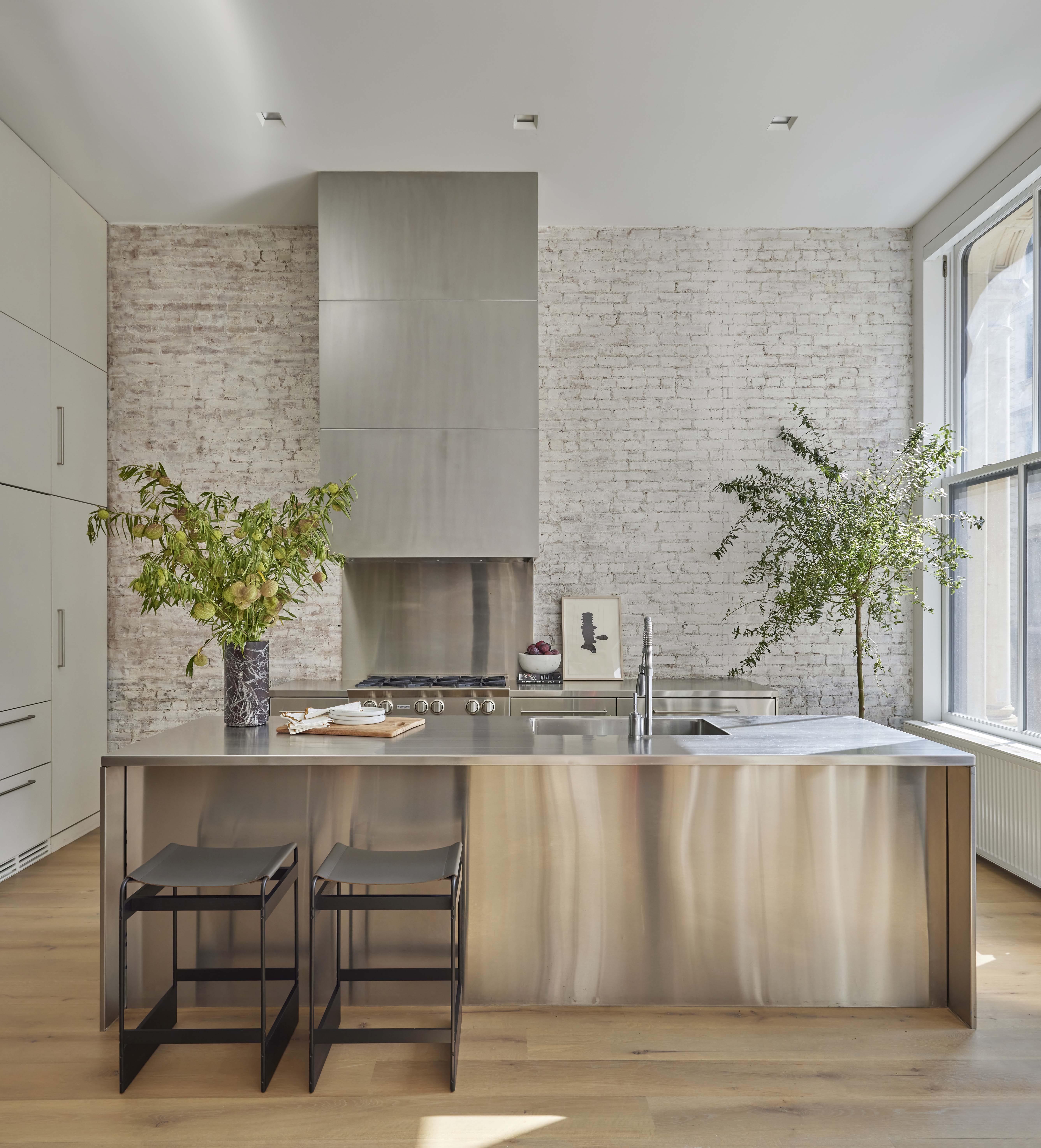
Combining brick, wood and metal creates a contrast that stops this kitchen from seeming either too rustic or too much like industrial interior design.
"I think a room that is too ‘matchy matchy’ can look bland and forgettable," says Juliette. "Kitchens are a great place to experiment with texture and by blending wood and metal you can create something that is both eye-catching and sleek. I’d suggest choosing one as your main focus and using the other material in accents, but both are extremely versatile materials and will complement one another perfectly."
"Choose metal brackets that can support floating wood shelves; metal hardware or a decorative metal light fixture can add texture and warmth," says Gustave. "Wood hardware for drawers with a metal escutcheon can provide a tactile experience."
23. Celebrate natural materials with wood and stone
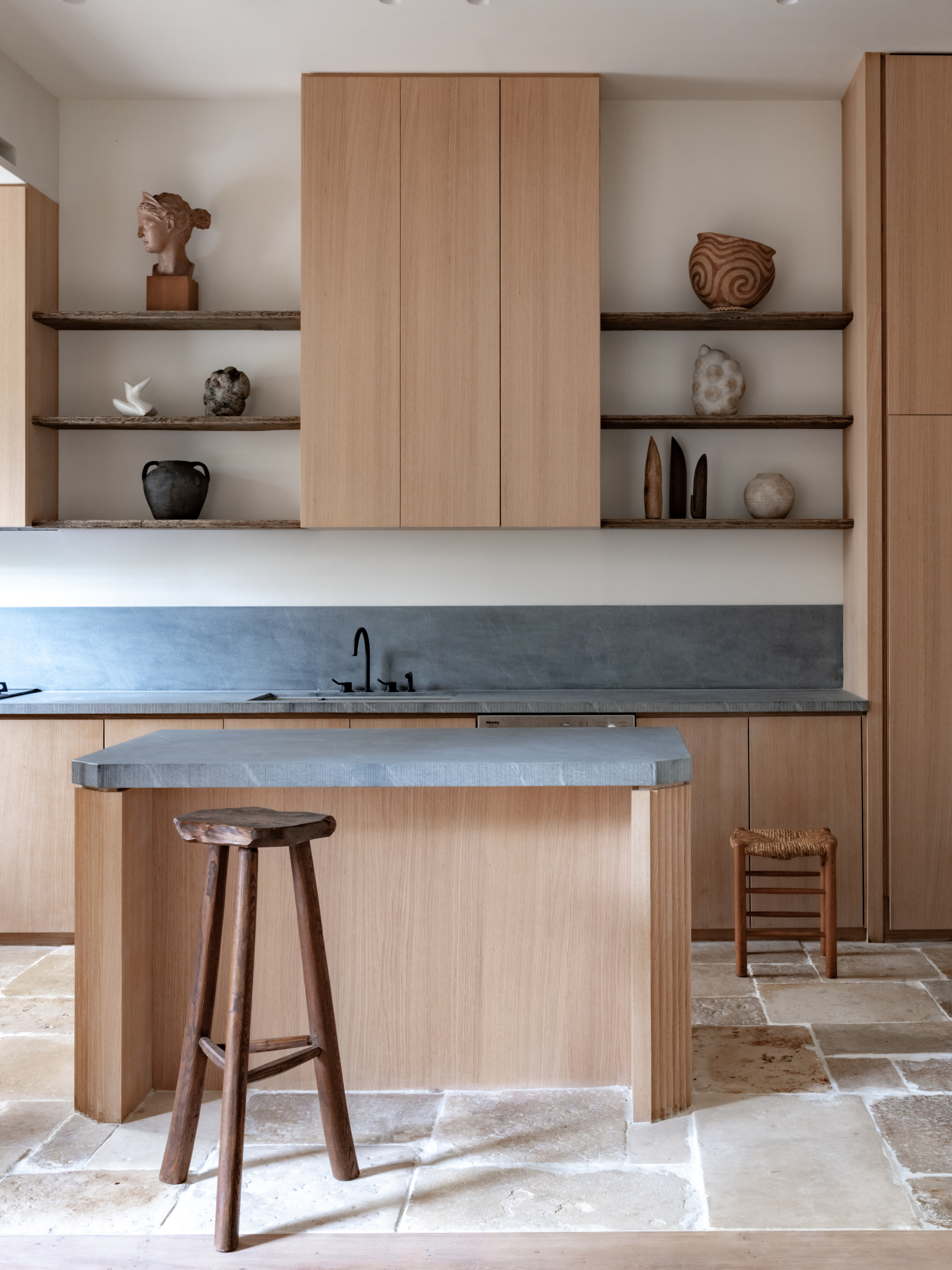
This kitchen embraces a palette of hardy materials, such as wood and concrete used for the kitchen island ideas. Select these materials for their honesty and robustness, as they are durable and suitable for real family life. The good thing is that they do not need to be replaced for years, sometimes even generations, and yet always look timeless and smart modern kitchen ideas.
"Marble stands as an eternal material, and when paired with an added texture, it ascends to a new level of sophistication and modern charm," says Kashi. "The intricate textures breathe life into the space, creating a feeling of luxury with a touch of natural elegance, creating an environment that is both opulent and grounded in its beauty."
24. Create contrast with black and white
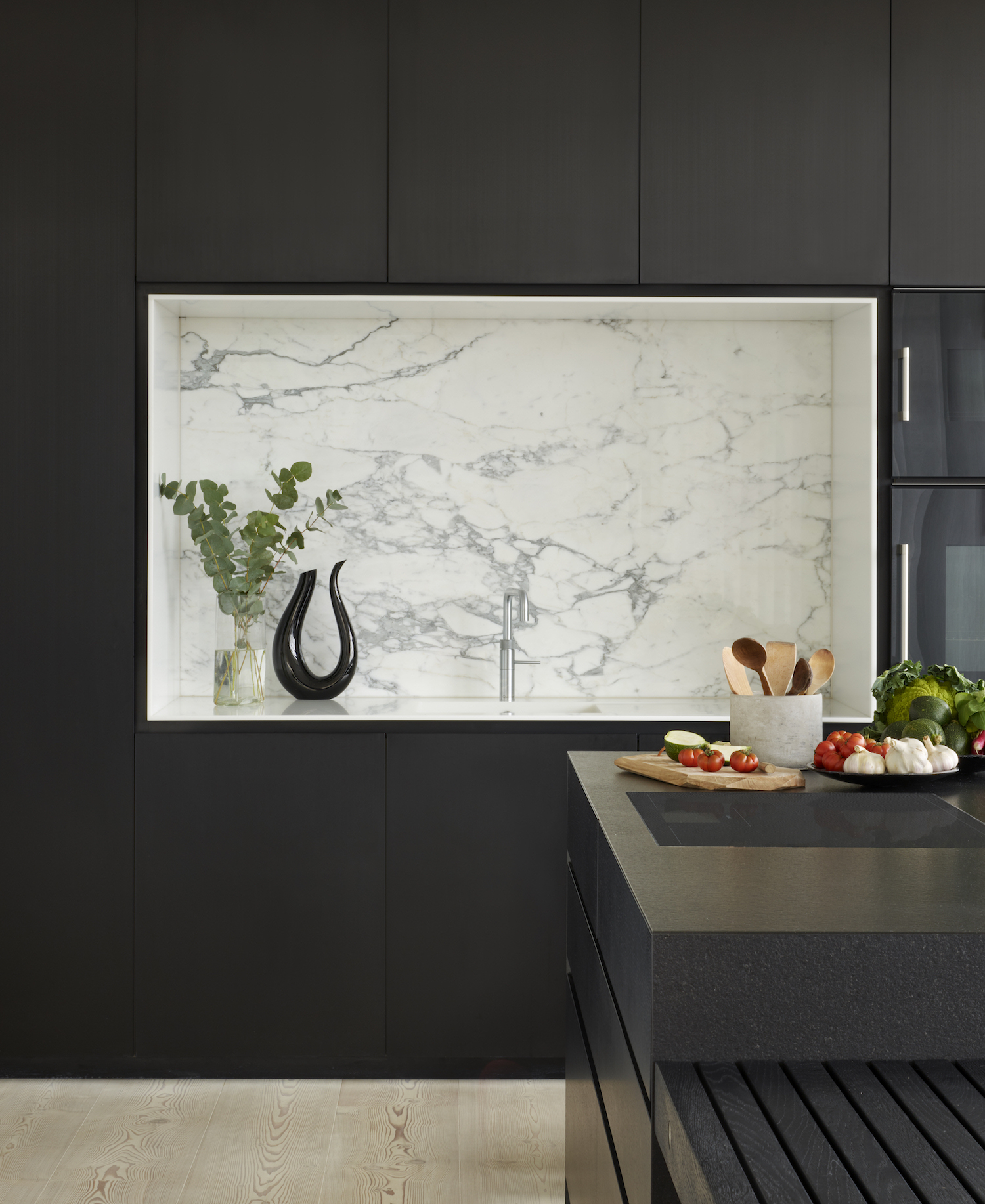
Black, white, and shades of grey kitchen ideas form a classic and sophisticated color palette that works beautifully to create a modern kitchen idea that will stand the test of time.
"The use of a palette of different black textures and materials in this kitchen achieves a masterful lightness in the space," says Gary Moor, designer at DesignSpace London. "The inset wet zone, clad in white Statuario marble and Glacier White Corian, draws the eye as if it were a work of art."
25. Extend the kitchen counter for modern dining
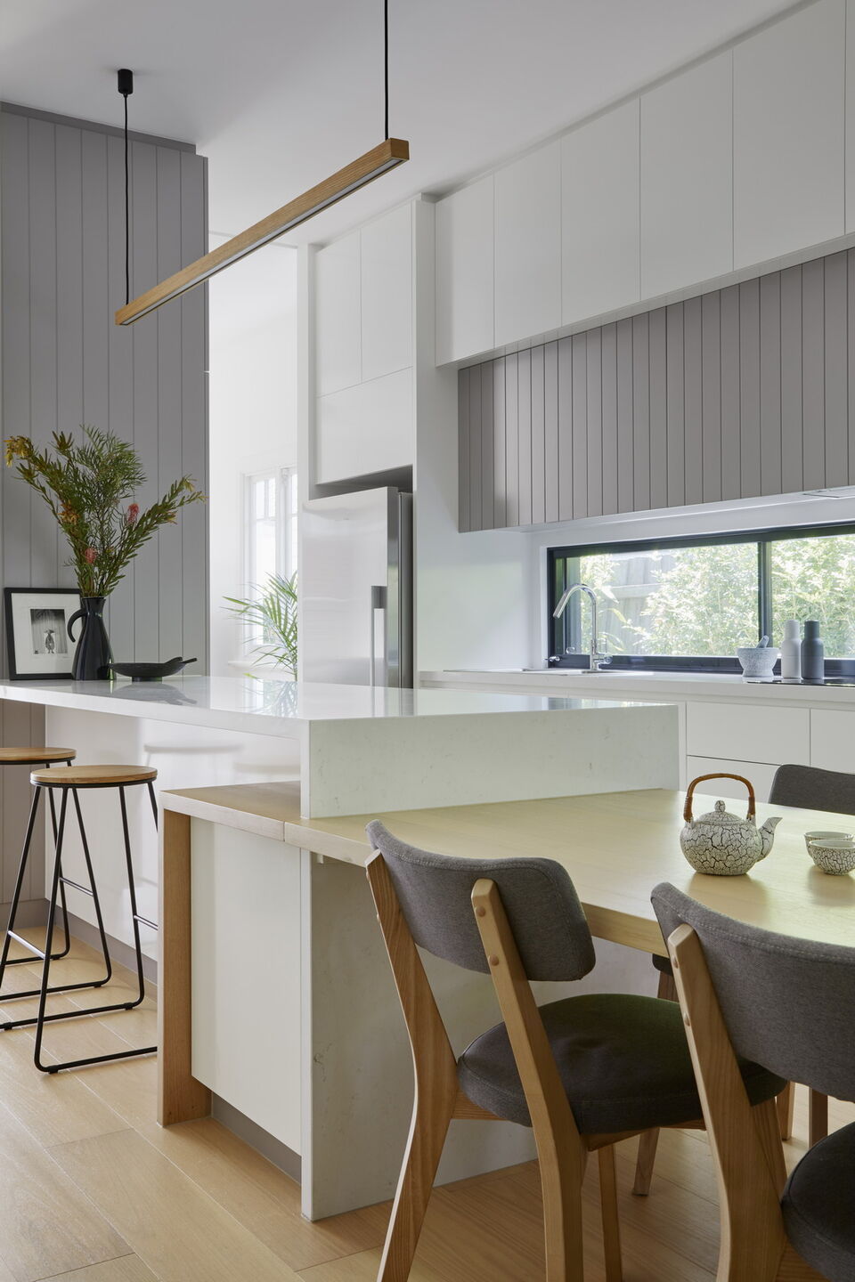
The kitchen is the heart of this small Melbourne home by Kirsten Johnstone Architecture – and clever design details help make the most of the space – utilizing some of the best small kitchen ideas.
"It’s quite a small house and the small kitchen is interconnected to all spaces," says Kirsten. "The dining ‘table’ is an extension of the kitchen island bench, and a wall of built-in cupboards with two depths maximizes storage." The backsplash is formed from a horizontal window that lets plenty of natural light into the small space.
26. Use eco-friendly materials

Sustainable living should be one of the most important considerations when it comes to any building project these days – and there are plenty of suppliers creating quality, on-trend finishes that are also kind to the environment.
"There are many materials and products that aid in sustainability and can be used in kitchens," says Jane Lockhart, founder of Jane Lockhart Design. "Materials such as porcelain countertops and flooring are highly durable, so chips or damage are an extremely low probability, meaning less chance of removal and longer lasting products. Wood cabinets and flooring can be made with sustainably sourced wood and can be purchased from local suppliers (as close as possible to the location of production) to reduce travel impact on the environment. And, many cabinets today are made with low VOC glues, so they don’t contribute to air pollution."
27. Use statement materials for a backsplash
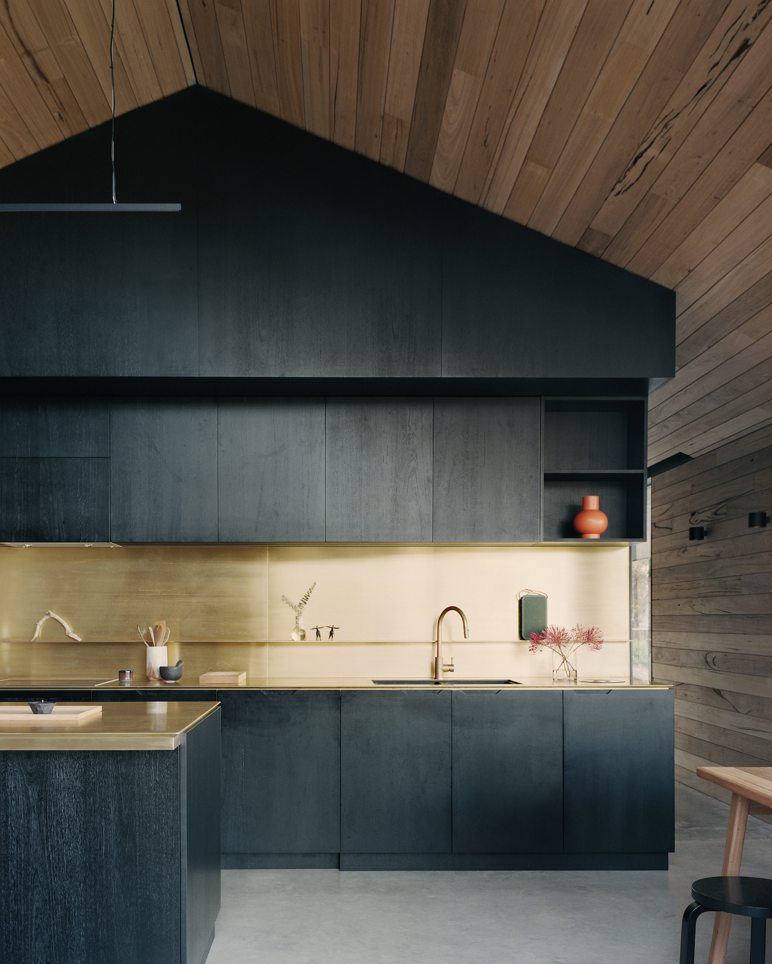
Beautiful brass details stand out against a stark backdrop of black joinery in the rustic kitchen of this home in rural Victoria, Australia.
"Brass was chosen for the bench and splash-back as it will patina over time, telling a subtle story of human habitation and also linking the home back to the era of cabins and sheds, which was important in its design," says architect Ben Shields. "Along the southern wall, there is an almost invisible bank of seamless joinery that hides pantry, fridges, and storage, as well as an entry nook with drawers for clients to throw mobile phones, helping to disconnect after arrival from the city."
What is a modern kitchen style?
In today's new homes and apartments, a modern kitchen usually refers to an open-concept place that features long countertops, wall lights, and cleverly designed storage solutions that help reduce clutter in the room. Usually, these spaces are painted in muted tones, and have porcelain or ceramic countertops.
"Open-concept kitchens create an inviting atmosphere by offering a seamless transition between the main living spaces," says Angela Hamwey of Mackenzie & Co. "Having a large open space allows for casual meals and conversations and makes entertaining effortless."
What is the most popular modern kitchen style now?
Even in modern kitchens, flat gloss slab doors aren't necessarily the most popular finishes. Shaker cabinetry, given a contemporary makeover with more slimline frames, deliver the most popular look with a cutting edge twist.
"Currently gold is a popular color for hardware as it adds warmth to gray and navy blue — two popular kitchen colors," says Jane Lockhart, founder of Jane Lockhart Design. "Gold also stands out against black cabinetry, so it becomes a feature."

Aditi Sharma Maheshwari started her career at The Address (The Times of India), a tabloid on interiors and art. She wrote profiles of Indian artists, designers, and architects, and covered inspiring houses and commercial properties. After four years, she moved to ELLE DECOR as a senior features writer, where she contributed to the magazine and website, and also worked alongside the events team on India Design ID — the brand’s 10-day, annual design show. She wrote across topics: from designer interviews, and house tours, to new product launches, shopping pages, and reviews. After three years, she was hired as the senior editor at Houzz. The website content focused on practical advice on decorating the home and making design feel more approachable. She created fresh series on budget buys, design hacks, and DIYs, all backed with expert advice. Equipped with sizable knowledge of the industry and with a good network, she moved to Architectural Digest (Conde Nast) as the digital editor. The publication's focus was on high-end design, and her content highlighted A-listers, starchitects, and high-concept products, all customized for an audience that loves and invests in luxury. After a two-year stint, she moved to the UK and was hired at Livingetc as a design editor. She now freelances for a variety of interiors publications.