

It seems like 2025 will be the year of purple. Glidden just announced their color of the year, and the plum purple shade is proving to be not only on trend but versatile, too. I've never been one to welcome purple into my style with open arms, but the more this moody shade pops up on my radar, the more I am inclined to introduce purple into my design repertoire.
With paint brands' predicted color trends spanning chocolatey shades of brown, deep purples, and muted terracottas, it's safe to say that the influence of the 70s is alive and well. What I love about darker colors coming back into interiors, is that they give you room to experiment with interesting visual moments and focal points.
Purple might not be the first color you think of when going for a design refresh, but as the shade gains popularity, it may surprise you how stylishly it blends into a well-curated home. If you're looking for accessible ways to use it, our editor says it's the perfect pairing for neutrals.

Price: $5.95
Quantity: Peel and Stick Swatch
Livingetc's Editor, Hugh Metcalf, says he's not surprised at purple's prominence but he envisions it being used in more accessible applications. "We're seeing 70s color palettes come through in a vast abundance, but I forecasted this color last year coming though outside of this context, too, as something more in neutral schemes," says Hugh.
That said, purple is a notoriously harder hue to decorate with effectively, but here lately, plum shades have been popping up to add a soft, chic moodiness to the otherwise youthful color. Hugh admits that "purple is never a color that I have considered sophisticated before, but I am really coming around to the idea of this as an accent in an elegant, neutral home."

Many of the paint ideas we opt for when choosing a bold pop are heavy visually, but a plum purple, like Glidden's Purple Basil, has more blue undertones that give it a more berry-like tone. This nod to nature is what makes the color feel serene and a calming "alternative to the richer tones we usually see used alongside neutrals, like ochre and burgundy," says Hugh.
If you don't have a paint project on your to-do list, accent chairs and playful wallpaper or fabric patterns are other creative ways to welcome purple into your decor. "I am imagining an all-beige living room with an unexpected purple armchair that is surprisingly rich and grounding," Hugh adds.
Here are a few Purple Basil-inspired home goods to help you get the look.

Price: $249.99
Color: Purple Velvet

Price: $28
Color: Purple

Price: $29.99
Color: Plum

-
 Jeremiah Brent Captures the Grit and Glamour of NYC in His New Loloi Collaboration
The TV-famous interior designer looked out of his own window — and hit the pavement — for a collection that turns city spirit into tactile design
-
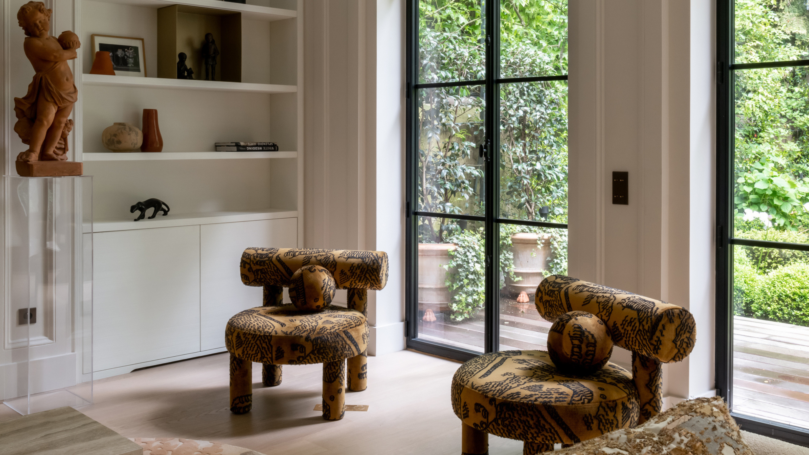 This Specific Fabric Print Is Literally Everywhere Right Now — Here's Why
It's whimsical, artistic, and full of character. We've called it already: Dedar's 'Tiger Mountain' is the fabric that will define 2025

