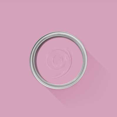
12 new Farrow & Ball paint colors that launch today – including an off-white we predict everyone's going to use
The new collaboration with fashion designer Christopher John Rogers is full of exuberant, cheerful colors – but we've got our eye on one new neutral in the bunch in particular
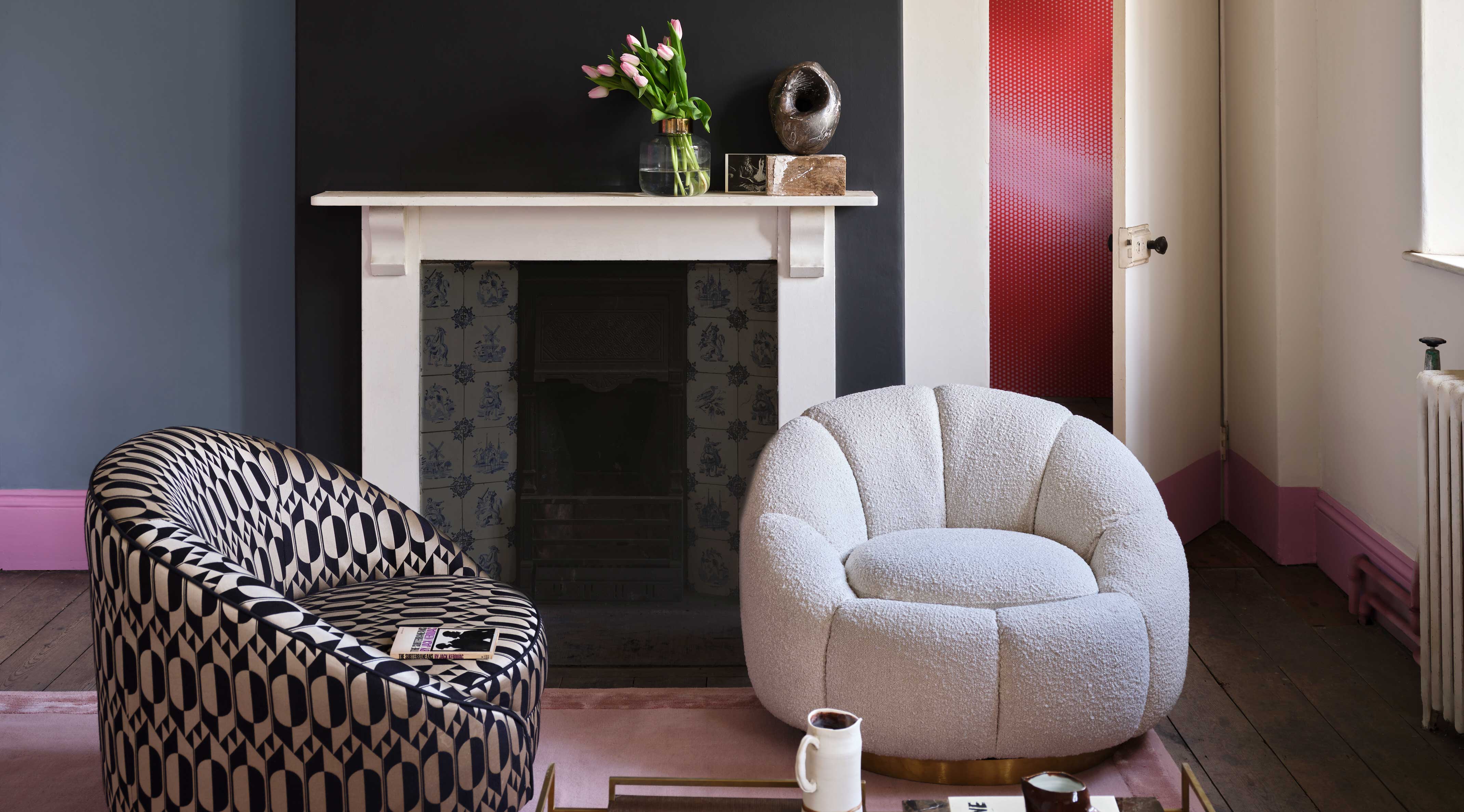
New Farrow & Ball colors are always a cause for celebration. These paint shades tend to be tastemakers for our homes, whether you end up buying them from Farrow & Ball or not. Some of the biggest color trends in recent years have had a Farrow & Ball shade attached from them, be in when everyone was painting 'Downpipe' walls, or we all starting choosing 'Hague Blue'-inspired shades.
These new launches, a partnership between premium paint and wallpaper maker Farrow & Ball and celebrated fashion designer Christopher John Rogers, is a match made in heaven. Andor the first time in a Farrow & Ball collab, this capsule collection also includes three new wallpaper patterns, each available in the collection’s colorways.
The collection, named Carte Blanche, brings together a wonderful balance of heritage and modernity. Combining classic inspiration and the traditional techniques Farrow & Ball has perfected over 75 years with an unexpected twist and the personal touch of Rogers creates an exciting result that is sure to stay just as inspiring and relevant in years to come, as it is now.
We promise it will spark more new paint ideas than you'll know what to do with. Exploring the space between pragmatism and glamour, Rogers’ designs emphasize quality, timelessness, and declaring your sense of self. The bar is raised high for this partnership, but I'm pretty sure you won’t be disappointed.
Carte Blanche, a collection full of joy
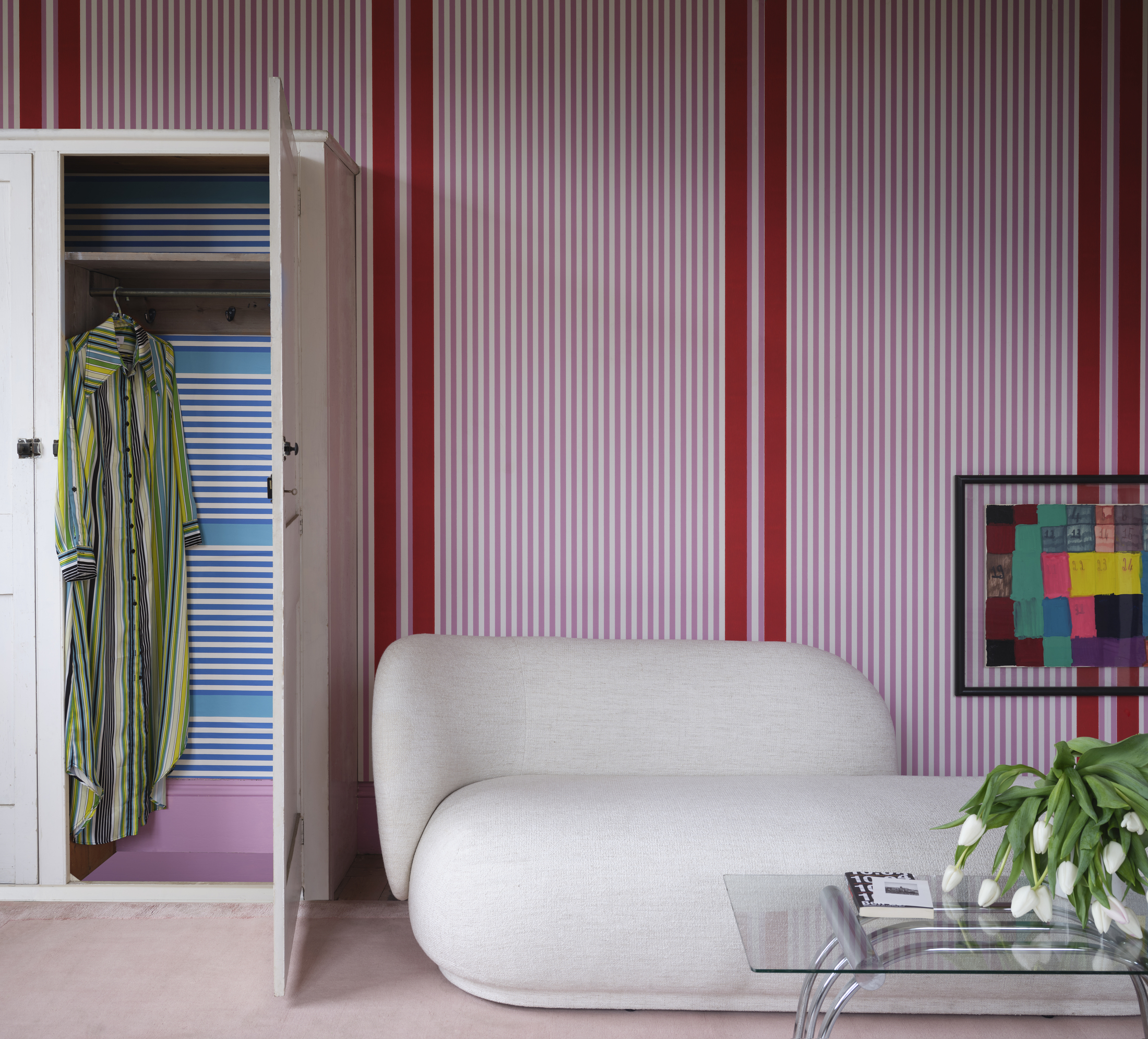
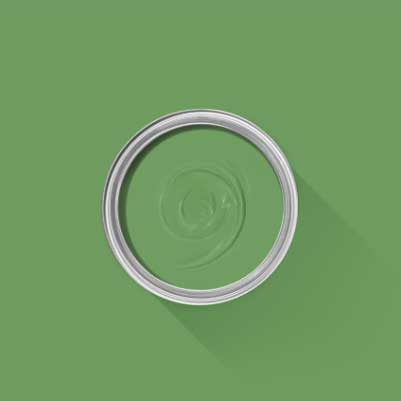
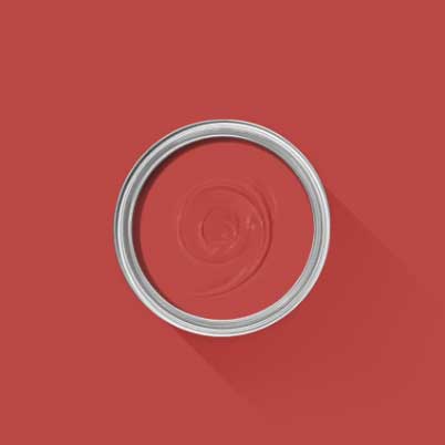
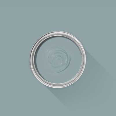
Through Carte Blanche, Farrow & Ball brings Rogers’ distinctive flair and unmistakable joy to the world of interiors. The collection comprises four neutrals, eight statement shades, and three playful wallpaper prints, aiming to put an emphasis on expressive, individual style. With such beautiful and vibrant paints in line with the latest color trends and papers to choose from, giving your home a refresh will feel like kid’s play.
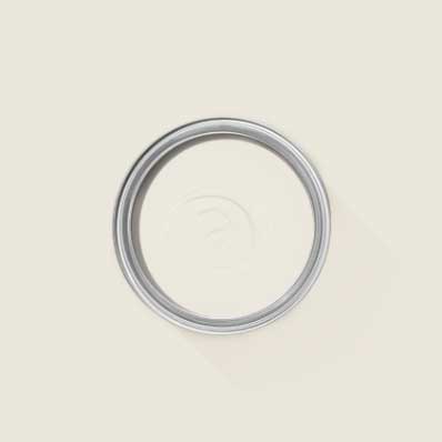
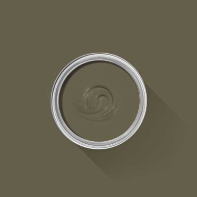
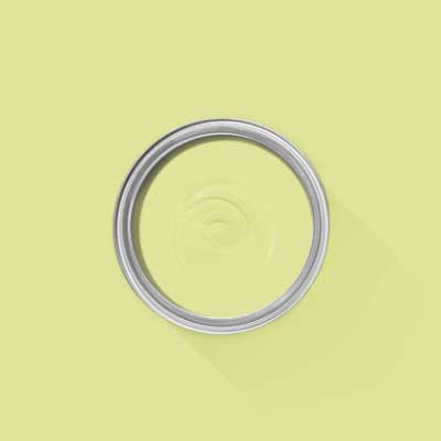
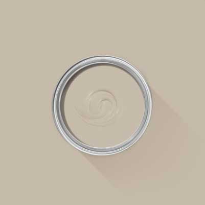
You’ll have plenty of options to choose from. Inspired by cherished memories of food and family, the colors range from vivid blue and verdant green to cheerful pinks and structural neutrals. It's one of the latter that's particularly caught our eye. New colorways 'Au Lait' is the warm minimalist off-white we've been dreaming of, while 'Roasted Macadamia' is the perfect taupe to use alongside it.
The wallpaper ideas consist of patterns centered around playing with shapes and are all available in the Carte Blanche colorways, which makes it easy to mix and match without fear of getting it wrong. Far from being restrictive, the possibilities for creativity are endless.
Be The First To Know
The Livingetc newsletters are your inside source for what’s shaping interiors now - and what’s next. Discover trend forecasts, smart style ideas, and curated shopping inspiration that brings design to life. Subscribe today and stay ahead of the curve.
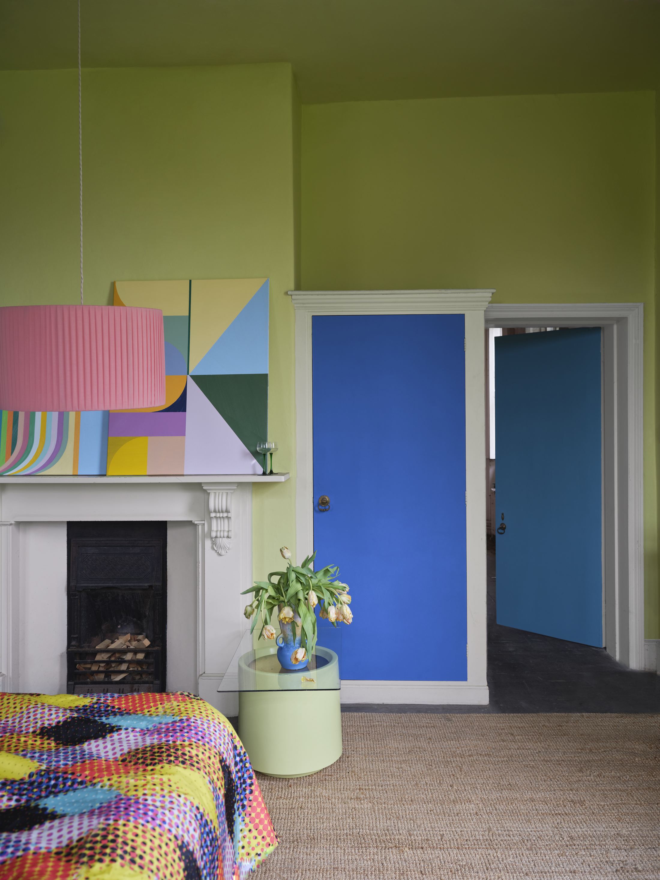
Charlotte Cosby, Creative Director for Farrow & Ball, tells us how this partnership came about: ‘I’m obsessed with Christopher’s use of color; he treats it so tenderly and the result can be a beautifully tempered explosion or a slick confident splash. It’s been incredible to work with Christopher because craft and attention to detail are intrinsic to both of our processes, so I always knew this collaboration was going to be something special,’ she explains. ‘Carte Blanche is all about finding the freedom to create a personal look and enjoying the process,’ adds Charlotte.
For Christopher John Rogers too the collaboration felt like a natural fit: ‘Colors, and the feelings that I get from them, are always my starting point when working. With Farrow & Ball’s emphasis on quality and longevity, and my emphasis on artful, declarative design, I think this partnership has created something incredibly exciting by mining the space between both feelings. I’m so excited for people to be able to access these paints and papers!’ And so are we! What better way to lift our spirits as we transition into autumn than with a joyful home update?
Raluca formerly worked at Livingetc.com and is now a contributor with a passion for all things interior and living beautifully. Coming from a background writing and styling shoots for fashion magazines such as Marie Claire Raluca’s love for design started at a very young age when her family’s favourite weekend activity was moving the furniture around the house ‘for fun’. Always happiest in creative environments in her spare time she loves designing mindful spaces and doing colour consultations. She finds the best inspiration in art, nature, and the way we live, and thinks that a home should serve our mental and emotional wellbeing as well as our lifestyle.
-
 The Weighted Blanket That Doesn’t Make You Sweat (and the Eye Mask to Match)
Luxury has weight. And apparently, volcanic minerals
By Julia Demer
-
 What Is Biophilic Interior Design? I'm an Actual Biophilic Designer, and This Is How to Apply It to Your Home
A biophilic designer explains the core principles of this practice, and the easy ways you can apply it to your home's design
By Marianna Popejoy
-
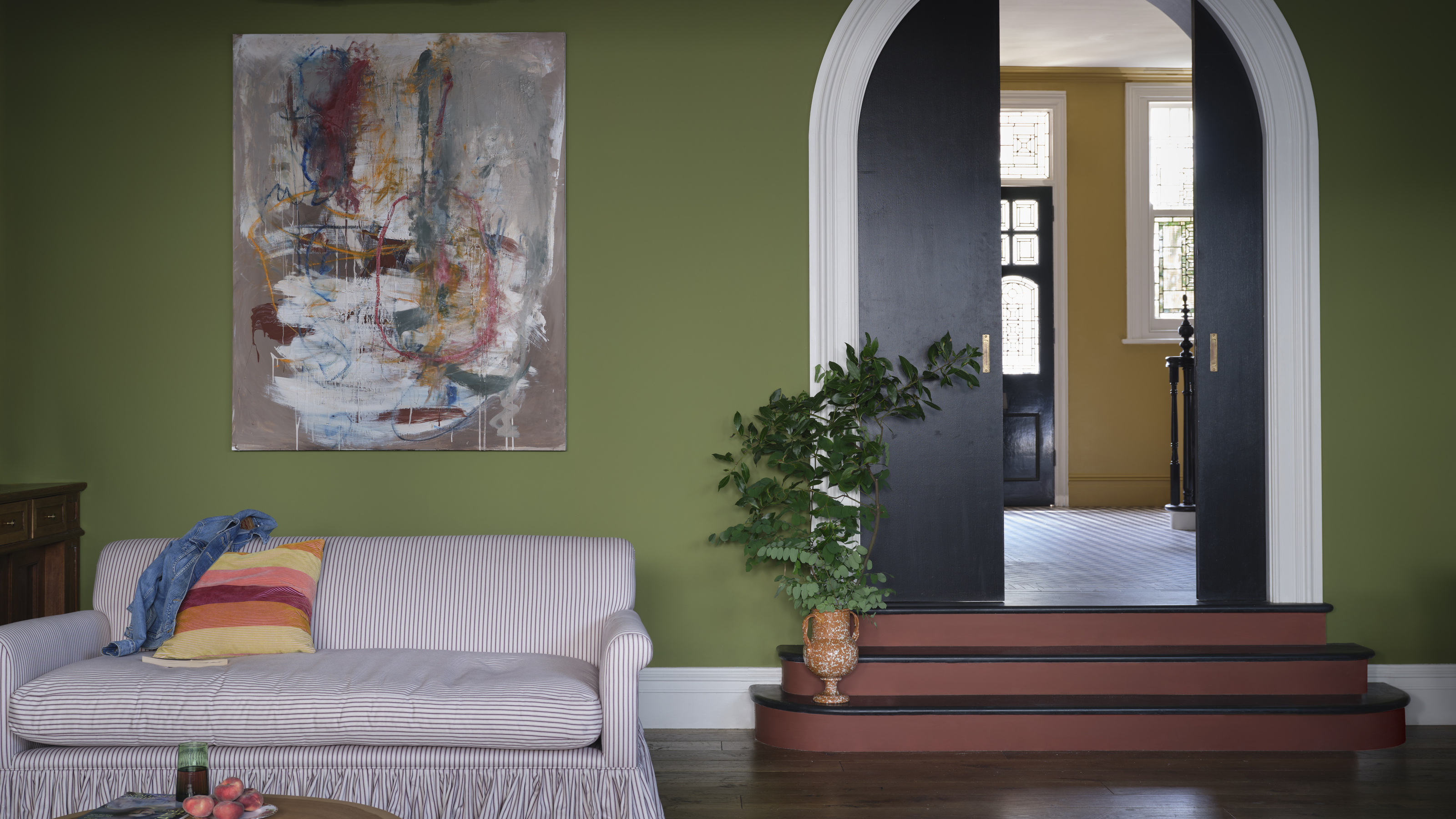 Farrow & Ball Just Brought Back 3 "Archive" Colors — Here's Why They're Important in Design Right Now
The British paint brand has reintroduced some cult classics, and they feel more relevant than ever
By Lilith Hudson
-
 Farrow & Ball has just launched a new paint – and it's going to change how you think about painting your walls
Perfect for rich, color-drenched spaces, Dead Flat is an ultra-matte finish with just a 2% sheen
By Lilith Hudson
-
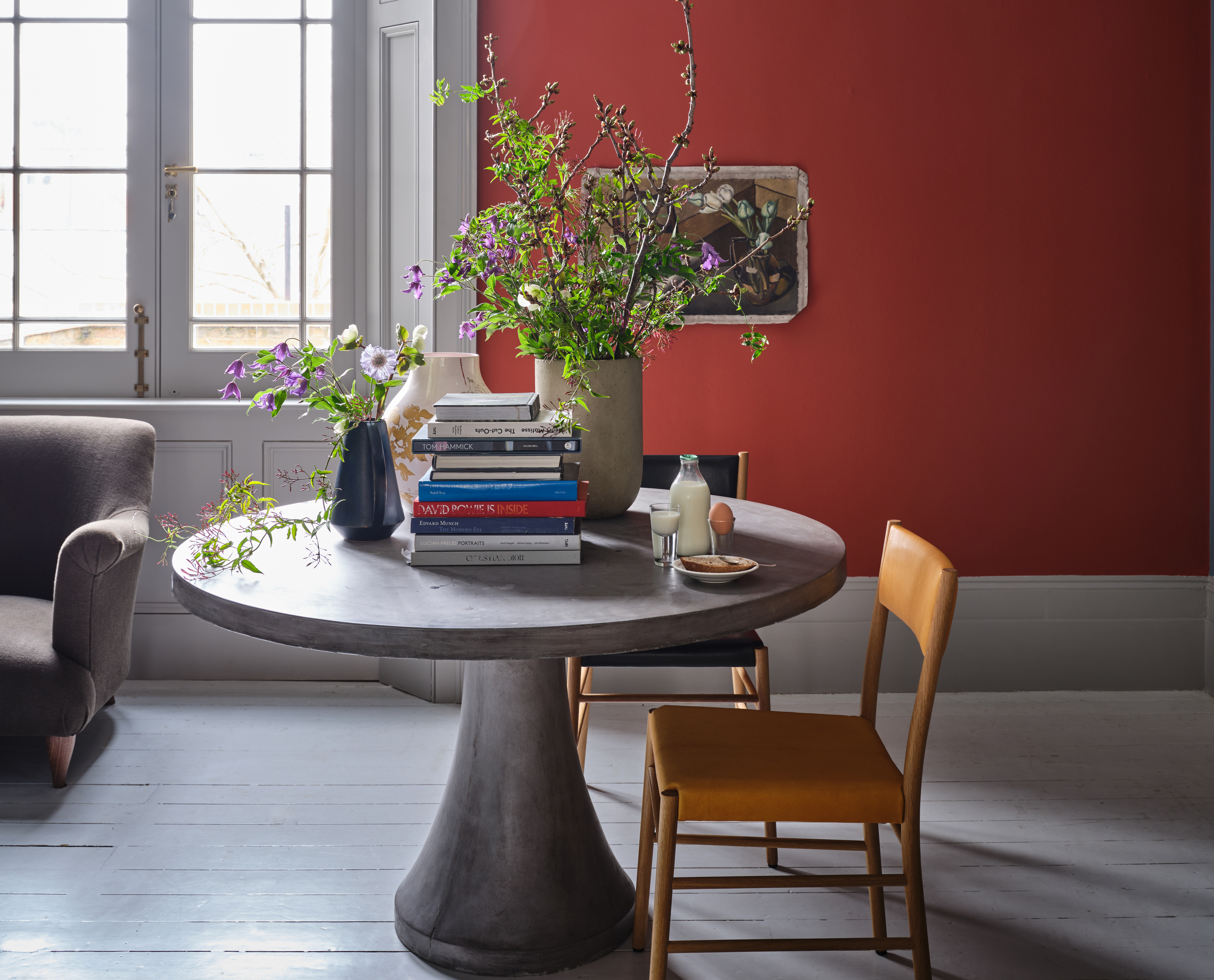 Bold reds are a big new design trend so Farrow & Ball's Joa Studholme explains how to use it
Red tones are trending, but why are they set to dominate designs in 2023? And how should we be using them to decorate?
By Lilith Hudson
-
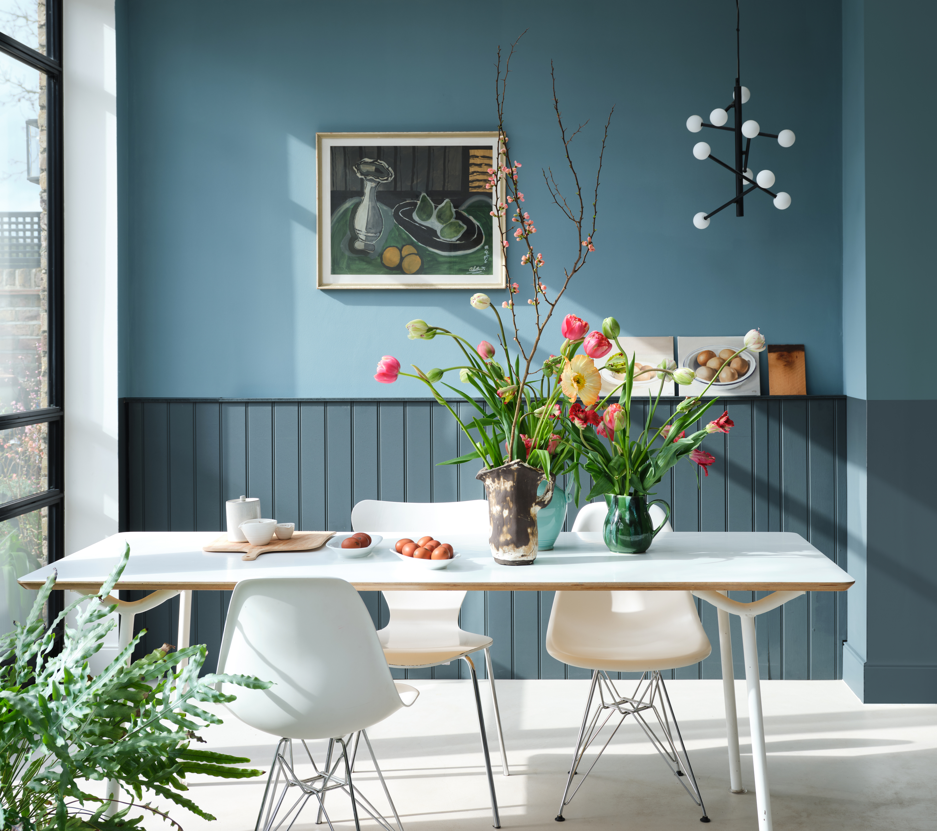 Farrow & Ball's new colors have just launched – we ask designers how to use this calm, yet colorful palette
The new color range from Farrow & Ball captures the mood of 2023 perfectly. These interior experts explain how they plan to use them in their designs
By Lilith Hudson
-
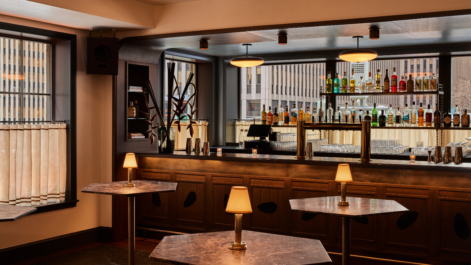 The Farrow & Ball paint in this New York bar will make you look good
Manhattan’s hot new hangout will make you look as good as possible – and you can recreate its aura in your home
By Megan Slack
-
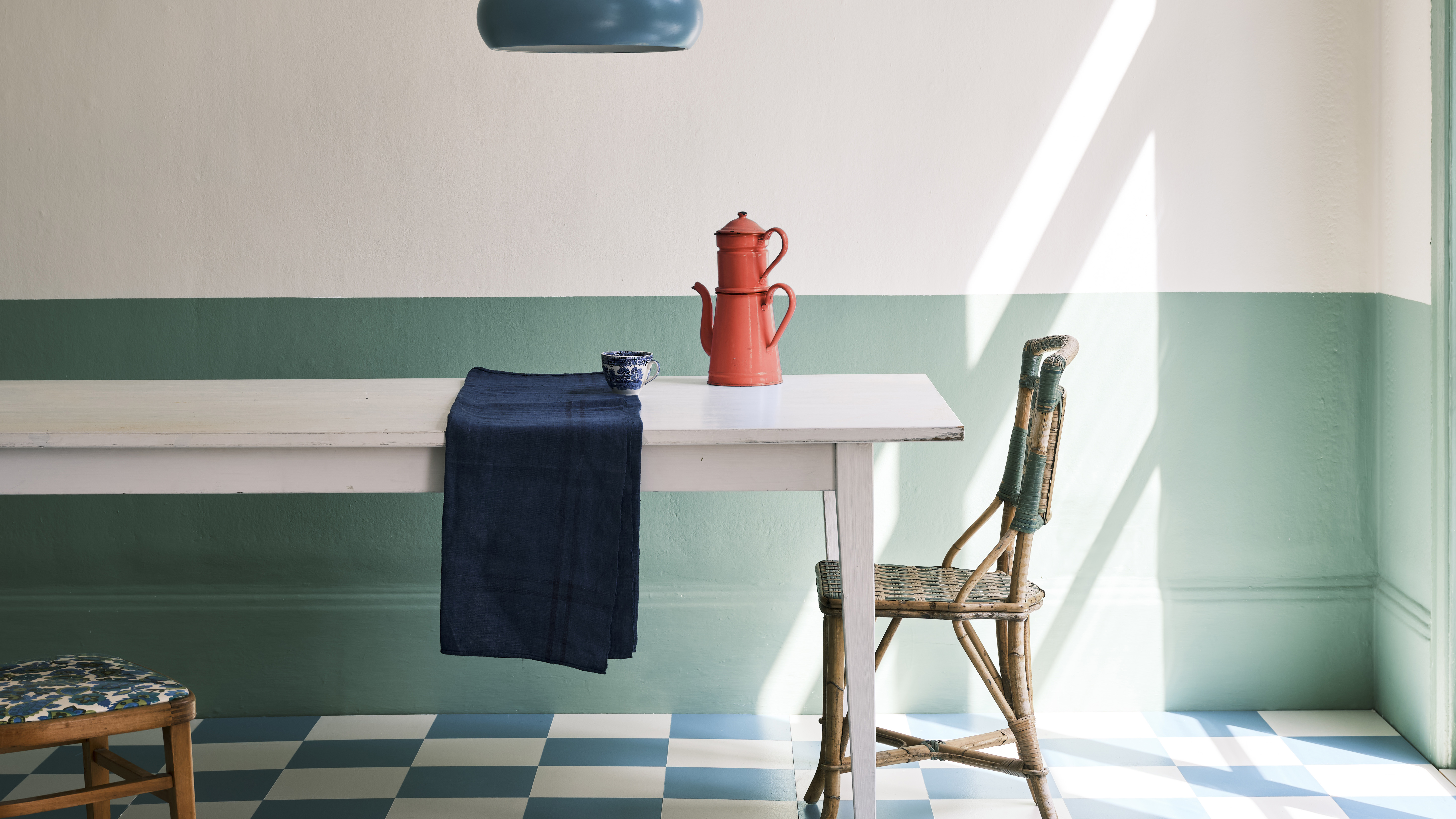 Farrow & Ball has predicted the exact green shade that will be big news in 2022
Their color curator has named the tone that will set trends in the year ahead – this is how to get ahead of the craze
By Megan Slack
-
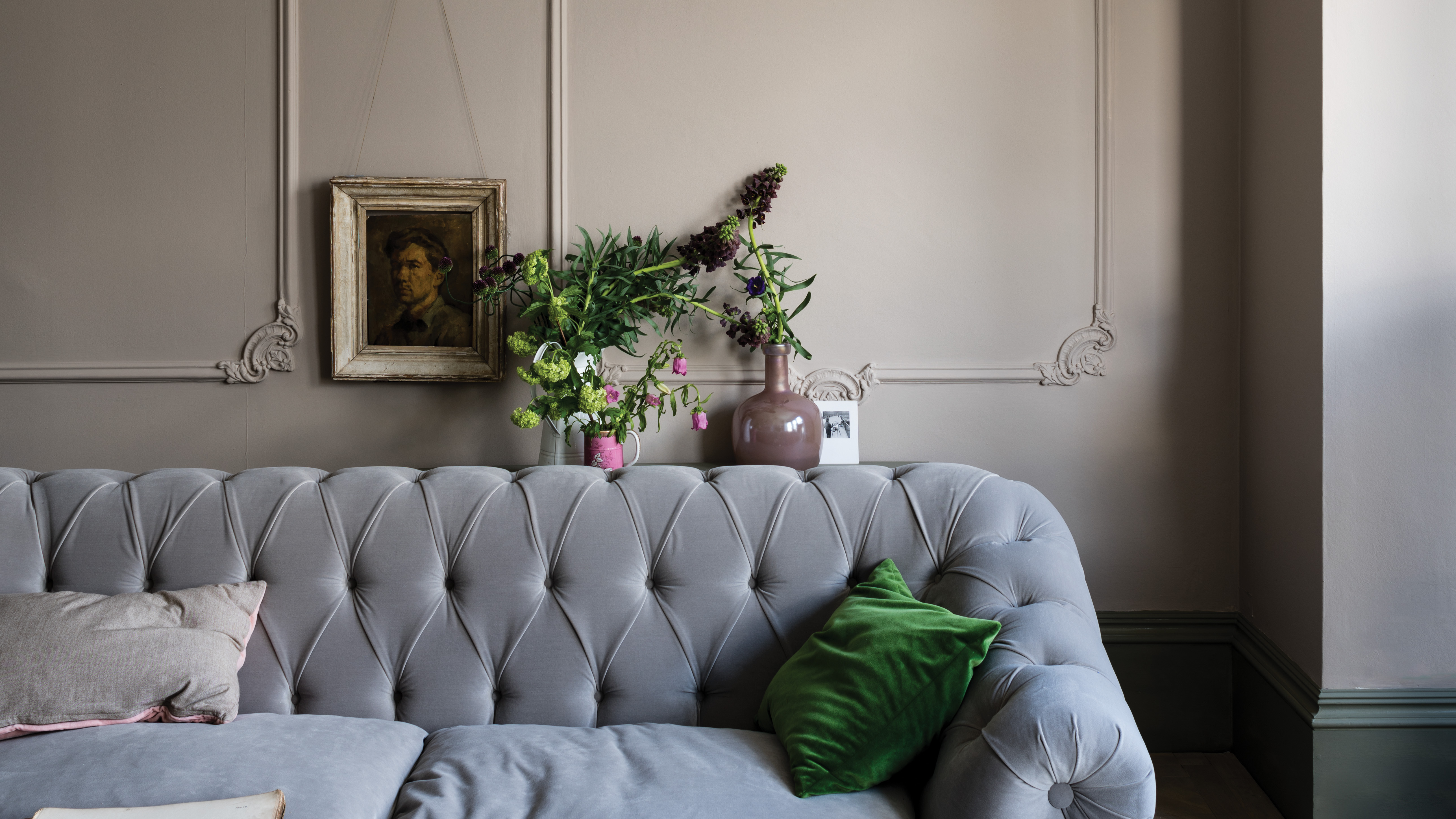 Farrow & Ball's Joa Studholme reveals the new neutral shade that will set the tone for 2021
The color curator urges us to look beyond beloved gray tones and embrace a stylish & subtle new hue
By Megan Slack
