5 Ways Interior Designers Used Color This Year That Have Changed Decorating Rules for Good
Designers have been painting with increasingly bold strokes when it comes to their use of color — these spaces have changed how we're decorating with color from here on out
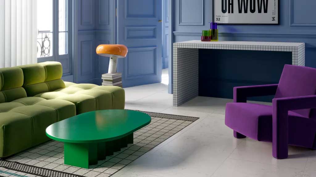
2023 has proven to be a year for experimentation as seen by the plethora of effervescent interiors that have captivated us this year. We’ve seen designers push the boundaries with color and bring together hues that were previously seen as clashing foes, from pastel yellows and soothing blues to energizing purple and refreshing greens.
By bringing together new and innovative recipes for color, designers can create spaces that feel as uplifting as they look elevated. To emulate these eye-catching interiors, remember to strike the balance between contrasting and complementary tones.
This selection of our favorites showcases those interior designers who are brave with their use of color and have proven themselves to be the best in class. They share the secrets behind these richly colored scenes and why they work so well to defy tradition and the new color trends they bring to the table.
1. COMBINING BRIGHT COLOR AND BOLD PATTERN
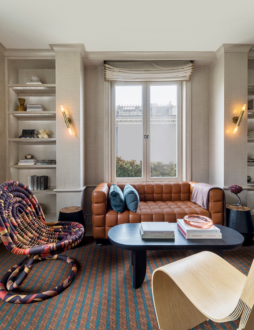
This inviting living room challenges convention in more than one way. With its densely patterned russet and teal carpet, purple and pink covered chair, and cinnamon quilted leather sofa, the breadth of color in this room is wide and might seem like an overwhelming combination at first glance.
Interior designer Heather Hilliard cleverly layers these tones with various textures against a soothing yet elegant backdrop. The blend of expressive patterns also feels more cohesive thanks to the consistency of warmth in all of the colors present.
'I think the unique palette we chose of rusty reds, light blue, purple, and a few yellows and pinks in the sculptural chair, works due to the amount of the color used,' says San Francisco-based interior designer, Heather Hilliard. 'It doesn't overwhelm the space or feel too extreme. The subtle millwork and walls also let the furnishings shine and balance out the room.' The result is a space that feels sophisticated but surprising, it is colorful and crisp, all whilst inspiring you to be braver with your design choices.
2. EXPERIMENTING WITH COLOR-BLOCKING
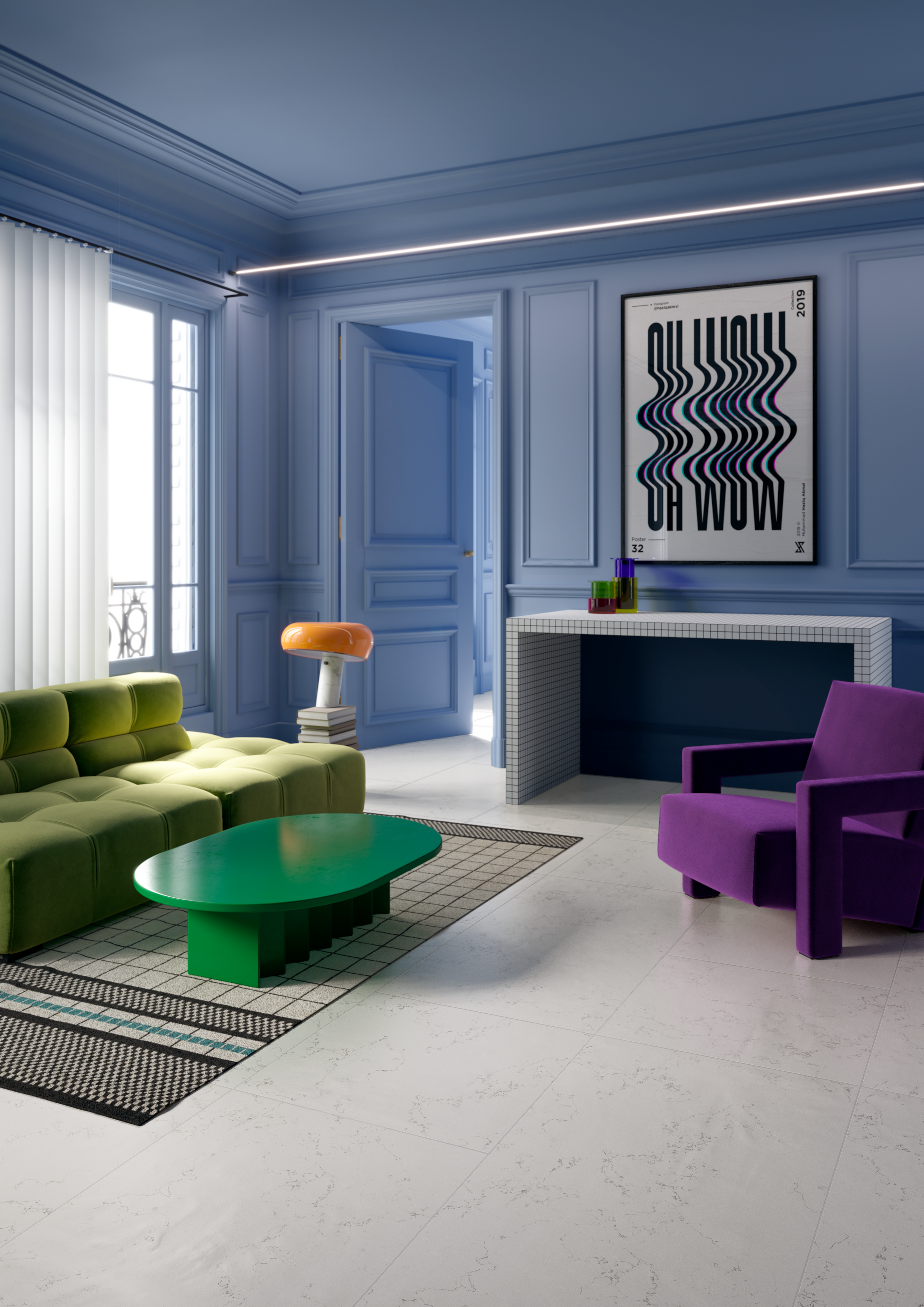
Color theory argues that shades that sit directly opposite one another make for a compelling combination. It’s easy to shy away from using these bright colors together though, some can be overwhelmed by the thought of bringing together vibrant shades like orange and blue or purple and green. Italian interior designers, Notoo Studio have done just that with their project for 41zero42.
Be The First To Know
The Livingetc newsletters are your inside source for what’s shaping interiors now - and what’s next. Discover trend forecasts, smart style ideas, and curated shopping inspiration that brings design to life. Subscribe today and stay ahead of the curve.
'For this project, we relied heavily on the use of color in the world of fashion and catwalks,' says Fabia Picchioni from Notoo Studio. 'Specifically for the living room, we were inspired by the Prada fall 2021 fashion show.' The combination of these punchy colors works just as well in this interior as it does on the runway. By using various tones of green and purple, the interior doesn’t feel too rigid but instead creates a series of light and dark vignettes, giving the room a more layered look.
3. CREATING ENVELOPING ESCAPES

Moroccan design is no stranger to creating a statement and their use of color has inspired designers through the centuries. This contemporary colorful bathroom from Kingston Lafferty Design takes it a step further with its striking use of color. The seafoam green walls and ceiling are complemented by the blue sink area and metallic brass accents around the room. It’s the perfect escape but still feels incredibly clean, modern, and minimal.
'The brief for this project was to be bold, bright, and colorful,' says interior designer Róisín Lafferty of Kingston Lafferty Design. 'This bathroom taking influence from the client's travels and love of color uses rich tones of mortex textured green walls and vibrant blue concrete sink and vanity to really maximize the and play on the color tones in the patterned floor tiles which have small areas of blue and green against the neutral background. It is a vivacious space full of energy and life that comes from the vibrancy and combination of not just the color but the textures and movement they bring.'
4. PUTTING COLORFUL ACCENTS CENTERSTAGE
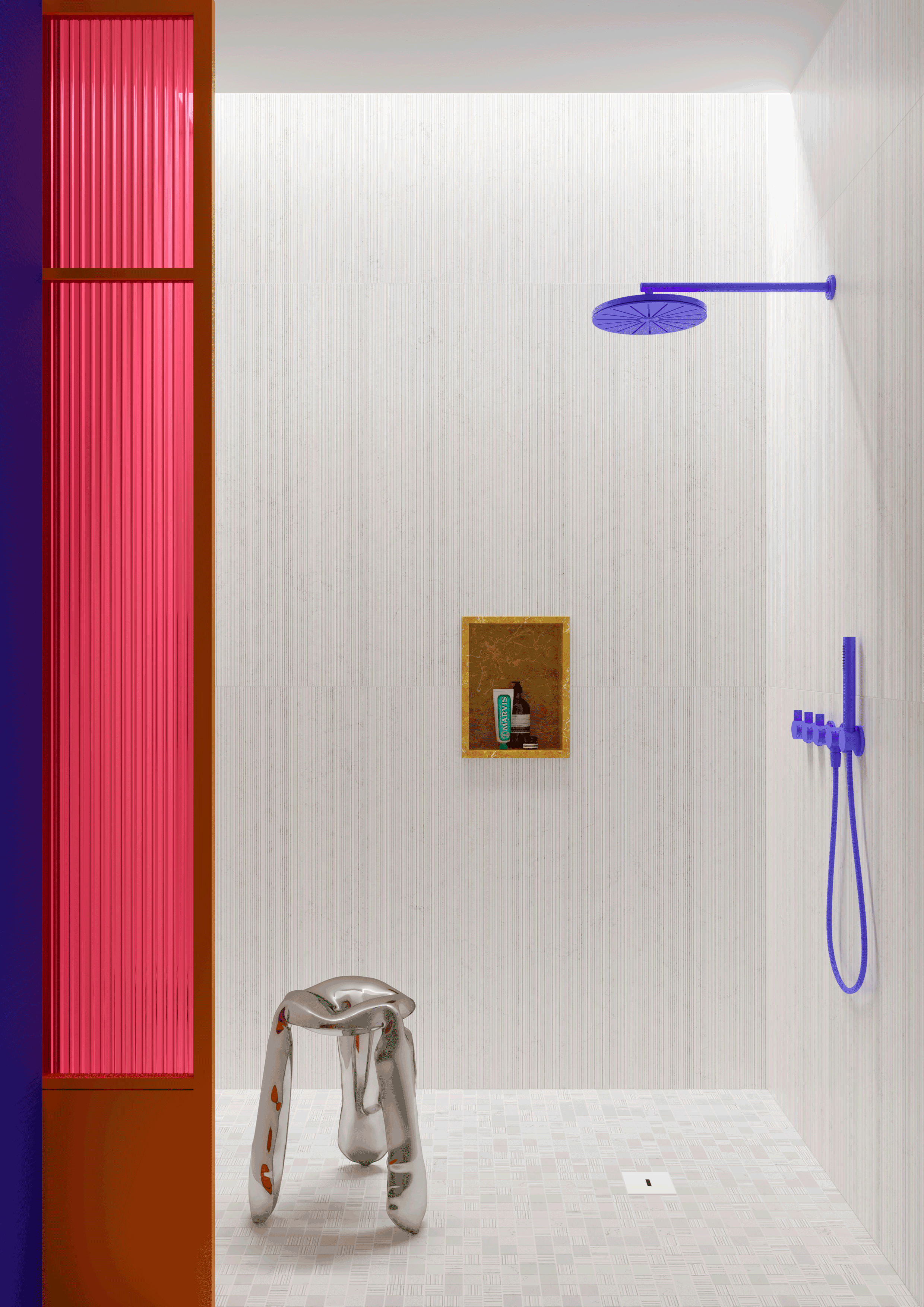
Small but mighty, this shower room design shows that color can be used in minimal proportions for maximum effect. The neon-like purple, pink, and yellow fixtures and moldings offer an easy route to a shower that sets itself apart from the conventional.
Designed by the Modena-based Notoo Studio, this space takes its inspiration from the expressive colors seen on the mood boards and runways of fashion designers. 'For the shower, we were inspired in general by the concept of color blocking, which has been seen in fashion shows in recent years,' shares Fabia Picchioni from Notoo Studio. 'The contrasting white marble tiles, so soft and delicate in both images, create a perfect contrast with the color and give a sophisticated air to the environment as if we were in a high fashion boutique.' For those looking to dip their toes into color, this project shows you the perfect place to start.
5. BLENDING FAMILIAR TONES WITH UNEXPECTED ONES
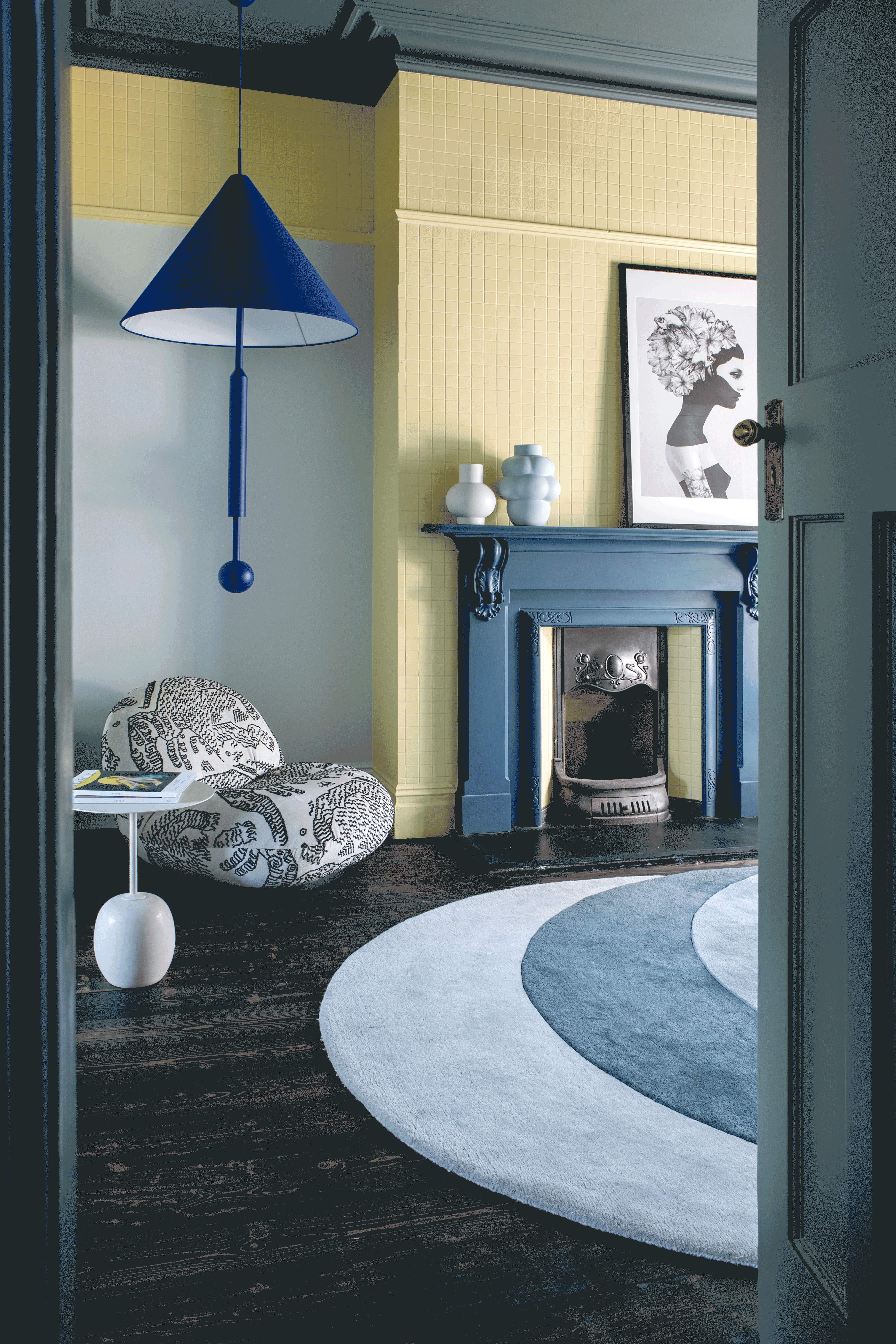
Sweet and zesty lemon finds comfort in the tried and tested arms of grey and steel blue. Kingston Lafferty Design’s recipe for success when it comes to experimenting with color can be summed up in a few short words: look at the bigger picture. By considering how the scheme works, this room takes canary yellow, a shade that would scare many, and makes it into a powerful ingredient in a welcoming and wonderous interior.
'For this family living room, we wanted to be playful and use almost clashing tones of different colors layered up with different textures,' reveals Róisín Lafferty, founder of Kingston Lafferty Design. 'The cobalt blue feature pendant is set against a soft pastel blue wall and sits beside a mid-blue fireplace. These blues sit in contrast to the sherbet lemon tiled fireplace creating a visual interest in both the color combination and the grid format of the tiles, these finishes are harmoniously pulled together under the rich blue-grey tone of the painted ceiling.'
Writer and design expert Faaizah Shah is the founder of The Interiors Consultancy. She has worked with designers such as Staffan Tollgard and design houses such as Sanderson to help them understand and communicate their narratives. She is known for crafting engaging stories and imaginative content, and understanding great decor from her years alongside some of the best creatives in the industry. She is also a contributor to Livingetc.
-
 This Outdoor Lounger Is the Color of the Season for Garden Furniture — And It's on Sale This Weekend
This year, it's all about the contrast, and this bright, sunny hue is the perfect foil to your green outdoor spaces
By Hugh Metcalf
-
 Kelly Wearstler Designed an Animal Hospital Where "Anxiety Just Melts Away", and I'm Taking Notes for My Own Home
The renowned designer's foray into healthcare demonstrates have even the most functional of spaces can still be design-forward
By Devin Toolen