'It's the new accent wall, but better' – the next big trend that will make your rooms so much more interesting
The accent wall was a great way to make an impact with interiors, but the trend for 'accent reveals' works so much better, say designers

The accent wall is dead, long live the accent wall. However you feel about the 'feature wall', it's fair to say it's fallen out of favor in recent years. Yet, there's a reason why the accent wall was so popular once upon a time.
It's a way to 'disrupt' your room's color scheme, and introduce something a little bit different. It creates a point of interest, directing the eye where you want it to go. And while today's interior schemes are a lot more interested in drenching the walls and ceiling in the same color, the idea of the accent still holds court with interior designers.
However, instead of the accent wall, designers have turned to another area to introduce something of a statement - the reveal. Whether it's doors or windows, these small insets in your home's architecture is the perfect way to introduce a feature color or pattern (or both), and we're seeing some of the world's best designers play with this feature.
Here are a few of our favorite 'reveal' ideas - and we think it might just be the next big interior design trend.
'I love the idea that this is the evolution of the accent wall,' says Sophie Donelson, a design expert and author of Uncommon Kitchens, 'but they're more effective. For me, an accent wall doesn't go far enough to transform a room. It draws your eye directly there. Using accents throughout allows your gaze to dance around the room and inhale the nuance as a full experience, not just a one-hit whomp of color.'
1. Introduce an accent color
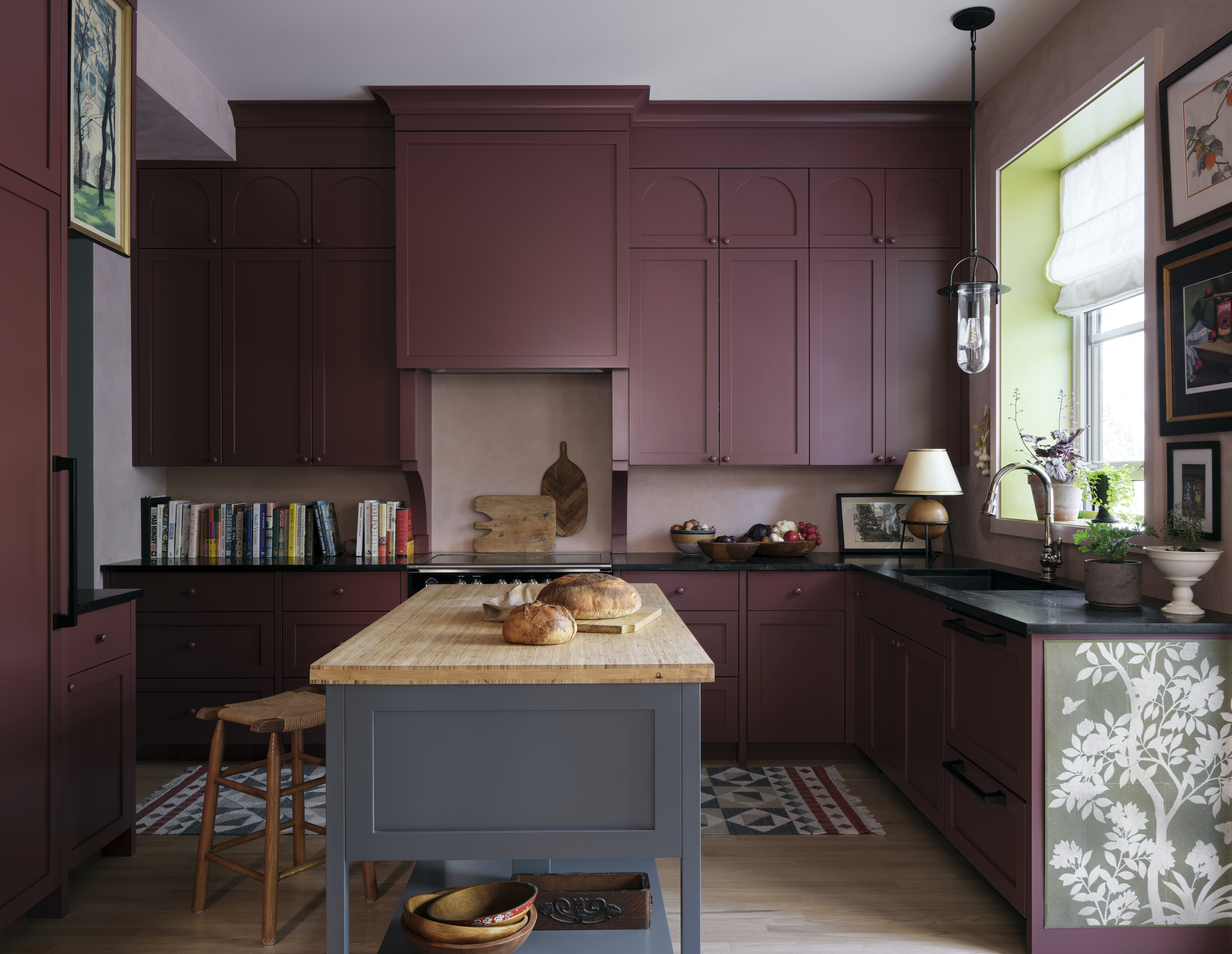
The classic accent wall was a way to introduce a bold contrast into an interior design scheme through color, but the 'accent reveal' offers a way to do it in a less overbearing way.
For Sophie Donelson, it was the answer for her own kitchen color ideas to bring some life to the scheme. 'The color palette of this room — with oxblood cabinets on one side, warm oak floors and rose-colored Venetian plaster throughout — is warm and sophisticated but a tad cloying and a little "safe" for my taste,' she says. 'It needed more verve!'
Be The First To Know
The Livingetc newsletters are your inside source for what’s shaping interiors now - and what’s next. Discover trend forecasts, smart style ideas, and curated shopping inspiration that brings design to life. Subscribe today and stay ahead of the curve.
This electric shot of green is the perfect antidote to make this kitchen feel more modern. 'Using a hit of acid green or yellow in a room is like citrus zest in a recipe,' Sophie says. 'It wakes the whole thing up. And like zest, you don't necessarily taste it specifically, but you feel the brightness the second you walk in.'
2. Create a patterned feature
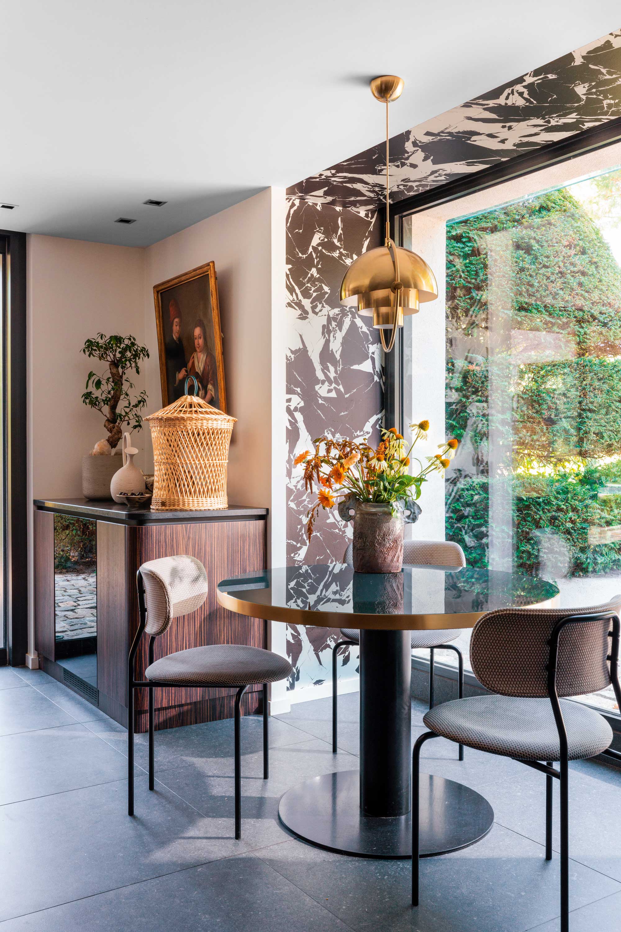
Of course, you can't talk accent walls without mentioning wallpaper, and as a way to introduce interest to a scheme, its a wall covering that works just as well for a reveal, as this project by French interior designer Claude Cartier goes to prove.
Framing the view out to the grounds of this beautiful villa in Irigny, eastern France, a bold monochromatic wallpaper - it's called Grand Antique by Mathias Kiss for anyone who wants to know - introduces the idea of the accent wall in a way that feels more self-contained than a single wall plastered in the same design.
3. Use it to zone an area
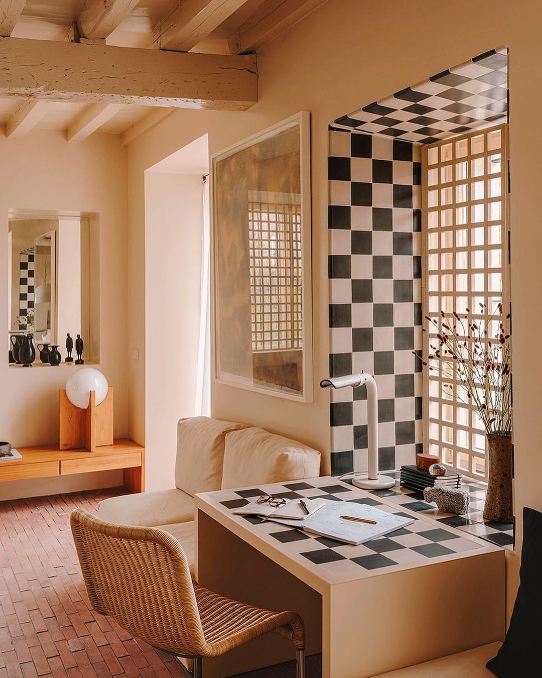
As well as a purely decorative element, an accent reveal can be used to help zone anything set against it, much in the same way the feature wall did.
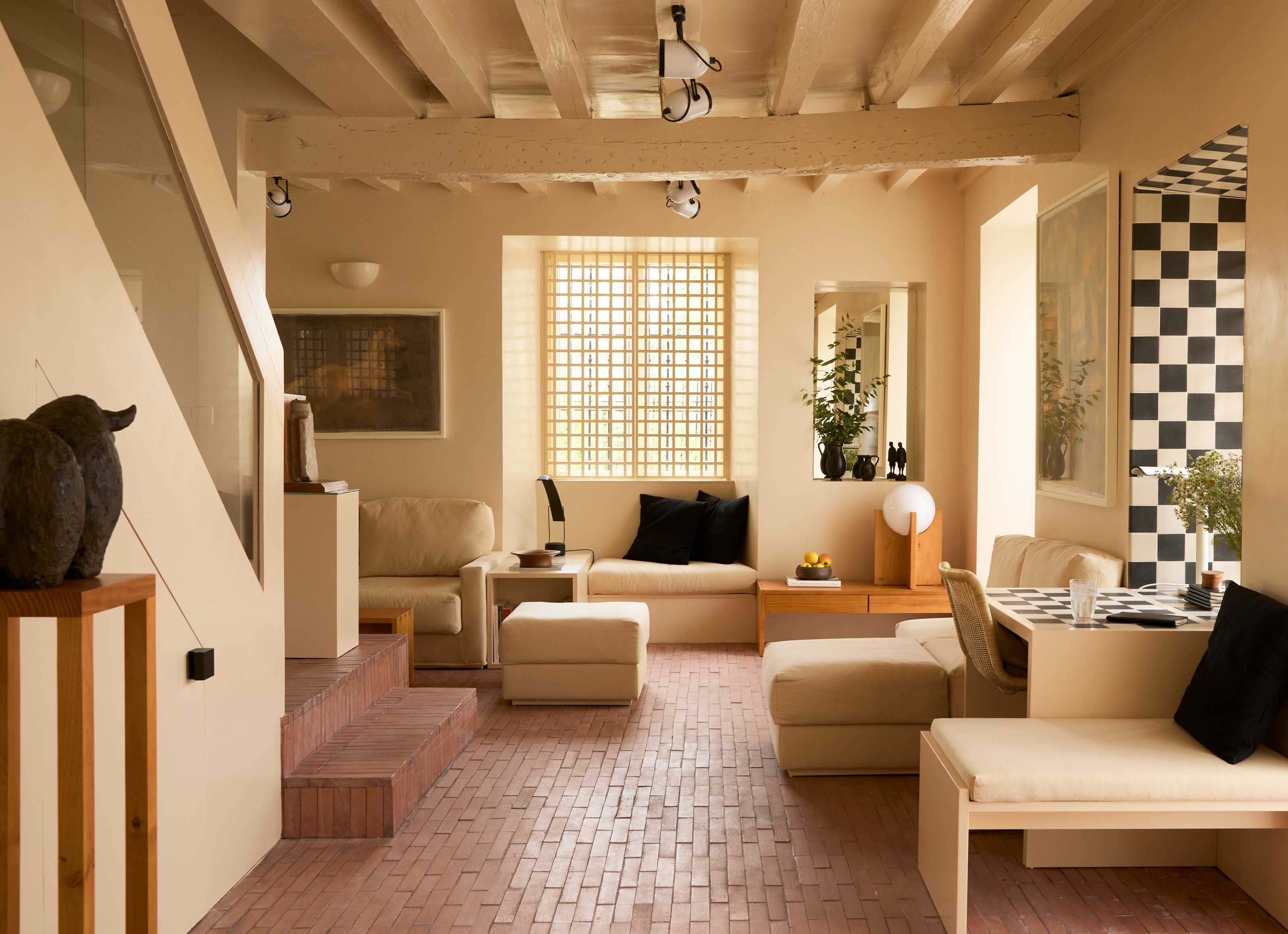
In the case of this Spanish home, designed by and for the founders of interior design studio Casa Josephine, a painted checkerboard in the window reveal extends out onto a desk tucked underneath the window - the perfect spot for a small home office that makes the best of the home's natural light.
'As the space is limited here, we took advantage of the fact that the walls are very thick to carved niches, shelves and even seats into the walls,' explains Pablo López Navarro, co-founder of Casa Josephine. 'In this case, we built a window in such a way that the window ledge merges on and continues on to the surface of a table. The ledge is made of off-white and dark-grey tiles (cement tiles), and we designed a table with the same table top, with the same height as the window ledge, multiplying the usable surface of the table.'

Luke Arthur Wells is a freelance design writer, award-winning interiors blogger and stylist, known for neutral, textural spaces with a luxury twist. He's worked with some of the UK's top design brands, counting the likes of Tom Dixon Studio as regular collaborators and his work has been featured in print and online in publications ranging from Domino Magazine to The Sunday Times. He's a hands-on type of interiors expert too, contributing practical renovation advice and DIY tutorials to a number of magazines, as well as to his own readers and followers via his blog and social media. He might currently be renovating a small Victorian house in England, but he dreams of light, spacious, neutral homes on the West Coast.
-
 My 10 Favorite Designs at Milan Design Week 2025 — Out of the Hundreds of Pieces I Saw
There is a new elegance, color, and shape being shown in Milan this week, and these are the pieces that caught my eye
By Pip Rich
-
 Iridescence Is Chrome’s More Playful, Hard-to-Define Cousin — And You're About to See It Everywhere
This kinetic finish signals a broader shift toward surfaces that move, shimmer, and surprise. Here's where to find it now
By Julia Demer
-
 IKEA Reveals Its 2025 Color of the Year — An Electric Blue Hue, That Is Enticingly Bold and Brilliant
Though unexpected, this shade of blue may be my favorite color of the year prediction yet
By Olivia Wolfe
-
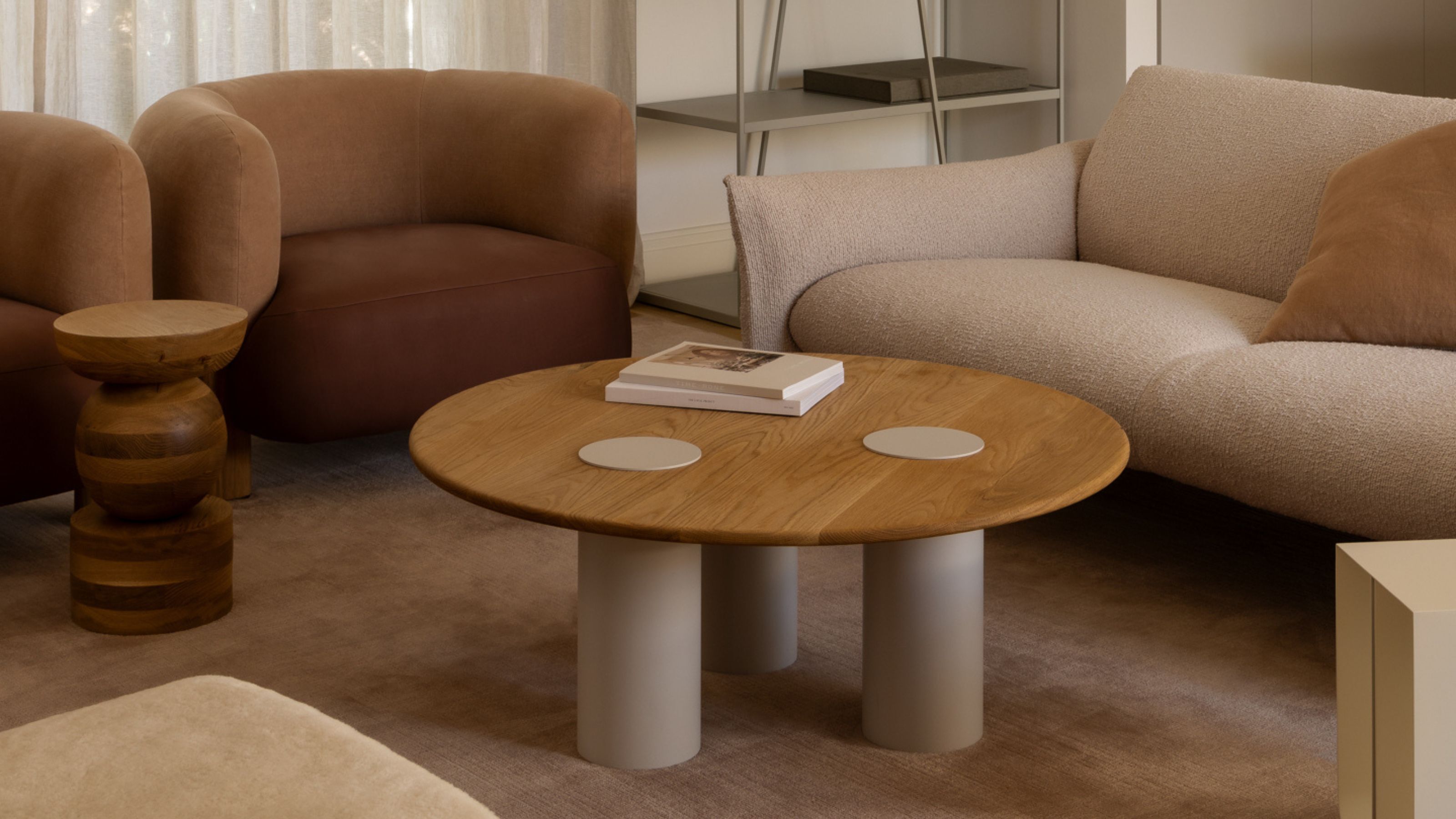 Pantone's Color of the Year for 2025 Has Been Announced — Meet 'Mocha Mousse'
We share how to style it, shop it, and everything else you need to know about the subtle yet elegant soft brown shade
By Olivia Wolfe
-
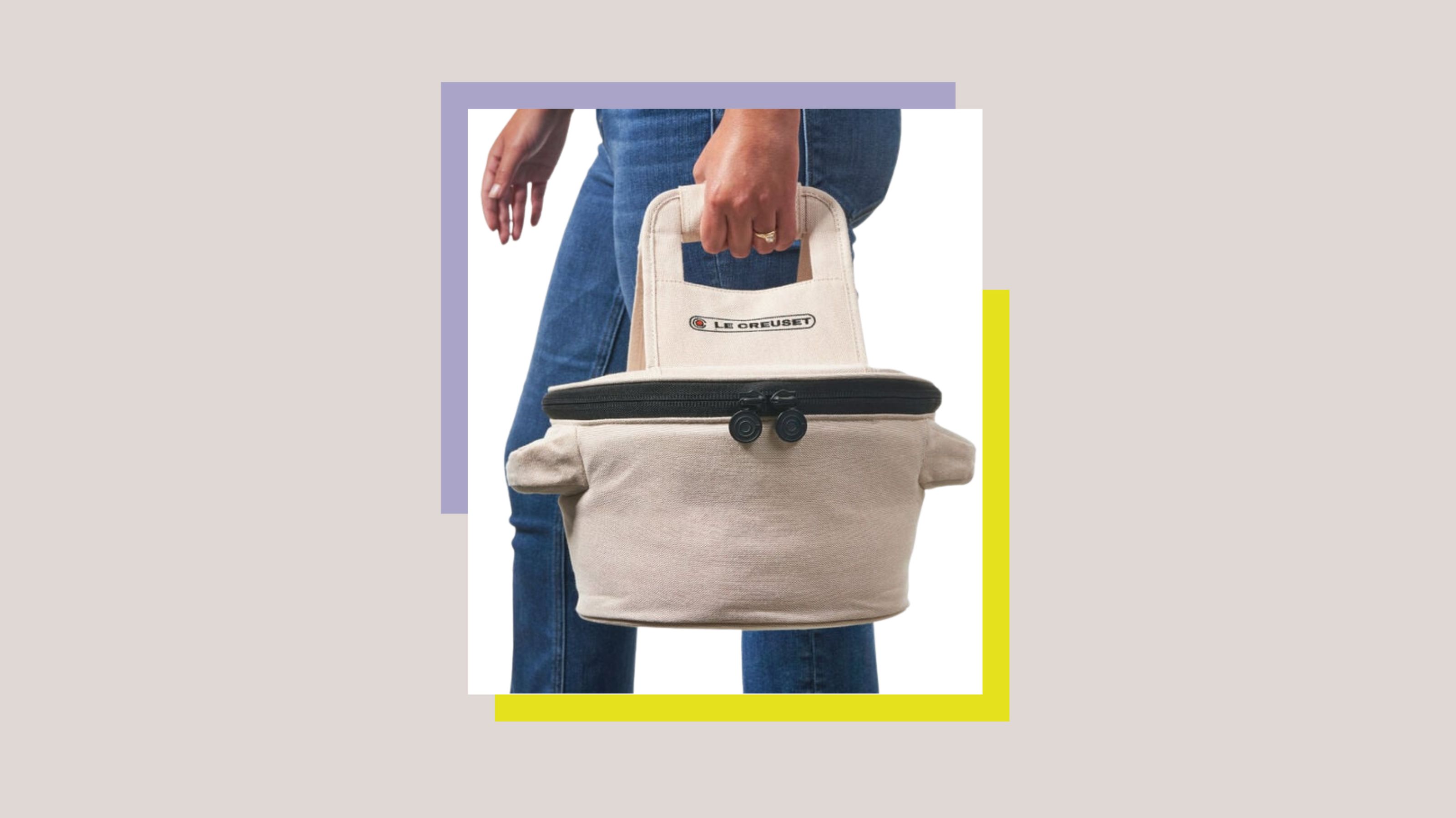 Le Creuset Just Released a Ridiculous Tote Bag for Transporting Their Dutch Oven to Dinner Parties — I'm Obsessed
Whether you need it is certainly not the question, here. But whether you want it... well, why wouldn't you?
By Olivia Wolfe
-
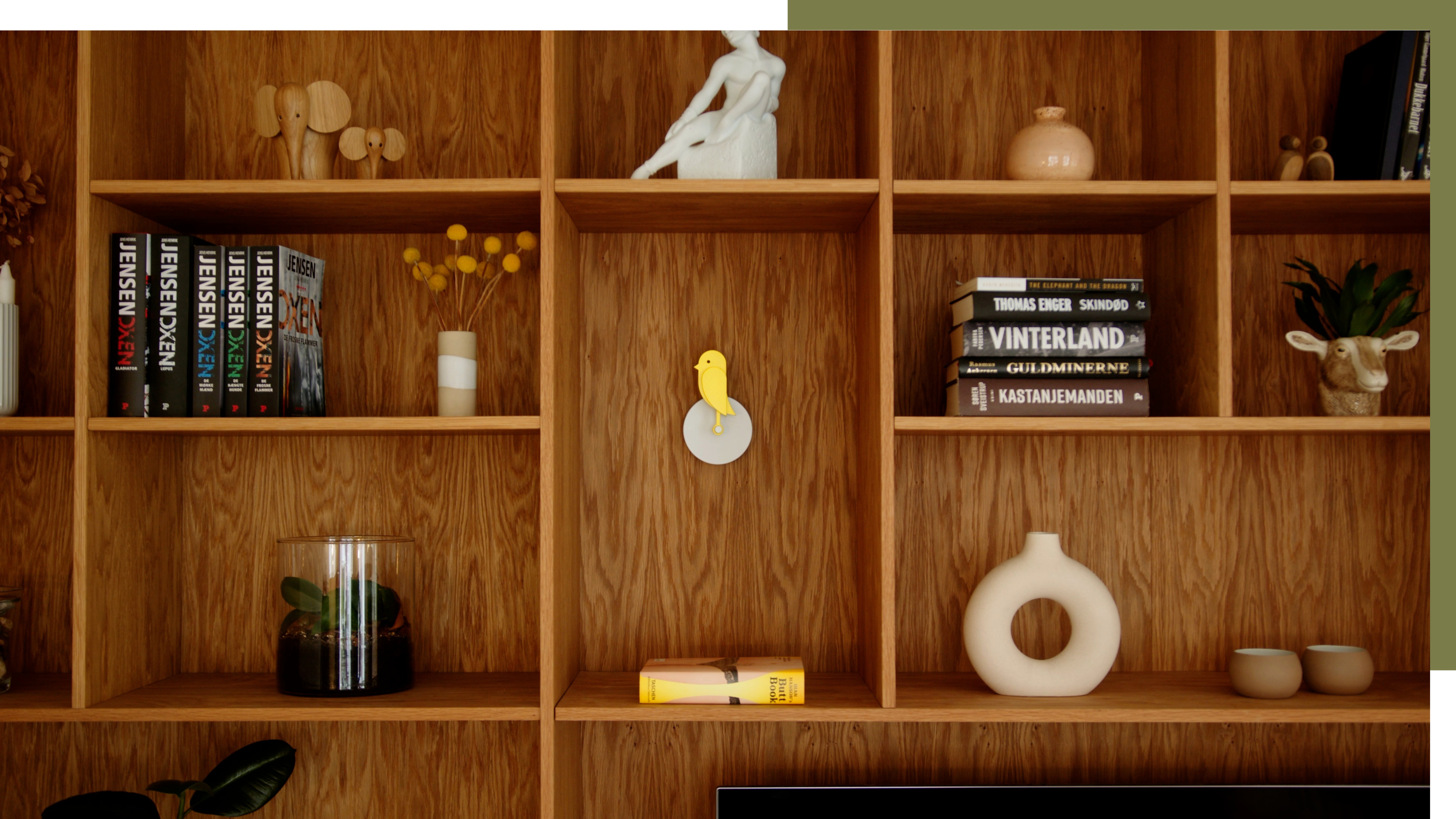 A Little Birdie Said Monitoring Your Air Quality Just Got a Stylish New Look
This Amazon buy is promising a healthier home with no style expense
By Olivia Wolfe
-
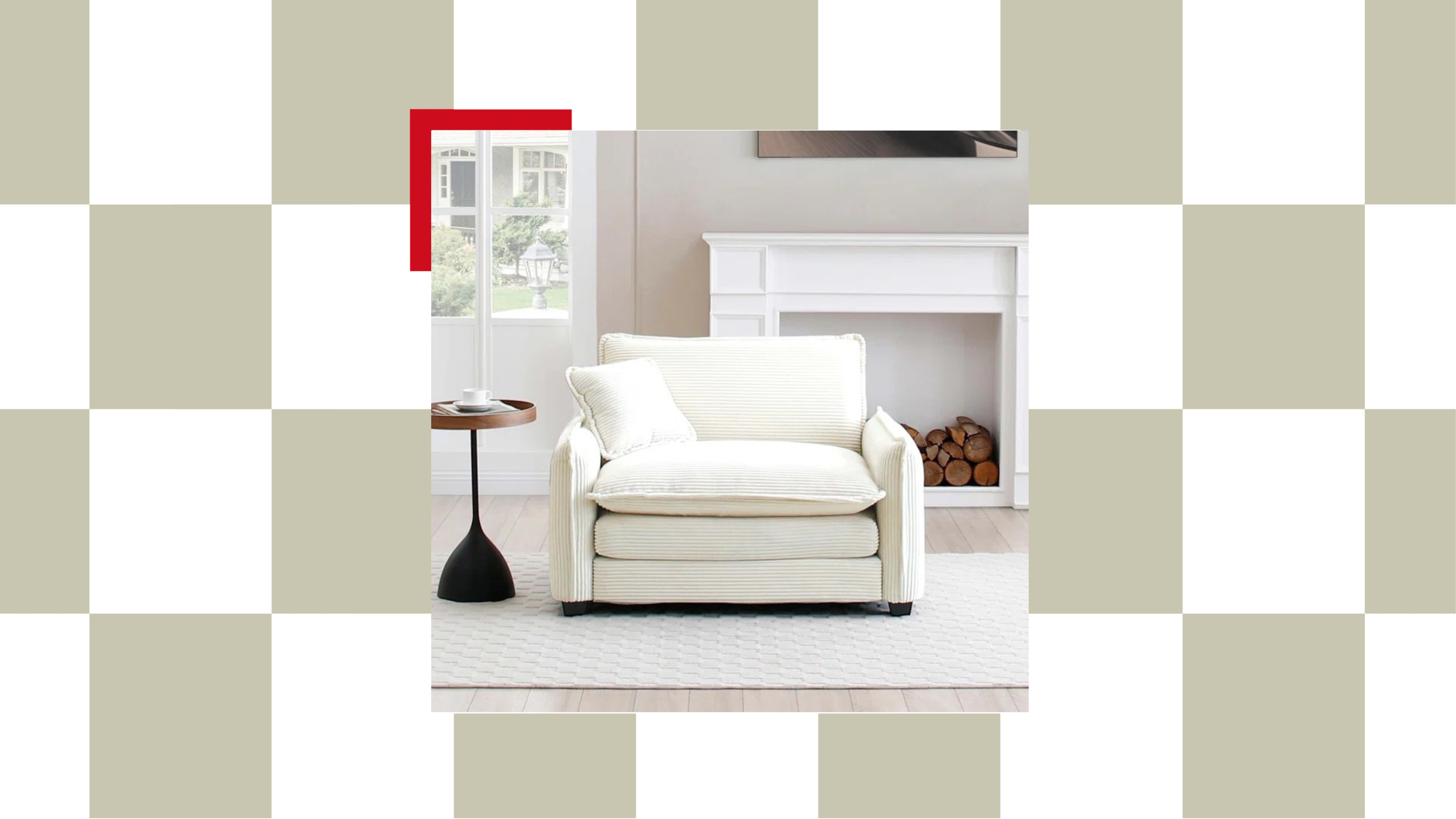 The "Chair-and-a-Half" Is the Goldilocks of Seating — Not Too Big, Not Too Small, but Just Right for Snuggling Up This Season
This accent chair trend is perfect for the cozy season, and it's on sale at Wayfair
By Olivia Wolfe
-
 Textured Walls Are Still Trending (And Just Got a Whole Lot More Chic Thanks to This Jeremiah Brent Collaboration)
'Nostalgia' is the name, and texture is the game; this moody new peel-and-stick wallpaper collection is bringing all the fall vibes to interior design
By Olivia Wolfe
-
 Ruggable's Latest Collection is Dripping in What We're Calling the Season's Go-To Fruit-Inspired Hue
We're seeing the sunny, mango-inspired shade cropping up in new collections across the design world — and it's surprisingly perfect for fall. Here's why
By Olivia Wolfe
-
 Sorry, Sherwin-Williams, We’ve Already Chosen OUR 2025 Color Crush!
You don't paint your whole home in one color, so why settle for just one Color of the Year when you can have a complete capsule?
By Olivia Wolfe
