Adrienne Bailon-Houghton's 'anti-trend' home office is just the right mix of old and new, according to designers
Adrienne’s home office takes inspiration from classic decoration techniques, but not in the way fans may expect

Adrienne Bailon-Houghton’s dedicated home Instagram account has become a source of interior design inspiration for her 30.2 thousand followers since its launch last November. Fittingly monikered ‘Chateau Houghton’, Adrienne gives us a closer look at her home as she continues to renovate the property.
Her latest post, a detailed look at her home office, offered something a little surprising for those who have come to love her home decorating style. Though Adrienne’s modern home has become synonymous with classic minimalism, the vintage wood-panelled aesthetic she opted for in her office may not be what fans expected from the 39-year-old Masked Singer contestant, TV presenter and former Cheetah Girls star.
A post shared by Chateau Houghton (@chateauhoughton)
A photo posted by on
In the post captioned ‘step into @adriennebailon’s office’, fans gain an insight into the home office of her New York home, which features what appears to be dark mahogany wall paneling covering the walls throughout, including over the dark emerald-green marble fireplace, with its beige antique-feel subway tiles.
The TV personality has chosen a minimalist vibe throughout her home, with most of the spaces showcased on her @chateauhoughton Instagram account light and bright. The dark, sultry feel of her office may surprise those who have followed her renovation journey so far.
However, the grandeur and warmth the office exudes will no doubt remind fans why Adrienne’s home is one to follow, and it offers several decor tips we can all benefit from.
A post shared by Chateau Houghton (@chateauhoughton)
A photo posted by on
It's Adrienne’s intertwining of new and old which catches Founder and Principal Designer of interiors studio Arsight, Artem Kropovinsky’s eye. 'Adrienne’s home office is a stunning mix of yesteryear charm and modern flair,' he remarks. 'The rich wooden touches combined with nostalgic elements like that typewriter make it unique. It feels like a beautiful fusion of memories and today, adding a distinctive personality to the room.'
Isfira Jensen of Nufacet Interiors says it is the paneling which is key to the vintage feel: 'The wood paneling gives an old world 1950s vibe to the space. This material and stain is often used to evoke a sense of opulence and high-quality craftsmanship, perfectly in line with the intended design of the room.'
Be The First To Know
The Livingetc newsletters are your inside source for what’s shaping interiors now - and what’s next. Discover trend forecasts, smart style ideas, and curated shopping inspiration that brings design to life. Subscribe today and stay ahead of the curve.
This 1950s glamour screams old Hollywood, a fitting choice for an actress’ creative space and one which can be recreated on a modest budget.
A post shared by Chateau Houghton (@chateauhoughton)
A photo posted by on
It is all in the details when taking inspiration from vintage home offices and bringing these details into a modern space. 'The sleek glass pendant light introduces a dash of contemporary luxury,' Artem tells us. 'But the wood, cozy textiles, and Roman shades speak to enduring aesthetics. It's this blend that offers both a novel and everlasting ambiance.'
The same is true of her desk which again uses dark wood creating a sense of continuity in the space, but features bronze hardware adding visual interest and a touch of modernity.
The secret to the success of this space as Adrienne’s creative site is the sense of enveloping warmth. 'That green-marble fireplace is a stroke of genius,' Artem says. 'Beyond its functional aspect, it offers a visual feast. The pop of green contrasts beautifully, and it offers a central point, radiating warmth and coziness.; Though an office is a practical space in terms of needing to be designed as a productive environment, creating a space which also feels inspiring and inviting is something we can all take from Adrienne’s design.

New York City-based interior designer Artem Kropovinsky is the founder of design studio Arsight, has a decade of extensive and global residential and commercial interior design experience. His expertise has been featured on the likes of Forbes and The New York Times
Minimalism in terms of the amount of items in the office is also crucial to a productive working environment. Brooke Spreckman of Design Hutch tells us that keeping accessories to a minimum as Adrienne does 'helps provide a sense of focus for it being an office. Less is more when you have heavier and darker finishes around.'

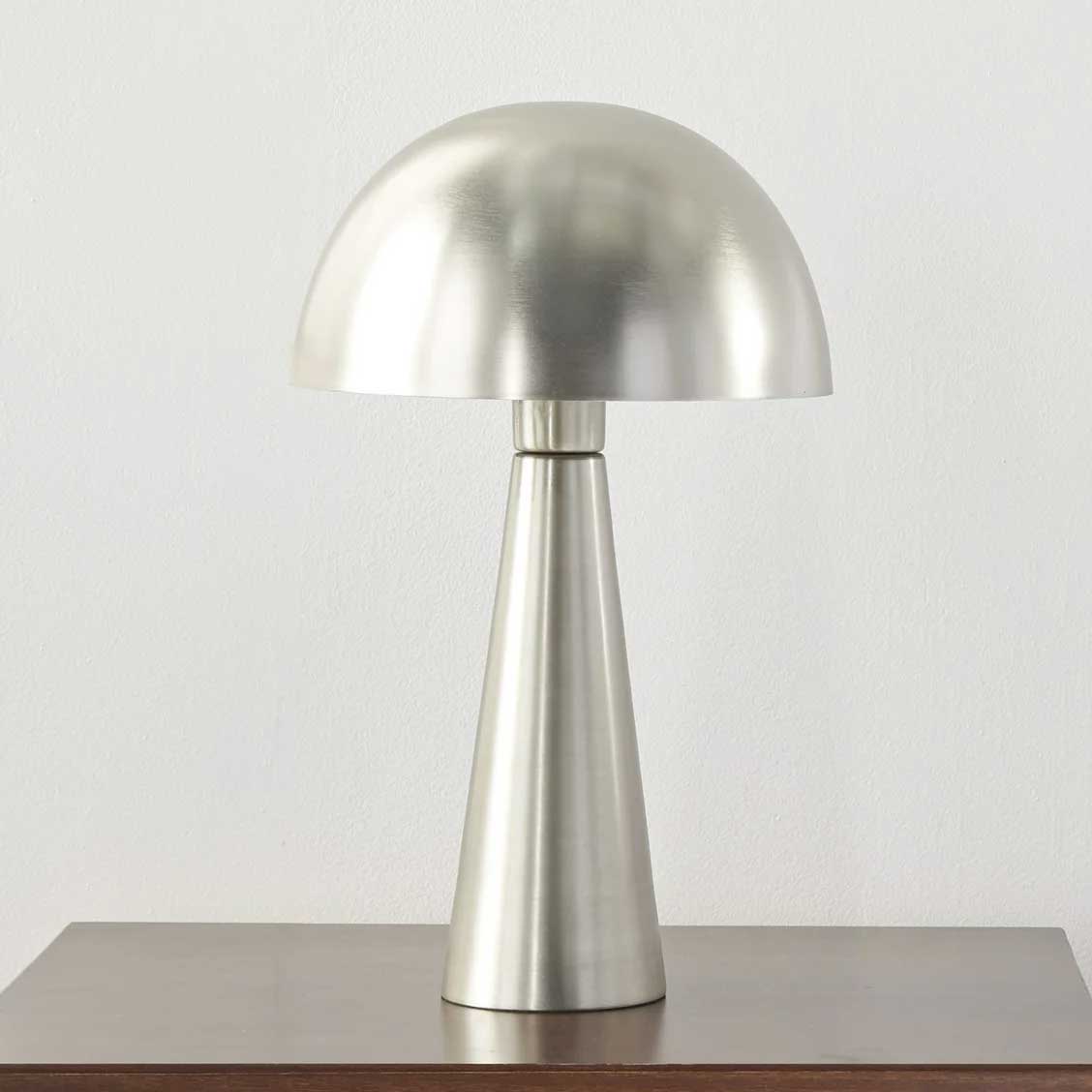
Price: $69.99
Get the look of Adrienne's modern lamp for a contrast to a more traditional scheme.
Adding lightness is a key tip which can be taken from Adrienne’s office as a space which revolves around dark surfaces. Isfira Jensen says: 'The creamy white armchairs are perfect pieces to offset the darker tones in the room. They allow the room to keep its moody feel without looking gloomy.' Bringing in the light chairs alongside a light ceiling color also ensures the paneling doesn't overwhelm the space or make it feel small.
When taking inspiration from offices of years gone by, it is important not to lose the personality of the space. Personal touches like Adrienne’s oversized books and her own magazine cover ensure that the space doesn’t look like a carbon copy of an old photo and a sense of self is detectable amongst the vintage charm.
Madison Popper, Founder of Chill Casa sums up the appeal of vintage home offices saying 'old school trends often evoke a sense of nostalgia, reminding people of a classic aesthetic. Combine that with exposure to classic films, art, literature, or music can shape an individual's preferences and inspire them to embrace vintage or old-school elements.' We can certainly see the impact these classics have had on Adrienne’s approach to interiors, and now, thanks to this inspiring design, on ours.
Katie is a freelance lifestyle writer who has recently finished an MA in Magazine Journalism at City, University of London. Before writing for Livingetc, Katie has gained bylines with The Caterer and The Telegraph and has interned at several lifestyle magazines including Grazia and Red. When not scrolling through Pinterest for interior design inspiration, Katie can be found writing about women's issues, trying out new beauty trends for her blog or seeing a West End show.
-
 Turns Out the Coolest New Café is Actually In Your Kitchen — Here's How to Steal the Style of TikTok's Latest Trend
Goodbye, over-priced lattes. Hello, home-brewed coffee with friends. TikTok's 'Home Cafe' trend brings stylish cafe culture into the comfort of your own home
By Devin Toolen Published
-
 5 Bathroom Layouts That Look Dated in 2025 — Plus the Alternatives Designers Use Instead for a More Contemporary Space
For a bathroom that feels in line with the times, avoid these layouts and be more intentional with the placement and positioning of your features and fixtures
By Lilith Hudson Published