5 interior design lessons from Ave Mario, London’s hottest new restaurant
Covent Garden's new hangout is a maze of Parisian rattan, Murano globes, and vintage Fiorucci posters – these are the secrets behind its style
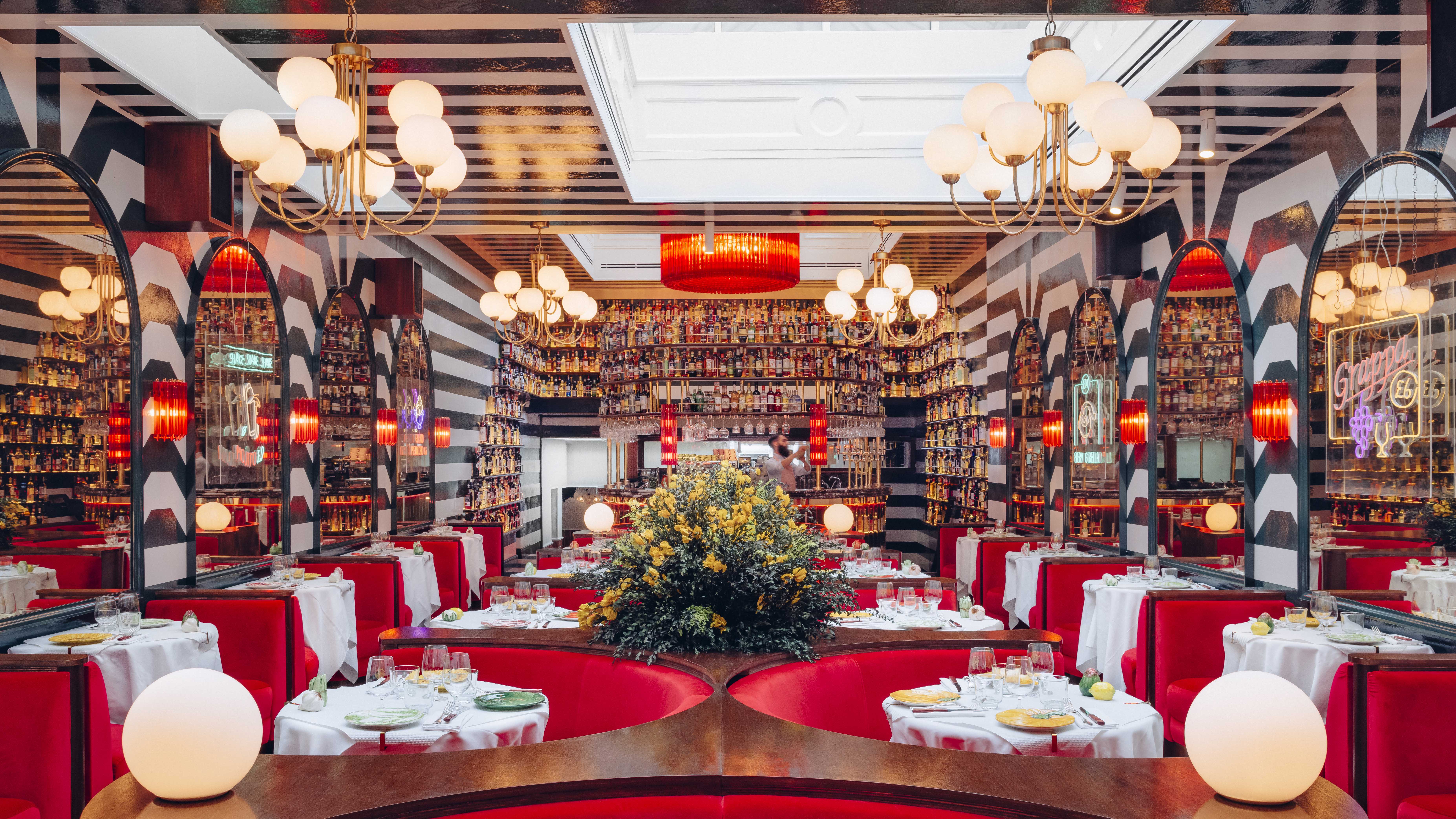

What do you get when you combine London's contemporary charisma with traditional Sienesene charm? You get Ave Mario, the latest member of Big Mamma's celebrated restaurant trio that allures interior and culinary enthusiasts across the city.
With its distinct Venician jewels and a colour scheme modelled from the red of the Pope's slippers, Ave Mario is the unorthodox new source of modern decorating ideas that you need to know about. Here, designer Apolline Lugger and the KIKI Design Studio team share their secrets.
1. Soften bold colours by adding layers of texture to the paint
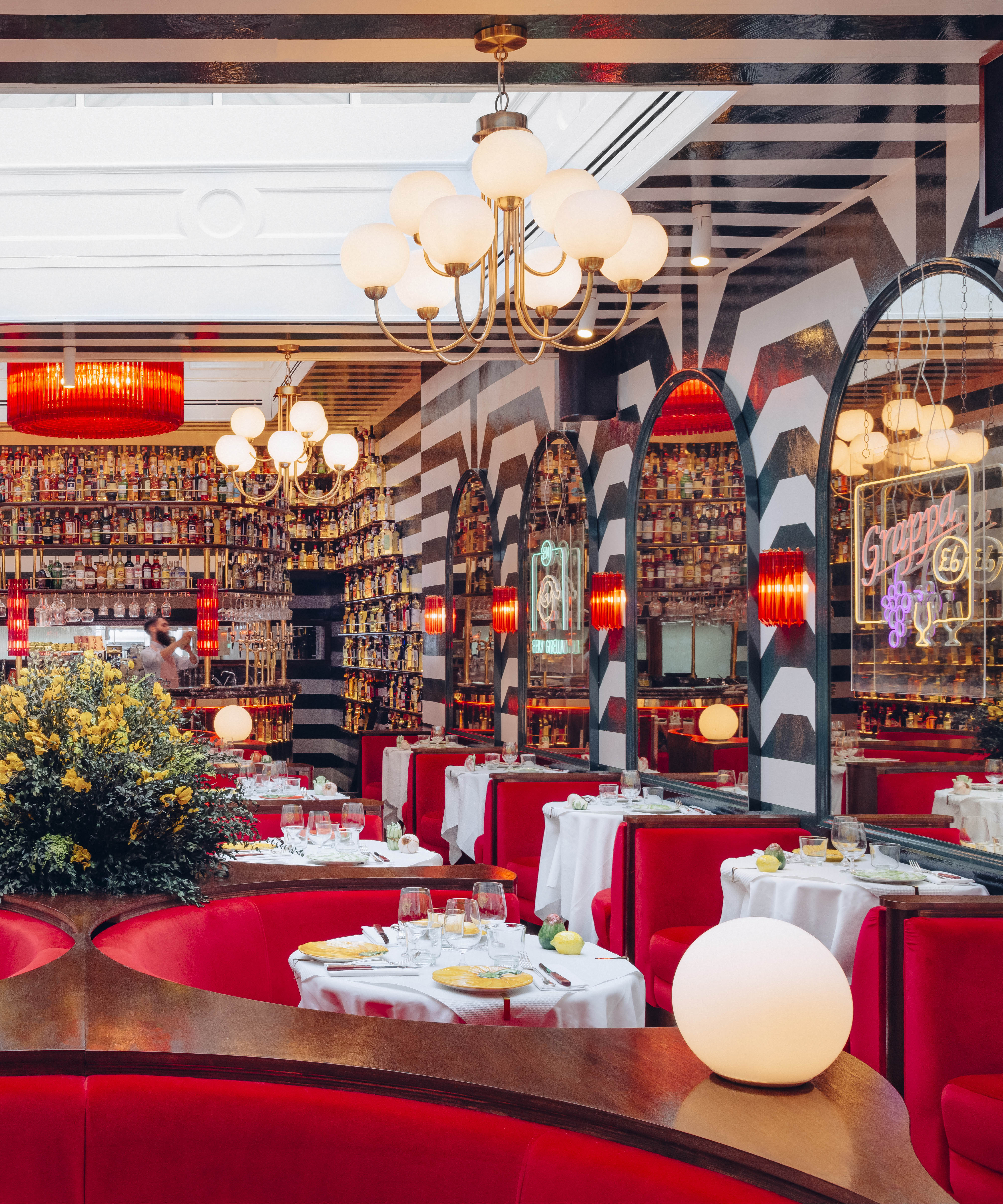
We wanted to create the feeling of entering the Duomo di Siena: authentic, punchy, beautiful, multi-layered Italian interiors, unpredictable, and always with a surprise. The cathedral-style stripes in the main dining hall are cool rather than overpowering because the shade of green is not garish – in fact, it's so rich and dark it often looks black.
It's a heritage paint by Dulux – Mallard Green offset with Piano White. If you're going for big colors, then showing texture within the paint finish helps to soften them. We used layers and layers of thick, glossy paint and left visible brush strokes. This gives the space more character and appears less serious and stark.
2. Use traditional pattern to contrast with modern design
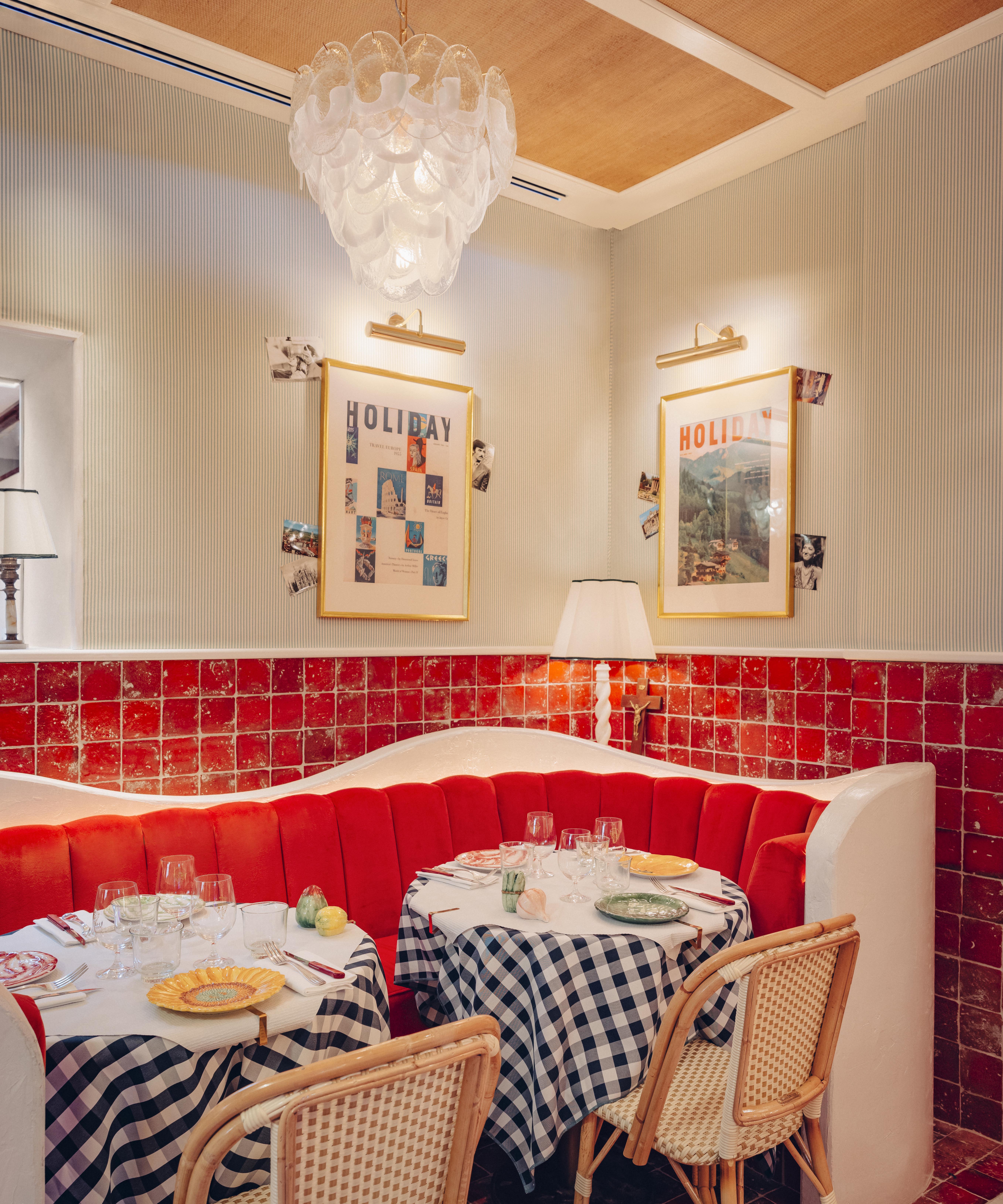
The backroom resembles more of an al-fresco, courtyard style of dining. Here, the gingham table cloths not only offset the terracotta flooring and outdoorsy style banquettes, but they also bring some Tuscan warmth and old Italian charm on a grey, cold London day.
Marbles and ceramic finishes look chic but can make a room feel cold, but traditional fabrics warm up hard finishes. Trattoria Gingham is a classic and timeless design, but when balanced with more contemporary features – such as the mirrored ceiling – it looks cool rather than old fashioned.
3. Let drink become decor
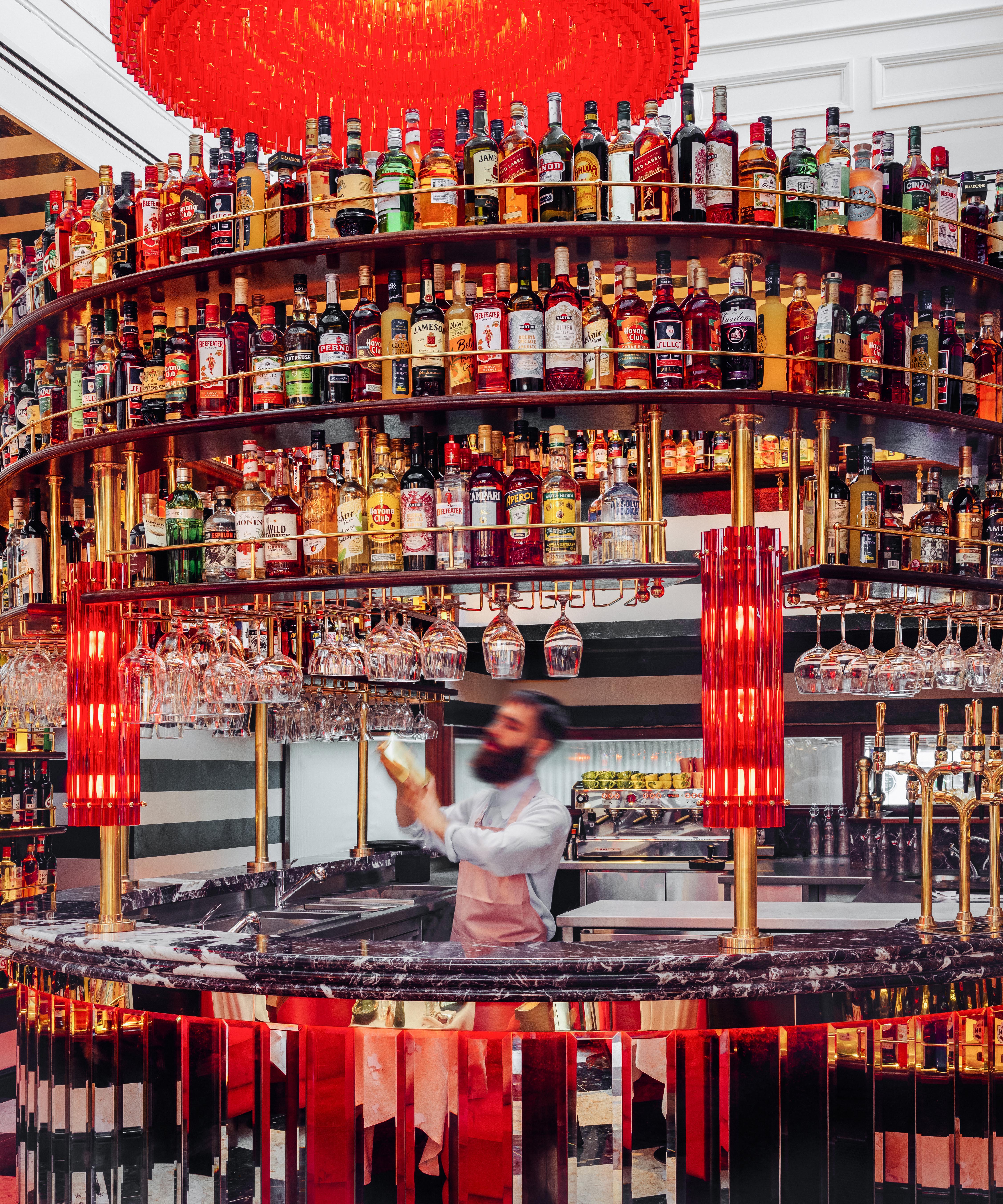
The bottles on walls is a signature look that we have in all the Big Mamma restaurants, which include Circolo Popolare and Gloria; we love the colors, chaos, and Italian charm they bring to shelves.
Be The First To Know
The Livingetc newsletters are your inside source for what’s shaping interiors now - and what’s next. Discover trend forecasts, smart style ideas, and curated shopping inspiration that brings design to life. Subscribe today and stay ahead of the curve.
We use a mix of vintage, undrinkable bottles of liquor and classic brands such as Aperol, Limoncello, and Campari, as the reds and yellows create a cozy glow. Our shelves are always designed with the height of bottles in mind; they're beautifully lit and always Italian. This is the modern dining room idea we never knew we needed, until now.
4. Embrace unexpected shapes
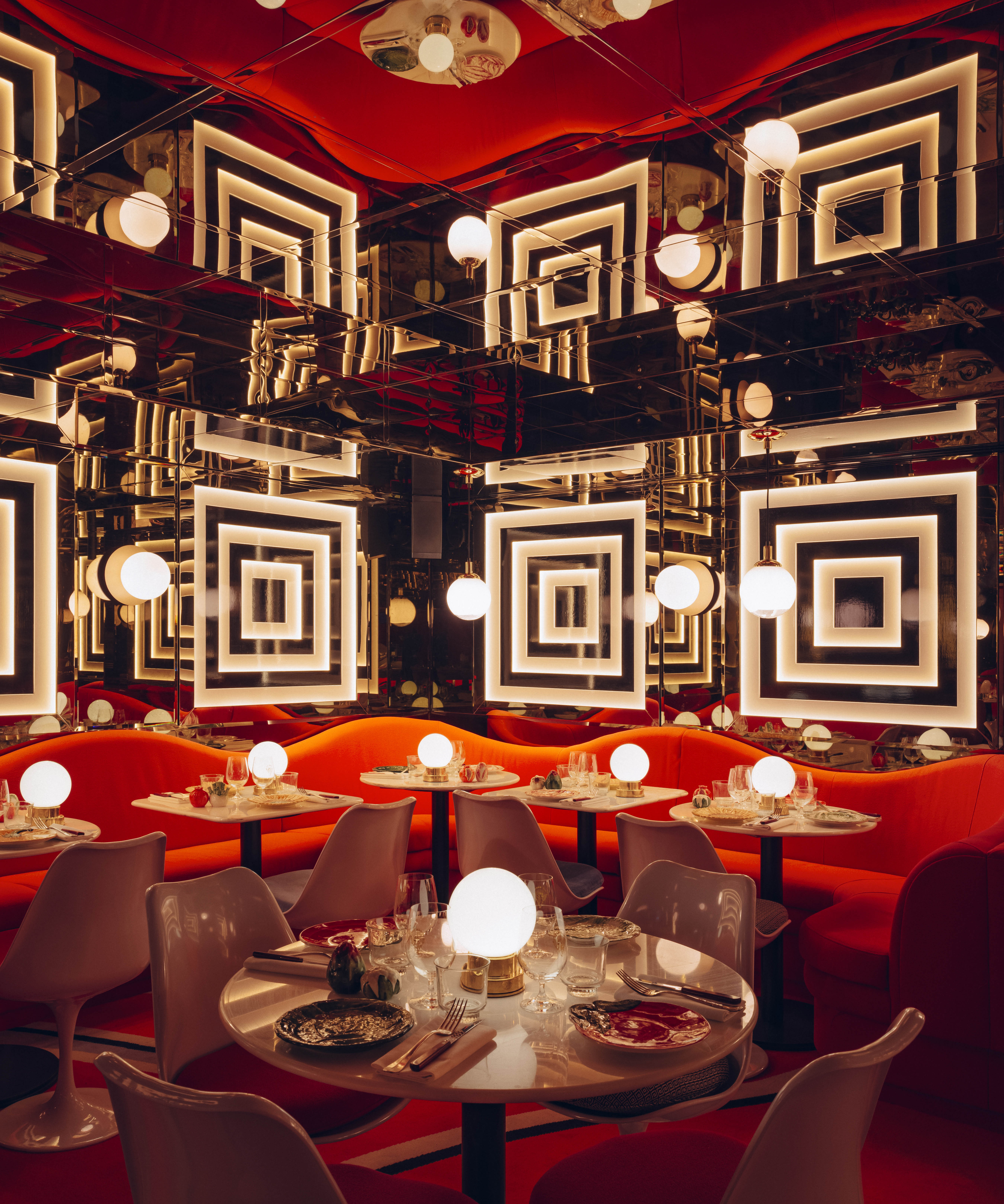
We designed the unique banquette sofa ourselves to bring a joyful 1970's groove to the space.
The room would be too serious if it only showcased straight lines. We worked with various French fabric houses and mills in North London to create the perfect orange for the room – from its tone and texture to its durability. It's playful, matches the carpet – and if everyone in the restaurant were to dance on it – it would survive.
The white chairs are Saarinen-inspired – this retro neo-futurist design is perfect for the basement. They are great dining chairs with pedestals, so customers can spin around and chat with others – this vibe translates exactly to dinner parties at home because they mean guests can freely talk to people on either side.
5. Source authentic accessories
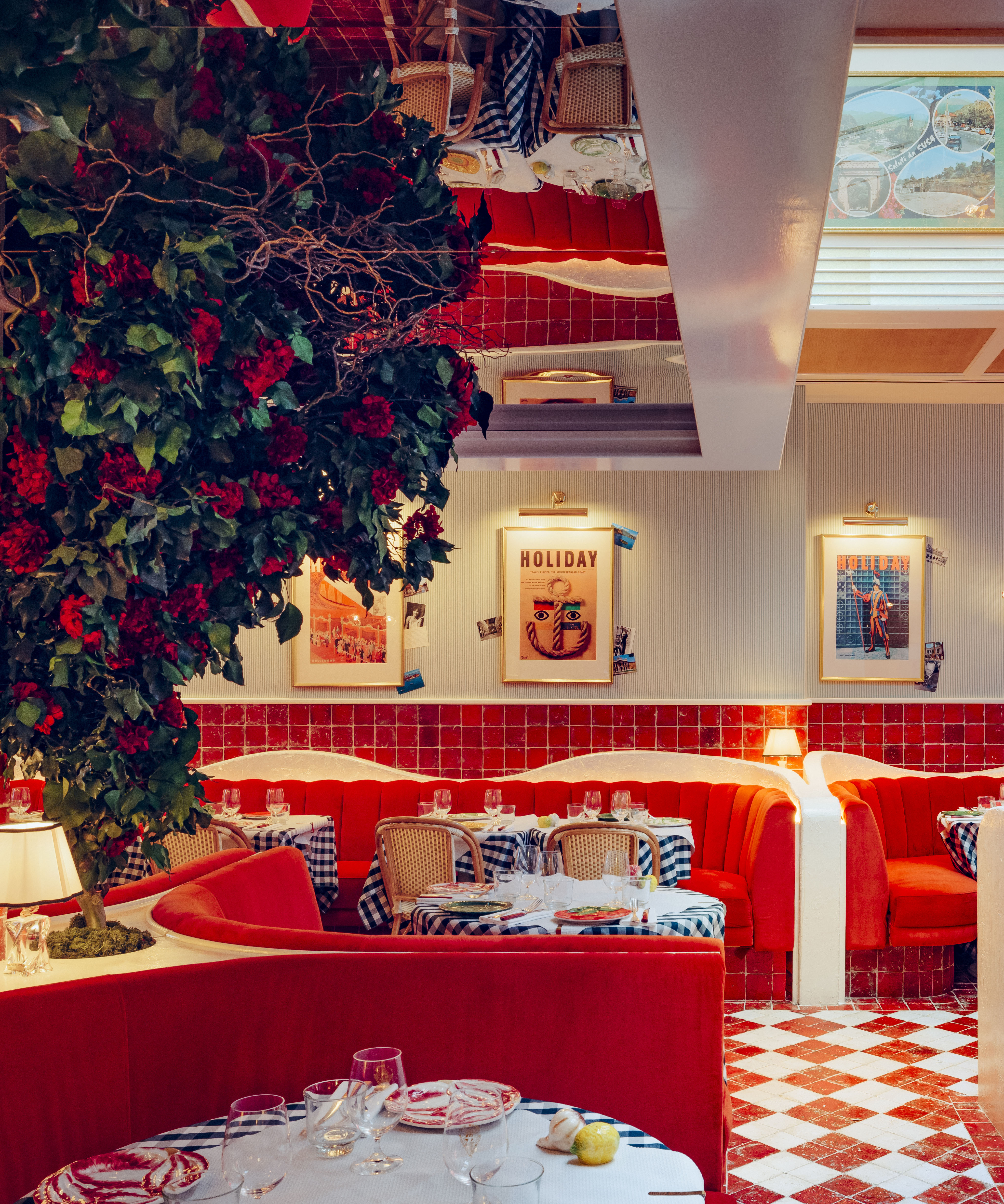
We love to mix classic design with a twist and always add plenty of layers of love – for example – our collection of Italian Holiday magazine covers from the 1970s, genuine postcards from Italy, and old-school Fiorucci ads.
We also chose custom bistro rattan courtyard chairs by Parisian makers Maison Drucker. Every chair is a love affair – they should be beautiful, comfy, and practical. Our lights, pendants, and globes are handcrafted in Venice from Murano factories that have operated for centuries. Always go authentic in your search for accessories.
Head to Ave Mario, 5 Henrietta St, London WC2E 8QG for the most fearless interior design inspiration in the city.

Megan is the Head of Celebrity Style News at Homes & Gardens. She first joined Future Plc as a News Writer across their interiors titles, including Livingetc and Real Homes, before becoming H&G's News Editor in April 2022. She now leads the Celebrity/ News team.
Before joining Future, Megan worked as a News Explainer at The Telegraph, following her MA in International Journalism at the University of Leeds. During her BA in English Literature and Creative Writing, she gained writing experience in the US whilst studying in New York. Megan also focused on travel writing during her time living in Paris, where she produced content for a French travel site.
Megan currently lives in London, where she relocated from her hometown in Yorkshire. In her home, she experiments with interior design trends and draws inspiration from the home decor ideas she observes in her everyday work life. Her favorite pieces include her antique typewriter and her expansive collection of houseplants. When she isn’t writing, she is browsing London’s coffee shops and bookstores to add to her ever-growing library, taking over the open shelving in her apartment.
-
 5 Bathroom Layouts That Look Dated in 2025 — Plus the Alternatives Designers Use Instead for a More Contemporary Space
For a bathroom that feels in line with the times, avoid these layouts and be more intentional with the placement and positioning of your features and fixtures
By Lilith Hudson Published
-
 Why Decorating With Mustard Yellow Helps Fill Your Interiors With a Sense of "Confident Calm"
There is so much more to decorating with this turmeric-tinted sauce-wiggled-on-a-hotdog not-quite-yellow shade than meets the eye
By Amy Moorea Wong Published