Before and After: An awkward London townhouse was transformed into an elegant home
The South London home emphasizes space with an open-plan area and an elegant mirrored wall
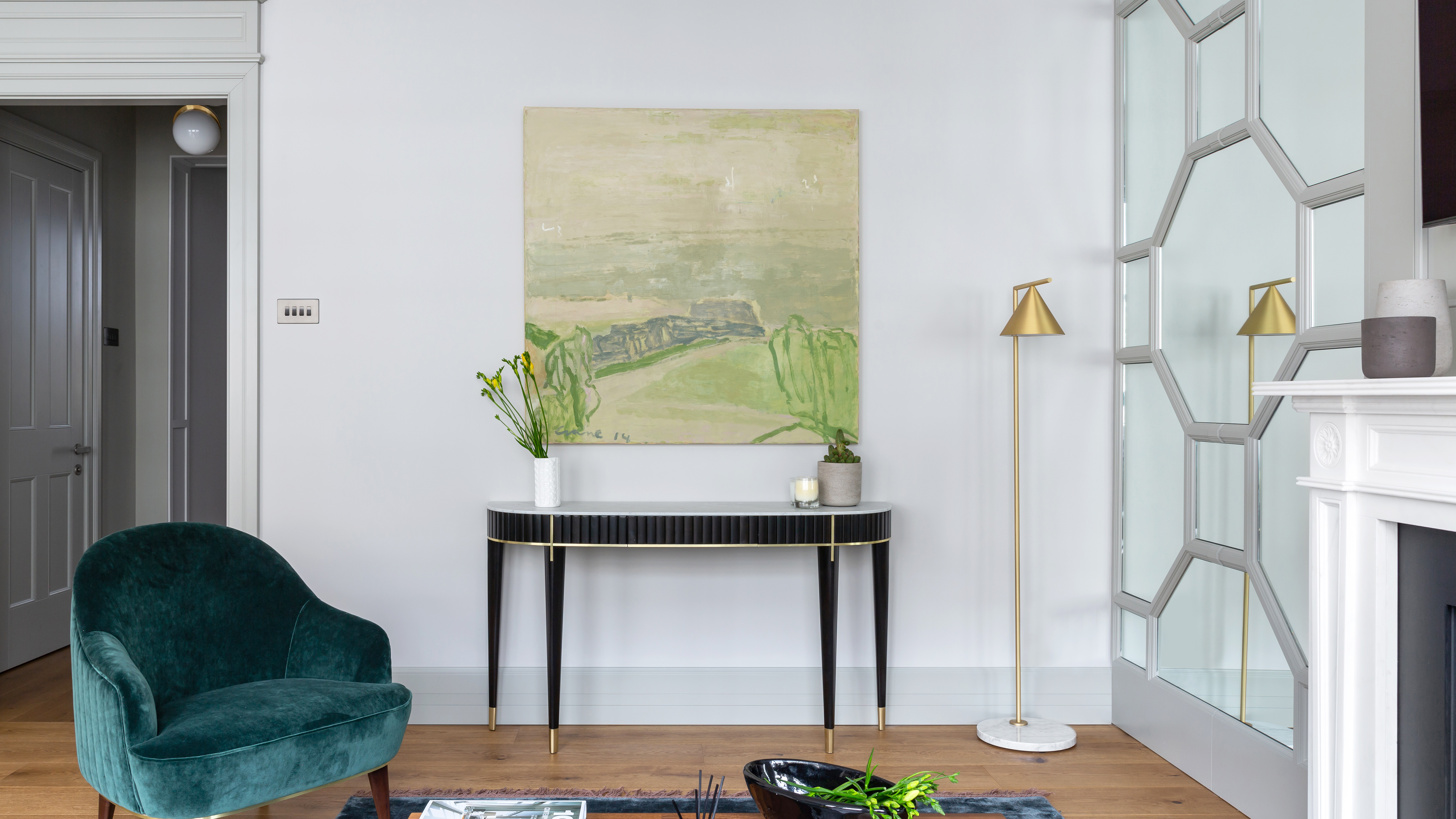

A young family in London’s South Kensington has transformed their apartment from a dull wooden space into a stylish family home – and the result is unrecognizable. The apartment, hidden in a Grade II listed property, was restricted by its traditional awkward footprint that came as part of the historic townhouse.
The project exemplifies overcoming the stubborn structure of a compact space – while combining timeless elegance with ultra-modern shapes. We’re stealing its modern living room ideas, and mirroring its sleek kitchen and bedrooms in our own interiors.
The apartment before renovation
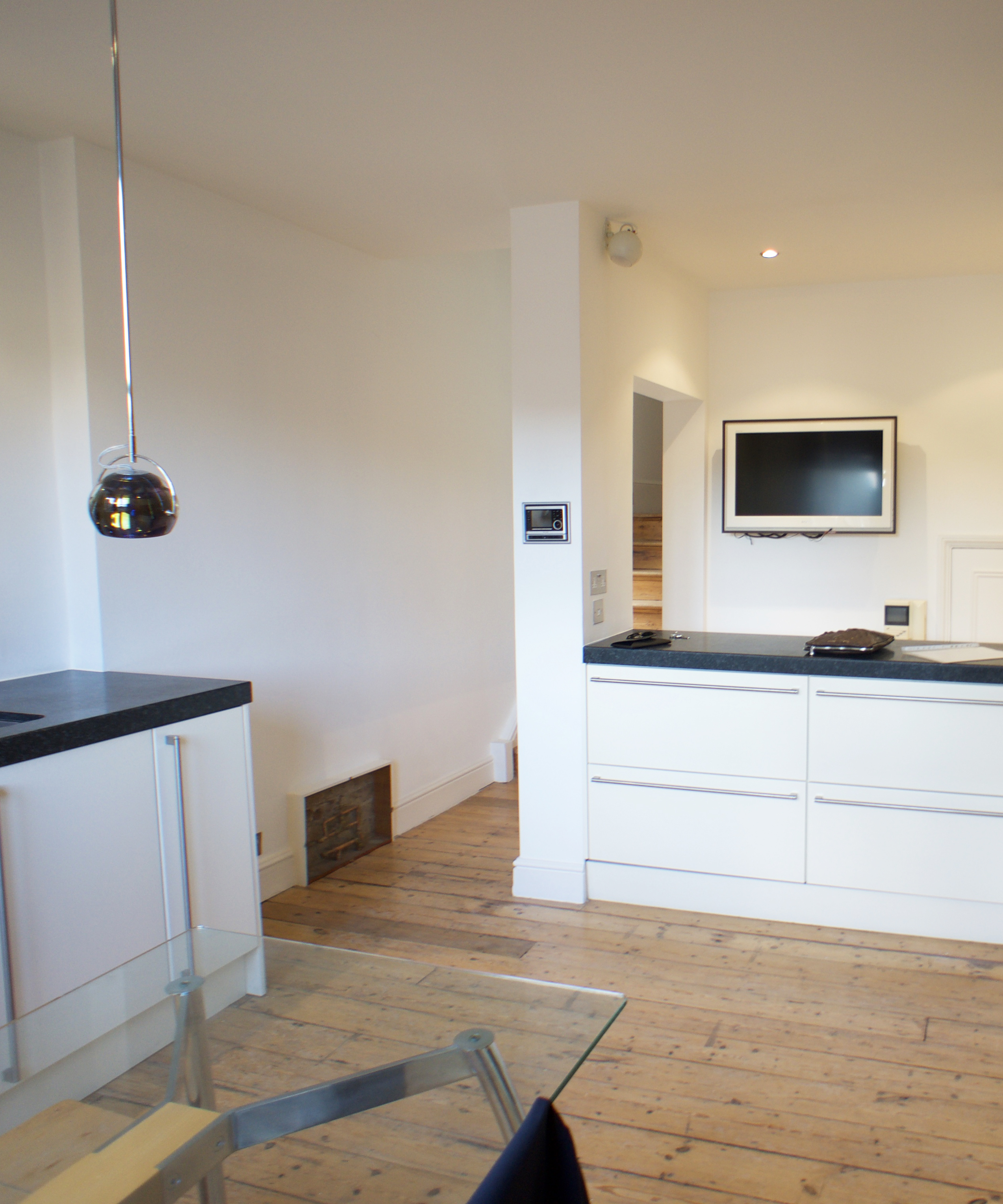
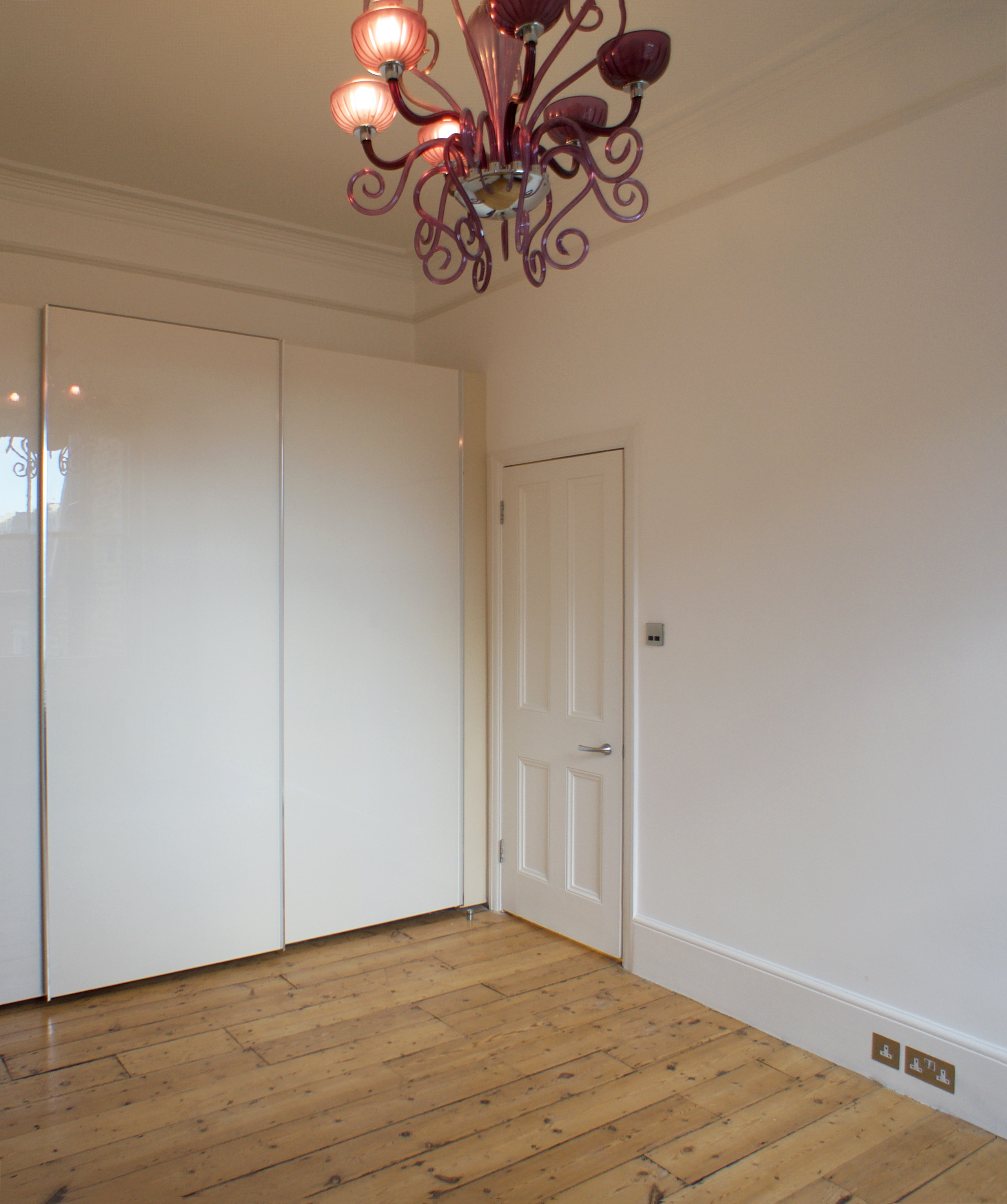
Prior to the project, the apartment was defined by its awkward floor plan, which included a small entrance space, an unusable bedroom, micro-kitchen, and a muted living space. The apartment was divided by a narrow corridor that adjoined the sparsely decorated rooms.
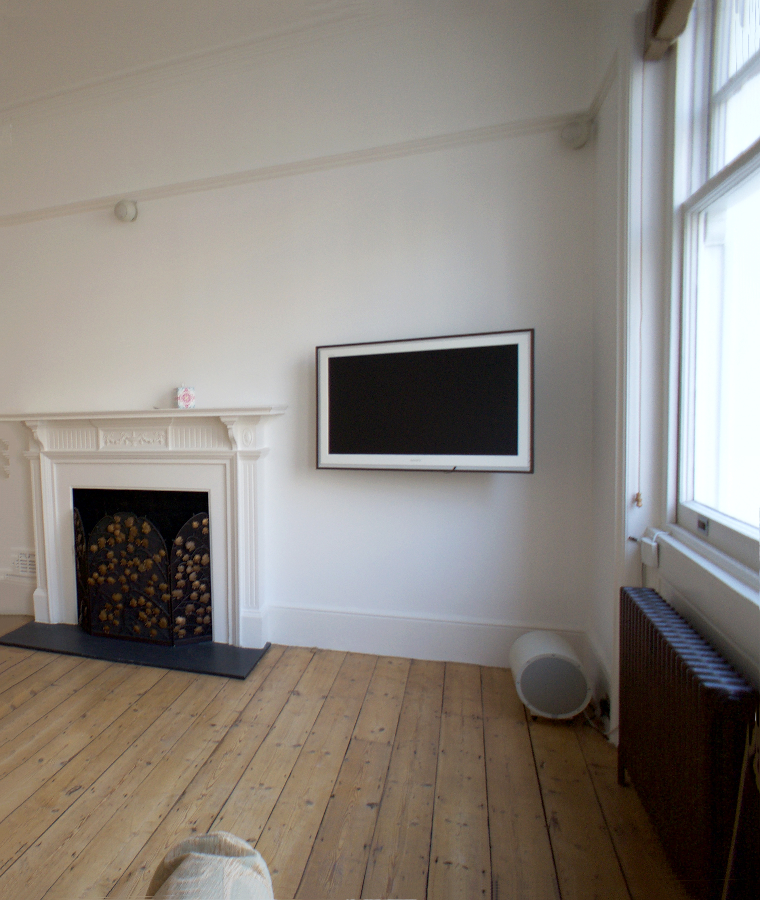
Despite the historic features adding quintessential charm to the home, it left the family and interior designer Linda Smaukstele of Balts Design with an intricate floor plan that was delicate to decorate. Linda collaborated with Moscow-based company Tochka Design throughout the renovation.
With a new apartment layout in mind, the team elevated the space into a luminous modern home that draws from the mystery of a mirror to accentuate the space and ensure its interior elegance matches its esteemed postcode.
The apartment after renovation
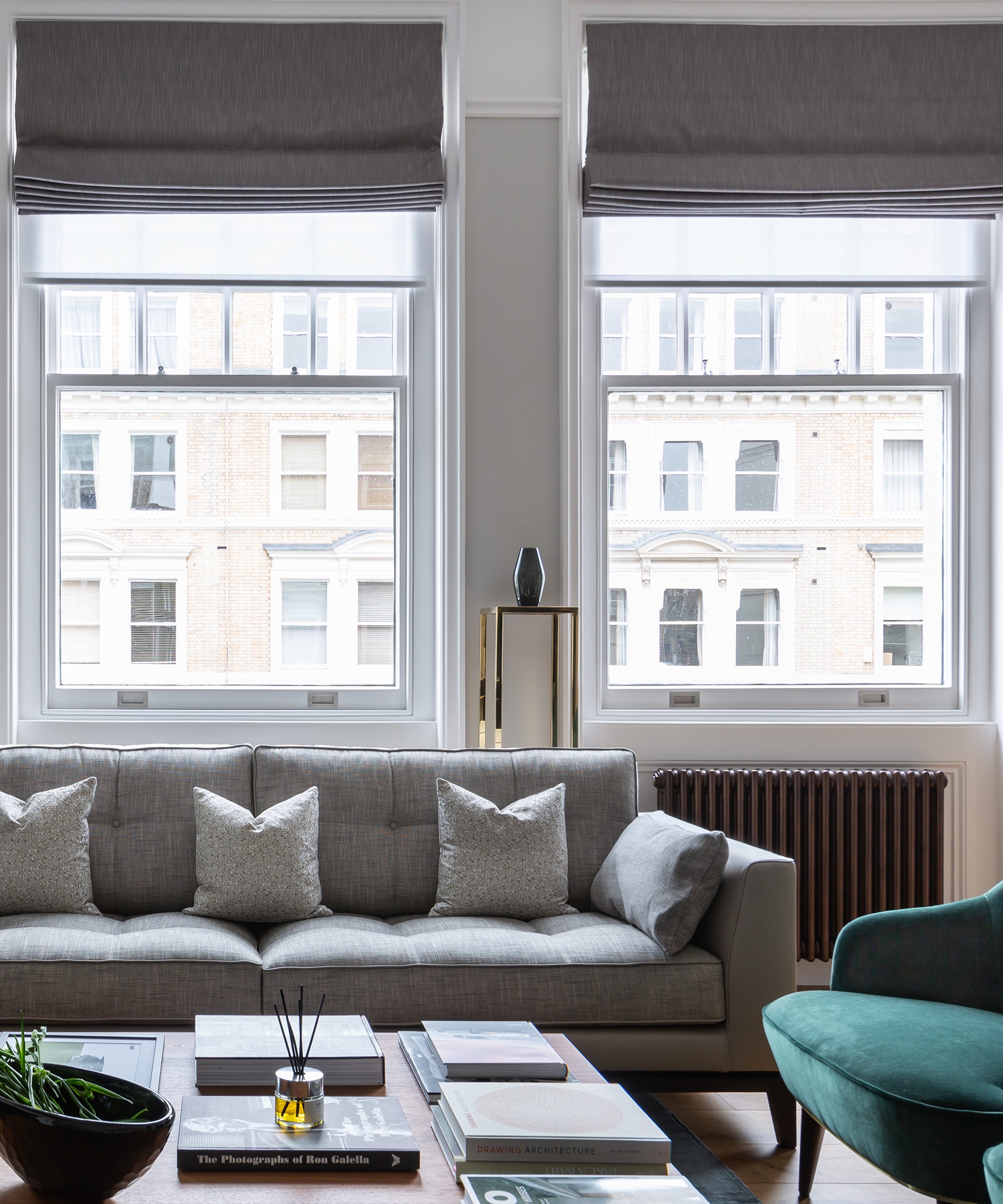
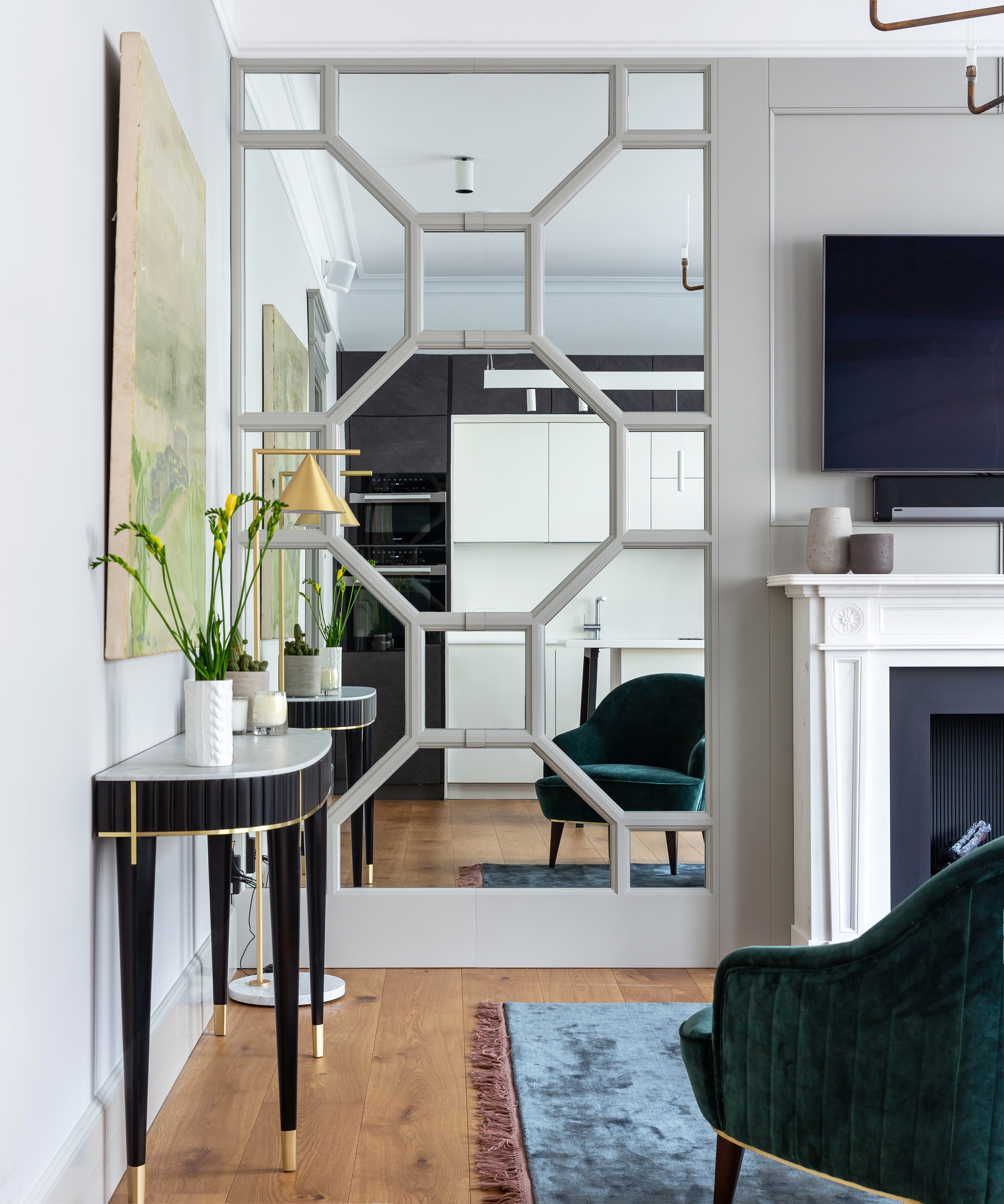
We begin with what is, perhaps, the most stylish and ingenious characteristic of the renovated apartment: the mirrored wall. This feature kissed the living room with a decorative surface that creates an illusion of space through its reflective material. Plus, the mirrored paneling frames the pièce de resistance of the property, the ornate fireplace, to ensure it remains the focal point in the room.
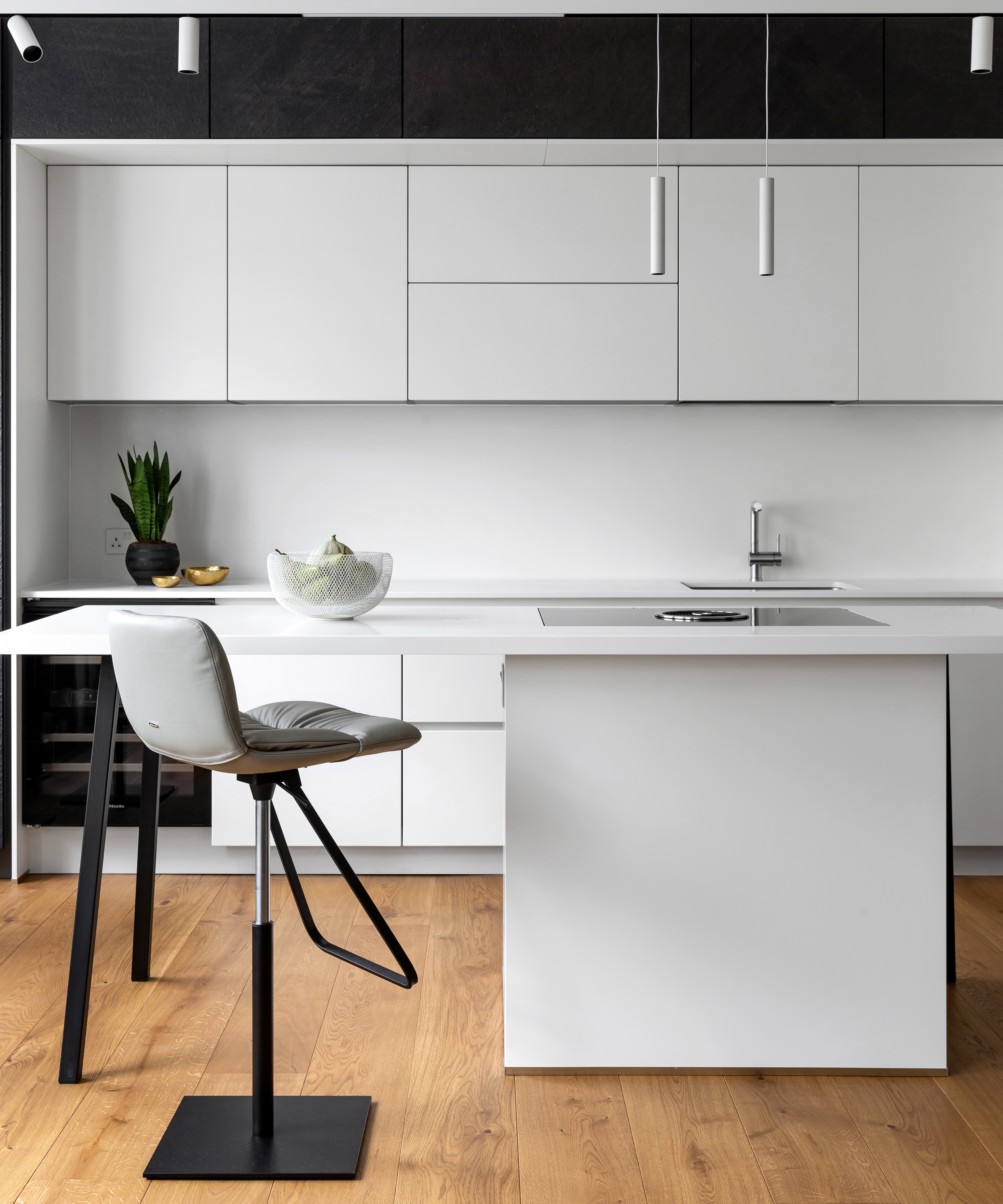
The team then flipped the original floorplan to bring the kitchen to the front of the property and design a contemporary open-plan living and dining space. This relocation also saw the replacement of the dated kitchen to a sleek monochromatic haven with chic task lighting and a multi-purpose kitchen island that doubles as a discreet hob.
Be The First To Know
The Livingetc newsletters are your inside source for what’s shaping interiors now - and what’s next. Discover trend forecasts, smart style ideas, and curated shopping inspiration that brings design to life. Subscribe today and stay ahead of the curve.
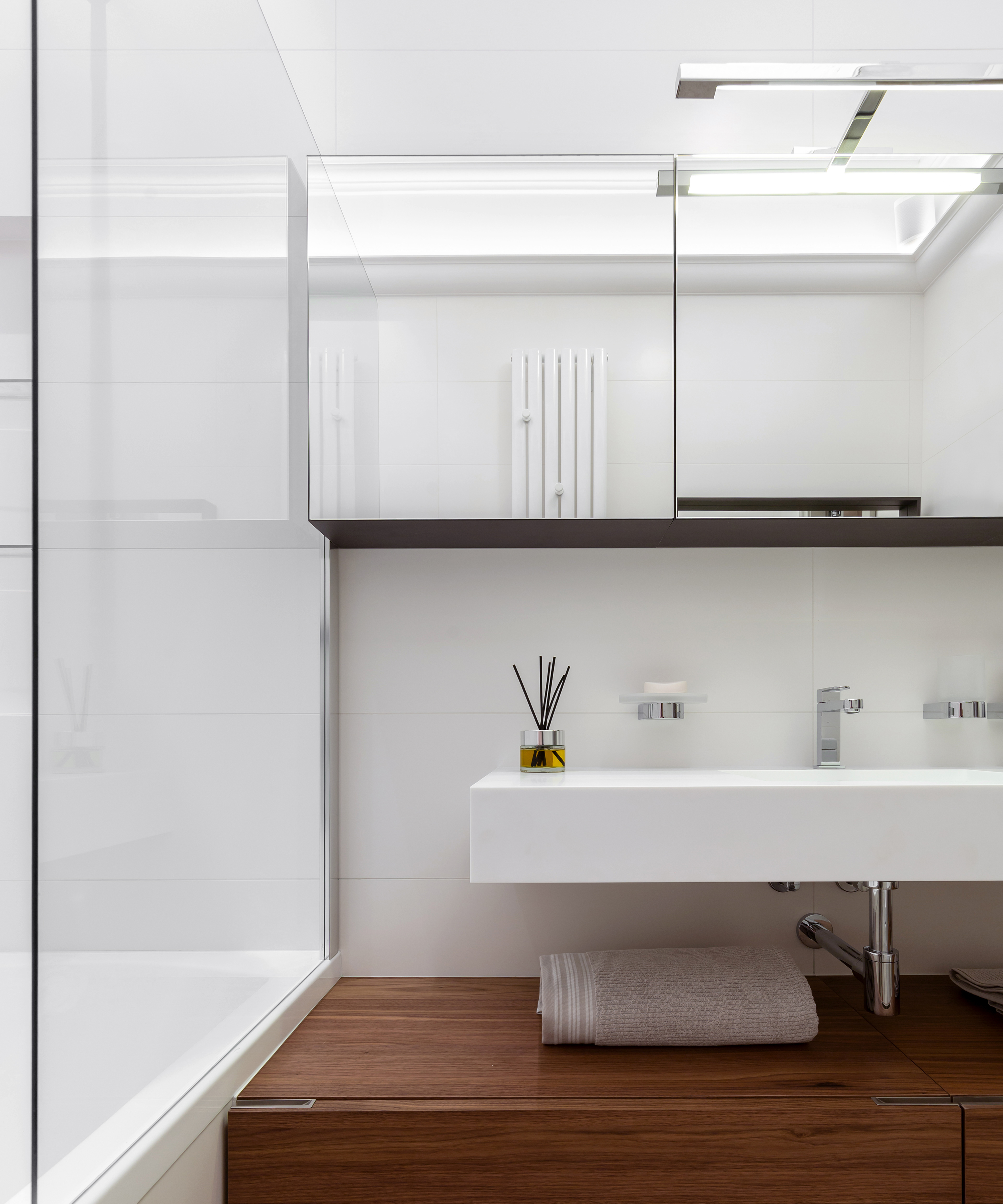
The new floor plan made room for Linda to design two larger bedrooms and an additional shower room alongside the original bathroom. This space follows the minimalistic scheme as seen in the new kitchen and continues to use mirrors to ensure the room appears more spacious.
These natural hues continue into the new master bedroom space that is once again blessed with a large mirror that reflects the main hallway. Linda drenched the walls in gray – the most sought-after-hue of the year – which gives the space a thoroughly modern allure and creates a subtle break between the other black and white color schemes. This cool shade has just climbed to the top of our painted wall ideas.
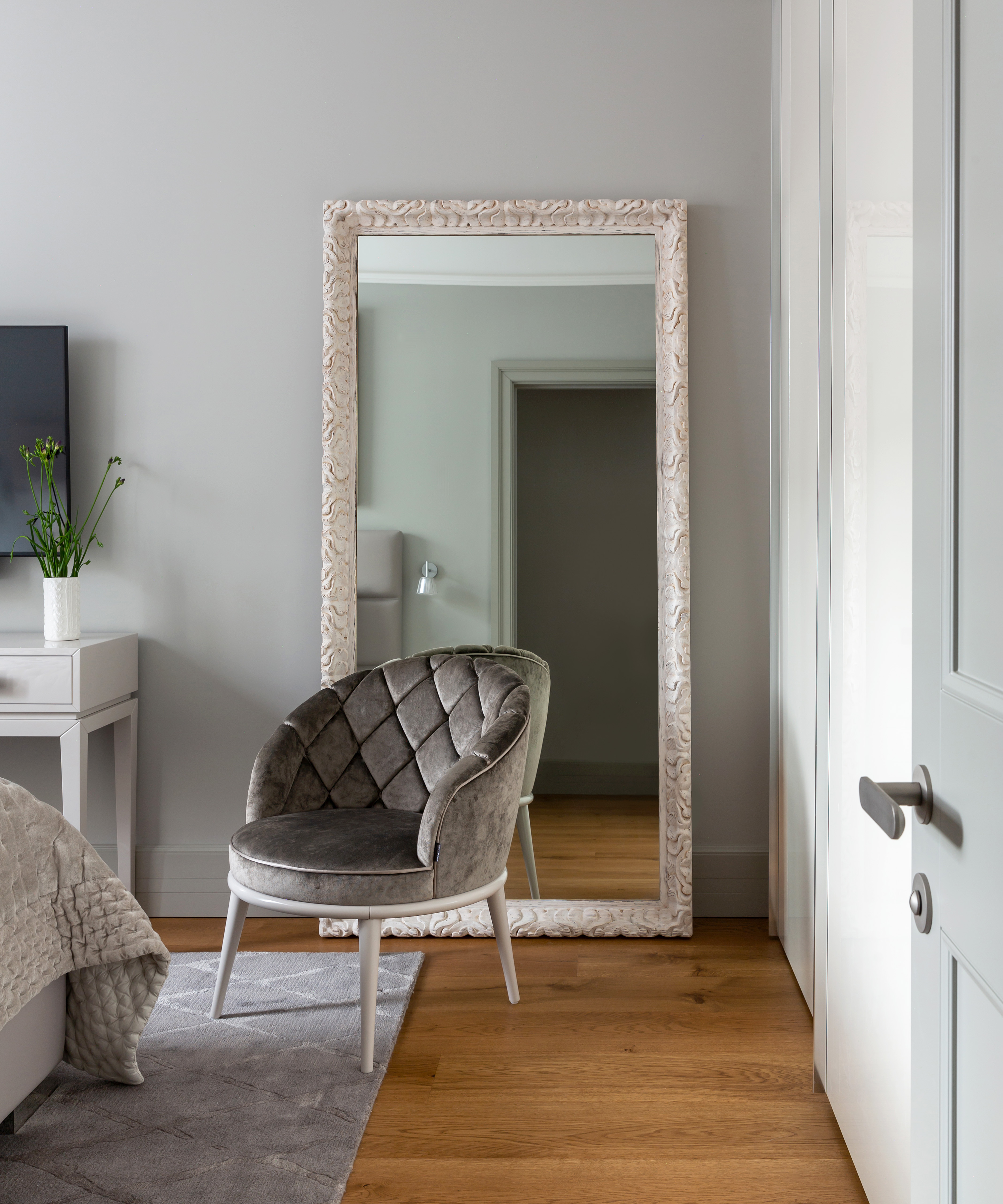
Now we’ve stepped through the looking glass into the world of a chic South Kensington townhouse; we’ll never look back. It’s time to bring even more mirrors into our homes.

Megan is the Head of Celebrity Style News at Homes & Gardens. She first joined Future Plc as a News Writer across their interiors titles, including Livingetc and Real Homes, before becoming H&G's News Editor in April 2022. She now leads the Celebrity/ News team.
Before joining Future, Megan worked as a News Explainer at The Telegraph, following her MA in International Journalism at the University of Leeds. During her BA in English Literature and Creative Writing, she gained writing experience in the US whilst studying in New York. Megan also focused on travel writing during her time living in Paris, where she produced content for a French travel site.
Megan currently lives in London, where she relocated from her hometown in Yorkshire. In her home, she experiments with interior design trends and draws inspiration from the home decor ideas she observes in her everyday work life. Her favorite pieces include her antique typewriter and her expansive collection of houseplants. When she isn’t writing, she is browsing London’s coffee shops and bookstores to add to her ever-growing library, taking over the open shelving in her apartment.
-
 Turns Out the Coolest New Café is Actually In Your Kitchen — Here's How to Steal the Style of TikTok's Latest Trend
Goodbye, over-priced lattes. Hello, home-brewed coffee with friends. TikTok's 'Home Cafe' trend brings stylish cafe culture into the comfort of your own home
By Devin Toolen Published
-
 5 Bathroom Layouts That Look Dated in 2025 — Plus the Alternatives Designers Use Instead for a More Contemporary Space
For a bathroom that feels in line with the times, avoid these layouts and be more intentional with the placement and positioning of your features and fixtures
By Lilith Hudson Published