Before & After: a 1950s home is transformed in the style of a cool coastal grandmother
Exposed beams, neutral tones and light wooden furnishings have completely elevated this Santa Barbara home
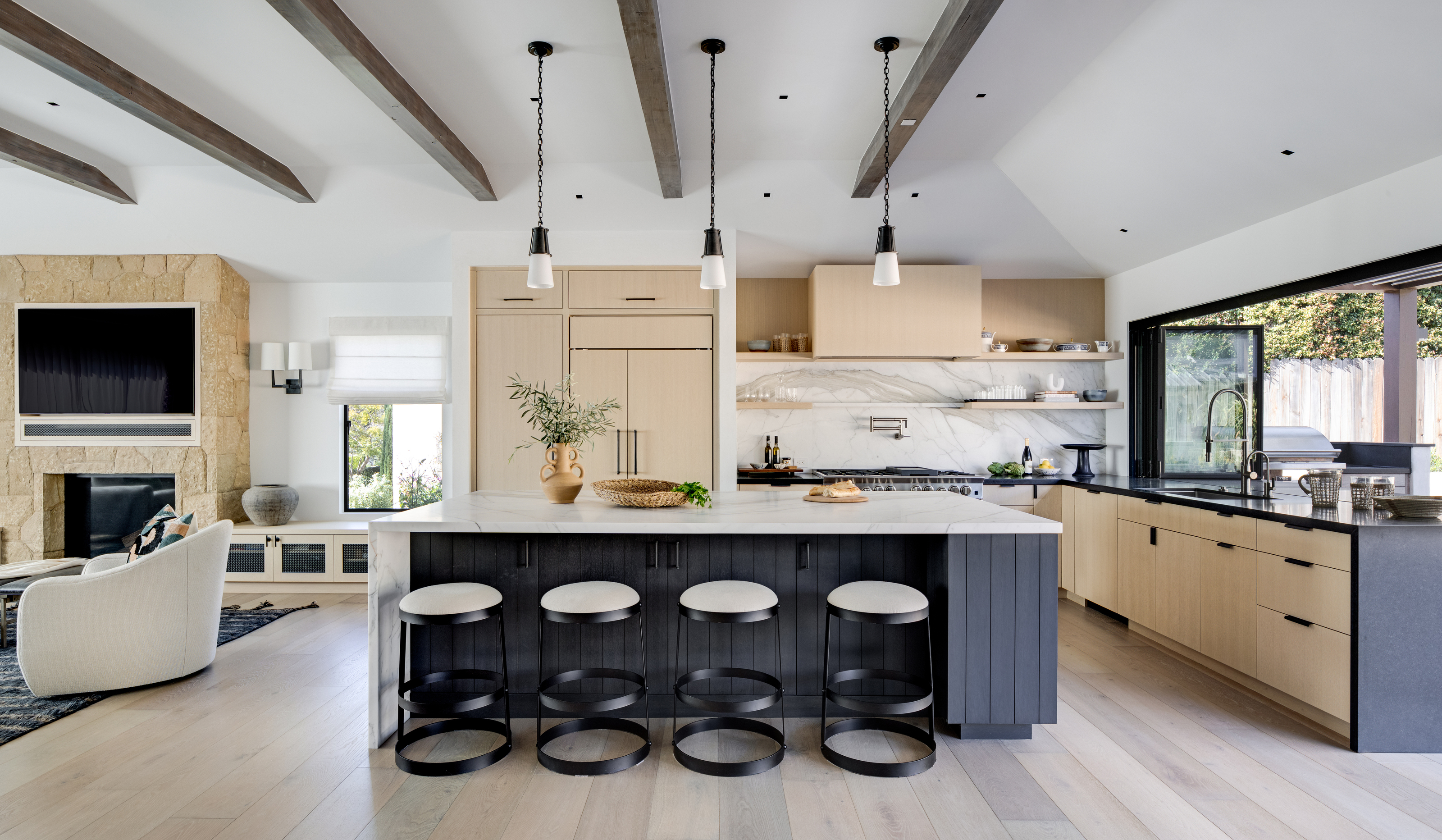

This family home's interior has gone from bland and traditional to a cool, modern and sophisticated coastal style. The four-bedroom, four-bathroom has been transformed into a modern home fit for the twenty-first century.
Before the renovation, the original 1950s home was lacking in personality. The homeowners' had a traditional style but their home lacked cohesion from room to room. Eager to update their space for modern living, they hired Santa Barbara interior designer Jessica Risko Smith to mustered her impeccable design skills.
By introducing modern fitted furniture, a neutral stony color palette, and natural wooden furnishings, she helped to complement the home's stunning architectural details.
'The goal was to achieve a clean, modern design with an open plan, indoor outdoor connection with ample space to entertain, relax and enjoy time with friends and family,' explains Jessica. 'We wanted to create something artistic, interesting and fresh and cohesive. We added color in a very mindful, measured way.'
The 3,300 sq ft Santa Barbara property had to be entirely gut renovated to update the floorplan. An extension allowed for a fourth bedroom and an additional small pantry space off the kitchen, but many elements of the traditional architecture were retained. Classic local materials such as Santa Barbara sandstone were also introduced to anchor the clean, modern forms and materials.
Before the renovation
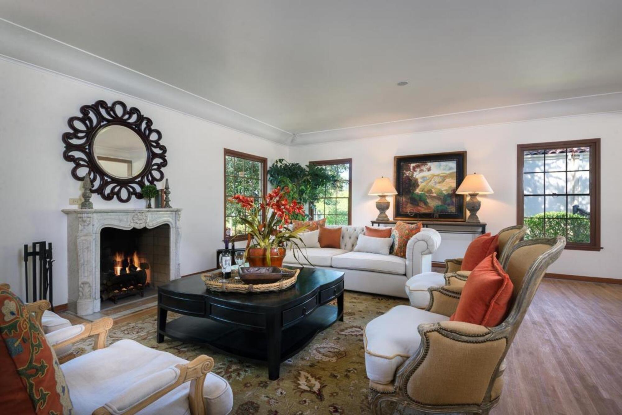
Before Jessica of JRS Interior Design helped to transform the property, the traditional living room lacked character and warmth. The antique furnishings gave the room a classy feel but not a cozy one, while the patterned rug distracted from the more remarkable features, such as the fireplace.
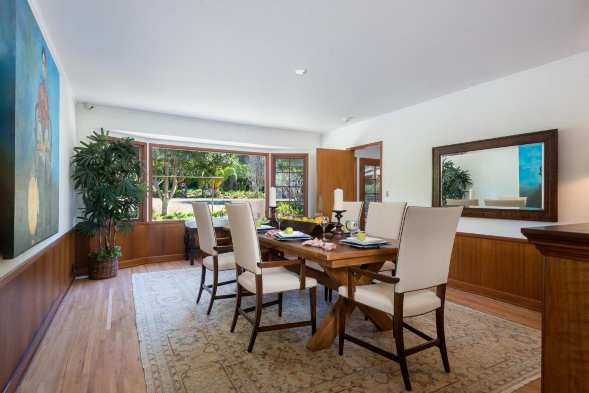
A closed-plan blueprint paired with dark wood panelling made the dining room feel claustrophobic despite the panoramic windows. The previous interior was in need of color and vibrancy.
Be The First To Know
The Livingetc newsletters are your inside source for what’s shaping interiors now - and what’s next. Discover trend forecasts, smart style ideas, and curated shopping inspiration that brings design to life. Subscribe today and stay ahead of the curve.
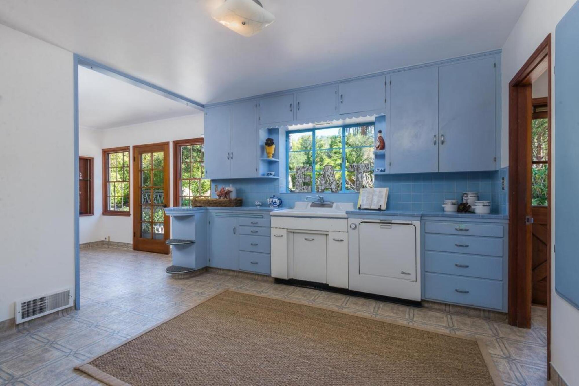
The only color in the main rooms of the home prior to Jessica's renovation was in the kitchen where all-blue cabinetry brought a shock to the system! Meanwhile, linoleum flooring and dated appliances made it feel as though you'd stepped back in time. Yet, the powder blue tones and natural hessian rug offer a hint of the coastal grandmother vibe that the homeowners later embraced.
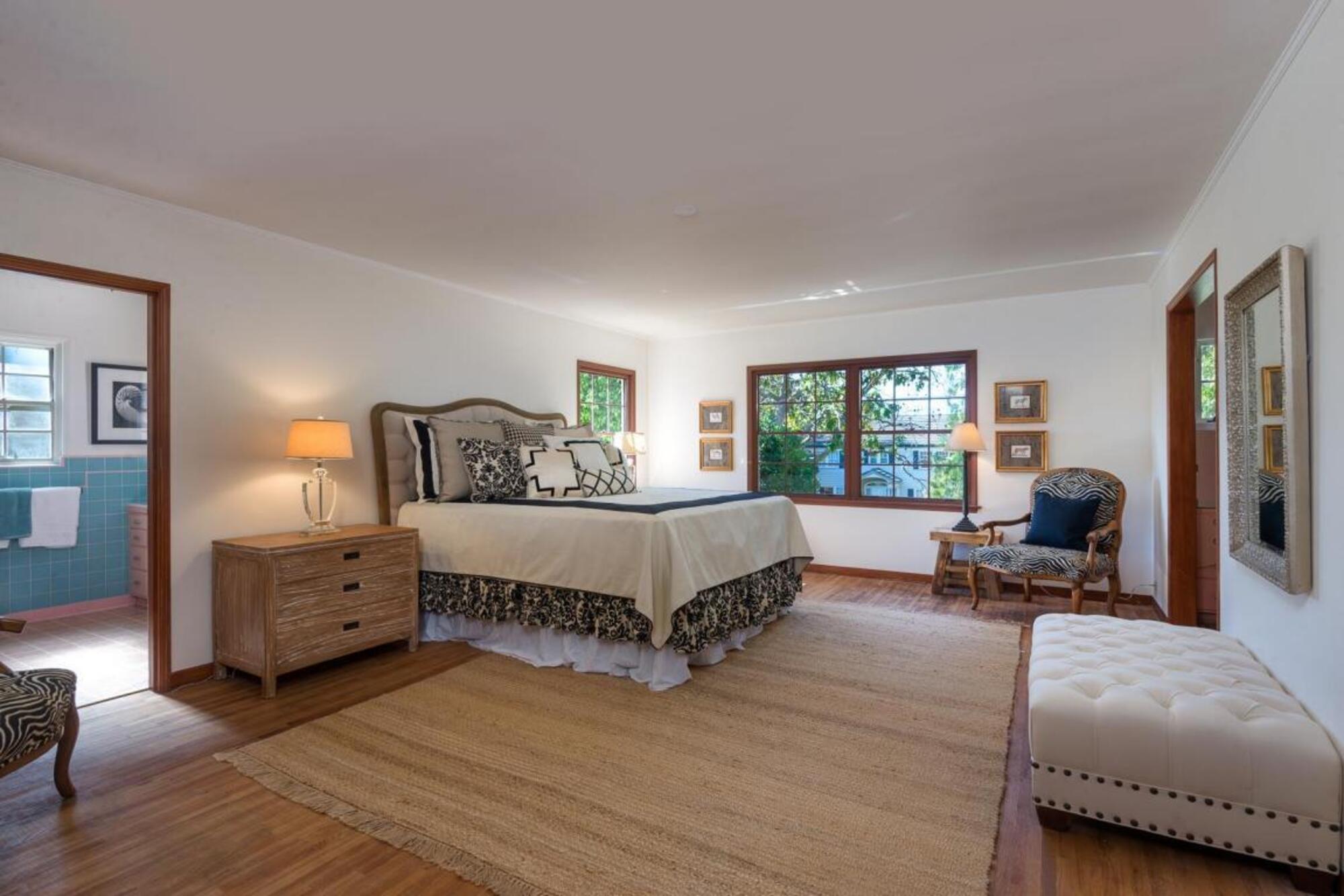
Previously, the master bedroom featured neutral hues but lacked enough tonality, resulting in a bland, two-dimensional space. With less natural lighting, the dark wooden flooring made the room feel enclosed.
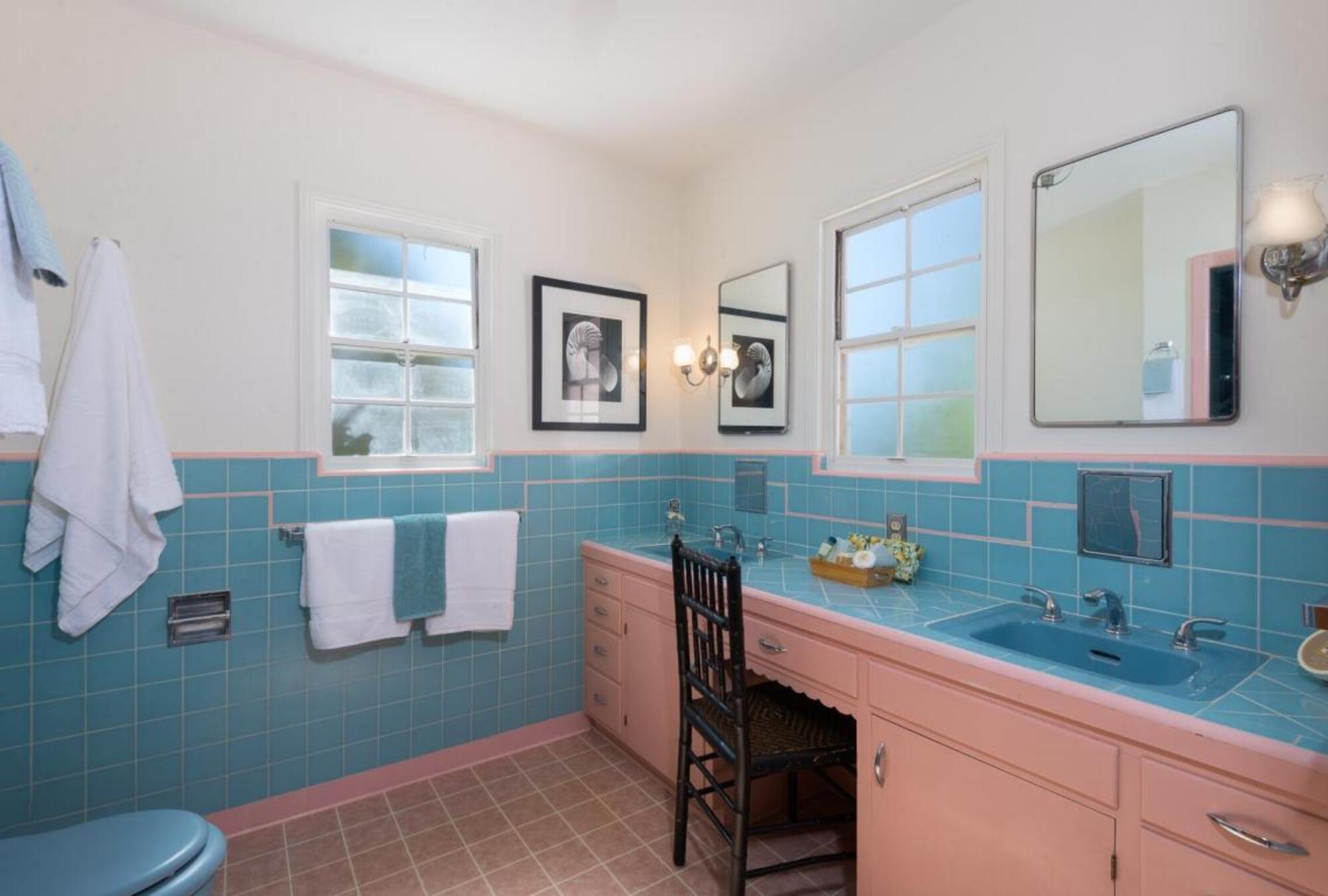
An unexpected burst of color in the ensuite bathroom made for a kitsch, outdated space. The blue and pink tiles and cabinetry were garish as opposed to playful, while the low vanity and lack of shelving proved impractical for the residents.
After the renovation
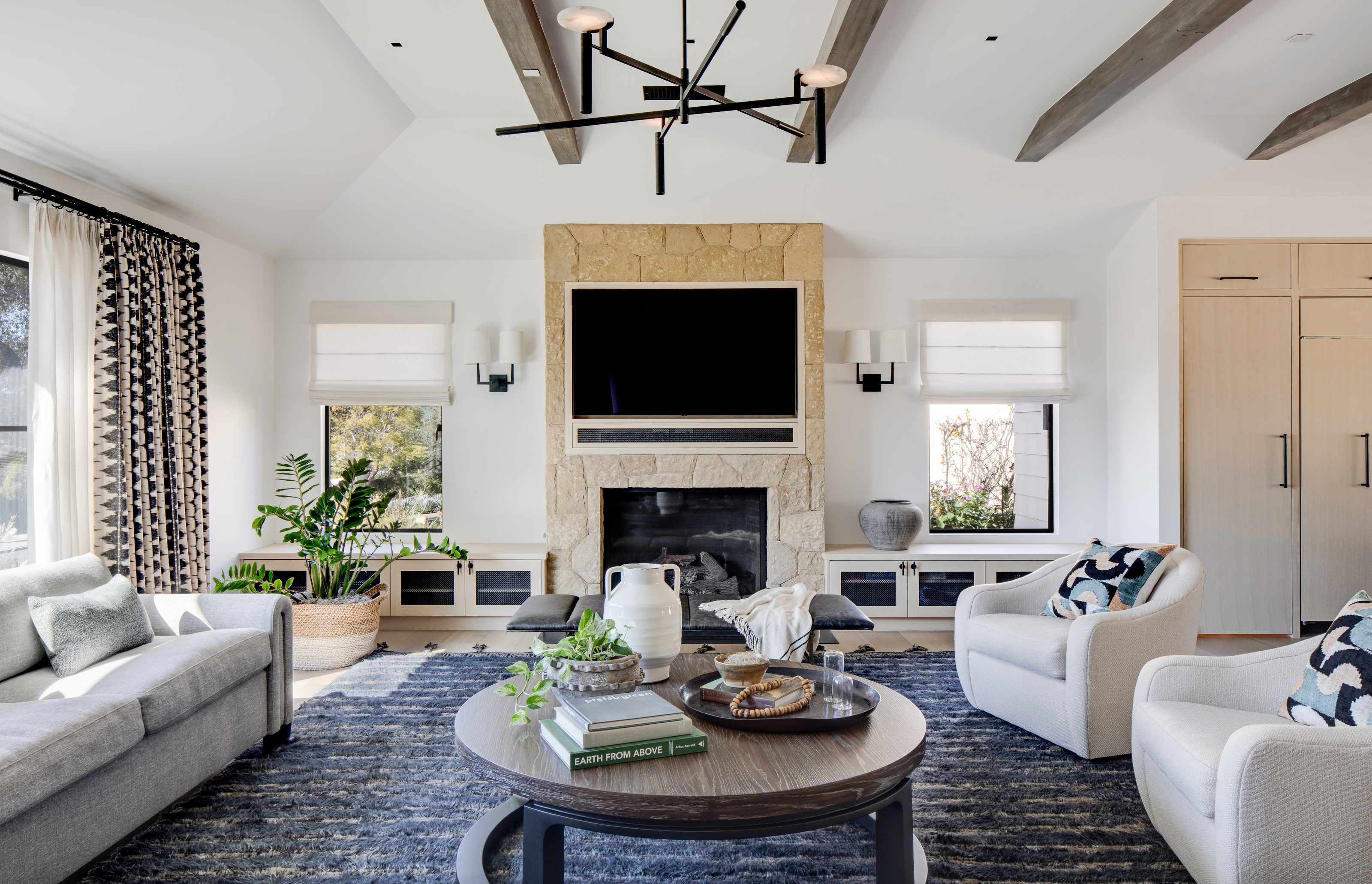
After the upgrades, a fresh yet cozy living room is totally unrecognisable. The cool color scheme of blues and greys adds a beachy theme fit for the Californian coastline. With the soft textiles and the sandstone fireplace, it achieves an on-trend coastal grandmother vibe.
On her use of color, Jessica explains: 'We used subtle hues in the fabrics and pillows and accessories. This home is in a California beach town so we wanted to reflect that, but with a very sophisticated approach.'
She added exposed beams to help emphasise the architectural ceilings while down below, the soft, earthy rug offers the perfect counterpoint to the sandstone fireplace.
'We made the room feel brighter by raising the ceilings in the great room, keeping a white and bright paint scheme and using varying tones of lighter woods throughout,' says Jessica. 'The larger windows across the back of the house also allow a great deal of light to enter the space.'
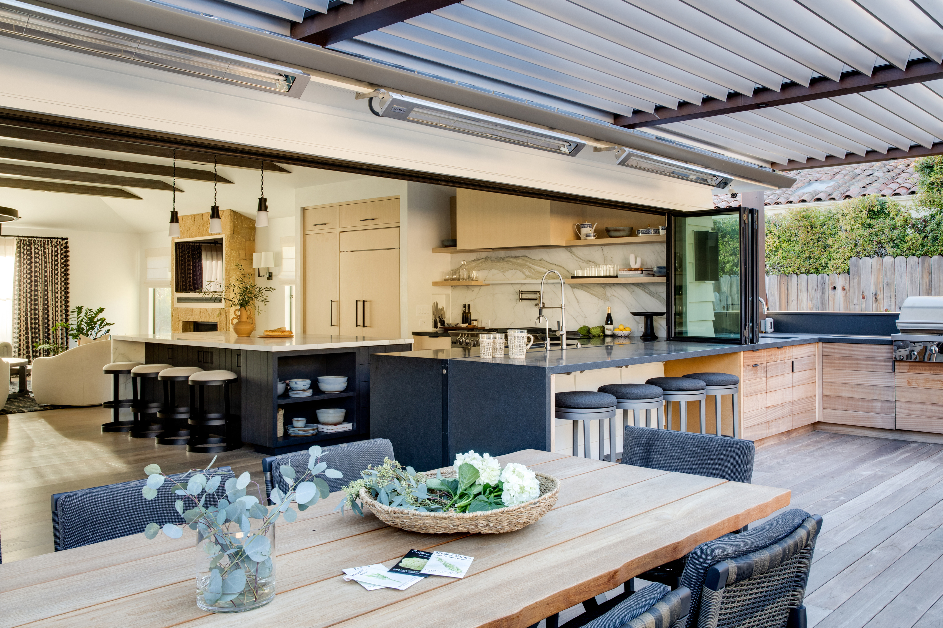
A beautiful open plan kitchen transitions seamlessly to an outdoor dining and kitchen space where wooden cabinetry, flooring and furniture feels rustic yet modern.
Connecting the interior materials to the exterior was a key focus for the design team who wanted a cohesive area that would enhance the space in the backyard. 'We wanted true inside/outside living in this home,' explains Jessica. 'Relocating the kitchen to the side rather than the center of the floorplan allowed us to anchor the back patio barbecue area off of the kitchen and from there everything just opens up.'
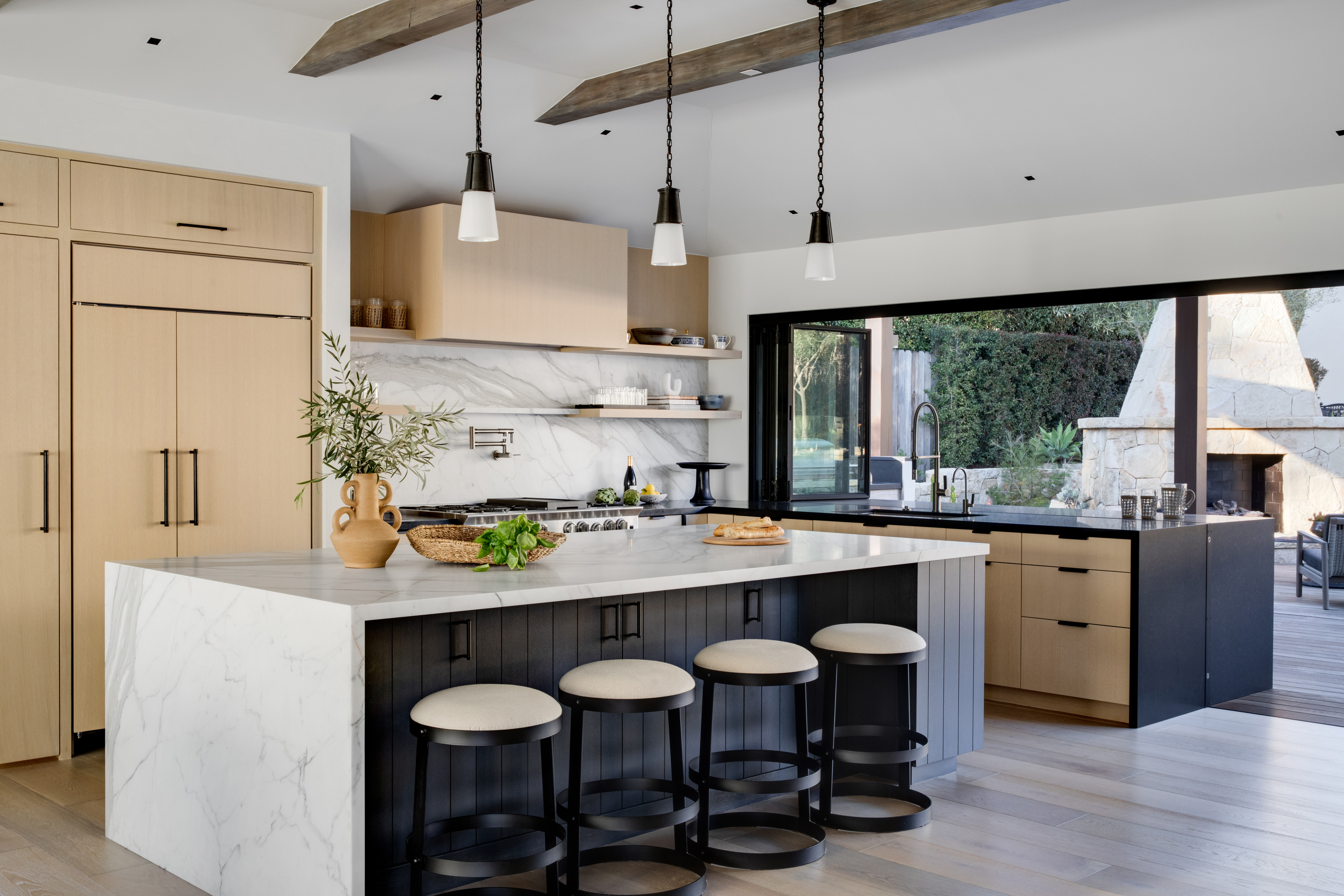
Bespoke pendant lighting enhances the high vaulted ceilings in the kitchen which, paired with the darker cabinetry indoors, add an hint of industrial interior design. Opening up the plan and introducing more light allowed Jessica to introduce these darker details. She also used the client’s daughter’s pottery and selected handmade pots from a local Ojai potter as décor touches throughout the home to add character.
Jessica gave special attention to the textures in the kitchen too. 'The marble splash and island were chosen to compliment and balance the rougher sandstone,' she says. 'I wanted an active visual element in the kitchen to draw you in and balance the fireplace component, and the graceful figure of this stone carries your eye across the room.'
She adds: 'The marble waterfall edge picks up this figure and anchors the island so it feels more like a true end point to the room.'
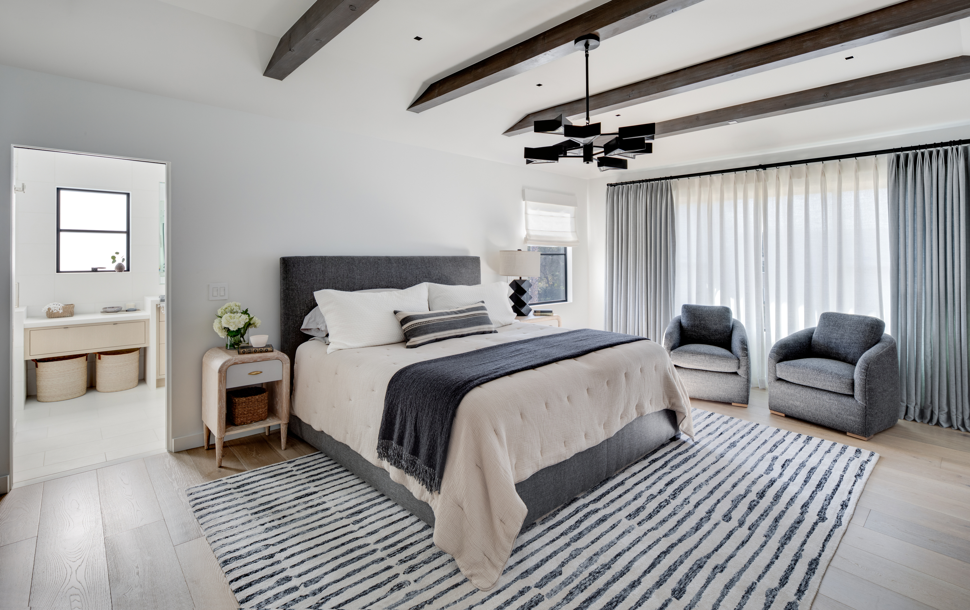
Post-renovation, thought has been given to the tonality of the bedrooms and softer furnishings make it feel warm and inviting. Compared to before, they're stylish and chic rooms perfect for relaxation. With this modern bedroom idea, the cool color scheme instantly lifting this master bedroom to make it feel light and airy.
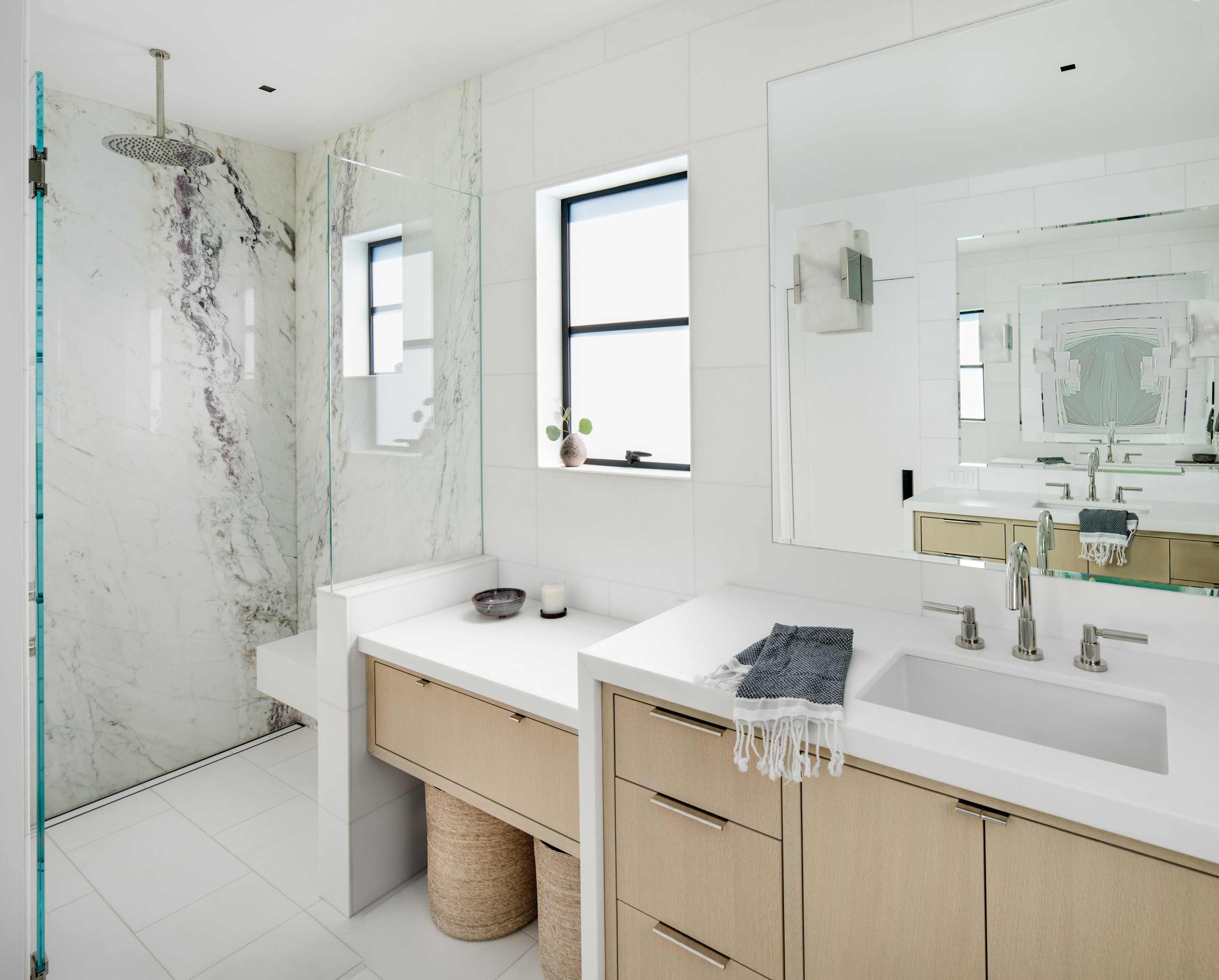
A neutral bathroom is far more fitting than the bright pink and blue of the previous en-suite. Wooden cabinetry pairs beautifully with the natural woven baskets and modern touches, such as the white marble and overhead shower, introduce a luxurious feel.
'We enjoyed playing with the materials to create some consistency, but I don't like cookie cutter bathrooms,' says Jessica. 'All of the rooms are related through the cabinetry light oak stain, or through the countertop materials. I like to riff on a theme using an edited palette, rather than repeat everything in each room. It makes for a more interesting day to day experience.'

Lilith Hudson is a freelance writer and regular contributor to Livingetc. She holds an MA in Magazine Journalism from City, University of London, and has written for various titles including Homes & Gardens, House Beautiful, Advnture, the Saturday Times Magazine, Evening Standard, DJ Mag, Metro, and The Simple Things Magazine.
Prior to going freelance, Lilith was the News and Trends Editor at Livingetc. It was a role that helped her develop a keen eye for spotting all the latest micro-trends, interior hacks, and viral decor must-haves you need in your home. With a constant ear to the ground on the design scene, she's ahead of the curve when it comes to the latest color that's sweeping interiors or the hot new style to decorate our homes.
-
 These Are the Flower Crowns I’m Wearing This Spring (Spoiler: They’re Actually for My Door)
Coachella confirmed the comeback of flower crowns. At home, they just go by another name: the spring wreath
By Julia Demer
-
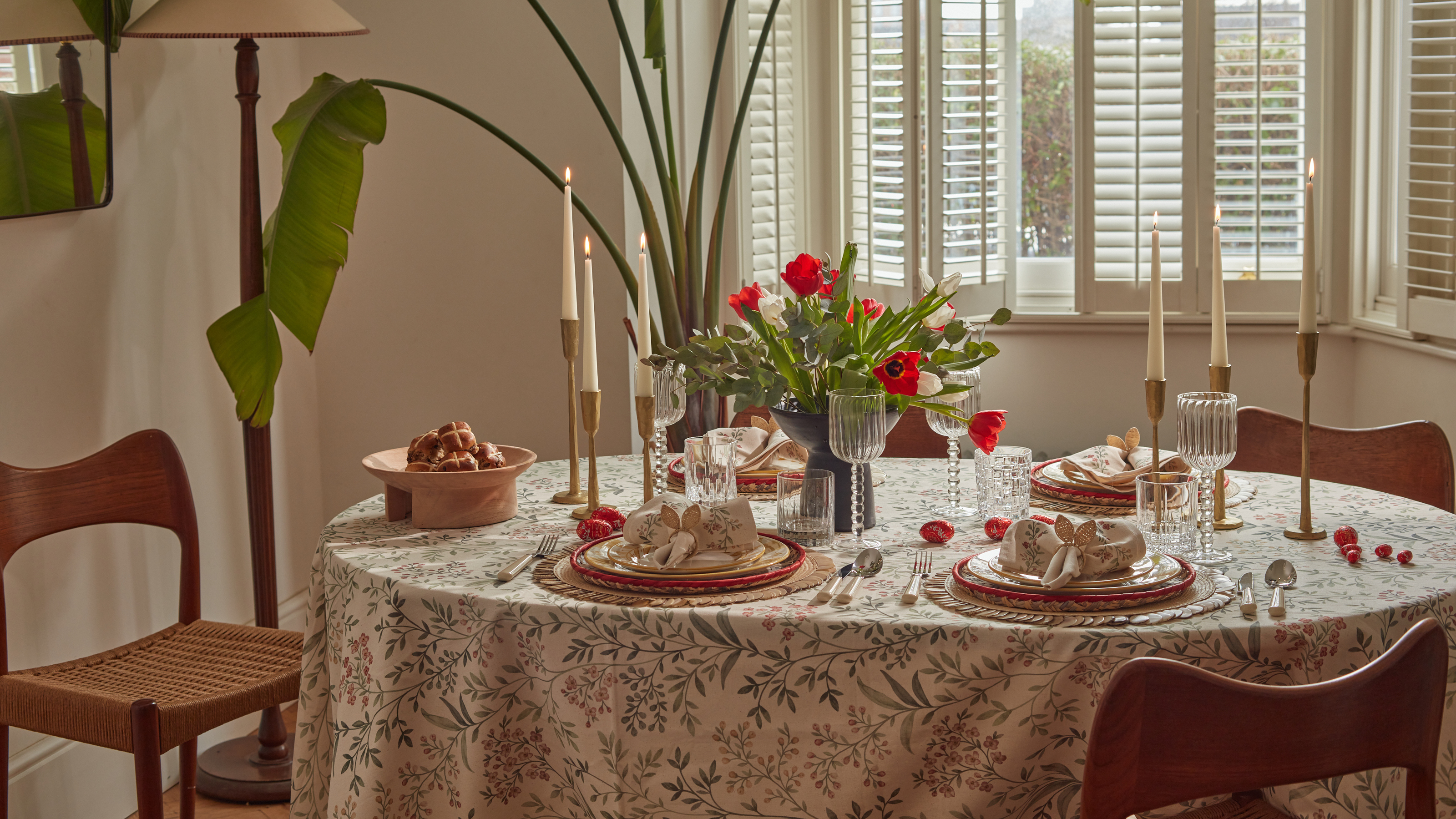 Bunny Ears, Be Gone — 7 Easter Table Styling Mistakes That Will Take Your Setting from Tawdry to Tasteful
From fussy floral displays that disrupt conversation to over-relying on tacky tropes, don't fall victim to these errors when decorating your Easter table
By Lilith Hudson