Before & After: this Beverly Hills home shows how boho style can be added beautifully into any space
Mid-century modern meets boho chic in this Beverly Hills home which has undergone an astonishing transformation


This 1960s Beverly Hills home - originally constructed by the architect behind Elvis and Priscilla Presley’s L.A. retreat, Rex Lotery - has been given a contemporary makeover that pairs the mid-century style with a boho vibe for a serene yet sophisticated space. With a calming color palette thrown in for good measure, the transformation of this modern home is something you'll be itching to replicate yourself.
The renovation is all thanks to the handy work of Hollis Jordyn Design, a studio headed by childhood friends, Hollis LaPlante and Jordyn Grohl. The duo thoughtfully reimagined and restored the three bedroom home, elevating the design and opening up to floorplan for a lighter, more airy space suitable for modern living. With a mid-century modern aesthetic the designers nod towards the home's heritage, while the bohemian style captures the essence of the Californian coastline.
'Our goals for this project were to bring in more light, break down walls to create fluid circulation, make the space feel expansive, and to enhance the relationship between the indoor and outdoor elements,' say Hollis and Jordyn. 'We wanted to maintain the original characteristics of Californian modernist architecture made by renowned architect Rex Lotery by giving certain design elements a refresh.'
Here, we take a look inside the hilltop home alongside some advice from the design duo on how to elevate the dated decor in your own home.

Lilith is an expert at following news and trends across the world of interior design. She has an eye for appealing designs and interesting spaces which she regularly shares with readers through home tours, such as this one. After seeing the transformation Beverly Hills home from tired and lacklustre to boho and beautiful, she couldn't wait to share the designers tips for creating such a calming space
Before the renovation
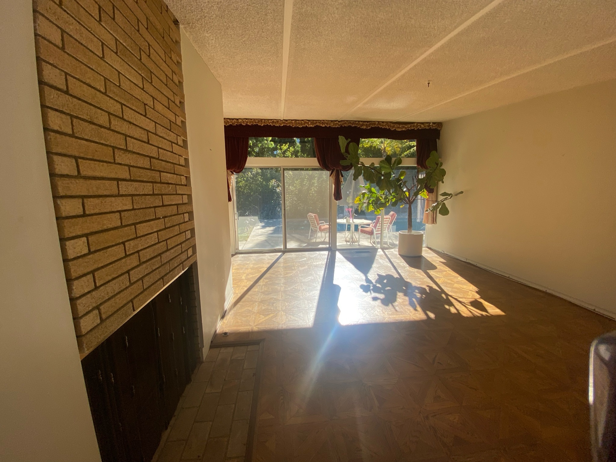
Prior to the renovation by Hollis Jordyn Design, the home was dark and dated with popcorn ceilings, closed off rooms, and damaged floors. The closed floorplan allowed for no sense of flow between individual rooms which failed to welcome guests inside. While it featured beautiful parquet wooden flooring, the dark wood made the spaces feel dark and enclosed despite the large floor to ceiling windows.
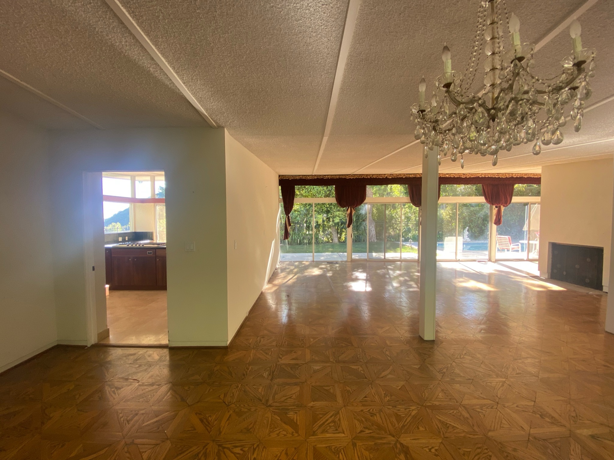
Despite being spacious rooms, the main living area felt smaller than it actually was thanks to a partition wall. The popcorn ceilings, red curtains and chandelier light fixture made it feel as though you'd stepped back in time upon entering the home, with few renovations having been made since the house was originally built.
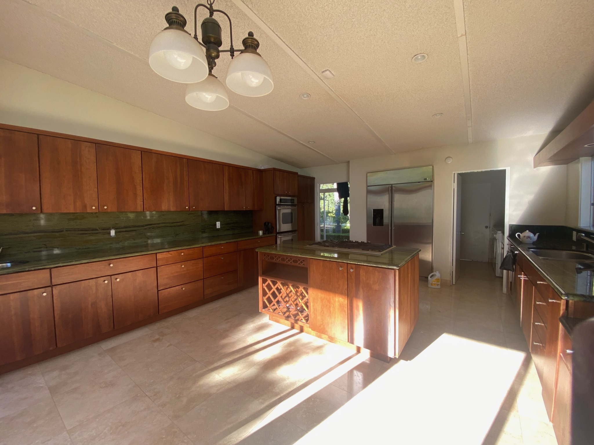
Dark wooden cabinets in the kitchen again contributed to the oppressive feeling of the rooms despite it being flooded with plenty of natural light. This was heightened by the dark countertops which absorb the light, and dated floor tiles which lacked any aesthetic appeal.
Be The First To Know
The Livingetc newsletters are your inside source for what’s shaping interiors now - and what’s next. Discover trend forecasts, smart style ideas, and curated shopping inspiration that brings design to life. Subscribe today and stay ahead of the curve.
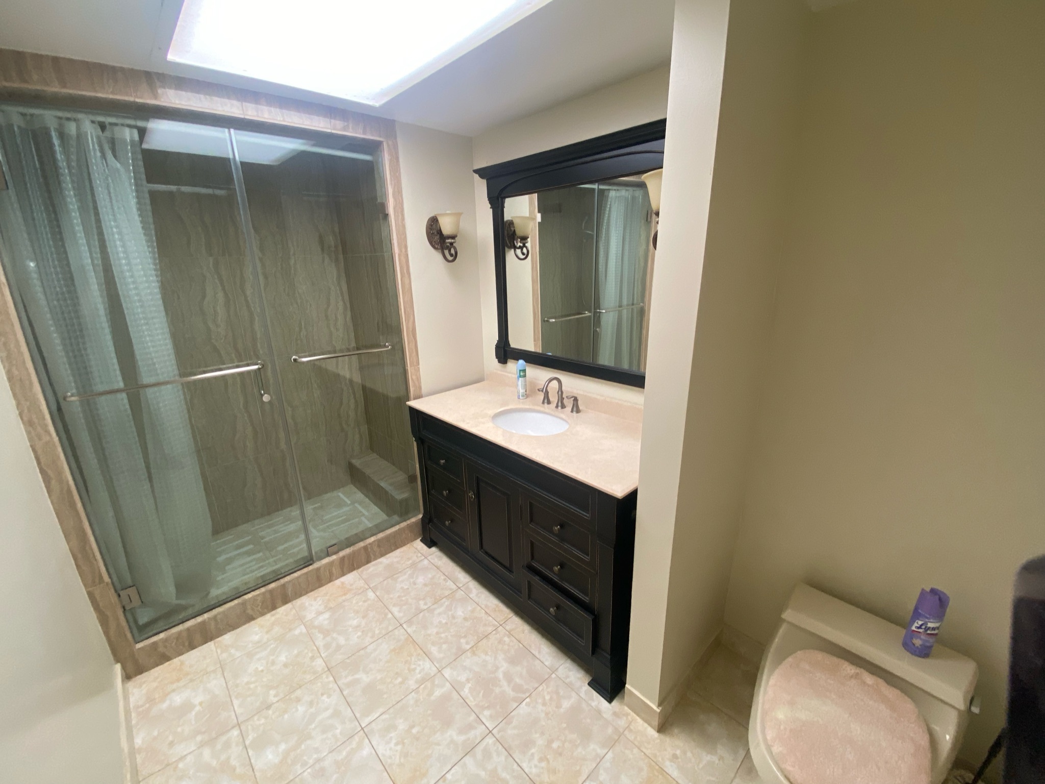
Dated tiles told the same story in the shower room where an off-white and jet black color scheme felt jarring. Despite the installation of a skylight, this space didn't feel fresh or airy as you'd hope from a washroom; it was calling out for a modern uplift.
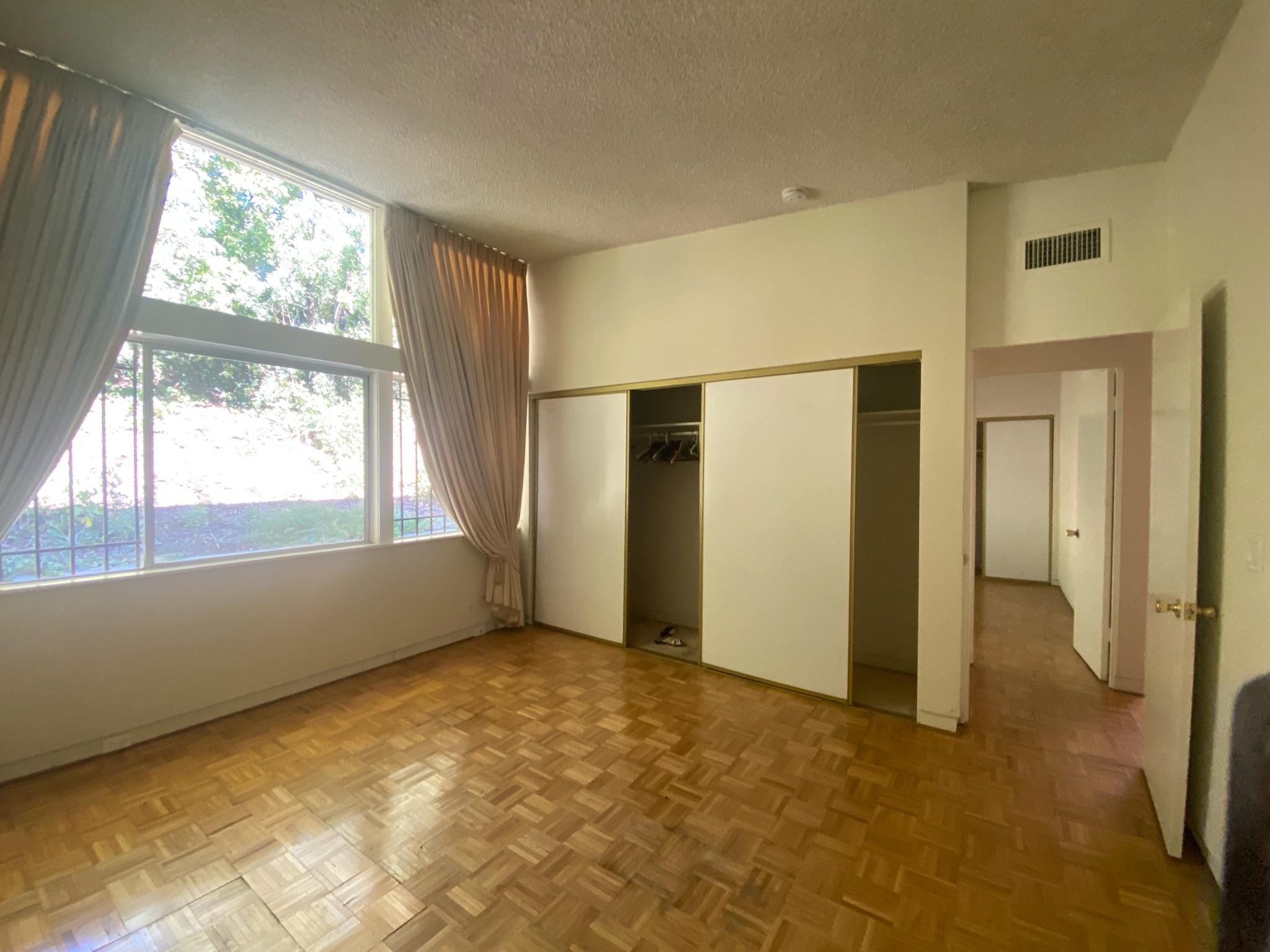
The bungalow benefitted from plenty of light and beautiful landscapes beyond the windows, but the bland colors used in the home failed to reap the benefits of these selling points. There was amble storage space in the bedrooms, but the closet doors were again dated and lacklustre.
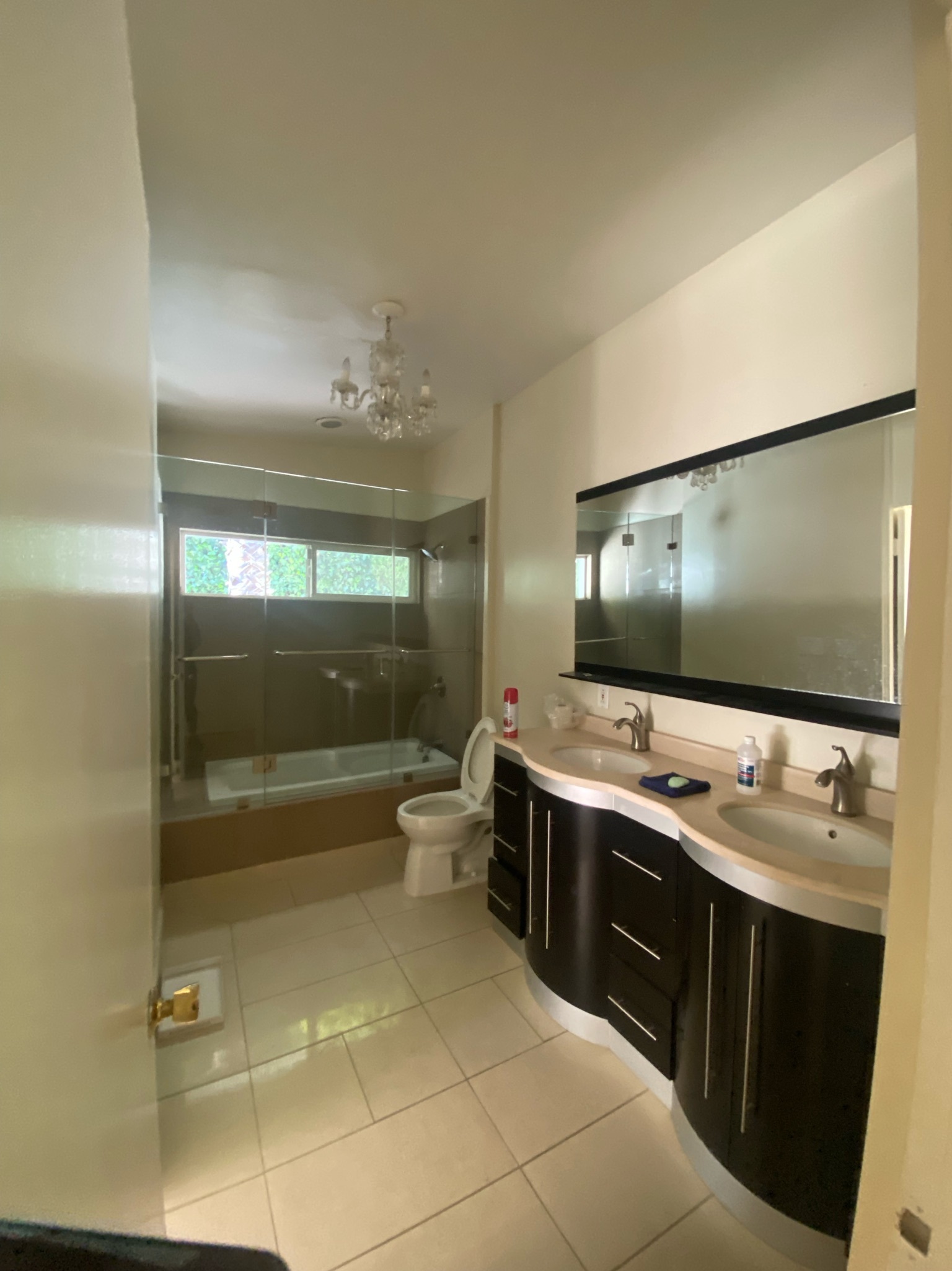
The primary bathroom boasted a double vanity and a large bath but a monochromatic color scheme made the space feel bland and dated. (And that's before you even lay eyes upon the chandelier light fixture!) The concept had potential, but the lack of contemporary details meant the visual appeal fell short.
After the renovation
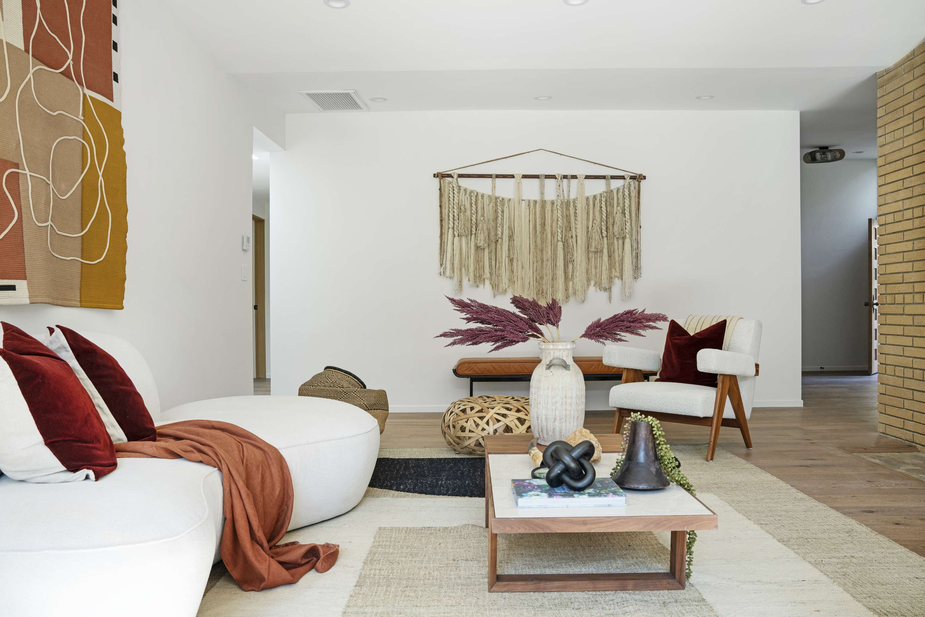
After Hollis and Jordyn put their skills to the test on this lacklustre hillside home, the living area was transformed into a cool, bohemian space that promotes comfort and relaxation. 'We worked with the staging company, Modern Mecca, to stage the space to reflect the Mid-Century design aesthetic,' says Jordyn. 'We wanted the lines to be geometric and clean coupled with a neutral color scheme with bold warm hues serving to ground the space.'
Despite exuding a California-cool vibe with the soft furnishings, the space still remains sophisticated thanks to the on-trend curved sofa and decorative details. 'When we discovered Modern Mecca we initially were drawn to their ability to transform a space through staging and bring a modern touch to the Mid-Century modern style,' adds Hollis. 'We feel that it’s very important for the furnishings to reflect the soul of the home.'
She continues: 'We love the overall muted and neutral tones of the furniture, which are paired with warm accents and natural textures. The wood elements pop and the curved furniture offers a beautiful contrast to the sharper lines found throughout the home.'
Add an abstract blanket into your living room used as a tapestry wall hanging for a bohemian feel. The subtle colors in this throw by Burke Decor come in three color-ways and promise to introduce serenity into your space.
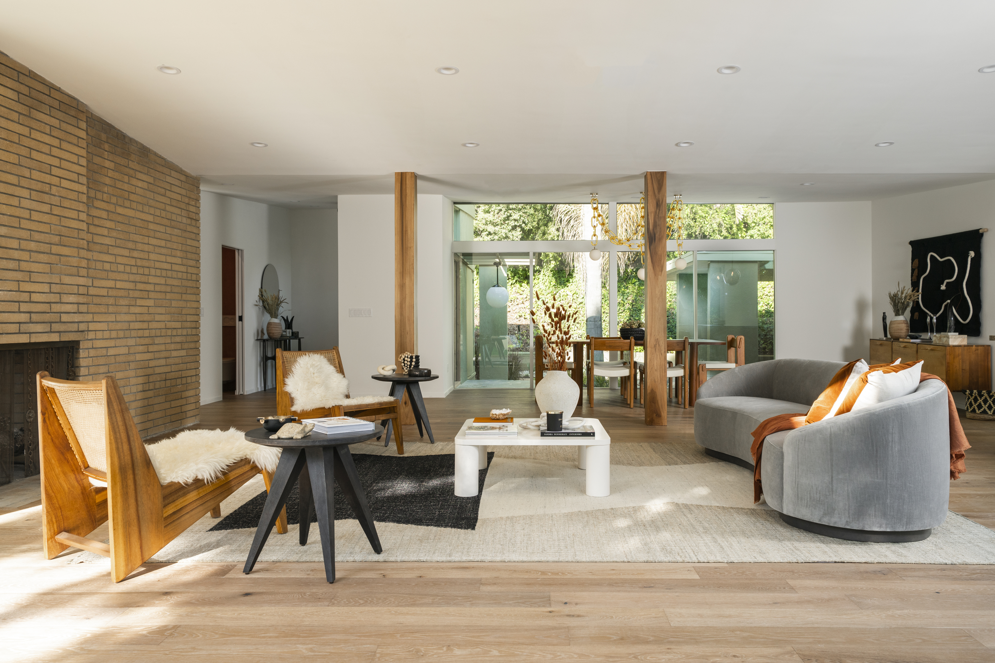
The adjoining open living space offers more convivial seating as well as a beautiful dining area. The warm brown tones of the brick fireplace and wooden pillars are echoed in the blonde wood furniture to compliment the neutral scheme.
'During construction we discovered the beautifully designed brick hidden behind the drywall on the fireplace,' explains Jordyn. 'We were thrilled that the brick was still in excellent condition and wanted to restore it and have it displayed as originally intended.'
This became the springboard from which the rest of the room's design was inspired. 'Once we stripped the original parquet flooring in favor of a lighter wood floor, we knew we wanted the flooring to reflect the subtle warm tones featured in the brick fireplace,' Hollis notes.
It was then a case of created a more logistical flow throughout the floorplan. As Hollis explains: 'In order to open up the space and create more light, we tore down the wall that originally closed the kitchen off from the living and dining room areas and removed a wall that closed off the den on the other side of the fireplace to encourage fluid mobility between all the common areas.'
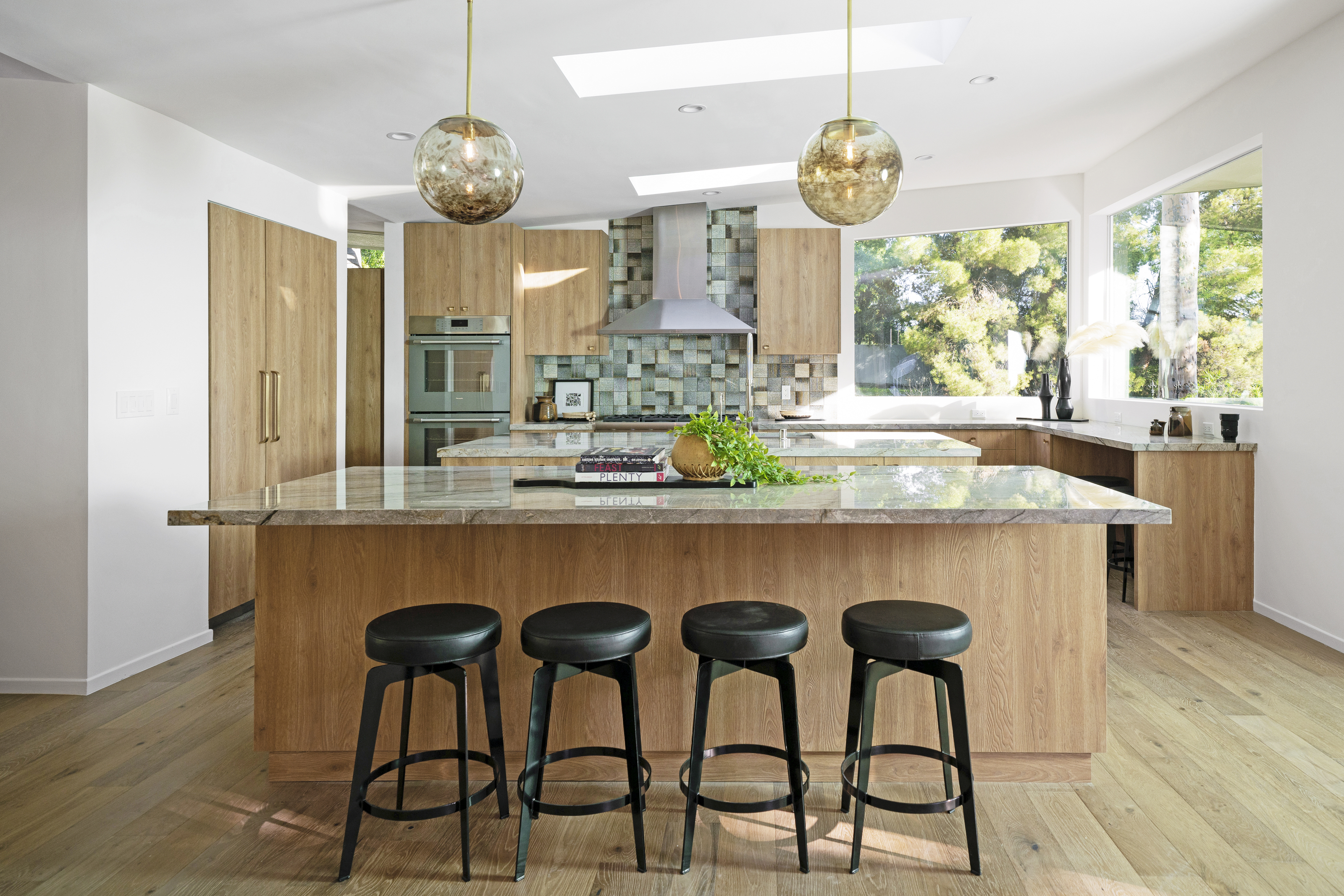
Adding light through soft tones was the running theme throughout the kitchen, too. 'The design team added durable materials to the home by incorporating custom oak cabinetry in the kitchen, engineered wood flooring, and interior doors which were constructed in oak wood and features a beautiful geometric design,' notes Hollis.
To keep up with the changing times, the homeowners wanted the kitchen to be a social as well as functional space for the family and their guests to enjoy. 'When considering the functionality of this home we wanted the layout and design of the kitchen reflect an inspiring relationship with the rest of the home that lends itself to entertaining and congregating while also connecting with the outdoors,' says Jordyn. The latter point was aided by the large windows and skylights which help to blur the boundaries of indoors and outdoors.
Add a touch of the mid-century modern style to your home with this glass vase, from Amazon. Elegant curved lines add a hint of sophistication to a functional space like the kitchen while the beautiful blue glass reflects the light around the room - the perfect addition to kitchen open shelving
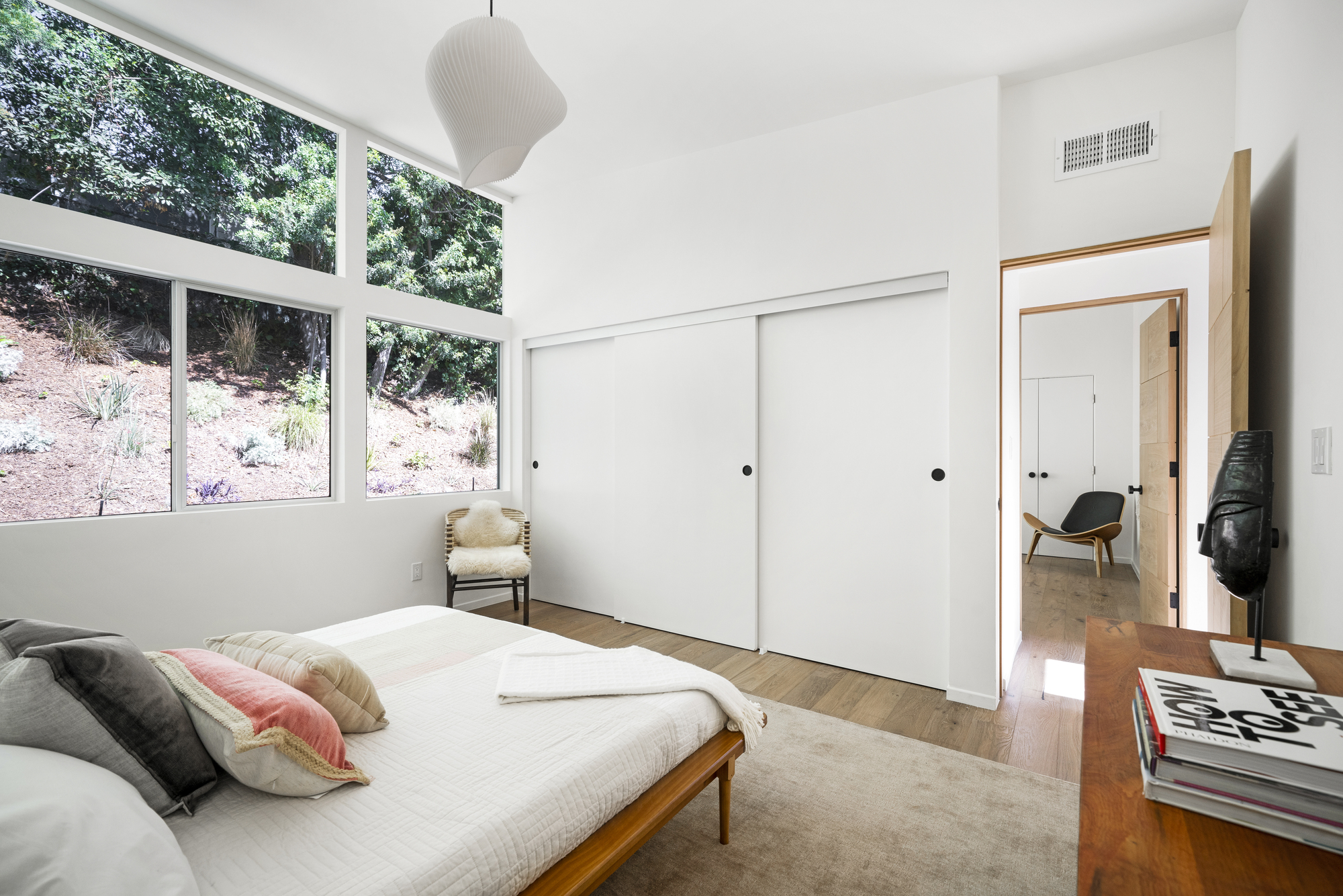
Carpets have been replaced with wooden flooring in the bedrooms for a more contemporary look, while large area rugs still contribute to a cozy feel. The bright white paint idea, as used throughout the rest of the home, makes these boho bedrooms feel fresh and airy while also inviting in plenty of west coast sunshine which is reflected around the room.
This was also helped my updates to the windows where the iron bars were removed and glass was replaced. 'We also removed the popcorn ceiling and refreshed the space with new doors,' explains Jordyn. 'Once again the pendants in each bedroom are sculptural and adhere to the Mid-Century style, honoring the home’s history and charm.'
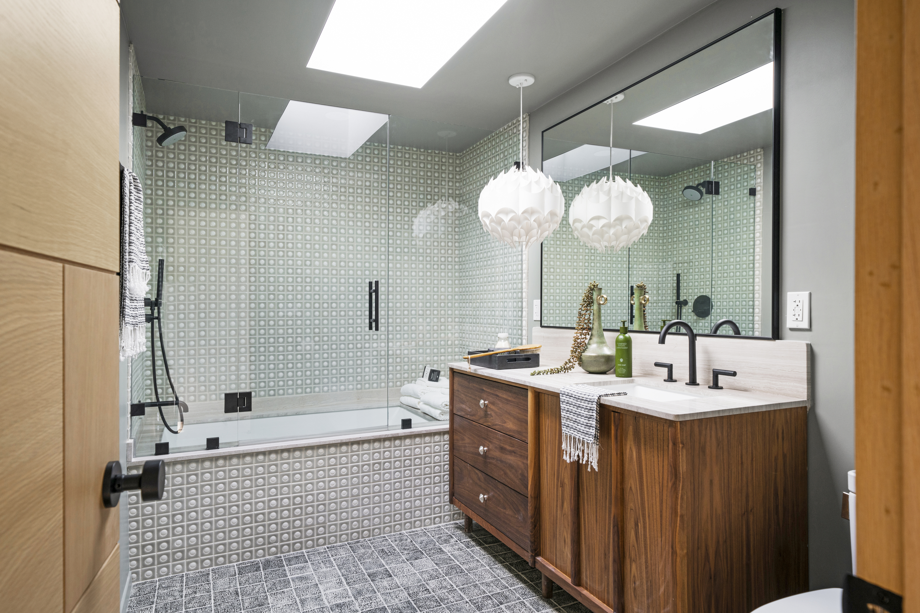
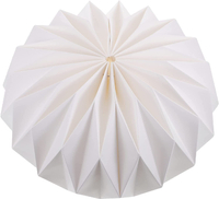
Pleated paper lamp shade, Amazon
Paper lampshades are timeless, but this pleated origami shade from Amazon brings a little something extra with its textured design. The folded pleats make the lighting extra warm and gentle, while the durable material is still hardy enough to be used in a bathroom, if you wanted to imitate the design above by Hollis and Jordyn.
The bathrooms have been warmed up with the help of custom walnut vanities staying true to the Mid-century aesthetic, while brighter bathroom tiles and a lick of paint help to lift the shadows that dominated before the transformation.
'When selecting materials for a bathroom it's always a good idea to consider the size of the space you are working with,' Hollis advisers. 'For example, darker colors in a small space will only make the bathroom feel more confined and cramped. In order to create a sense of space and airiness in a bathroom, keep the majority of the tones light with darker or richer colors used as accents.'
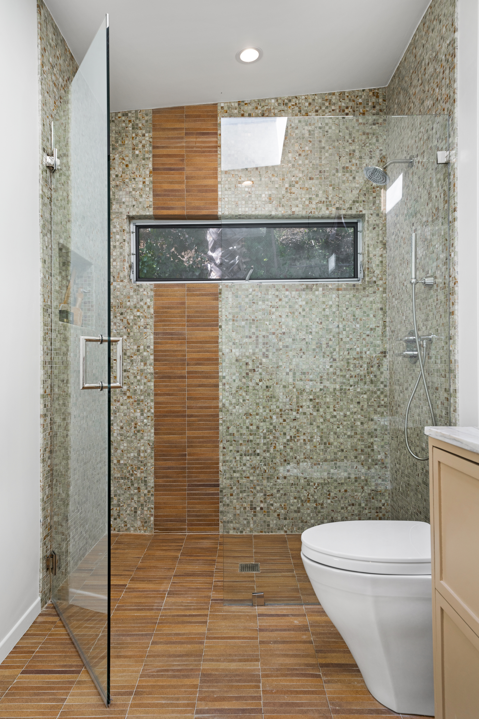
Finally, the primary bathroom is now a spa-like space with a combination of terracotta and mosaic tiles which add a hint of the Mediterranean. Recessed lighting also helps to maximize light and space in this previously dark and confined area.
'When designing the Primary bathroom, our goal was to bring in more light and so we added a skylight here,' explains Jordyn. 'We fell in love with this stone countertop, which has various shades of white, gray, and purple, and painted the walls white, which allowed other design elements to pop and liven up the space.'
She adds: 'The custom built vanity was painted in Benjamin Moore’s Brookline Beige, which brought in the subtle warm tone also found in the flooring. The brick tile we picked out has a warmth to it that is reflected in the Dark Green Onyx used in the shower, while the green tile pays homage to the natural beauty surrounding the home.'

Lilith Hudson is a freelance writer and regular contributor to Livingetc. She holds an MA in Magazine Journalism from City, University of London, and has written for various titles including Homes & Gardens, House Beautiful, Advnture, the Saturday Times Magazine, Evening Standard, DJ Mag, Metro, and The Simple Things Magazine.
Prior to going freelance, Lilith was the News and Trends Editor at Livingetc. It was a role that helped her develop a keen eye for spotting all the latest micro-trends, interior hacks, and viral decor must-haves you need in your home. With a constant ear to the ground on the design scene, she's ahead of the curve when it comes to the latest color that's sweeping interiors or the hot new style to decorate our homes.
-
 These Are the Flower Crowns I’m Wearing This Spring (Spoiler: They’re Actually for My Door)
Coachella confirmed the comeback of flower crowns. At home, they just go by another name: the spring wreath
By Julia Demer
-
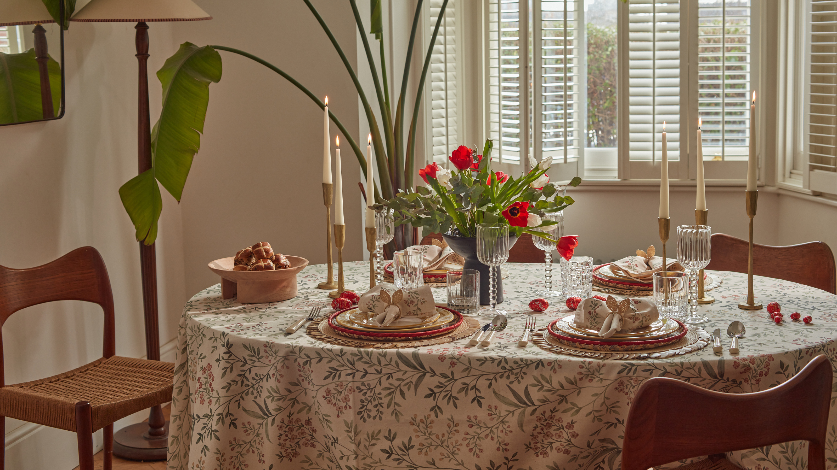 Bunny Ears, Be Gone — 7 Easter Table Styling Mistakes That Will Take Your Setting from Tawdry to Tasteful
From fussy floral displays that disrupt conversation to over-relying on tacky tropes, don't fall victim to these errors when decorating your Easter table
By Lilith Hudson


