Before & After: see how this Hollywood home was transformed using clever mid-century ideas
What was a bland home is now a contemporary neutral paradise with playful touches
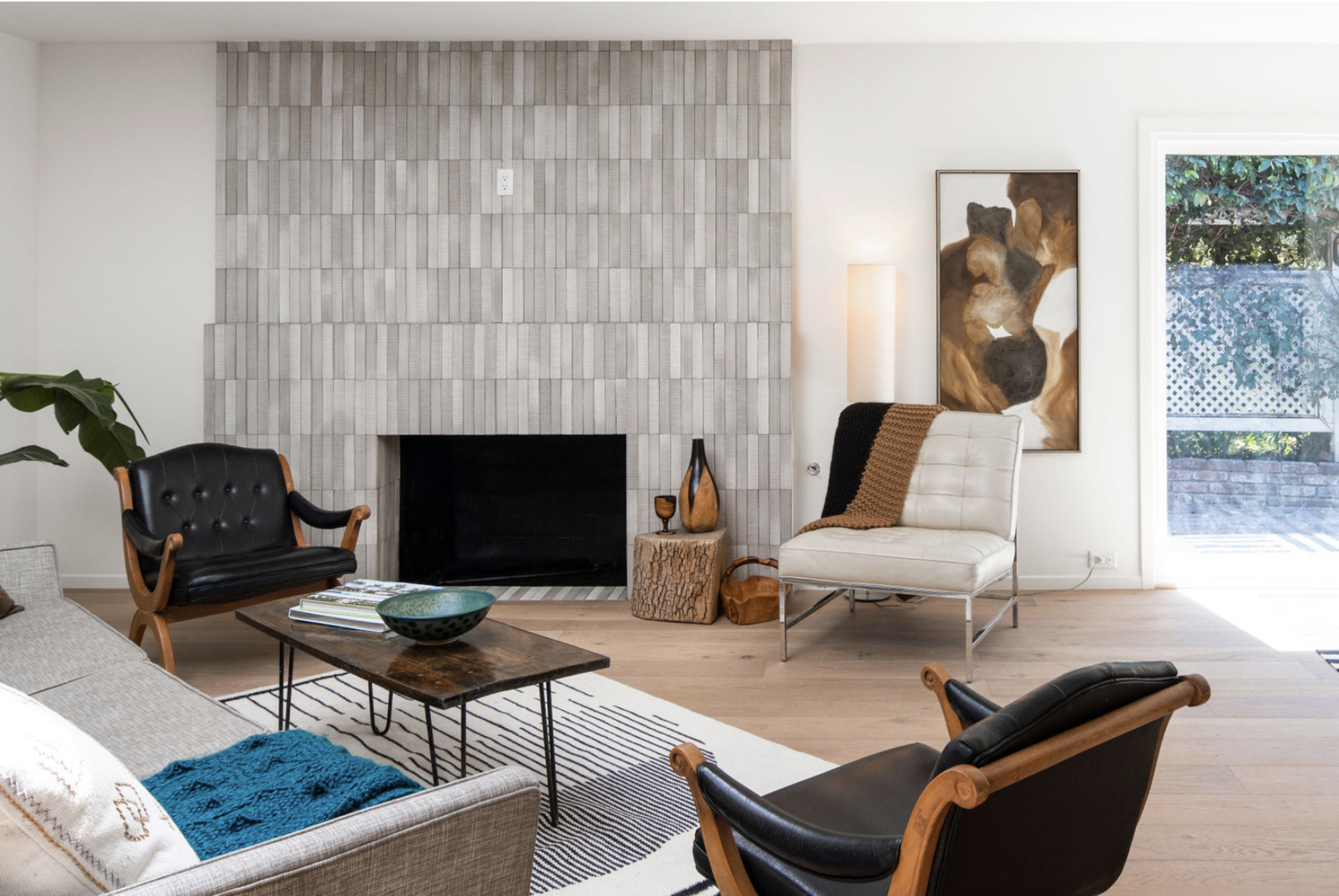

This dated Californian property has been transformed into a beautiful space with an updated floorplan and elegant contemporary finishes.
Prior to the renovation, the home was designed in a 'new-modern' style but felt dated and disjointed. The floorplan didn't allow for a cohesive sense of flow with the kitchen cutting the house into separate sections, and the design lacked any personal touches that made it unique to the homeowners.
That was the case until designers Hollis LaPlante and Jordyn Grohl, founders of Hollis Jordyn Design, transformed the property to create the perfect balance between style and functionality. By opening up the floor plan they brightened up the space with plenty of natural sunlight, aided by a neutral color scheme. They also introduced more unique furnishings, such a plunge bath, to help elevate the space into a modern home.
'Our vision for this project was to transform this disjointed home with multiple personalities into something that was free-flowing, streamlined, and fresh,' say Hollis and Jordyn. 'The home is located in Lake Hollywood by the reservoir so we wanted to keep the home feeling natural with organic tones throughout.' The result is a beautiful calming and sophisticated home that suits the busy lives of the homeowners.
Before the renovation
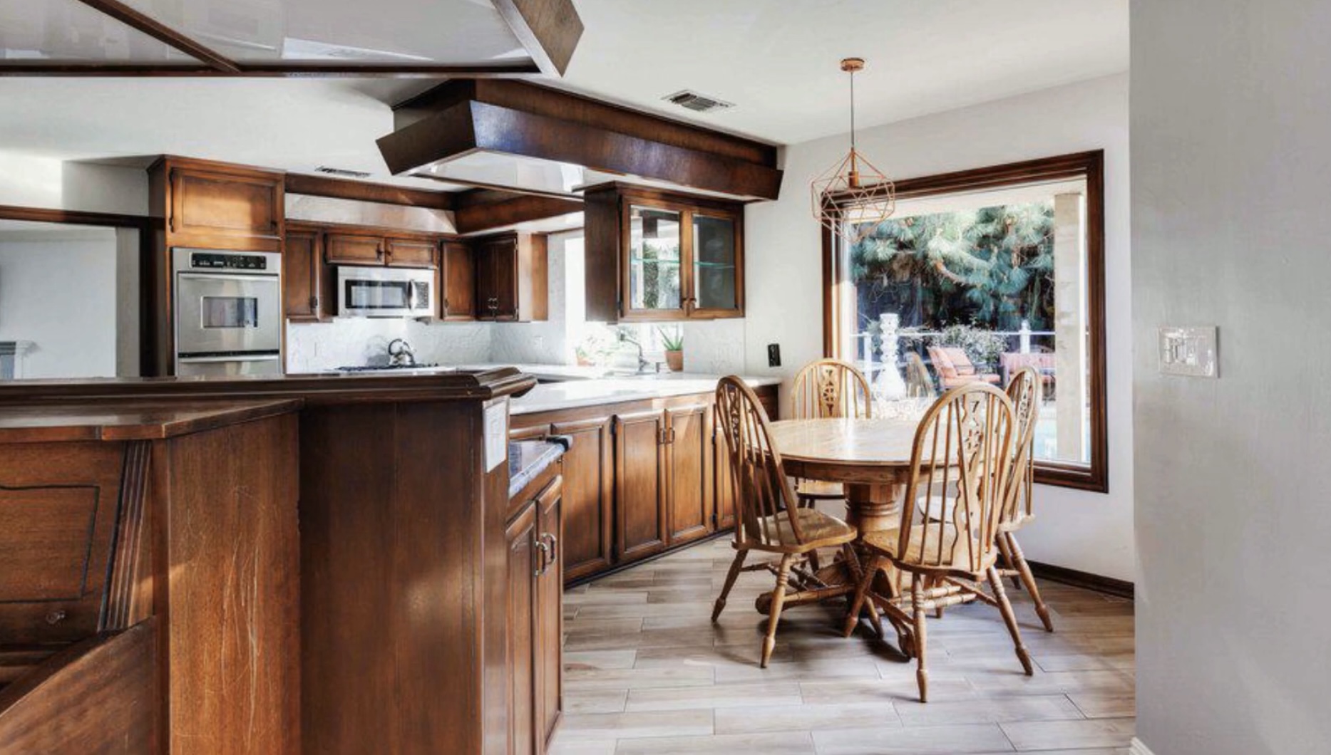
Prior to the admirable work by Hollis and Jordyn Design, the kitchen looked dated and lacked any personality. Although the organic features of the dark wooden cabinetry and the wood flooring made for a neutral style, the decor within the room lacked any continuity. Despite being such a high traffic area, the awkward layout made it a difficult place for the homeowners to socialise in, and it interrupted the rest of the floorplan.
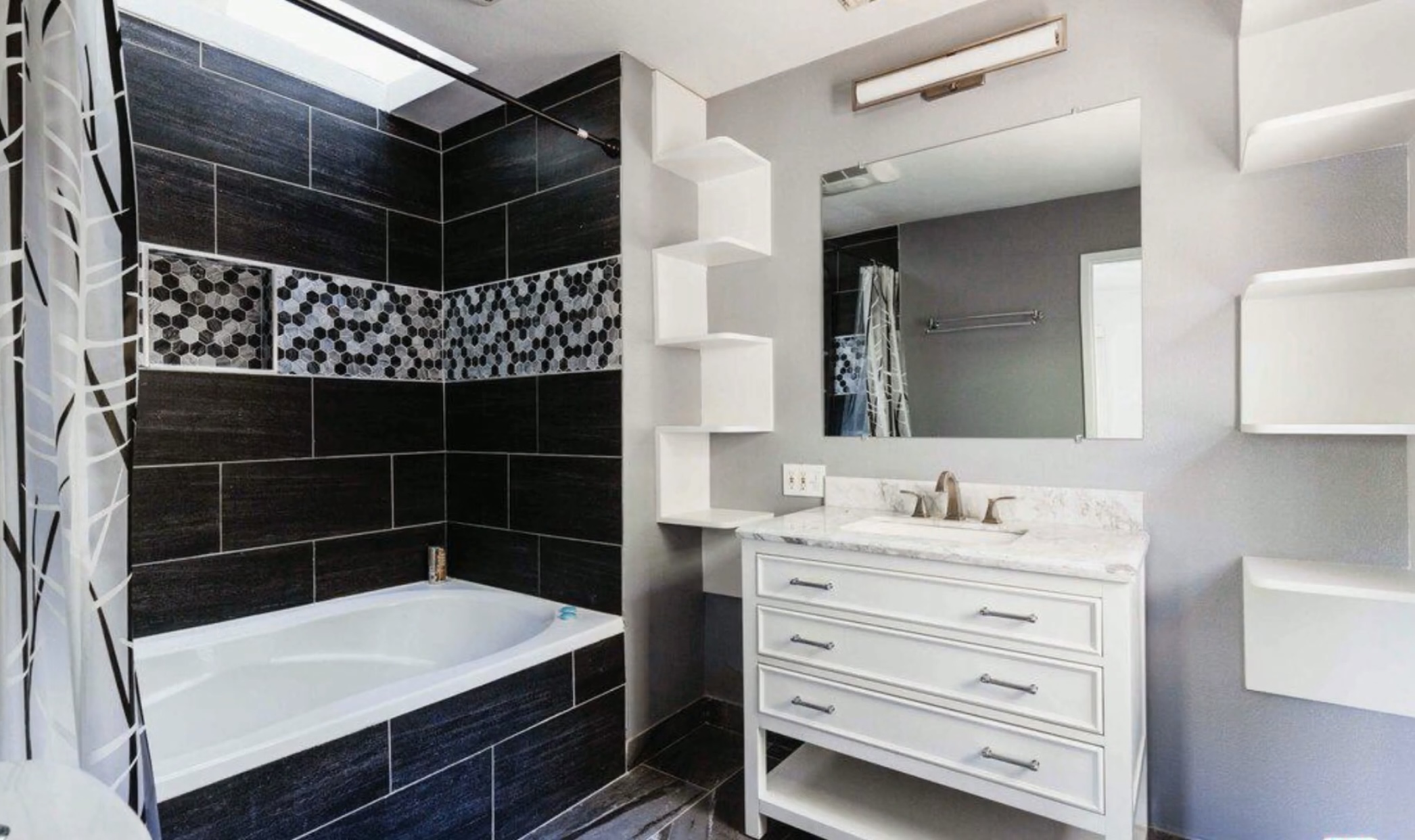
Although the primary bathroom was relatively modern in its design, the black and white theme felt over used. The style bore no resemblance to the other rooms in the house and, despite interesting visual elements such as the wall cladding, the bathroom generally needed a overall lift.
After the renovation
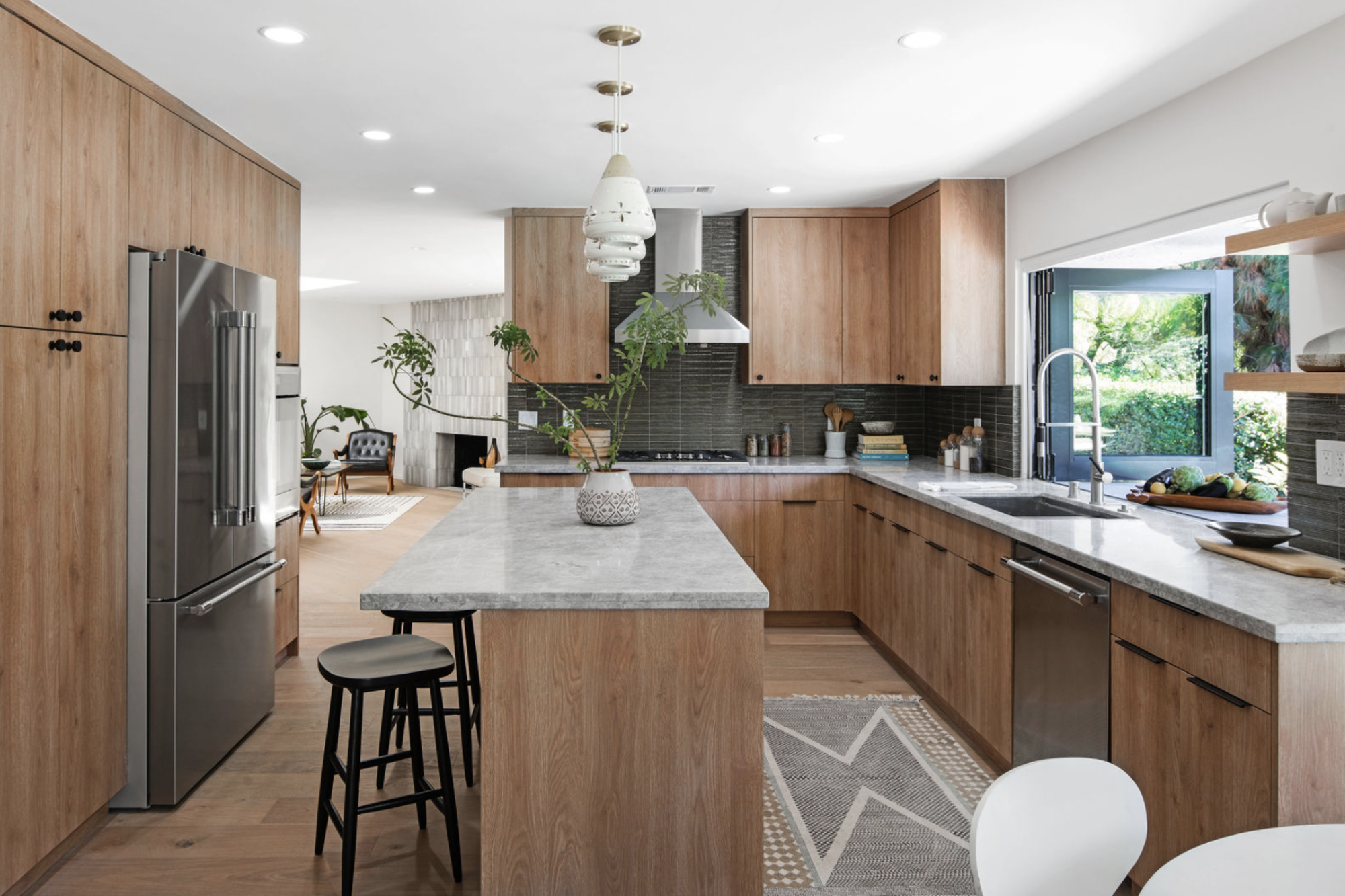
Fortunately, Hollis and Jordyn worked their magic on the dated home to give it a modern makeover. The kitchen - the favorite space the designers worked on - is now a paradise of neutrals and organic tones that brighten the entire space.
Be The First To Know
The Livingetc newsletters are your inside source for what’s shaping interiors now - and what’s next. Discover trend forecasts, smart style ideas, and curated shopping inspiration that brings design to life. Subscribe today and stay ahead of the curve.
'We changed the layout and opened up the space to have a better flow that was less angular and confined,' say Hollis and Jordyn. 'The previous kitchen was very awkward and cut the house off into sections so we decided to open up the floor plan and invite the outside in.'
One way this was achieved was through the installation of a sliding pass-through window that opens the modern kitchen onto the pool area outside. The statement black trim gives a modern edge that contrasts with the softer palette inside the room. 'We chose the lighter cabinets to allow the space to breathe and expand, rather than confine it.'
Furnishings such as the geometric textured rug add a homely feel to the space. 'We worked with a stager and decided to use a rug in the kitchen to serve as a reflection of the veining in the grey countertops, the geometric shape of the backsplash tile, and the warm tones of the cabinetry,' Hollis and Jordyn explain. 'It's also a nice way of breaking up the wood flooring and cabinetry.'

Throughout the home, the previous harsh colors have been muted, resulting in a clean and neutral palette that is accentuated by the use of soft vintage lighting. One great example of this is in the living room, where modern spotlights are paired with a tube floor lamp to create a more cozy feel.
'Apart from the kitchen, the living room is where people gather and come together,' Hollis and Jordyn note. 'Working with owner and stager Kari Dias of Two Upon Ten, we wanted to anchor the room with our leather chairs, but continue to instill a balance between soft and hard color tones.'
They also used tiles to add dimension to the fire surround where a stone fireplace creates a cozy style. As Hollis and Jordyn explain: 'The multi-dimensional tones in the fireplace allow for flexibility and give visual interest to the neutral palette.'
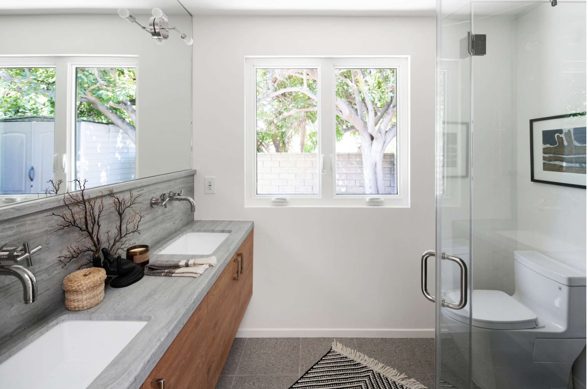
In the modern bathrooms, the neutral scheme is continued helping to achieve a more contemporary look. 'We worked with clean lines, light wood tones, and cool stones to create a calming bathroom environment,' Hollis and Jordyn say.
Compared to the previous bathroom, the space is brighter and the overall feeling far softer. 'We wanted to pivot away from the home's prior aesthetic by neutralizing the palette to keep the atmosphere soft, bright, and light so that the furnishings could pop,' the designers explain.
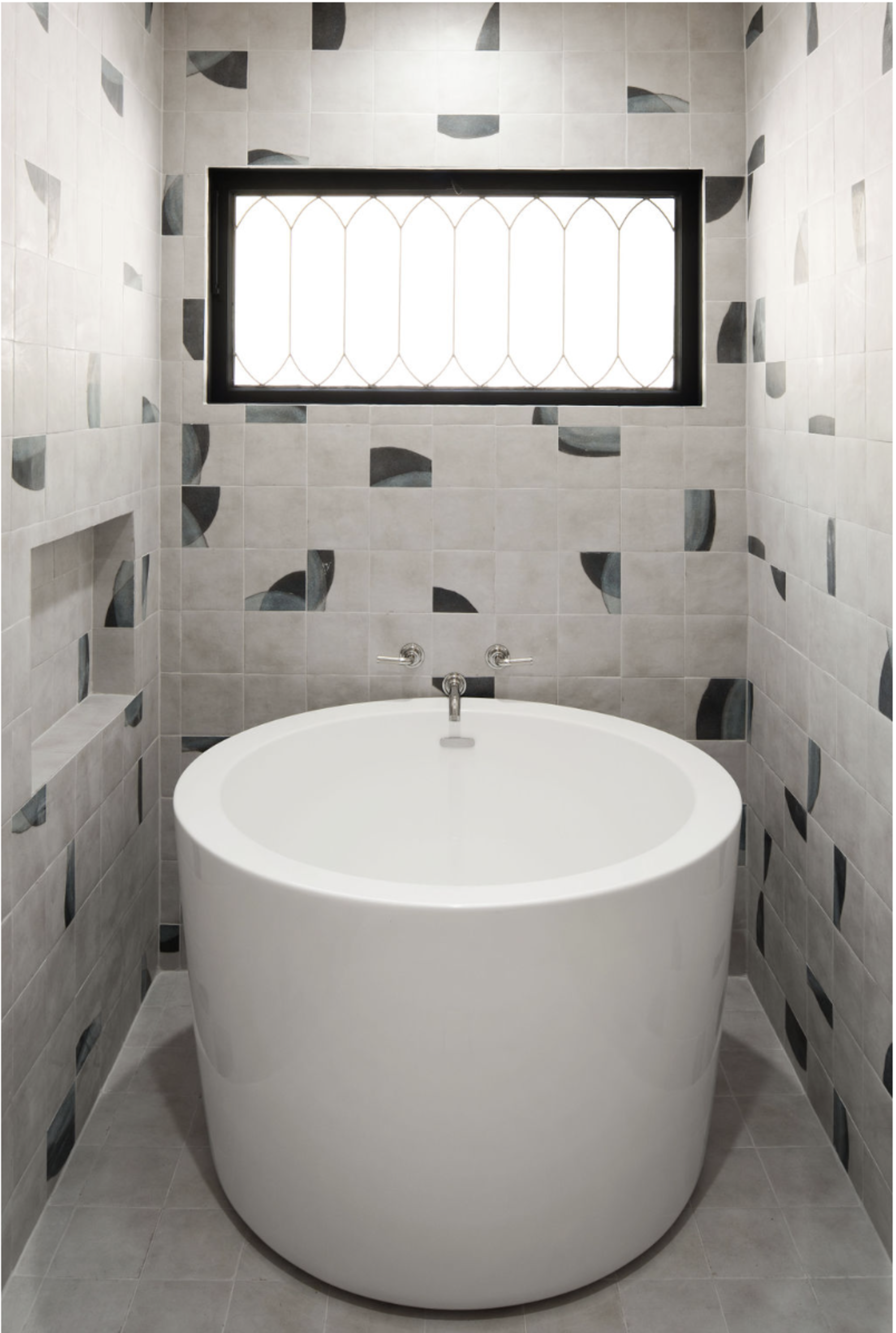
The Jack and Jill guest bathroom has a soaking bath - the sturdy tub with its curved lines adds a touch of elegance and luxury to the small space while the geometric tiles add a fun touch. As Hollis and Jordyn put it: 'The use of geometric tiles allows the space to come alive in a playful way. It makes the space more interesting to look at and ultimately enjoy.'
The patterning of the tiles adds dimension and movement to an otherwise small and plain space. 'The tones are still soft and the pattern is simple so it doesn't feel overwhelming but instead, rather quite sublime,' say Hollis and Jordyn.

Lilith Hudson is a freelance writer and regular contributor to Livingetc. She holds an MA in Magazine Journalism from City, University of London, and has written for various titles including Homes & Gardens, House Beautiful, Advnture, the Saturday Times Magazine, Evening Standard, DJ Mag, Metro, and The Simple Things Magazine.
Prior to going freelance, Lilith was the News and Trends Editor at Livingetc. It was a role that helped her develop a keen eye for spotting all the latest micro-trends, interior hacks, and viral decor must-haves you need in your home. With a constant ear to the ground on the design scene, she's ahead of the curve when it comes to the latest color that's sweeping interiors or the hot new style to decorate our homes.
-
 Turns Out the Coolest New Café is Actually In Your Kitchen — Here's How to Steal the Style of TikTok's Latest Trend
Goodbye, over-priced lattes. Hello, home-brewed coffee with friends. TikTok's 'Home Cafe' trend brings stylish cafe culture into the comfort of your own home
By Devin Toolen Published
-
 5 Bathroom Layouts That Look Dated in 2025 — Plus the Alternatives Designers Use Instead for a More Contemporary Space
For a bathroom that feels in line with the times, avoid these layouts and be more intentional with the placement and positioning of your features and fixtures
By Lilith Hudson Published