Before & After: this dated Spanish Revival home has transformed into a masterpiece full of decor ideas
An interior designer and architects have made this 1930s family home into an elegant modern space with enticing curves throughout
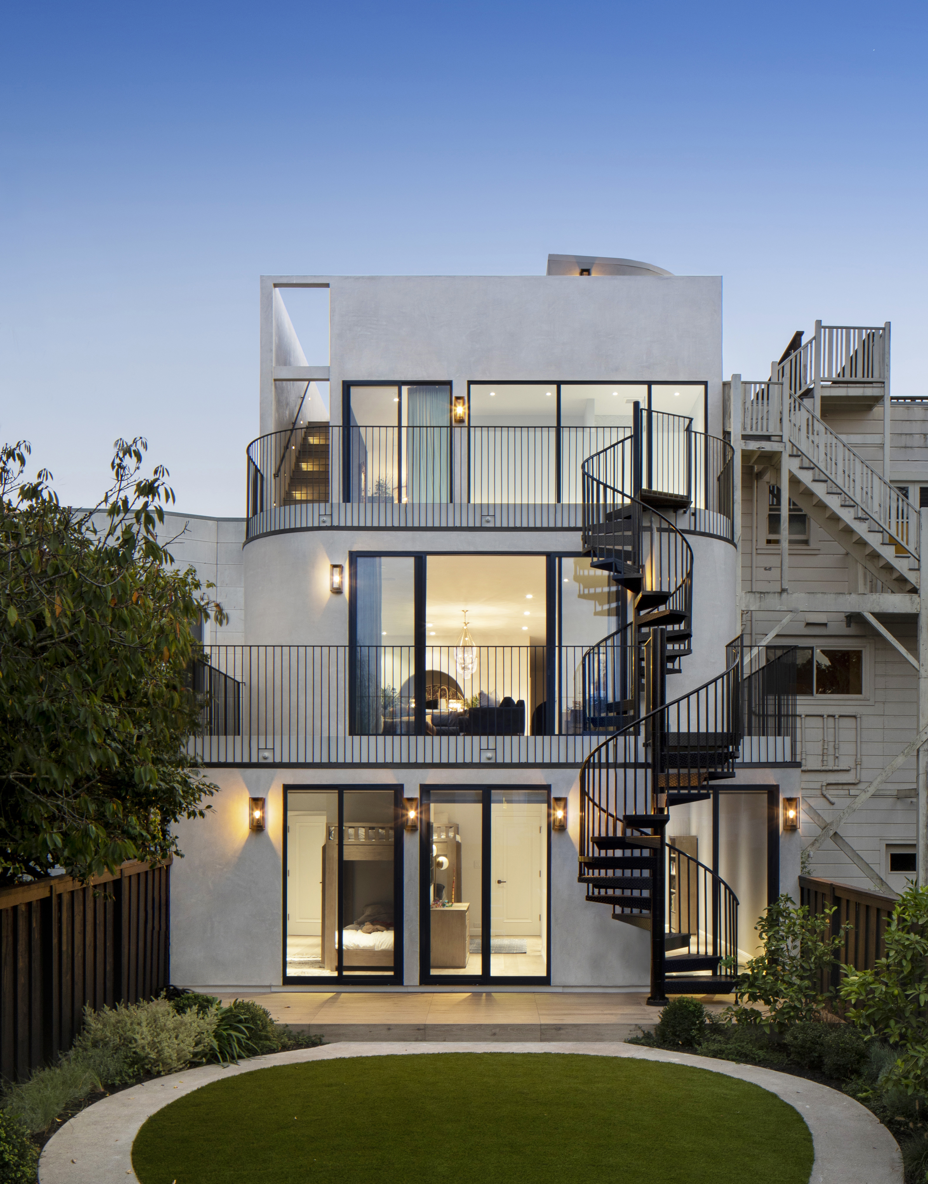

This family home in sunny California is now completely unrecognisable after an expansive architectural renovation has transformed it into a modern home fit for 21st century living.
Situated in San Francisco's Marina district, the original 1930s three-bedroom Spanish Revival home was expanded both vertically and horizontally to encompass six bedrooms, totalling 4,738 square footage of interior space.
Throughout the renovation, carried out by designers at Spiegel Aihara Workshop (SAW), the homeowners’ desire for more space for their family was an important consideration. To do this, architects built horizontally and vertically by remediating the contaminated earth below the home caused by a local landfill site residue and a former gas plant.
Naming the project Wraparound House (influenced by the curved design throughout), SAW made an expansive architectural renovation of the property and landscape, embracing Art Deco inspired archways, spiral staircases, and curved lines. In excavating the top layer of soil, they also decided to replace the house's foundations, modernizing the foundations below the house with a thick mat slab.
Architecturally, the Wraparound House lifts the ground plane from an extended backyard up through a series of terraces, all the way up to the roof deck with panoramic views of the city and bay. Dan Spiegel, architect and founding partner of SAW, says: 'While many buildings have terraces or balconies, we set out to maintain a complete continuity of a new ground across the entire house ensuring that every roof was not so much the top of something, but the bottom of something - a new ground.'
BEFORE THE RENOVATION
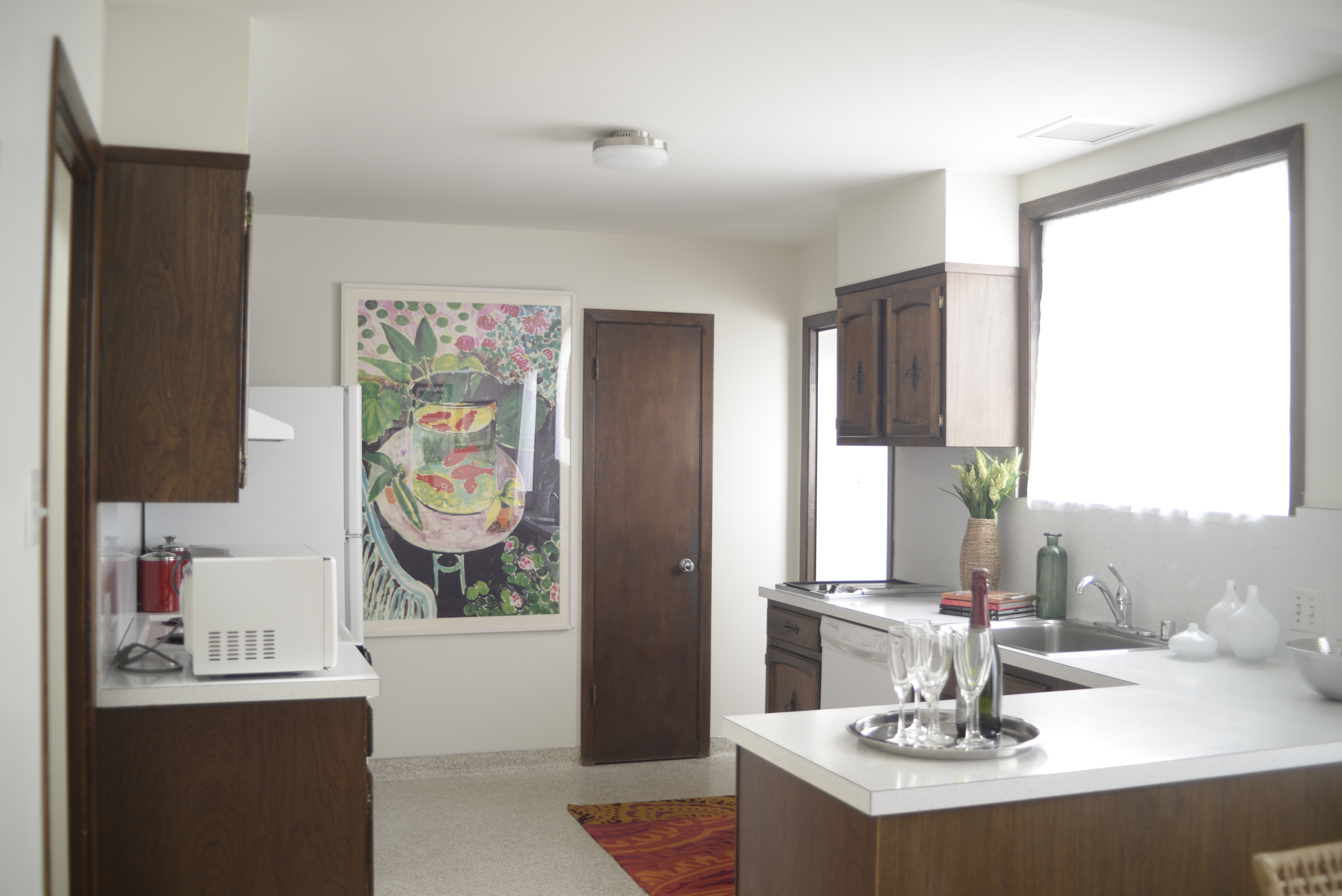
Although the home had seen several upgrades and improvements, the interior was still dated its architecture unremarkable. In the kitchen, dark wooden kitchen cabinets and white glossy countertops made for a uniform space that lacked character.
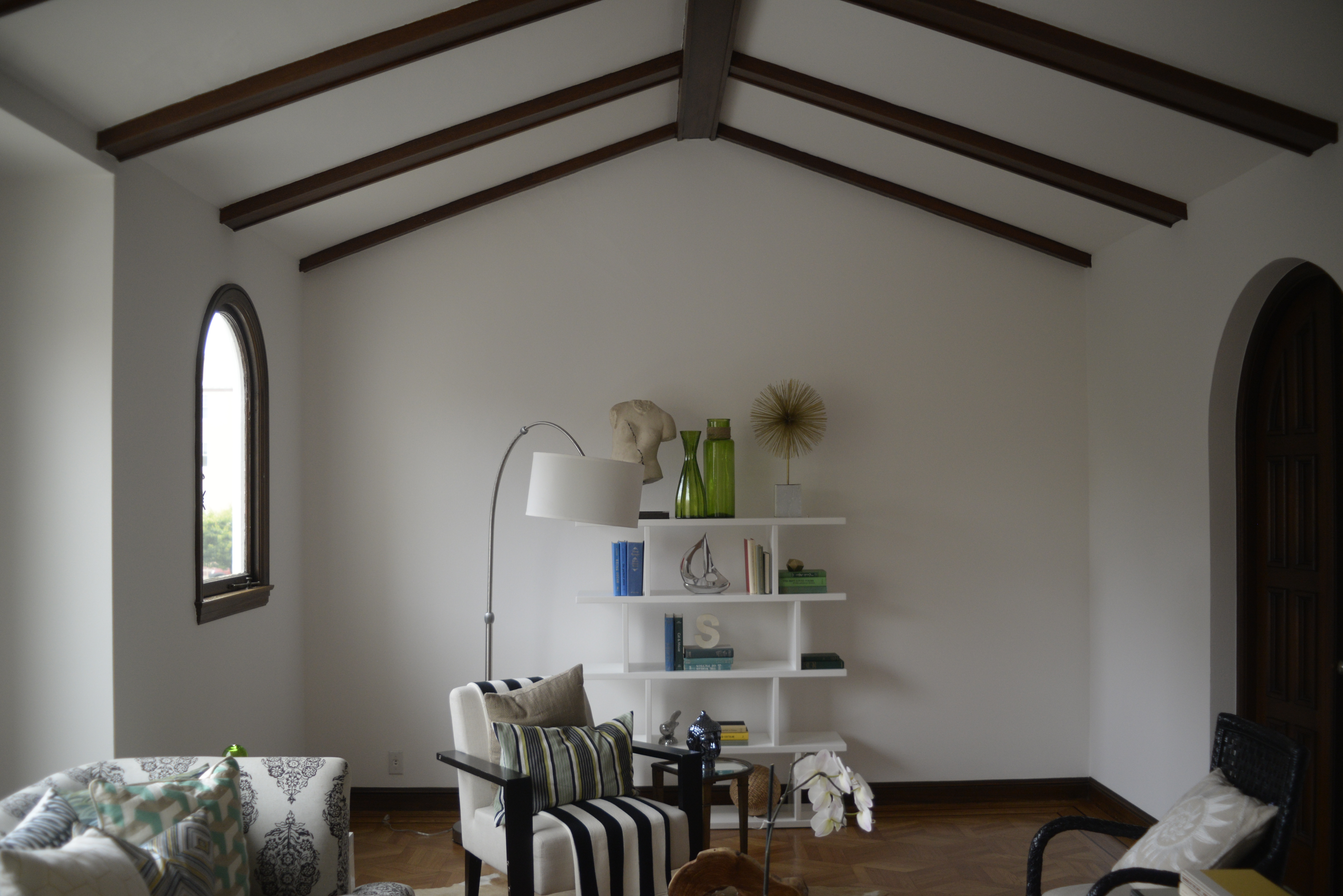
A vaulted ceiling, arched doors and windows, and traditional wooden beams in the living room emanated the Spanish feel intended by the original architects, but the furnishings failed to compliment the space. The large space with its high ceiling wasn't used to its full potential, while the color scheme and textiles lacked any cohesion.
Be The First To Know
The Livingetc newsletters are your inside source for what’s shaping interiors now - and what’s next. Discover trend forecasts, smart style ideas, and curated shopping inspiration that brings design to life. Subscribe today and stay ahead of the curve.

The pink and green tiles in the bathroom looked dated and dingy. The entire room was in desperate need of a modern makeover to make it feel clean and fresh.
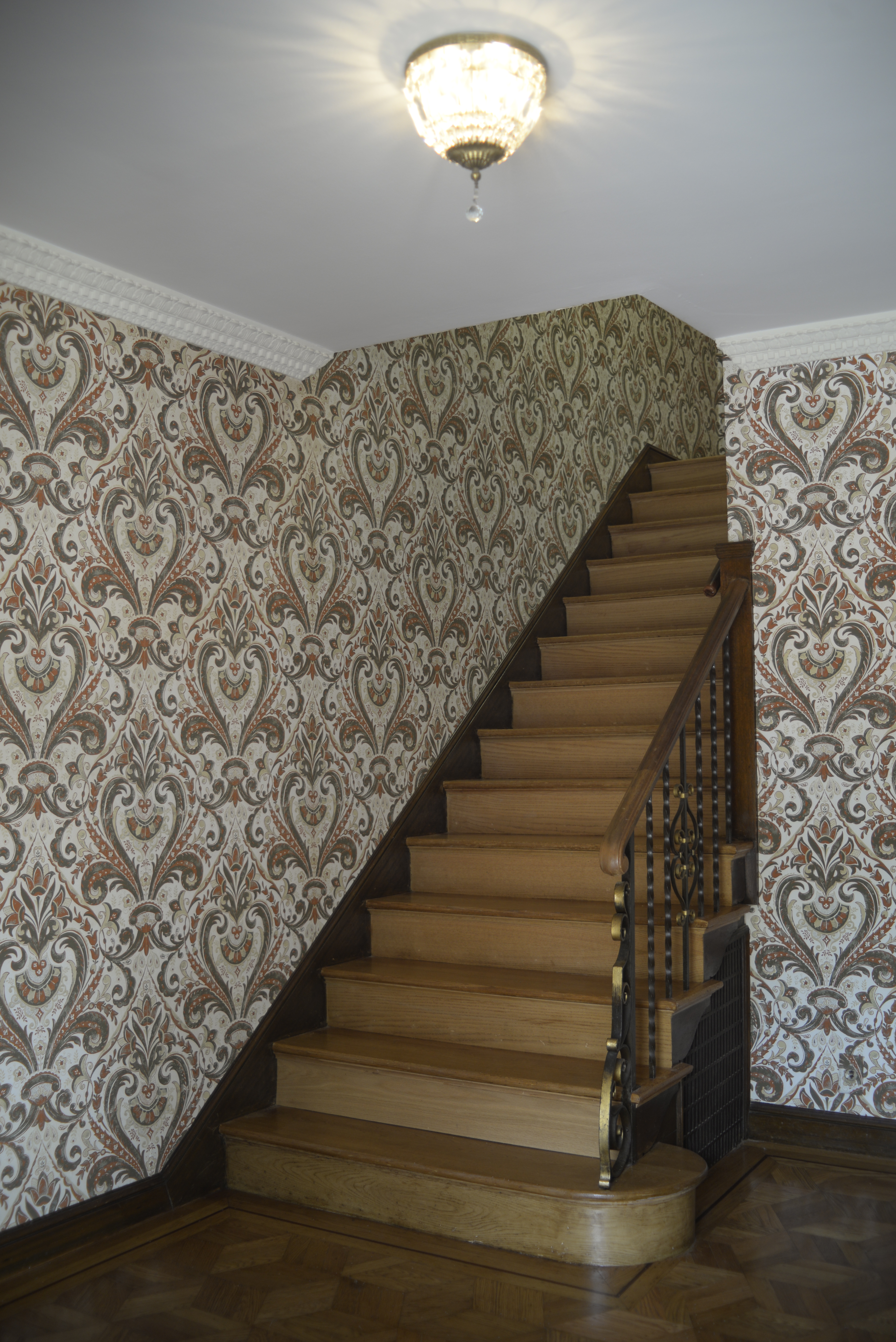
A once grand wooden staircase appeared drab and mundane thanks to the clashing patterned retro wallpaper.
AFTER THE RENOVATION

After designers at Spiegel Aihara Workshop (SAW) put their skills to the test, the home's exterior is a architectural masterpiece with an interior to match (as designed by Heidi Kim, of White Space Design).
Each level of the house had a different focus: on the rooftop it was highlighting the distant views to the bay and the Golden Gate Bridge; the interconnected kids' bedrooms enjoy direct access to the yard via the external spiral staircase; the living room overlooks the backyard from above as a verdant backdrop to outdoor dining; and at the primary suite, the glass walls are a major source of light for the bedroom.
The circular lawn and garden path complement the curved edges of the home's exterior walls while also offering a visual contrast to the angular lines on the rooftop wall. 'The rounded edges of the garden path play in the perpetual motion game, forming a scooter/bike track, and the rounded corners of the family room gradually guide you out to the terrace,' says Spiegel.
He continues: 'Meanwhile, the master bathroom is conceived of as a thickened window for the bedroom, balcony-like and perched over the bay. It doesn’t quite look like it, but the home works a bit like a mobius strip in that way.'
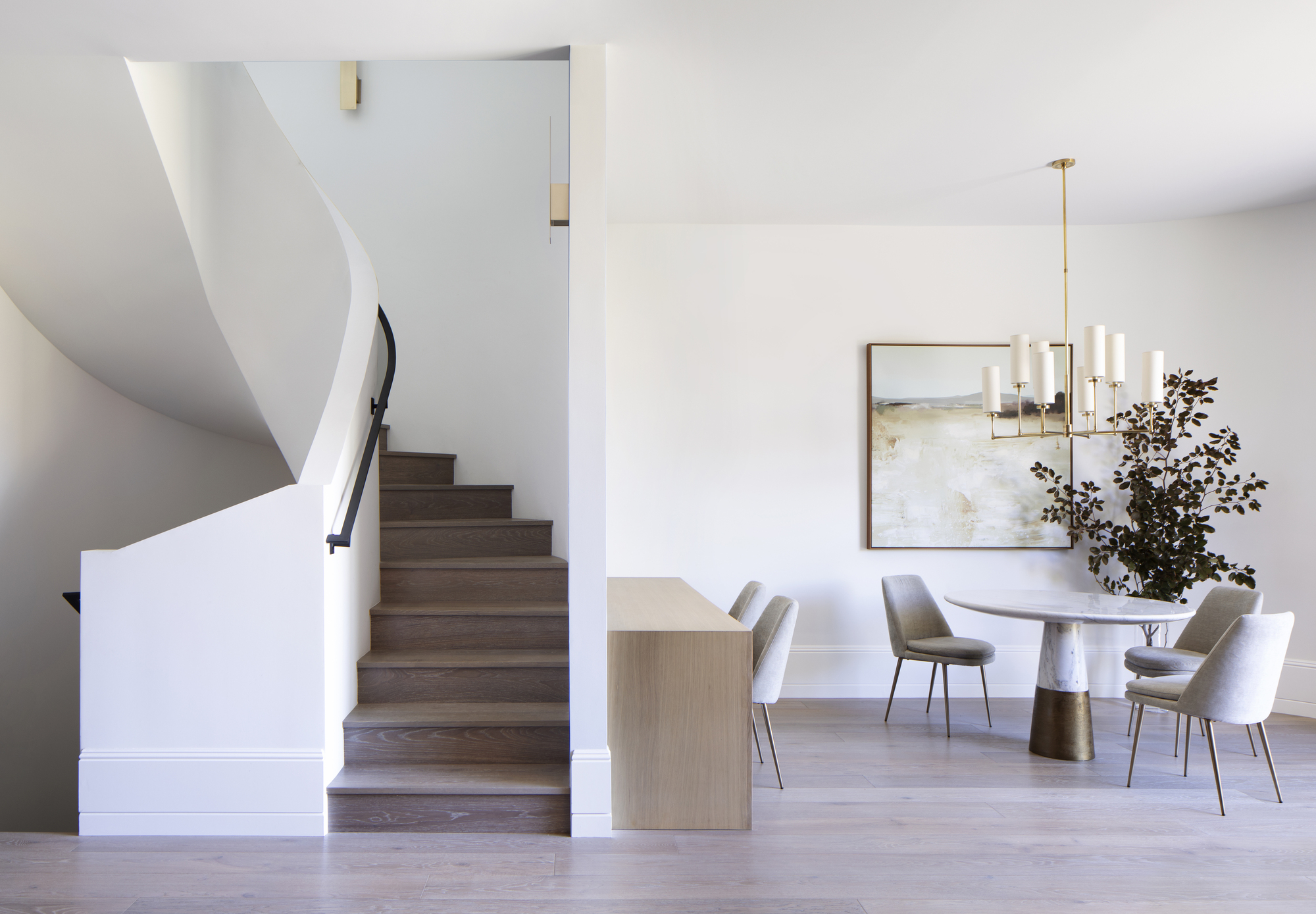
The dining area is now a cohesive and calming space thanks to the neutral color scheme and minimalist design. Architecturally, the home is a feast for the eyes, with curved edges blending seamlessly alongside angular features for a surprising yet satisfying contrast.
Most notable of all is the central interior spiralling staircase which forms the core of the house. The white lines cast subtle shadows adding dimension to the simple color scheme while the softer texture of the wooden stairs add warmth to the space.
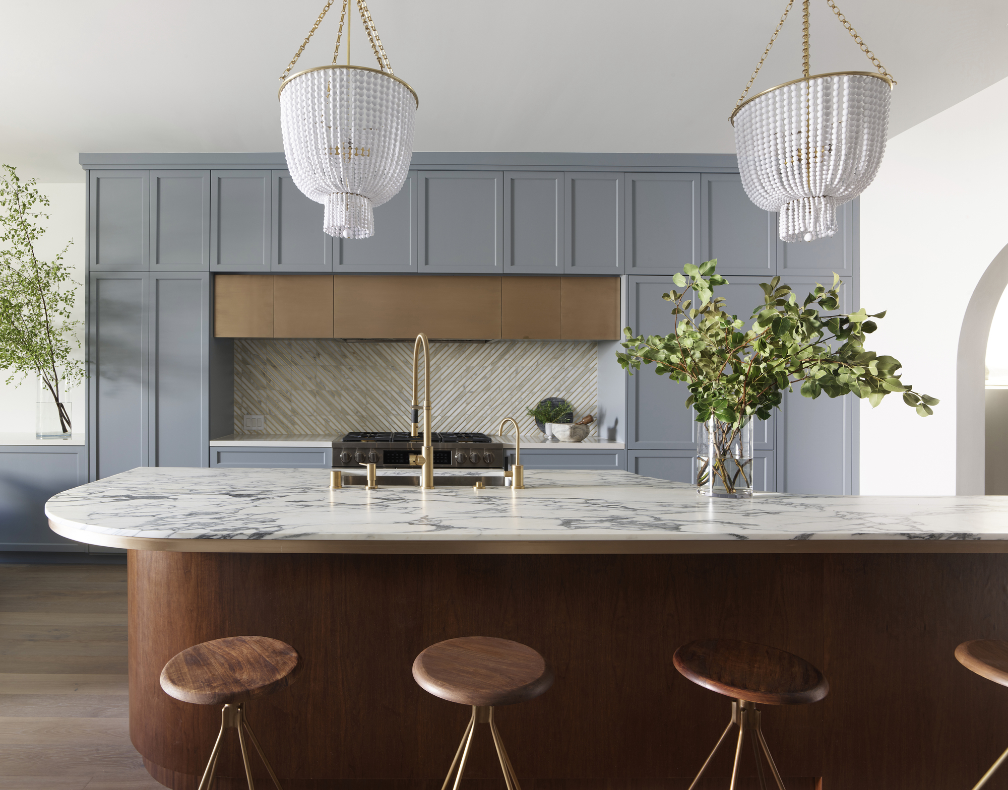
Continuing the curved theme in the kitchen is the marble island countertop for a convivial feel reminiscent of the home's original Art Deco design period (also evoked by the beaded lights).
Fun and vibrancy has been injected into this central space with the help of the light dusty blue cabinetry that marries beautifully with the dark wood of the island and bar stools. Brass finishes on the taps and stools tie the space together for a cool yet sophisticated vibe.
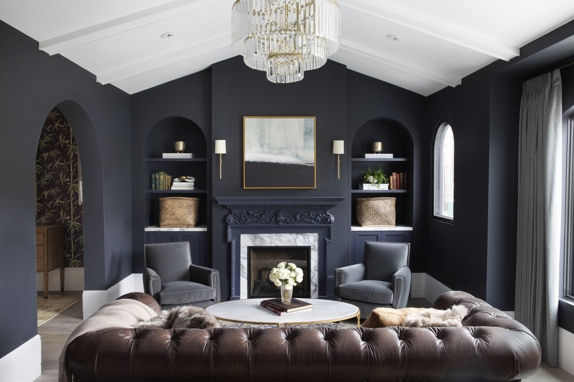
The living room is a luxurious space for relaxing with the family. Aesthetically, the elegant feel is achieved with the aid of the studded leather couch and the charming beaded chandelier lighting. Meanwhile, the arched doors, windows and built-in shelving evoke nod to the home's 1930s heritage and also give the illusion of a larger space.
'When we cut the arch in the living room in half and began pulling the corners apart, the Spanish Revival arch became the Streamline Moderne wall,' explains Spiegel. 'We wanted to embrace this link, and, of course, we found these forms to be beautiful.'
Compared the softer and more delicate colors throughout the rest of home, the dark blue-grey walls of the living room help to make it a more relaxing space. Yet, to prevent the room feeling too enclosed, the all-white beamed ceiling and skirting introduce plenty of light.
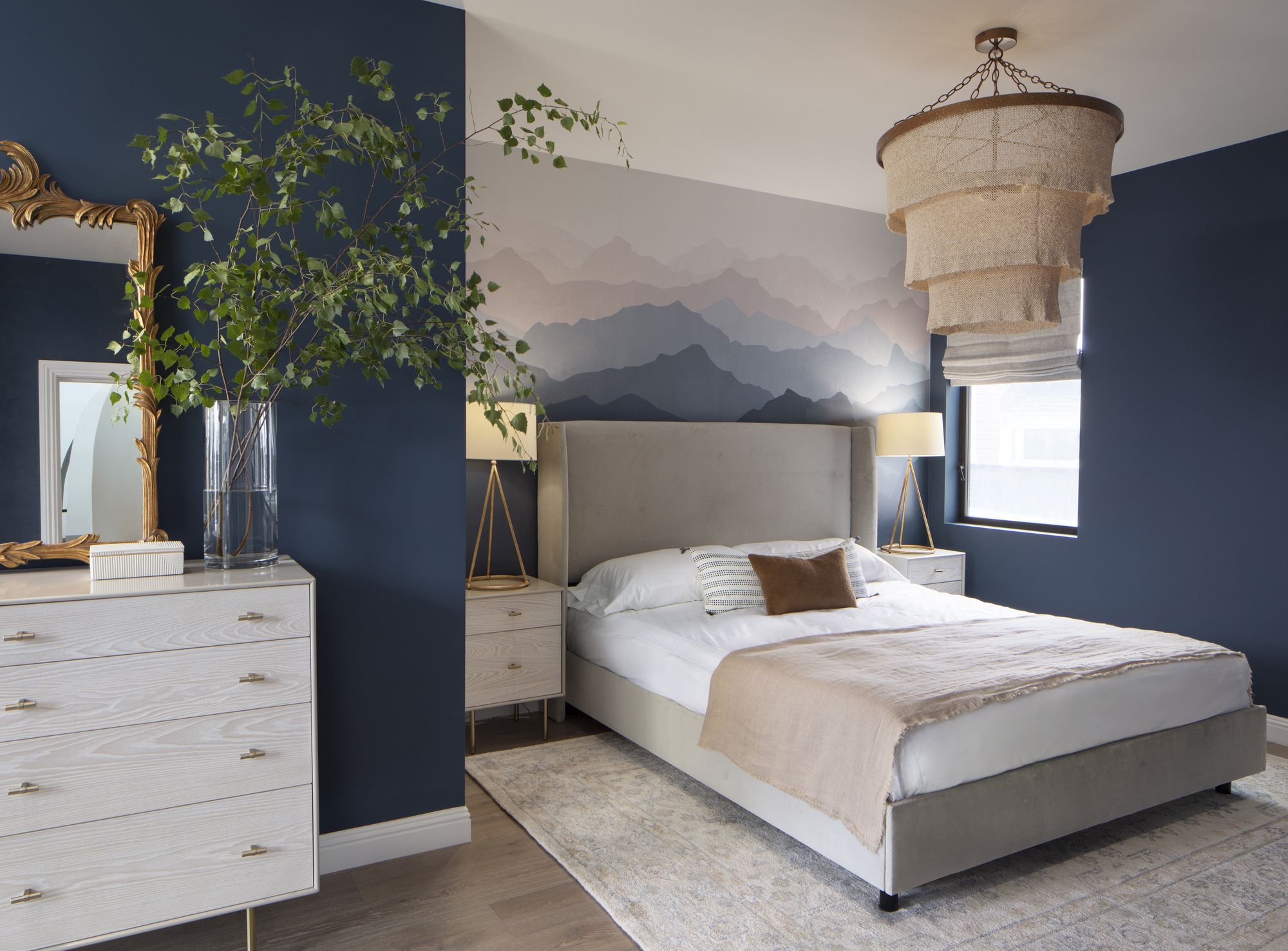
Pairing modern furnishing - like the tall bedside lamps - with more traditional details, - like the guilt framed mirror - make the bedroom feel fresh and new while still retaining class and sophistication. The alcove feature wall of a gradient mountain scape is a fun detail that adds character to a modern bedroom which is truly unique to the homeowners.
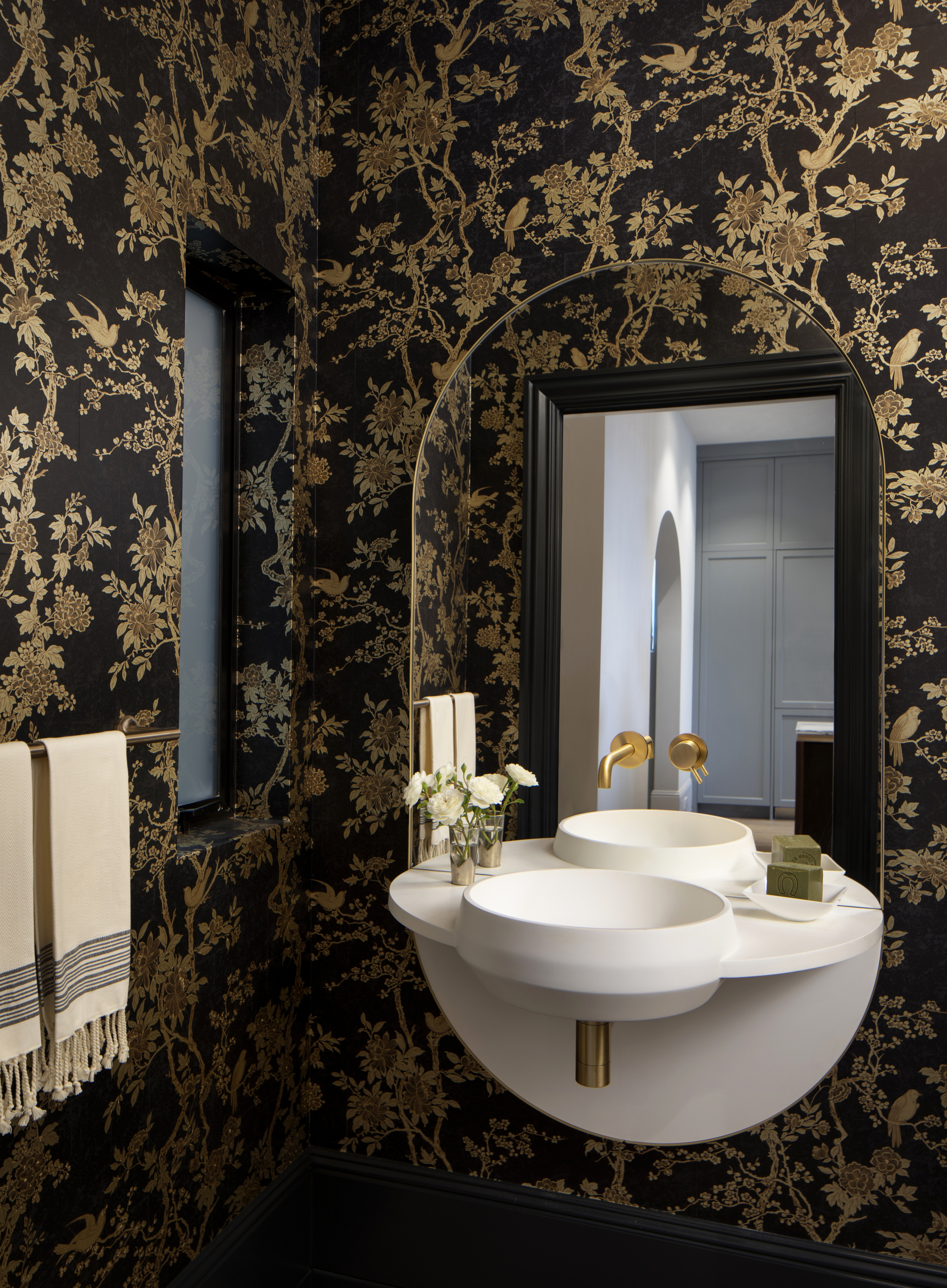
Traditional inspiration is evident in the ornate black and gold patterned wallpaper in the modern bathroom which is expertly contrasted with contemporary finishes, such as the taps. The curvature of the sink and the soft edges of the tap are reflected in the arched mirror for an illusory effect.

Lilith Hudson is a freelance writer and regular contributor to Livingetc. She holds an MA in Magazine Journalism from City, University of London, and has written for various titles including Homes & Gardens, House Beautiful, Advnture, the Saturday Times Magazine, Evening Standard, DJ Mag, Metro, and The Simple Things Magazine.
Prior to going freelance, Lilith was the News and Trends Editor at Livingetc. It was a role that helped her develop a keen eye for spotting all the latest micro-trends, interior hacks, and viral decor must-haves you need in your home. With a constant ear to the ground on the design scene, she's ahead of the curve when it comes to the latest color that's sweeping interiors or the hot new style to decorate our homes.
-
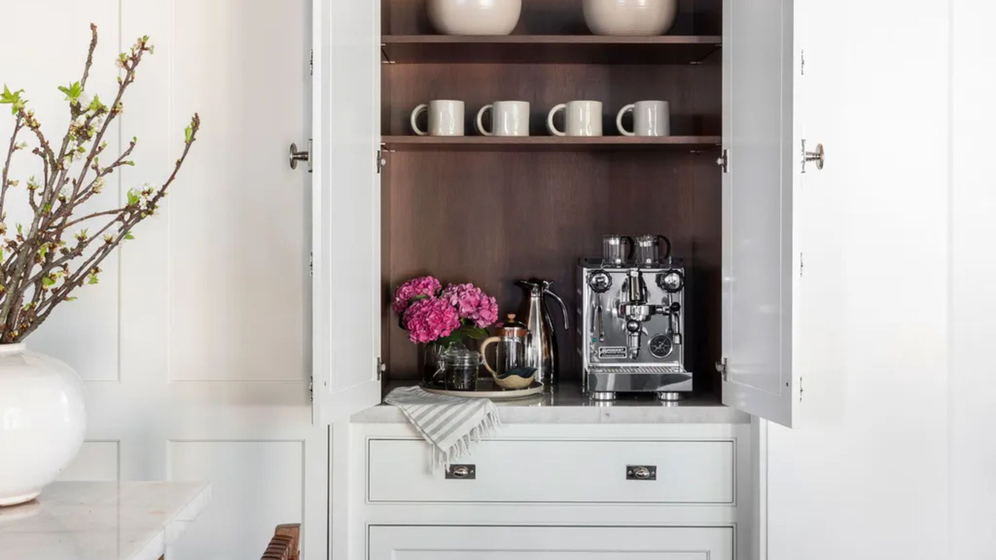 Turns Out the Coolest New Café is Actually In Your Kitchen — Here's How to Steal the Style of TikTok's Latest Trend
Goodbye, over-priced lattes. Hello, home-brewed coffee with friends. TikTok's 'Home Cafe' trend brings stylish cafe culture into the comfort of your own home
By Devin Toolen Published
-
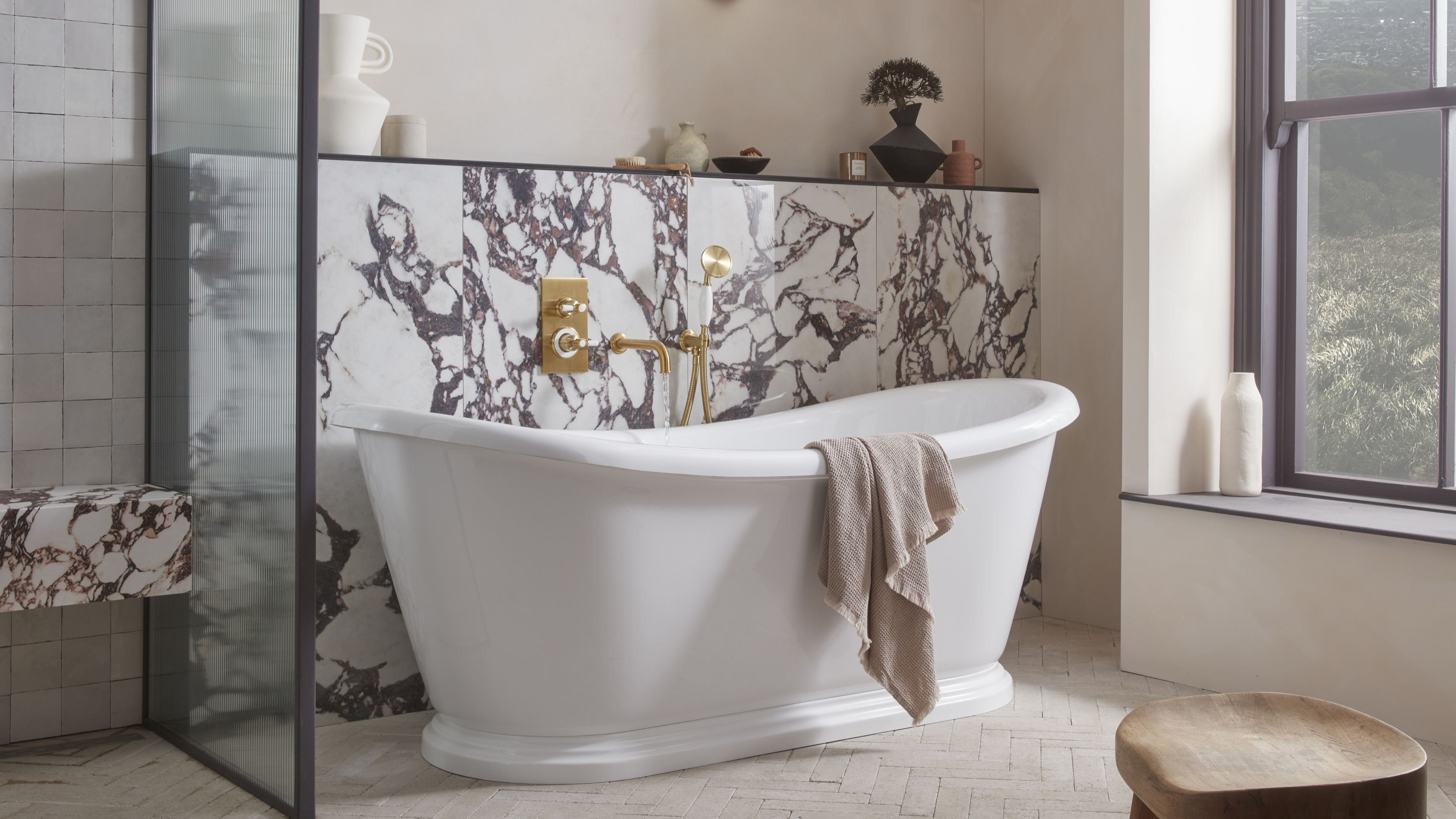 5 Bathroom Layouts That Look Dated in 2025 — Plus the Alternatives Designers Use Instead for a More Contemporary Space
For a bathroom that feels in line with the times, avoid these layouts and be more intentional with the placement and positioning of your features and fixtures
By Lilith Hudson Published