Benjamin Moore's Color of the Year, Cinnamon Slate, is an "In-between Shade" that Works in Any Space — We Show You How
The luxurious dusty plum is a moody, shape-shifting shade that's ready to reinstate purple back into the design vernacular

The Livingetc newsletters are your inside source for what’s shaping interiors now - and what’s next. Discover trend forecasts, smart style ideas, and curated shopping inspiration that brings design to life. Subscribe today and stay ahead of the curve.
You are now subscribed
Your newsletter sign-up was successful
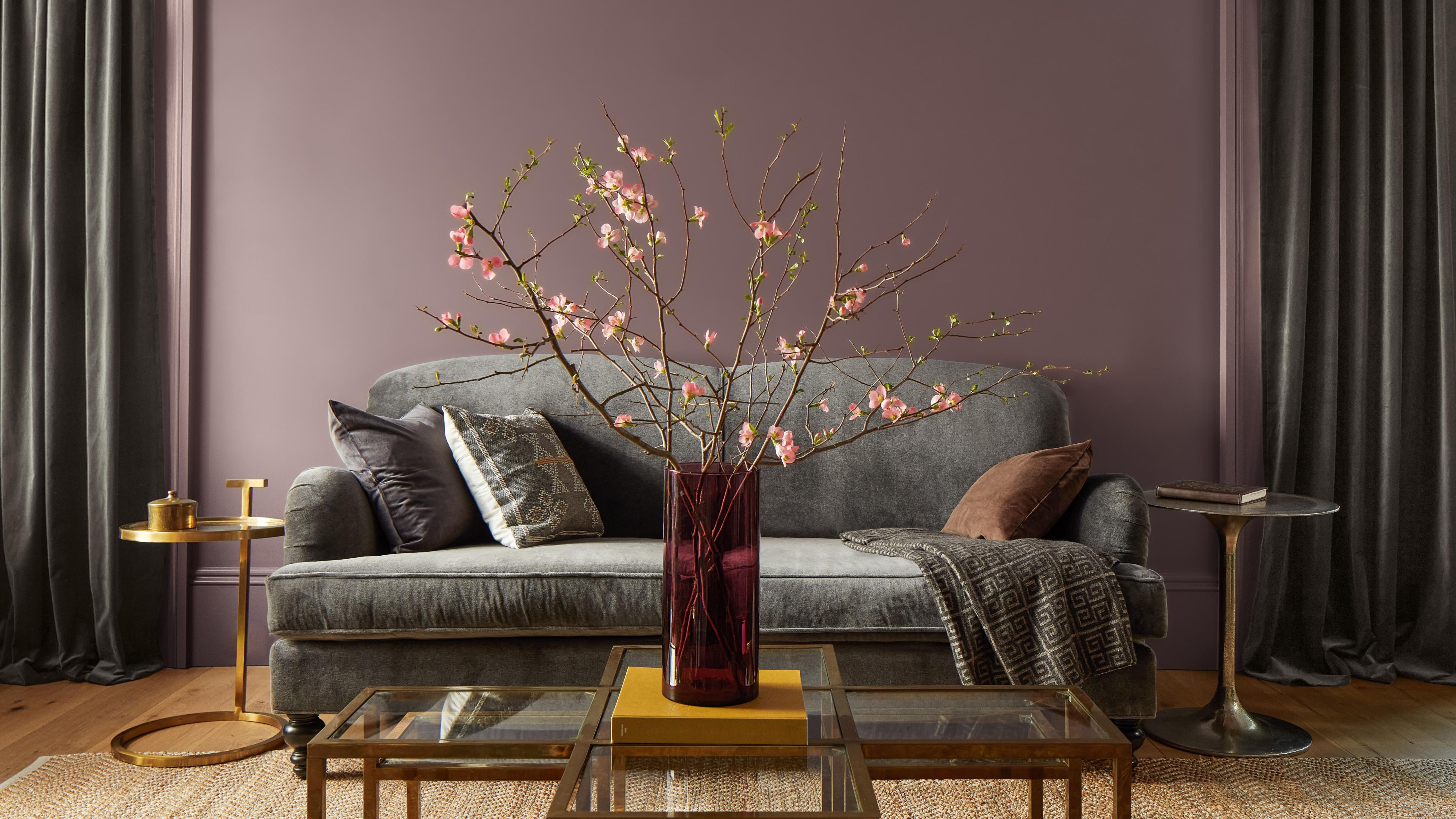
I am calling you all here today to discuss perhaps one of the biggest Color of the Year announcements. Benjamin Moore has just dropped their reigning color for 2025, Cinnamon Slate (plus an adjoining palette) with the dusty plum hue setting the stage for a full-on purple takeover.
A Color of the Year prediction gives us the necessary insight into what colors to incorporate in our homes and the palettes that will define the mood of the upcoming year. Love it or hate it, purple is the color trend dominating the mood boards of the current interior design world. Helen Shaw, a color expert and director of marketing at Benjamin Moore, explains, “As we looked at the transition of trends over the past few years, the idea of quietly colorful hues came to the forefront."
Benjamin Moore's Color of the Year perfectly encapsulates this idea of quietly colorful — it is a color that has a presence without distraction. Cinnamon Slate offers a sophisticated and slightly muted version of the recent trend towards bolder colors. And more importantly, dare I say, it may just be converting me to a life as a purple enthusiast.
Article continues below 
Price: $5.99/sample
How to describe Benjamin Moore's 'Cinnamon Slate'
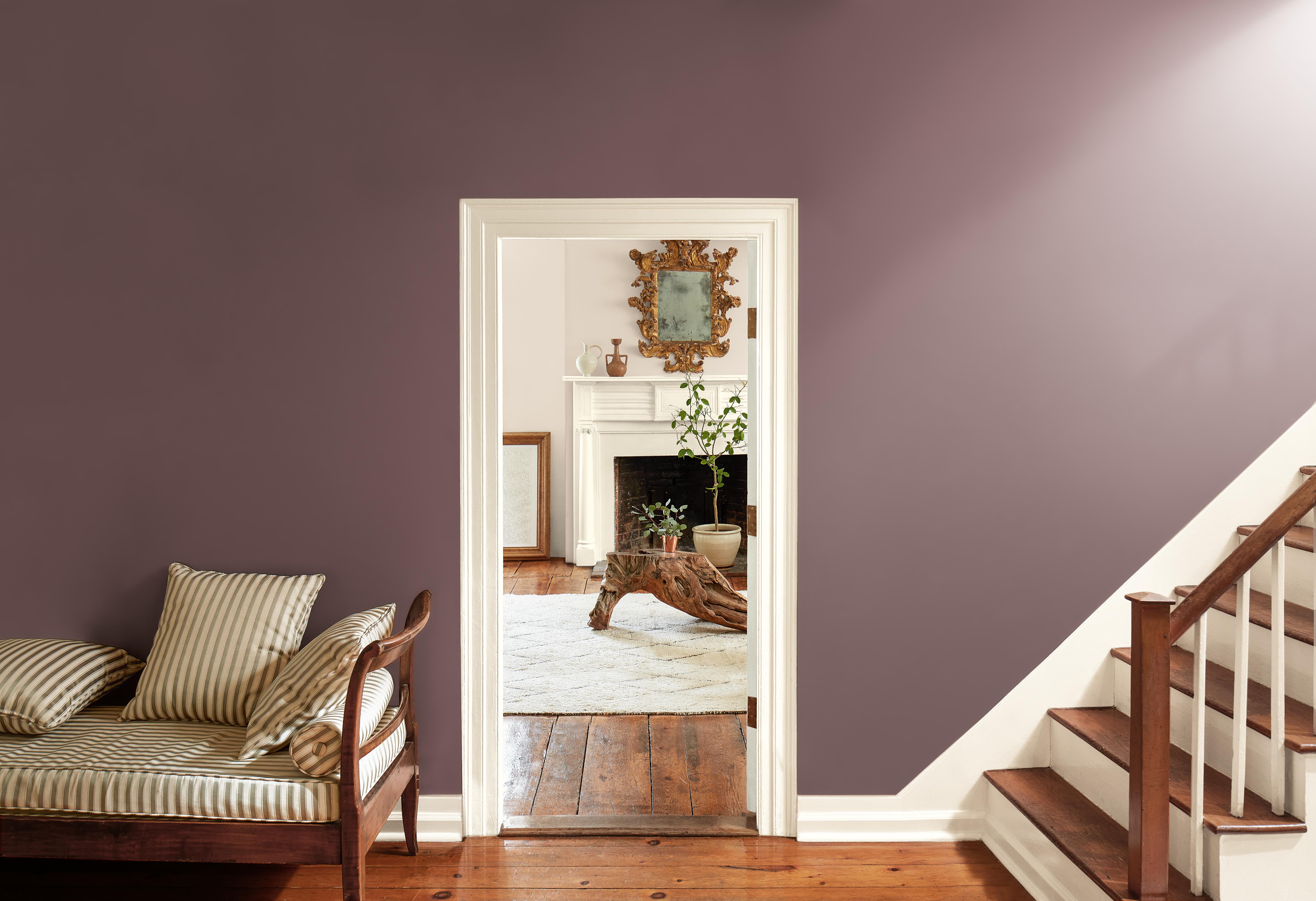
The word purple can be a bit of a trigger word in interior design. Notoriously known for being hard to pair and bold in identity, purple is not the color for everyone. Yet, Cinnamon Slate is trail-blazing the way in color trends, showing that there is more than meets the eye with this tricky purple pigment.
Really, this dusty plum can make a phenomenal neutral. The team at Benjamin Moore "saw a continued interest in embracing color, but a subtle move away from heavily saturated hues to more subtle and muted ones," says Helen. When it comes to our homes, this year has seen a strong push to start decorating with color again.
Cinnamon Slate is the perfect example of a color that is deep in saturation but not overly bright in a way that feels overwhelming; its undertones of plum mixed with hints of burgundy and gray give the color a well-rounded base that broadens its compatibility. Helen describes it as "a delicate mix of heathered plum and velvety brown. It is adaptable, yet distinct, it brings a soothing familiarity and balance to any design."
So it seems Benjamin Moore is bringing purple back, but in a more nuanced way. It screams quiet luxury but is uniquely versatile enough to harmoniously blend into a multitude of different design styles.
The Livingetc newsletters are your inside source for what’s shaping interiors now - and what’s next. Discover trend forecasts, smart style ideas, and curated shopping inspiration that brings design to life. Subscribe today and stay ahead of the curve.
How to Style Benjamin Moore's 'Cinnamon Slate'
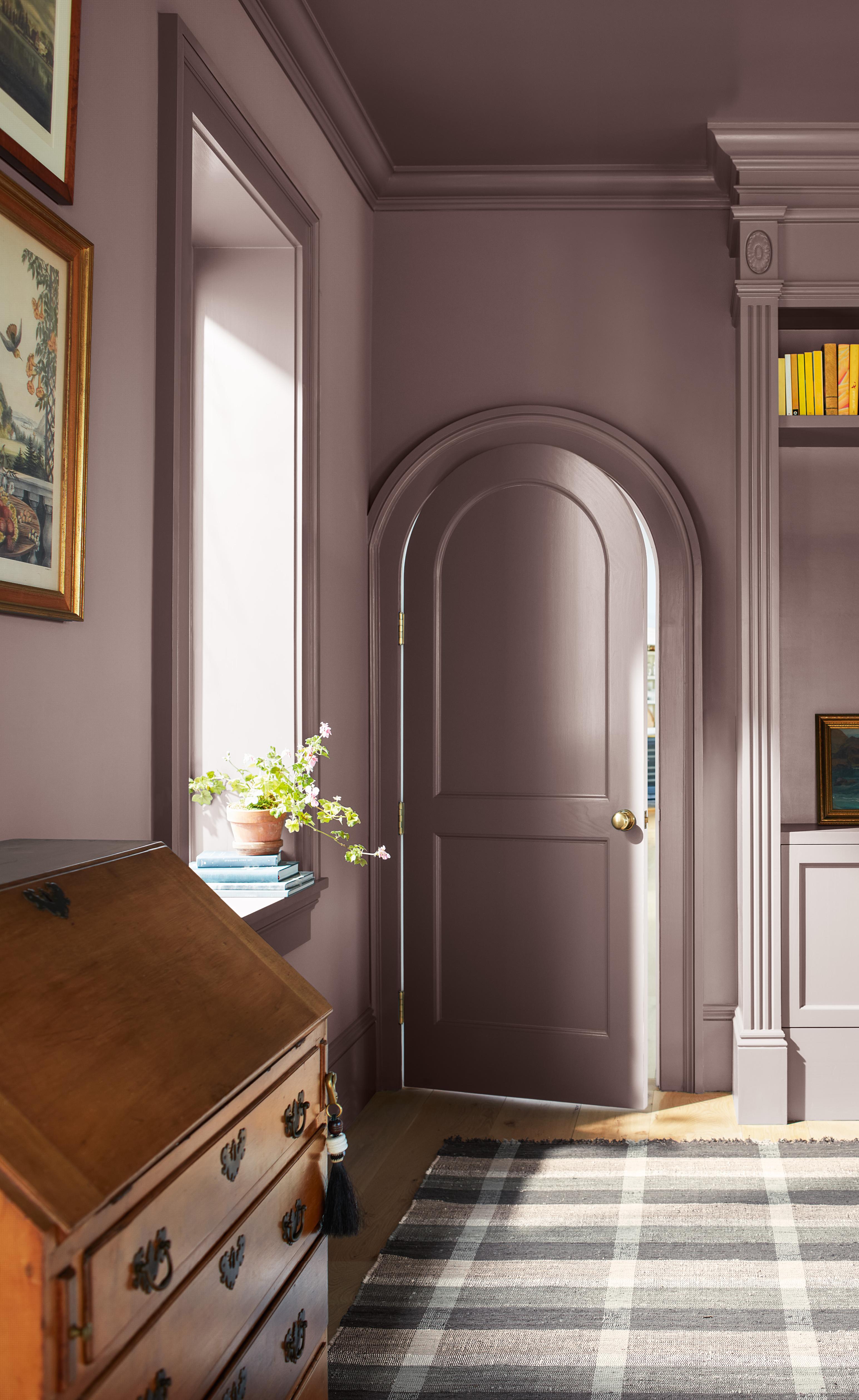
The idea that a subtle purple can be a new playful neutral means that there is a spot for Cinnamon Slate in any room. Here, we break down how to style this dusty plum shade throughout your home.
- Living room — When looking for purple living room ideas, Helen says "this rich hue works particularly well when coating or drenching a living room with color." She recommends adding in moments of leather and brushed gold metallic accents to unify a cozy yet luxurious look.
- Bathroom — Smaller spaces like bathrooms are the best for experimenting with color. Helen recommends using Cinnamon Slate in a lustrous, high gloss finish for the ultimate design detail. This choice not only plays into purple's luxe aesthetic appeal but "choosing a finish that reflects the light can deceive the eye and make the room seem larger.”
- Bedroom — Helen says "To create an enveloping ambiance in a bedroom combine Cinnamon Slate with crisp white trim, layered neutrals, and the softness of velvets and cashmere."
No matter where or how you choose to style Cinnamon Slate this year, the most important thing to think about when bringing this dusty shade of plum into your life is the colors that go with it. Luckily, Benjamin Moore's palette pairing has you covered.
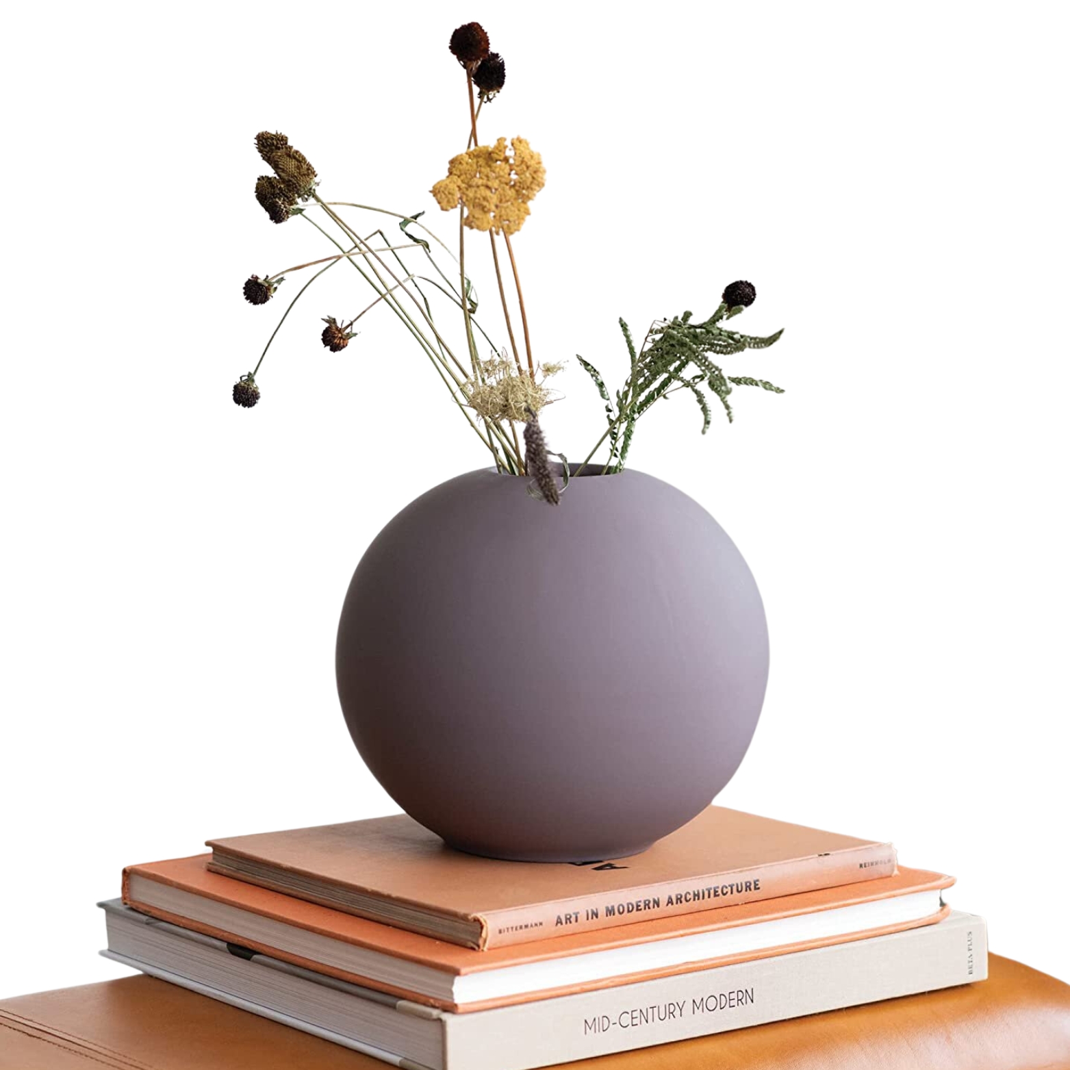
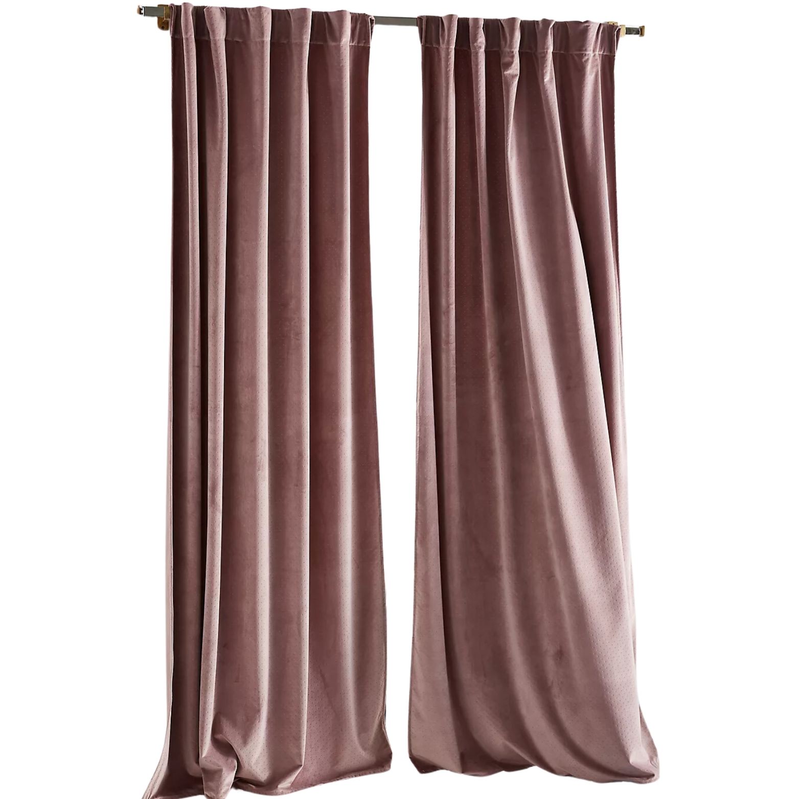
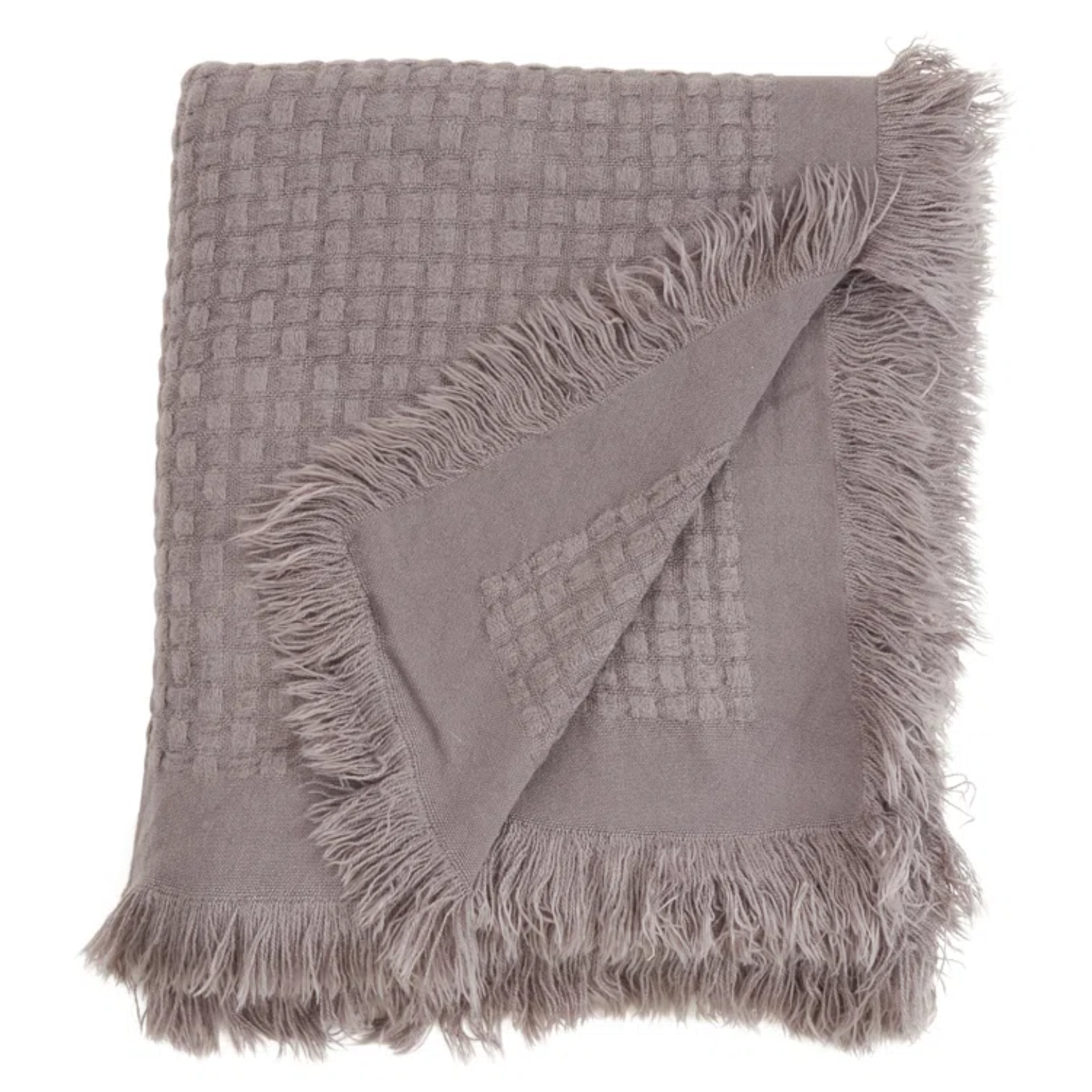
Shop 'Cinnamon Slate'-Inspired Decor
The Entire Benjamin Moore 'Color of the Year' Palette
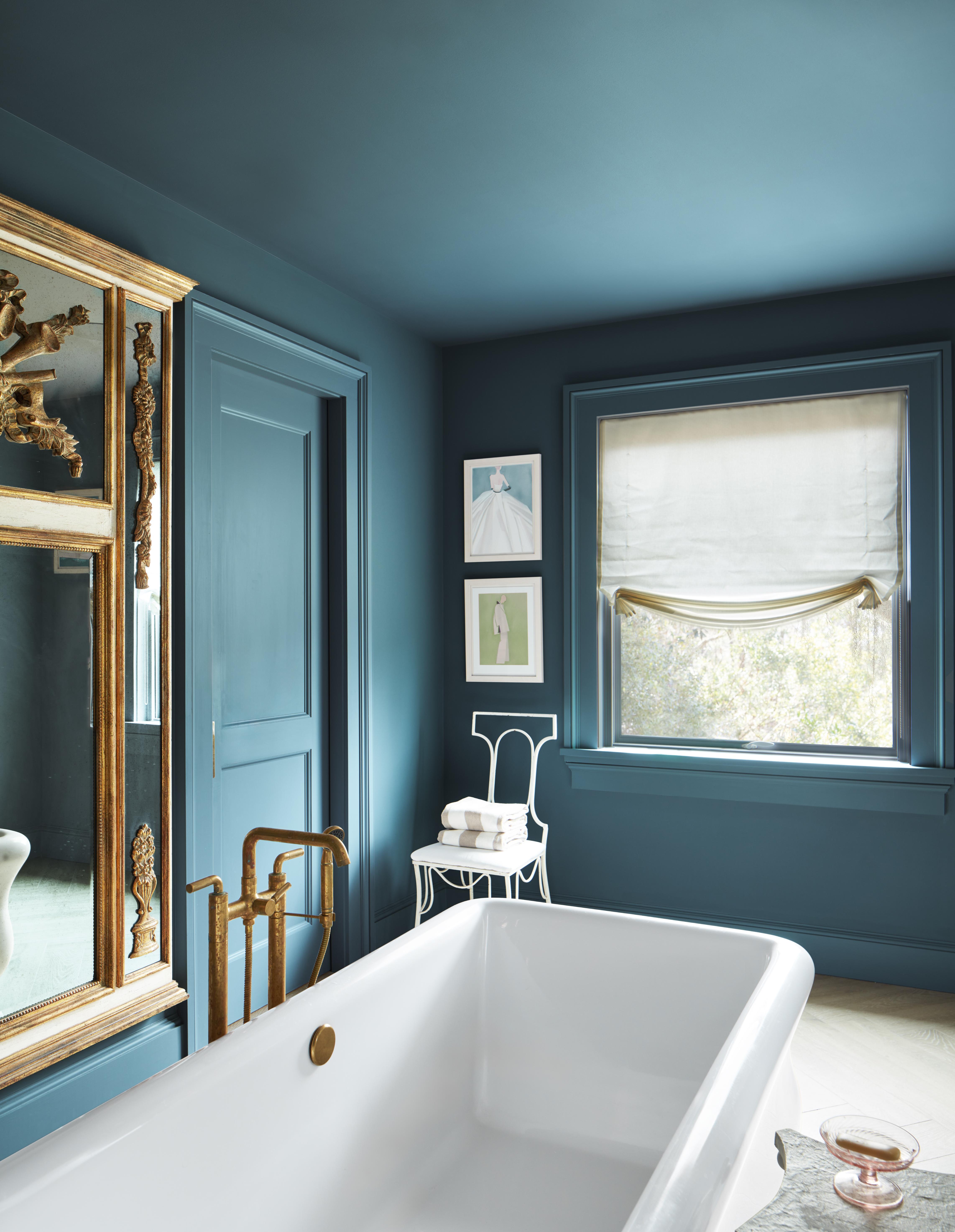
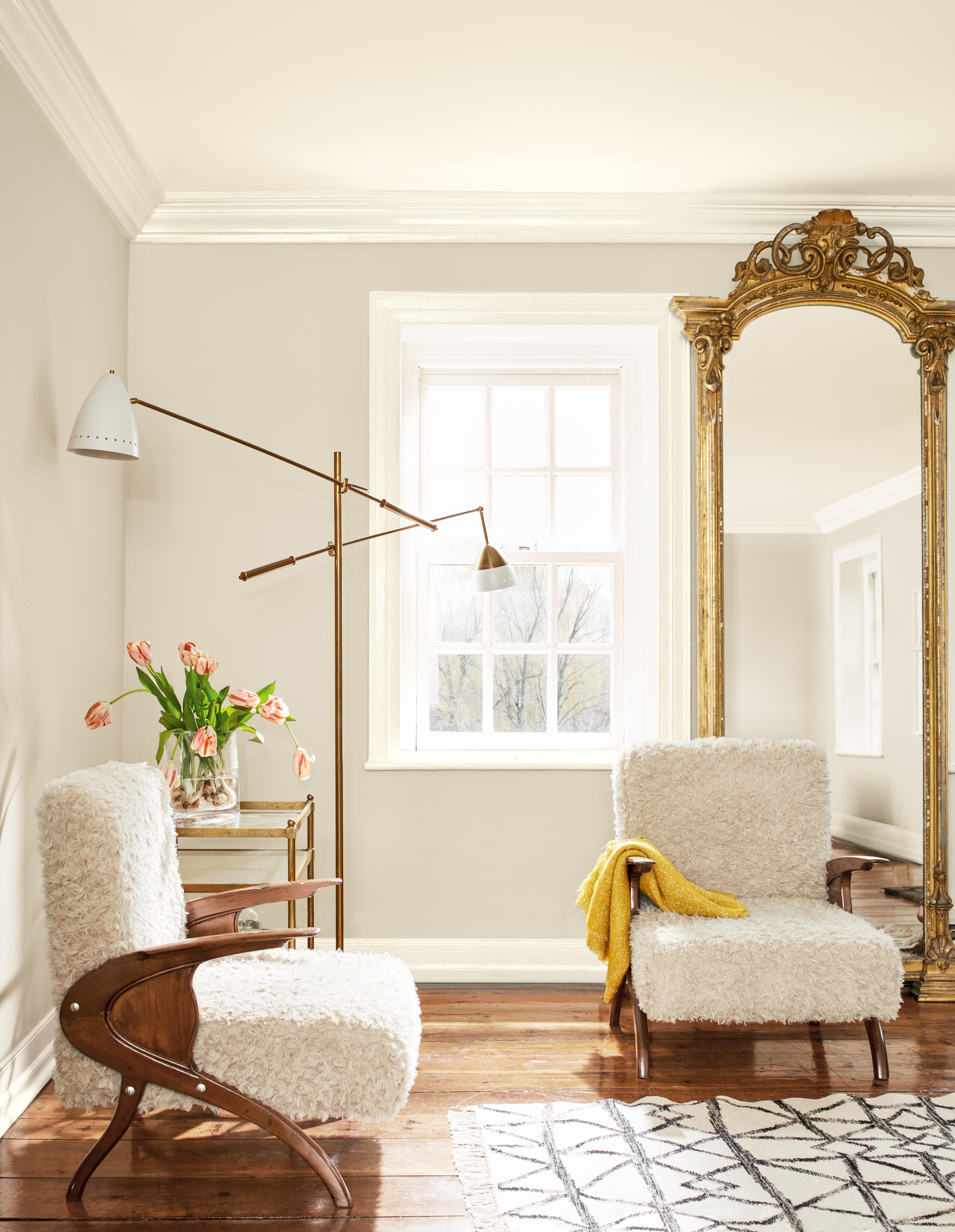
Though Benjamin Moore has chosen their champion color of the year, they have created an entire nine-color accompanying color palette that perfectly pairs with Cinnamon Slate. The colors that go with purple in this case are a mix of warm browns and neutrals, as well as deep blues and greens.
"Cinnamon Slate is interesting when used adjacent to a deep green, such as Ashwood Moss, or a saturated blue-green like Stained Glass," adds Helen, referencing two colors that form part of the wider palette.
More interestingly, Benjamin Moore has described their palette as a series of "in-between" shades that transition gracefully across any room in your home. As mentioned, their palette emphasizes saturation that is approachable. Each color in the collection has complex undertones "that lend depth and richness to schemes throughout different rooms, and boast an intriguing interplay with light and dark that can transform a space from dawn to dusk," says Helen.
A colorful home does not have to mean maximalist or overwhelming. The best paint colors will be ones that are comforting and that offer an enduring style that is personal to you. Cinnamon Slate and its accompanying palette is the perfect range of subtle hues to start bringing color back into your home. And best of all, these 10 colors all work wonderfully together, so you can use the entire collection all throughout your home, getting a sense of variety but harmony at the same time.
Shop the Paint Palette

Olivia Wolfe is a Design Writer at Livingetc. She recently graduated from University of the Arts London, London College of Communication with a Masters Degree in Arts and Lifestyle Journalism. In her previous experience, she has worked with multiple multimedia publications in both London and the United States covering a range of culture-related topics, with an expertise in art and design. At the weekends she can be found working on her oil paintings, reading, or antique shopping at one of London's many vintage markets.
