Color Trends for 2024 — 20 Palettes for a Fresh, Confident, and Forever Stylish Home Designers Love Now
These color trends for 2024, approved by design experts, will help your home stay ahead of the curve in the coming year
Lilith Hudson
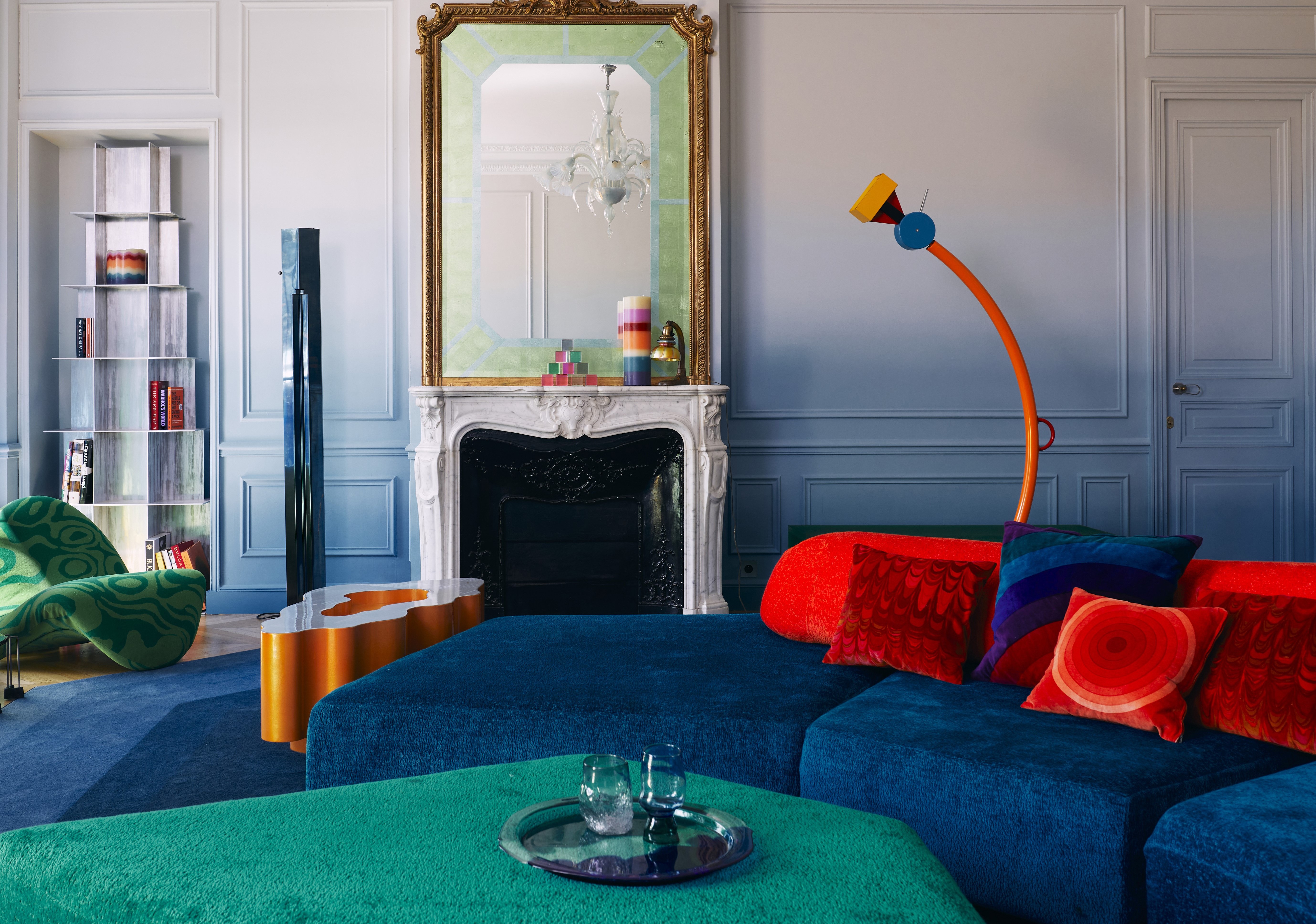
Color trends in 2024 highlight a fresh, new mood — that of being bold and confident with your choices. Gone are the days of soft, light palettes that created 'safe' looking interiors. Today, the trend is to create multidimensional interiors using layered tones, deep shades, and characterful colors.
'I see the current color trend swinging towards cooler tones and brighter colors as people are becoming more daring with their interiors,' says Lucie Ayres, founder of 22 Interiors. While blues, greens, and cool gray shades are all enjoying a moment in the spotlight, however, classic neutrals and timeless warm tones certainly still have a place in our homes.
To help you navigate the interior design trends for colors, we asked experts to tell us about the trending hues for 2024 and how to decorate with them throughout the year ahead. Take a look at the list below and give your spaces a brand-new identity with a brave new palette.
These were our take on the biggest color trends in 2024, when this piece was originally written, but you can now find our guide to color trends for 2025.
1. Magnolia 2.0
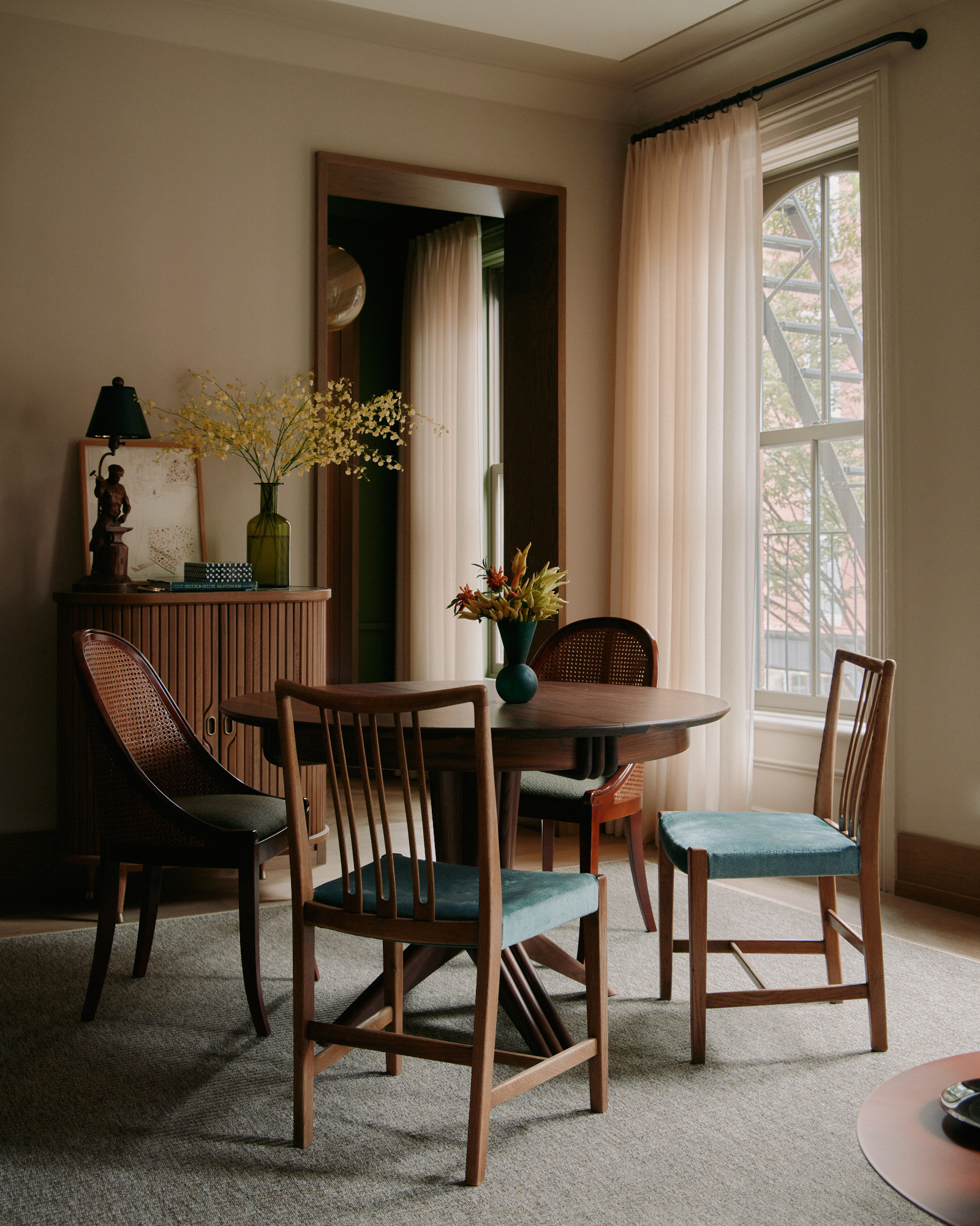
There's been a lot of talk about the 'new' magnolia in the Livingetc offices, as we think this once-dated shade is having a real resurgence in 2024. This time round the neutral is more nuanced, with complex undertones that give this color a transformative effect depending on the light. Similar to taupe, it brings warmth and comfort to any room.
'Meet New Magnolia 2.0, a fresh and contemporary take on the evergreen neutral shade that is gaining popularity in the design world,' says Isy Jackson, founder of Cheltenham Interiors. 'As homeowners seek peaceful and sophisticated vibes in their living spaces, Magnolia 2.0 presents a modern twist on a much-loved color, combining warmth, versatility, and subtle elegance.'
Taking things back to basics, Isy reminds us that this color draws inspiration from magnolia blossoms' soft and creamy hue, but with a modern touch. 'This refined neutral shade is warm and sophisticated, making it versatile for different design styles, from modern minimalism to classic tradition,' she says. 'The original version is reminiscent of the 1980s Laura Ashley style homes and was indeed my own mother’s favorite paint color.'
Be The First To Know
The Livingetc newsletters are your inside source for what’s shaping interiors now - and what’s next. Discover trend forecasts, smart style ideas, and curated shopping inspiration that brings design to life. Subscribe today and stay ahead of the curve.
Isy recommends investing in furniture pieces or upholstery in this soft shade or painting your walls in this soothing hue as an excellent backdrop for artwork, furniture, and decor.
2. Black-Blue
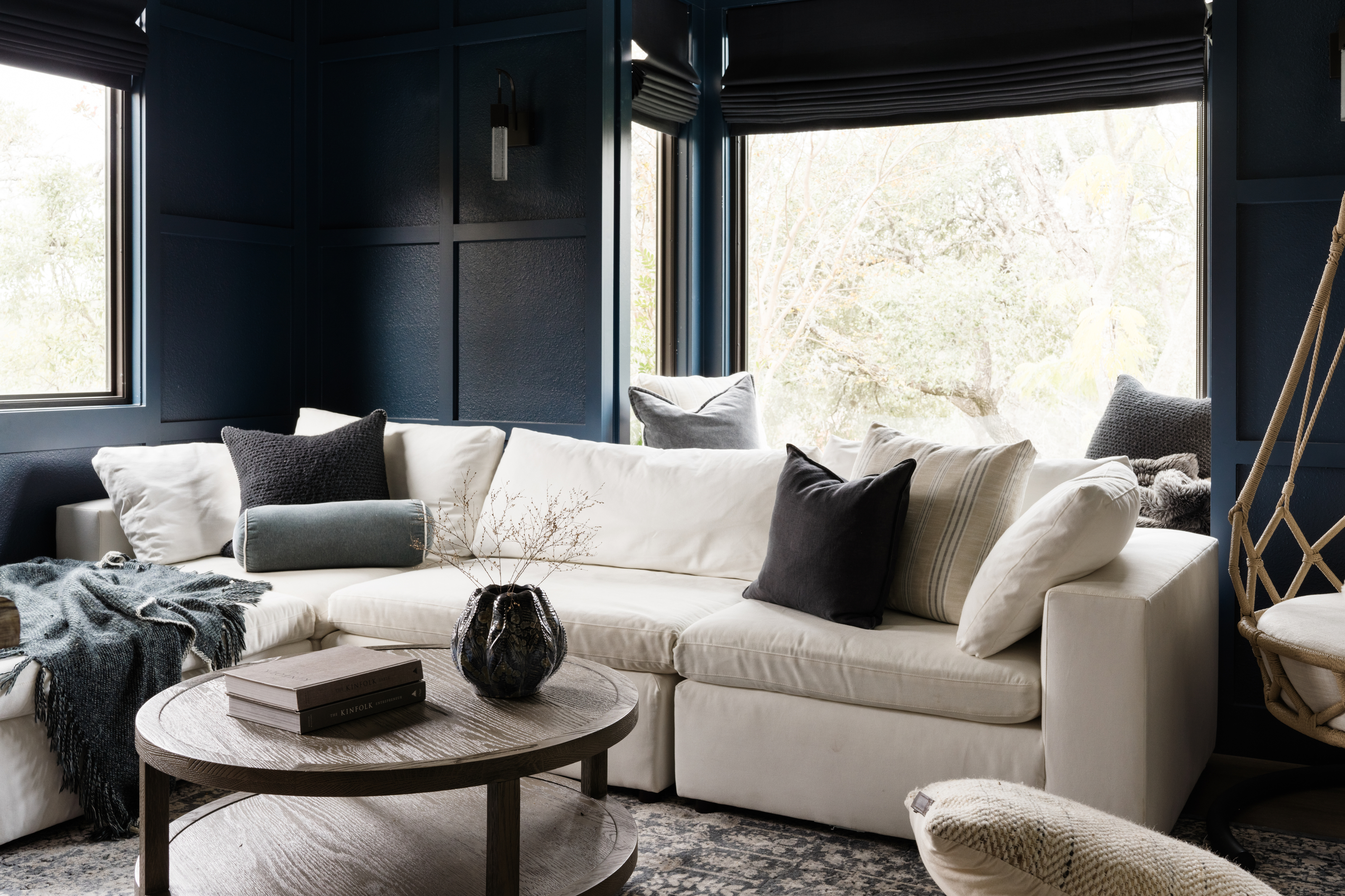
Dark blue-blacks are back in full force and proving especially popular in kitchen settings. While it's a brave color to decorate with on your walls, the navy living room above makes a case for sophisticated spaces swathed with the deep tone then lightened with neutral furniture.
'When it comes to interior design, few colors can create a timeless sense of elegance and sophistication, quite like dark navy,' Isy explains. 'Its refined and deep essence makes it ideal for creating dramatic spaces. Pair it with crisp white trim or metallic accents and you'll have a striking contrast that enhances the elegance of the navy backdrop.'
Deep blues also have a softer, more versatile quality to them than their other moody counterparts. 'Dark navy provides a timeless alternative to traditional black or gray, adding depth and dimension without overpowering the space,' Isy adds. 'In the kitchen, crisp white marble countertops balance the darkness of navy cabinetry and the jewelry accents of metals.' As far as paint suggestions go, Isy is a fan of Farrow and Ball's Stiffkey Blue and Winedark 308, and Benjamin Moore's Mistral C-842.
3. Cobalt
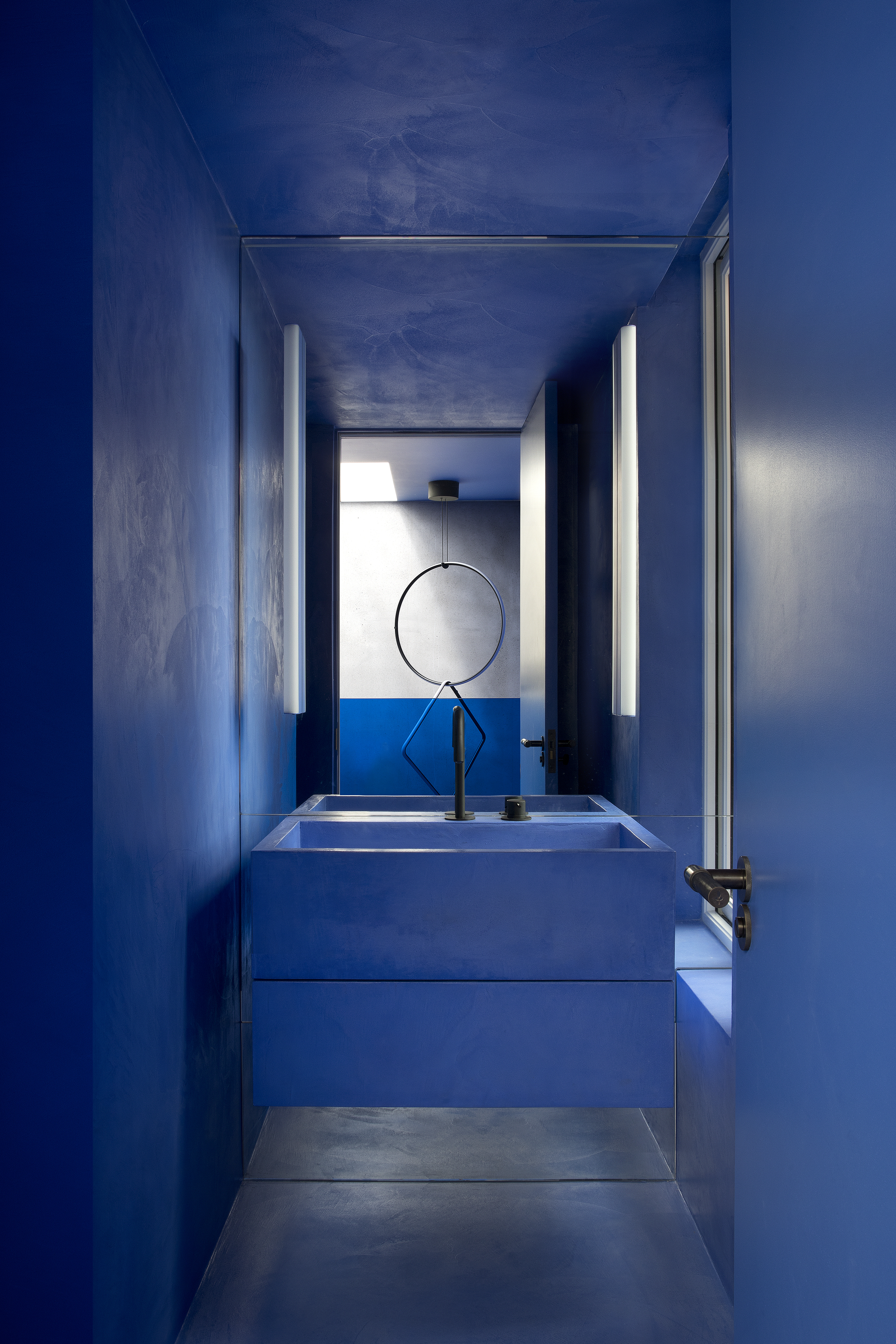
When it comes to bold, daring interiors, no color compares to a dark blue. This tone is not only packed with personality but also has an underlying charm to it, and cobalt blue decor in particular is reminiscent of the outdoors yet has a modern, crisp feel.
'In the project pictured above, cobalt was applied to walls, floor coverings, and bathrooms using a single material — micro cement — allowing the finish to blend as one where walls appear to melt to floors and steps wrap into seats,' says Róisín Lafferty, founder of Kingston Lafferty Design.
According to Róisín, cobalt is also picked up in key furniture pieces offset from core linking spaces, helping to create a harmonious atmosphere. 'This dominating, intense block of color diffuses the space entirely blurring the lines between what is wall, floor, joinery, art and sculpture,' she says.
4. Red
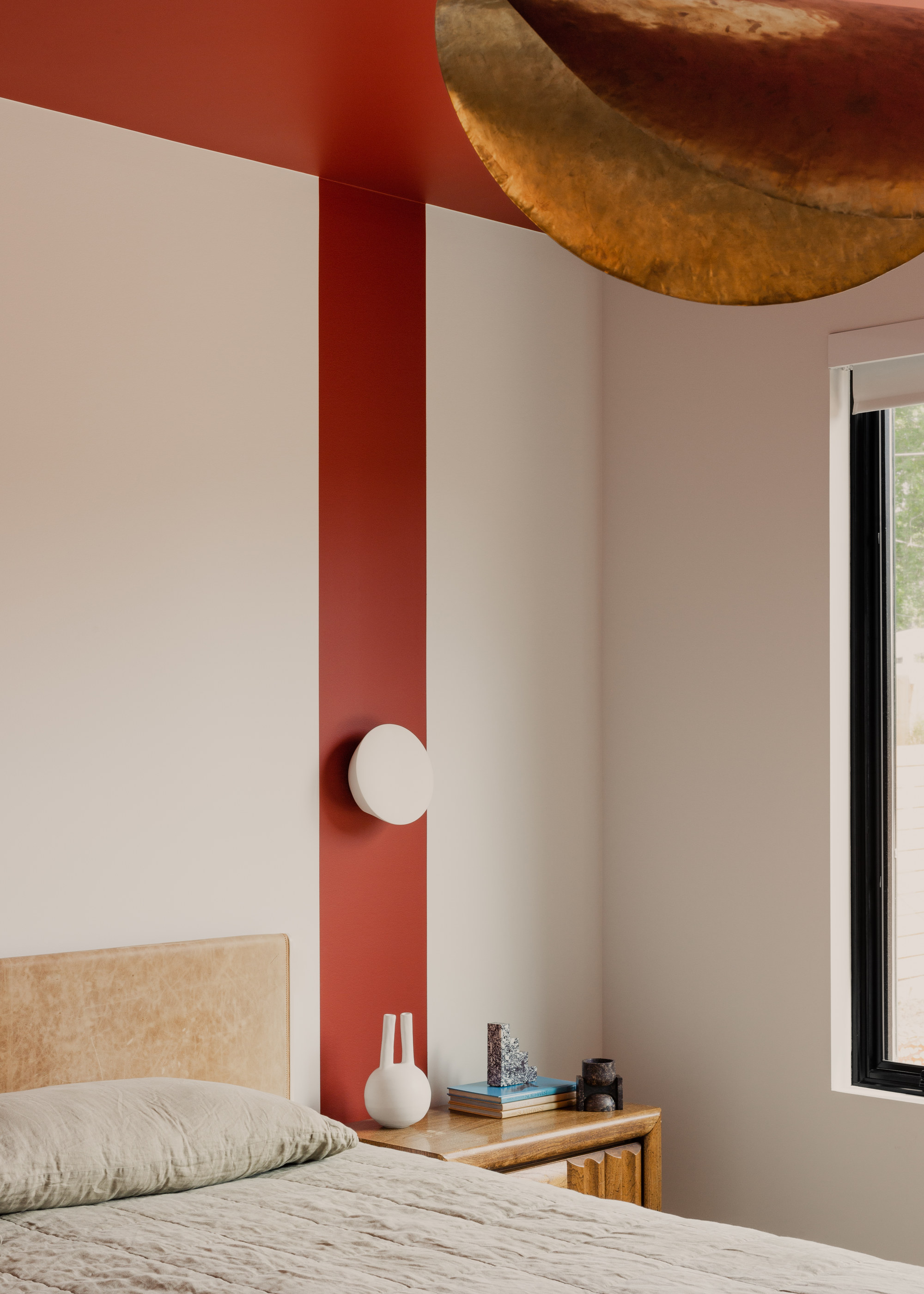
Another personality-filled, confident hue to try is red. While it may not be the best color to use in large swathes, in smaller decor pieces and accents red still makes a serious impact. Better still, many colors go with red allowing you to bring in more hues to dial down the impact of this fiery color.
'When using colors like red, you're approaching the design with the intent to make a statement,' says Katie Paulsen, interior designer at Maestri Studio. 'To give a space a soothing quality, you can soften the brighter values of the red by pulling in wood tones and adding in warmth with metal finishes.'
5. Warm Gray
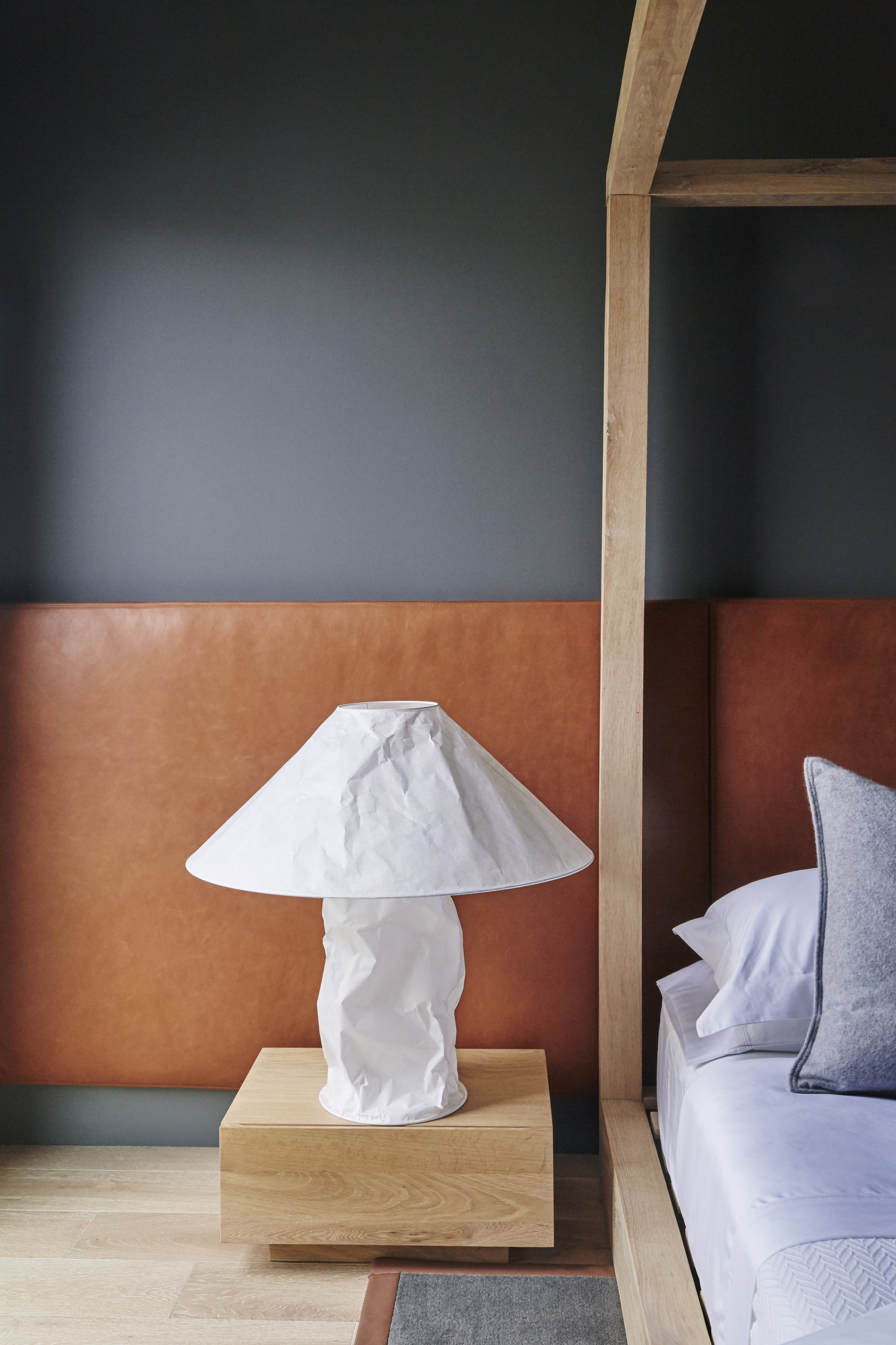
'To make a room cozier, my go-to is warm toasty shades,' says Dan Mazzarini, principal and creative director of BHDM. 'Benjamin Moore's Kendall Charcoal is a good example. It's a cocoon color, almost like a chunky knit cashmere sweater, that makes you want to curl up and read (or nap). Don't be afraid of the dark – the outcome is cozy, soft, and almost velvety in appearance.'
Julia Mack, founder of Julia Mack Design, adds that the versatility of gray makes it such a great shade to use within the home. 'Consider a warm gray wall paint as it offers a bright, off-white tone with a lively airiness during the daytime and cozy warmth at night,' she says. 'Elegant and sophisticated, the walls will shine even brighter when paired with a yellow table or chair.'
If it's a more earth-tone bedroom or living room you wish for, keep your eyes peeled for mushroom gray. A softer counterpart to traditional grays with warm undertones, this trending color has its roots in nature, making it a perfect choice for a calming scheme.
6. Dark pink
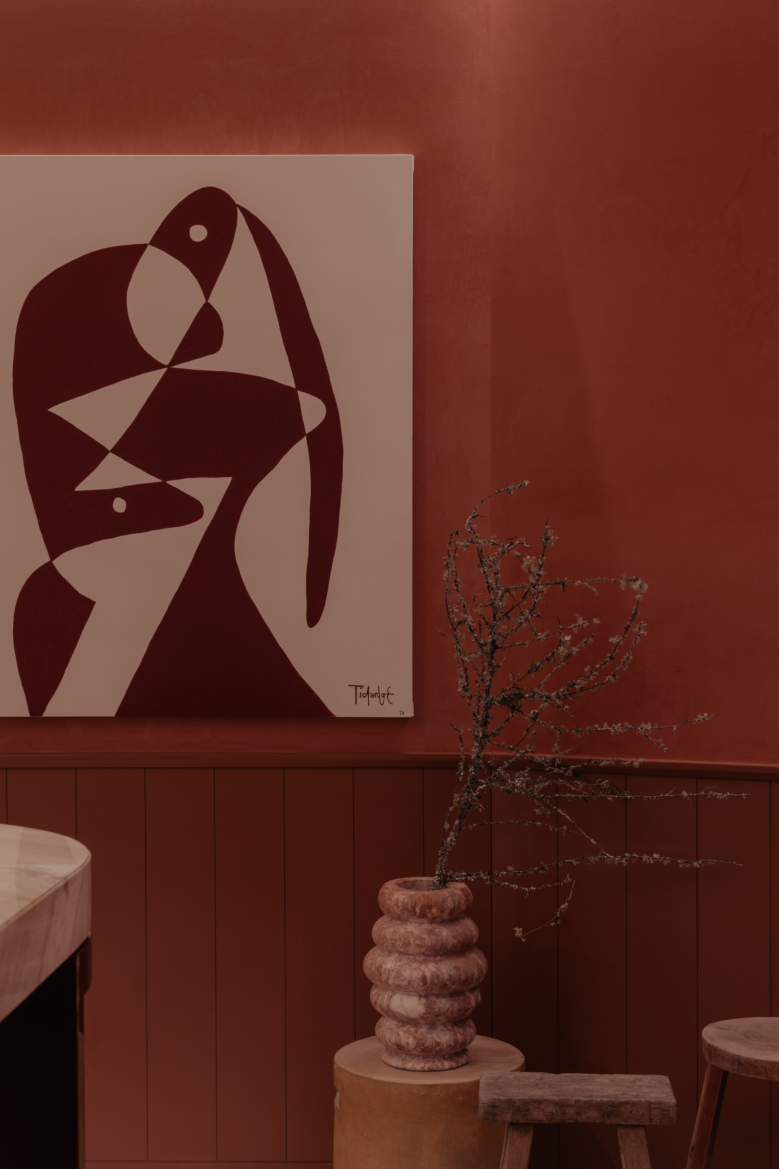
Pink is a timeless color that never seems to go out of style. Several renditions of this eye-catching hue have been used in interiors over time, be it dark pink, dusty salmon, or rosy tones. Like green, plenty of colors go with pink, making it a versatile, easy-to-use shade.
'The color pink emerges as the central element, defying expectations and transforming the visual experience of the space, making us feel contained and warm,' says Jimena Orvañanos of Cuaik studio. 'Beyond its aesthetic appeal, this choice serves a deeper purpose. It becomes a beacon that guides our attention to the focal point of the house, a space that promotes interaction and connection.'
With these soft, calming qualities in mind, it's easy to see why this color is trending, and Jimena has a few words of advice when incorporating it into a contemporary space. 'If you want to create a layering effect, use two shades of pink in a room,' she says. 'Select a dominant pink for walls and large items, complement it with a contrasting shade for accents, incorporate neutral tones for balance, and add texture and accessories to create a harmonious and visually pleasing space.'
7. Forest green
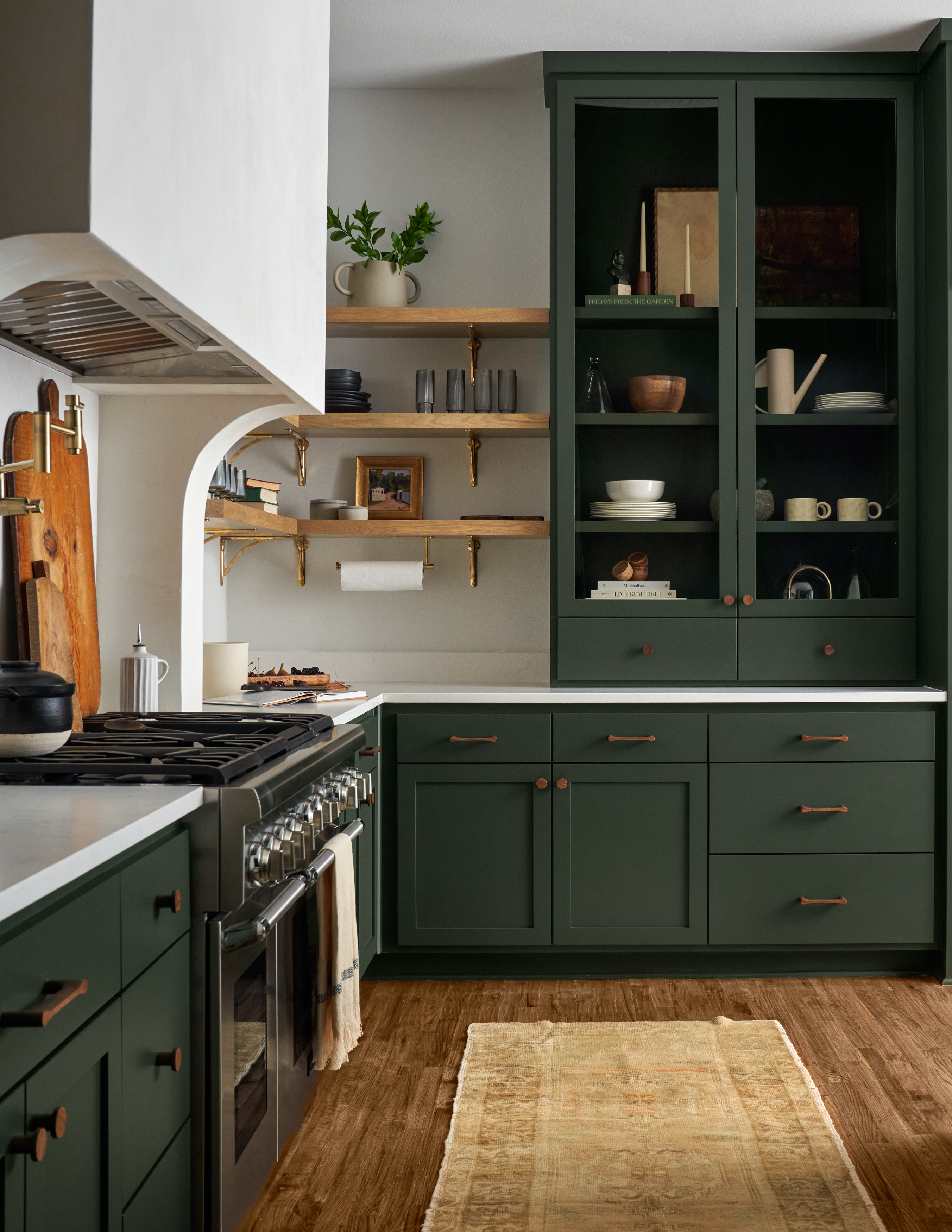
Green has a grounding, warm effect on spaces (despite being a cooler tone), and can create modern, atmospheric room schemes. When it comes to colors that go with dark green, the combinations can bring balance, drama, or even tranquility to a space depending on which complementary shades you decide to use. Of course, it also introduces a natural theme that can have a calming effect on a room.
'We wanted something bold but not overwhelming, and slightly unexpected,' explains Ginger Curtis, President of Urbanology Designs and the designer responsible for the forest green kitchen pictured above. 'We're seeing a shift towards moodier colors in general - saturated hues that embrace a strong vibe - and we always love to give a nod to nature and bring in organic elements wherever possible.'
8. Soft Blue
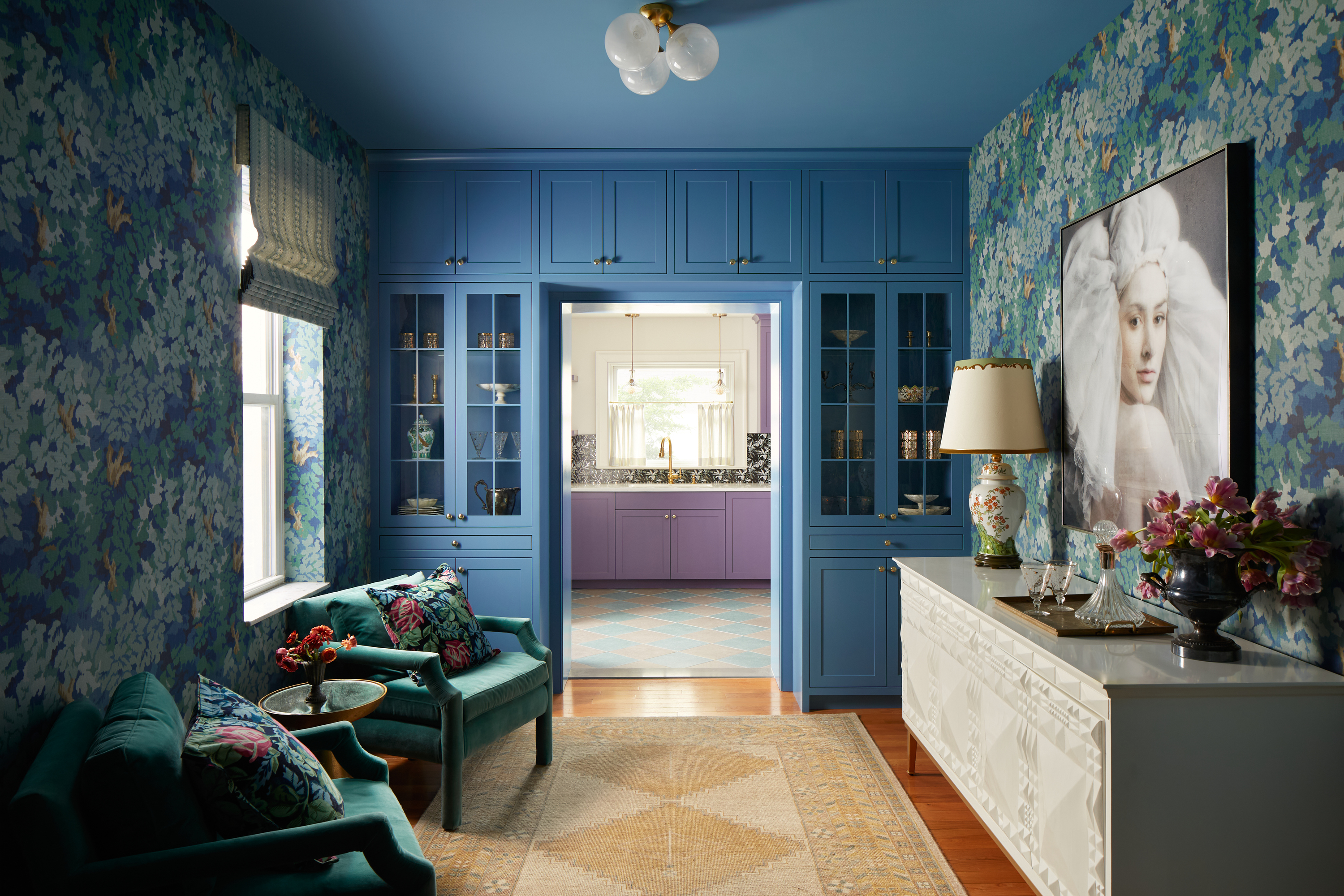
Soft, mid-blue is a classically beautiful color, and it's super easy to live with. It can conjure an outdoorsy environment, reminiscent of clear skies, or transport you to calm blue waters.
When paired with deeper, darker tones, the combination can look arresting and make a serious statement. Pair blue with more muted tones, on the other hand, and you have a timeless-looking space. The opportunities really are endless since there are a host of colors that go with blue, helping you build a harmonious color palette around this particular tone.
'We designed the color scheme for this room based on a few factors – one being that this wallpaper was just perfect for the home,' says Michelle Gage, founder and creative director of Michelle Gage Co and designer of the space above. 'It gave this room that lush, lounge-like feel that we were after. To make it feel cool and not too traditional, we pulled out this fresh blue tone for the built-ins and ceiling, and we went for tone-on-tone with the upholstered chairs.'
9. Lavender
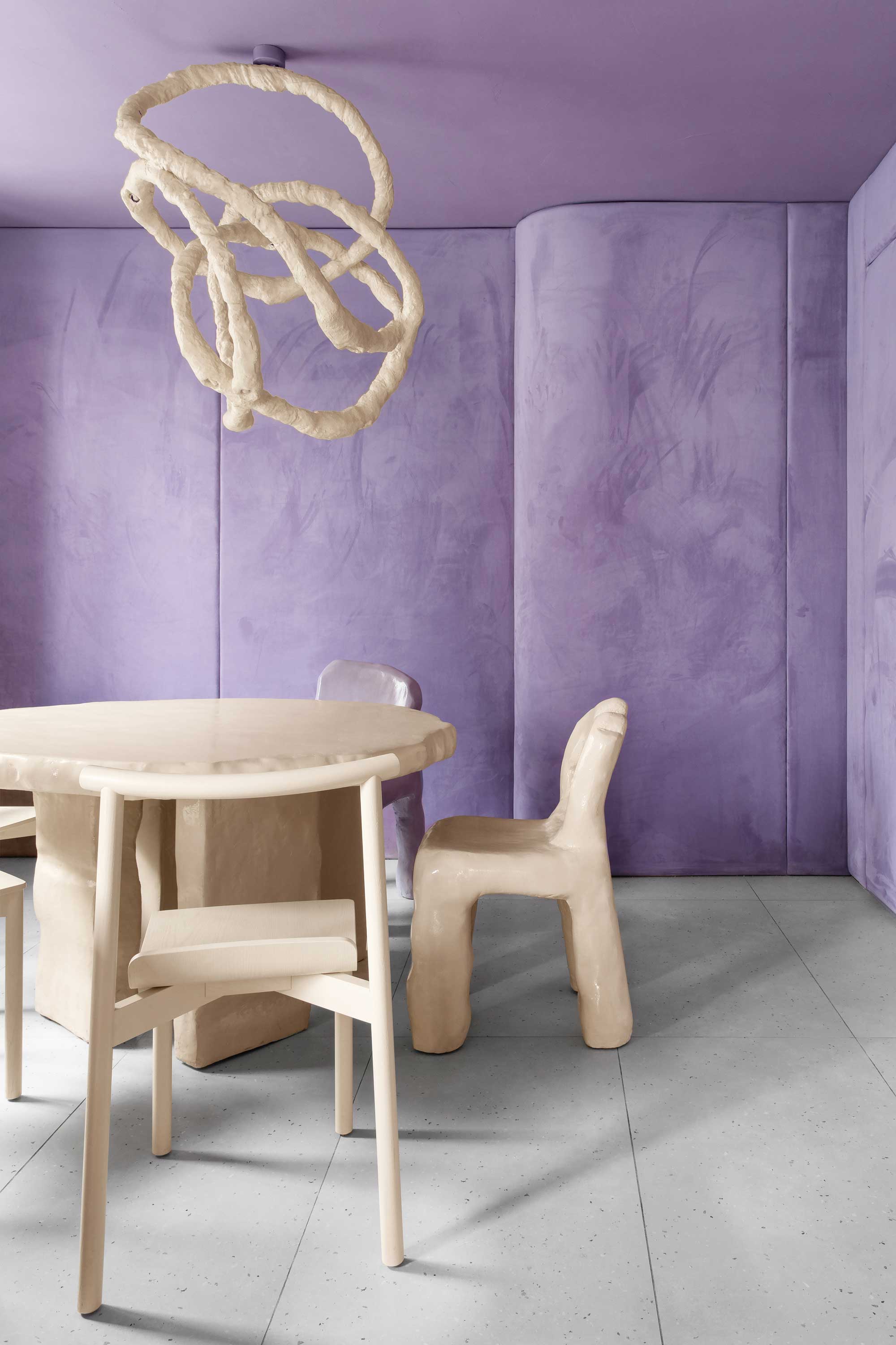
Shades of purple have previously been associated with wealth and royalty and, while many might associate it with a traditional interior scheme, designers are incorporating it into fresh, contemporary aesthetics bringing a new dynamic to the color.
Lavender in particular has a somewhat whimsy feel about it, and the delicate tone has been cropping up across many designs of late. What's more, many colors go with lavender making it an easy hue to play with in your own home. 'Lavender just feels good,' says Lucie Ayres, founder of 22 Interiors. 'It's soothing like a blue and also has the moodiness of a purple. It's the most underused color in my opinion.'
Isy Jackson agrees. 'Lavender is the ideal color trend for creating a peaceful bedroom or a vibrant living area, refreshing and elevating any space,' she says. 'This soft and calming hue has the ability to promote a sense of tranquility and well-being in spaces, making it an ideal choice for people who want to refresh their homes. Additionally, its versatility makes it an excellent complement to a wide range of design styles, from modern minimalist to classic traditional, adding a touch of elegance and sophistication to any space.'
10. Burgundy

This deeper, more somber red hue makes the perfect shade for sophisticated interior spaces. As a livable red, burgundy looks right at home in a bedroom, living room, or bathroom, and it also taps into the current quiet luxury trend that designers are loving right now.
'Burgundy is a rich sultry color that can be paired with several hues,' says Jasmin Reese, founder of Jasmin Reese Interiors, who points out how many colors that go with burgundy are also on trend right now. 'Burgundy paired with grays works best when the other materials are an eclectic mix of materials like brass, wood, and neutral fabrics to really make the color stand out.'
11. Pistachio
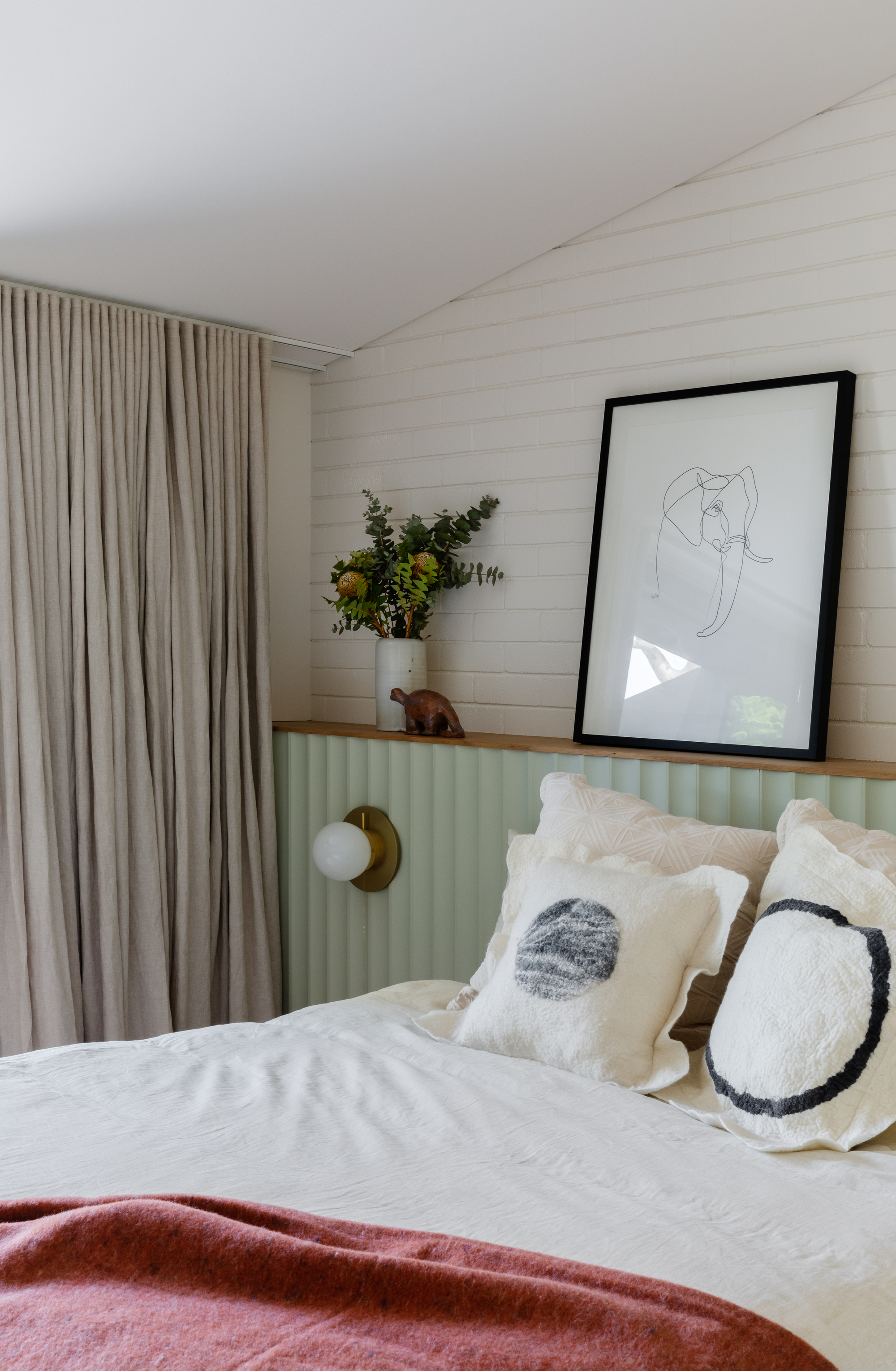
Pistachio is packing a punch at the moment, with the trend for deep, forest greens moving into delicate sage greens and this gentle tone. Its retro connotations make it a happy and positive shade, and pairing it with the right neutrals will strip this green of any coldness.
We love the color as it is used here by Carter Williamson Architects, perfect in the bedroom, bringing softness and serenity to the space, and warmed up with a classic pink and green combination.
'Soft and natural, pistachio works wonders on plain, dull walls - particularly when paired with white and natural wood tones - and it acts as a perfect backdrop for large sunny spaces,' says Julia Mack, founder of Julia Mack Design. 'Do not mistake pistachio with its more vibrant cousin called chartreuse, which is very bright with eye-catching vibrancy and saturation.'
12. Light pink
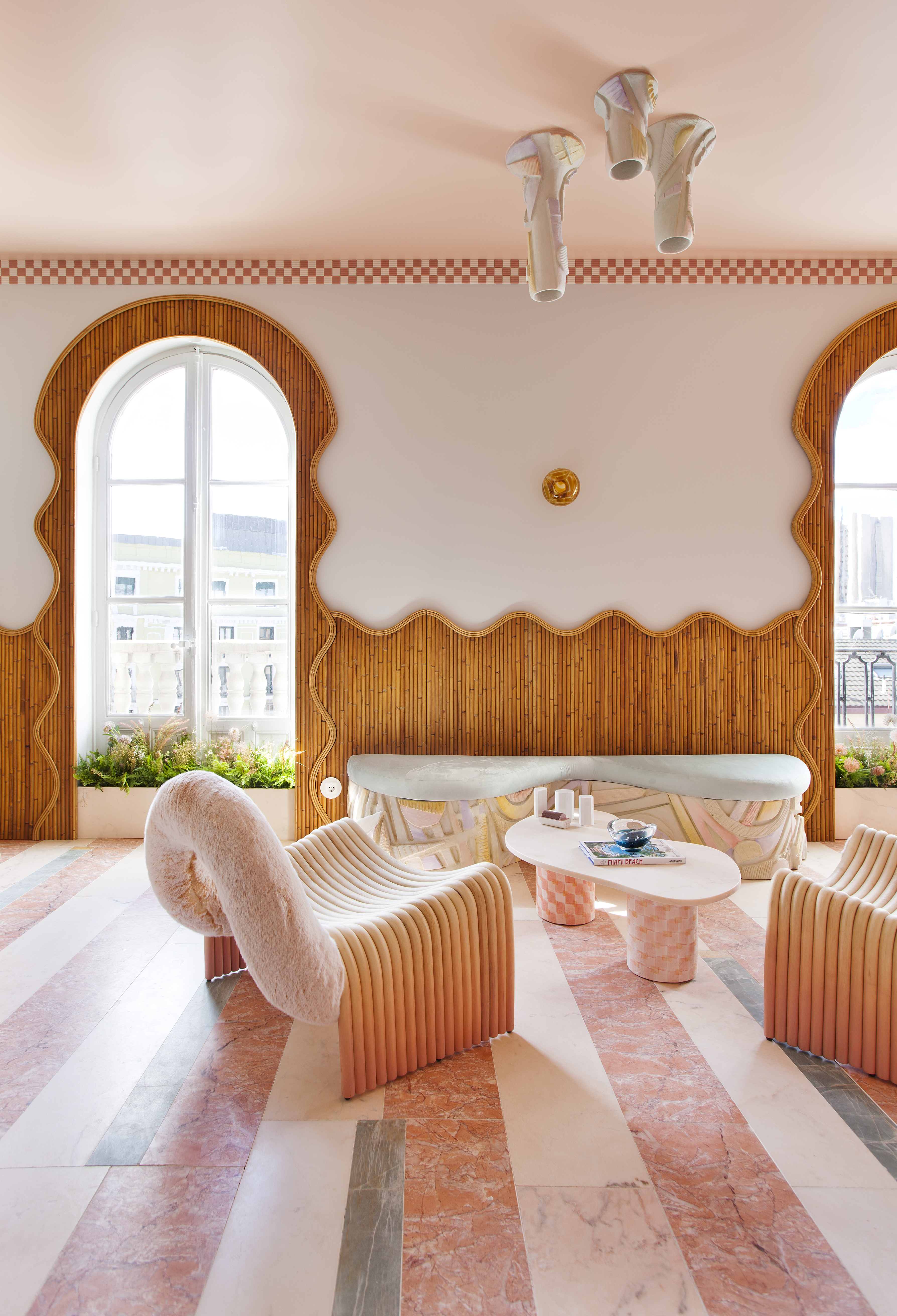
Light pink, is certainly the mood of the moment right now. This tone has been around for a while and plays the perfect companion to almost all tones, sometimes even working as a neutral. It works wonderfully as a gentle accent or equally well when dramatically used to color drench a room, plus many colors go with light pink so you can experiment with different schemes to your heart's content.
'Pale or light pink is the winner in terms of popularity,' says Lucie Ayres. 'It's been used in fashion and interiors since the 1700s, and there's something so innocent, delicate, and sweet about a pale pink. It works in shadow or bright light and at all times of day. Timeless for sure.' Lucie's favorite shade? Middleton Pink by Farrow & Ball.
13. Gold
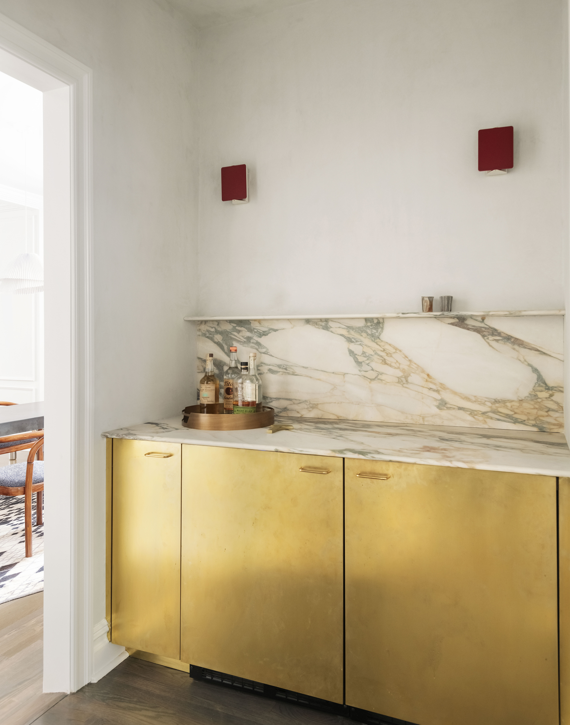
Metallic gold tones inject so much warmth and joy into a space. Look to materials as well as paint to bring this color into your home, and embrace the opulence brought by a touch of warm brass. With a natural sheen, these materials can reflect and augment other colors in the room and add that touch of luxury that we're looking for in our lives.
'For a space like a den, family room or guest room, consider gold tones paired with a variety of greens in artwork, area rugs and modern lighting, with white walls and a light color natural tone wood floor,' says Julia. 'Next, add more hints of gold in shiny brass in furniture knobs and pulls, curtain rods and rings and in doorknobs and hinges. The result will be a colorful and impactful space with a balance of warm and cool colors and little pops of shiny warm metal, that act like jewelry in your room.'
Looking for colors that go with gold? Try green, black, or navy blue for a dramatic look, or yellows or reds for a more opulent feel.
14. Jade
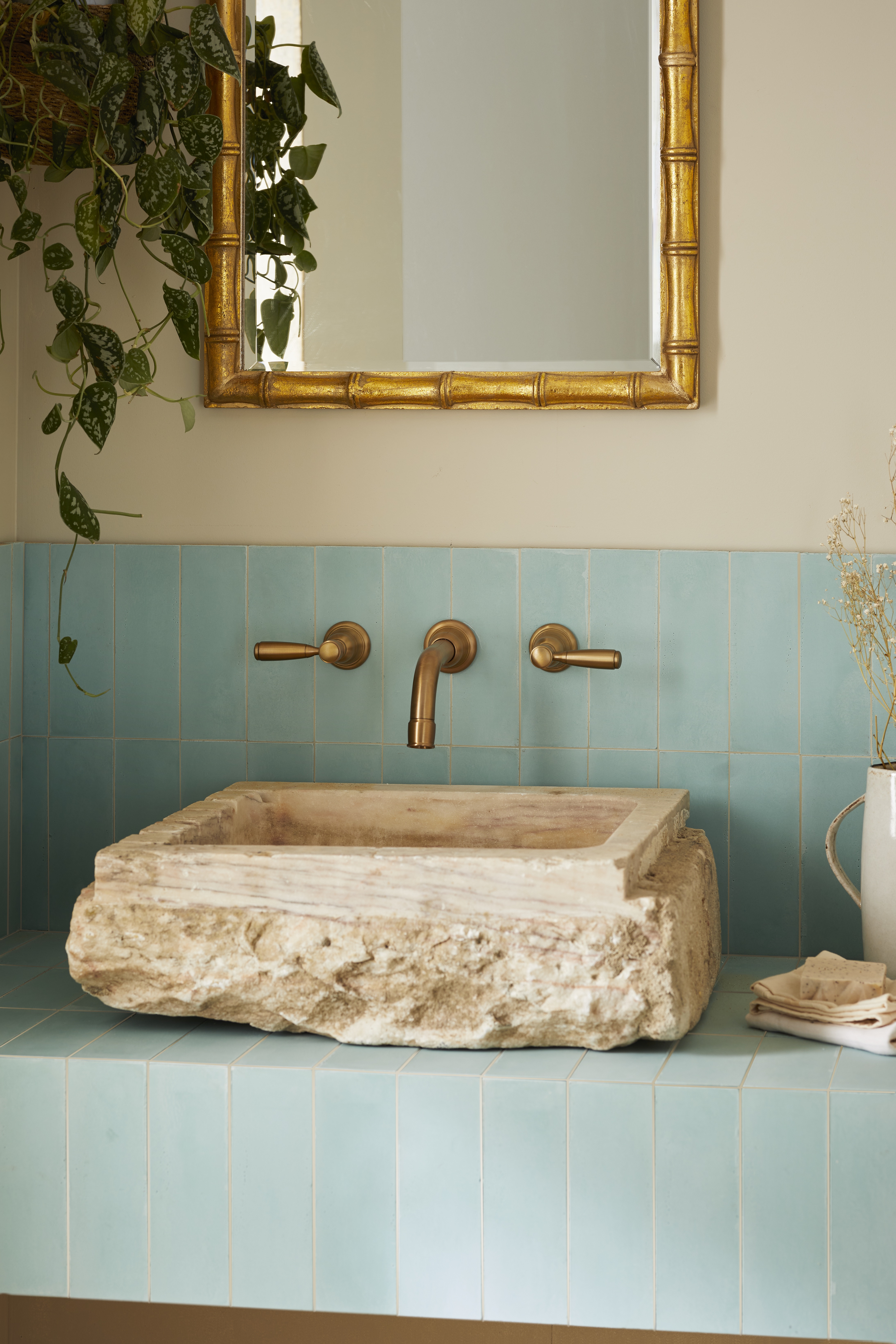
Touches of gold, emerald, and jade are popping up in interiors across the world, showing people how to decorate with jewel tones. Pale blues and greens inspired by the natural color of the gem itself are increasingly popular and can be applied to both tranquil and striking aesthetics depending on how it is used.
'There is really no wrong way to use jade in interiors – it pairs beautifully with any tonal white, taupe gray, peach and pink and - the classic - glossy red,' says Julia. 'It was exotic and rare in the 1850s then roared through the 1920s, popping up again in contemporary design of the 1970s. Almost every designer from Mackintosh, Tiffany to Frank Lloyd Wright had their own interpretation of how to best use jade in interiors.'
'Consider soft and moody textural jade color walls for a main bedroom then repeat the jade color in bedding paired with natural linen curtains and area rug,' Julia continues. 'Monotone and soothing, a jade color scheme adds tranquility and subtle sophistication, plus a touch of the exotic to all interior spaces.'
15. Honeyed tones
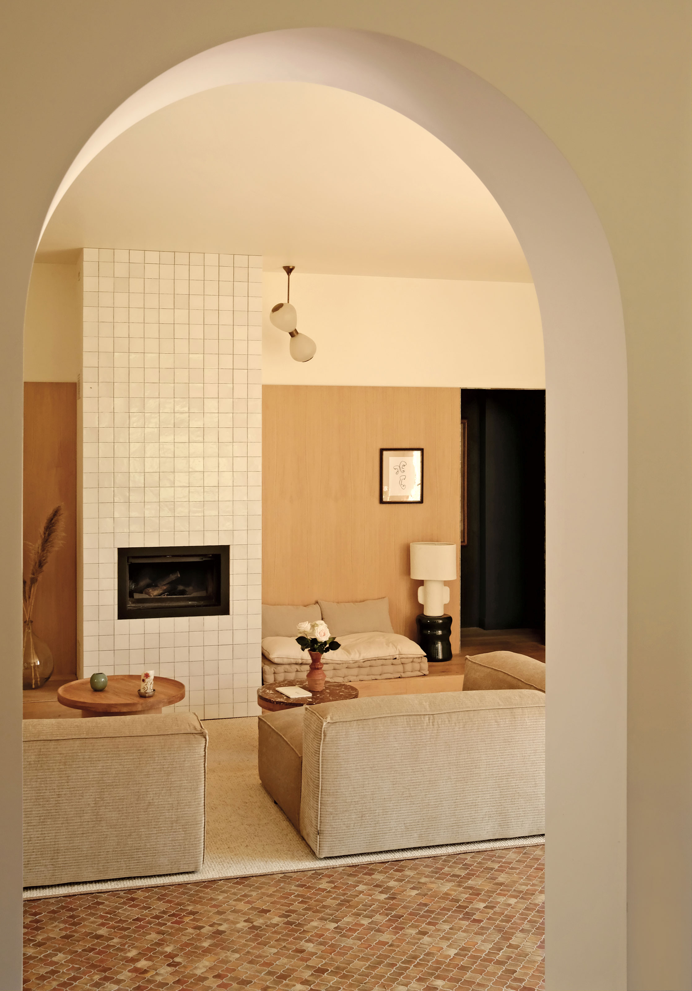
Layering neutrals is one of the best ways to create depth and dimension in a space, and adding a rich honey hue will immediately make it feel so inviting. 'Honeyed tones absolutely read warm and sexy,' says Lucie of 22 Interiors. 'They really set a mood, screaming "I'm inviting, carefree, and energetic".'
Injecting small pops of these tones can help build confidence initially before taking it to the wall. When looking for a chic and stylish paint color for bathrooms or kitchens, matching tonal shades on the tiles and walls can bring cohesion to the space.
16. Warm beige
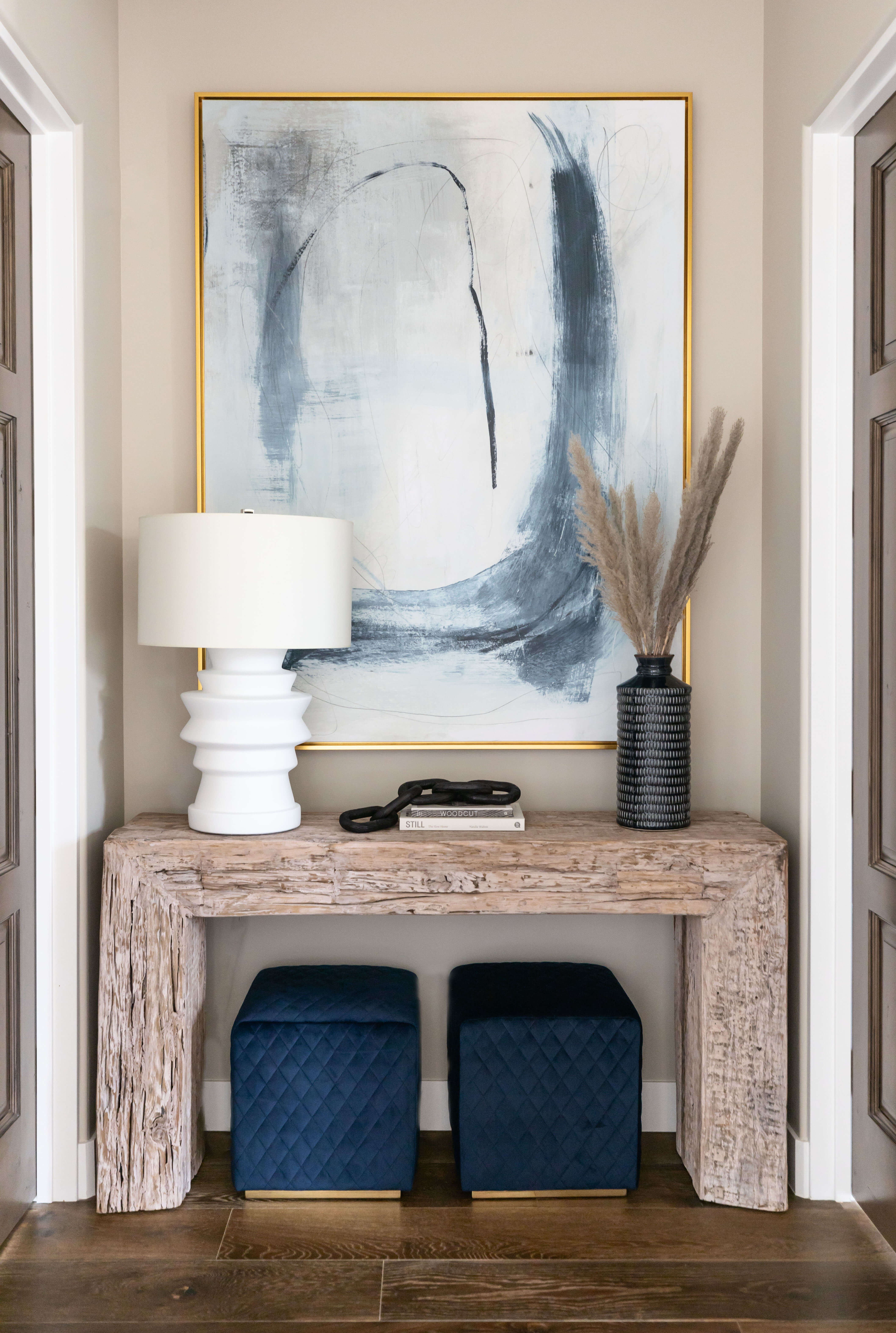
Similarly, our love for base neutrals has returned, especially in bedroom trends where it helps create a restful ambiance and a sanctuary to escape in. Warm beiges and earthy creams work well paired with soft terracotta or deep red tones, adding depth to the room for ultimate comfort.
Remember, with neutral color schemes, layers of texture bring tactility and interest to create a distinguished feel within the space. 'In today's color trends, accenting a room with pops of beige in the painting, pillows, and curtains can create dimension, especially when set against a dark background without detracting from the bold impact,' says Lindye Galloway, founder and chief creative officer of Lindye Galloway Studio + Shop.
Isy of Cheltenham Interiors agrees that this versatile, inviting color exudes sophistication, warmth, and tranquility. 'This trending color can transform your home and create a truly inviting atmosphere,' she says. 'As homeowners today prioritize comfort, coziness, and connection within their living spaces, warm beige home paint emerges as the favored choice for its ability to create an environment that promotes relaxation, well-being, and a sense of sanctuary. Pair it with other complementary colors for an even more transformative experience.'
17. Brown
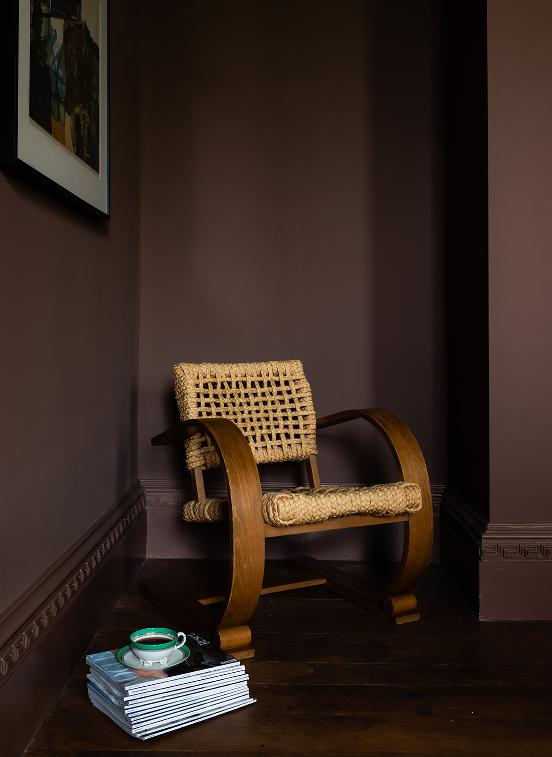
Yes, brown is back, and it’s looking better than ever. Often perceived as drab or boring, designers and stylists are helping us to view the color in a new light. Bringing an earthy yet sophisticated tone to any interior, brown living rooms are full of drama and they feel oh-so cozy.
'Often times I will specify shiny dark chocolate brown walls with glossy white for an impactful space,' says Julia. 'Best in tight spaces like hallways, den or half bath, the contrast is a surprising and formal way to incorporate a tonal shade into a more traditional interior.'
18. Yellow

With yellows firmly on trend for 2024, pairing brighter tones of the color with black accents in a monochromatic style is a great way to embrace the look. 'Consider orange and bright green when pairing sunlit yellow for interiors for a bit of a retro 1960s vibe,' says Julia. 'Bright, happy, and optimistic, sunlit yellow plays well with saturated colors and lots of bold pattern wallpaper like stripes and flowers.'
Because it is so bright, Julia recommends starting small by adding accents to your space with the likes of placemats, linen napkins, and kitchenware. 'Start small and try a minimal amount to give it a test fit then add judiciously as you feel more comfortable in your space,' she adds.
'The bright and cheerful hue of yellow can instantly uplift and energize any room, creating a sense of warmth and vitality that resonates deeply with our desire for comfort and connection within the home,' notes Isy. For this reason, it makes a great home office paint idea where it can boost both your mood and productivity.
19. Purple
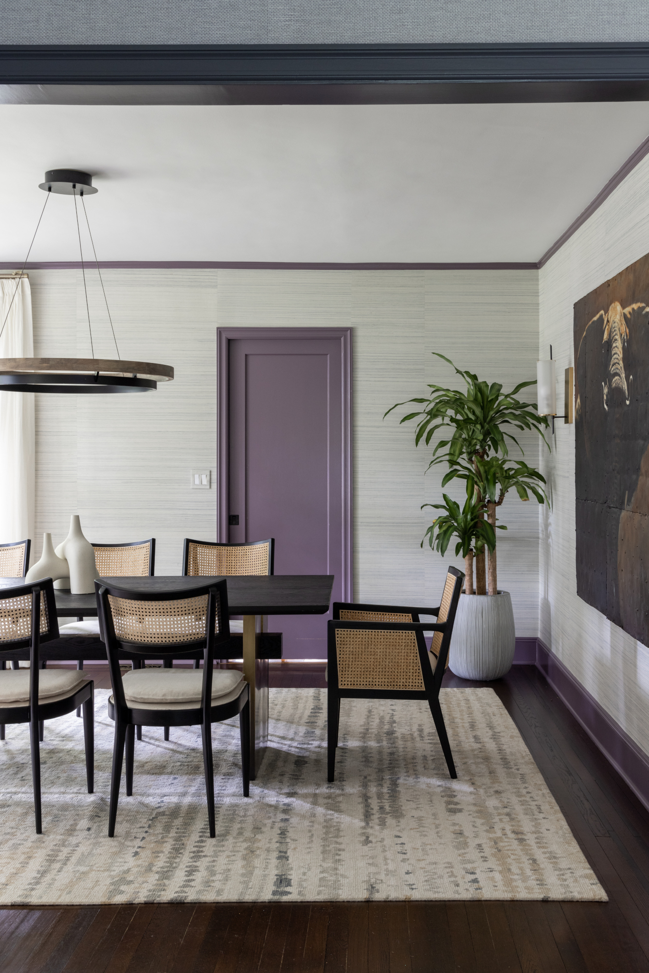
Dark and stormy shades are still up there when it comes to color trends. In 2024, designers are using the hue on staircases, feature windows, or woodwork to bring elegant definition to a space. A deep plum with a red undertone makes for a warmer and more striking alternative to the popular deep charcoal grays and blue blacks. It adds warmth to cooler palettes and pairs beautifully with pink and nude tones.
'Purple is having a big moment right now, especially lighter shades such as lavender and lilac,' says Victoria Holly, principal and founder of Victoria Holly Interiors. 'It exudes calmness and luxury at the same time. Deeper shades such as eggplant or royal purple are rich with playful depth, creating a sense of luxury when used in textiles or on walls.' If you're looking for colors that go with purple, Victoria adds that its versatility allows it to be paired with various colors, too.
20. Neutral stone hues
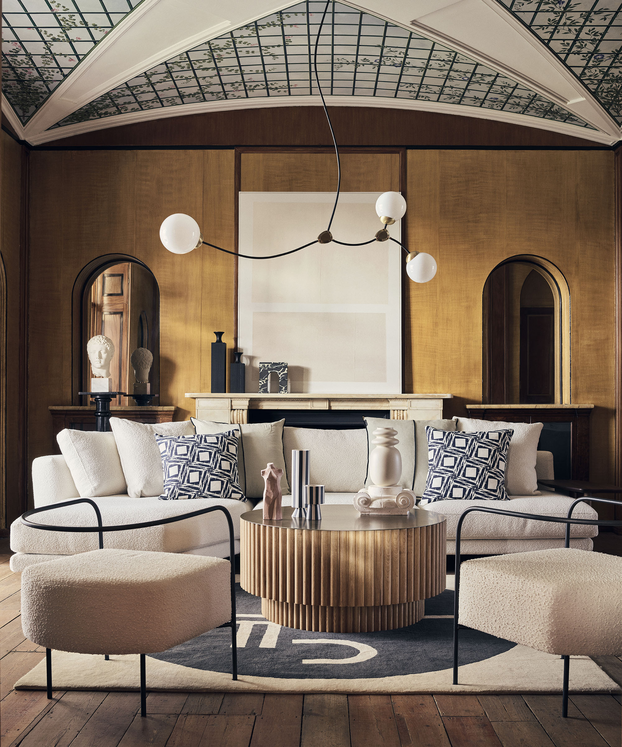
The neutral trend has subtly been moving away from cold grays and traditional creams towards warmer neutral stone tones. For an earth tone living room or bedroom, consider colors such as dark brown, rust, and sandy pink.
'Earthy stone hues evoke a sense of grounding and connection to nature, which is very big in the California look,' says Victoria. 'These tones are perfect for creating cozy and inviting interiors. For example, shades such as slate gray mimic the look of natural stone and work in both modern and industrial-inspired spaces. Sandstone and terracotta are also having a moment, bringing warmth to interiors, especially in Mediterranean or rustic design themes. And lighter stone tones like travertine or limestone are used to brighten spaces with a sense of airiness.'
What were the most popular paint colors for 2023?
Amongst the popular paint colors of 2023 were sage green, pistachio, and burgundy. All colors, though different in depth and values helped create a soothing, calming and relaxing interior. These colors were also seen abundantly in the more minimalist interiors, as the world moved towards a restrained, subdued spaces.
What is the next color trend after gray?
While the jury is still out on that, judging by how minimaluxe has taken over homes this year, and with the love for minimalism rampant amongst homeowners, the warm beige seems to be the next big thing.
3 paint colors to give your home a refreshed look
Design writer, presenter, panel host, consultant and journalist Roddy Clarke is a regular on the pages of Livingetc. He also writes frequently for FT Weekend and Forbes. Based in London, and with a breadth of skills and hands-on industry experience, Roddy now offers an exclusive interior styling and design service.
- Lilith HudsonFormer News & Trends Editor
-
 12 Essentials Every Cool, Collected Spring Host Needs — And You’ll Never Guess Where They’re From
Guests will think you thought of everything, you just knew where to shop
By Julia Demer Published
-
 Smeg Says Teal, and We’re Listening — The Kitchen Shade of the Year Is Here
Designers are already using the soft, sea-glass green everywhere from cabinetry to countertops
By Julia Demer Published
-
 Straight from Salone: 5 Emerging Trends I Found in Milan That'll Shape Interiors For the Year Ahead
From reflective silver to fluidity, here's my perspective on the key themes and new moods coming through from Milan Design Week
By Sarah Spiteri Published
-
 The 'Red Table Trick' Is the Easiest and Most Expensive-Looking Trend to Hit 2025 So Far
A red dining table makes a seriously stylish statement; the beloved pop of red trend just got an bold and expensive-looking upgrade
By Olivia Wolfe Published
-
 Cork Is the Cool, Sustainable, and Surprisingly Chic Material We Can't Stop Furnishing With Right Now
In honor of Earth Month, we’re toasting to cork... furniture, that is
By Julia Demer Published
-
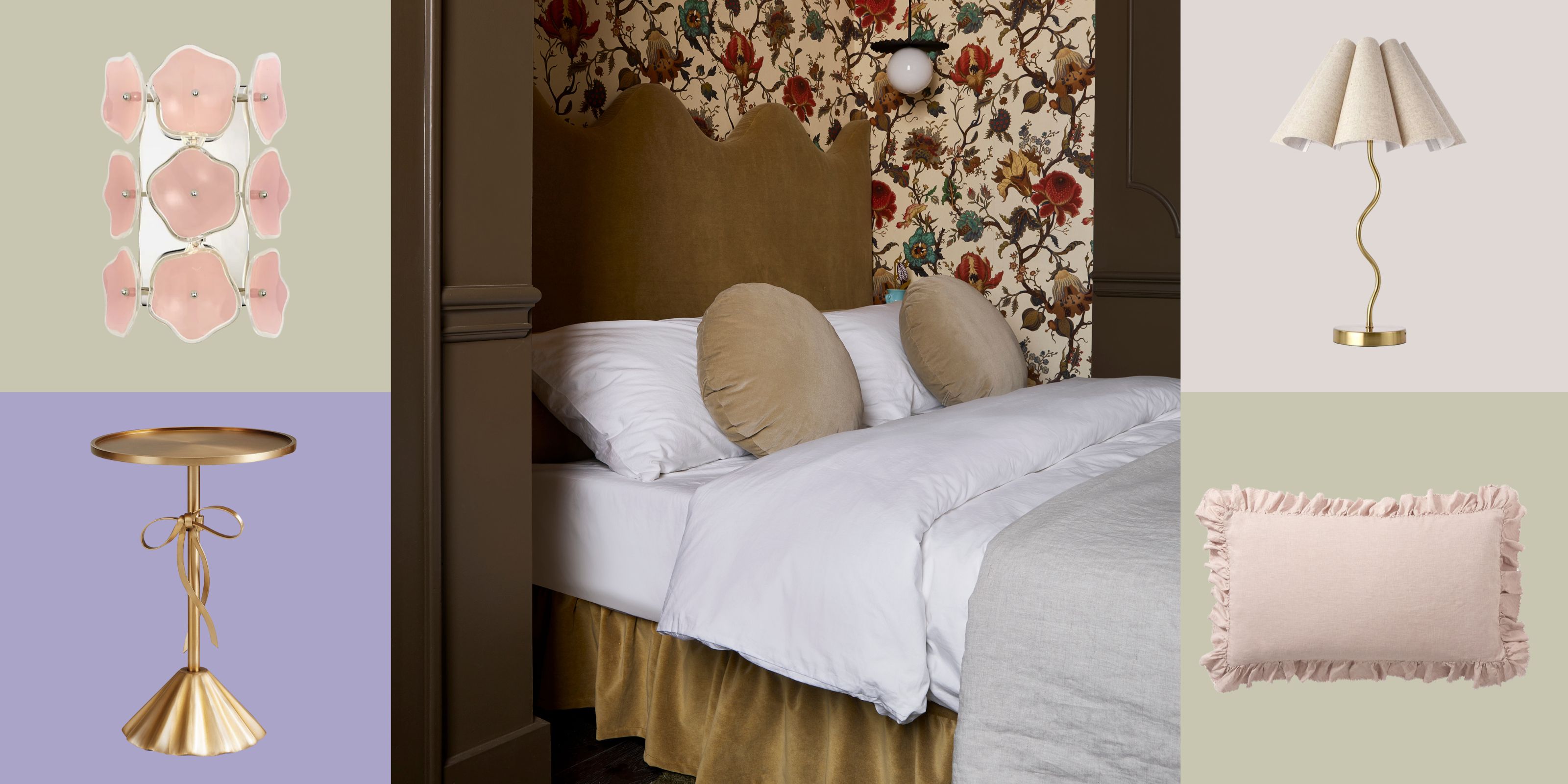 The Coquette Aesthetic Is Still Going Strong in Homes in 2025 — But Now It's Charming, Whimsical, and Has Modern Flair
A designer weighs in on how you can make the classic coquette trend feel modern while still retaining its whimsical elegance
By Devin Toolen Published
-
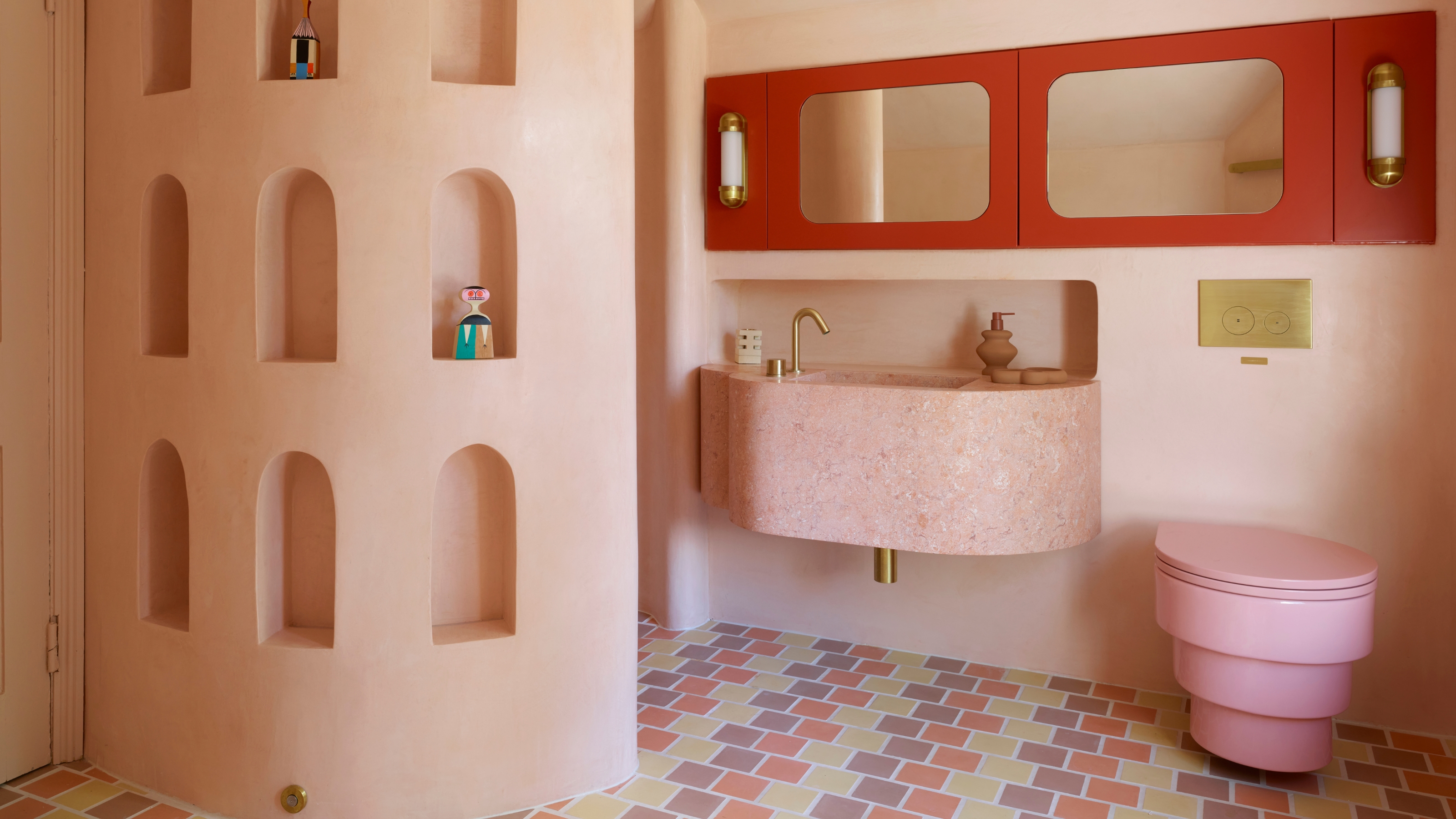 Spotted in the Coolest Bathrooms of the Moment — This Colorful-but-Divisive Trend Is the Idea You'll Either Love or Hate
See you later, sterile white. This playful plumbing trend is bringing color back to our bathrooms in an utterly unexpected way
By Olivia Wolfe Published
-
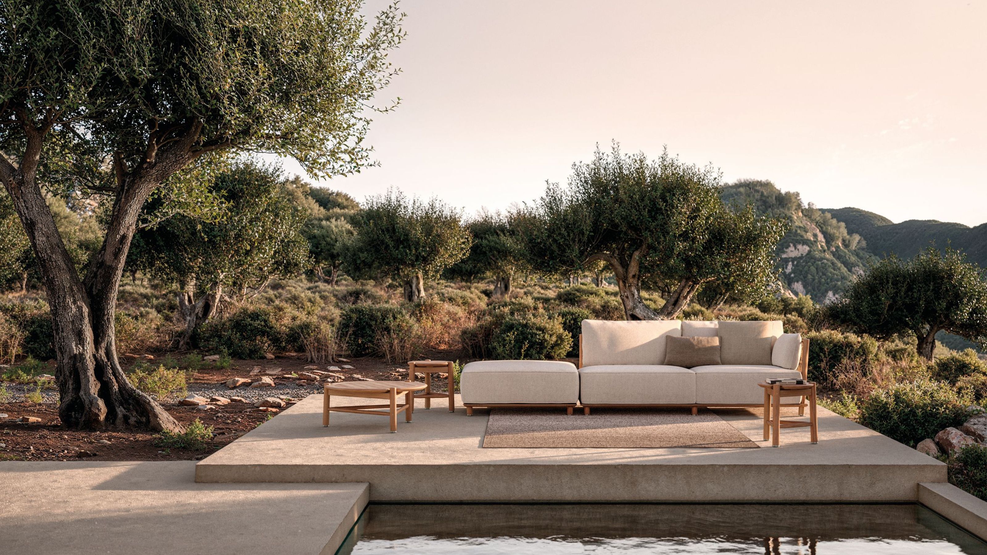 The Biggest Outdoor Furniture Trends for 2025 Embrace the Natural World, White Lotus, and a Touch of Whimsy
Sofas as plush as your living room’s, tables fit for a five-star resort, and materials straight from nature — here’s how outdoor living is evolving this year
By Julia Demer Published
-
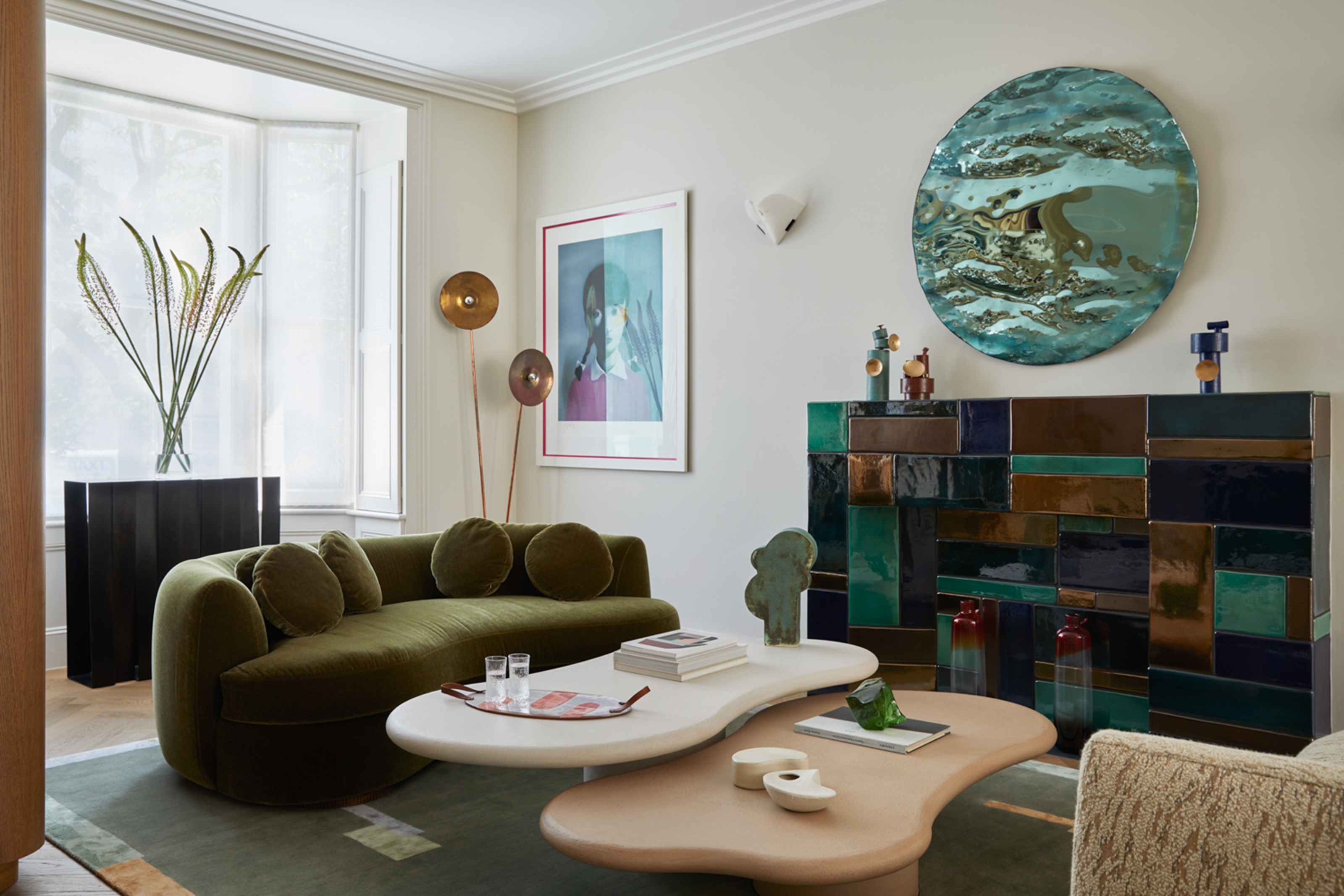 The "One Amazing Thing" Theory Could Just Be the Secret to Making Your Decorating Budget Go Further (While Making More Impact)
What if we told you designers had found a way to control a project's spend even while elevating the final result? This new trend does just that
By Pip Rich Published
-
 Carpets Used to Give Me the Ick, but This Bold New Style Makes Me Think They're the Next 70s Design Detail Due for a Revival
I've always had visions of ripping up wall-to-wall carpets, but now I'm thinking about actually installing them — what gives?
By Emma Breislin Published


