Five reasons this London townhouse kitchen is a masterclass in blending materials
A restrained approach to this kitchen gives a nod to heritage while providing a well-equipped space for the future
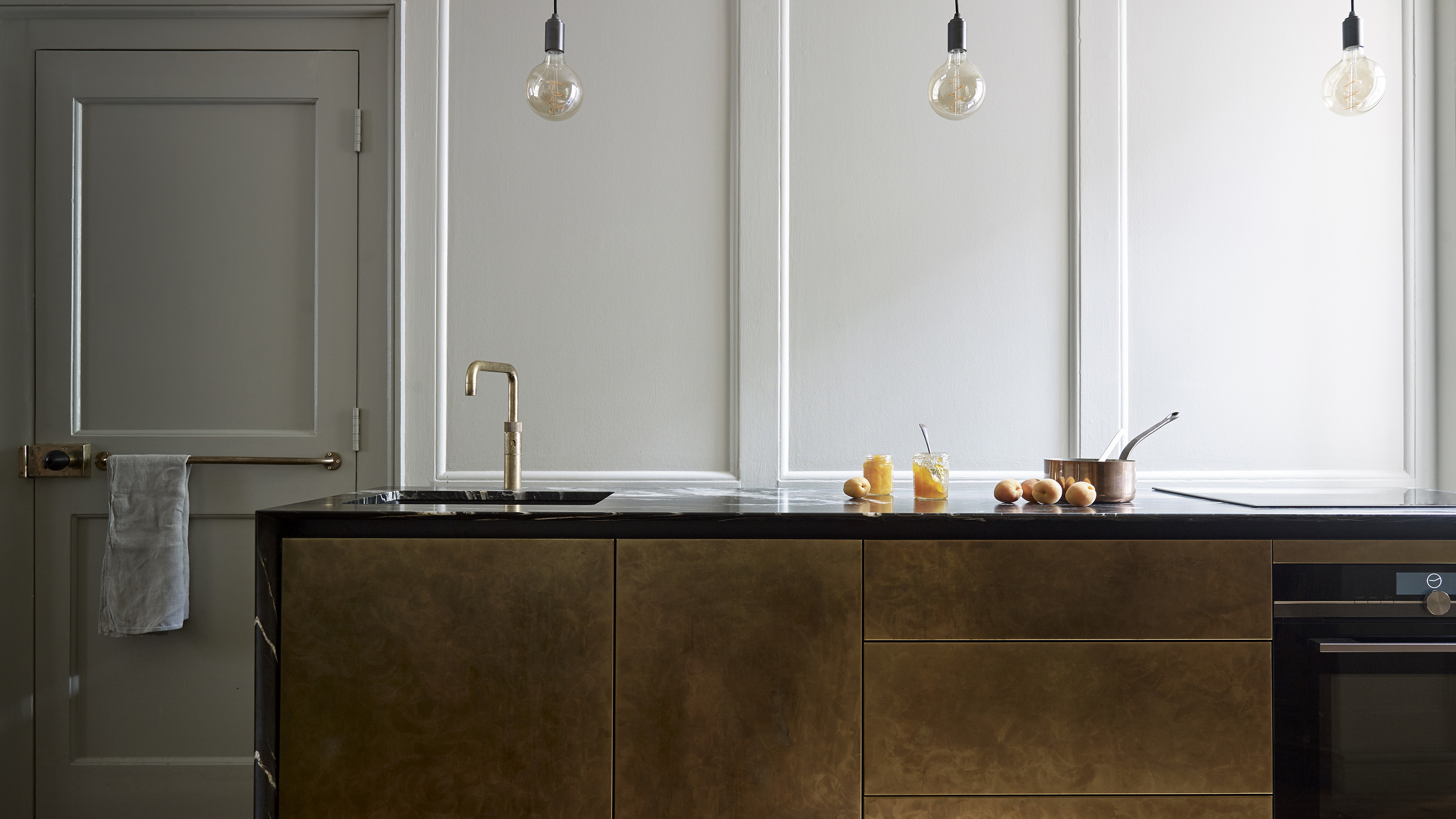
This small but very well-appointed kitchen in London's Soho is a masterclass in how to respectfully restore without compromising on mod cons.
Awarded Grade II Listed status, whereby glorious architecture comes with strict planning caveats, this property would test anyone’s renovation skills. Luckily, it wasn’t the new owners’ first project, and they enlisted long-trusted designer Victoria Marriott to bring their kitchen ideas to life.
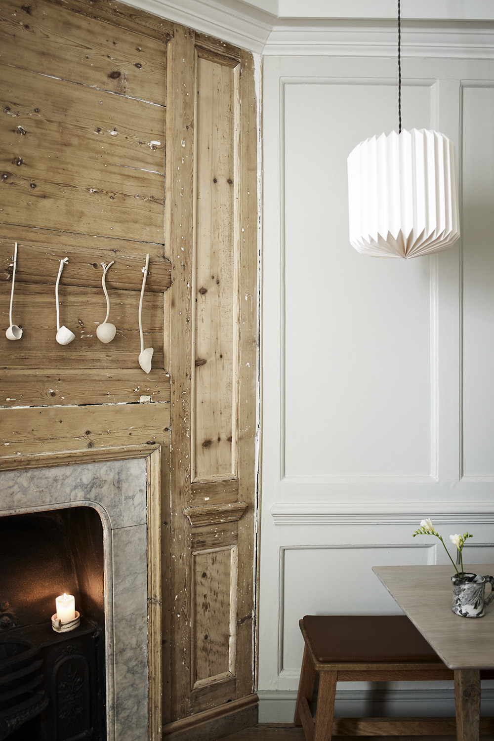
‘The property had been offices for years so there was no kitchen blueprint to follow location-wise,’ recalls Victoria from Roundhouse. ‘The spacious basement was considered, but the natural light at ground level made two small rooms at the rear of the house far more appealing.’
The larger room has a sizeable angle taken by the hearth, which is protected, as is the original Georgian paneling, sash window, and the internal walls.
‘To exacerbate matters, the owners are committed cooks. The kitchen had to really work, not just look the part while they eat out every night!’ she adds. There was a lot to consider but this is how she was able to achieve all her clients' needs.
1. Stunning wall-to-wall storage
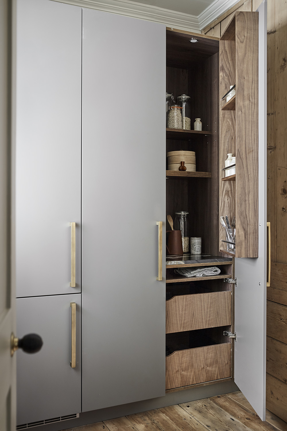
Victoria approached the layout as a game of two halves. The rear room would serve as a store, something of a back pantry, with the cooking action taking part in the main room. Though a nightmare to install in such cramped conditions, the pantry’s floor-to-ceiling units neatly take care of all chilled and ambient storage.
Painted in Mole’s Breath by Farrow & Ball, the pantry cupboards include a walnut-lined breakfast cupboard and fully integrated refrigeration. Here are some more inspiring pantry ideas.
Be The First To Know
The Livingetc newsletters are your inside source for what’s shaping interiors now - and what’s next. Discover trend forecasts, smart style ideas, and curated shopping inspiration that brings design to life. Subscribe today and stay ahead of the curve.
2. Pretty prep space
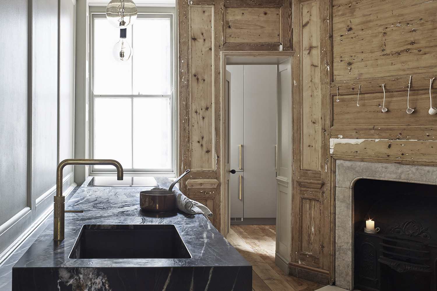
In the main room, the added challenge of a dining table left only one possible wall for the oven, hob, dishwasher, sink, and prep space. And that wall was heavily paneled, naturally.
‘We stepped the units away from the paneling to prevent worktop cutting across the moldings,’ explains Victoria.
Turning the awkward situation into an advantage, this channel detail was sized to store oils and utensils, with concealed lighting casting a soft glow over the paneling by night. And pitching the sink and hob at each end of the worktop maximizes prep space in the middle.
3. Matt and burnished surfaces combine
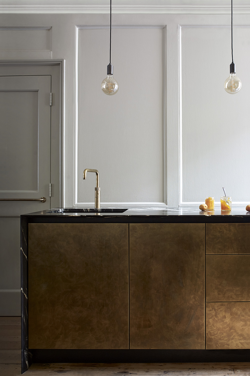
The material choices were pivotal, and the decision to leave sections of paneling stripped back particularly inspired. Generous slabs of veiny quartzite envelop antique brass drawer fronts, with unlacquered brass and walnut accents connecting both rooms.
4. Smart fittings elevate the look
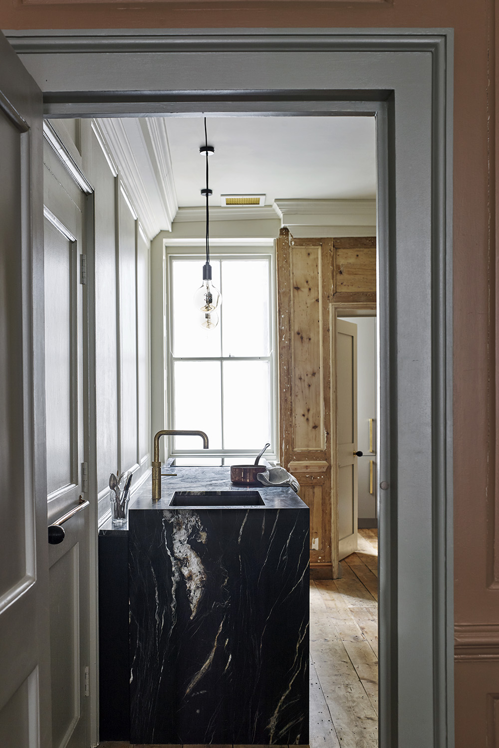
The choice of fittings and cabinet hardware can make or break a kitchen design. Simply upgrading the pulls on cabinetry, for instance, can breathe life into a tired look.
In this project, brass fittings sit like jewels in the black composite sink. Read modern kitchen cabinet ideas for more inspiration.
5. The paint palette has been well considered
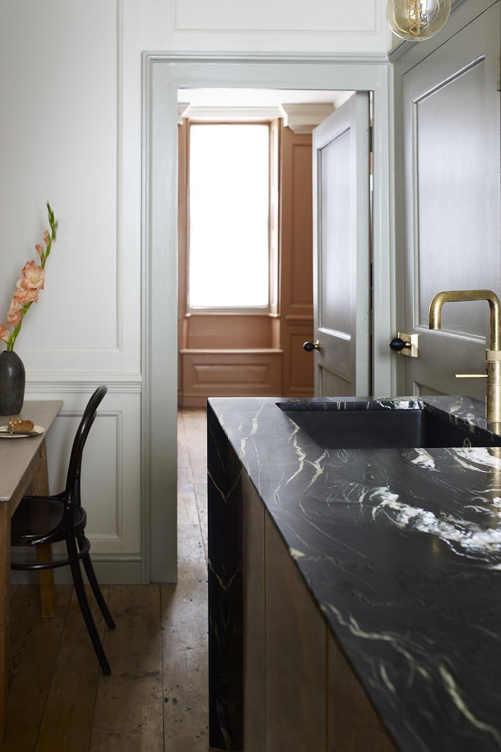
The paint palette, developed by Farrow & Ball color consultant Scott Silcox, achieved cohesion throughout all three floors. Dirty whites, greys, and pinks muddle softly with warm metals, leathered stone, and antique pine.
‘It was so important to retain the deliberately spartan, textural quality of the original space, with its deeply ingrained sense of history, without letting the kitchen disappear,’ explains Victoria. ‘The kitchen feels restful but still stands out as special.’
Linda is a freelance journalist who has specialized in homes and interiors for more than two decades, and now writes full-time for titles like Homes & Gardens, Livingetc, Ideal Home, and Homebuilding & Renovating. She lives in Devon with her cabinetmaker husband, two daughters, and far too many pets, and is currently honing her DIY and decorating skills on their fourth (and hopefully final) major home renovation.
-
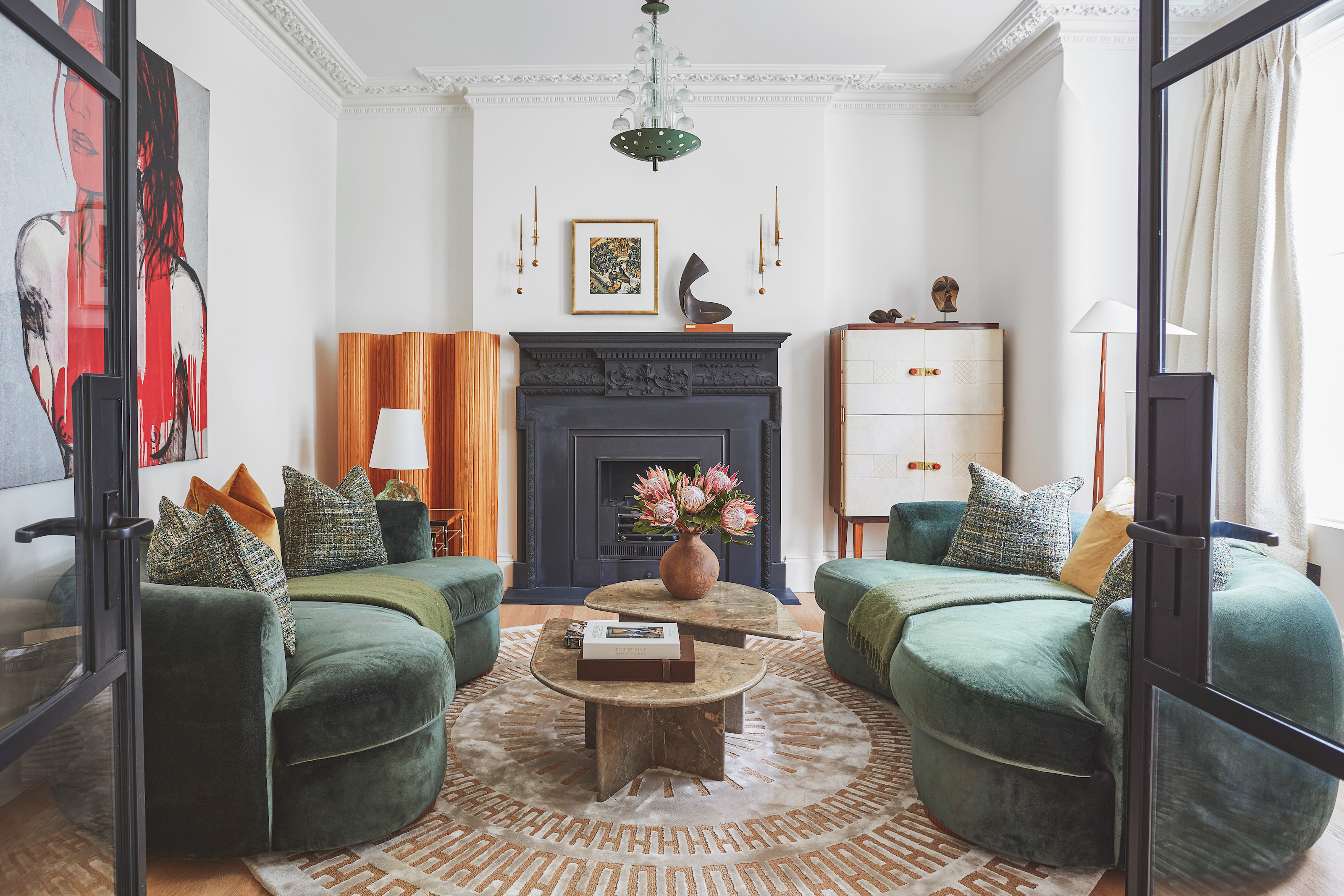 The 'New British' Style? This Victorian London Home Embraces Its Owners' Global Background
Warm timber details, confident color pops, and an uninterrupted connection to the garden are the hallmarks of this relaxed yet design-forward family home
By Emma J Page
-
 Muji Living Room Ideas — 5 Ways to Harness The Calming Qualities of This Japanese Design Style
Inspired by Japanese "zen" principles, Muji living rooms are all about cultivating a calming, tranquil space that nourishes the soul
By Lilith Hudson