Built-in Benches — Architects Are Embracing This Cleverly Comfy Design Trend
Built-in benches are being used in new and exciting ways to zone small spaces, as architects move this design trend into the future
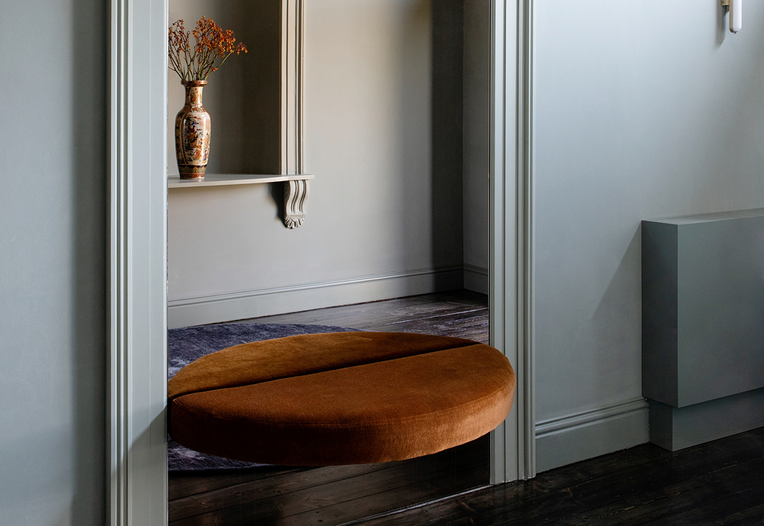
Often as sleek as they are seamless, built-in bench seats have a foothold in the modern architect’s toolkit. Popular as window seat ideas or as dining banquettes in kitchens, they also come in handy all throughout the home – especially in smaller spots that warrant an impromptu sit.
Built as extensions of wall cabinetry, positioned near the front door, or even tailor-fit for tight corners that might not accommodate floating furniture, they offer a small but mighty dose of charm in unexpected places.
Space is naturally the chief benefit. ‘Built in furniture works for different purposes in different projects,’ say Sarah Zames and Colin Stief, founders of Brooklyn’s General Assembly. ‘We often do built-ins in small spaces, where maximizing the space as much as possible is desirable.’
And as homeowners seek bespoke design throughout their home, customization is increasingly important; integrated bench seats have a tendency to fill any void, no matter how tricky the layout.
‘We’re deploying more and more custom designed elements in our projects to solve spatial issues when an off the shelf piece of furniture simply can’t be found to address the issue – for example a horse-shoe shaped room,’ says Alexandra Donohoe Church, managing director and founder of Australia’s Decus, which has a penchant for upholstered benches in their projects. ‘We find we can infuse an awkwardly shaped room with a feeling of seamlessness through custom built-in upholstery.’
How to perfect the built-in bench
With simple designs easy enough to install all on your own, or complex enough to call on your favorite builder, here are just a few built-in bench ideas that add functional character to any home.
1. Zone the space
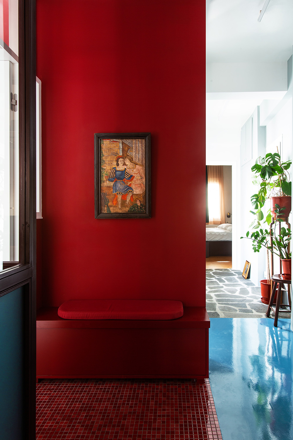
Using architecture to demarcate the entryway in this colorful Athens apartment, designers installed distinct flooring and a monochromatic palette (matching the built-in bench seat) to zone the seating area within the open space. ‘The seat is part of a wall, which is the background for a painting,’ says Konstantinos Pantazis, co-founder of Point Supreme Architects. ‘The floor has the same deep-red color that absorbs the differences in function and makes a stark contrast with the spaces adjacent, such as a ciel and green small indoor garden.’
Be The First To Know
The Livingetc newsletters are your inside source for what’s shaping interiors now - and what’s next. Discover trend forecasts, smart style ideas, and curated shopping inspiration that brings design to life. Subscribe today and stay ahead of the curve.
For the architects, this type of zoning helps highlight the bench seat’s unique purpose. ‘We believe functionality comes first, in spaces,’ adds Marianna Rentzou, Pantazis’ fellow co-founder. ‘So being able to take a seat, taking off and hiding your shoes when entering is crucial – it creates the conditions to walk barefoot in the house leaving dirt at the entrance, so it is hygienic too.’
2. Add cushioning
You can leave them bare, but designers often use benches as an opportunity for built-in upholstery – permanent, plump padding that can soften the look and function of your space. This was all the more convenient for the interior above, where a cushioned seat rounds off a piece of joinery in a ‘rumpus room’ for teenagers. ‘The upholstered element made sense here because the space needed to shape-shift to meet a variety of uses,’ says Alexandra Donohoe Church, founder of Decus. ‘We felt the room needed some softening (it’s immediately off the pool outside) and had to be durable so the upholstery element is outdoor fabric.’
As far as kids’ room ideas go, an upholstered bench seat goes the distance. “The great thing about kids is they use every surface, lie on the floor, lounge on the sofa, sit on the end of the joinery, etc,’ adds Alexanda, noting how this built-in creates a proper seat on a ledge that would have been used as impromptu seat anyhow. ‘In some instances it’ll be kids hanging and chatting and other times it’ll be utilised for watching a game of pool or ping pong unfold opposite.”
3. Float the bench
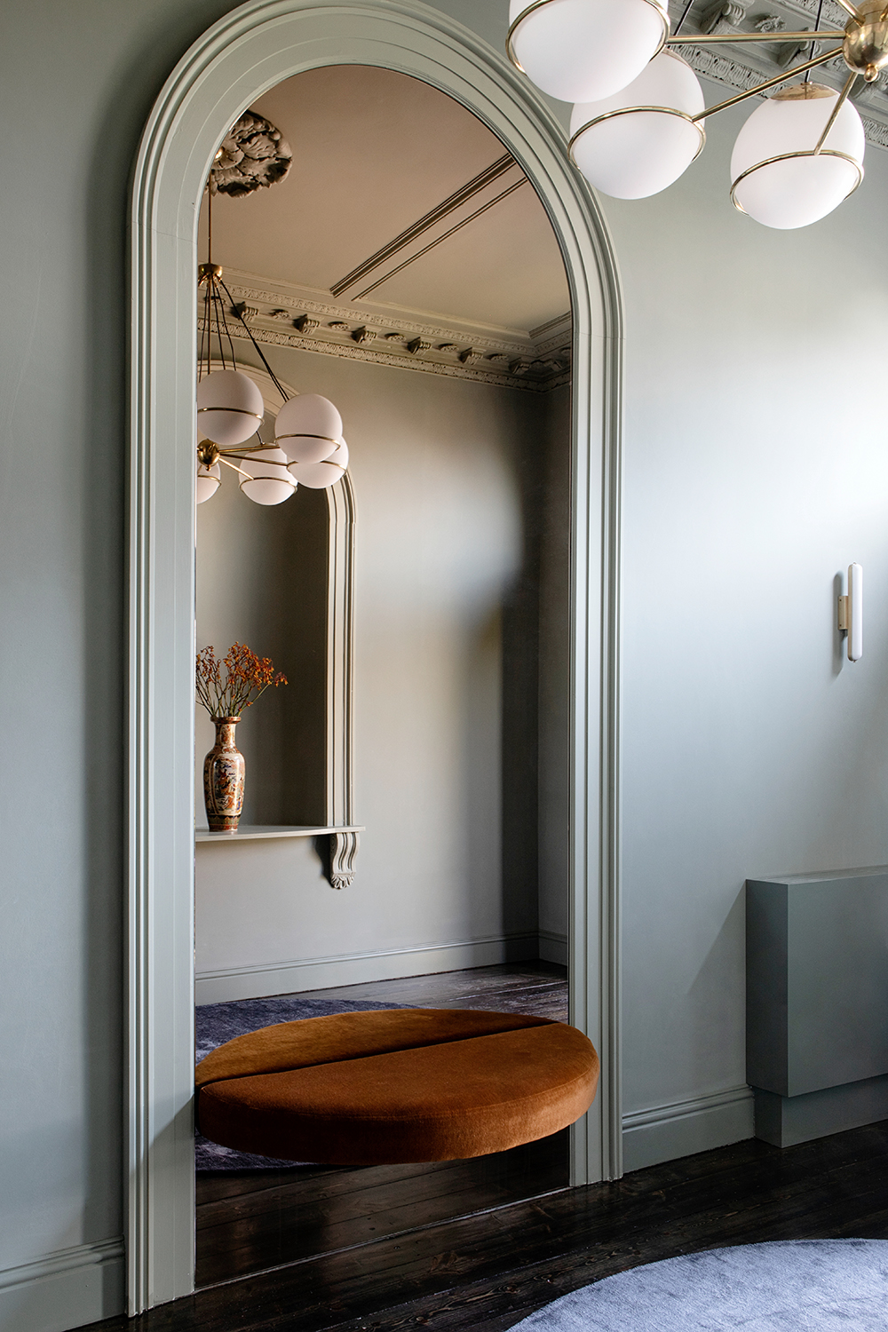
Freestanding benches need ground support. But built-in benches can float with the right hardware. For the design above – a plush semicircle seat inside the home’s entrance – Dublin’s Kingston Lafferty Design chose a cantilevered effect that hides the support structure. ‘What you don’t see in the finished piece here are the metal brackets which have carefully positioned timber grounds (batons) to be fixed into,’ says Becky Russell, the studio’s CEO, describing their custom-made hardware. ‘Once you have the correct strength of brackets and the correct wall build up, the rest is joinery and upholstery.’
Leaning into the weightless look, the studio also tricked out the seat with a full length mirror, emphasizing the entryway’s dramatic height while amplifying the space’s original detailing. “To make the bench really feel like it is floating, fit the mirror below as well as above,” recommends Russell for anyone hoping to achieve a similar look. “It will extend the line of the floor, tricking the eye!”
4. Pair the bench with storage
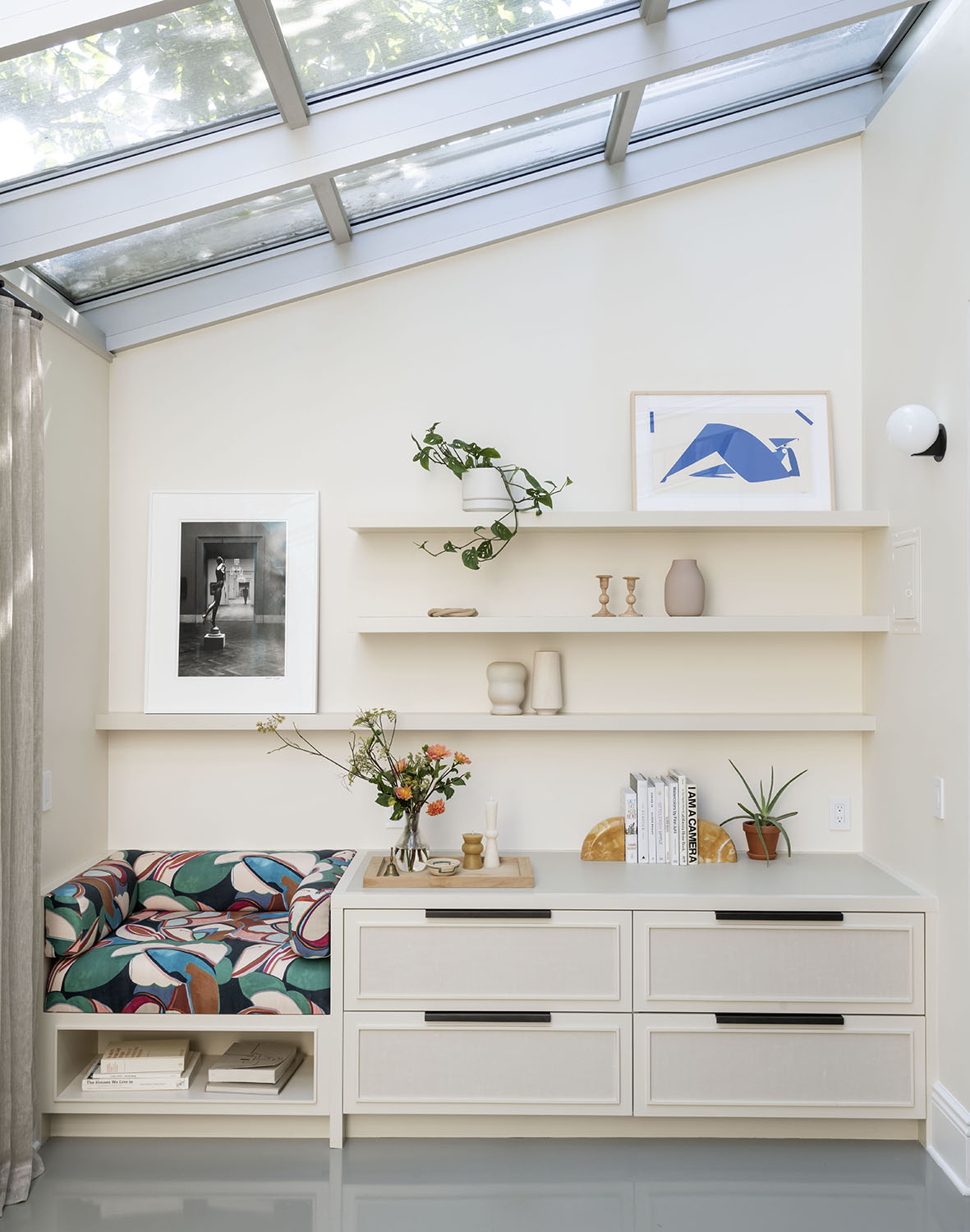
Incorporating a built-in bench with cabinets or storage is multifunctional furnishing at its best. ‘In the case of the Bergen Street Townhouse, we created this built-in as part storage, and part reading nook,’ say the founders of General Assembly of this cushioned niche. ‘The space is adjacent to the dining room, and so we wanted to incorporate some storage for serving ware, but we also wanted to take advantage of all of the beautiful natural light in the space, and so bringing in a cozy space to hang out felt like a good use for that corner.’
And just because it’s functional doesn’t mean it can’t be beautiful. You can think of your bench as an opportunity to bring in a splash of visual interest with built-in upholstery. ‘The seat portion of the built in is upholstered with Dedar Margaritas, which brought a lot of color and texture into the space,’ adds General Assembly.
5. Perfect the size
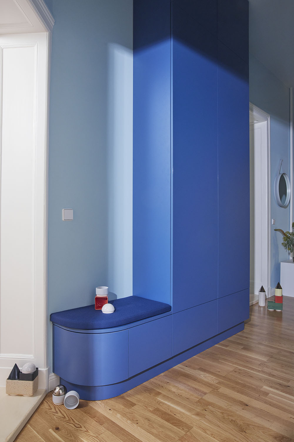
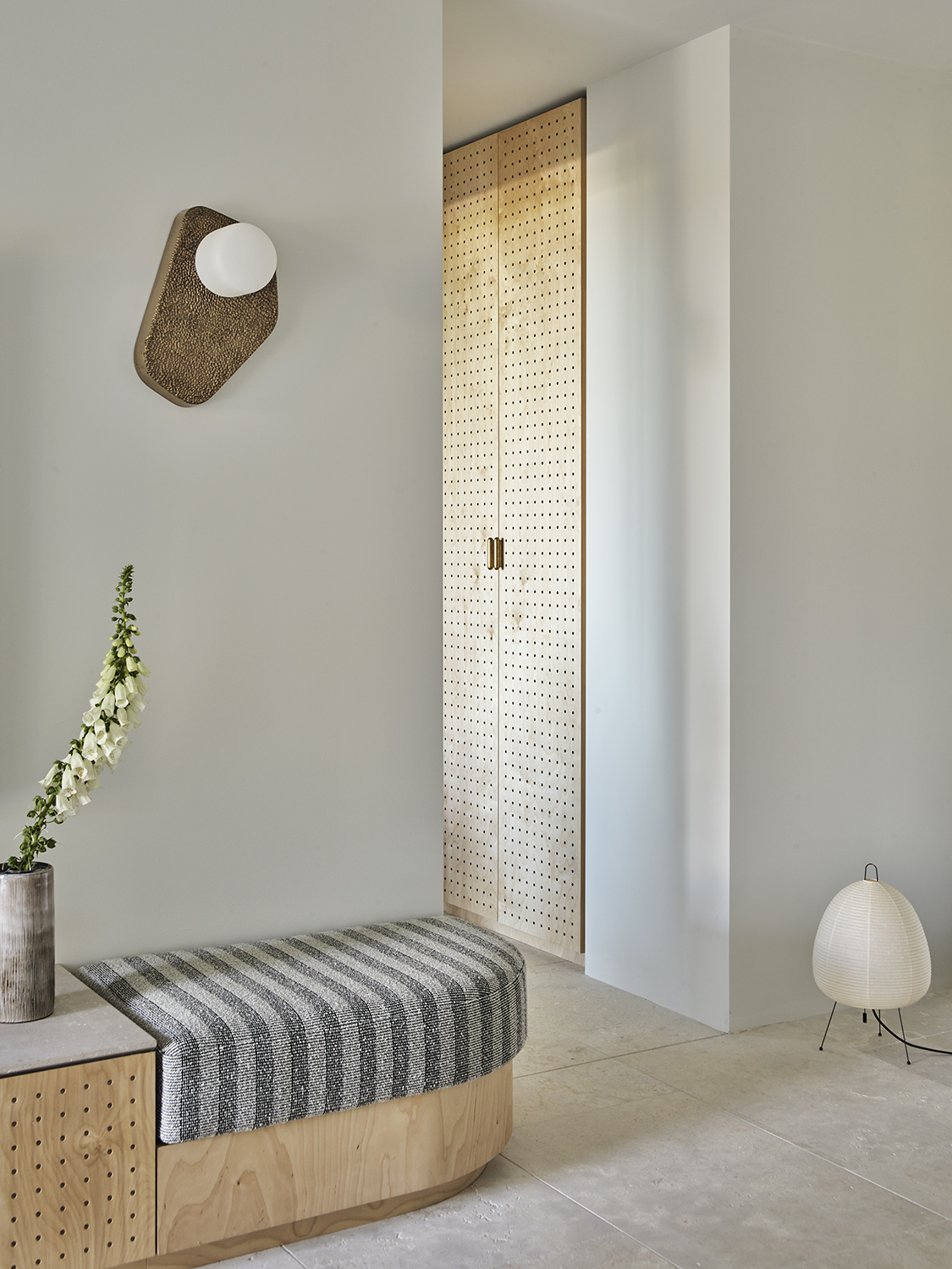
If you want your bench to rise to any occasion, you’ll need to get your dimensions right. The entryway bench above – a perfect perch designed for putting on to taking off shoes – offers a sensible blueprint for a comfortable seat. ‘We always base our seating options on a good seat height, which is usually around 16.5 inches,’ says Sina Gwosdzik, co-founder of Berlin’s Jäll & Tofta. ‘This in turn is a good height for a drawer to store boots and shoes. The depth is again oriented to the depth of the cabinet and this is 16-27 inches.’
And it makes sense to get this right, especially if it’s located just inside your front door. “Hallways usually have in common that they are fragmented by many doors into different rooms and become a representative eye-catcher through color, a uniform structure and predominantly closed fronts,’ adds Sina. ‘The hallway is the first impression that you or your guests get of your home.’
6. Create privacy
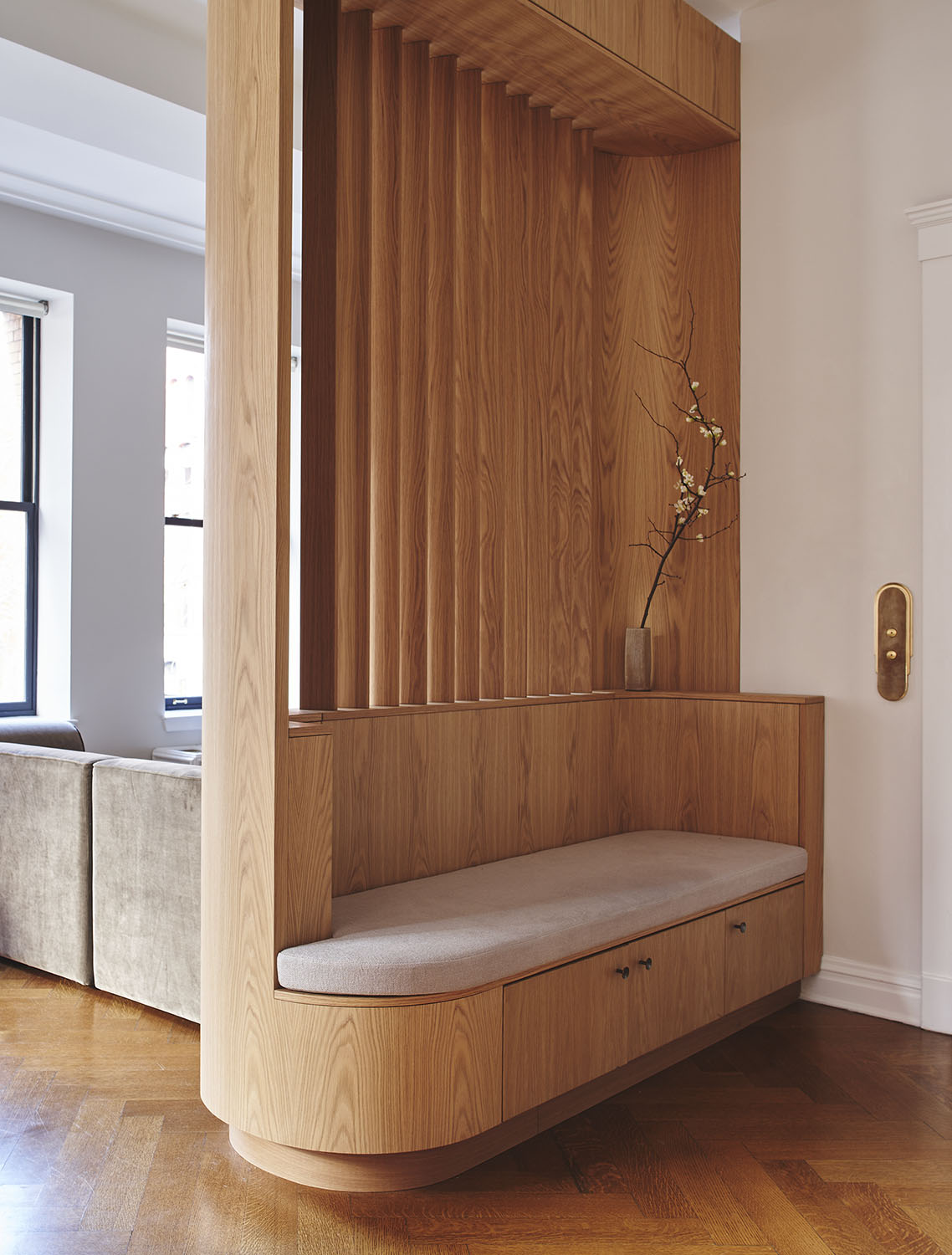
In this case, the bench is just the beginning — it serves as an anchor for a smart partition wall just inside the home’s open entrance. ‘We wanted to create a restful place to sit that doubled as a threshold into the home from the outside, thus enhancing the transition,’ says Tommy Zung, principal of Studio Zung. ‘The slatted wood allows for light to percolate in gradually making the entryway subtle and refined, while also providing filtered sightlines.’
The bench works because it’s both useful and beautiful, creating new lines and aesthetics to the space. “Built-in furniture like the entryway bench at Maison Duane works exceptionally well in modern interiors because it offers an efficient use of space, maximizing functionality without sacrificing style and adding a layer of architectural detail to an otherwise standard layout,” adds Tommy. “We created a sense of privacy for the great room which elevated the overall design aesthetic of the home with a unique solution.”
Keith Flanagan is a New York based journalist specialising in design, food and travel. He has been an editor at Time Out New York, and has written for such publications as Architectural Digest, Conde Nast Traveller, Food 52 and USA Today. He regularly contributes to Livingetc, reporting on design trends and offering insight from the biggest names in the US. His intelligent approach to interiors also sees him as an expert in explaining the different disciplines in design.
-
 String Lights Are Over — This Outdoor Lighting Collab Is What Comes Next (And Fixes Your Backyard’s Biggest Issue)
No plugs, no problem. Pooky x The Novogratz makes a compelling case to ditch your string lights for good
-
 The Deep Dive — Why Architect and Designer Alvar Aalto Has a Last Legacy in Design
Alvar Aalto remains so significant to Finnish design — from how they approach the seasonal light to inspiring the mediums, designers, and brands that prove important to the country’s buoyant creative scene