C2's Color of the Year for 2025 Is a "Chameleon" That Will Make Your Walls Look Effortlessly Sophisticated
This rich, elegant shade cements grounding brown hues as one to watch in 2025

We're about to welcome fall or, as I like to call it, color forecasting season. This month, all your favorite household paint brands will be announcing the shade they predict will dominate the year ahead, and there's one particular color that's topping the trends already.
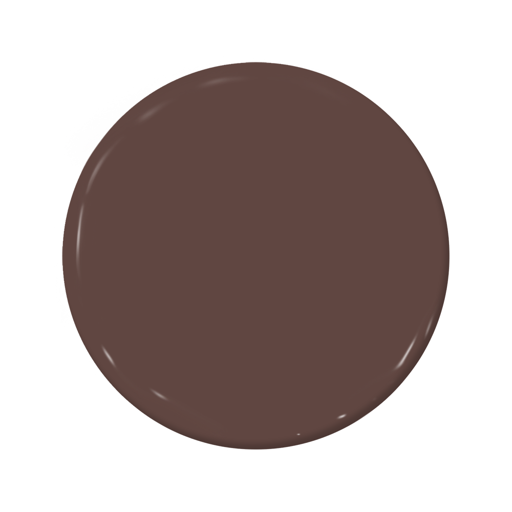
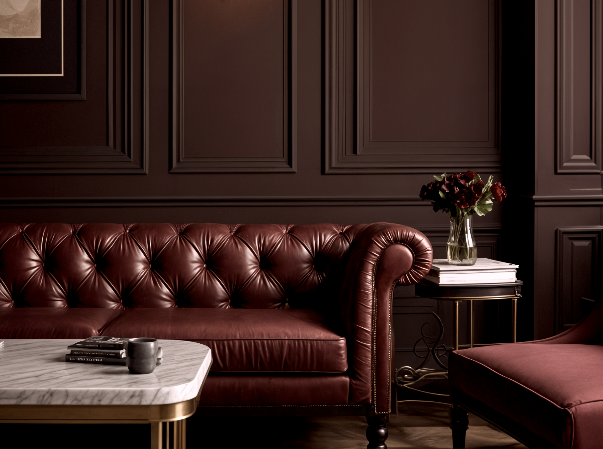
One of those leading the way is C2's color of the year for 2025. "Raku" is a rich, chocolatey brown tone that feels elegant, sumptuous, and sophisticated, and it's not the first time we've seen the hue crop up in this year's color forecasting, either. Browns are clearly one to watch as we head toward 2025, offering us the chance to ground our spaces and swathe our walls in comforting earthy color.
But the true advantage of this color is its versatility. C2's Paint Color and Design Specialist, Philippa Radon, says there are so many ways to describe the shade, listing off "umber, mahogany, dark whiskey, cordovan, earthy, burnt, brownish red with oxidized undertones, oxblood". "It really has a chameleon-like quality, meaning it picks up the tones of the surrounding colors and materials and is informed by lighting," she says. If you want to embrace color trends in your upcoming paint ideas, here's everything you need to know about this moody, mutable shade.
What is C2's Color of the Year for 2025?
If you've been keeping up with 2024's color trends, you'll know this year has been all about decorating with color. The past year has been dominated by blue shades and bright, primary tones (see: the "Unexpected Red" trends and the "butter yellow" craze). As much as I've been lapping up these bodacious color ideas, our decorating habits are cyclical in nature, so an eventual return to earthy neutrals seemed inevitable.
Enter, "Raku" by C2. If you've been craving grounding, sophisticated color, then this shade delivers. Inspired by an ancient Japanese tea ceremony, the color draws from a centuries-old pottery technique known for its unique, variegated patterns which celebrate imperfection. The burnt, brownish red has dynamic hints of mahogany which infuses spaces with drama and intimacy, so if you want to achieve that timeless luxury aesthetic you're seeing everywhere, it's perfect for the job.
"C2 Raku encourages you to create balance but in a sophisticated way, and create spaces where you can unwind from the fast pace of life and technology, pause, take a breath, and reflect," says Philippa Radon at C2. "Rooted in the concept of Yin and Yang, Raku harmonizes tradition with contemporary style. It becomes the connection between the emotional and the experiential, providing a way to embrace balance and enjoy life’s more meaningful moments - the ones that nurture our souls in order to meet our days with strength and positivity."
Why is brown paint trending?
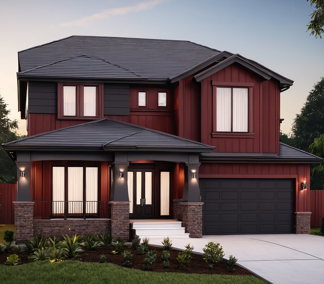
To understand why a sturdy color like brown embodies the mood of the moment, all you need to do is look around you. Our homes are places we rely on for a moment's respite from life's increasing demands, and in an increasingly stressful world, grounding neutrals help us curate a home that feels nurturing and relaxing.
Be The First To Know
The Livingetc newsletters are your inside source for what’s shaping interiors now - and what’s next. Discover trend forecasts, smart style ideas, and curated shopping inspiration that brings design to life. Subscribe today and stay ahead of the curve.
That said, we're also asking more of our homes than ever before. We also want a space suited for entertaining that feels sophisticated, elegant, and luxurious. And, as if by magic, browns manage to encapsulate all of the above. Be it a convivial brown living room idea or a dark and moody dining room, Raku can set up to the task.
Phillipa also notes the timelessness of a color like Raku. "In a year marked by elections and uncertainties, embracing a color like Raku goes beyond following a trend. It's about comprehending and embracing the emotional landscape that color brings into our lives," she says. "While we appreciate trends, our mission is to highlight how colors like Raku can provide a beautiful perspective—a grounding force amid chaos and a reminder to cherish the simple pleasures, to find beauty in tradition, and to celebrate the magic in everyday moments.”
How should you decorate with Raku?
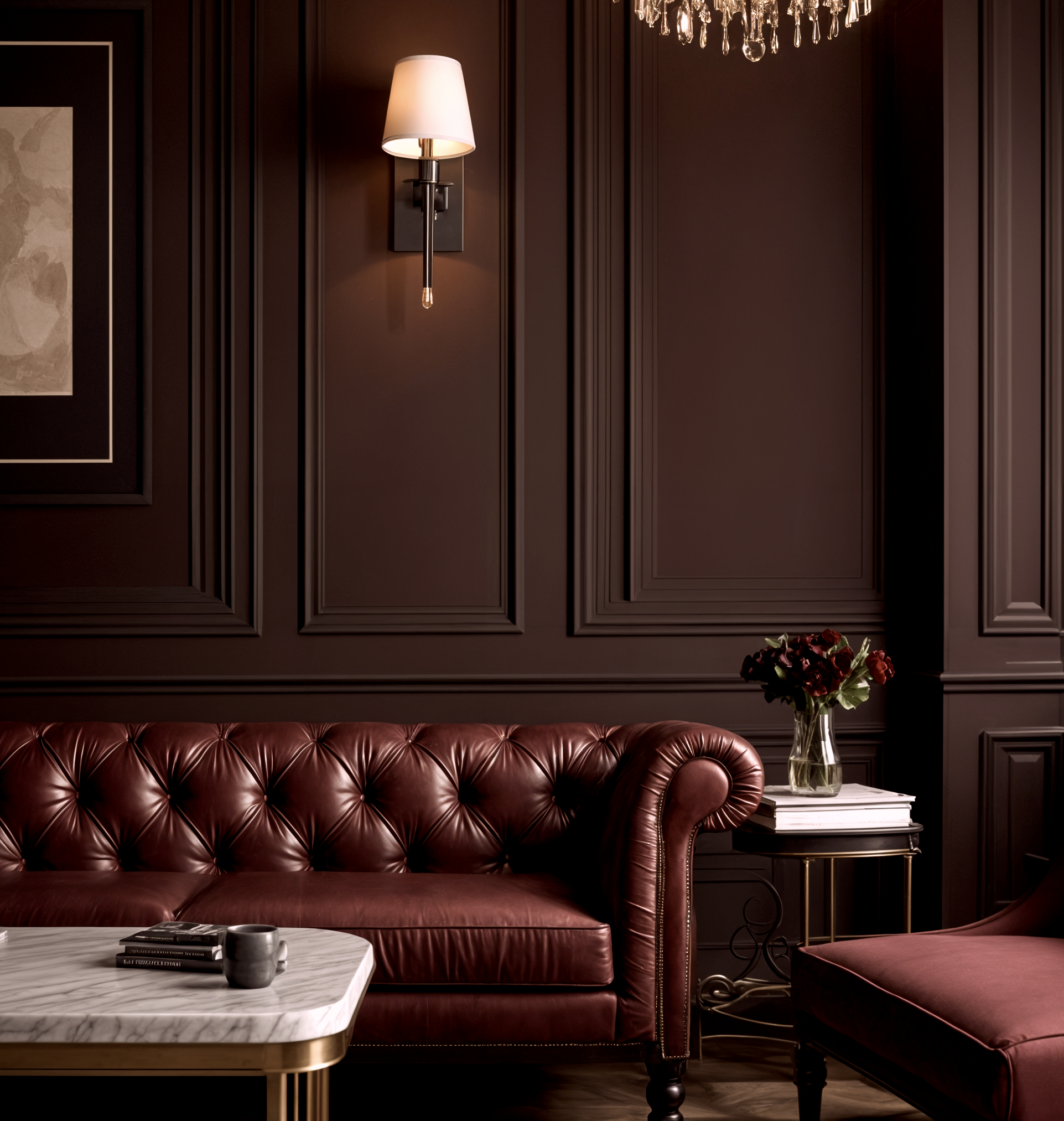
Thanks to its versatility, Raku is an accessible color that can be used in virtually any space. From classic period homes with millwork details to contemporary minimalist spaces flooded with natural light, this mutable shade can find a home anywhere.
Of course, if you want to embrace a dark moody palette but you've been hesitant to so far, it's a great place to start. "With the arrival of fall, it's time to redecorate interiors, and C2's Raku is the perfect shade to experiment with," says Livingetc's Design Editor, Aditi Sharma Maheshwari. "For those looking for deeper, darker tones for a moody interior, this could be your new neutral."
Being a neutral shade, there are plenty of colors that go with brown for a plethora of palettes. Aditi recommends pairing Raku with layers of dark yellow, blue, and teal for an elegant vibe. Meanwhile, Phillipa suggests pairing it with a pale pink (such as C2 Twist) or dusty grey blues for something a little more genteel. "It would also pair well with en terre neutrals like C2 Ostrich, bringing a harmonizing, softening warmth," she adds. "And if we’re talking about current trends, we are seeing a lot of C2 Raku paired with reds."
Shop Similar Shades
To make a serious statement, however, why not use it as an all-over hue and try color drenching? Swathing your walls, ceiling, and woodwork in this shade makes for a seriously cocooning space that's perfect for that old-timey aesthetic. This works especially well in a home office or library room, where you can use warm lighting and brass accents for a luxurious, old-money feel.
Lastly, don't limit Raku to your standard wall application, either. "It can be used on millwork to highlight detailing, as a full-gloss front door color that would be appealing with aged brass door hardware, in a bar or barista area, or in any space wanting a warm, enveloping environment," says Philippa. "Using it in a high sheen gives it luster and added richness, and in a flat finish, it takes on a more organic, rustic vibe."
However you decide to decorate with C2's color of the year for 2025, rest assured that this classic choice will promise to endure for many years to come. For a timeless, sophisticated paint idea, you can rely on Raku, and I'm pretty certain you'll be seeing many more iterations of it during our next circle around the sun.

Lilith Hudson is a freelance writer and regular contributor to Livingetc. She holds an MA in Magazine Journalism from City, University of London, and has written for various titles including Homes & Gardens, House Beautiful, Advnture, the Saturday Times Magazine, Evening Standard, DJ Mag, Metro, and The Simple Things Magazine.
Prior to going freelance, Lilith was the News and Trends Editor at Livingetc. It was a role that helped her develop a keen eye for spotting all the latest micro-trends, interior hacks, and viral decor must-haves you need in your home. With a constant ear to the ground on the design scene, she's ahead of the curve when it comes to the latest color that's sweeping interiors or the hot new style to decorate our homes.
-
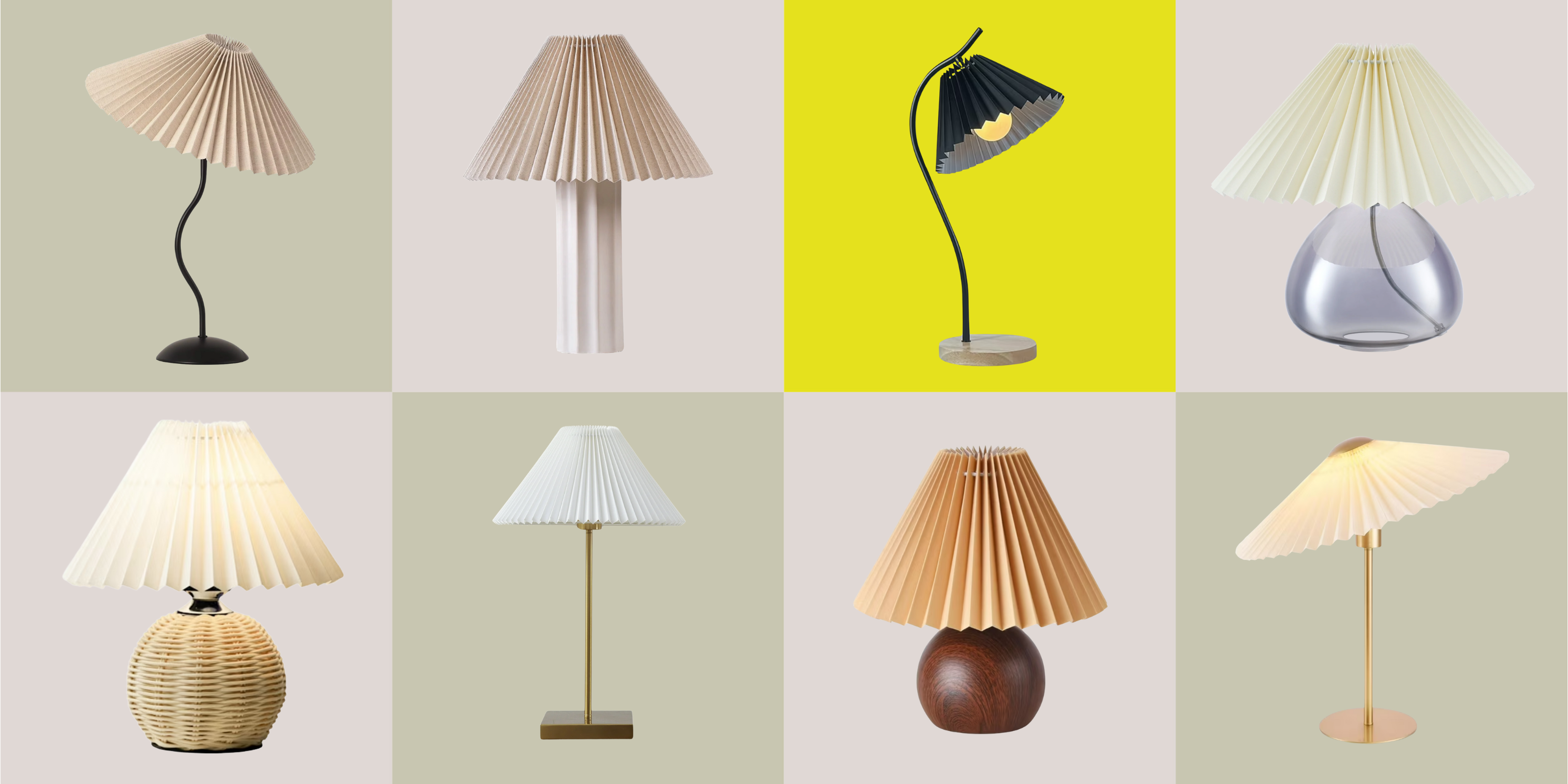 Pleated Lampshades Are the Silhouette of the Season — I've Found 9 For Well Under $100 (You'll Never Guess Where)
Leave it to Walmart to bless us with a collection of stunning pleated lampshades — proving this old-fashioned feature can look fresh and modern
By Devin Toolen
-
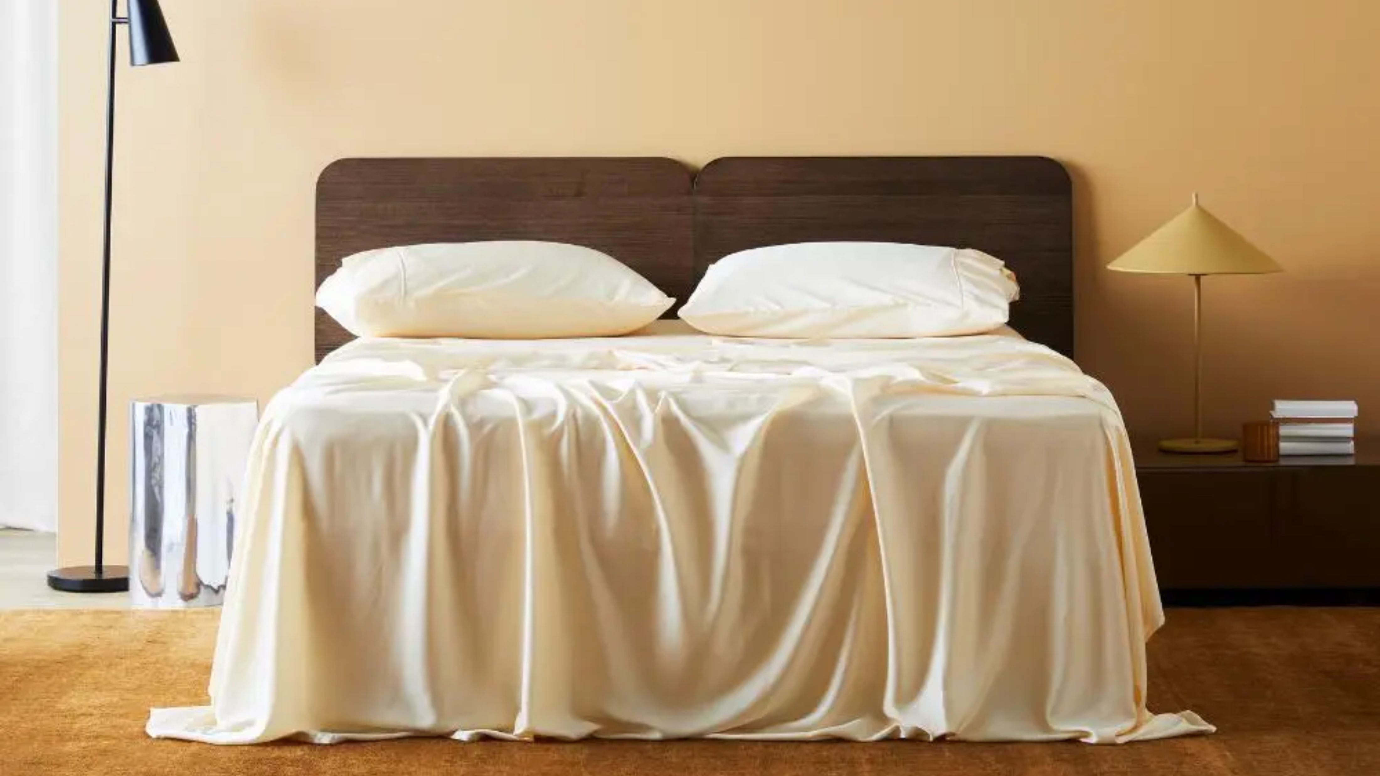 I Found the "Healthiest” Bedding for Earth Month — Why Ettitude Is the Sustainable Sleep Label to Know
Softer than silk and smarter than cotton, Ettitude’s innovative take on bedding delivers luxury with a conscience
By Julia Demer
