Is the checkerboard trend over? The designers re-inventing this classic pattern don't think so
The renaissance of checkerboard patterns has been one of the defining trends of the year. We think it's set to continue in these forward-thinking guises
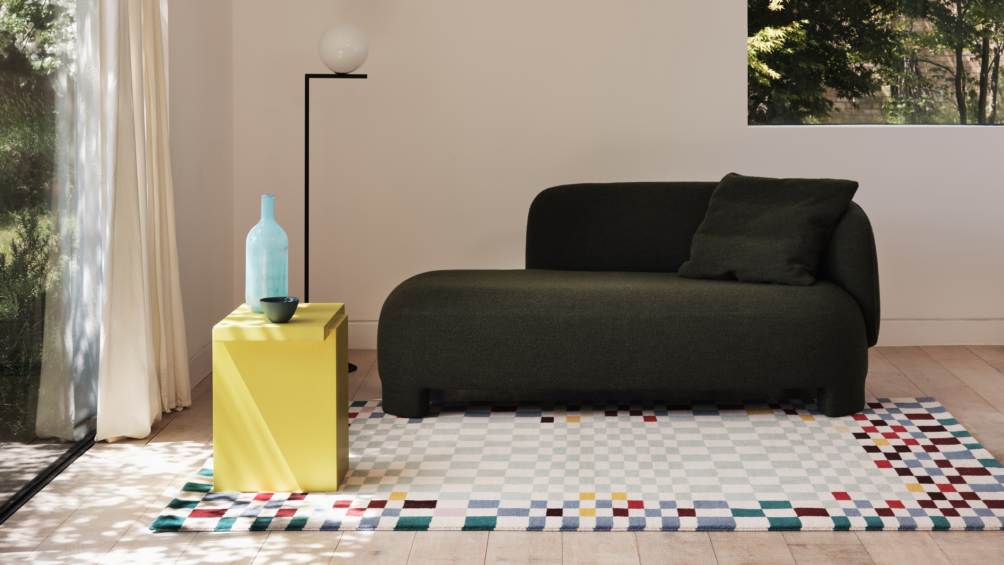

Checkerboard has been one of my standout trends for the last year. What may have started out as a longing for tiled checkerboard floors and plush patterned rugs is now finding new and exciting incarnations in the likes of ceramics, and even as a painting trend.
However, I've not found the right piece of checkerboard decor to commit to yet, and I couldn't help but think I might have missed the bandwagon. Is checkerboard going to stand up against the interior design trends of 2023?
Scouring the new interior collections we're already seeing for fall and beyond, the answer is a resounding yes. However, the checkerboard trend we saw in 2022 is evolving, taking an interesting new direction.
'Looking back in design history, checkerboard obviously has a very classical appeal, given its repetitive, symmetrical nature,' interior designer and stylist Tim Neve tells us. It's a pattern that has a visually arresting quality, especially in its traditional, high-contrast black and white form, but that doesn't answer why it's captured the mood of interiors and fashion in 2022. 'It reappeared last century in retro lino, almost the backdrop to domestic bliss. This makes me consider its current re-emergence as it has an appeal for its safeness and stability, perhaps what we are all craving in interiors at the moment,' Tim muses.
But what does this mean for this new perspective on checkerboard? From surprising color combinations to psychedelic takes on the trend, these are the ways designers are re-imagining this classic pattern in a fresh way.
Luke is an interiors writer and stylist who loves modern and minimal design. Questioning whether the checkerboard patterns we've seen throughout 2022 are going to translate into 2023, he's researched how designers are re-interpreting the trend in a modern way.
How to use checkerboard in a modern way
I'm expecting to see checkerboard infiltrate the collections that space across the home in a big way in the coming year. 'Nowadays, checks are popping up on products everywhere - from textiles, to ceramics,' says Tim. 'It means you can choose to add a small dose of it to an interior, or really make a graphic statement depending on the scale of homewares you choose.'
While the tried and tested versions of this modern trend don't feel dated yet, if you're looking beyond what's now to what's next in interiors, this is just a few examples of how designers are giving checkerboard a new twist to futureproof your choices.
Be The First To Know
The Livingetc newsletters are your inside source for what’s shaping interiors now - and what’s next. Discover trend forecasts, smart style ideas, and curated shopping inspiration that brings design to life. Subscribe today and stay ahead of the curve.
1. A colorful approach
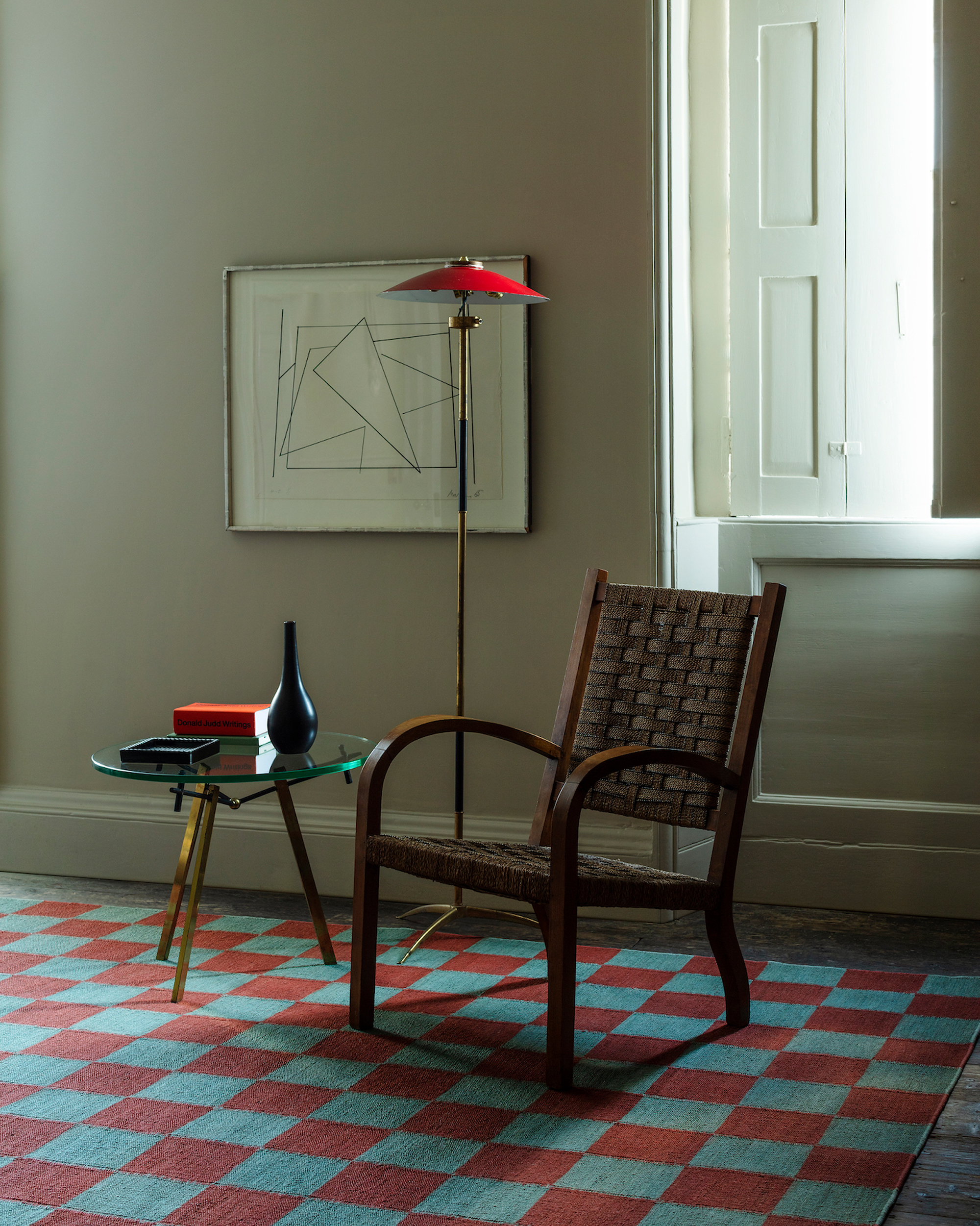
Checkerboard has already undergone a revolution when it comes to color. The traditional checkerboard palette of black and white has shifted in this re-imagining. However, it has often been based on a light and dark contrast.
Warm neutrals have been the go-to for checkerboard patterns until now. 'The more classic gingham-style versions are re-appearing in fashion, in on-trend colorways like warm rust tones,' explains stylist Tim Neve. These warmer browns, reds and oranges tend to be paired up with beiges and creams for a softer contrast than the chess board-esque version of this design.
For 2023, don't expect these tones to go away, but you're likely to also see more unexpected pairings define the color trends for checkerboard, too. This Vanderhurd X 8 Holland Street checkerboard rook rug is a perfect example of how checked patterns are evolving, taking the trend beyond neutral color schemes for those who want to get more creative with their home's palette.
2. Mixing scale
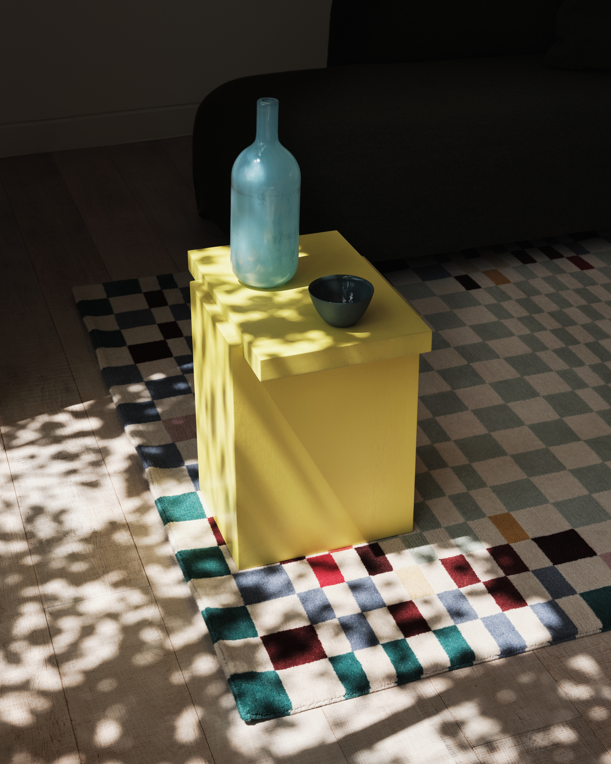
We've already said that part of the allure of checkerboard is in its repetitiveness, however, new takes on the checkerboard trend are messing with the rigidity of this pattern to make it more expressive. 'I've definitely noticed variations on the classic checkerboard,' Tim says. 'Designers are playing with different scales from small to large, distorted versions or misaligned repeats to put their own stamp on it.'
Introducing different checkerboard scales has an intriguing effect on the pattern. Where a standard checkerboard pattern feels almost like a Magic Eye trick to look at. The repetitive nature of the pattern means there isn't somewhere for the eye to naturally rest.
Compare this to a design like this recently launched rug from FLOOR_STORY's new collection with textile designer Kangan Arora. The colorful checkerboard undoubtedly remains intact, but it adds a pacing to the pattern as the squares shrink, grow and in some cases even elongate, bringing a distinctly different energy when used as a living room rug.
3. Warped forms
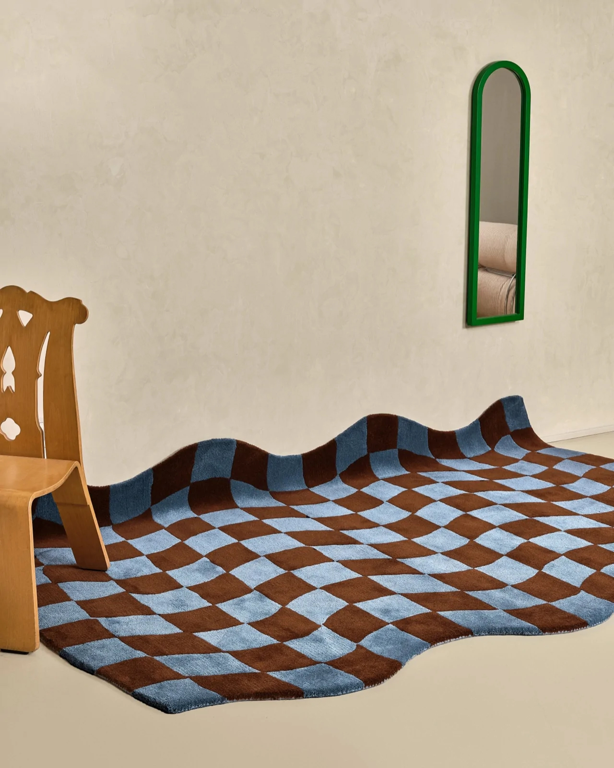
You can rely on a classic checkerboard pattern to bring a sense of sophistication, even a formality, to your home. It's reminiscent of the Victorian floor tiles in grand entryways - structured and rigid. However, this makes it even more impactful when designers play with the idea of distorting this pattern for a modern take on the trend.
Combining checkerboard with the trend for curved lines and organic shapes brings out a new sensibility to this pattern. Designs like Pieces Home's Giglio Rug, pictured, draws on the fantastical elements of modern Italian design of the 1960s and 70s, while also having echoes of the 'Acid Aesthetic' in embracing fluid forms that were inspired by the boom in psychedelics in the era.
4. Softer prints
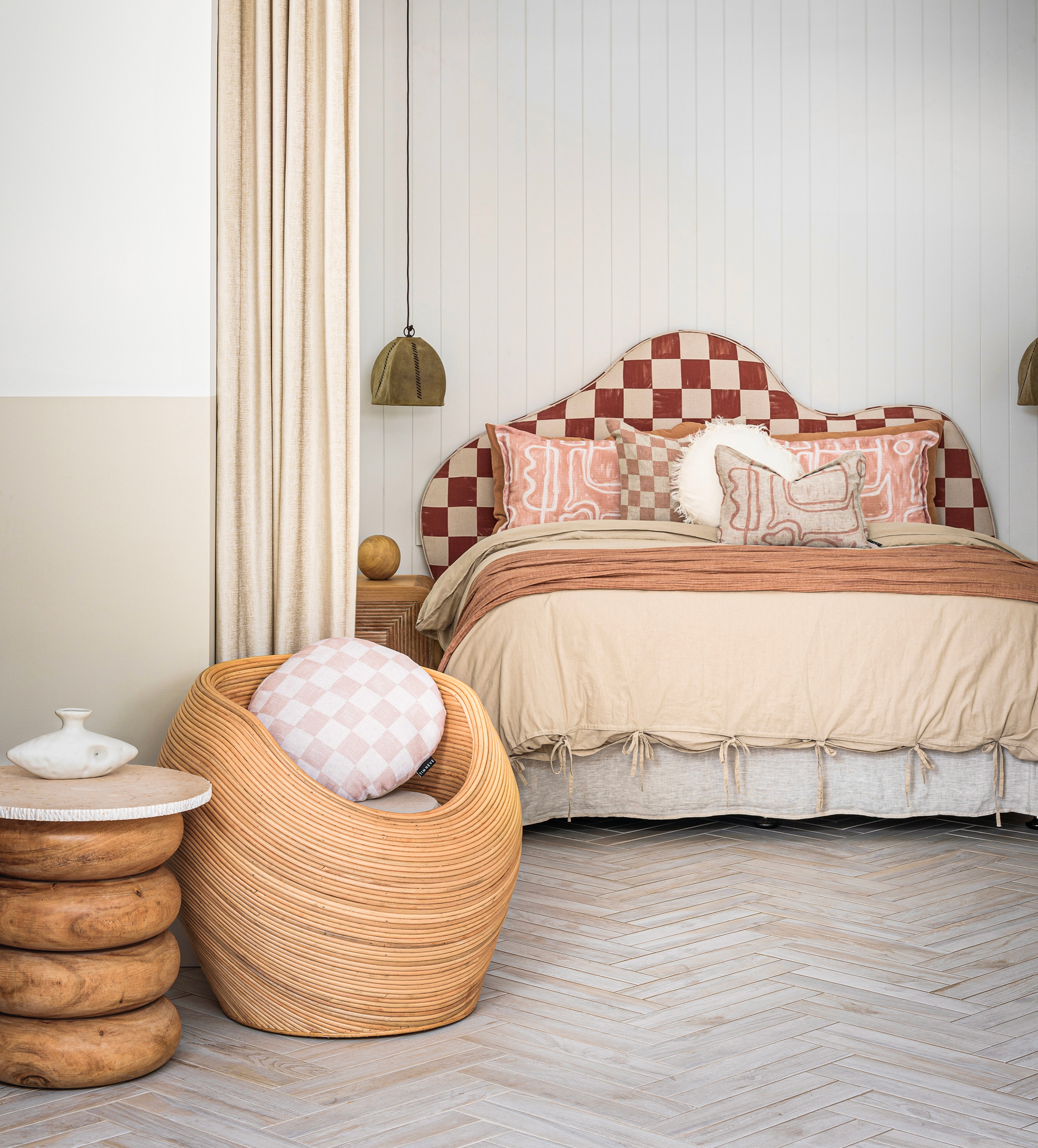
We've talked a lot already about the structure of checkerboard and the way that designers are undermining that to take this pattern in a new direction. Many of these ideas are bold and disruptive, embracing loud colors and forms, but this trend is equally evolving to include a quieter version of the design.
Designs such as Tim Neve's handpainted checkerboard textiles look to soften the stark contrast of checkerboard by making the blocks less solid forms. 'For my check design, I executed it in a hand-painted version on paper first,' Tim tells us of his painterly checkerboard print. 'That means when it's digitally printed onto our base cloths, it appears really tactile.'
You'll also see this version of the trend take place with less structured outlines, wobbly lines and more, leaning into the organic modern style that's popular right now

Luke Arthur Wells is a freelance design writer, award-winning interiors blogger and stylist, known for neutral, textural spaces with a luxury twist. He's worked with some of the UK's top design brands, counting the likes of Tom Dixon Studio as regular collaborators and his work has been featured in print and online in publications ranging from Domino Magazine to The Sunday Times. He's a hands-on type of interiors expert too, contributing practical renovation advice and DIY tutorials to a number of magazines, as well as to his own readers and followers via his blog and social media. He might currently be renovating a small Victorian house in England, but he dreams of light, spacious, neutral homes on the West Coast.
-
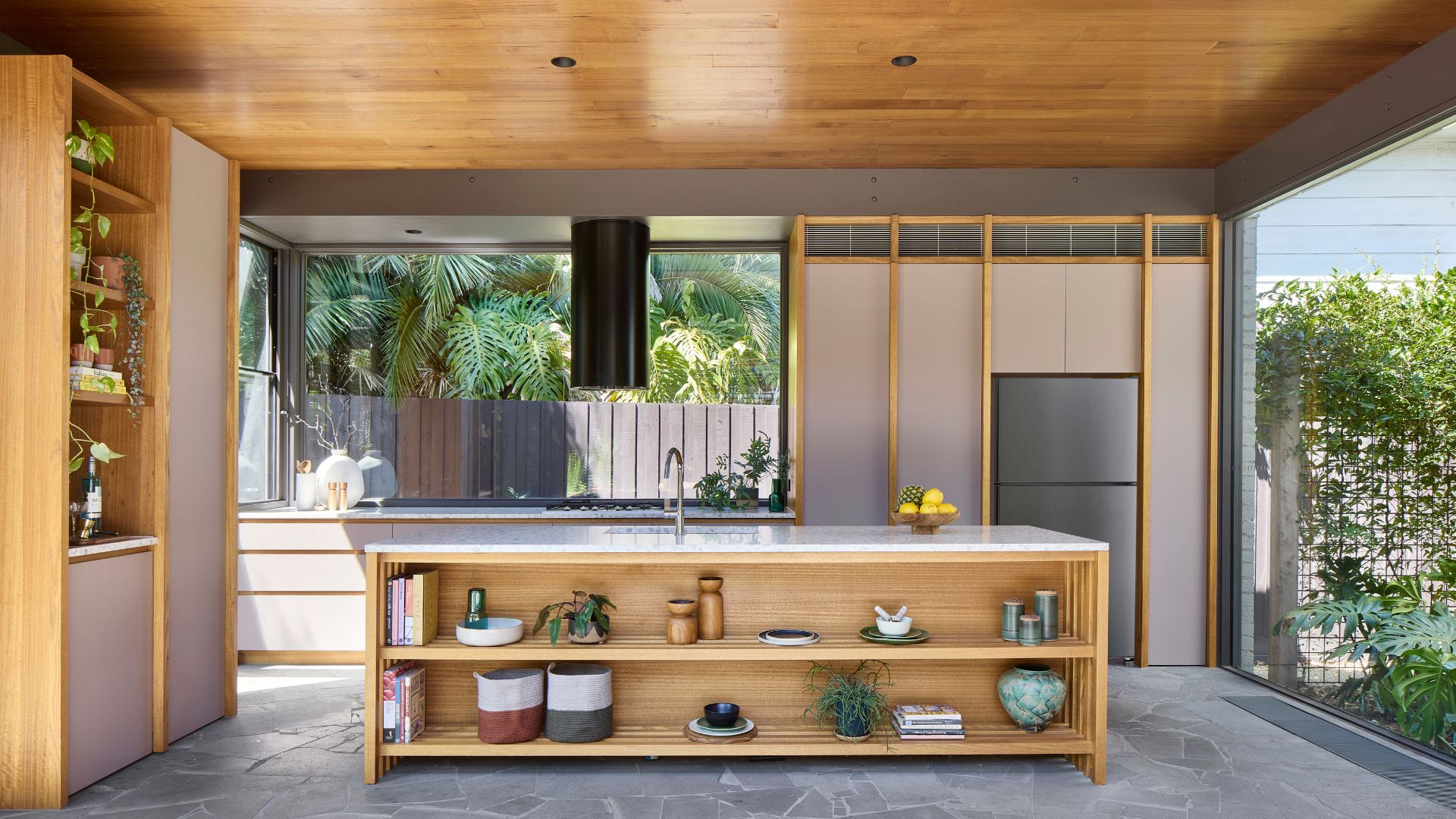 Biophilic Decluttering — What to Take Out of Your Home (and What to Put in) for a More Natural Home
Try your hand at biophilic decluttering to ground your interiors, connect to the environment, and cure chronic clutter in one go. Here's how.
By Amiya Baratan
-
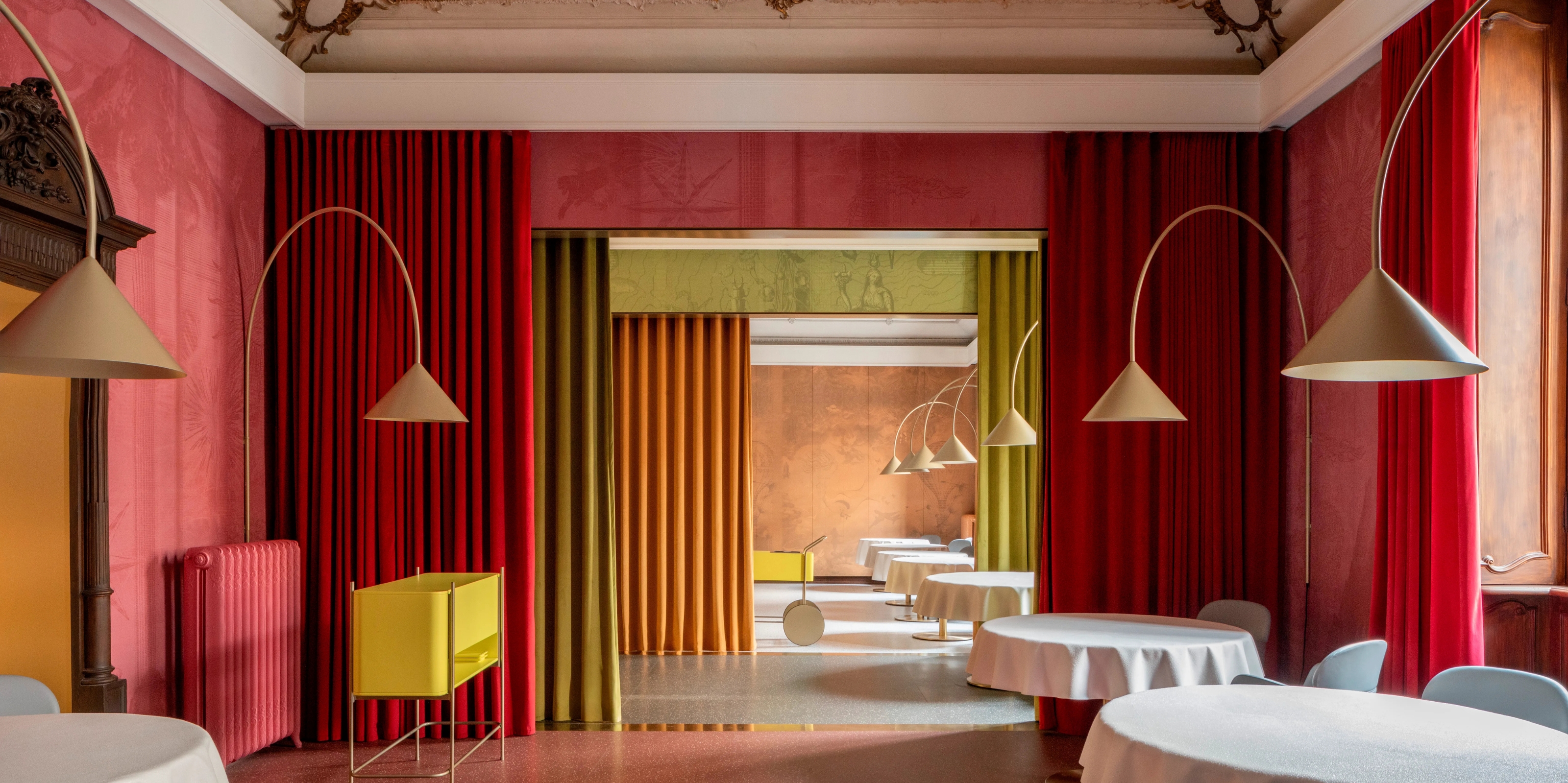 10 Arrestingly Beautiful Milan Restaurants Locals *Actually* Dine at — Selected for Their Interiors
Brought to you by our community of culture insiders, this edit of the best restaurants in Milan sees authentic Italian food and immersive design unite
By Gilda Bruno