This paint color could be stopping you from sleeping, according to psychologists
This popular hue may be keeping you awake at night – here's what to use instead
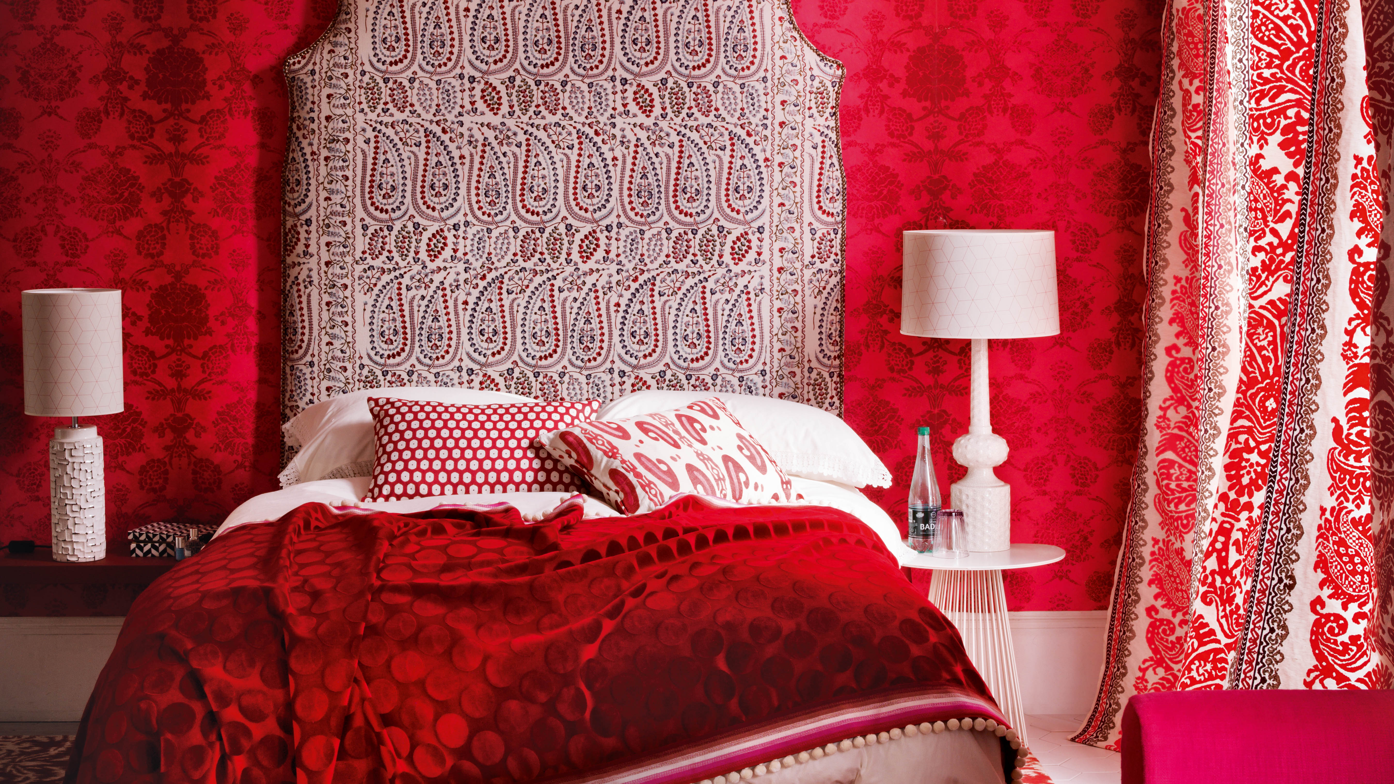

The study of color psychology is important in every room – but none more so than the bedroom. In this room, your interior design decisions have a direct impact on your sleep – and (consequently) your overall wellbeing. So, it's important you get them right.
According to psychologists, your paint ideas have a significant impact on your sleeping pattern. However, there is one popular hue that they would always avoid.
The color in question is red – a shade that, they suggest, is best 'kept to a minimum.' This is why you should need to avoid the fiery tone – and what you should opt for instead.
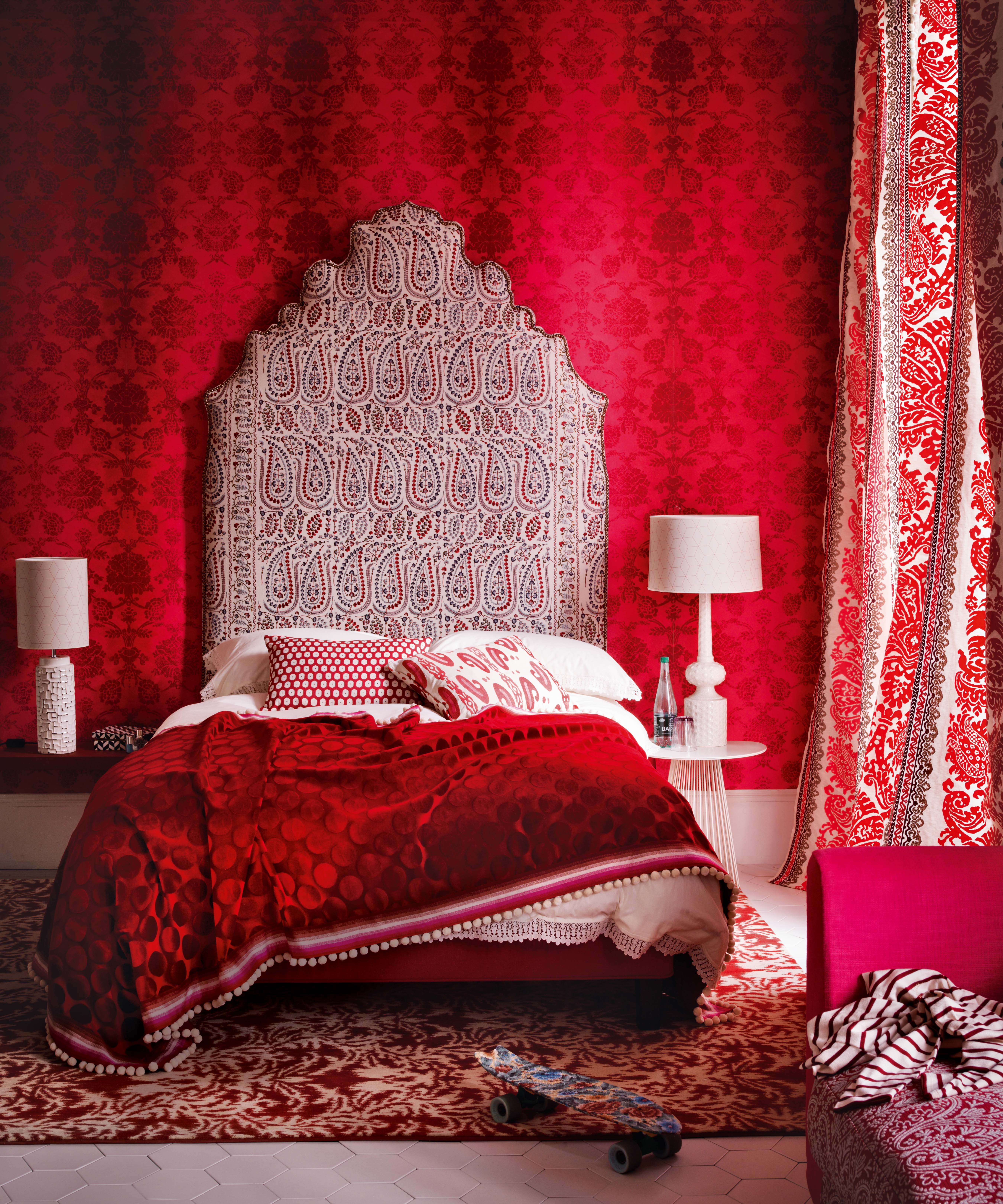
Why you should avoid red in the bedroom
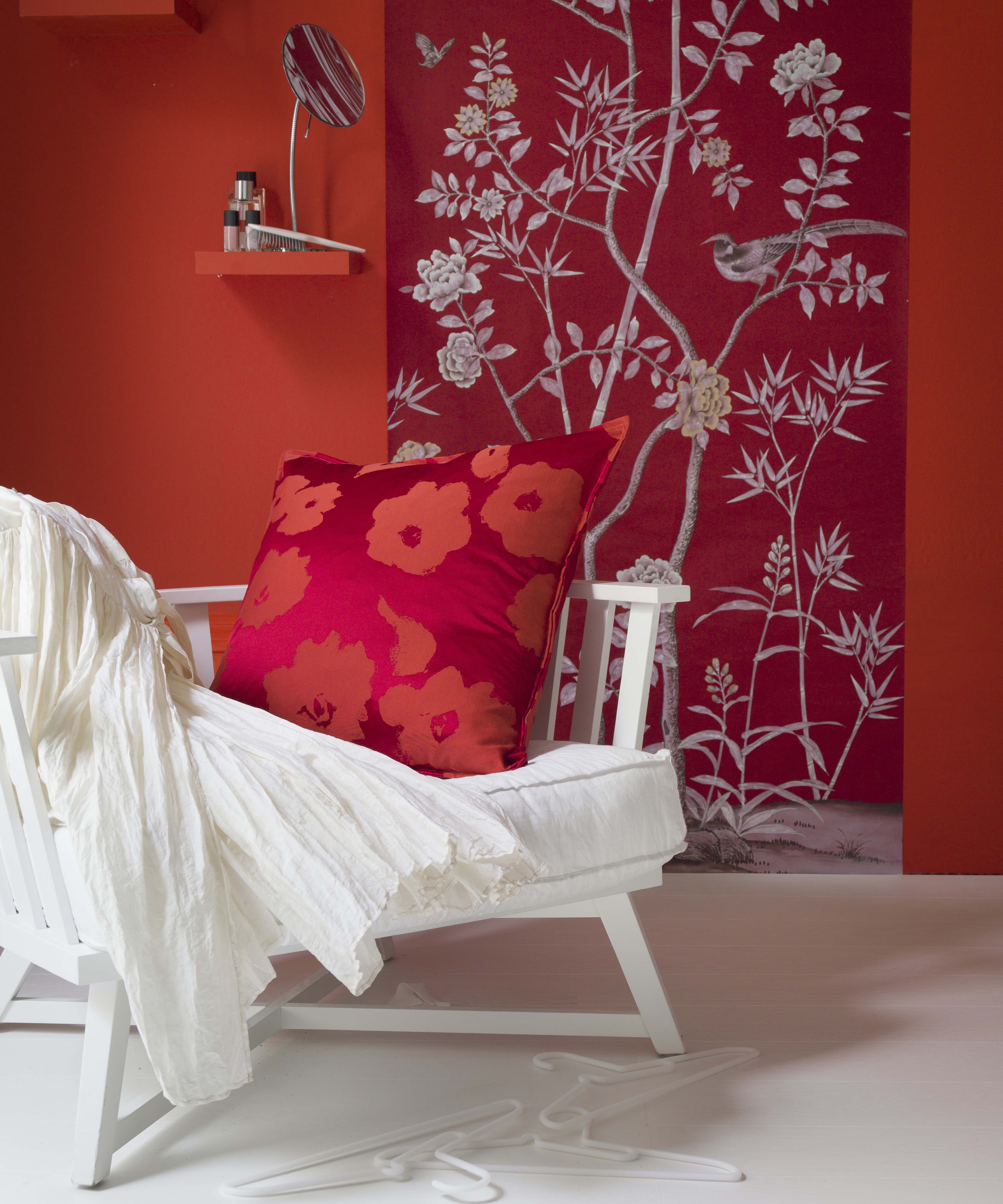
'Red, orange, and other hot colors raise the blood pressure, increase the heartbeat and muscle movement, so it is best to keep these to a minimum,' explains color psychologist and holistic designer Suzy Chiazzari.
Color psychologist Lee Chambers adds that surrounding yourself in red for a prolonged period can increase your heart rate and make you feel agitated – making it a bad choice for the bedroom.
'As we look to cultivate a space for us to live and restore ourselves in, crimson can literally keep us on high alert and can leave us feeling unsettled, rather than being at peace and feeling restful,' Lee adds.
What color is best for the bedroom?
While psychologists warn against red, there are some expert-approved bedroom ideas that will refresh your space – and renew your sleeping pattern.
Be The First To Know
The Livingetc newsletters are your inside source for what’s shaping interiors now - and what’s next. Discover trend forecasts, smart style ideas, and curated shopping inspiration that brings design to life. Subscribe today and stay ahead of the curve.
A recent study* that surveyed the sleeping patterns of 1000 Americans revealed that purple is the best color to paint your bedroom. This comes after only 12% of respondents with purple walls confessed to having a bad night's sleep.
'Generally softer shades of purple and dark blue stimulate the unconscious mind, so encouraging dreams and inner peace,' Suzy explains.
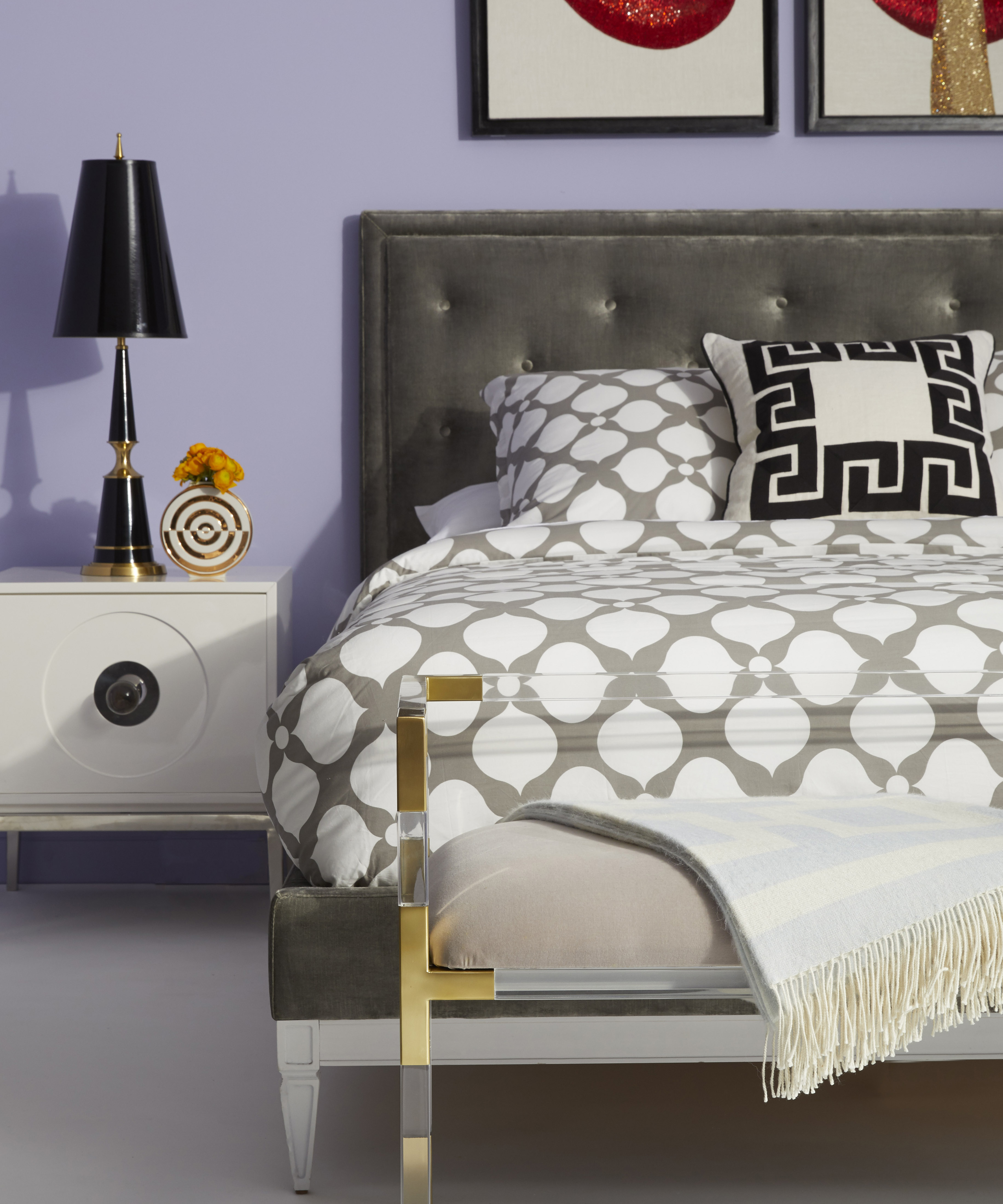
When choosing the right shade of purple, Sleep expert and writer Christine Lapp also adds that you should look for a 'bluer hue' instead of a pinker tint. 'Purple is known to represent peace. Therefore, this color provides a sense of tranquillity and allows the body to unwind and rest easier,' she says.
'Blue was the second-best paint color for sleep, known for its soothing and calming properties, whereas pink tends to be the color best suited for inducing creativity, exciting the brain, rather than winding it down.'
So, while blue is amongst the colors that go with purple, its benefits stretch beyond a stylish scheme. Instead, this pairing may improve your sleeping pattern – so you can wake up feeling refreshed this 2022.
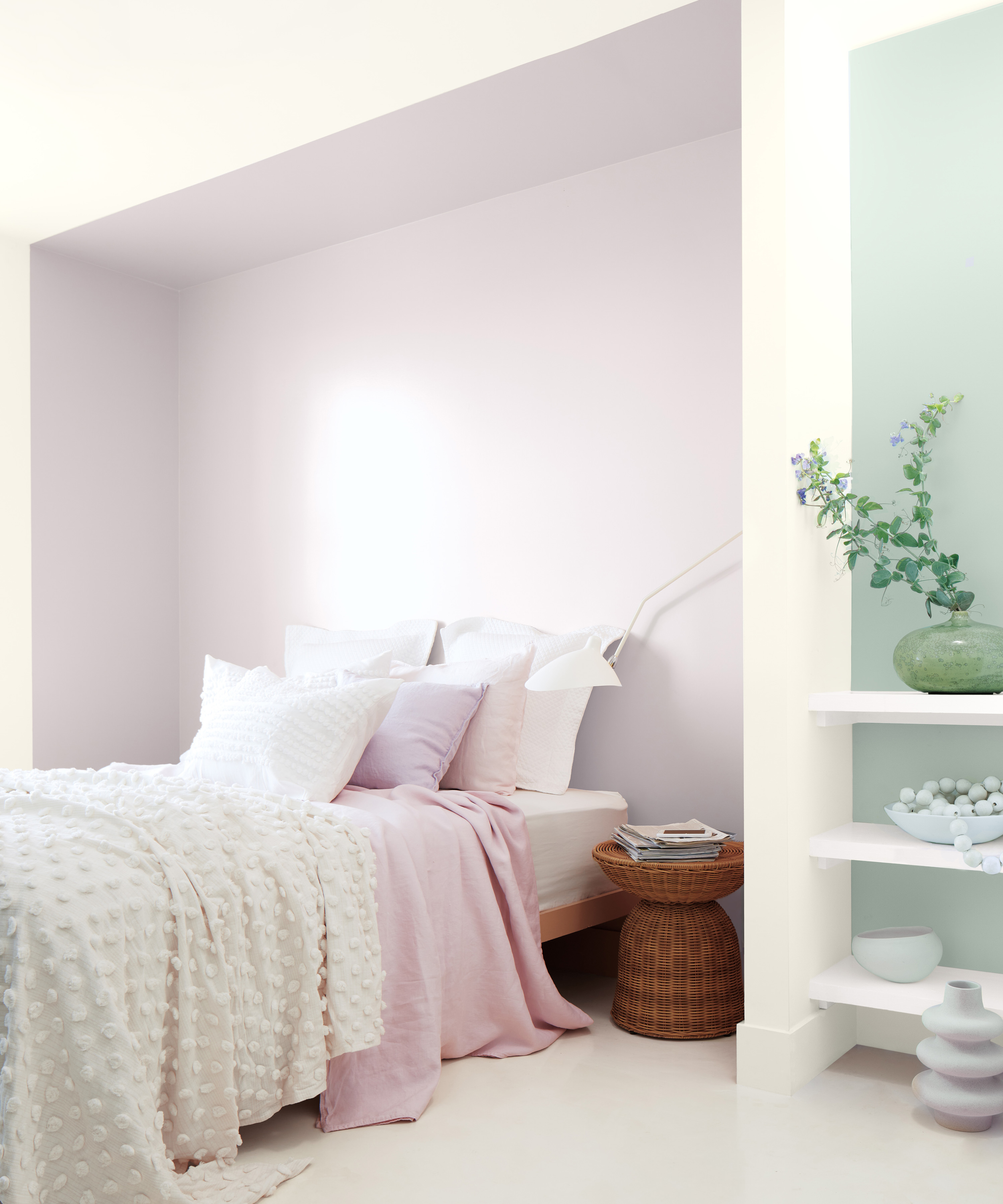
*Survey by Sleep Junkie

Megan is the Head of Celebrity Style News at Homes & Gardens. She first joined Future Plc as a News Writer across their interiors titles, including Livingetc and Real Homes, before becoming H&G's News Editor in April 2022. She now leads the Celebrity/ News team.
Before joining Future, Megan worked as a News Explainer at The Telegraph, following her MA in International Journalism at the University of Leeds. During her BA in English Literature and Creative Writing, she gained writing experience in the US whilst studying in New York. Megan also focused on travel writing during her time living in Paris, where she produced content for a French travel site.
Megan currently lives in London, where she relocated from her hometown in Yorkshire. In her home, she experiments with interior design trends and draws inspiration from the home decor ideas she observes in her everyday work life. Her favorite pieces include her antique typewriter and her expansive collection of houseplants. When she isn’t writing, she is browsing London’s coffee shops and bookstores to add to her ever-growing library, taking over the open shelving in her apartment.
-
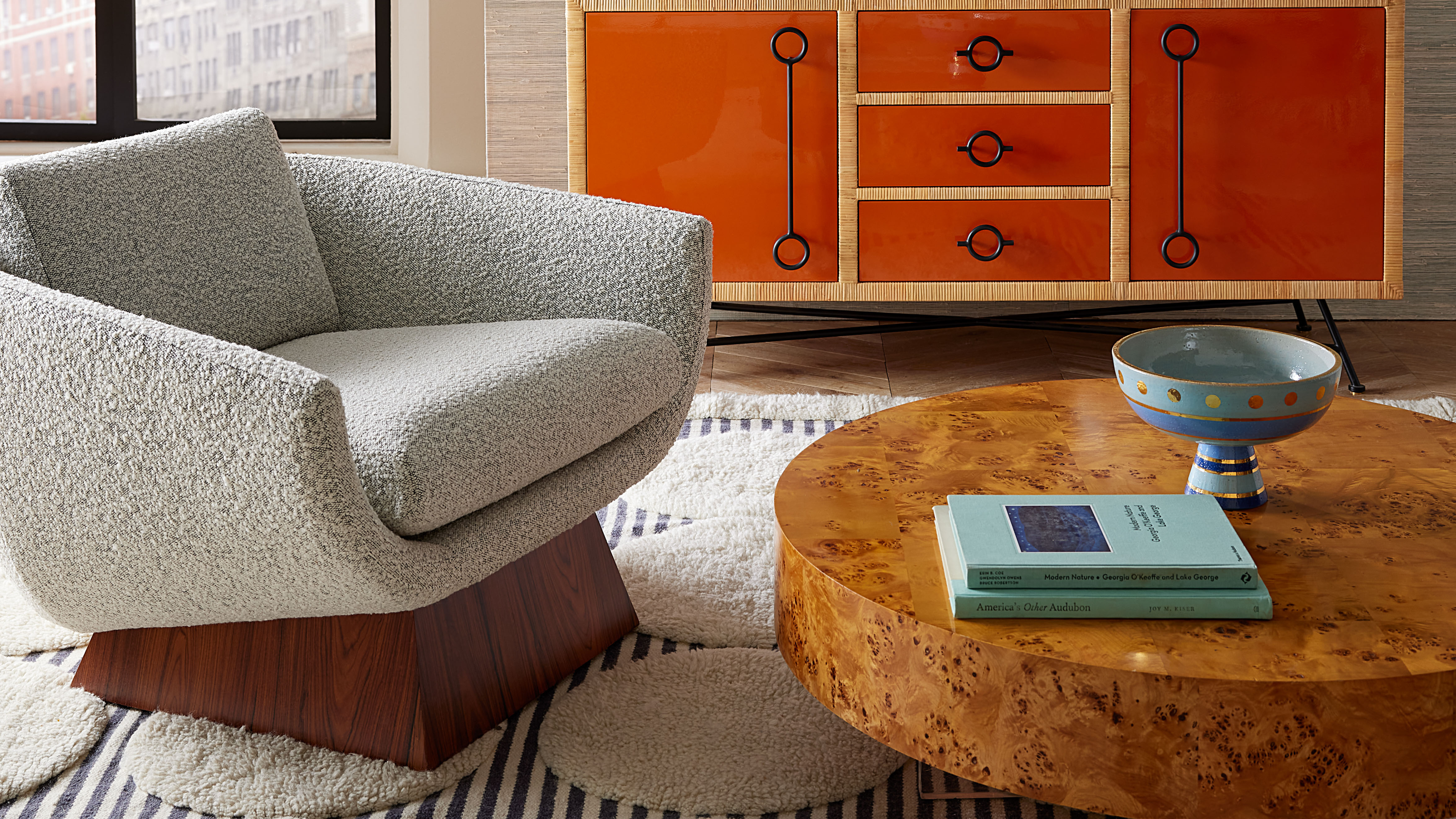 Burl Wood Decor Is 2025’s Most Coveted Comeback — Here’s How to Get the Storied Swirls for Less
Irregularity is the ultimate luxury, but you don’t need an antiques dealer to find it
By Julia Demer Published
-
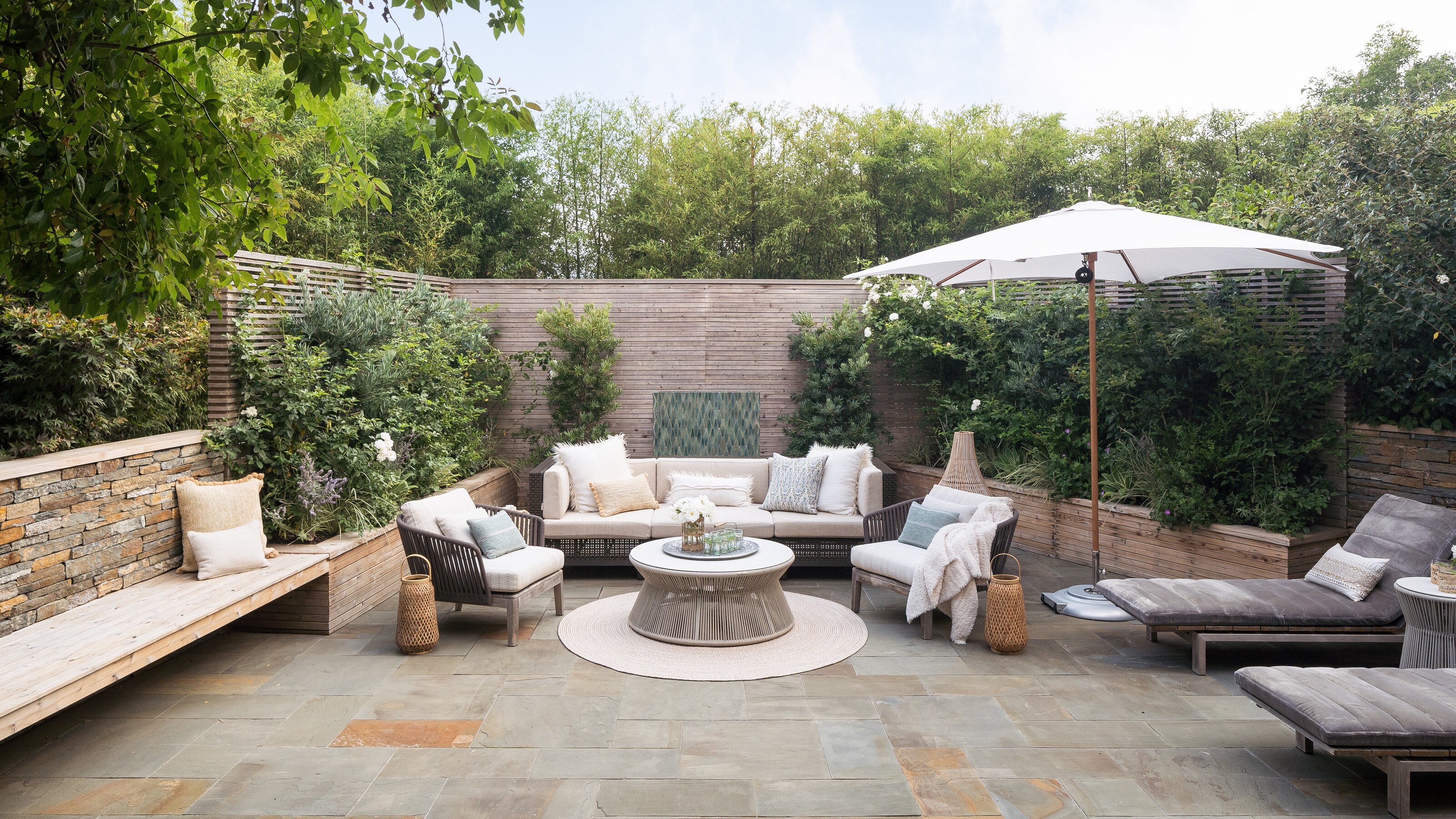 5 Garden Features That Instantly Add Value to Your Home — While Making Your Outdoor Space More Practical, too
Get to know all the expert tips and tricks for making your backyard a standout selling point for your home.
By Maya Glantz Published