Dorit Kemsley's hallway is the perfect example of why you shouldn't neglect "in-between spaces", say designers
The Real Housewives of Beverly Hills star showed off her statement wallpapered hallway recently - here's why designers love the idea


On the Real Housewives of Beverly Hills, Dorit Kemsley is known for her refined (and often a little eccentric) sense of style. And though we already know that the reality star and fashion designer isn't afraid to go bold with pattern when it comes to her closet, it turns out she's not afraid of it with her interior design, too.
If you've ever watched the show, you'll have had glimpses into the interior design style Dorit and partner PK have chosen for their home in Encino, Los Angeles. Think classic materials given a fresh twist with a pop of color and interesting, unusual paneling ideas.
However, there are some spaces we haven't laid eyes on before, and while you might think a hallway isn't the most exciting spot in someone's house, Dorit's used one of these tiny, transitional spaces to make a bold statement for her design. We asked the experts about this trend for exciting modern hallways, and why it might be the thing that makes your home.
A post shared by Dorit Kemsley (@doritkemsley)
A photo posted by on
Strutting her stuff before heading to Beyonce's recent concert in Los Angeles, Dorit shows us that a hallway can make for a brilliant runway, especially if you've got a bold monochromatic wallpaper up in it.
It might not be your first thought to go with such n intensely-patterned wallpaper ideas when designing a small space, but according to designers, it's a brilliant way to make your home's transitional spaces, which can often feel a little lackluster design-wise, come to life.
'As the “in-between spaces” like hallways and corridors naturally offer a compact spatial experience and clear sightlines we believe these spaces create some of the best opportunities to highlight a concept and have an impact on the viewer,' architect and designer Polina Sandström of Aska Architects tells us.
Architect Irene Astrain agrees: 'There is no reason why a transitional space shouldn’t be beautiful and expressive. We may only experience these spaces in passing but they can really brighten up a home.'
Be The First To Know
The Livingetc newsletters are your inside source for what’s shaping interiors now - and what’s next. Discover trend forecasts, smart style ideas, and curated shopping inspiration that brings design to life. Subscribe today and stay ahead of the curve.
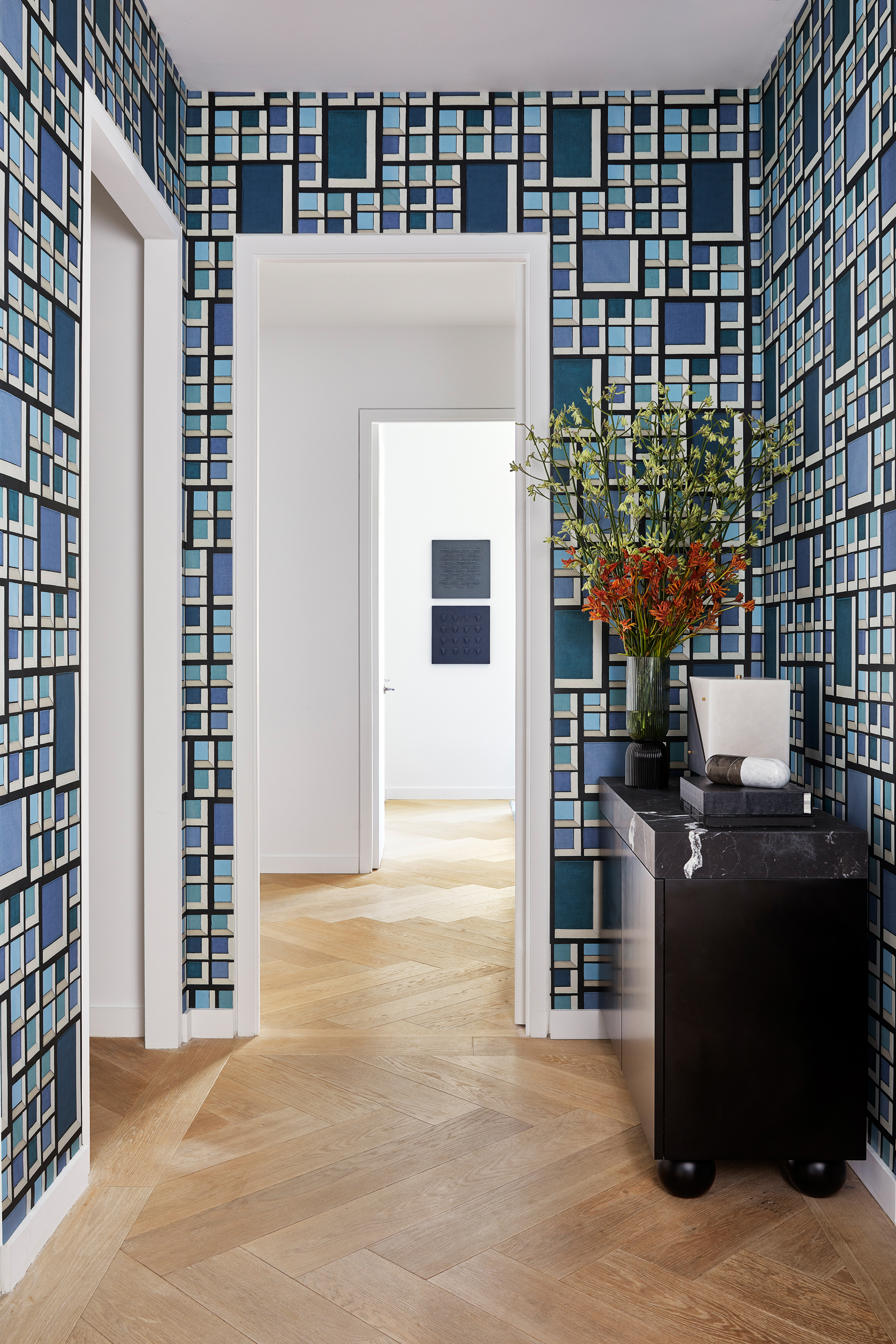
It's an idea that interior designer Justin Charette utilized in this New York apartment, explaining that it also works as a way to tie together the rooms that the hallway connects. 'The wallpaper in the hallway is a fun pattern by Kelly Wearstler,' Justin says. 'I wanted something on the busier side that would tie all the colors into the space. Plus, the busy pattern helps conceal all the utility items in this space that would stand out otherwise - there's a garbage chute and electric boxes in this small hallway,' he adds.
What wallpaper did Dorit use?
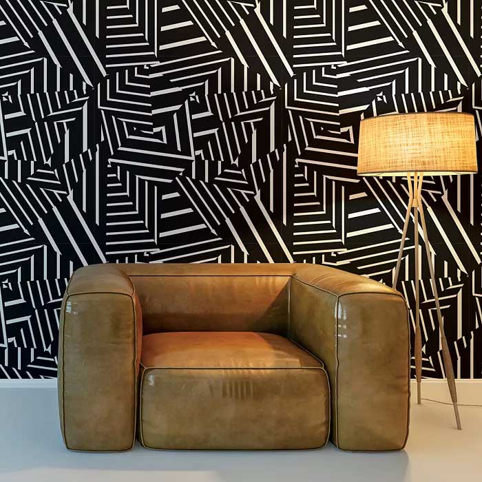
We've done some interiors sleuthing and found the exact match for Dorit's creative hallway. The good news is it's a surprisingly affordable brand - and given that Dorit spends half her life in expensive designer clothes, that wasn't a given. However, we have some bad news, too - it seems as though it's been discontinued.
The pattern is from Bobby Berk's collection with peel-and-stick wallpaper brand Tempaper, and it appears they no longer sell it in this colorway. It's not all doom and gloom, though, you can find the same pattern in white, alongside a few other interesting monochromatic designs from the same collection.

Hugh is Livingetc.com’s editor. With 8 years in the interiors industry under his belt, he has the nose for what people want to know about re-decorating their homes. He prides himself as an expert trend forecaster, visiting design fairs, showrooms and keeping an eye out for emerging designers to hone his eye. He joined Livingetc back in 2022 as a content editor, as a long-time reader of the print magazine, before becoming its online editor. Hugh has previously spent time as an editor for a kitchen and bathroom magazine, and has written for “hands-on” home brands such as Homebuilding & Renovating and Grand Designs magazine, so his knowledge of what it takes to create a home goes beyond the surface, too. Though not a trained interior designer, Hugh has cut his design teeth by managing several major interior design projects to date, each for private clients. He's also a keen DIYer — he's done everything from laying his own patio and building an integrated cooker hood from scratch, to undertaking plenty of creative IKEA hacks to help achieve the luxurious look he loves in design, when his budget doesn't always stretch that far.
-
 Parachute Just Dropped a Collection at Target and It's A Guaranteed Sell Out
High quality bedding and bath linens just got a lot more accessible. Parachute's signature effortlessly chic style is now available in over 200+ pieces at Target
By Devin Toolen
-
 Now Serving: Jewelry for Dinner — Alighieri Brings Its Signature Raw Beauty to the Table
Alighieri CASA is what happens when a jewelry house designs your cutlery — and yes, it’s just as fabulous as it sounds
By Julia Demer
