Dulux's 2024 Color of the Year is so luxe and versatile our Editor is doing both his living room and bedroom in it
'Sweet Embrace' is a delicate, pale pink that offers a moment of clarity and joy amongst the chaos of our modern age
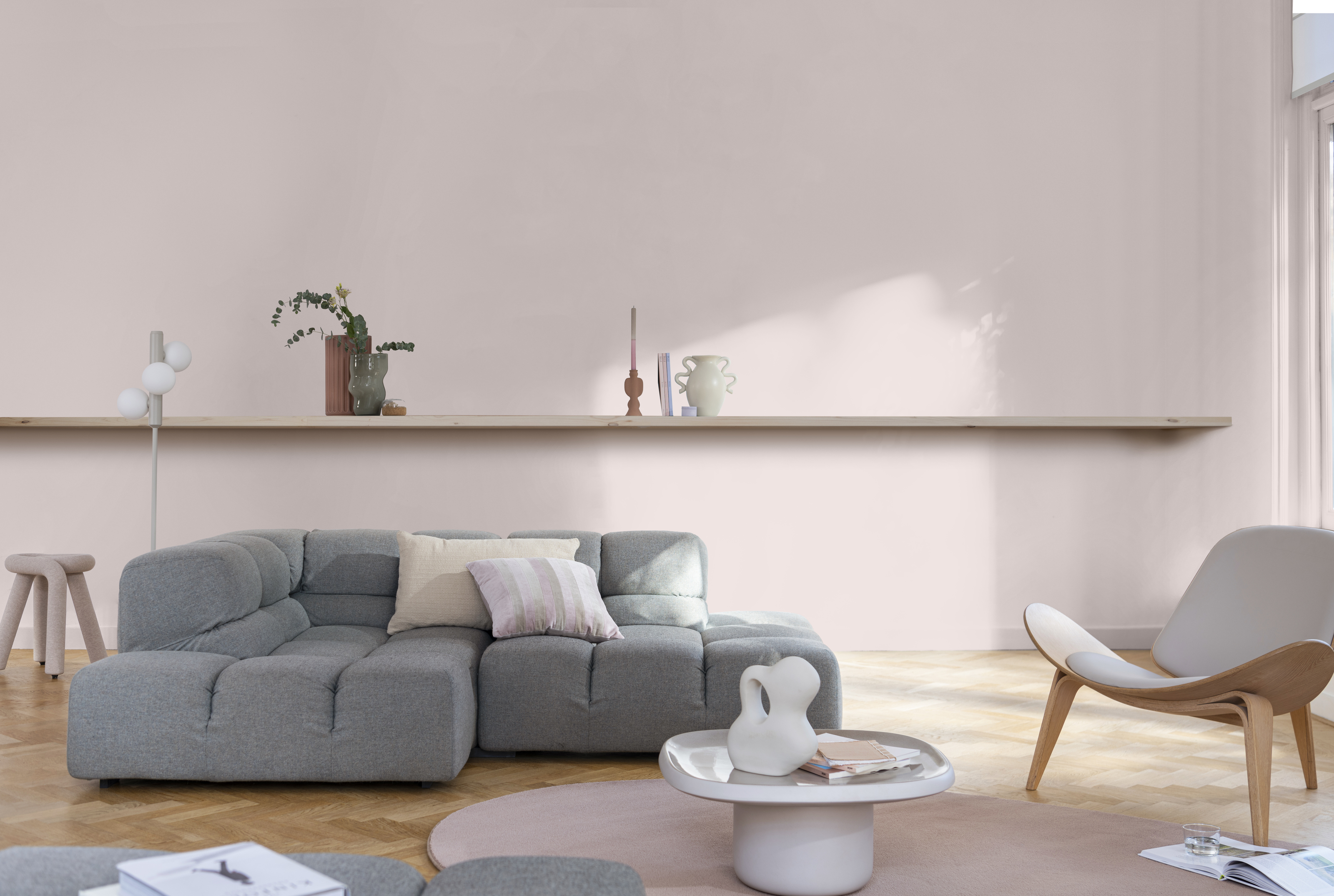

There are few things that get us more excited than the annual Color of the Year announcements, and renowned British paint brand Dulux always delivers an on-trend shade. This year it's a hue that we've been noticing a lot already, and we predict it will successfully encapsulate our next journey around the sun. Now that it's had Dulux's seal of approval, we can't wait to decorate with it.
'Sweet Embrace' is a delicate, pale pink with a chalky blue undertone that evokes feelings of tenderness, comfort, and assurance. In turbulent times when stability is hard to come by, it captures the cozy spirit of home - the perfect shade to create a sanctuary space for a moment's respite. It's also extremely versatile when it comes to its application, too. Whether you want a vintage cottagecore feel or a contemporary take on a warm neutral, this chalky shade has limitless possibilities within the home.
'I can see this featuring in both my living room and bedroom refreshes next year,' says our editor Pip Rich. 'Pink in a bedroom is so calming to wake up, and in my wes-facing living room I know it will feel cocooning, too.'
It's safe to say that Dulux's color forecasters have earned our trust as we look ahead to 2024's color trends. Here we take a closer look at the shade and what it brings to our homes, alongside some tips on how to incorporate it into your existing style and scheme with some help from Dulux's color expert, Marianne Shillingford.
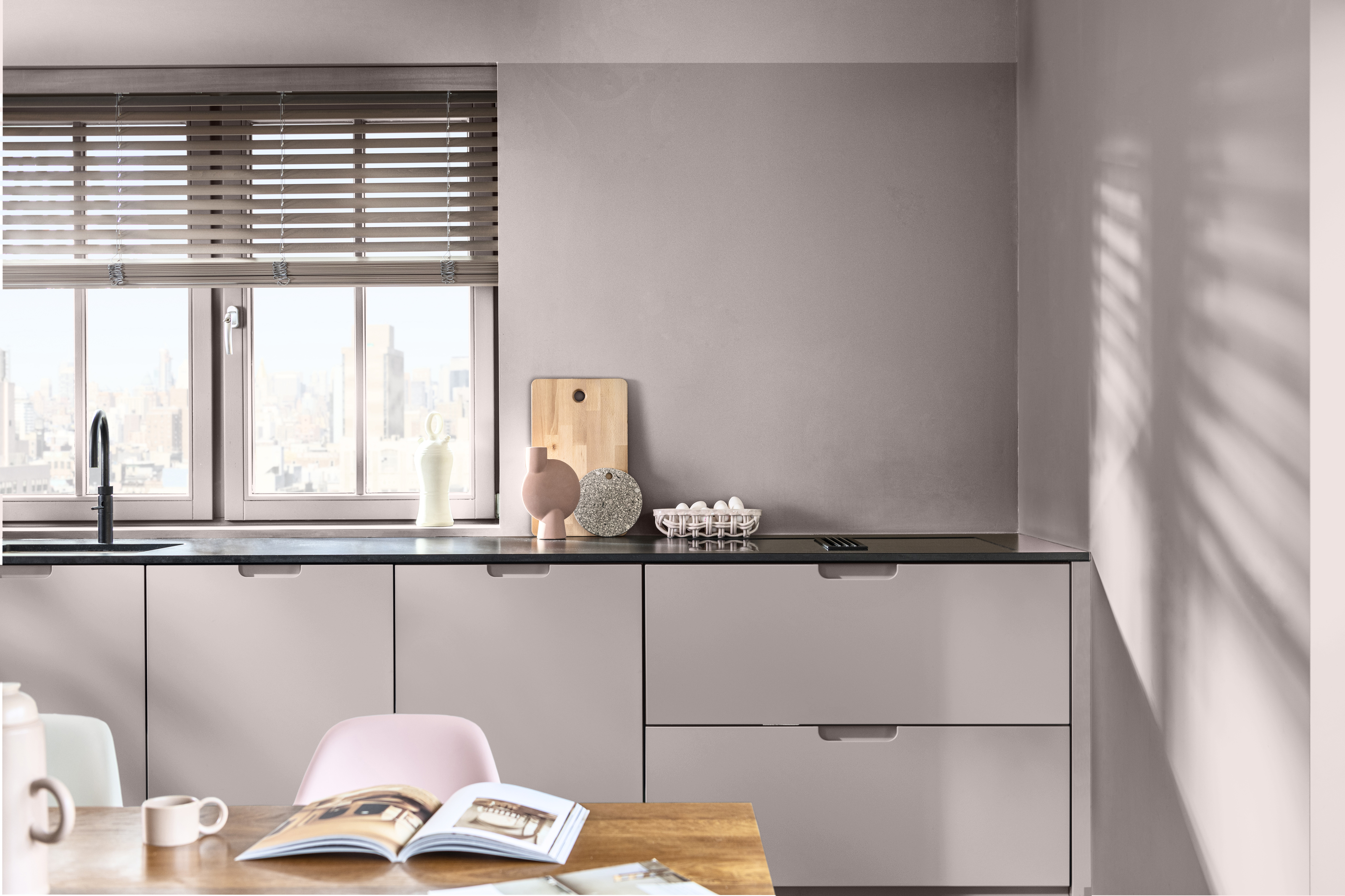
This year marks the 21st anniversary of Dulux's trend forecasting so they're certainly well-versed at capturing the mood of the moment by now, and the coming year's shade, 'Sweet Embrace', arrives at a time when we could all do with just that. The comforting hue exudes a gentle, calming energy that feels like a familiar arm around your shoulder. In our busy and at times overwhelming age, it offers a moment of clarity and joy amongst the chaos.
'What is so wonderful about Sweet Embrace is its soothing quality,' says Marianne Shillingford, Creative Director and Color Expert at Dulux. 'Like a whisper of reassurance in a moment of stress, it has a visual softness that calms the senses and creates an atmosphere of serenity.'
Following tradition, Dulux's Color of the Year is also accompanied by a set of curated color palettes that feature the hero shade for fresh schemes that inspire. The three 'color stories' are: 'warm', a group of cozy terracotta shades; 'calm', the convergence of sage and sea-green for a nature-inspired space; and 'uplifting', where earthy ochres meet modern mauves for an energizing effect.
Be The First To Know
The Livingetc newsletters are your inside source for what’s shaping interiors now - and what’s next. Discover trend forecasts, smart style ideas, and curated shopping inspiration that brings design to life. Subscribe today and stay ahead of the curve.
The theme that runs throughout them all is one of nuture. 'We’re all running non-stop these days, so it’s important that our homes provide us a raft in the storm, where we feel safe to take time out from facing our toughest challenges,' says Marianne. Similar to Dulux's 2023 Color of the Year, Wild Wonder, it urges us to reconnect with our homes in ways we've previously overlooked.
How should we incorporate Sweet Embrace into the home?
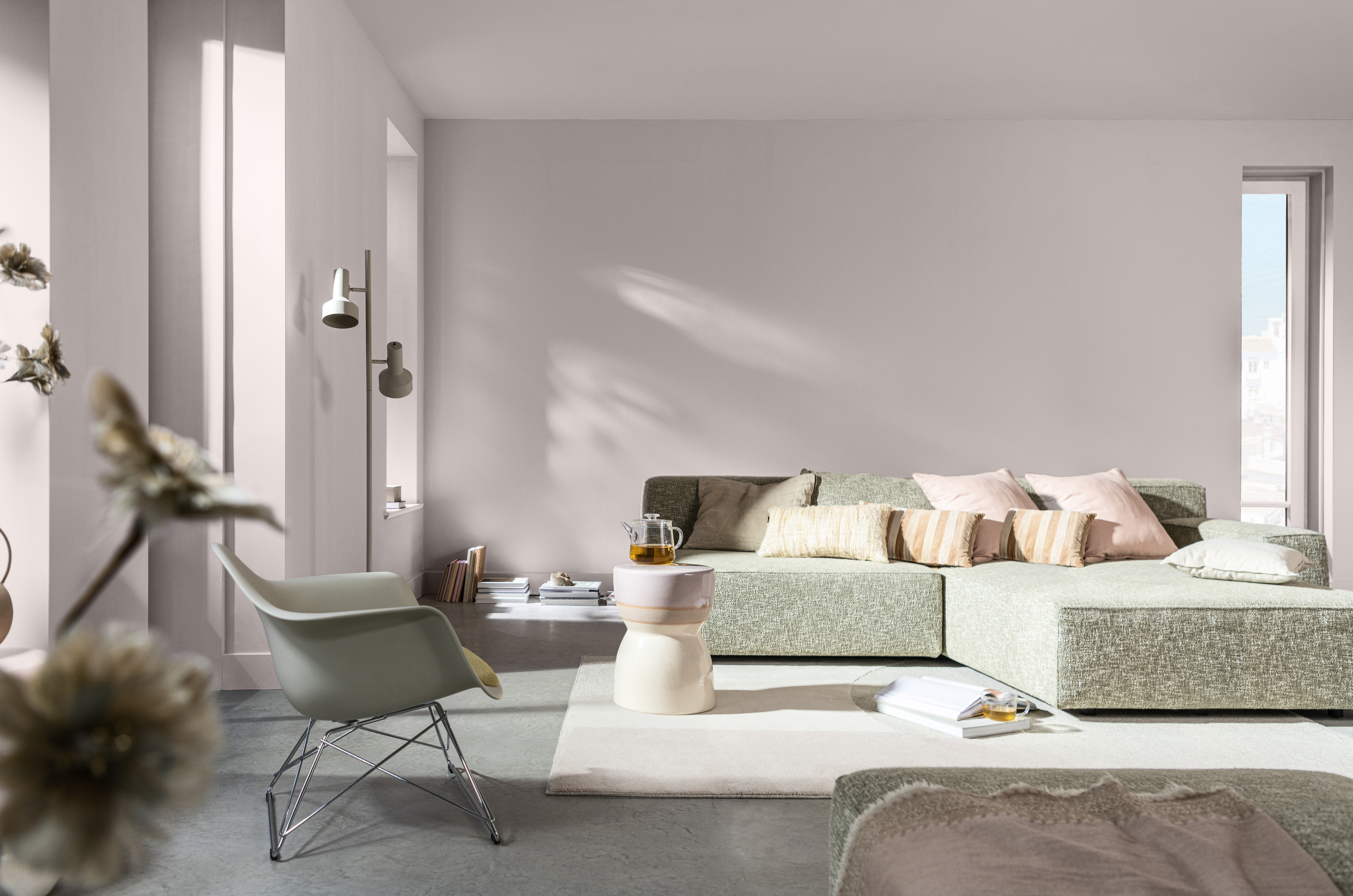
The pale shade might be subtle, but it acts as a strong, stable foundation on your walls. As a metameric color, different tones are highlighted during particular points of the day as the natural light changes. For example, it appears crisper in the early morning, becoming more blush pink through the day and then increasingly violet in the evening. As Marianne explains: 'This makes it perfect for north-facing rooms or houses that don’t have much natural light.'
This makes it an extremely versatile choice for your paint ideas, too. Unlike more classic pastel shades, the chalky undertone gives it a modern edge that doesn't feel kitsch. The desaturated tone also means it can be used as a neutral as an alternative to white. If the trend for creamy, off-whites features too much yellow for you, a pale pink makes a more playful alternative. 'It’s the perfect modern neutral that you can use with confidence, knowing it will unite each element from furnishings to artwork while creating a gently uplifting atmosphere,' Marianne adds.
As well as being a beautiful standalone color, Sweet Embrace also pairs well with a myriad of other shades. 'We especially love the look when paired with natural materials,' says Marianne. 'Think jute rugs, exposed wood trim, and organic textiles like linen for a Scandi-inspired style.'
Why is pink trending?
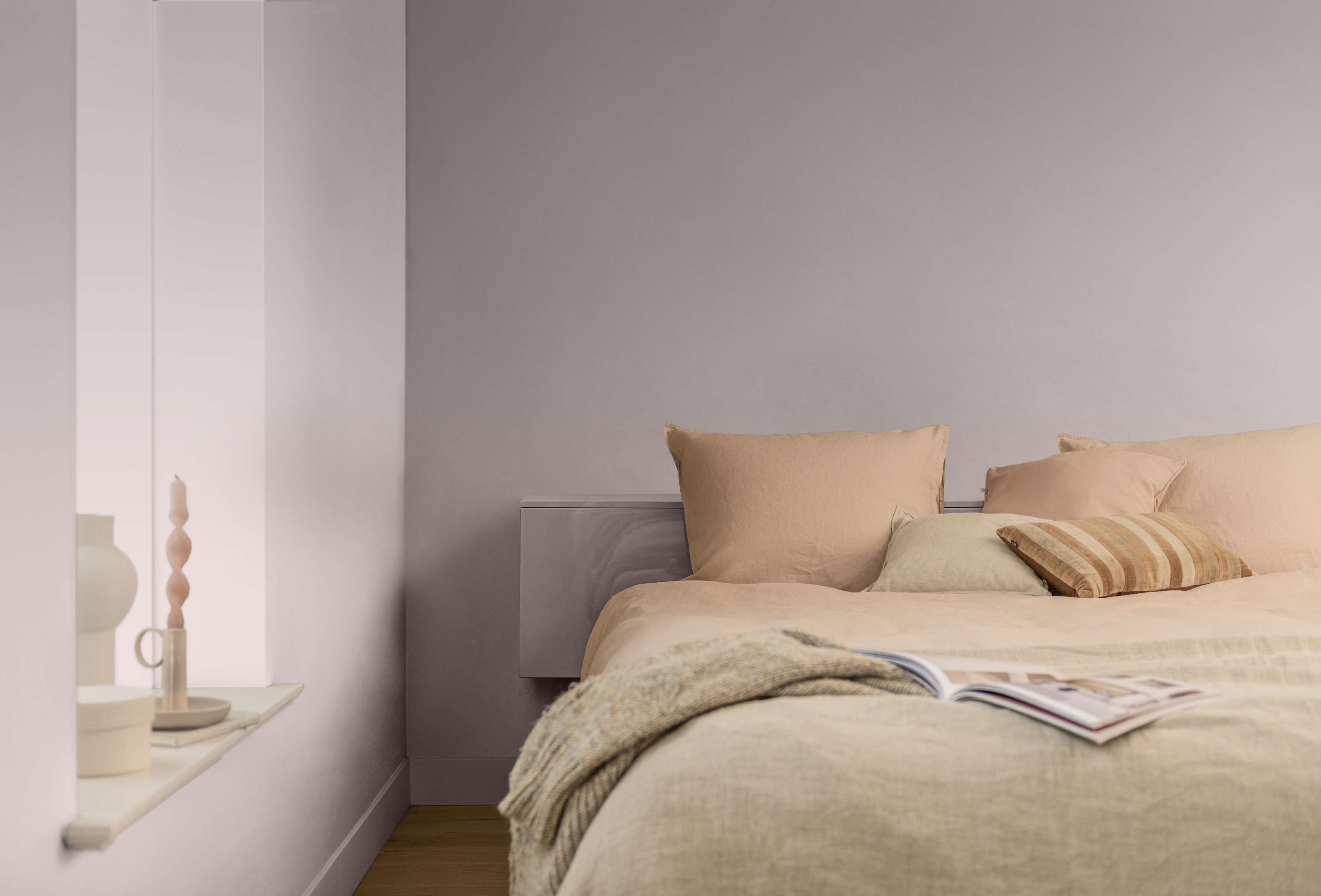
There's no denying that pink has been having a serious resurgence of late, in part owing to the Barbiecore craze since the release of the recent film. The playful shade is being used in fresh new ways, and Sweet Embrace offers a similar opportunity to experiment. 'It taps into the in-vogue pink interior trend, which has been swelling for the past decade,' notes Marianne. 'But the color offers a soft and usable solution to the current craze through its cooler, sophisticated edge.'
We've also noticed a trend towards warmer, more comforting hues in recent years. Gone are the days of grey walls and the overuse of stark whites. As Dulux expertly captures, we now want our homes to act as sanctuary spaces that envelop us in a warm welcome on our return home, and Sweet Embrace does exactly that. If you're looking for a fresh yet comforting shade to introduce to your home and a modern way to decorate with pink, it's the perfect place to start.
Can't get your hands on Dulux? Here are 3 similar shades from our other favorite paint brands

Lilith Hudson is a freelance writer and regular contributor to Livingetc. She holds an MA in Magazine Journalism from City, University of London, and has written for various titles including Homes & Gardens, House Beautiful, Advnture, the Saturday Times Magazine, Evening Standard, DJ Mag, Metro, and The Simple Things Magazine.
Prior to going freelance, Lilith was the News and Trends Editor at Livingetc. It was a role that helped her develop a keen eye for spotting all the latest micro-trends, interior hacks, and viral decor must-haves you need in your home. With a constant ear to the ground on the design scene, she's ahead of the curve when it comes to the latest color that's sweeping interiors or the hot new style to decorate our homes.
-
 Turns Out the Coolest New Café is Actually In Your Kitchen — Here's How to Steal the Style of TikTok's Latest Trend
Goodbye, over-priced lattes. Hello, home-brewed coffee with friends. TikTok's 'Home Cafe' trend brings stylish cafe culture into the comfort of your own home
By Devin Toolen Published
-
 5 Bathroom Layouts That Look Dated in 2025 — Plus the Alternatives Designers Use Instead for a More Contemporary Space
For a bathroom that feels in line with the times, avoid these layouts and be more intentional with the placement and positioning of your features and fixtures
By Lilith Hudson Published

