This Edwardian house in northwest London oozes a dash Californian style
This Edwardian house in northwest London turns up the contrast, adding a light, bright Malibu beach house style to a dark and moody British base.
THE PROPERTY
A five-bedroom Edwardian house in northwest London. The modern home has four floors: the ground floor has an entrance hall, cinema room, gym and mezzanine library, leading down to the lower-ground rear extension, comprising a kitchen-diner and living area, plus WC. The master suite, a guest bedroom and the family bathroom are on the first floor with the boys’ bedroom, playroom and a bathroom on the top floor.
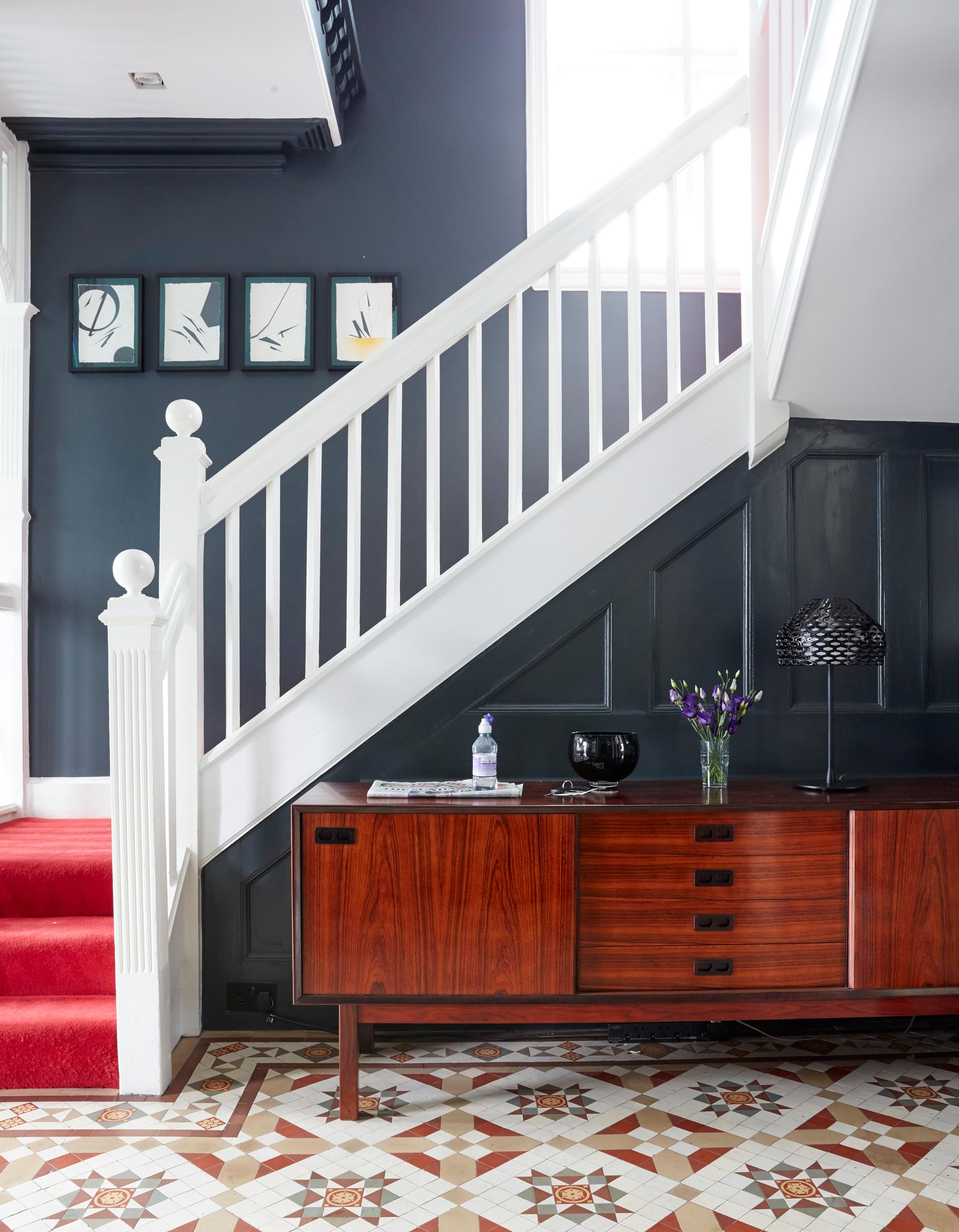
HALLWAY
The house’s dark Edwardian roots shine through in the hallway (pictured above). In the hallway the period mood really holds sway, with lighted windows, wood panelling and turned banisters.The house’s original Edwardian tiles are partnered with darkest walls.
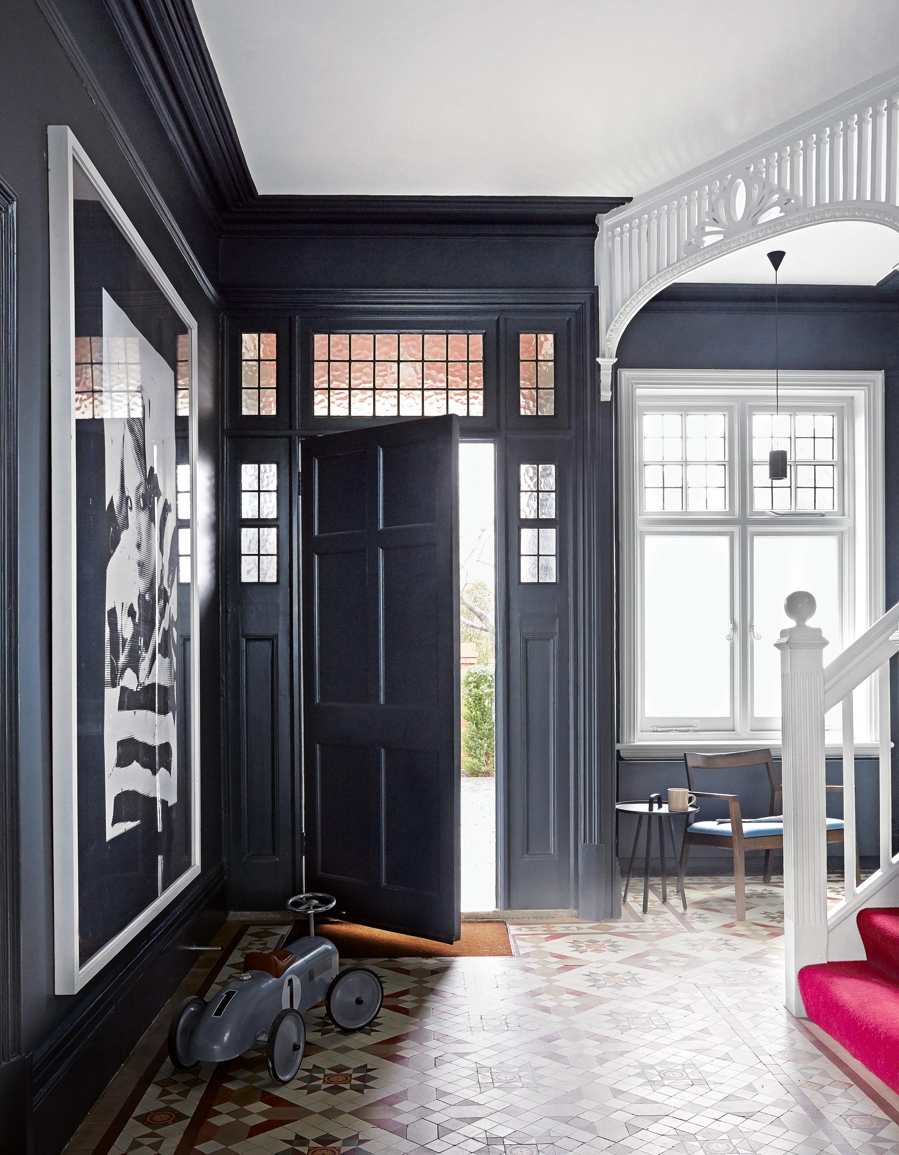
The hallway offers a point of transition; it’s where you see the Edwardian framework melt away as you head towards the lightened up area at the back of the house.Everything is very white and airy as you go into new part of the house, but this feels more warm and cossetting.
KITCHEN
In true Yellow Brick Road style, the intricate tiling leads to a very different world.Walking into the kitchen is an instant mood-lifter, with windows looking out over London, and the lofty atrium above the kitchen adding great height to the space.
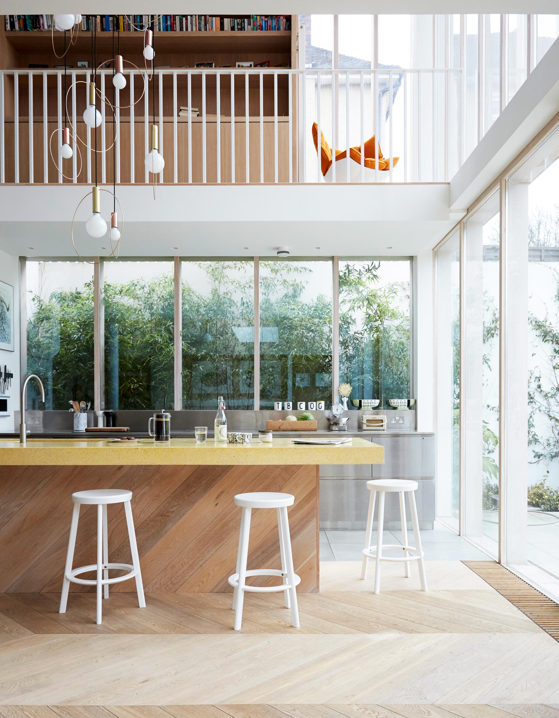
The sun-soaked beaches of Malibu might seem a long way from London’s NW6, but memories of its open, light-filled architecture have injected some Californian brilliance into this Edwardian home. The flowing spaces of the airy extension at the back of this London home feel as breezy as an early run along Escondido beach.
The creative vision behind this marriage of English formality and Stateside cool was architect Andy Martin. The owners wanted a Malibu beach house vibe. Andy’s solution was to extend out while also digging down into what had been ‘a dingy cellar, with barely enough space to stand up in’ to create a generous space fit for family life.
Be The First To Know
The Livingetc newsletters are your inside source for what’s shaping interiors now - and what’s next. Discover trend forecasts, smart style ideas, and curated shopping inspiration that brings design to life. Subscribe today and stay ahead of the curve.
DINING AREA
Sharp, colour-dipped outlines are undercut by the natural hues of the oak flooring. The customised light over the table was tricky to mount in the right position, but worth the fiddle.
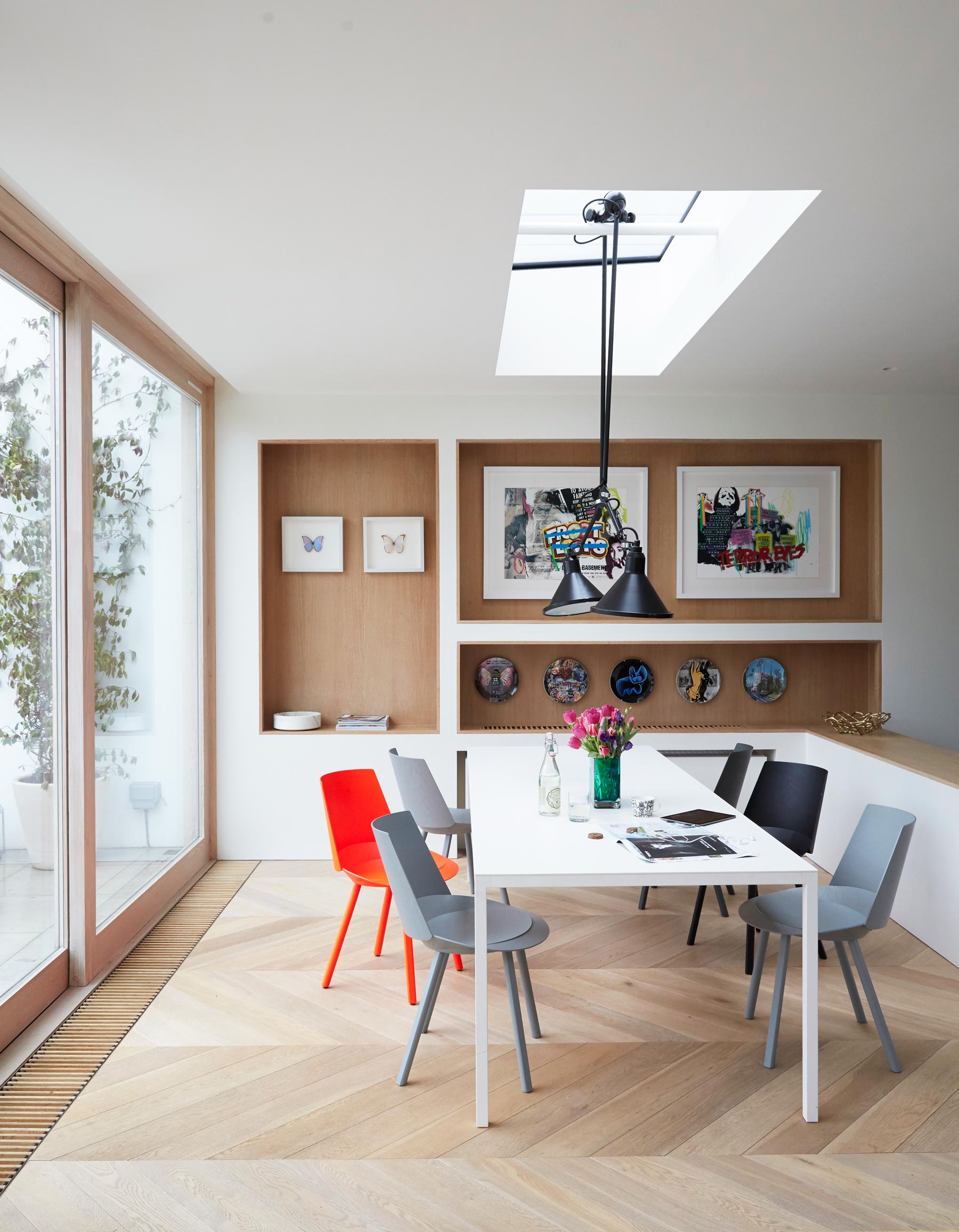
See Also: Statement dining room lighting
STAIRCASE
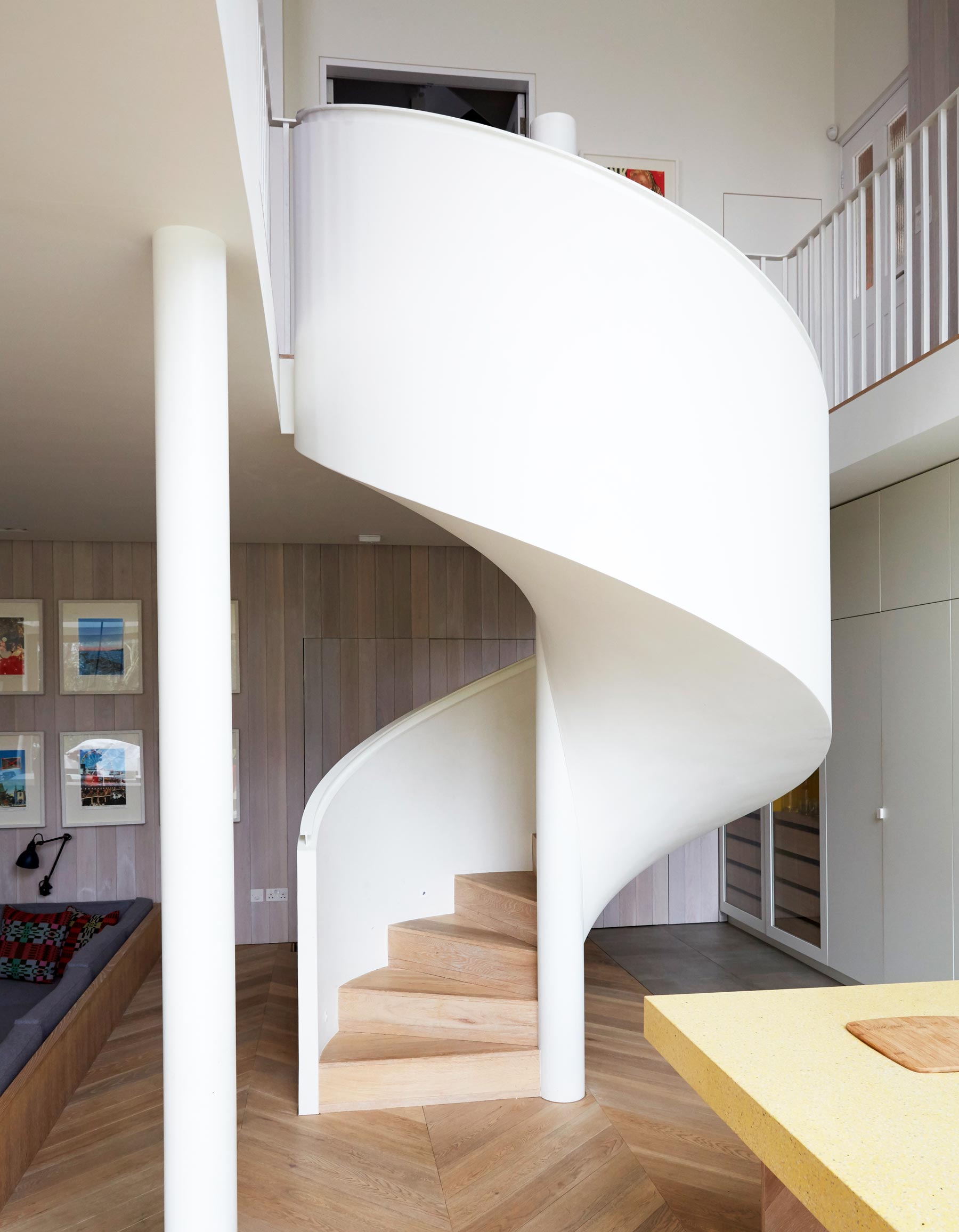
The extension’s strong vertical lines contrast with the organic curves of the stairs, fitted with oak treads and plastered by hand on site.
A spiral staircase, as white and curved as a bleached seashell, flows down from a galleried library to an open-plan living room that’s 100 per cent contemporary.
LIVING ROOM
For a coherent feel, pieces of furniture such as the sofa and some of the lighting were also by Andy. Because he’s also a furniture designer, he thinks in terms of how smaller pieces will fit inside the larger space. So all the proportions just work.
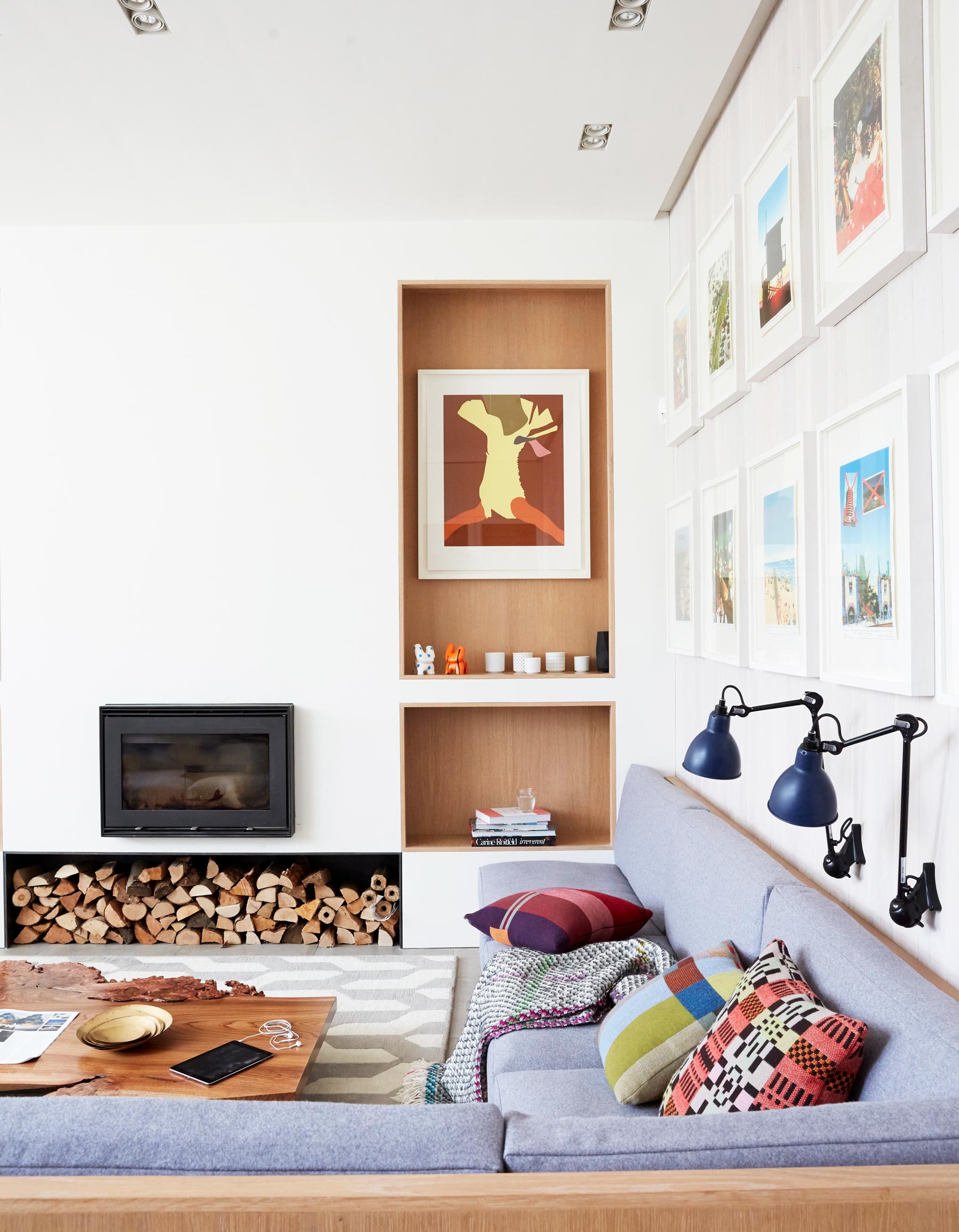
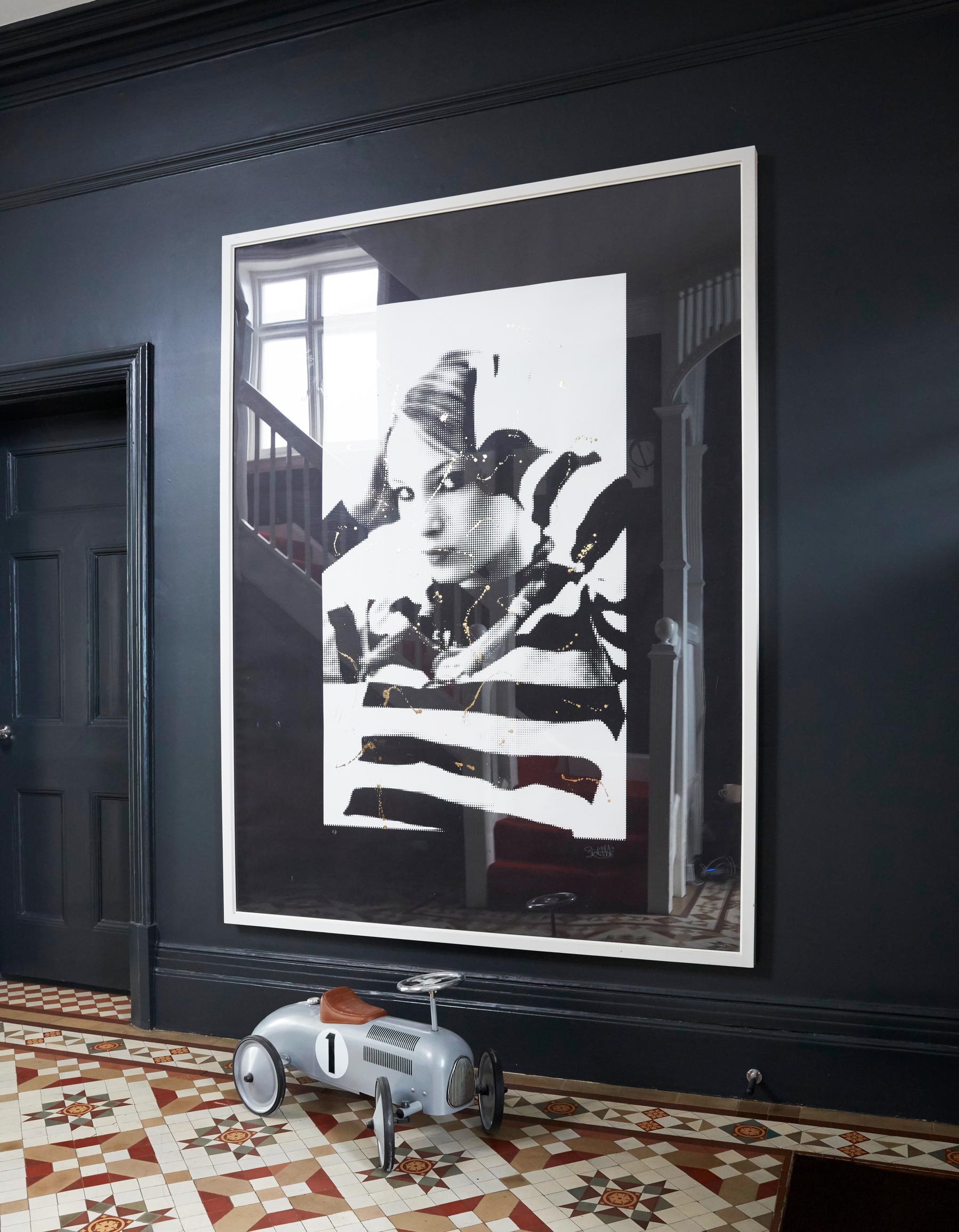
The final ingredient that makes this house zing is the collection of contemporary art and photography. A set of Peter Blake artworks, Chris Floyd photographs and Stuart Semple’s vivacious prints pop up throughout the house.
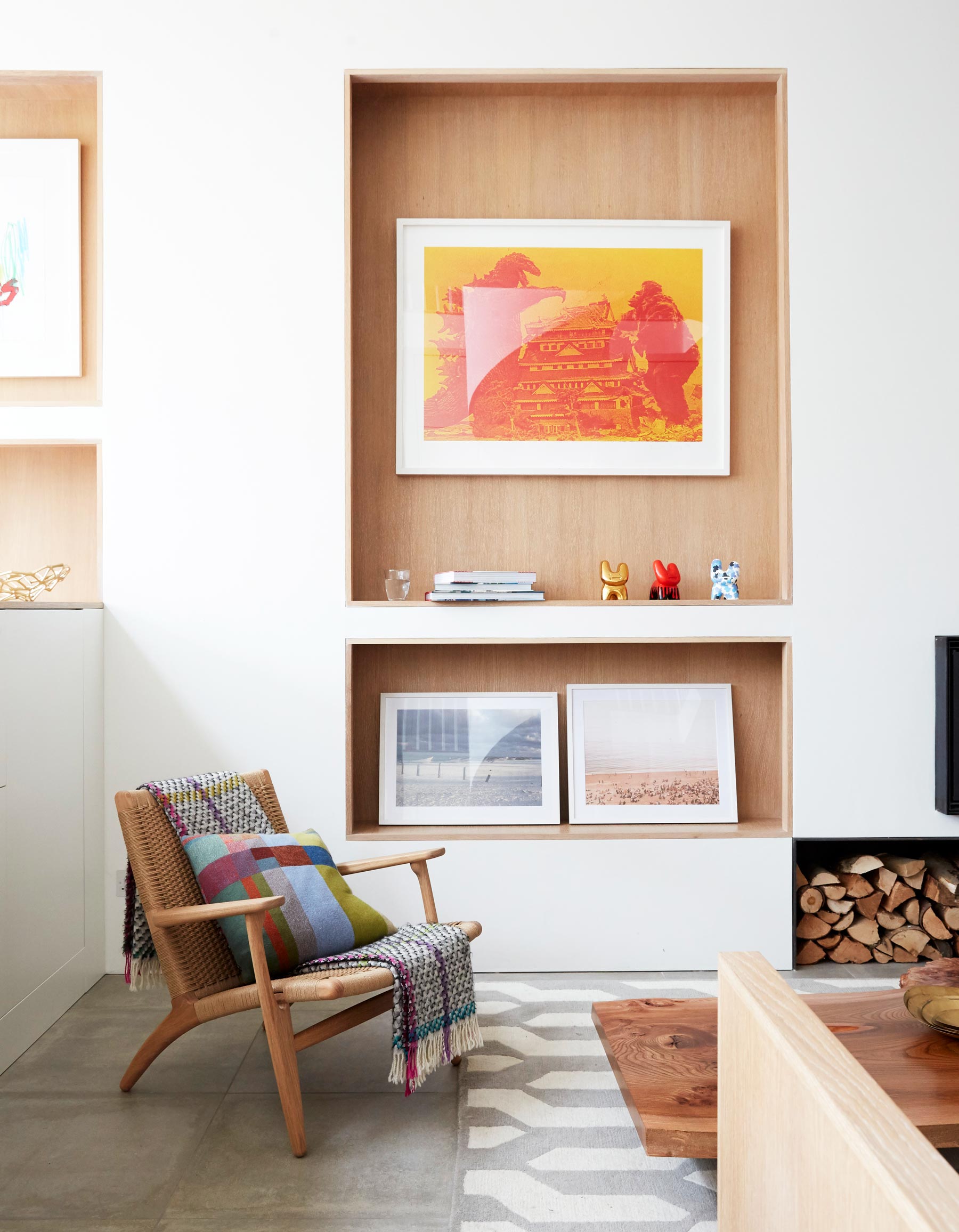
But alongside the statement art and playful architecture, what’s most evident here is the relaxed family vibe.
CINEMA ROOM
There's concealed drinks cabinet behind the wall unit, for once kids have gone up to bed.
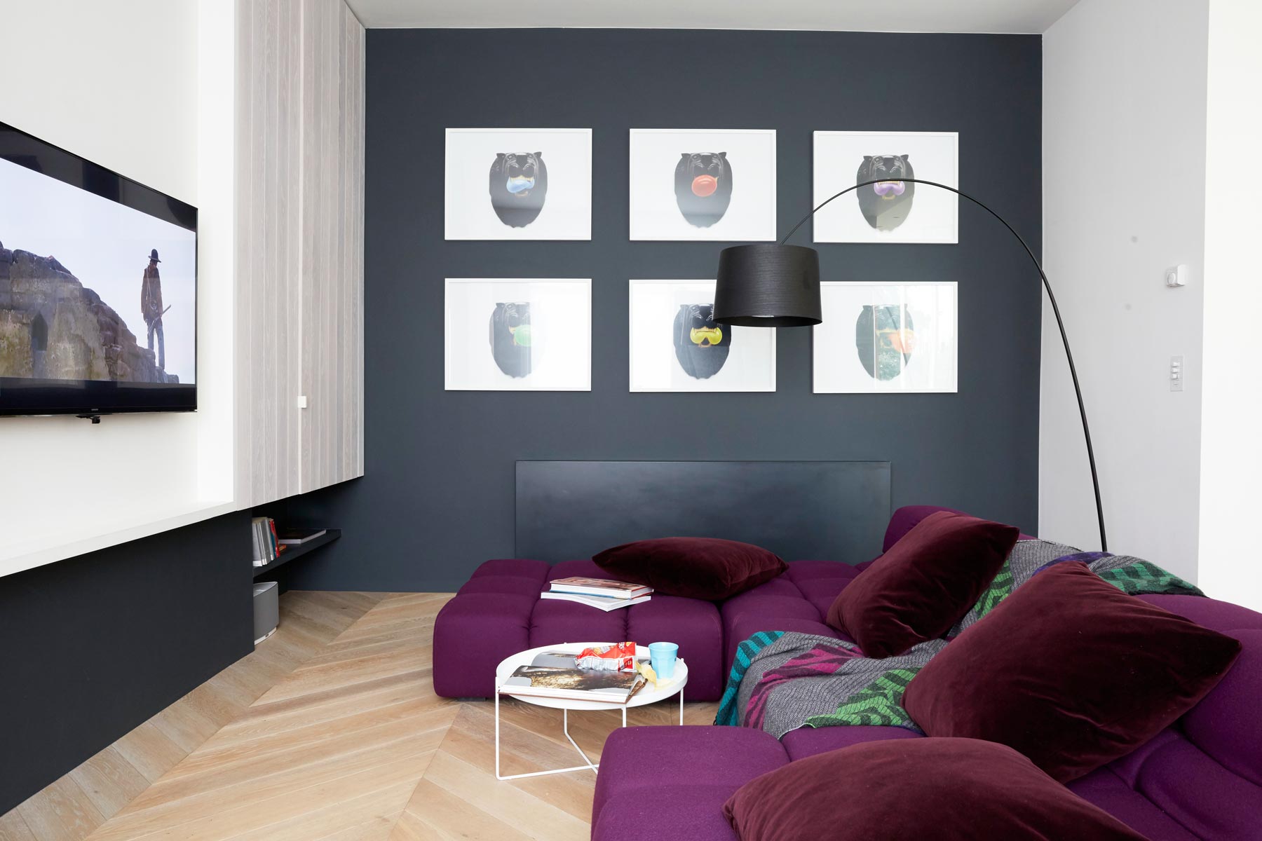
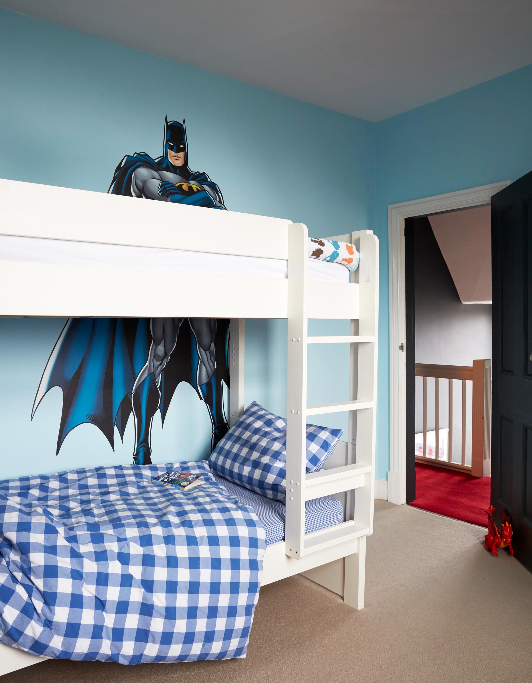
BOYS’ ROOM
Doubling up two kids in one room freed up a separate playroom.
MASTER BEDROOM
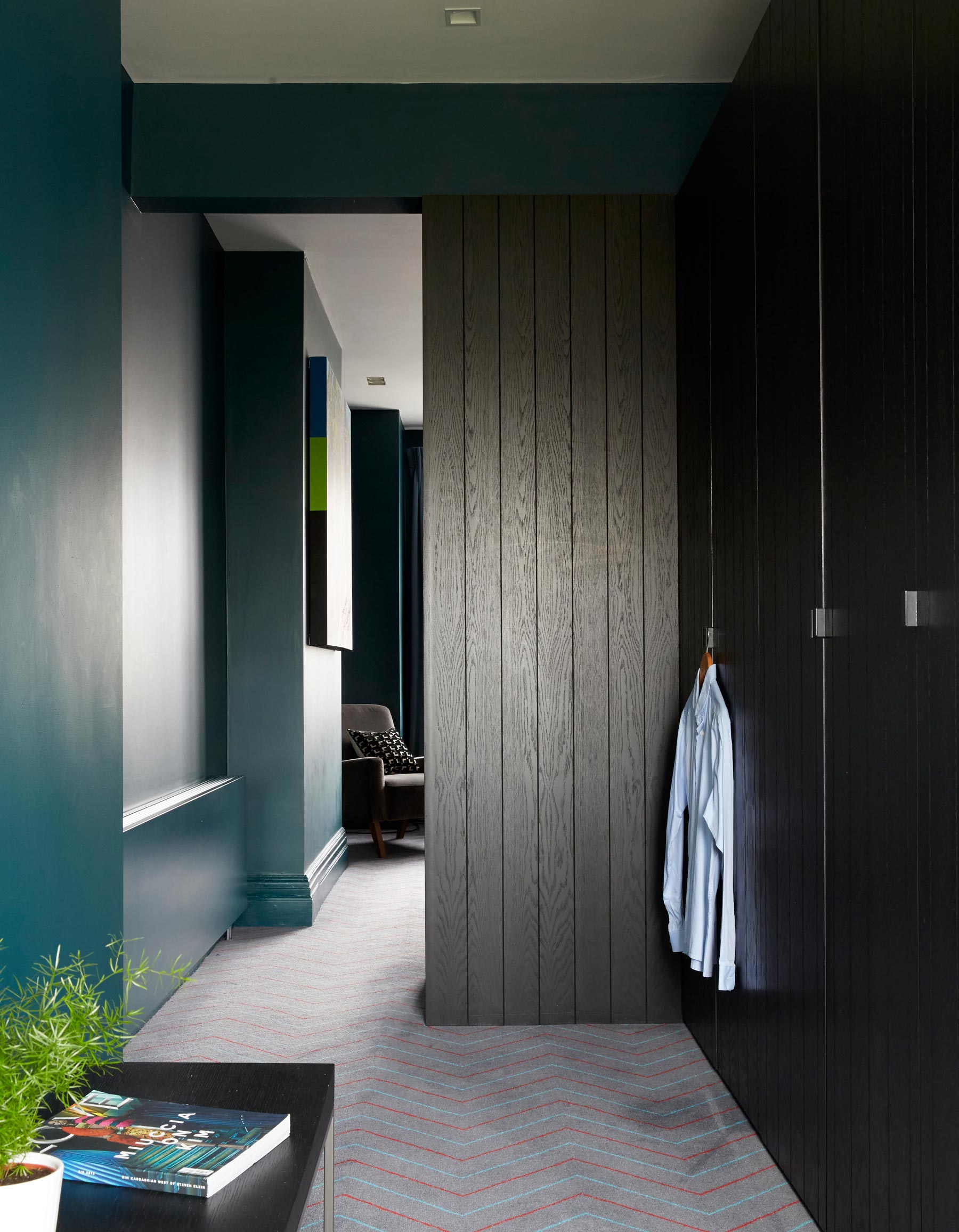
In the master bedroom, high skirtings are worked into a darkly glam space, its surfaces glowing in deep teal, brass and matt-black timber.
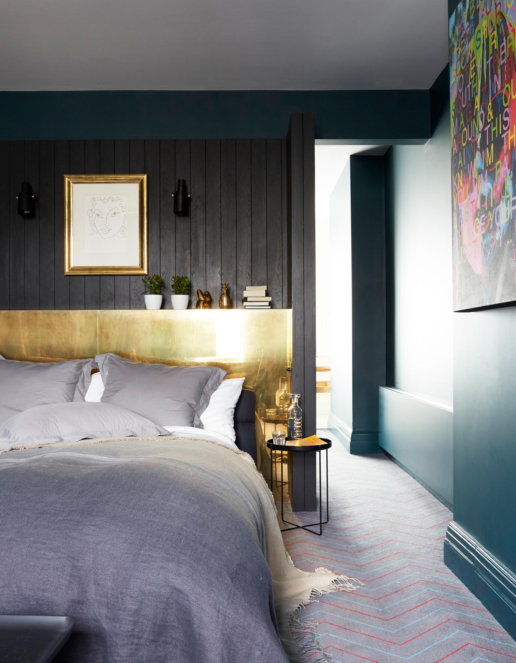
The carpet echoes the herringbone pattern downstairs, subtly linking the different floors and styles.
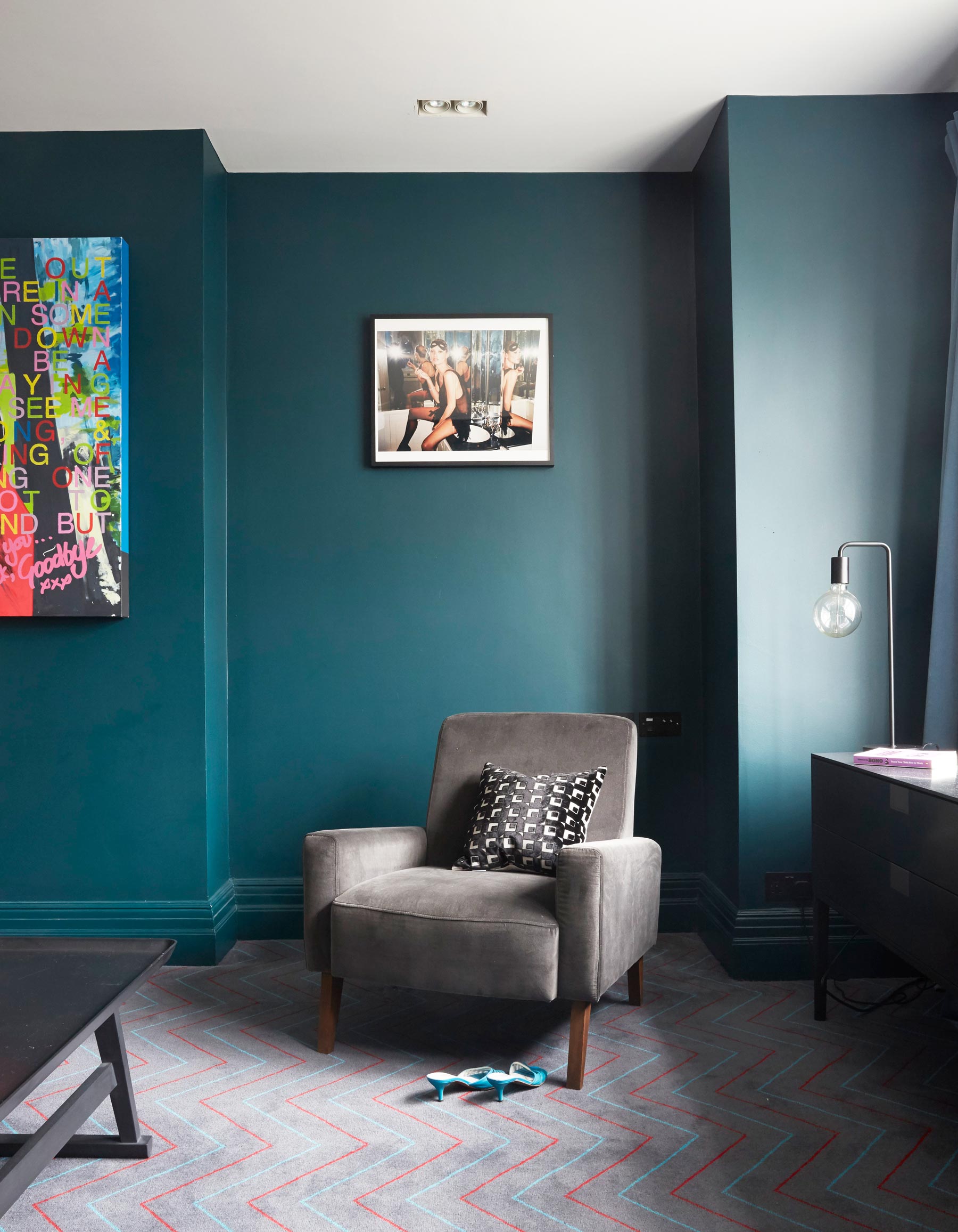
The master bedroom has a smart dressing area too.
BATHROOM
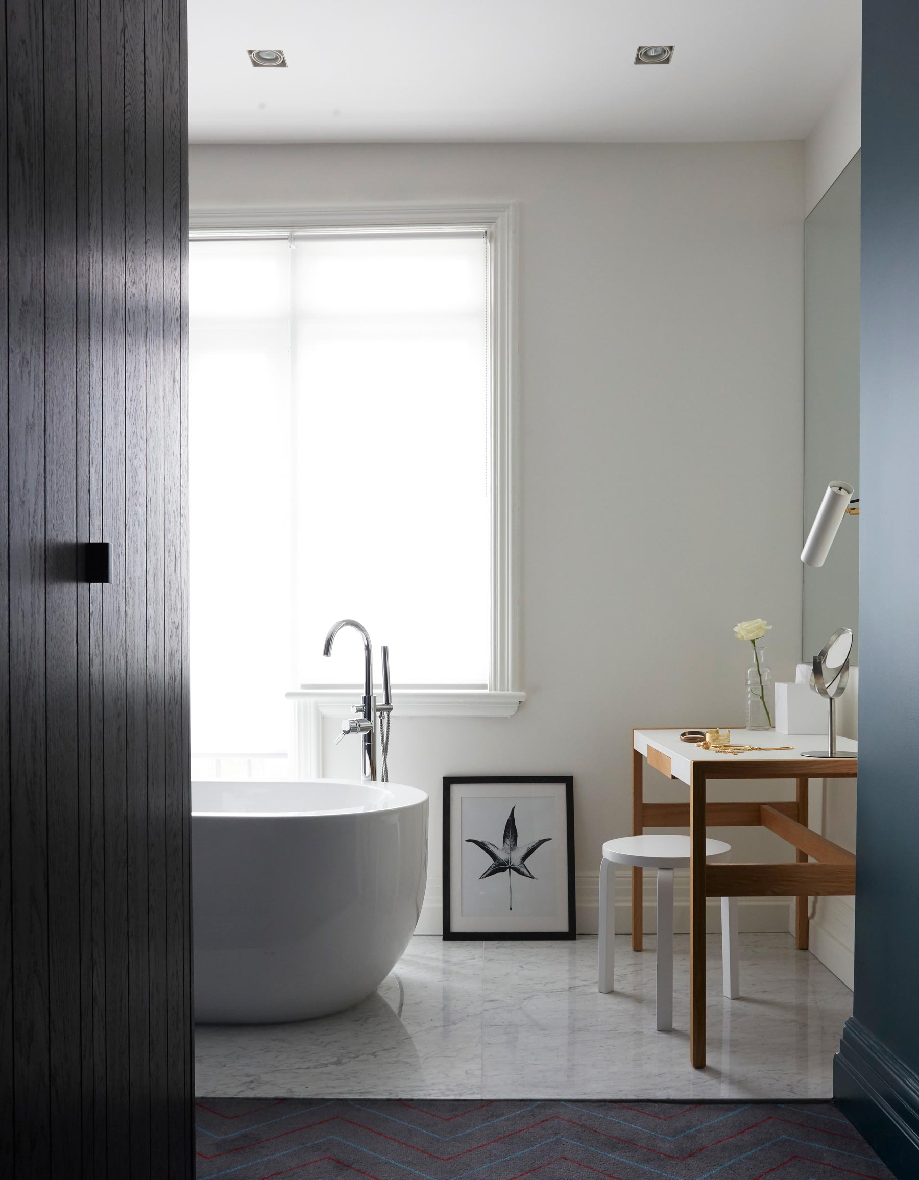
The dressing area leads into the master ensuite, which is separated just by a marble floor.
Andy Martin Architecture: andymartinarchitecture.com
Photography / Paul Massey
See Also: Master bathroom ideas - 19 stunning design ideas for a dreamy master bathroom
The homes media brand for early adopters, Livingetc shines a spotlight on the now and the next in design, obsessively covering interior trends, color advice, stylish homeware and modern homes. Celebrating the intersection between fashion and interiors. it's the brand that makes and breaks trends and it draws on its network on leading international luminaries to bring you the very best insight and ideas.
-
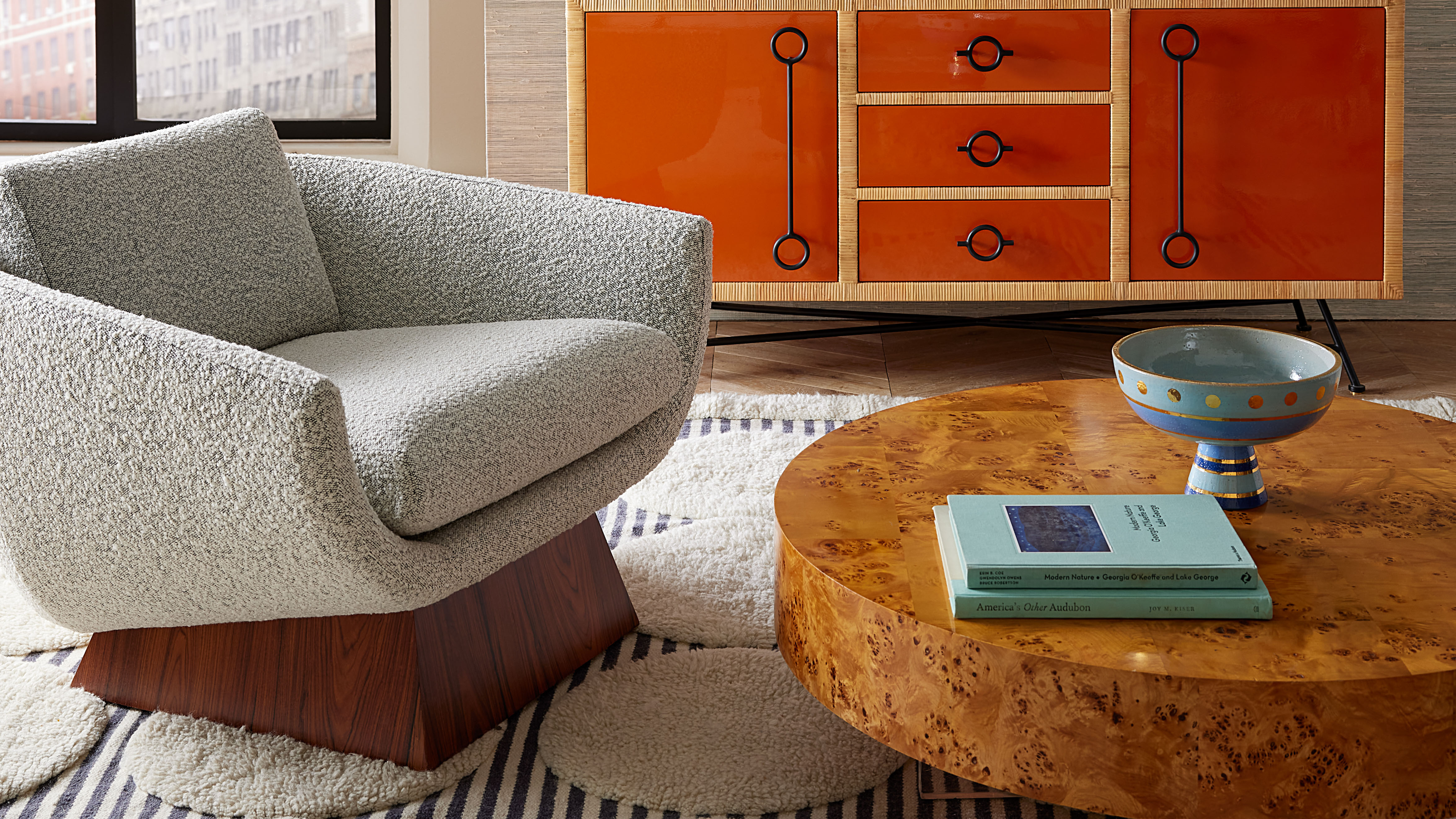 Burl Wood Decor Is 2025’s Most Coveted Comeback — Here’s How to Get the Storied Swirls for Less
Irregularity is the ultimate luxury, but you don’t need an antiques dealer to find it
By Julia Demer Published
-
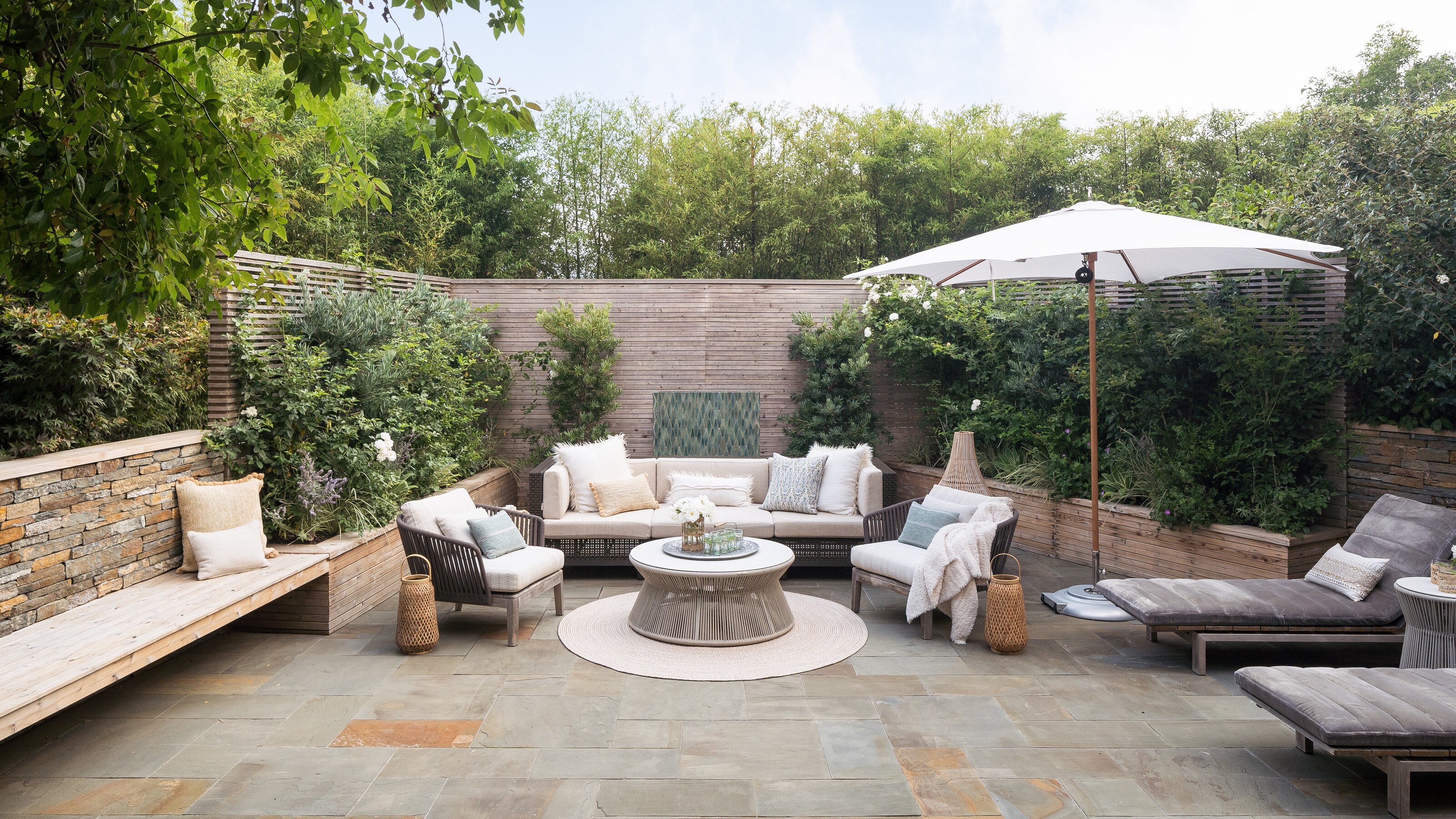 5 Garden Features That Instantly Add Value to Your Home — While Making Your Outdoor Space More Practical, too
Get to know all the expert tips and tricks for making your backyard a standout selling point for your home.
By Maya Glantz Published