

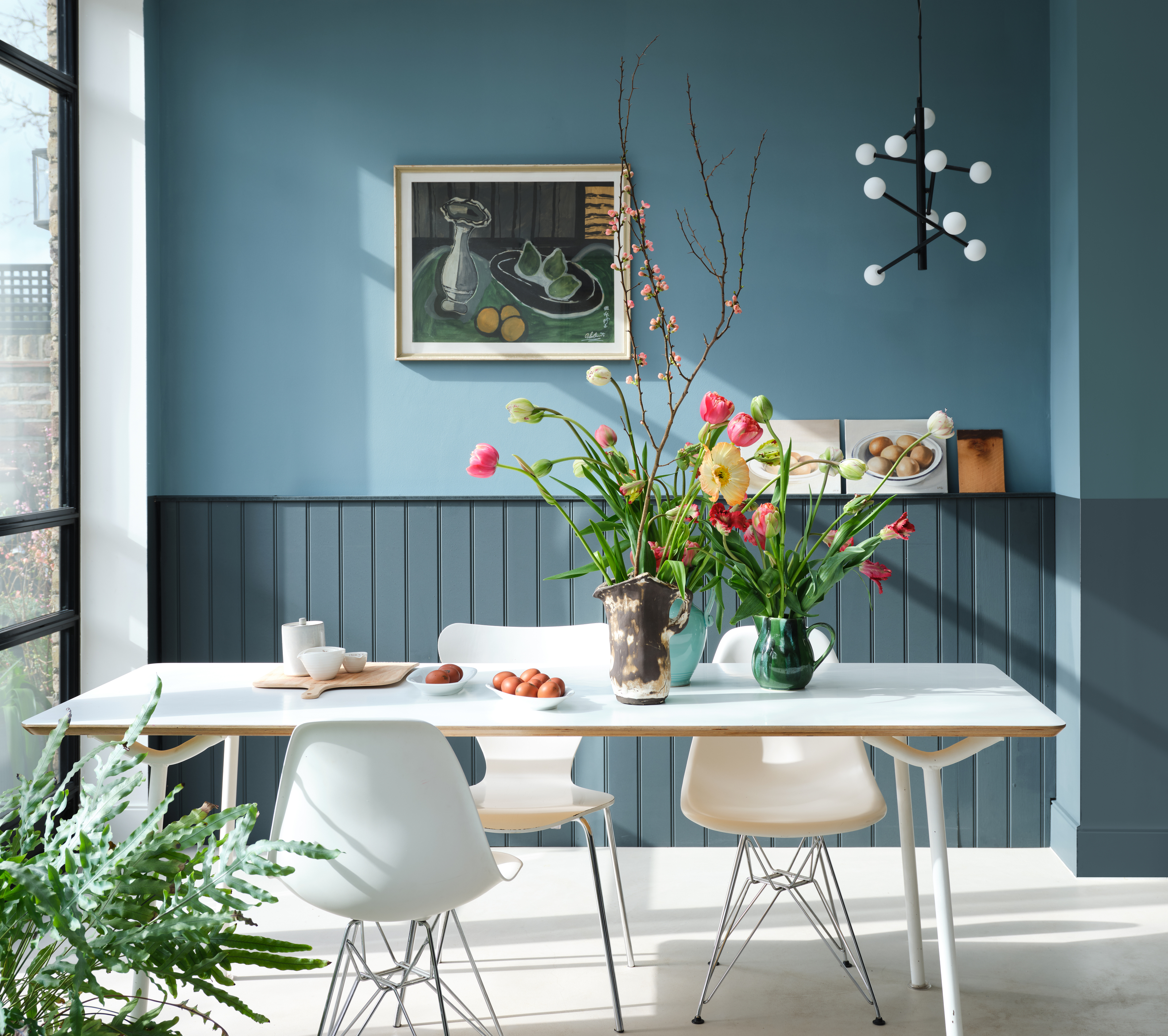
Few things excite the Livingetc team as much as a new launch from Farrow & Ball, and so far in 2025, we've been royally spoiled by the British paint brand. Alongside nine new heritage shades introduced in February, they've unearthed three archive colors that are now readily available once again — shades they think deserve to be part of the color conversation in 2025 (and rightly so).
Generously, Farrow & Ball has always sold its archived paint colors online made-to-order, but this official relaunch — the first of its kind — is a big deal. Not only does it signify that these "old" shades have newfound relevance in the design world, but they're now available to pick up in showrooms and can be sampled more easily. Launching these three hues alongside a wider, new collection also gives us an insight into Farrow & Ball's current curation, offering us a beautiful chroma of color that speaks to the mood of the moment.
So, what can you expect from the new shades, and will they join the prestigious lineup of the best Farrow & Ball paint colors? The shades are Broccoli Brown, Sap Green, and Etruscan Red, and in true Farrow & Ball fashion, they're all classically elegant with a distinctive heritage feel. Like the new hues that were recently released, they're also notably earthy, grounding, and subdued. Here's why they sum up decorating in 2025 so brilliantly, with tips on how to use them.
Broccoli Brown

This mid-tone brown was an original shade, first launched when Farrow & Ball was founded in 1946.
If there's one color trend that's proved consistently popular in the past five years, it's brown. Quiet luxury, minimaluxe, the retro revival — so many important design movements have brown tones at their heart, and this timeless color will endure for years to come, too.
It's hardly surprising, then, that Farrow & Ball have given Brocolli Brown a permanent position on its paint roster. In a recent video, the brand's ambassador and color expert, Patrick O'Donnell, commends this livable shade for its versatility. "It's a little bit stronger than 'Mouse's Back' but it's still got a very usable quality," he says, recommending it for kitchen cabinetry or walls for a cozy, moody space.
"In a time when warm, natural neutrals are overtaking cooler grays, Broccoli Brown offers an alternative that feels grounding rather than dull," explains interior designer Nina Lichtenstein, who notes that this nuanced shade avoids feeling too flat. "In a study or library, Broccoli Brown creates a cocooning effect that pairs beautifully with warm woods and brass accents, or use it as a kitchen cabinet color where it exudes an Old World charm, especially when paired with cream walls and marble countertops."

Price: £5.50/sample
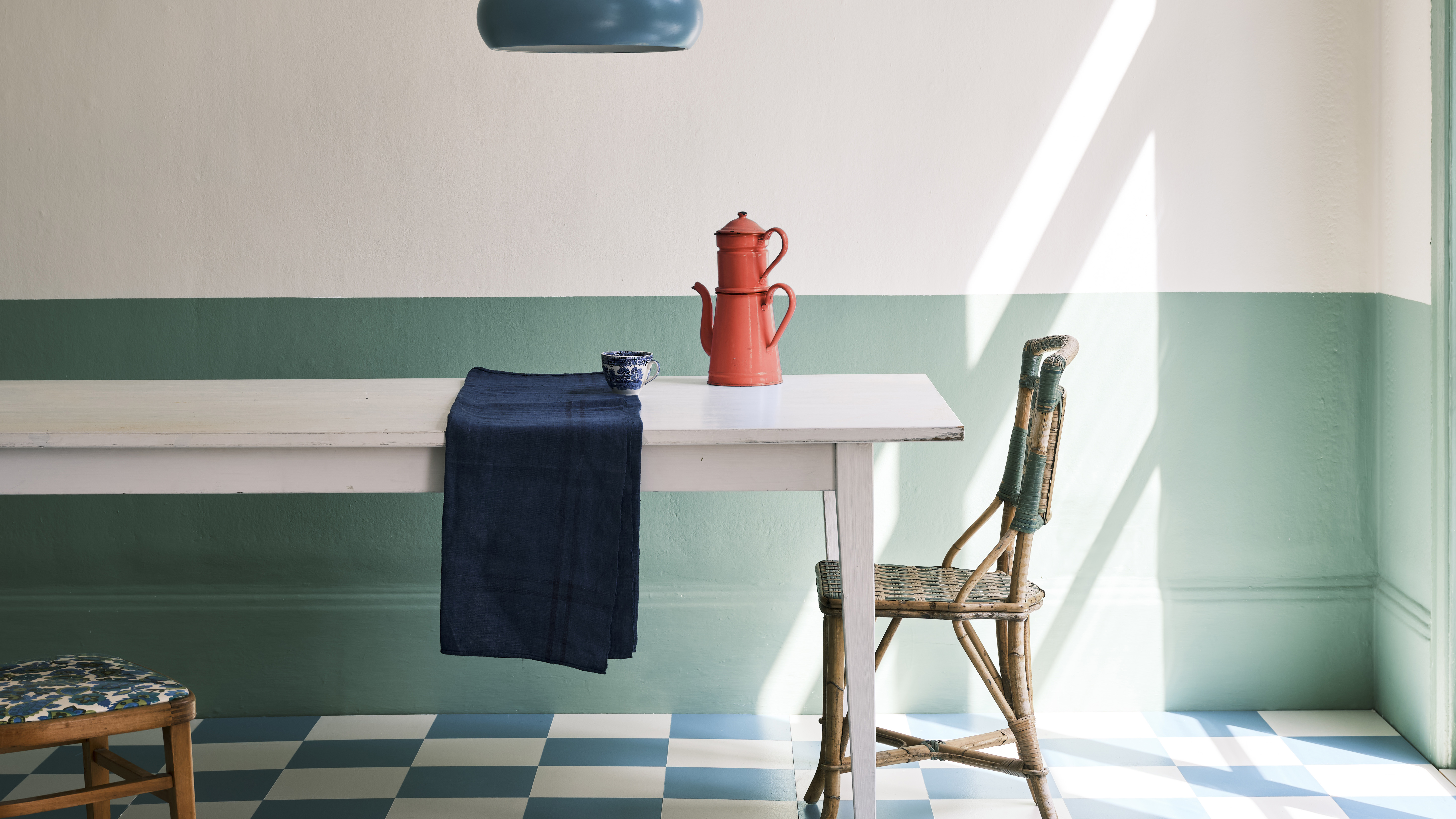
Sap Green

This verdant color brings vibrancy to your walls, breathing new life into a stale space
Biophilic influences have had a firm hold over the design world of late. Ever since the pandemic, there's been a move toward grounding, nurturing spaces, and few colors deliver that as expertly well as nature's green thanks to its serene qualities.
If, however, you've grown tired of sage, you'll be pleased to hear that mid greens are now the talk of the town instead, which makes the reintroduction of Sap Green from Farrow & Ball all the more relevant. Patrick recommends this verdant shade if you're looking for more vibrancy in your interiors, describing it as a "slightly sharp, sort of acid-olive" shade. "It makes a lovely drawing room color," he says. "Very elegant, very smart."
Despite decorating with green being so ubiquitous and bordering on overuse, Nina says Sap Green stands out because of its liveliness. "It’s not too muted, not too bright, but just the right balance of warmth and saturation," she says. "It creates an instant connection to nature, especially in a kitchen with natural wood shelving or stone countertops."

Price: £5.50/sample
Etruscan Red

This rich red is so on-trend right now, and it makes a great choice for characterful kitchen cabinets
Deep burgundy reds have been a huge trend so far in 2025, cropping up across various color of the year announcements, so Etruscan Red's prodigal return feels especially relevant.
Patrick calls it his personal favorite, revealing that it was the first Farrow & Ball color he ever used, back in 1994, to decorate his kitchen. He calls the color an "un-red" akin to oxblood. "It has lots of brown through it, so it's really muted and really restrained," he says. "It gives you warmth and saturation of color without screaming too much."
If you want to embrace red but feel put off by fiery, true red hues, this quieter iteration is far more forgiving. It doesn't have that "pillar box quality" — as Patrick puts it — that was popular with 2024's "unexpected red" theory. Instead, it's reminiscent of a rich, warm mulberry.
As Nina puts it, "Red can be a tricky color in interiors, but Etruscan Red gets it right". "Inspired by the hues found in ancient Italian pottery, this shade has an earthy, sunbaked quality rather than the overt brightness of a true red," she goes on. "It leans terracotta but with a refined, slightly muted quality that makes it incredibly livable."

Price: £5.50/sample
Decorating in 2025 draws some of the core trends of the past five years together: natural influences, warmth and comfort, and grounding earthy tones that nurture the soul. The return of these three archived Farrow & Ball shades — Broccoli Brown, Sap Green, and Etruscan Red — represents just that, encapsulating those ideas beautifully.
As Nina summarizes: "These shades don’t just follow trends; they tap into something deeper: a desire for authenticity, warmth, and a sense of place inside our homes."

-
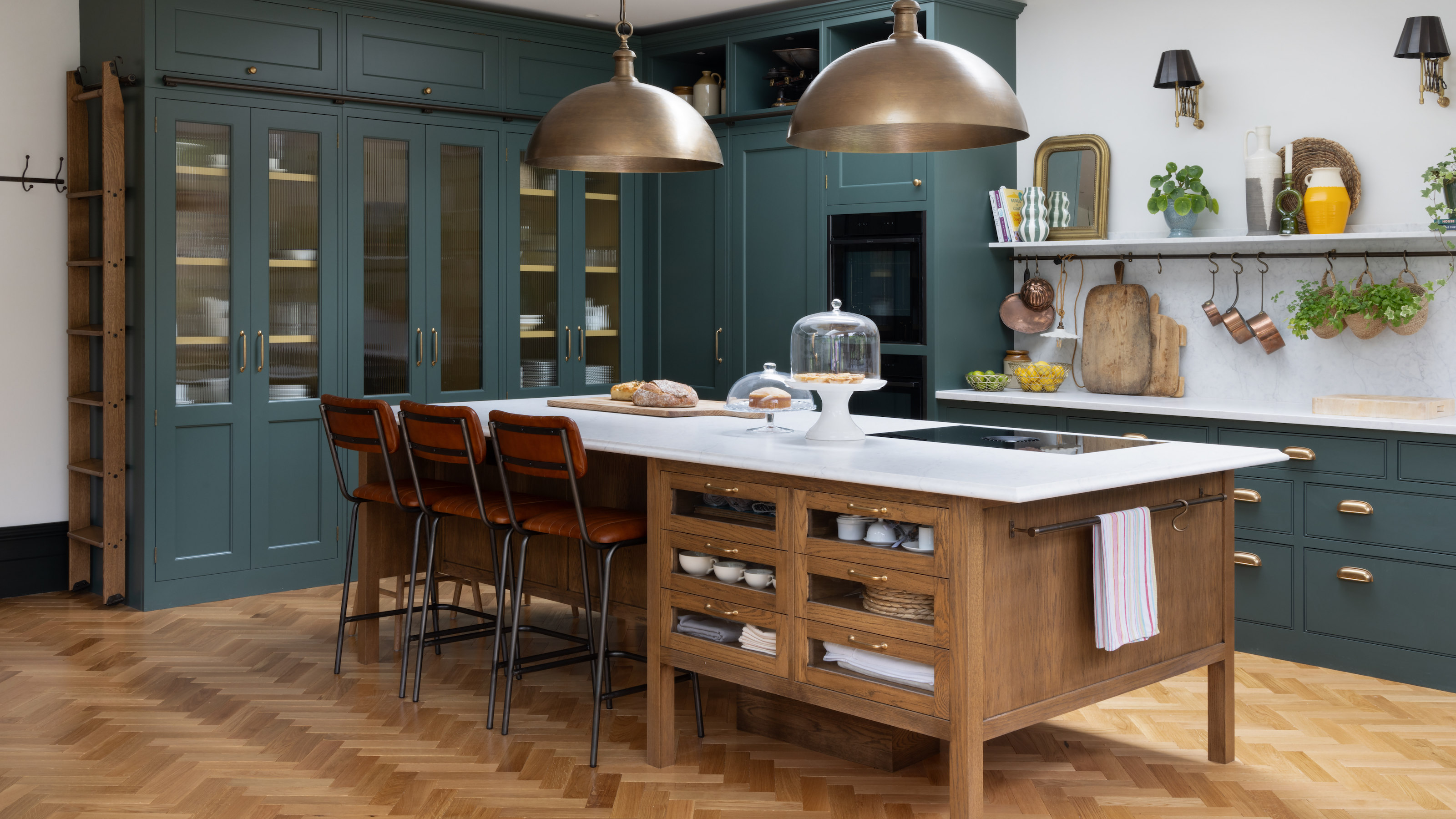 10 Ladder Kitchen Cabinet Ideas That Make the Most of High Storage and Make Your Scheme Feel Classy
Rail ladders in a kitchen have a sort of elegance to them that's hard to ignore, but they're also practical for storage, too
-
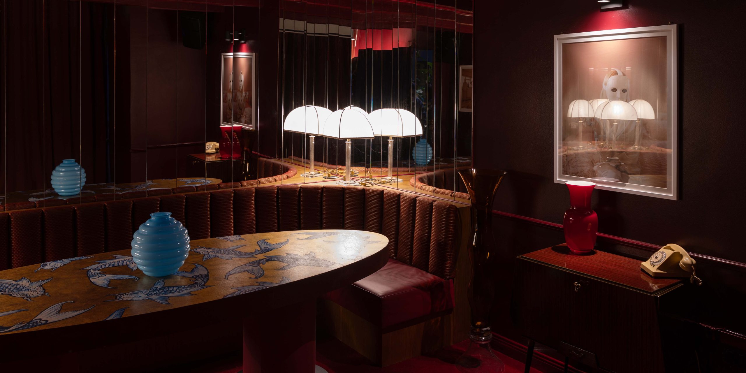 The Best Bars in Milan — 8 Instantly Iconic Drinking Spots You'll Regret Not Knowing While Planning a Camera Roll-Worthy Aperitivo
In the Italian design capital, it's always cocktail o'clock. But what are the best Milan bars? Scroll to discover our style-led edit


-
 12 new Farrow & Ball paint colors that launch today – including an off-white we predict everyone's going to use
The new collaboration with fashion designer Christopher John Rogers is full of exuberant, cheerful colors – but we've got our eye on one new neutral in the bunch in particular
-
 Farrow & Ball has just launched a new paint – and it's going to change how you think about painting your walls
Perfect for rich, color-drenched spaces, Dead Flat is an ultra-matte finish with just a 2% sheen
-
 Bold reds are a big new design trend so Farrow & Ball's Joa Studholme explains how to use it
Red tones are trending, but why are they set to dominate designs in 2023? And how should we be using them to decorate?
-
 Farrow & Ball's new colors have just launched – we ask designers how to use this calm, yet colorful palette
The new color range from Farrow & Ball captures the mood of 2023 perfectly. These interior experts explain how they plan to use them in their designs
-
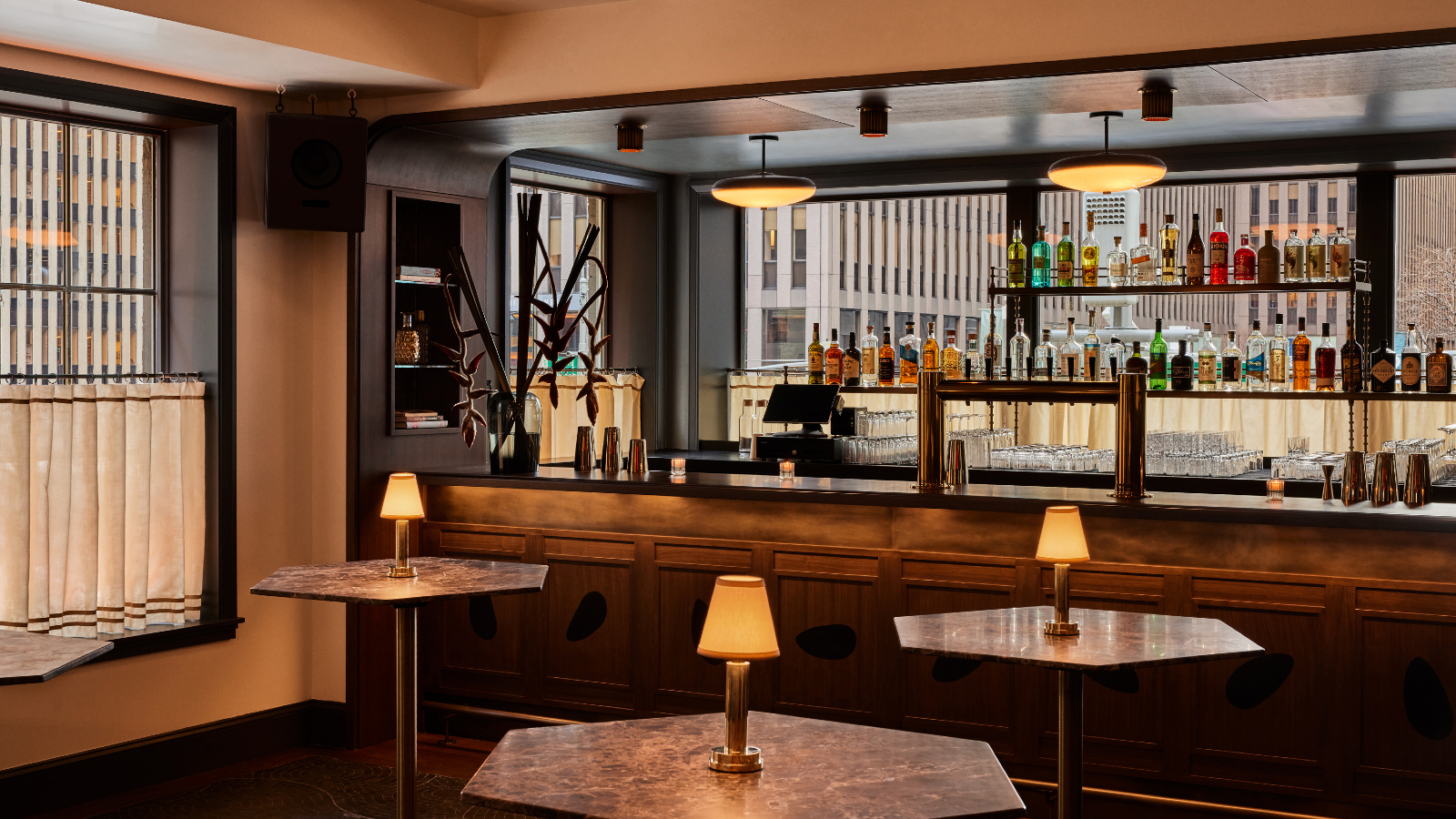 The Farrow & Ball paint in this New York bar will make you look good
Manhattan’s hot new hangout will make you look as good as possible – and you can recreate its aura in your home
-
 Farrow & Ball has predicted the exact green shade that will be big news in 2022
Their color curator has named the tone that will set trends in the year ahead – this is how to get ahead of the craze
-
 Farrow & Ball's Joa Studholme reveals the new neutral shade that will set the tone for 2021
The color curator urges us to look beyond beloved gray tones and embrace a stylish & subtle new hue


