This simple flooring trick makes a narrow space seem wider – the architect behind it explains how
This simple tiling idea tricks the eye into thinking a narrow living space is larger than it really is. This architect explains how it's done

Anyone who has to contend with narrow areas in their small home will, at times, long for more space. For most of us, the idea of a sprawling interior with ample room is nothing but a pipe dream, but luckily there are some clever design tricks that can make your space seem bigger - and this home has one up its sleeve that you'll want to know about.
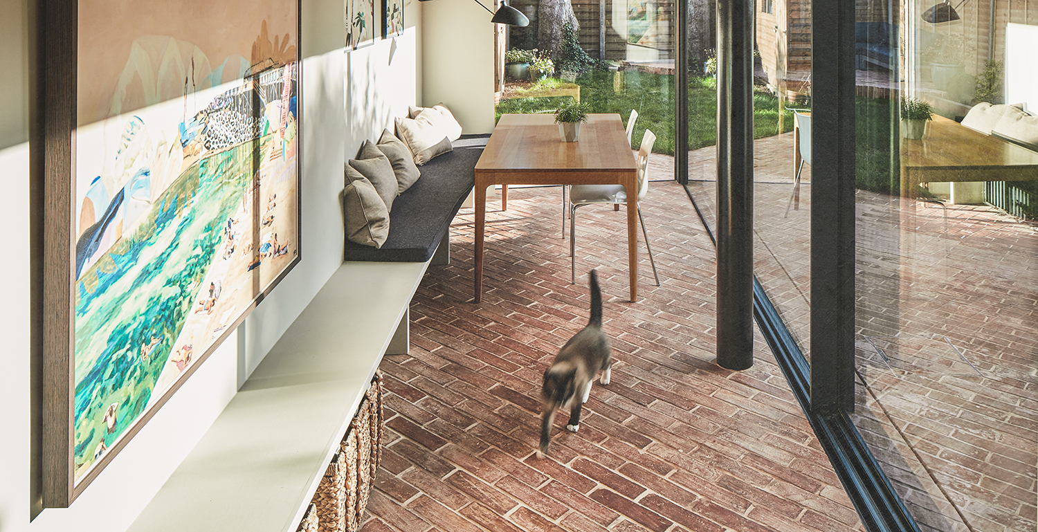
This narrow house belongs to a family of four who wanted to maximize space. They called in the help of Rees Architects who redesign a cohesive ground floor for the owners to entertain friends and family throughout their modern home more comfortably. For us though, the star of the show is the use of diagonal floor tiles in the narrow conservatory extension which has the effect of making the space seem far bigger than it really is. Here, we asked them to share their design secret in more depth.

Lilith is an expert at following news and trends across the world of interior design. She has an eye for appealing designs and interesting spaces which she regularly shares with readers through home tours, such as this one. After chatting with the architect's behind this project, she was keen to impart their clever design trick that makes this small home look bigger.
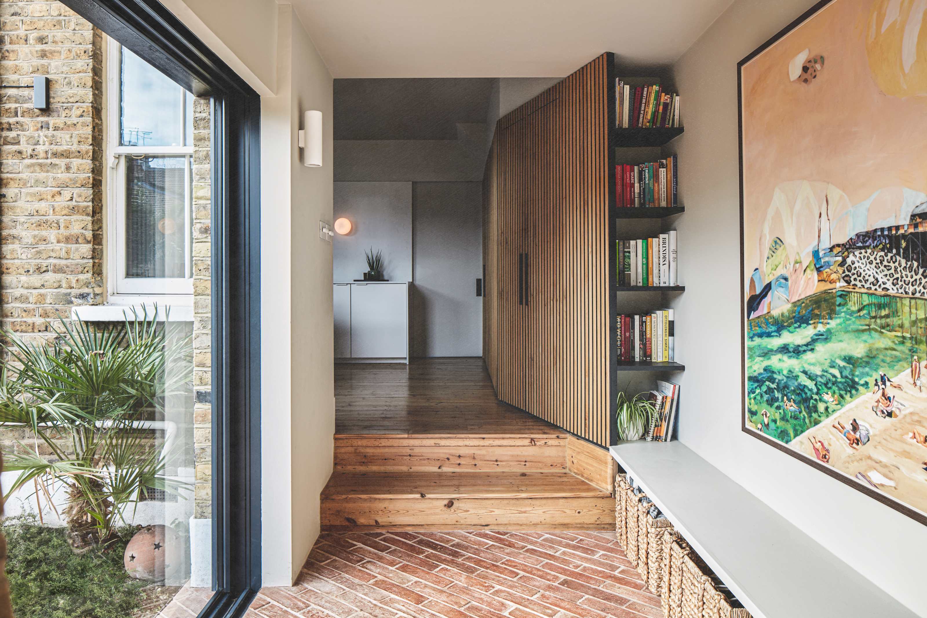
The trick in question? Using diagonal kitchen floor tiles in their narrow addition which is used as an open-plan seating and dining area. Not only does the unique idea offer an intriguing design to draw the eye, but it makes the small floor space look wider than it really is.
It's also a continuation of the flooring on the outside patio, bridging the gap between interior and exterior to help bring the outdoors in. 'The diagonal orientation of the floor finish is a direct connection from the adjacent patio,' explains Daniel Rees, Managing Director at Rees Architects. 'The patio was purposely designed on an angle to cut through the backyard and building, drawing your eye through the glazed part of the addition and making both feel like one space.'
So how does this clever illusion work? Well, floor types are actually one of the best ways to play with perception. As the biggest surface area of a room that we first lay eyes upon, patterned tiles can contribute a lot to a space. Just as horizontal lines can make a surface look wider, and vertical lines give the illusion of length, horizontal lines carry the eye across as our minds anticipate the continuation of the pattern. Combine that with the impact flooring has on design, and you can trick the eye into thinking a space is larger than it really is.
In this home, the transitional-style design connecting out and in also plays a part. 'Using the same material on the inside and the outside, without a step, immediately draws your eye past the full-height glazed doors and window into the garden,' says Daniel. 'The narrowness of these tiles enhances this, as there are more lines to accent the direction, making you feel like you are in a bigger space than you really are.'
The choice of slim terracotta tiles compliments the muted tones used within the neutral color scheme while also echoing the brick walls of the home's exterior.
Be The First To Know
The Livingetc newsletters are your inside source for what’s shaping interiors now - and what’s next. Discover trend forecasts, smart style ideas, and curated shopping inspiration that brings design to life. Subscribe today and stay ahead of the curve.
As Daniel explains: 'The design of the project uses different natural materials to give a warm, sophisticated and timeless aesthetic to the house. Terracotta tiles are used in this area as they are a hard-wearing material that is suitable for both inside and outside, but also give a similar warmth, tactility and depth to the stone, brick and wood materials used elsewhere.'
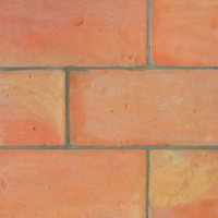
Terracotta tile, Stone Tile Depot
For a timelessly beautiful floor, terracotta tiles are the way to go, and these ones from Stone Tile Depot are an excellent choice. They add a warm Meditteranean feel to any room and can be arranged in a pattern to fit your space and dimensions.
If you're wanting to try out the technique, Daniel suggests using it in spaces that are directly related to a backyard, especially when connected with larger windows or bi-fold doors, such as a sun room, backyard studio or orangery.
'I would avoid using it in a kitchen as the grout lines and slightly rough surface of the tiles aren't the easiest to clean grease from,' he adds. 'However, they are suitable for muddy boots, entryway mudrooms could also be a good location.'
To really play on the idea of maximizing space, Daniel's tip is to run the materials in the direction you want to feel wider to draw your eye and connect spaces.
The rest of the house
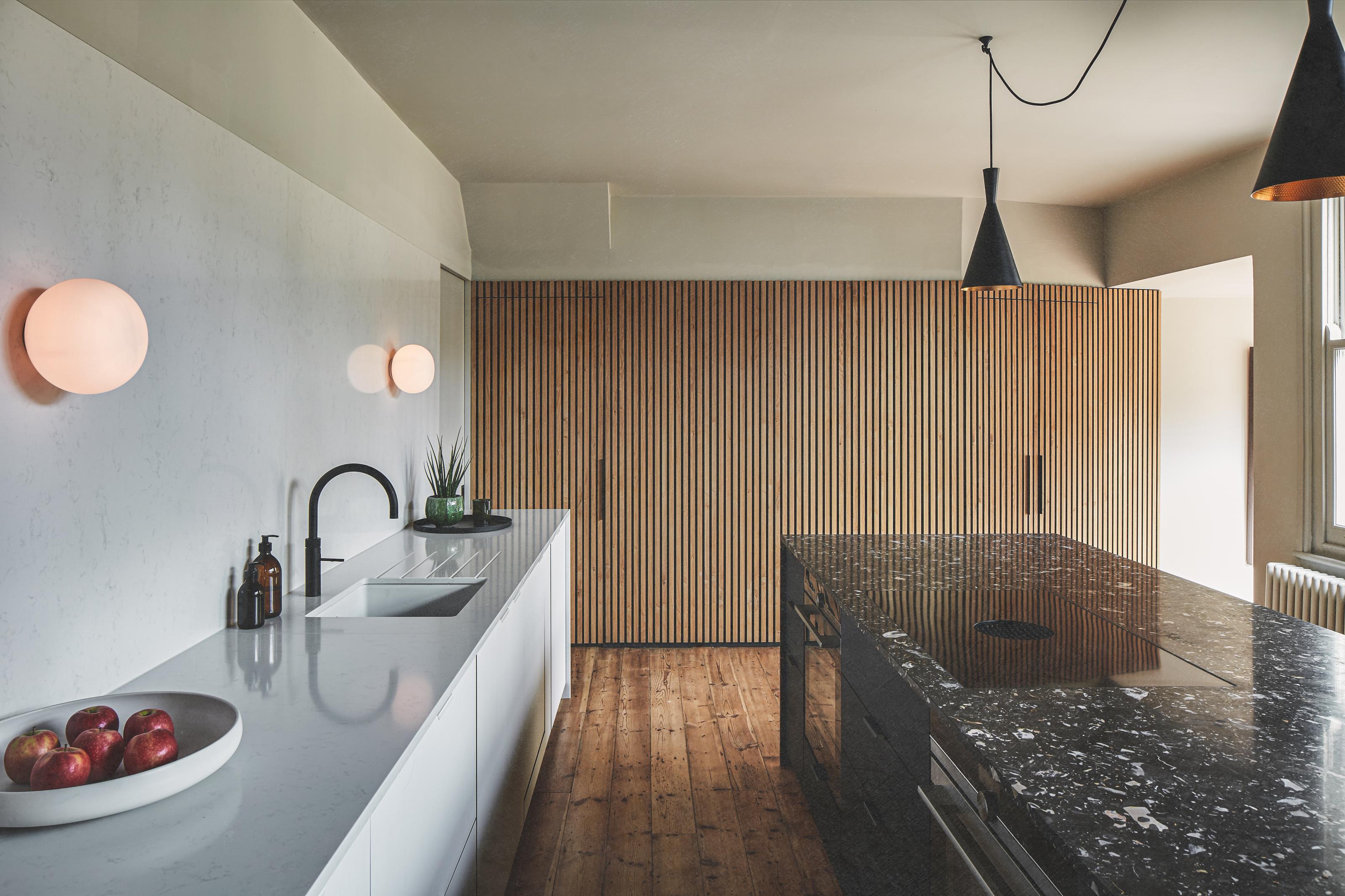
In fact, the rest of the house is full of design ideas too. The monochrome palette in the large minimalist kitchen is warmed up by different textures and materials, such as the oak cladding cabinets that lead down into the extension.
The black granite island and white kitchen countertops show how two-tone kitchens can be done in way that feels complementary - both surfaces have the same level of gleam.
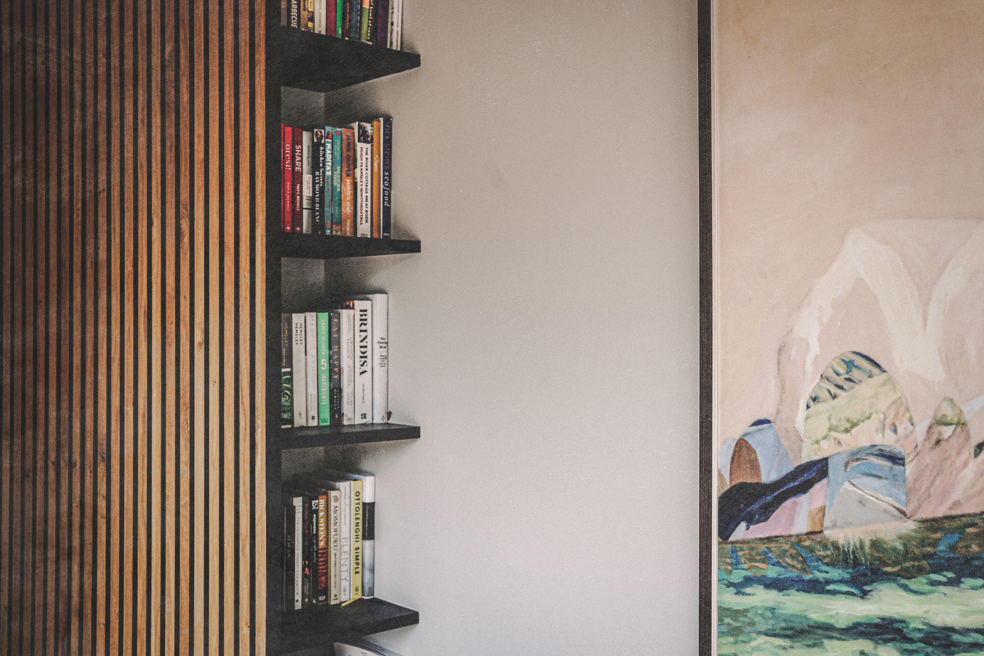
Clever space-saving storage solutions feature throughout the home, such as this slim bookshelf nestled in the corner of the cabinets. The simple black lines of the shelving are a good example of how a pared-back design can prove that less is more.
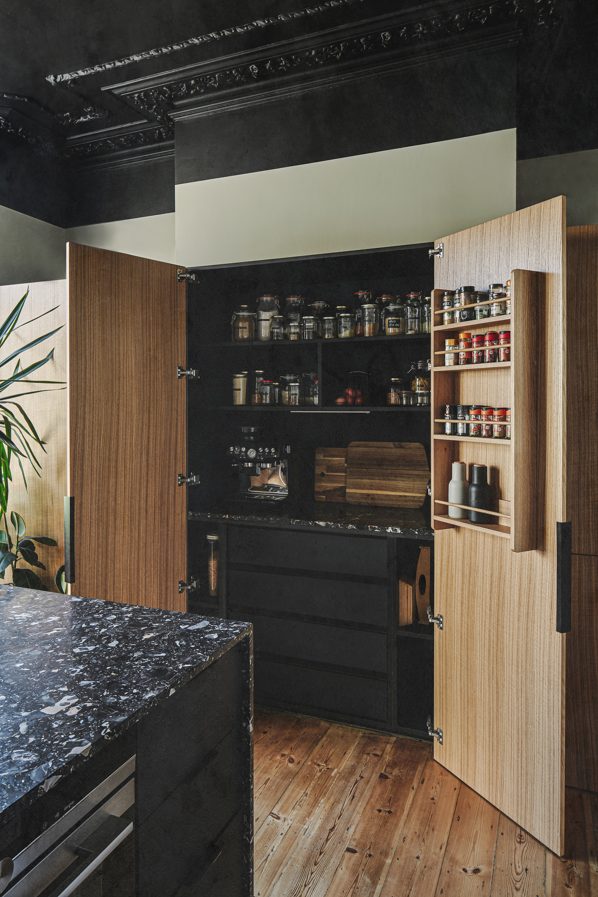
A built-in pantry helps to keep this kitchen organized and the recessed storage is an excellent way of freeing up floor space.
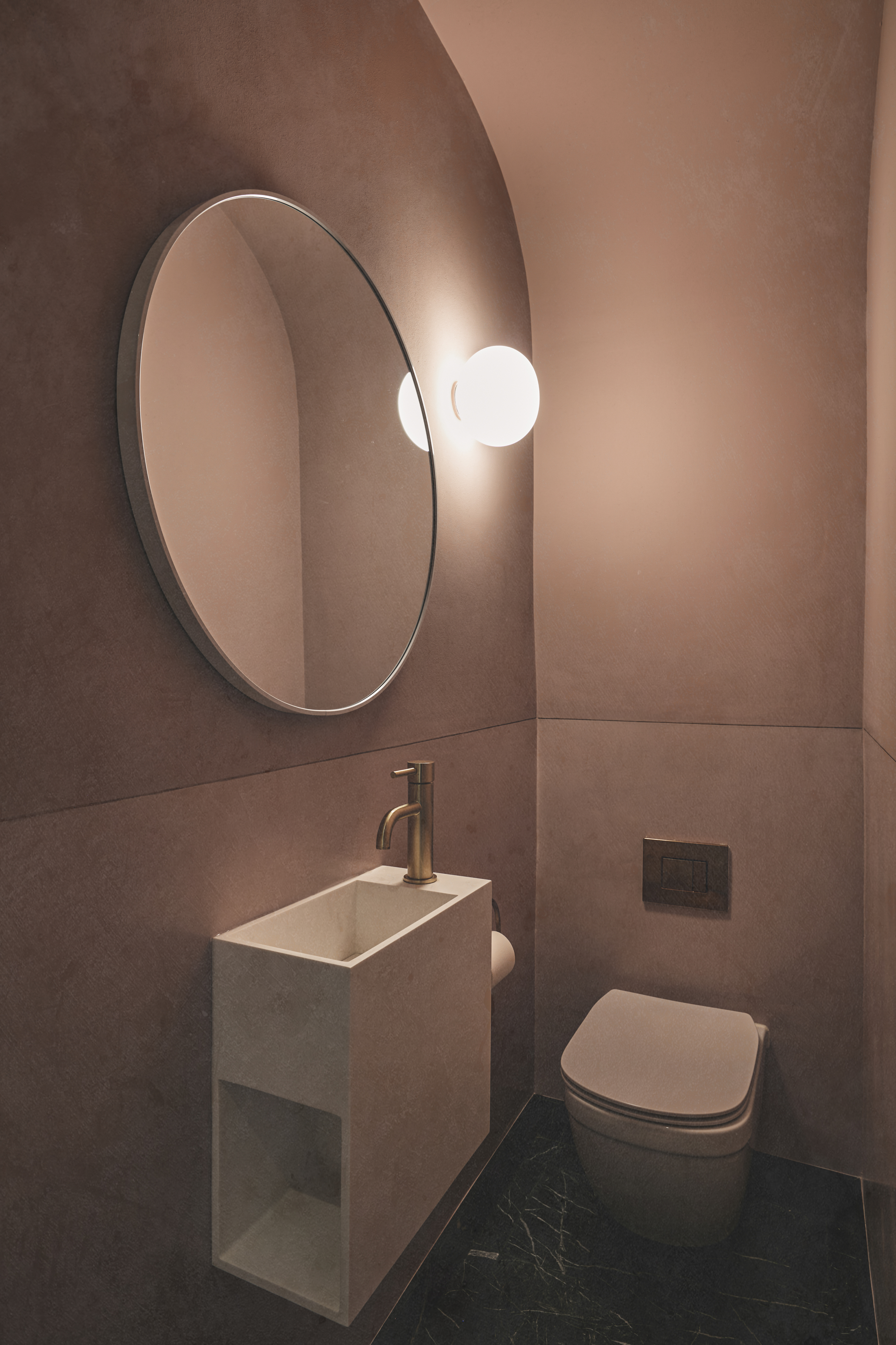
The decision to color-drench this powder room in a dusty pink is yet another trick to make a small space seem bigger. A wall-mounted sink also frees up the limited floor space available.

Lilith Hudson is a freelance writer and regular contributor to Livingetc. She holds an MA in Magazine Journalism from City, University of London, and has written for various titles including Homes & Gardens, House Beautiful, Advnture, the Saturday Times Magazine, Evening Standard, DJ Mag, Metro, and The Simple Things Magazine.
Prior to going freelance, Lilith was the News and Trends Editor at Livingetc. It was a role that helped her develop a keen eye for spotting all the latest micro-trends, interior hacks, and viral decor must-haves you need in your home. With a constant ear to the ground on the design scene, she's ahead of the curve when it comes to the latest color that's sweeping interiors or the hot new style to decorate our homes.
-
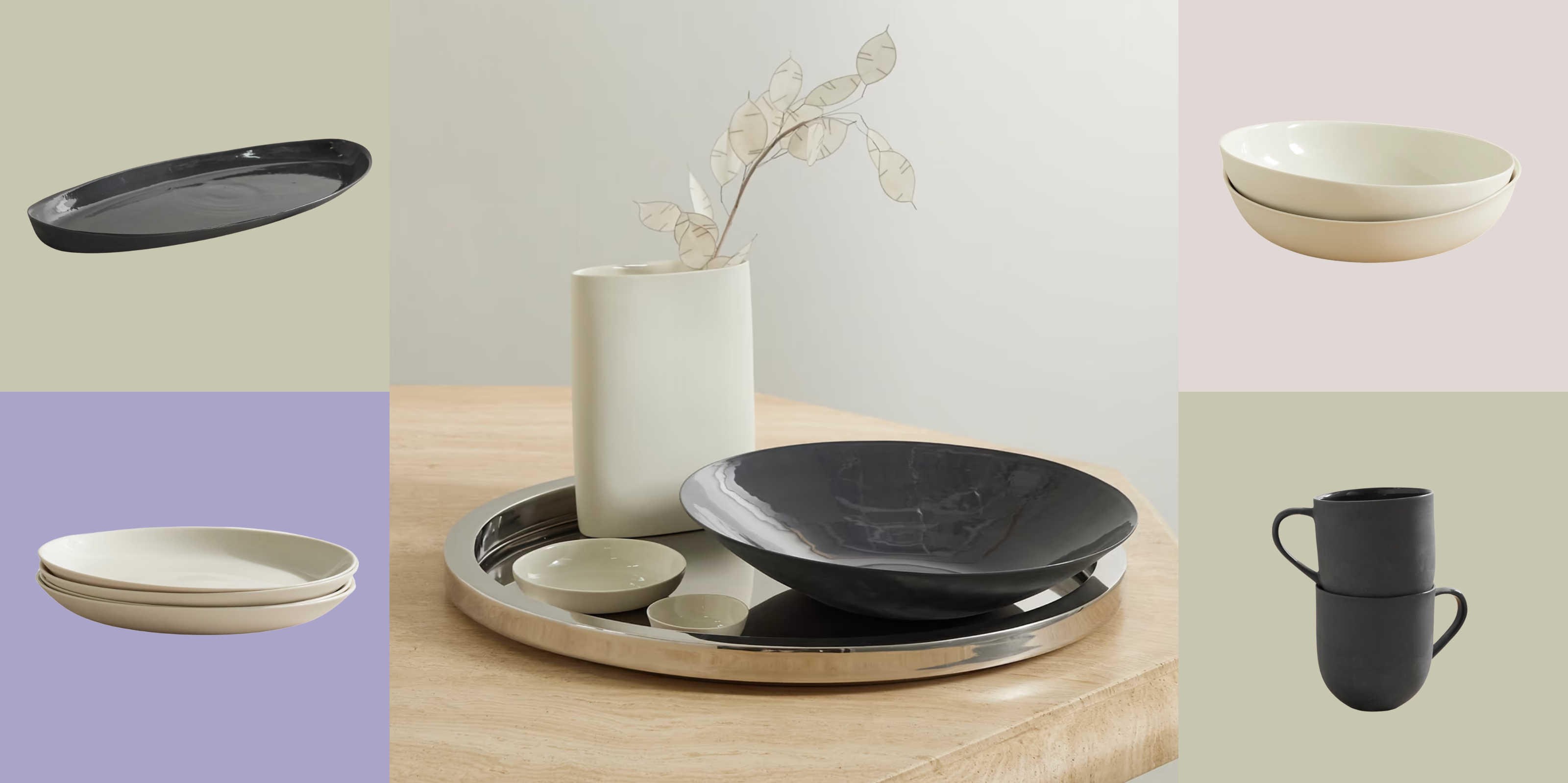 Turns Out, Sustainable Design Can Be Chic, and Net-a-Porter's 'Net Sustain' Curation Is Proof — Here's What I'm Shopping
From the Net Sustain collection, Mud Australia's homeware is not only design-oriented, but eco-focused, too
By Devin Toolen
-
 Before and After — How This Jewel-Box Bathroom Made the Most of Its Proportions With Maximalist Design and a 'Soaking Tub'
This design offers a masterclass on creating a luxurious bathroom that is equally playful and elegant.
By Maya Glantz
