The 1980s glass brick design trend is big for 2023 - designers love how they make homes lighter and lovelier
Hear us out, glass blocks are cool again and these designers can prove it...
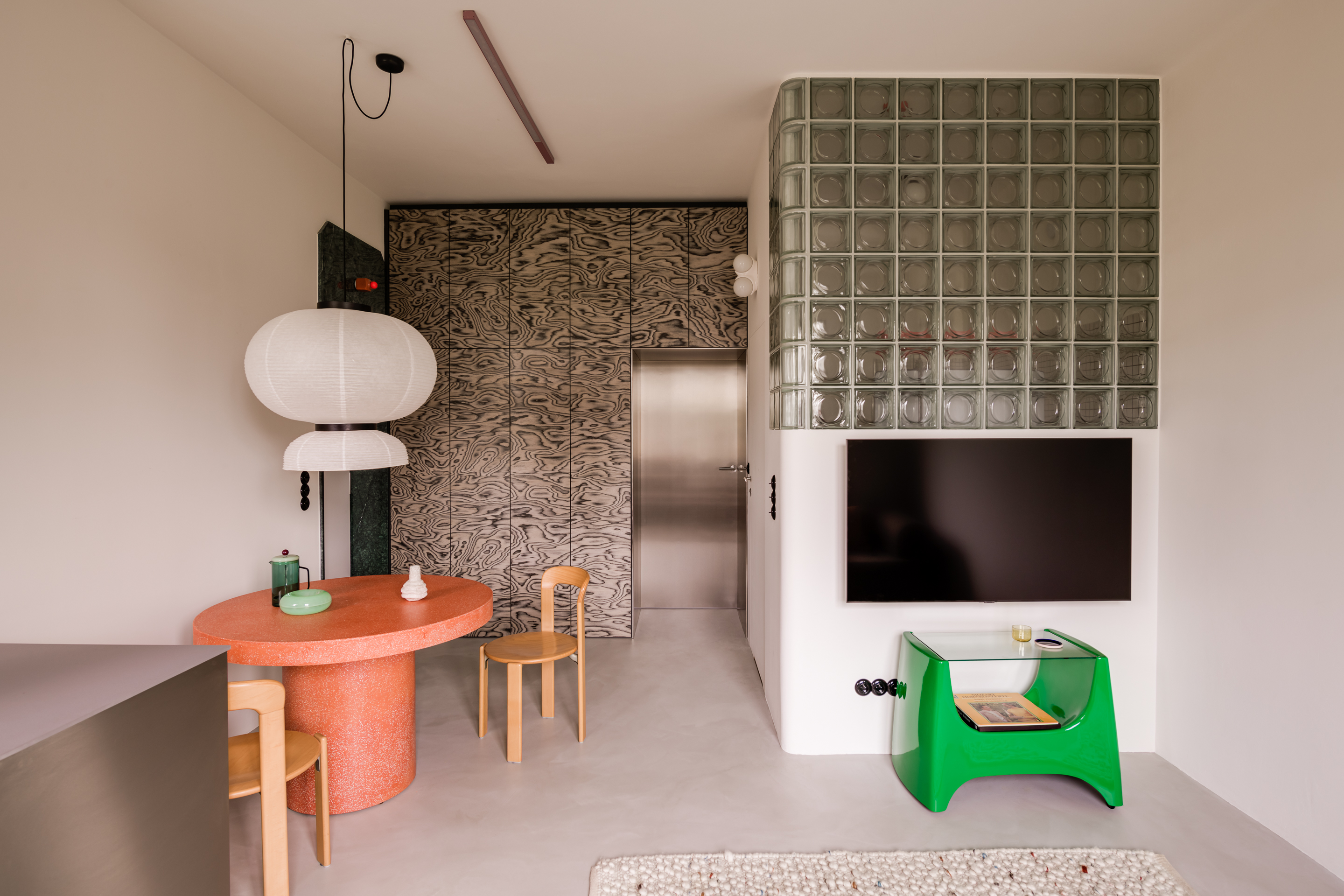

What is it with so many 80s styles making a comeback right now? With fashion, we get it, there are so many cool looks to take from the 80s, but in the world of interiors? Well, it was an era we never thought would rise again – chintz curtains and shag carpets deserve to stay in the past. But we are seeing a lot of 80s decor making a slow and steady resurgence, and one we have been really noticing recently in glass bricks.
Thought to be an ingenious solution to filling a room with light without compromising on privacy or as a 'funky' shower enclosure, glass blocks were thought to be the height of cool a few decades ago. Whole outdoor walls were built from these things, and so many apartments featured them as a divider that kept the space feeling open, but divided. But what do we think of them being used in 2023?
As designer Raili Ca puts it 'Like every other interior design trend, glass block may or may not have a comeback, but it's not coming back into my projects. The first thought I have when I see a shower enclosed in glass block is "Pass me the sledgehammer".' And up until we saw these spaces, we were in agreement, but we are being swayed. In the right space, with the right style, they really can work. We asked designers that have used them in their projects to explain why they chose them, and what they can add to a room...
Are glass blocks still on trend?
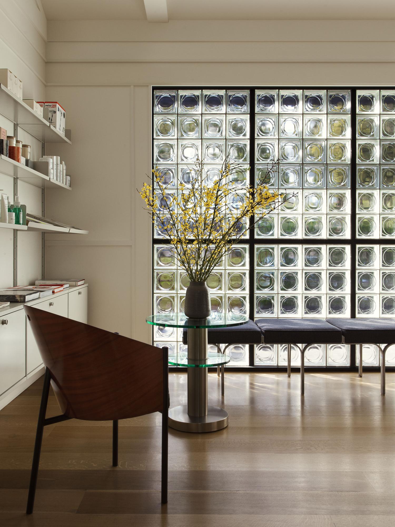
'Glass bricks, once out of fashion, are making a return. Modern designers love them, and it's easy to see why. They let light in while keeping things a bit private. And while trends come and go, it's essential to use them wisely,' says founder of Arsight, Artem Kropovinsky. 'These bricks are perfect where you want light without giving up privacy, like in bathrooms or parts of larger, open plan rooms. They fit great with simple and industrial looks but can also spice up traditional spaces. However, of course, there are pros and cons to the trend to be aware of before you commit:
The pros:
Light play: Glass blocks light up rooms in a unique way.
Privacy: They blur things out but don't shut out views completely.
Looks great: They add an interesting touch to even basic rooms.
The cons:
Heat: They don't keep heat in or out as well as normal walls.
Cleaning: Marks and dirt show up, so they need regular cleaning.
Overwhelming: Using them everywhere can be overkill. They're best as a highlight.'
So really, as with any interior design trend, it's not so much about whether something is trendy or not but more about whether you love the look and if it would work both practically and aesthetically in your home. Let's take a look at some examples that do work and why...
Be The First To Know
The Livingetc newsletters are your inside source for what’s shaping interiors now - and what’s next. Discover trend forecasts, smart style ideas, and curated shopping inspiration that brings design to life. Subscribe today and stay ahead of the curve.
1. A book filled glass block house
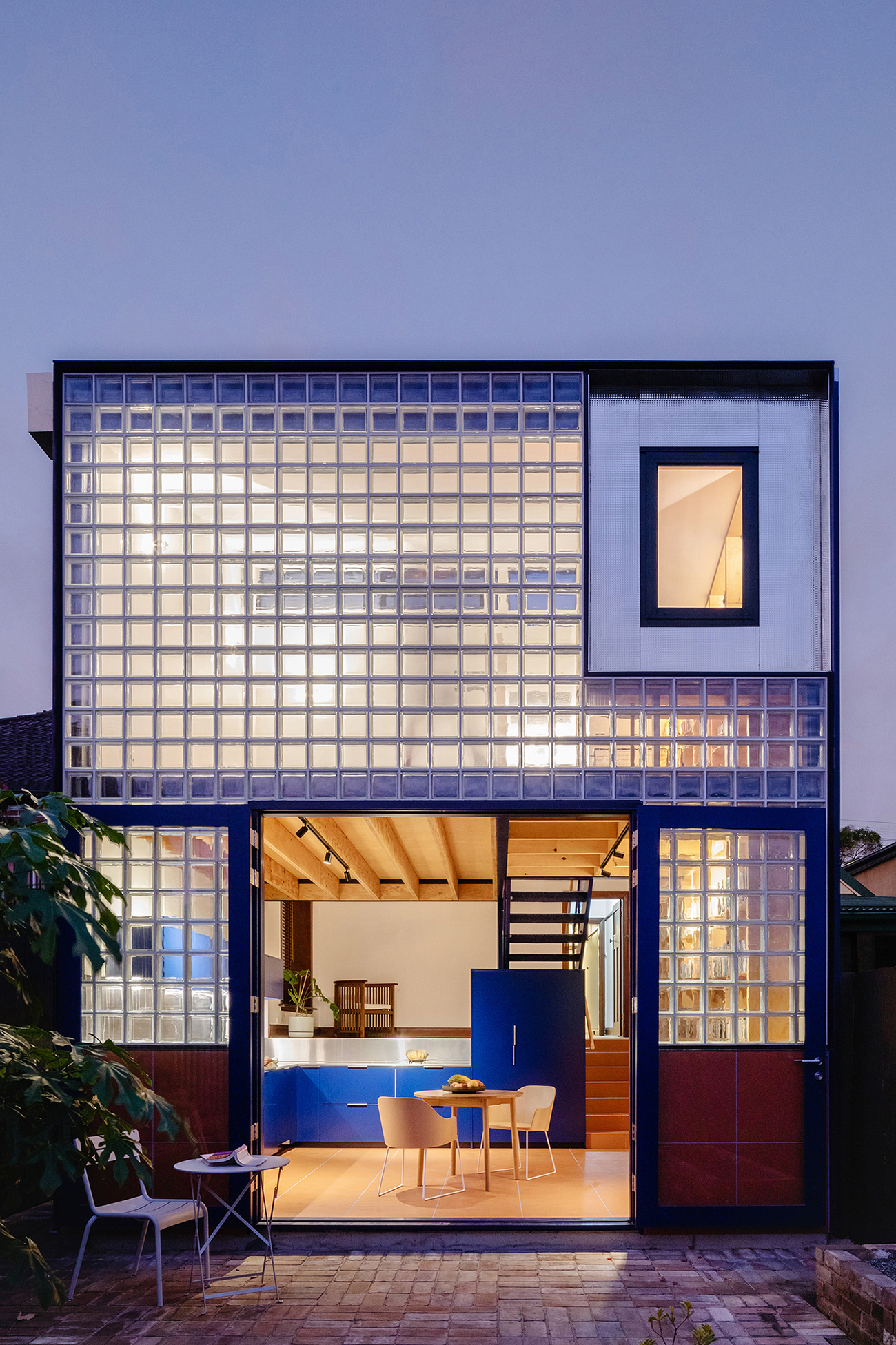
A real commitment to the material, this glass block home designed by Sibling Architecture used glass bricks for the entire back wall of the house. But it's not all about aesthetics, the location of this home meant it needed to be super soundproof. This is one of the surprising benefits of glass blocks, and probably why it seems to be a feature in every 'cool' office in the 80s and 90s, it's really great for blocking out sound.
'The client is a retiring English literature academic, and her brief was to create a new home for herself and her vast collection of books. Our approach was to focus the new key living spaces around a library and the activity of reading, which takes place within the new light-filled double-story addition to the rear of the house,' explains the studio's director Qianyi Lim.
'The new glassblock façade of the extension takes advantage of its southern aspect, bringing indirect daylight (perfect for reading) deep into the home; and the depth of the glassblocks acoustically protects the home from the nearby airport. The glass block wall also slightly blurs views across the immediate neighborhood rooftops, while a feature window in line with the front door and hallway points towards the nearby airport, where the tails of aircraft may sometimes be seen.'
2. A reconfigured apartment with glass block walls at the center
Prague-based firm Papundekl Architects was tasked with transforming a poorly lit, poorly laid out 70s apartment into an open and bright home for its new owners. The answer was an expansive curve of glass running from the entrance, wrapping around the bathroom and straight through the kitchen, giving a new, more interesting, and open layout. To use, the result of the renovation really proves why glass block walls were so popular in the first place and why the trend really makes sense in a small apartment like this one.
'The clients knew all the advantages and problems of the apartment layout and their main goal was to make the apartment more light and get enough storage space. After joint discussions, a path of minor adjustments to the existing, otherwise satisfactory, layout was chosen,' explains Šimon Bierhanzl.
'In order to allow more natural light into the center of the apartment, the architects designed new partitions made entirely of glass blocks. This way, light literally passes through the entire apartment. Glass blocks have good acoustic parameters, let light through, and can be easily arranged in a curve, which was used to round off the originally narrow corridor and wrap around the bathroom. The glass-block walls thus became the main theme of the interior of the apartment.'
'Glass bricks bring a lot of daylight to the rooms in the center of the flat, which would be otherwise quite dark. They also bring interesting reflections and transparencies - you can see behind them but the picture is a bit distorted,' Šimon adds.
3. A chic restaurant in a shopping mall with a glowing glass wall
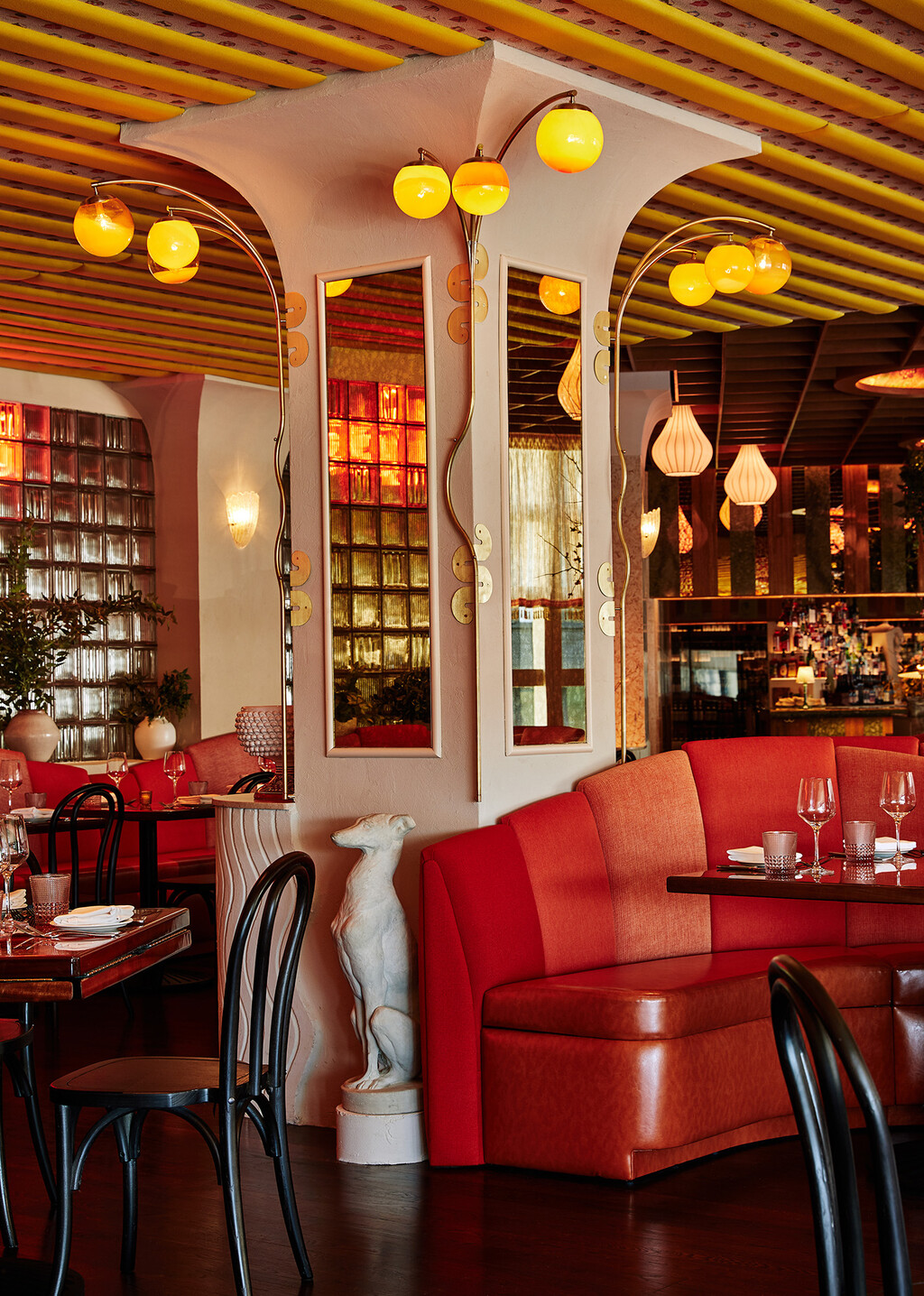
This uber chic restaurant designed by GRT Architects demonstrates how it's all about the lighting when it comes to glass bricks. As Rus Mehta, partner at the firm explains, 'With glass bricks, it's not so much about what style it works best with – I think any material can be used right or wrong, it’s more a question of lighting, ambiance and detailing that determines if you can ‘pull something off’ so to speak. I think there is perpetual interest in revisiting materials and styles that have become passe. We and others seem to relish the challenge of bringing a fresh take to materials that are often used unimaginatively.'
'Bad Roman is located in The Shops at Columbus Circle which is a shopping mall. A nice shopping mall, but still a shopping mall,' explains Rus. 'Our goal with this design was to create transparency that hints at the action inside the restaurant without compromising the aesthetics of the interior with views to adjacent shops.'
'We love the way the glass bricks diffuse the red light from the neon sign hung on the mall side and the varied refractions they create. We used unusual deeply fluted blocks that enhance the refraction of light, creating a much livelier wall than just plain glass would have,' he adds.
4. A reimagined open plan workspace with a glass 'pod'

Studio Rhonda transformed a bland 1950s space into an uber-chic office for Zetteler, a London-based creative agency. Glass blocks really come into their own in an open plan space, acting like a wall but less...solid. They don't break up the space as much but still allow for some level of privacy, so they totally make sense in an office that wants the open plan vibe, with zones for meetings.
'I worked closely with Sabine and the team at Zetteler to create their new office space in Hackney. It is a retrofit of a 1950s large light-industrial open-plan room, and one of the main criteria was to create an acoustic pod within the space to allow for more private meetings with clients, and also very functionally to help acoustically,' explains the studio's founder Rhonda Drakeford.
'We combined the glass bricks with timber-clad walls, door, and ceiling to allow light to flow beautifully into the pod, whilst also softening and dampening the aesthetic and acoustic aspects. The pod’s position in the middle of the space also allows for a different approach to the spaces on each side of it – a more formal office environment at the front, and a more relaxed, cafe feel to the rear. What’s so successful with the glass bricks is that nothing feels visually closed off, or heavy.' she adds.
'Traditionally you might expect glass bricks to be used in a more industrial style aesthetic, but I was keen to pair it with a more softer, almost residential palette of materials and furnishings. The glass becomes almost ethereal, like a jeweled box.'
5. A tiny apartment with a glass brick backsplash
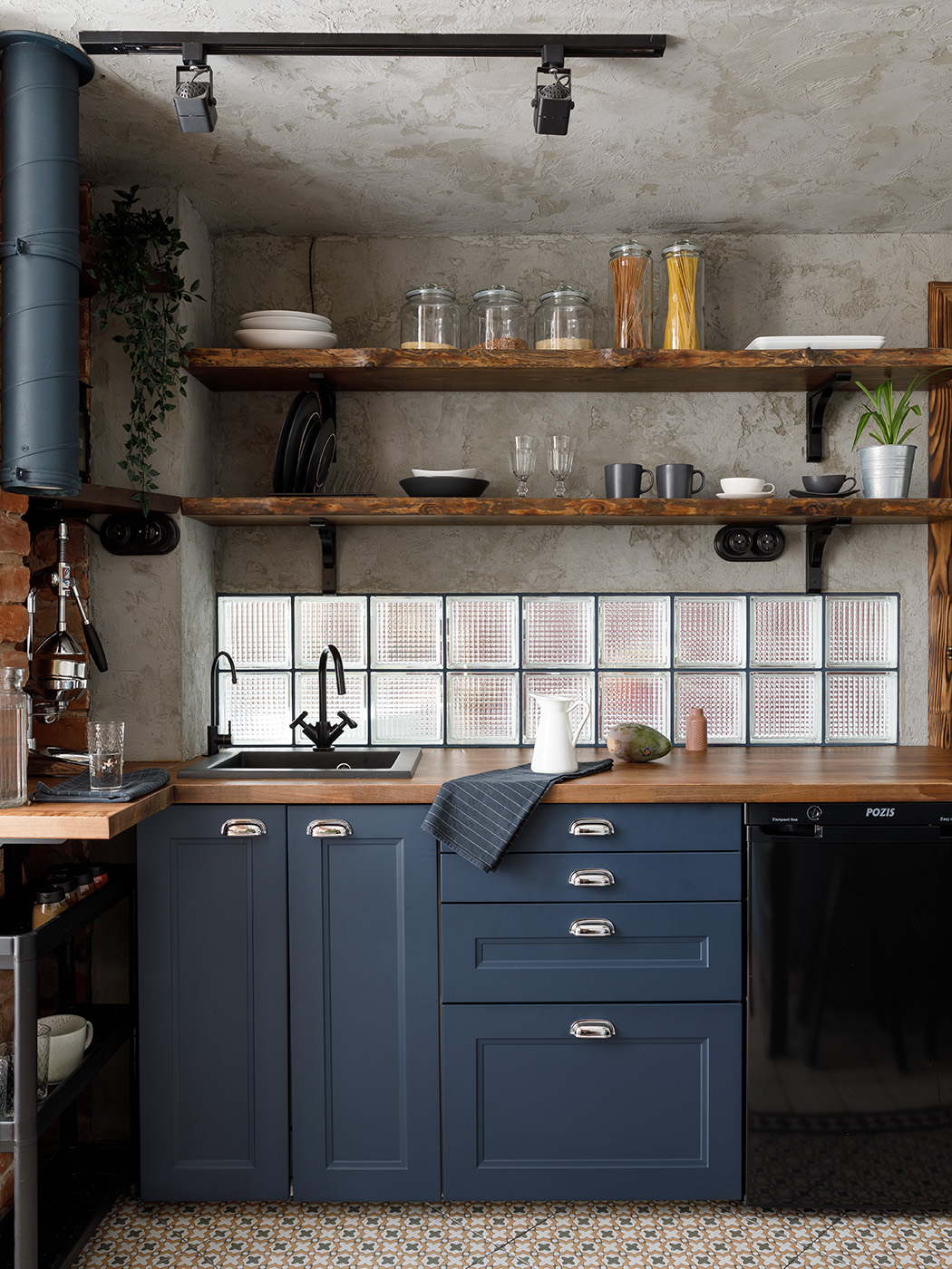
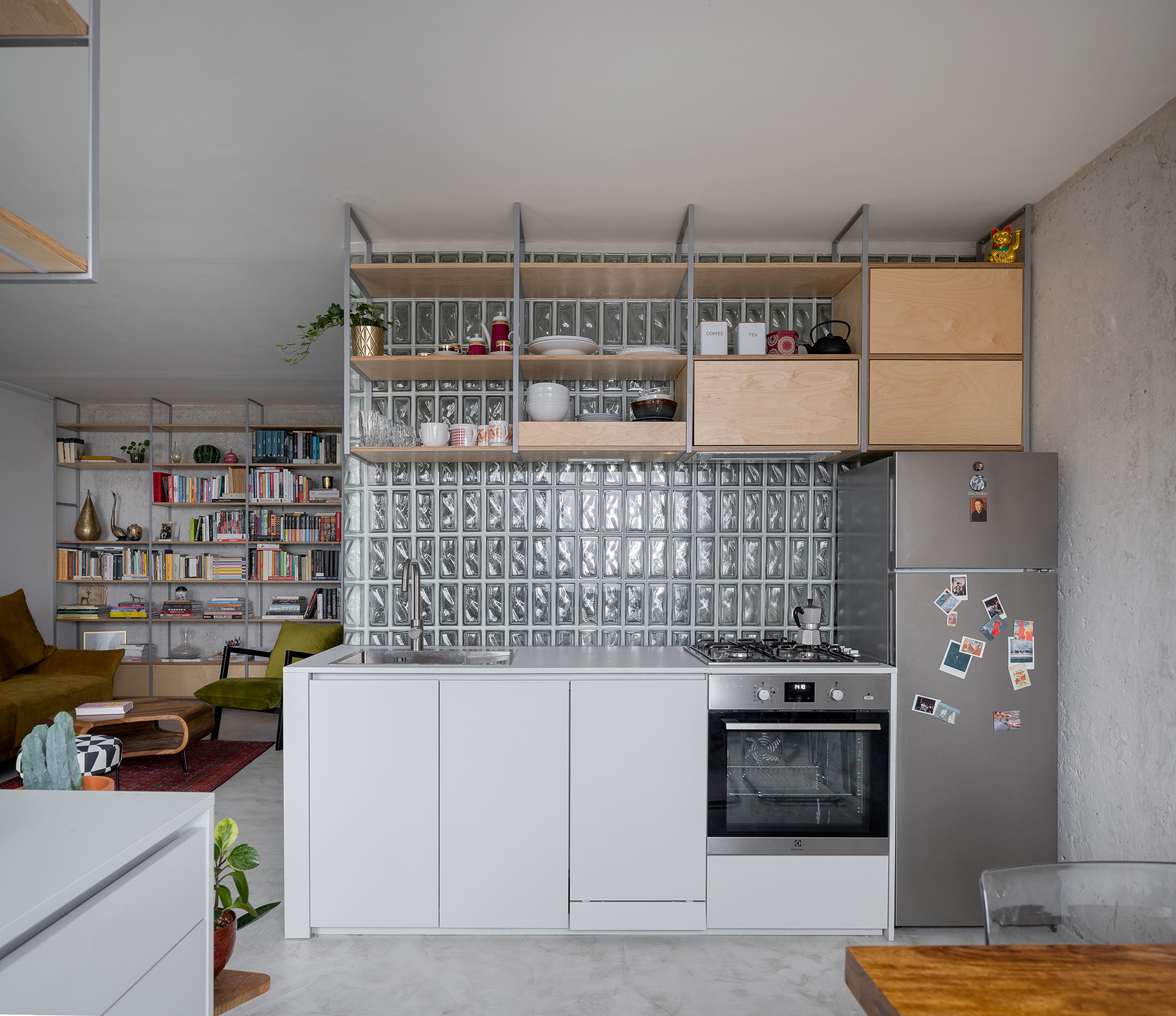
What an ingenious kitchen backsplash idea. If you are after a more subtle approach to embracing the glass brick trend, this is it. Designers SerpahimDSGM pretty much took this one bedroom apartment apart and put it back together to really make the most of the limited square footage. A huge benefit of the space was the amount of natural light, so glass blocks are used throughout to space to let that light flow freely.
'We were lucky to have creative freedom and an opportunity to change the apartment configuration (inside there were no load-bearing partitions). For this specific project from the very beginning, we wanted to integrate glass bricks firstly because it matches the authentic bricks, secondly because of their ability to pass scattered light, which is extra important for small spaces, and thirdly for aesthetics,' explains Serafima Gavrilenko, founder of SeraphimDSGN.
'We decided to replace the common tile backsplash in the kitchen area with glass bricks. Behind the kitchen wall, there is a bathroom that has a huge window, thus this replacement provides additional light in both areas. So starting with this we added glass bricks in other areas – the bar base is made of the bricks of the same pattern, the shower cabin is made from the basic transparent glass bricks with no pattern, and the entrance of the walk-in-closet is made from both these types.'
'I believe glass bricks are a timeless feature in both interior and exterior design (just as Victorian floor tiles). And here are some undeniable benefits of glass brick too – they are extremely durable and temperature resistance, soundproof, moisture resistance and easy to maintain,' she adds.
6. A home/studio with an exterior glass block wall
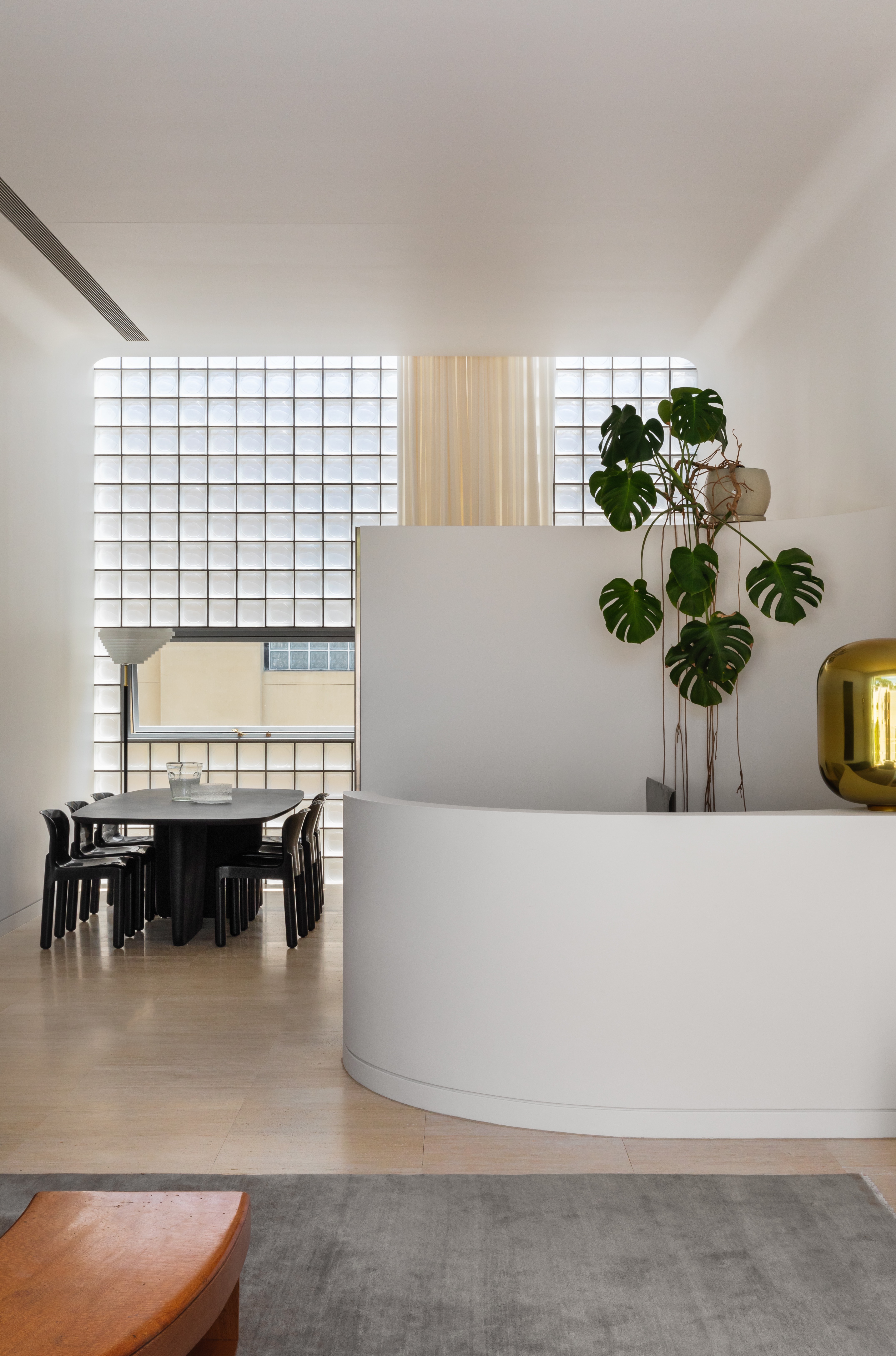
Designed in collaboration with industrial designer Henry Wilson and Brad Swartz Architecture, this narrow home (just 15ft) is bookended by two glass brick walls, so despite the small square footage, all the rooms are lofty and filled with light. And there's a cohesive feel also, with almost every space featuring the glass blocks. There are benefits of not going with a totally glass facade too. The blocks diffuse the light beautifully, and as the light is less direct there's less of an issue with overheating plus, there's far more privacy.
'I think most of us have got past the trauma of the 80’s and 90’s glass block windows in bathrooms, and that, combined with beautiful solid glass bricks now being available for building, has really allowed for glass bricks to again be considered a great options for treating a facade,' says the studio's director Brad Swartz.
'I think glass blocks have particular value on inner city sites and homes, but can be suitable to any project that needs to balance privacy with access to light. This project is a two-bedroom apartment with ground floor studio/garage/gallery space and located on a tight inner city laneway, with a commercial building across the laneway. The glass block facade enabled us to create private, light-filled living spaces.'

Formerly the Digital Editor of Livingetc, Hebe is currently the Head of Interiors at sister site Homes & Gardens; she has a background in lifestyle and interior journalism and a passion for renovating small spaces. You'll usually find her attempting DIY, whether it's spray painting her whole kitchen, don't try that at home, or ever-changing the wallpaper in her entryway. She loves being able to help others make decisions when decorating their own homes. A couple of years ago she moved from renting to owning her first teeny tiny Edwardian flat in London with her whippet Willow (who yes she chose to match her interiors...) and is already on the lookout for her next project.
-
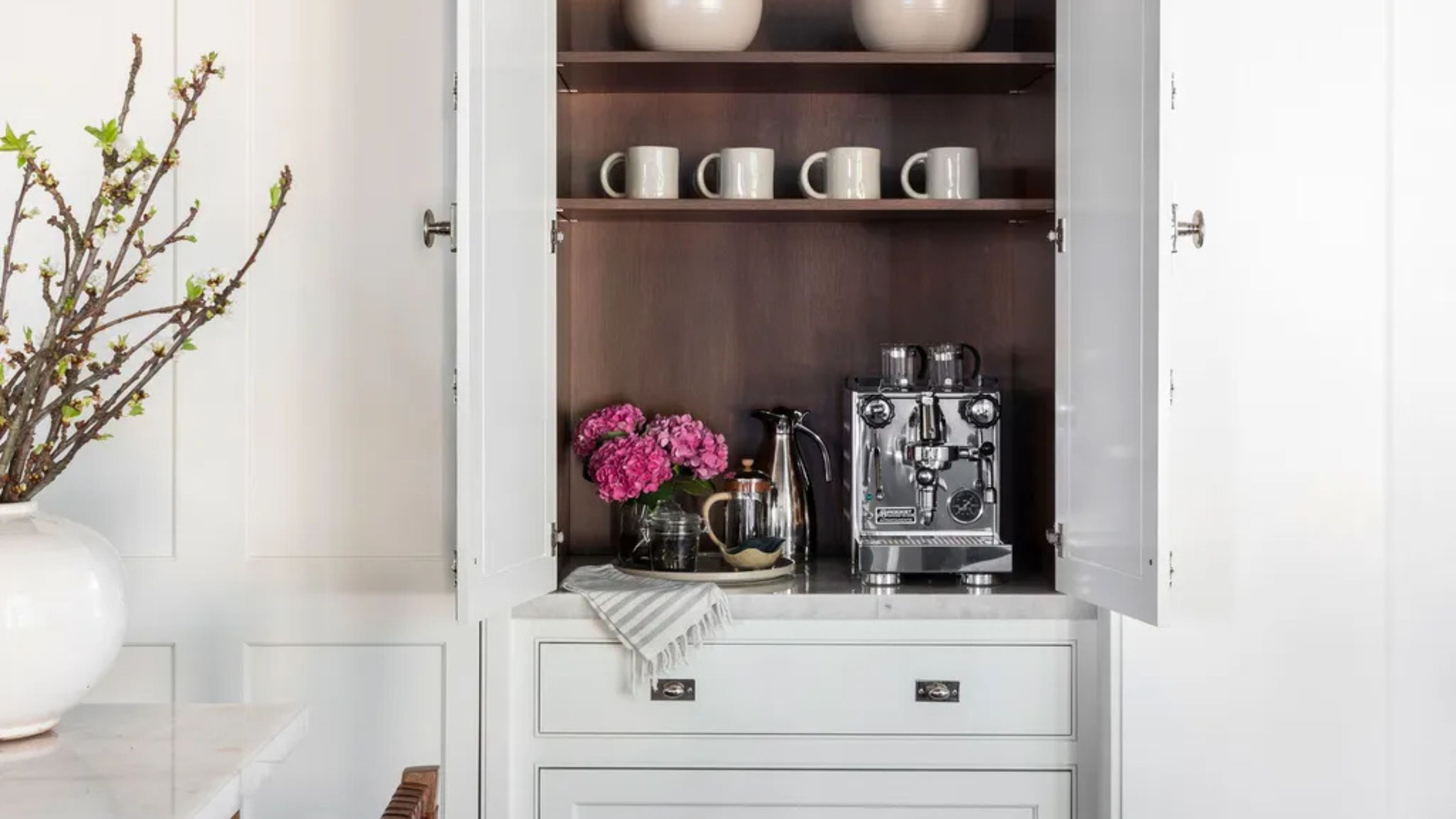 Turns Out the Coolest New Café is Actually In Your Kitchen — Here's How to Steal the Style of TikTok's Latest Trend
Goodbye, over-priced lattes. Hello, home-brewed coffee with friends. TikTok's 'Home Cafe' trend brings stylish cafe culture into the comfort of your own home
By Devin Toolen Published
-
 5 Bathroom Layouts That Look Dated in 2025 — Plus the Alternatives Designers Use Instead for a More Contemporary Space
For a bathroom that feels in line with the times, avoid these layouts and be more intentional with the placement and positioning of your features and fixtures
By Lilith Hudson Published
-
 IKEA Reveals Its 2025 Color of the Year — An Electric Blue Hue, That Is Enticingly Bold and Brilliant
Though unexpected, this shade of blue may be my favorite color of the year prediction yet
By Olivia Wolfe Published
-
 Pantone's Color of the Year for 2025 Has Been Announced — Meet 'Mocha Mousse'
We share how to style it, shop it, and everything else you need to know about the subtle yet elegant soft brown shade
By Olivia Wolfe Published
-
 Le Creuset Just Released a Ridiculous Tote Bag for Transporting Their Dutch Oven to Dinner Parties — I'm Obsessed
Whether you need it is certainly not the question, here. But whether you want it... well, why wouldn't you?
By Olivia Wolfe Published
-
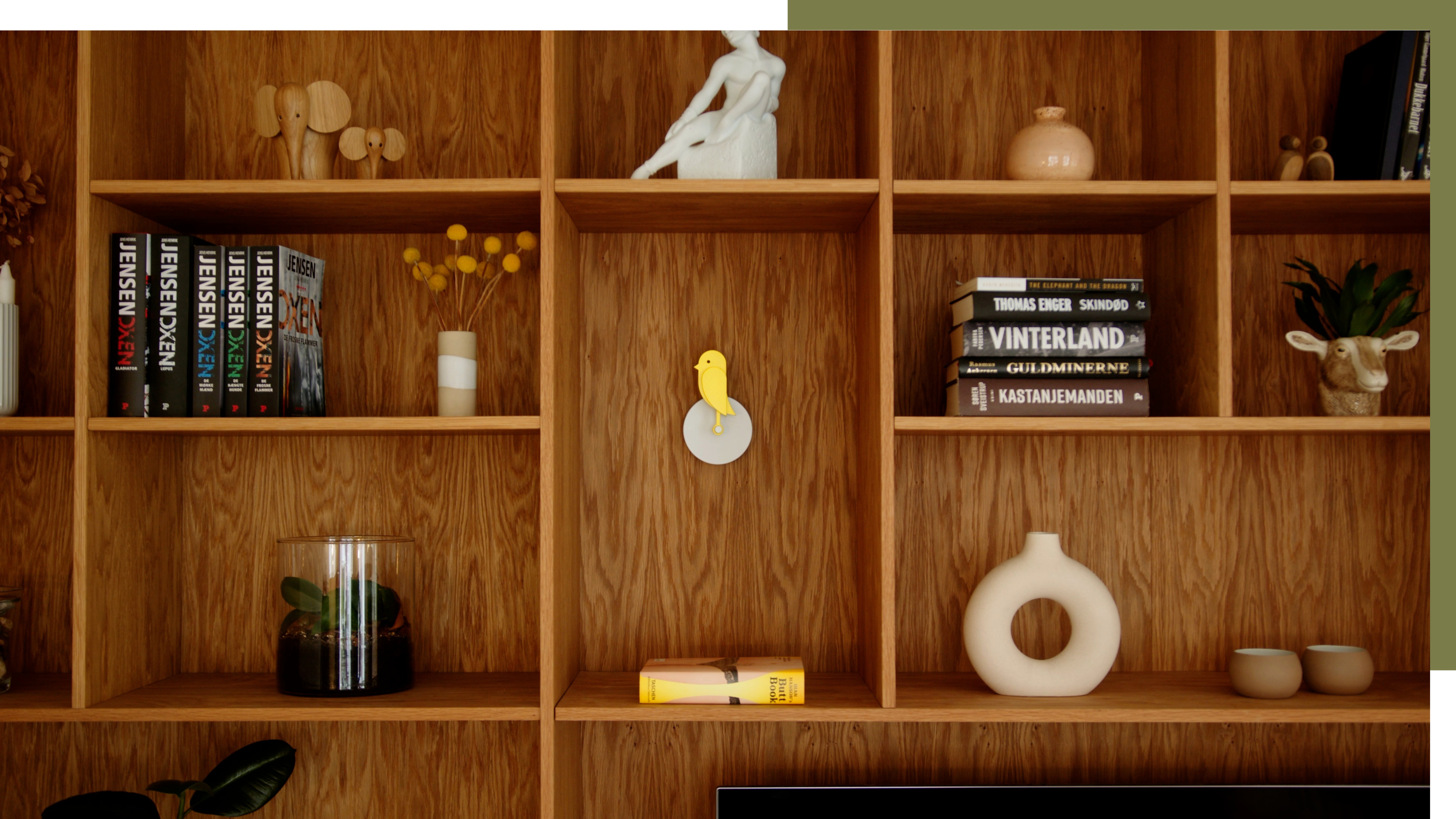 A Little Birdie Said Monitoring Your Air Quality Just Got a Stylish New Look
This Amazon buy is promising a healthier home with no style expense
By Olivia Wolfe Published
-
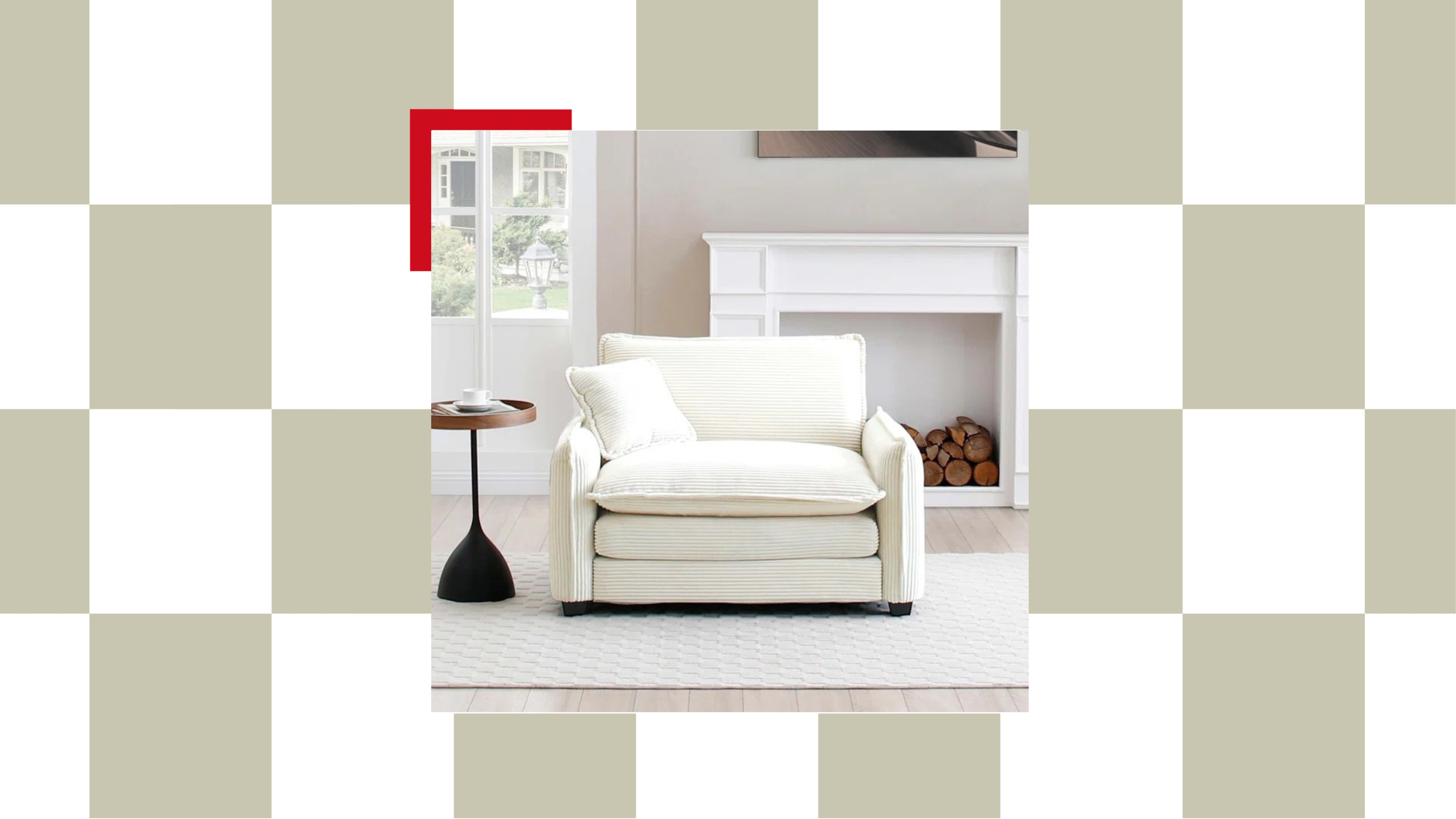 The "Chair-and-a-Half" Is the Goldilocks of Seating — Not Too Big, Not Too Small, but Just Right for Snuggling Up This Season
This accent chair trend is perfect for the cozy season, and it's on sale at Wayfair
By Olivia Wolfe Published
-
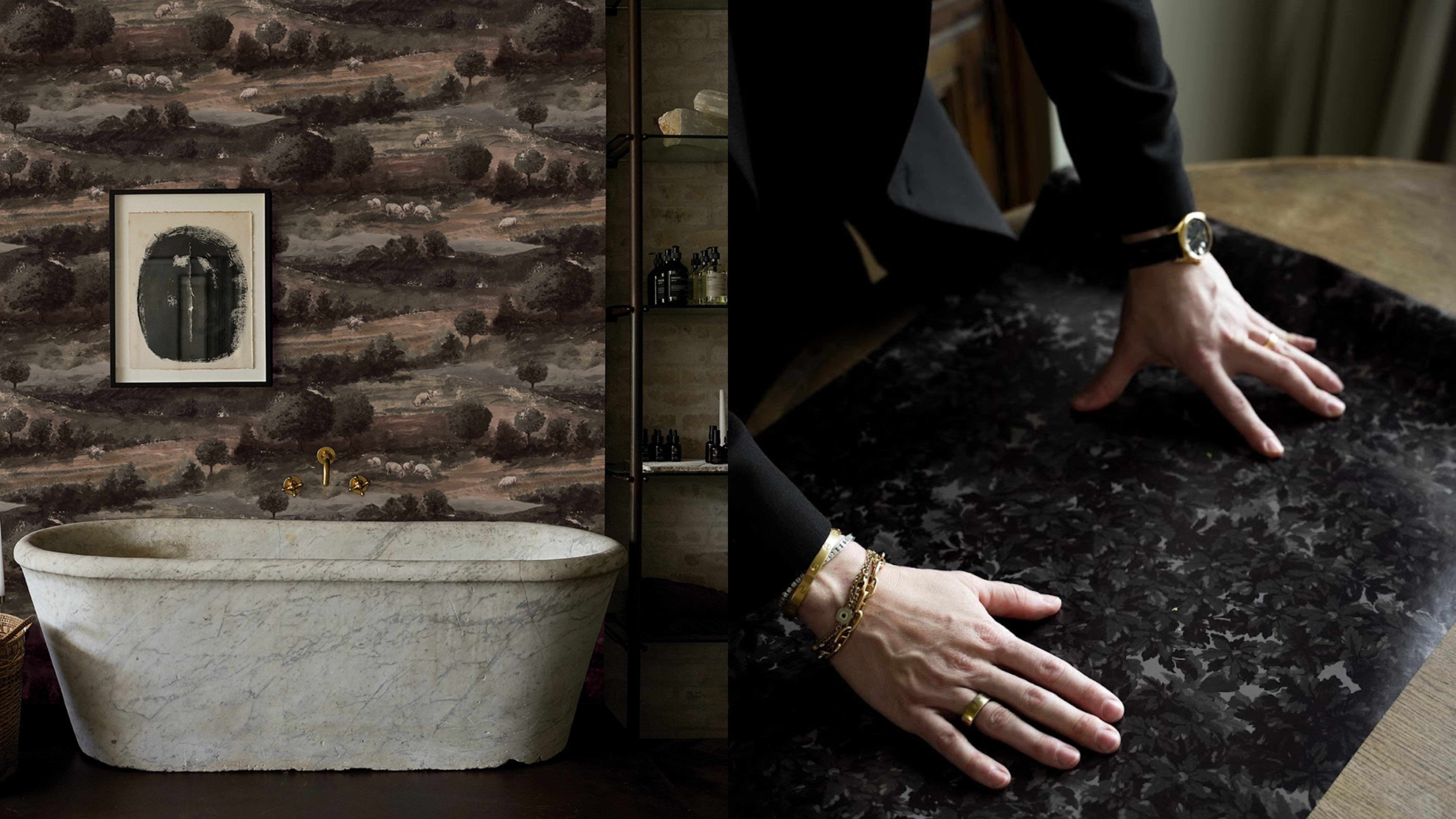 Textured Walls Are Still Trending (And Just Got a Whole Lot More Chic Thanks to This Jeremiah Brent Collaboration)
'Nostalgia' is the name, and texture is the game; this moody new peel-and-stick wallpaper collection is bringing all the fall vibes to interior design
By Olivia Wolfe Published
-
 Ruggable's Latest Collection is Dripping in What We're Calling the Season's Go-To Fruit-Inspired Hue
We're seeing the sunny, mango-inspired shade cropping up in new collections across the design world — and it's surprisingly perfect for fall. Here's why
By Olivia Wolfe Published
-
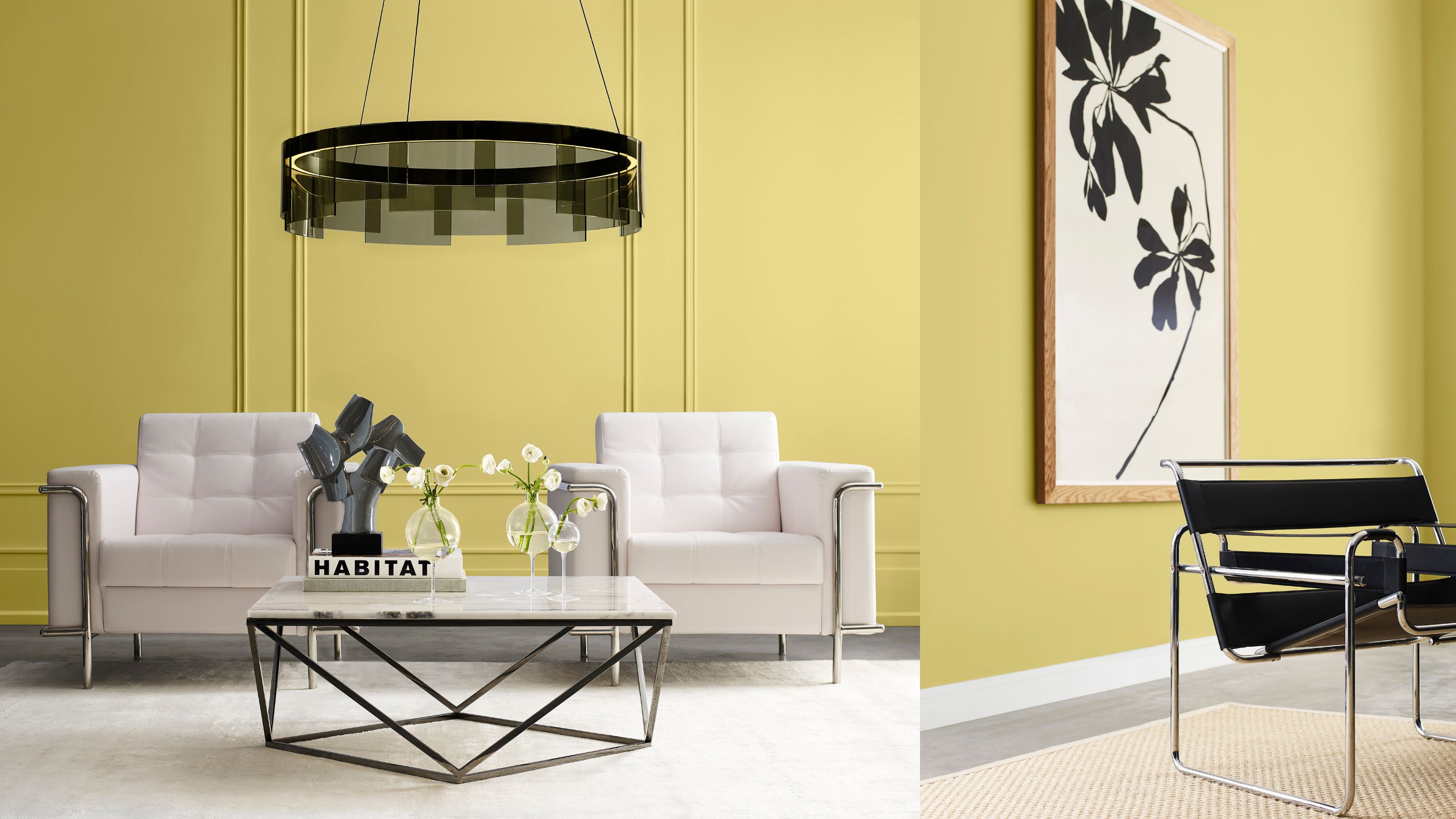 Sorry, Sherwin-Williams, We’ve Already Chosen OUR 2025 Color Crush!
You don't paint your whole home in one color, so why settle for just one Color of the Year when you can have a complete capsule?
By Olivia Wolfe Published