This super-chic new kitchen trend might be the solution to finding room for an island, even if you're short on space
Think your kitchen is too tiny for an island? There's a new idea designers are using to make them work, and it just so happens to look good, too

Realistically, not every kitchen has a big enough floorplan for an island – and for most spaces, it's not the end of the world. If you have a small kitchen, it's often easy to make your layout work without worrying about having an island as the centerpiece of your room. The problem comes when you've got a kitchen that's almost big enough for an island, but not quite. These are the spaces that can feel like something is missing from your layout, both in how your kitchen looks and how practical it is to use.
Recently, I've noticed a kitchen trend that feels like the perfect solution to this problem, creating a way to add a kitchen island on a smaller scale, without it feeling diminutive or undersized. I'm calling it the 'chopped' kitchen island – and it might just be the solution to your small space woes.
What is a 'chopped' island?
If you think of the standard kitchen island as a large rectangle, a 'chopped' island is a design where you remove one of the corners, creating an angled edge. This brings down the overall footprint of the island, but still retains its sense of proportion for the longest edge of the island.
So why does this matter? For a small kitchen, simply scaling down your rectangular island may make it feel particularly undersized and diminutive - hardly the centerpiece you're looking for in a kitchen island. The angled island on the other hand rearranges this footprint for a more dynamic use of the space. It also works particularly well for rooms with awkward, angular walls.
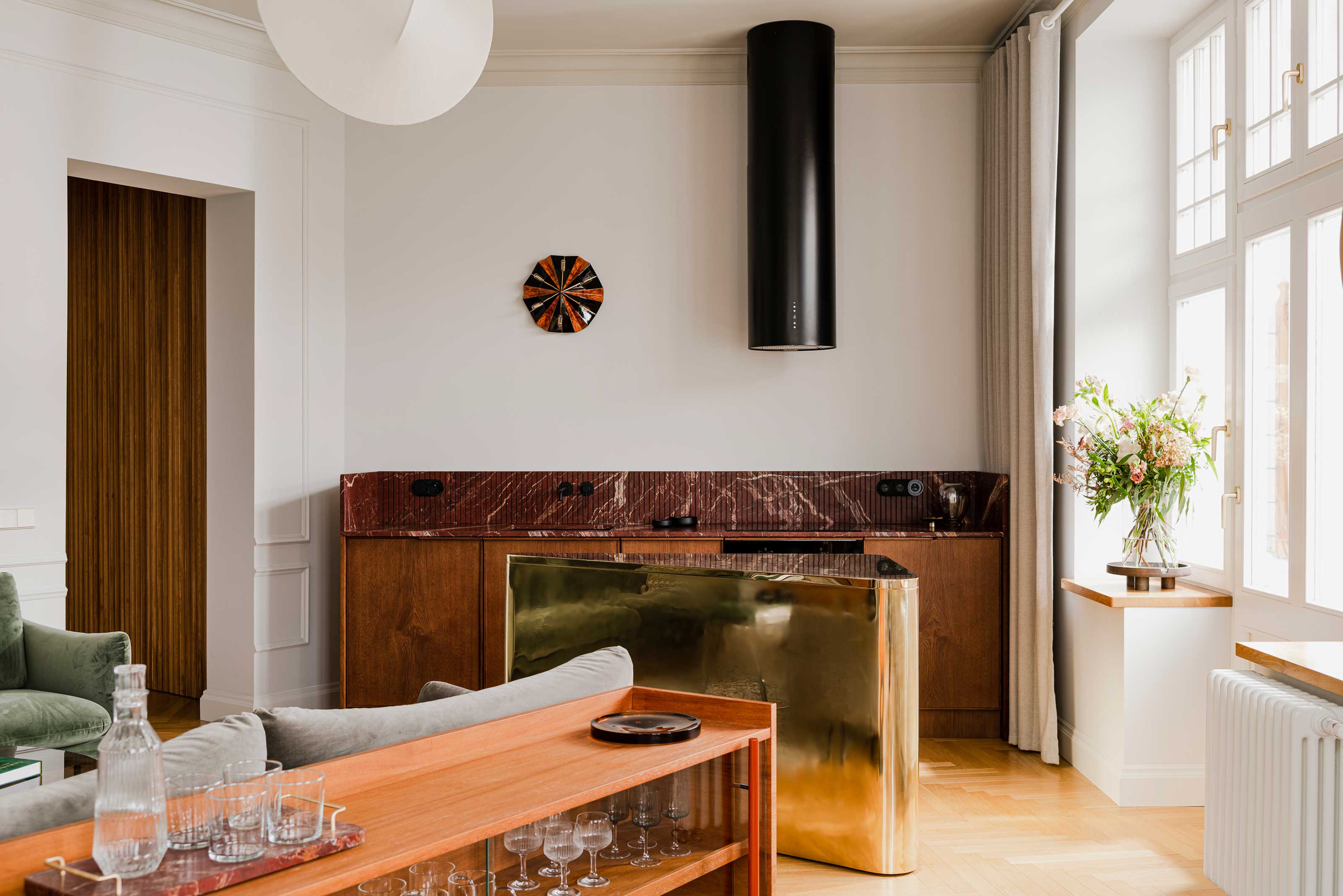
This modern apartment in Poland
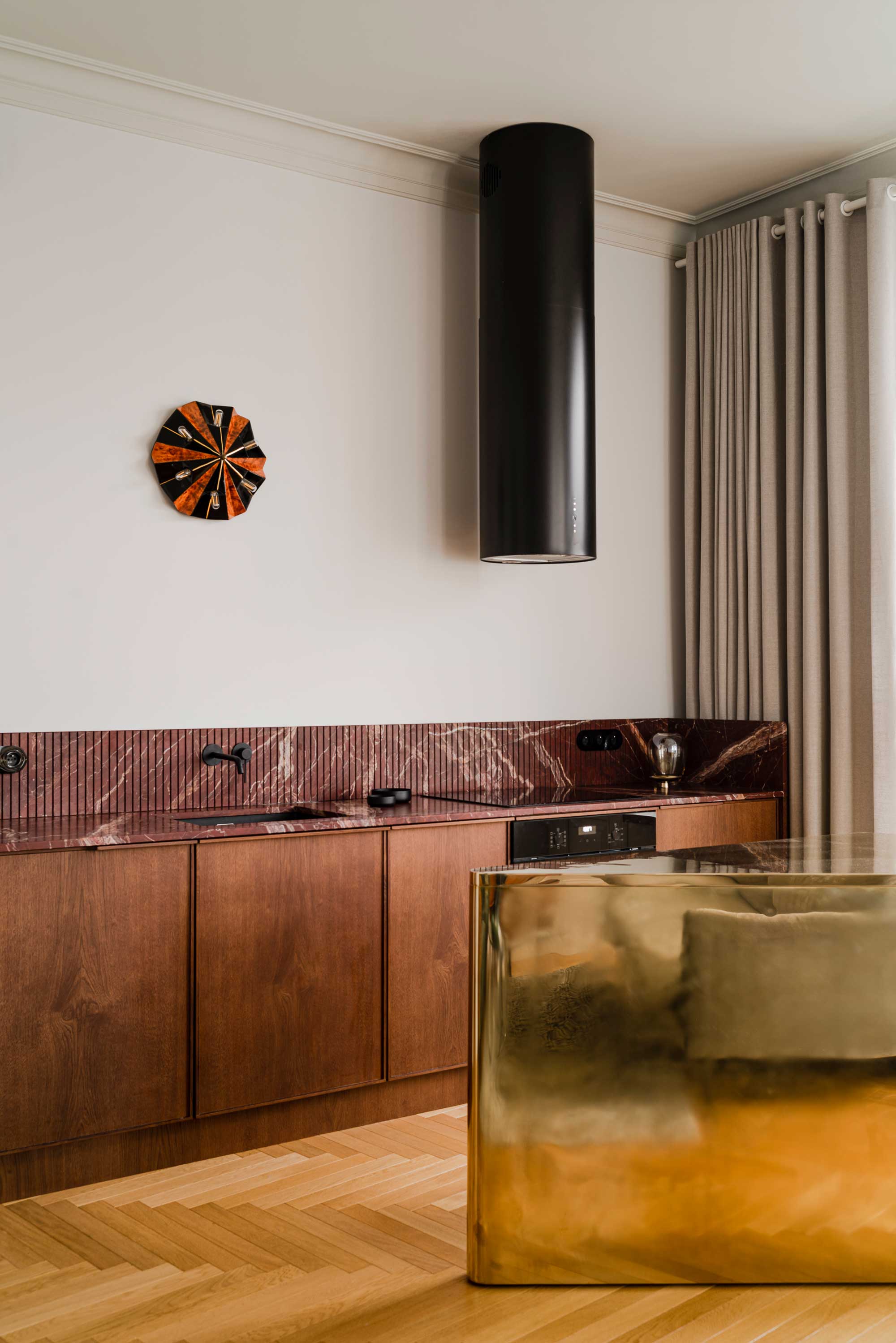
A chopped island was the solution for this luxury apartment, designed by Studio Akurat. 'We were faced with a challenging space which was highly irregular in shape and strongly limited by construction walls,' Maciej Ryniewicz, creative director and founder of Studio Akurat, tells me. 'As architects we felt a strong need to organize it while keeping in mind the owners wish to have a comfortable lounge area, dining area and functional kitchen space within this one room.'
The triangular kitchen island creates a walkway that creates flow for the space and a natural divide between the kitchen and living area. 'By simply offsetting the directions set by the walls and juxtaposing the outcome with the apartment's main axis we defined a shape that felt in harmony with its surroundings no matter from which direction you would approach the furniture piece,' Maciej adds.
Would a standard rectangular island have worked in the space? 'Given the modest footprint, placement of the drains and installations, the location of the entrance to this space and functional requirements I am certain it wouldn't work,' Maciej says. 'We tried different solutions and strongly felt that a rectangular centerpiece would work as an obstacle and feel totally out of place in this particular case. I feel as if our solution works as a backbone for the entire space giving a sense of order and tranquillity.'
Be The First To Know
The Livingetc newsletters are your inside source for what’s shaping interiors now - and what’s next. Discover trend forecasts, smart style ideas, and curated shopping inspiration that brings design to life. Subscribe today and stay ahead of the curve.
This angular kitchen in a luxury home
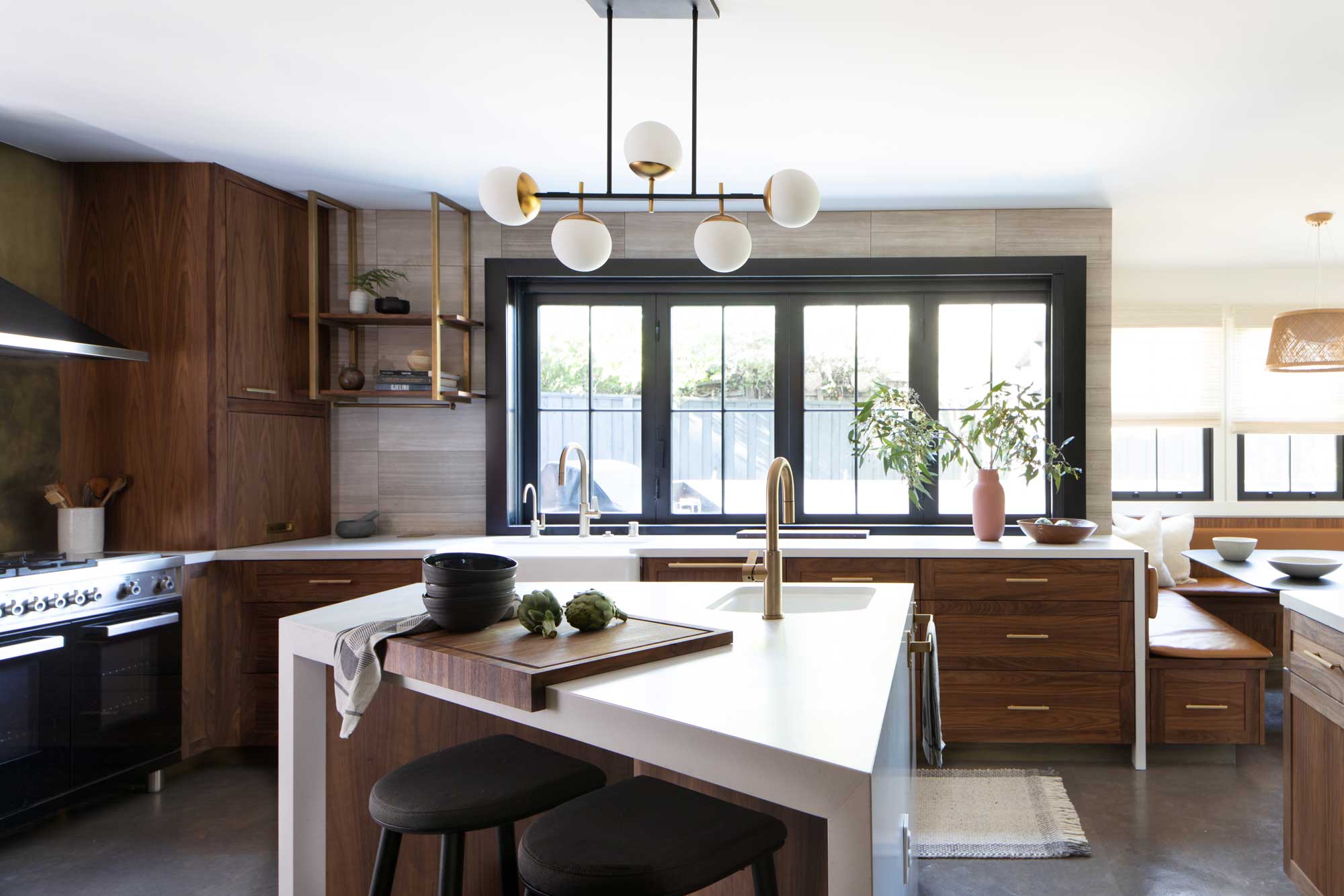
Design studio Atelier Cho Thompson was also faced with an unusual, angular space for the modern kitchen of this home, and introduced an angled island as the centerpiece of this kitchen to make it somewhere their clients enjoyed spending time.
'The island shape resulted from the fact that we were opening up walls and combining two-three spaces at the corner of the home,' Christina Cho Yoo, co-founder and principal of Atelier Cho Thompson explains. 'Islands help anchor a kitchen and become a hub of social activity where people can sit and hang out while others are cooking. Rather than keeping this space open, the angled island was our solution to this interstitial space, and sure enough, it is a very actively-used space today.'
For Christina, this angular island is a response to the environment of the kitchen. 'An angled island does not work everywhere, but given the unusual shape of our kitchen, it organizes the space and provides a touchdown location when traversing from different sides of the kitchen. Each side of the angled island is parallel to a wall in this kitchen,' Christina explains.
'We wanted a spatial element that helped regulate the flow through the kitchen. Without this angular island, the client may feel a bit aimless crossing from one side to another,' Christina adds. 'This particular island mediates the space and provides a landing zone for various activities in the space that happen in the in-between space like hanging out and observing, washing hands or fruit, laying out hors d'oeuvres for a party, or prepping food.'
This large open plan home in Melbourne
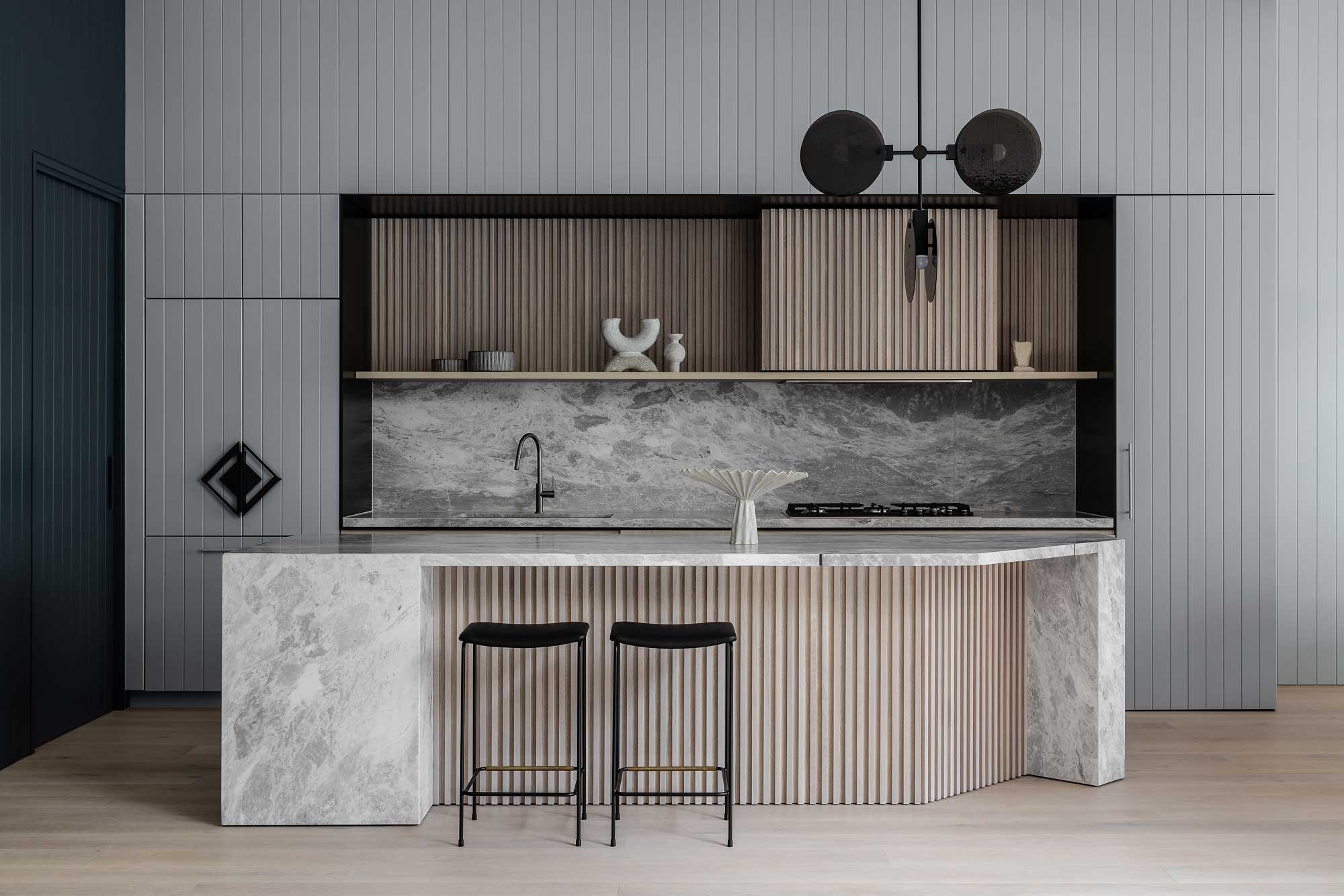
The 'chopped' island isn't just the preserve of small kitchens, however. It's a design detail you'll see applied to large kitchen islands, too - albeit in a slightly different way. We're seeing kitchen islands with 'chopped' corners, helping these designs feel less monolithic.
This example, designed by Studio Doherty for a Melbourne home, is the perfect example of how it can work. 'The motivation behind the chamfered corner was more of a design-driven decision,' says founder Mardi Doherty. 'Nevertheless, we did consider how people would sit and interact around the island bench, which did in part inform the approach to the island.'
The chopped corner is on the side that opens up to the open-plan living room. This helps the island beckon to guests - that chopped corner is the perfect spot to lean and speak to someone using the prep zone of the kitchen.

Luke Arthur Wells is a freelance design writer, award-winning interiors blogger and stylist, known for neutral, textural spaces with a luxury twist. He's worked with some of the UK's top design brands, counting the likes of Tom Dixon Studio as regular collaborators and his work has been featured in print and online in publications ranging from Domino Magazine to The Sunday Times. He's a hands-on type of interiors expert too, contributing practical renovation advice and DIY tutorials to a number of magazines, as well as to his own readers and followers via his blog and social media. He might currently be renovating a small Victorian house in England, but he dreams of light, spacious, neutral homes on the West Coast.
-
 Jeremiah Brent Captures the Grit and Glamour of NYC in His New Loloi Collaboration
The TV-famous interior designer looked out of his own window — and hit the pavement — for a collection that turns city spirit into tactile design
By Julia Demer
-
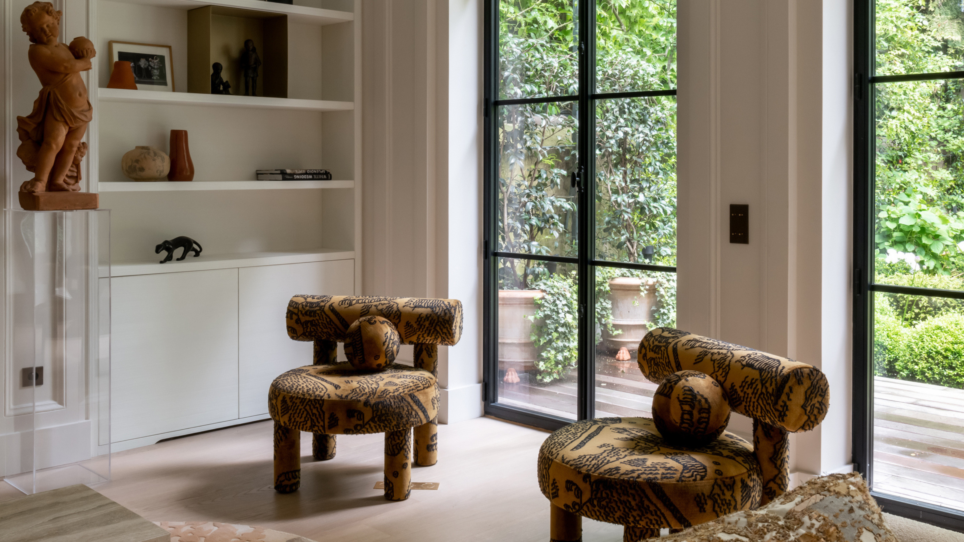 This Specific Fabric Print Is Literally Everywhere Right Now — Here's Why
It's whimsical, artistic, and full of character. We've called it already: Dedar's 'Tiger Mountain' is the fabric that will define 2025
By Devin Toolen