First look at House of Hackney's new paint collection, as they reinvent how to use color now
House of Hackney's new paint collection is a wonderfully soothing collection of 39 incredible colors. See the first preview here
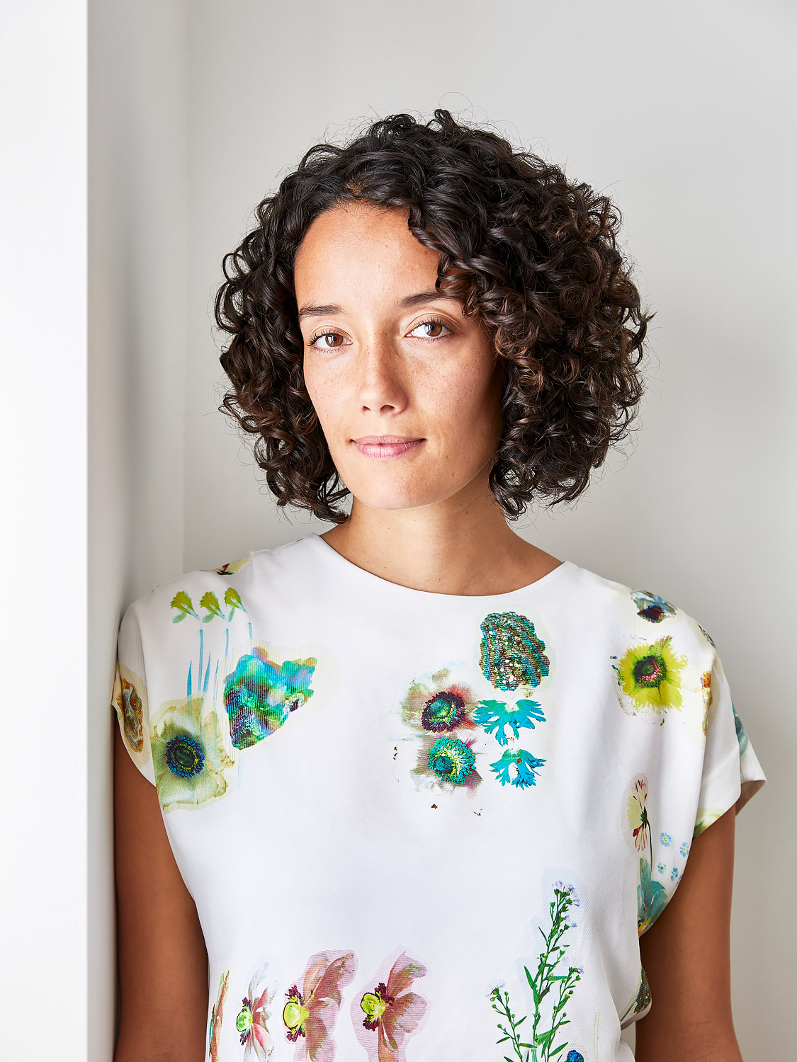
It was just over a decade ago when creatives Frieda Gormley and Javvy M Royle founded British pattern brand House of Hackney with the aim to bring color and texture into homes, designing their own prints after failing to find the contemporary wallpapers and textiles they craved. Their family home in – yes – London’s Hackney opened its doors as their first showroom, bedecked in the evocative palms and exuberant florals that would quickly catapult the fledgling label into every design lover’s little black book (or Blackberry).
A celebrated trailblazer in rule-breaking patterns, 360-degree wallpapering and hardcore matchimalism, as House of Hackney becomes a tweenager it’s undergoing one of its biggest transformations to date – the introduction of a 39-color range that is going to be informing all our paint ideas from now on. After years of recommending other brands to customers seeking shades to coordinate with their designs, Frieda and Javvy are spinning their famously maximalist aesthetic on its axis to include painted walls.
‘Our ambition has always been to infuse homes with color’, explains Frieda. ‘While pattern is still our DNA, our paint gives us the freedom to showcase different levels of pattern and creativity. It’s an evolution.’
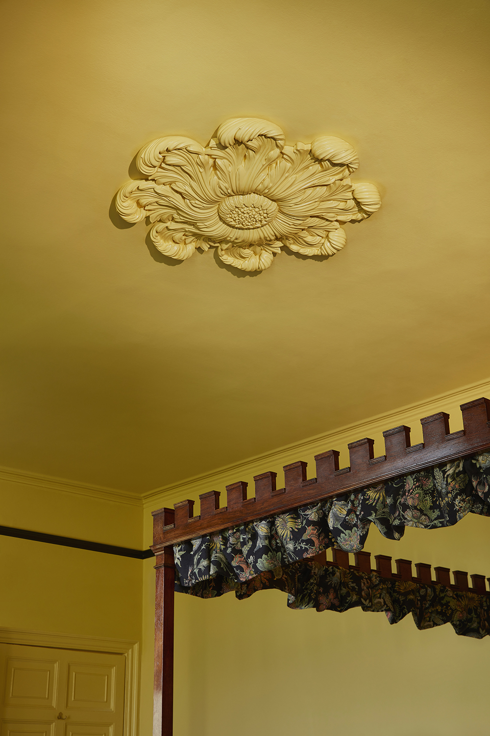
Wall and ceiling in Orpiment by House of Hackney
Like much of House of Hackney’s handiwork, The Art of Nature paint collection draws its inspiration directly from the bounty of the wild, and for every recyclable tin sold the brand will purchase and protect 115 square feet of forest. Available initially in Eggshell and Emulsion finishes, walls and woodwork are coated in the same matt texture as each other.
The palette fits into how current decorating trends are working now. As we see some of the world's best designers recommending lavender for bedrooms, so there is a general move towards greyer tones and understated warmth. 'We've seen this in the shades of green that are currently popular,' says Livingetc's editor Pip Rich. 'All of a sudden, it's shades that sit between sage and olive, taking the grey from sage and the mossiness of olive and becoming a wonderfully soothing hybrid of both. Elsewhere, greyed, earthy palettes are taking in dusky pinks, rusty oranges and - of course - lavender.'
It's this greyed off, earthy palette - designed to perfectly match Frieda and Javvy’s key prints - that we're seeing here. The paint collection includes an extensive exploration of green, inky blues, rusty reds, dusky pinks, fresh yellows and a set of neutrals. ‘The range is an ode to Mother Nature’s ever changing colourful ways,’ says Frieda, the tones referencing and christened for plants (Thistle, Spruce), flowers (Nasturtium, Anemone), stones (Obsidian, Zircon), clouds (Cirrus) and more. ‘The naming process was a big deal to us, bestowing the right name gives life to each shade – I wanted them to be simple and purist to let the colours do the talking.’
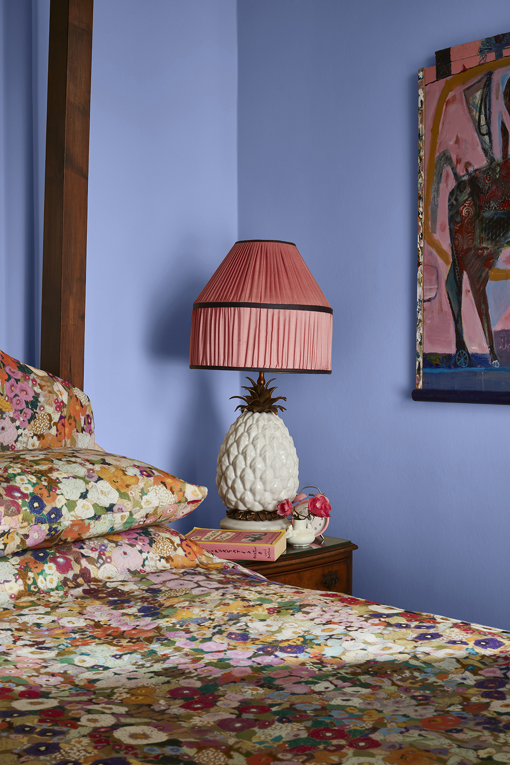
Wall in Azure by House of Hackney
The paint trends to follow right now
Just as the brand changed everything in wallpaper trends for a new decorating era in the 2010s by banning feature walls and championing pattern on every surface, this time around it’s re-educating us on what to take brush or roller to. ‘Paint can absolutely be maximalist – we want to inspire people to be inventive and have fun with it,’ Gormley tells us. Out goes the rulebook, again, and in come painted ceiling roses, doorways framed with pigment, contrasting panelling, statement dado rails and vibrant fireplaces. ‘We’re entering a new aesthetic movement where paint is being used really experimentally, it’s almost like a revival of what we saw with The Bloomsbury Group.’
Be The First To Know
The Livingetc newsletters are your inside source for what’s shaping interiors now - and what’s next. Discover trend forecasts, smart style ideas, and curated shopping inspiration that brings design to life. Subscribe today and stay ahead of the curve.
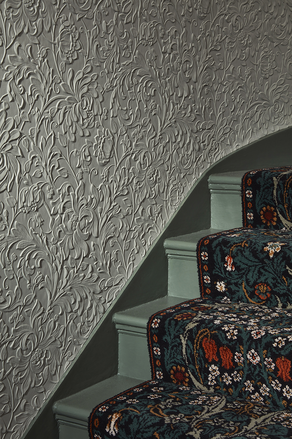
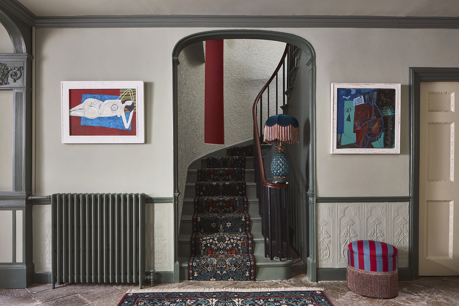
Wall in Celadon, stairs in Jadeite, both from the new House of Hackney collection
While exuberance features heavily in the House of Hackney school of painting, if you're wondering how to paint a wall then pale hues have a home too. ‘We love a space that feels like it’s encased in color. It’s so beautiful to drench an entire room – including the ceiling – in one shade and pick out smaller details such as woodwork in a neutral tone. It’s about balance and harmony’ says Gormley. ‘Color is what makes us happy,’ she smiles. ‘For us, this is about showcasing color and inviting people to be playful and brave with it – we’re very excited to see the results.

Amy Moorea Wong is a color authority and contemporary interior design writer who has specialized in all things decorating for over a decade. Amy is Livingetc magazine’s Colour Expert, Interiors Editor at The Glossary magazine and a Contributing Editor at Homes & Gardens magazine, and she frequently contributes to an array of global publications to share her insights on interior design zeitgeist. Her book Kaleidoscope: Modern Homes in Every Colour explores a collection of cool colorful homes fizzing with creativity, surprises, and inspiration.
-
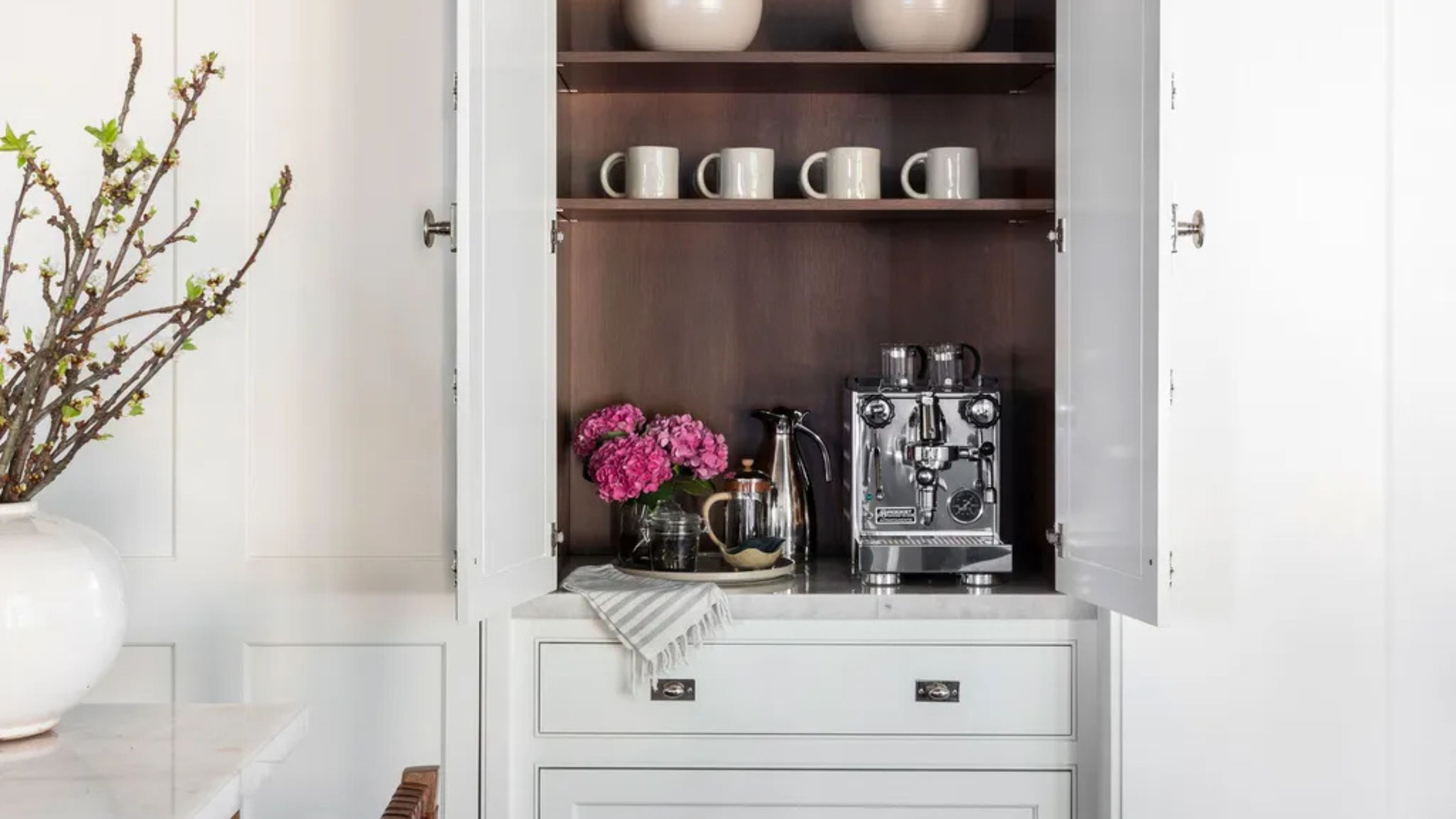 Turns Out the Coolest New Café is Actually In Your Kitchen — Here's How to Steal the Style of TikTok's Latest Trend
Goodbye, over-priced lattes. Hello, home-brewed coffee with friends. TikTok's 'Home Cafe' trend brings stylish cafe culture into the comfort of your own home
By Devin Toolen Published
-
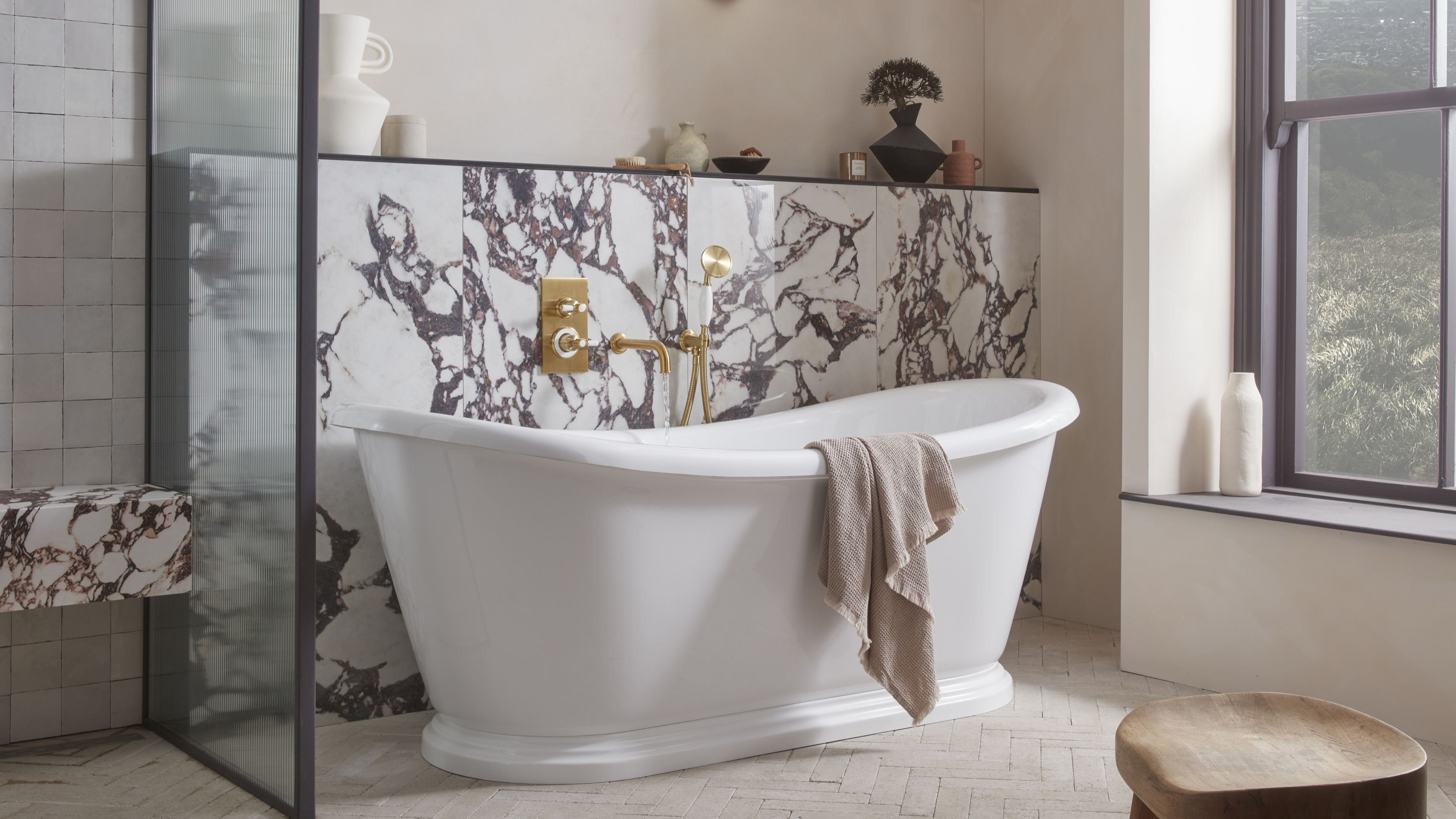 5 Bathroom Layouts That Look Dated in 2025 — Plus the Alternatives Designers Use Instead for a More Contemporary Space
For a bathroom that feels in line with the times, avoid these layouts and be more intentional with the placement and positioning of your features and fixtures
By Lilith Hudson Published