Why "paprika" is a trending color in decor right now
The big color of next year is here already and there are ways to use it already which help you create restful decor schemes
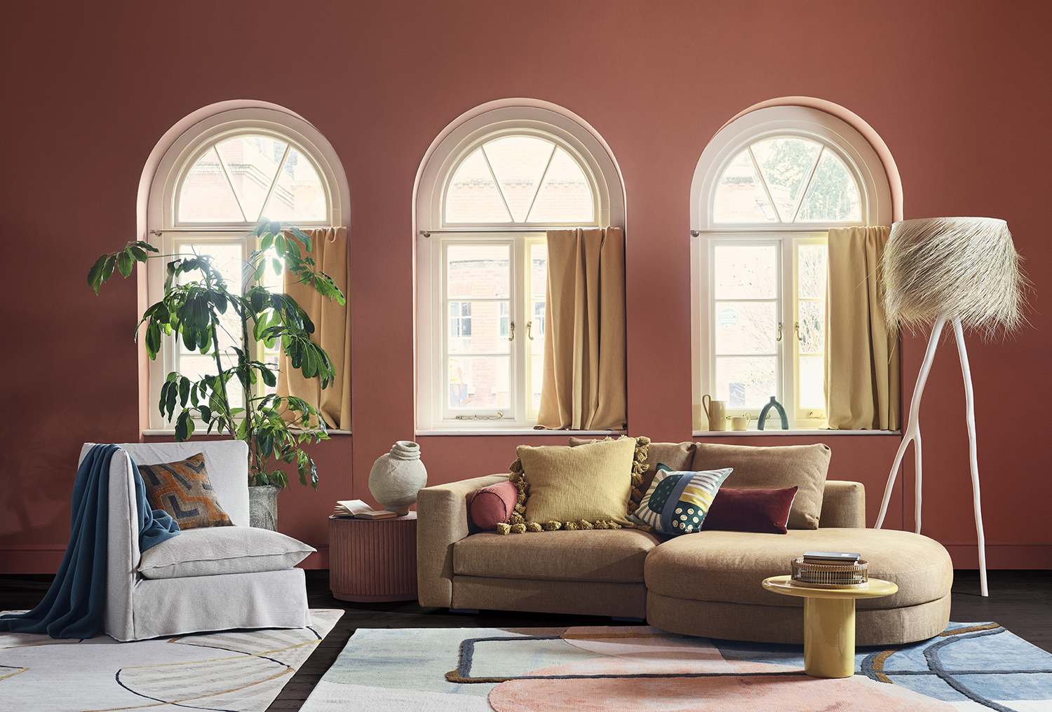
As far as color trends go, isn’t warmth a mood we all want from our homes? A feeling of sunshine, heat, vacations and comfort? These seem to be the biggest watchwords in decor right now, and words that designers have at the forefront of everything they're creating.
So it's no surprise that one of the biggest color trends we're seeing on the horizon for 2023 has all these qualities. Step forward paprika, the punchier cousin of terracotta that adds a dash of spice to uplift your decor schemes.
'I'm obsessed with burnt oranges right now,' says the designer Yinka Ilori, known for his distinctive and daring use of color. 'I use it so much in my work and home. It's important to live with hues that speak to you.
'It is a key trend as we continue to look to our homes for comfort and sanctuary,' says the designer Kelly Wearstler. 'The shade is not only versatile but is inherently warming and effortlessly complements handcrafted objects made from natural materials, such as rattan, seagrass and linen. I love using it in the home. It’s an easy-going color characterized by softness, like morning sunlight.'
At Salone del Mobile in Milan in June, the furniture fair where all the big new designs and ideas are launched, paprika was everywhere. Used across outdoor tables at Flexform, dressers at Galotti&Radice and sofas at Calligaris, it’s the new neutral that goes with anything, quite literally spicing up your (home) life.
1. Use it on a statement piece of furniture
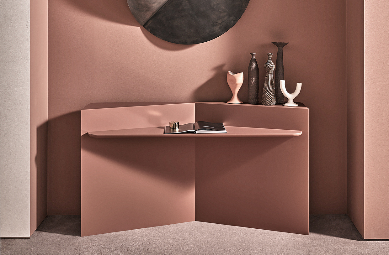
An easy way to add in an accent color is always by using a statement piece of furniture. Galotti&Radice's Hanami vanity, which debuted in Milan in June, is just that - a modern and angular dress which has sharp edges and even sharper decorative style.
Use it to cut a dash in a neutral bedroom or against other vacation tones like a light sky blue or a soft, sunny yellow.
Be The First To Know
The Livingetc newsletters are your inside source for what’s shaping interiors now - and what’s next. Discover trend forecasts, smart style ideas, and curated shopping inspiration that brings design to life. Subscribe today and stay ahead of the curve.
2. Pair paprika with greys
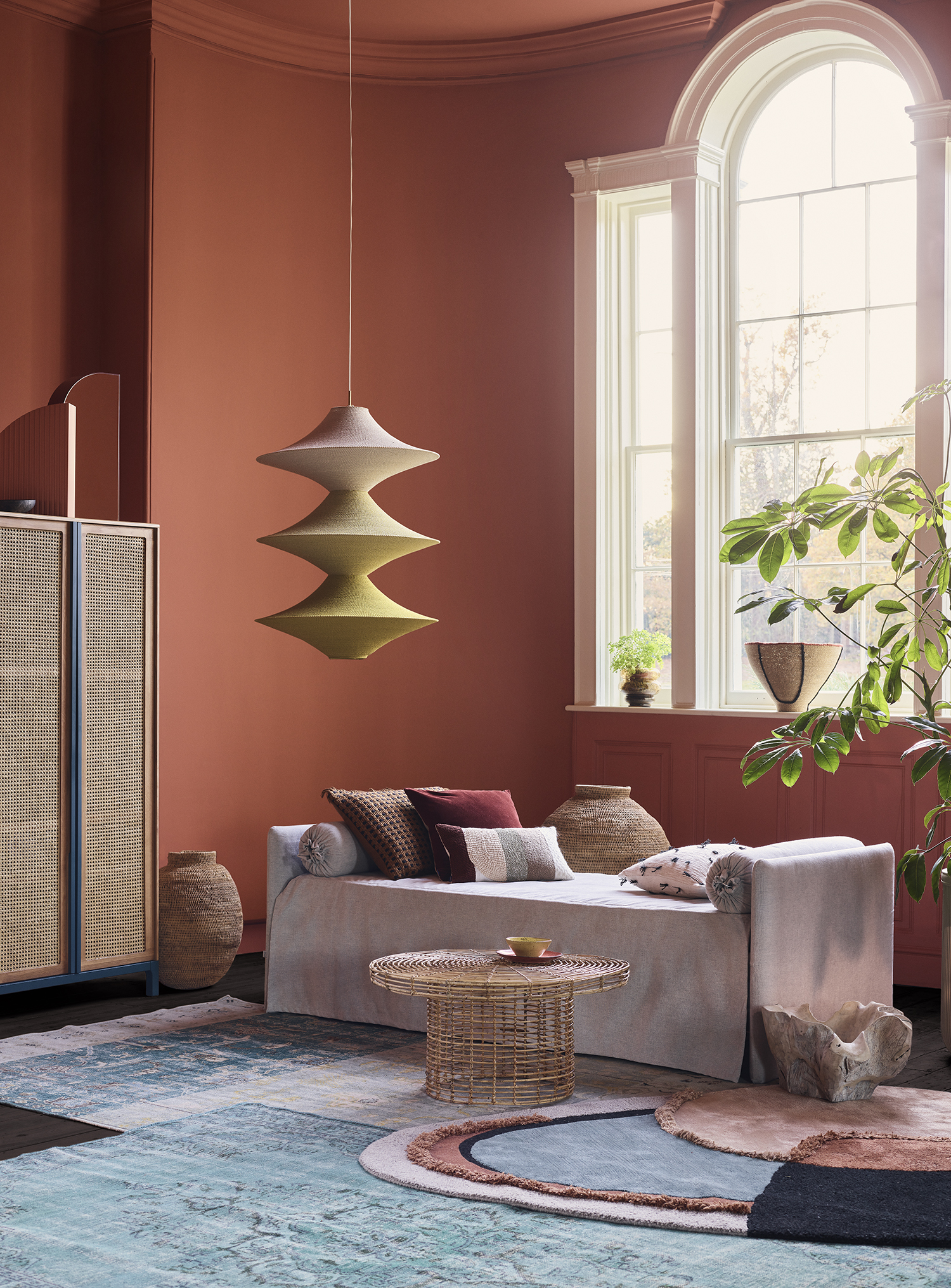
For this shoot that the stylist Hannah Franklin created for Livingetc, she used paprika on the walls - it's actually Tuscan Red by Little Greene- and paired with a mixture of softer shades.
'The quiet, neutral upholstery acts as a perfect foil to all the color and rich texture,' she says of her choice to include the grey daybed.
And that's one of the brilliant things about paprika - its ability to work with almost anything. Even being our new favorite color to go with grey.
3. Enhance warmer tones in other pieces
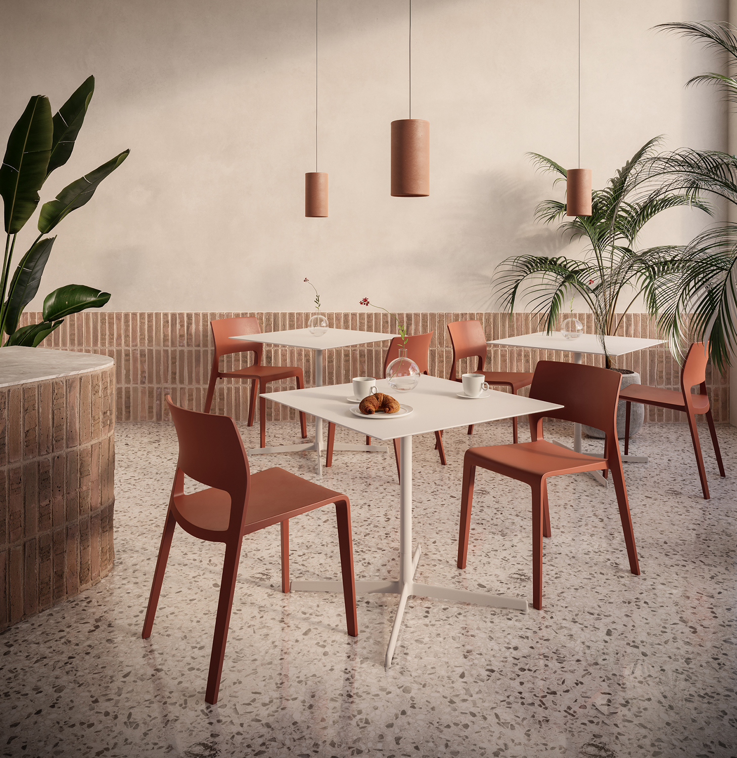
Because of how close paprika is to terracotta, the instant association it creates is that of sunbaked clay on a terrace in the Mediterranean. And it lends that warmth to whatever it is placed next to, becoming an instant mood booster throughout the house.
These Juno chairs by Arper have loaned their warmth to the terrazzo flooring they've been placed on and the brick wall surrounding them, enhancing the redder tones and creating a space that suddenly no longer feels neutral. So pair paprika with subtle patterns or materials that you think could do with a lift - anything with a red pigment in it will be the perfect complement.
4. Create an outdoor oasis
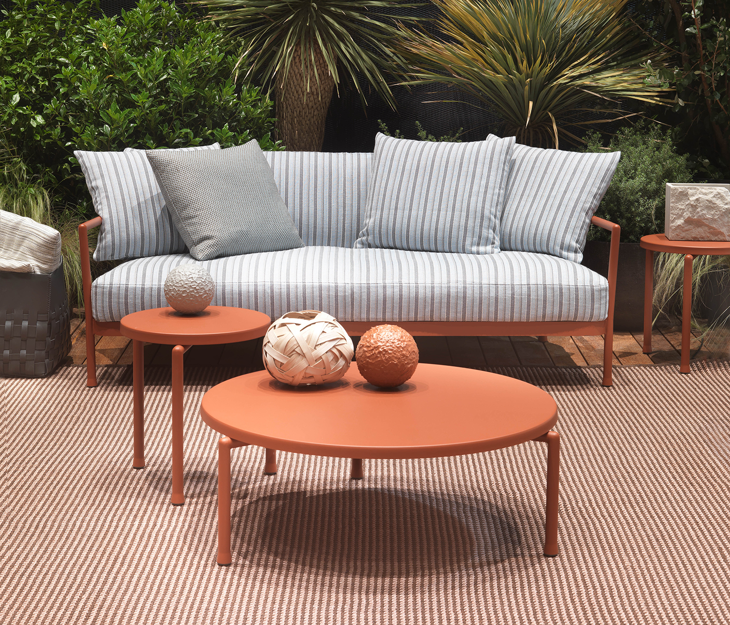
Flexform took paprika outside with its Camargue table, part of a family of alfresco products made from lightweight aluminium. As far as interior design trends go, nothing could be more on the money for 2023 - this color brings the sunshine even when there isn't any, creating a space just made for lounging.
'It's known as a color that aids conversation,' says stylist Hannah Franklin. 'Offset with a soft rug underfoot for a convivial space.' A theory that works both indoors and out.
5. Enliven the most functional of spaces
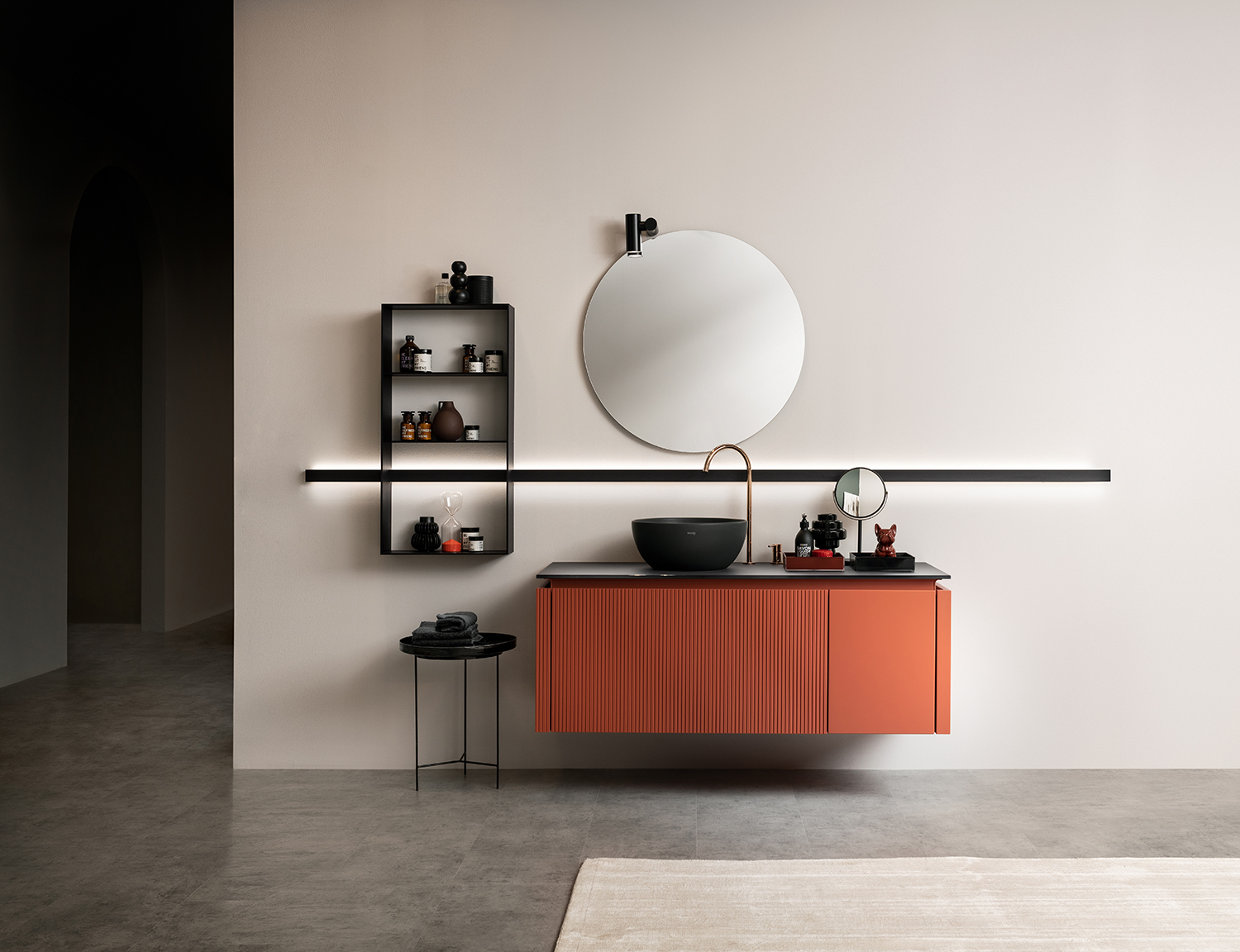
Paprika is an unexpected shade to see in a functional space like a kitchen or bathroom, but that's why it works so well. A hugely versatile color, it is a brilliany contrast to muted white and cream tones more usually seen in these spaces.
'Introduce the shade subtly through tiled flooring, or pair with marble and tiles in the same hue,' Kelly Wearstler says. 'When it comes to this shade, integrating local stones can create an emotive link between the home and its surroundings – designs that play upon the raw, natural beauty of an environment are the most beautiful.'
Scavolini debuted this tone to startling effect at Salone - its Libra bagno bathroom unit truly lifts this spa-like space, a wonderful jolt that proves the power of paprika.
The editor of Livingetc, Pip Rich (formerly Pip McCormac) is a lifestyle journalist of almost 20 years experience working for some of the UK's biggest titles. As well as holding staff positions at Sunday Times Style, Red and Grazia he has written for the Guardian, The Telegraph, The Times and ES Magazine. The host of Livingetc's podcast Home Truths, Pip has also published three books - his most recent, A New Leaf, was released in December 2021 and is about the homes of architects who have filled their spaces with houseplants. He has recently moved out of London - and a home that ELLE Decoration called one of the ten best small spaces in the world - to start a new renovation project in Somerset.
-
 My 10 Favorite Designs at Milan Design Week 2025 — Out of the Hundreds of Pieces I Saw
There is a new elegance, color, and shape being shown in Milan this week, and these are the pieces that caught my eye
By Pip Rich
-
 Iridescence Is Chrome’s More Playful, Hard-to-Define Cousin — And You're About to See It Everywhere
This kinetic finish signals a broader shift toward surfaces that move, shimmer, and surprise. Here's where to find it now
By Julia Demer