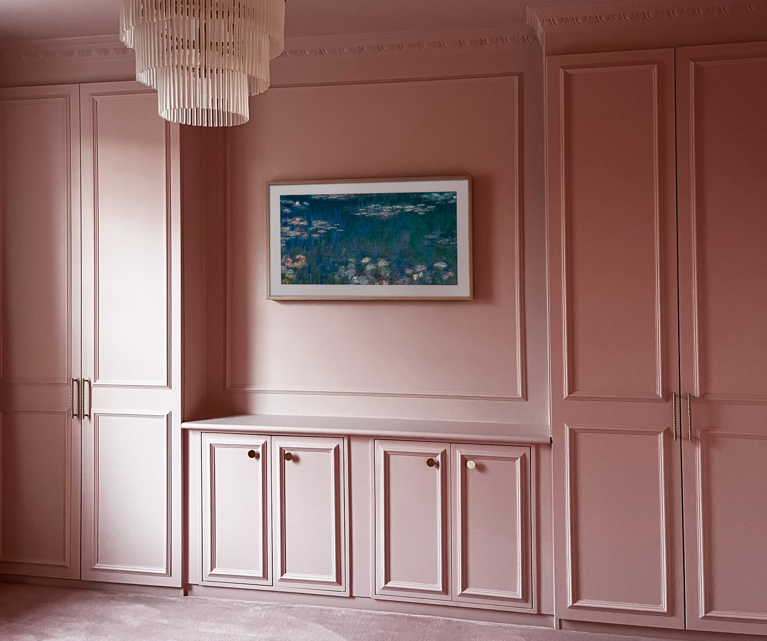
This IKEA Pax hack creates a built-in closet that looks authentically turn-of-the-century
DIY molding gives this built-in wall closet a paneled look that blends seamlessly into this period property

The Livingetc newsletters are your inside source for what’s shaping interiors now - and what’s next. Discover trend forecasts, smart style ideas, and curated shopping inspiration that brings design to life. Subscribe today and stay ahead of the curve.
You are now subscribed
Your newsletter sign-up was successful
When it comes to creating a built-in closet you can always rely on the IKEA PAX. With this versatile system, the size and shape of your wardrobe are decided by you to maximize every inch of your storage space. But alas, the simple ubiquitous design of IKEA's flat-pack furniture often falls short, and it certainly doesn't belong in a turn-of-the-century home. Or does it?
This latest IKEA hack shows that with a few simple tweaks, contemporary flat-pack furniture has a rightful place in period properties. Homeowners Frances and Benjamin - who share the renovation of their 1899 home over Instagram (@itsnotsogrimupnorth) - wanted a built-in wall closet that fitted seamlessly into their turn-of-the-century hom. By combining the PAX with a few EKET cabinets and putting their DIY skills to the test, they came up with this elegant IKEA hack that blends in beautifully in their color-drenched bedroom.
Here, the couple share how they transformed their IKEA flat-packs into an authentic-looking Victorian built-in wardrobe.

Lilith is an expert at following news and trends across the world of interior design. A personal fan of the Scandi-inspired interior, her job entails keeping up with everything there is to know about the Swedish powerhouse IKEA. Paired with her insight into the latest home renovation projects, she regularly shares IKEA hacks with readers to inspire their own DIY projects in home design.
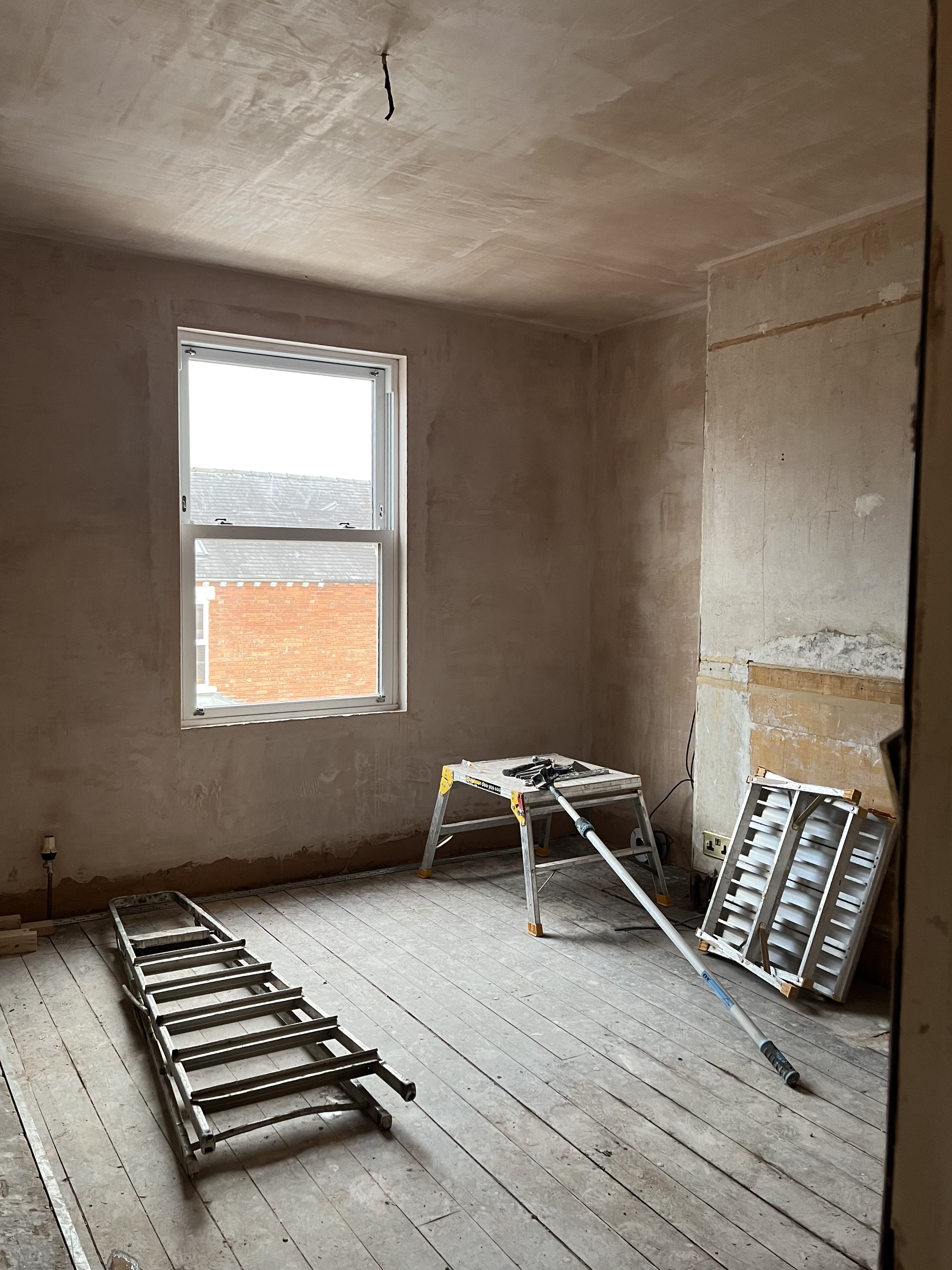
Frances and Ben's home is a typical turn of the century home found in cities in the northern hemisphere - high ceilings, bay windows and decorative period features like ceiling roses and crown molding. However, like many other Victorian homes, it also has awkward spaces that don't utilize space.
After knocking out part of the wall in their master bedroom in an effort to make their alcoves more symmetrical, they realized they couldn't remove the structural area in the middle (likely the chimney flue), so they decided to accommodate it in a built-in storage solution. 'We’re in the process of renovating the entire house so bespoke built-in units were out of our budget,' explains Frances.
Naturally, they turned to the next best thing available; a trusty IKEA hack. 'We knew this way we could get the classic symmetry we wanted while saving some money and hiding the awkward architecture by only compromising a small section of the interior in one of the units,' Frances notes. 'With some careful planning and IKEA's PAX planner builder tool, we managed to come up with a design that would work in the space.'
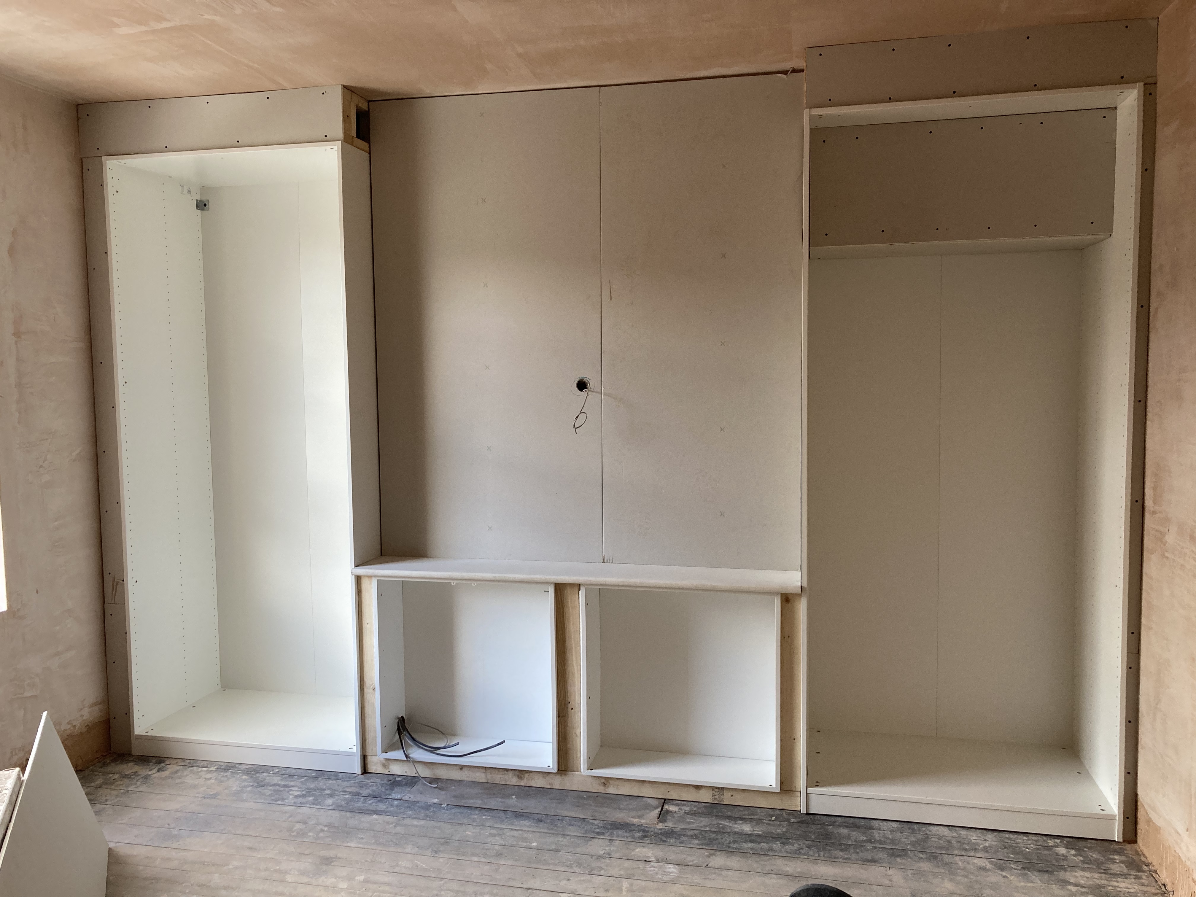
To bridge the gap between the closets in each alcove, they bought two EKET cabinets with double doors. Frances admits that she and Ben are more attuned to design than DIY, so, when it came to construction, they had a little extra help in the form of Ben’s dad. (You're never too old for a helping hand from your folks.) 'We used a jigsaw to cut the back of one of the PAX units to fit perfectly into the shape of the alcove and also slimmed down the EKET units so that they fit in line with the PAX frames,' Ben explains.
The Livingetc newsletters are your inside source for what’s shaping interiors now - and what’s next. Discover trend forecasts, smart style ideas, and curated shopping inspiration that brings design to life. Subscribe today and stay ahead of the curve.
Once all the dimensions of the individual systems were flush, Ben and Frances (and, of course, Ben's dad) then built a frame out of timber to lift all the units off the floor. To create the built-in look for their bedroom, they then used MDF boards to fill the gaps between each section. 'Afterward, we plaster-boarded from the ceiling down and lightly skimmed everything in,' Ben says. 'The ceiling had been lowered and plastered anyway as it was covered in horrible artex so this was the ideal solution for us.'
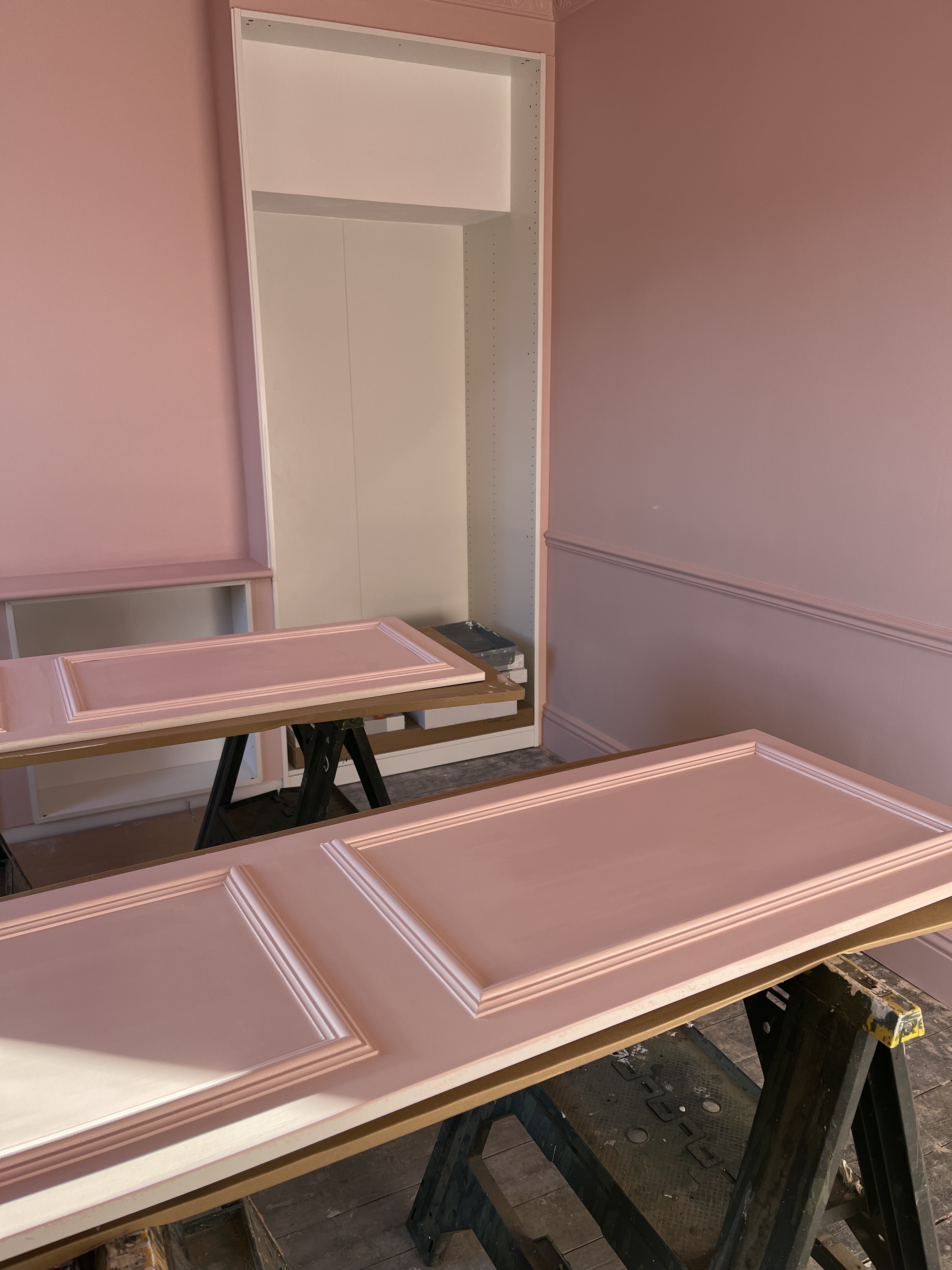
After the frames were complete and everything was fixed to the wall, they then used an MDF window board with a bullnose edge as a DIY shelf on top of the EKETS. To create a traditional paneled look on the simple IKEA cabinets, they added pine wood molding to all the doors.
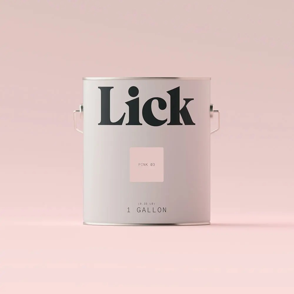
Once these were dry, it was time to paint. Ben and Frances knew they wanted to color drench their space by painting their fifth wall the same shade as their other walls for a bedroom that feels airy and elegant but with a modern twist. 'For the color, we loved Lick’s Pink 03 - we were aiming to create a room that had the feeling of a Parisian boutique hotel,' says Frances. (If I'm honest, it's the manifestation of my dream bedroom as a kid!) After going in with a coat of Zinsser B-I-N primer, they then added the color.
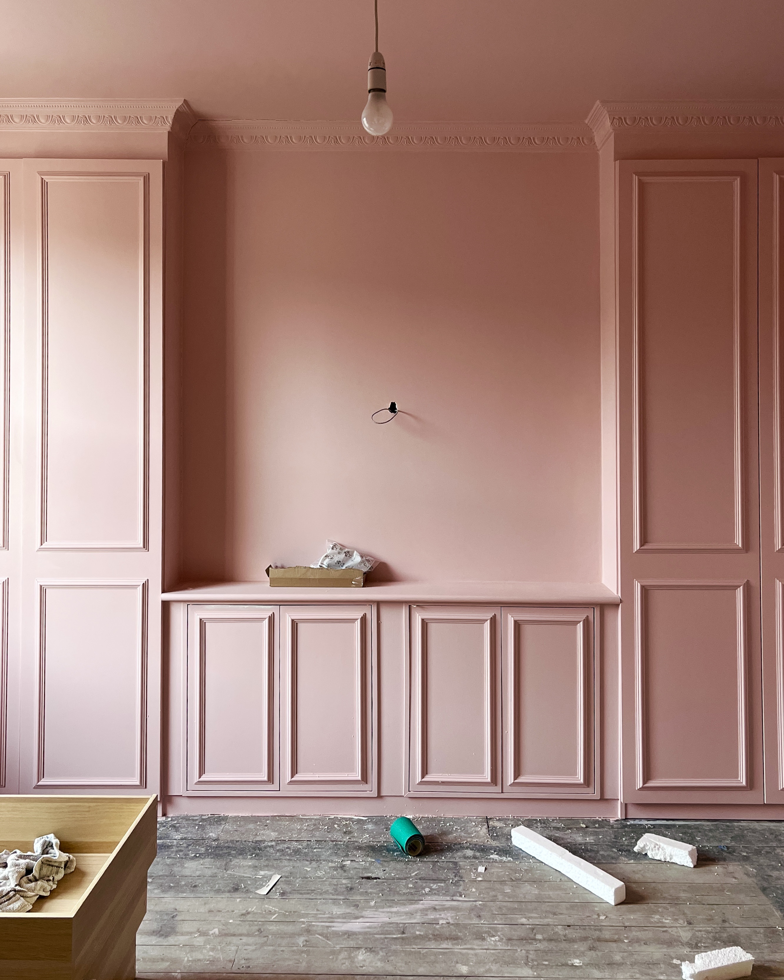
According to Ben and Frances, it was the painting that was most time consuming of all. 'We found that the key to a smooth finish is to sand very lightly between coats and to paint the molding with a brush first before going over the door with a small roller to keep as flat of a texture as possible,' explains Ben. 'It was a pretty monotonous process but definitely worth the effort.' They finished off the wall closet with a coat of clear furniture varnish and added some modern brass hardware from Plank (the STACK ribbed T-bar handle and the LOVELL circular knobs) to give them a more modern, transitional style.
To help their wall closet look as though it was an original feature of the property, they chose to add coving around the top edge which they carried along the entire ceiling. This attention to detail is what makes this built-in wardrobe look so traditional and authentic. It really is the little things that count.
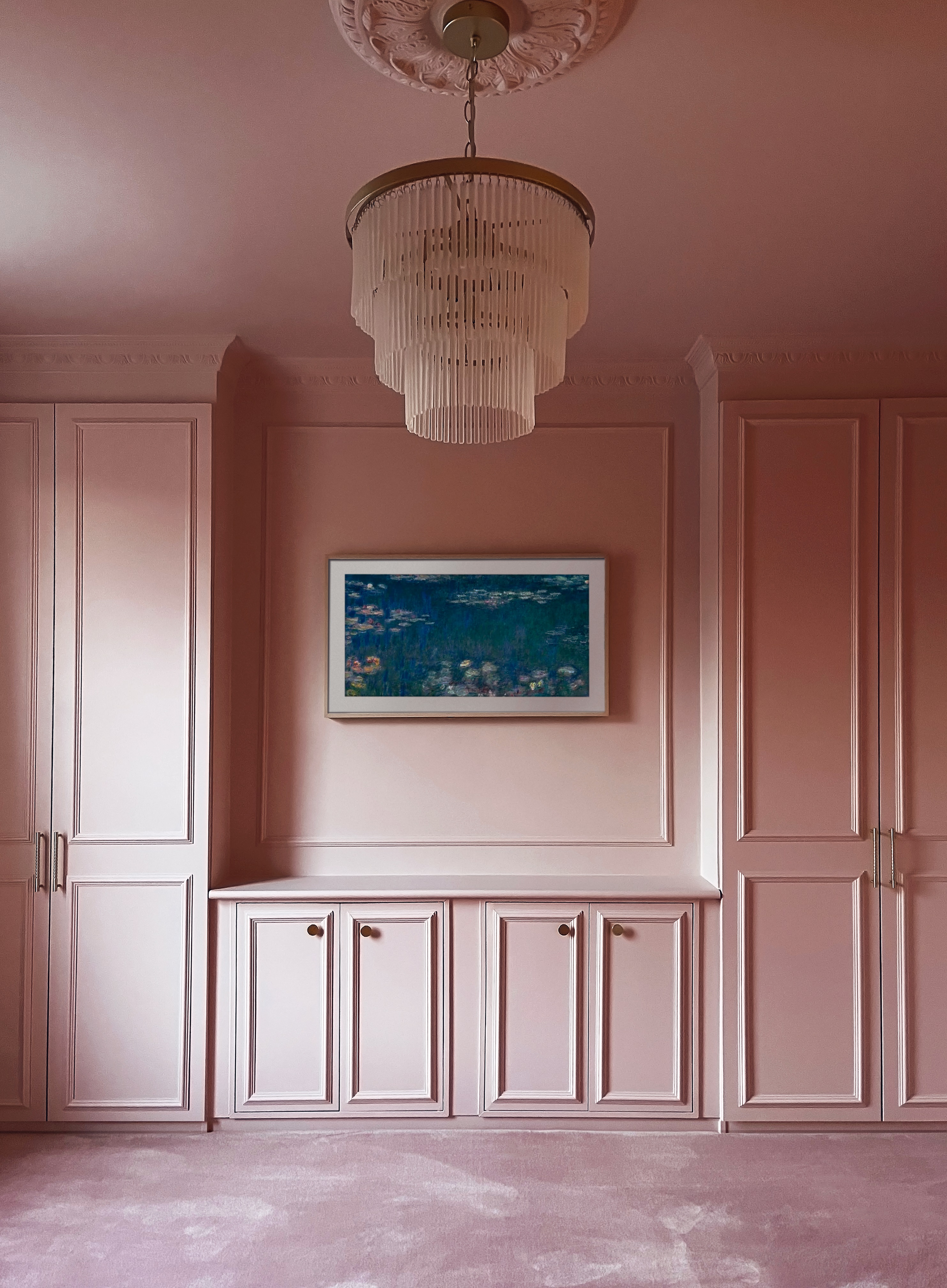
'We absolutely love the final result,' says Frances. 'As our combined design style is a blend of traditional with some more contemporary touches, we can’t imagine anything else working as well for us in the space without spending on custom carpentry.' They've already found a legion of fans on Instagram who are hailing Frances and Ben's bedroom as ‘the pink room of dreams’. It's a label Frances and Ben would be more than happy to catch on!
Get the look
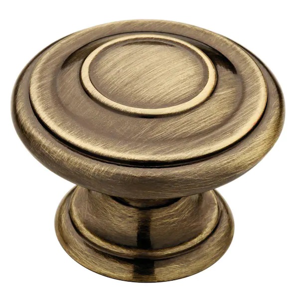
Although they're new, these brass cabinet knobs from The Home Depot have a vintage feel about them thanks to their distressed look. The gold tinge pairs beautifully with pink if you want to recreate Ben and Frances look, but they look just as sophisticated on a white or black backdrop.
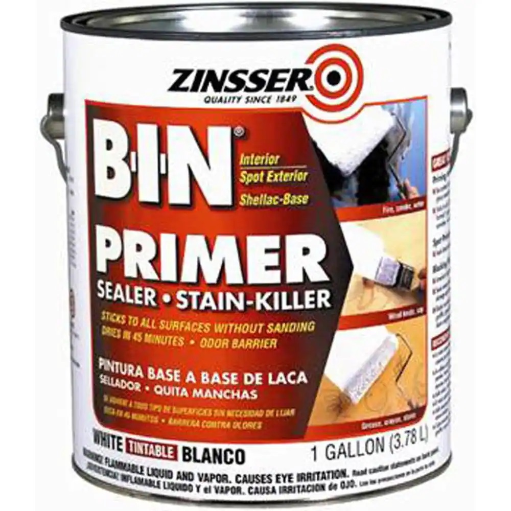
There's a reason Zinsser's B-I-N shellac-base primer is an industry favorite. Use their white primer before painting to help make your color pop and prolong its life. The best part? It sticks to any surface without sanding making it perfect for IKEA hacks and furniture painting.

Lilith Hudson is a freelance writer and regular contributor to Livingetc. She holds an MA in Magazine Journalism from City, University of London, and has written for various titles including Homes & Gardens, House Beautiful, Advnture, the Saturday Times Magazine, Evening Standard, DJ Mag, Metro, and The Simple Things Magazine.
Prior to going freelance, Lilith was the News and Trends Editor at Livingetc. It was a role that helped her develop a keen eye for spotting all the latest micro-trends, interior hacks, and viral decor must-haves you need in your home. With a constant ear to the ground on the design scene, she's ahead of the curve when it comes to the latest color that's sweeping interiors or the hot new style to decorate our homes.
