Is turning your books backwards a design faux-pas? We settle the debate once and for all
The bookshelf decorating trend has divided opinions with some loving the neutral minimalist look and others arguing it's an impractical fad...
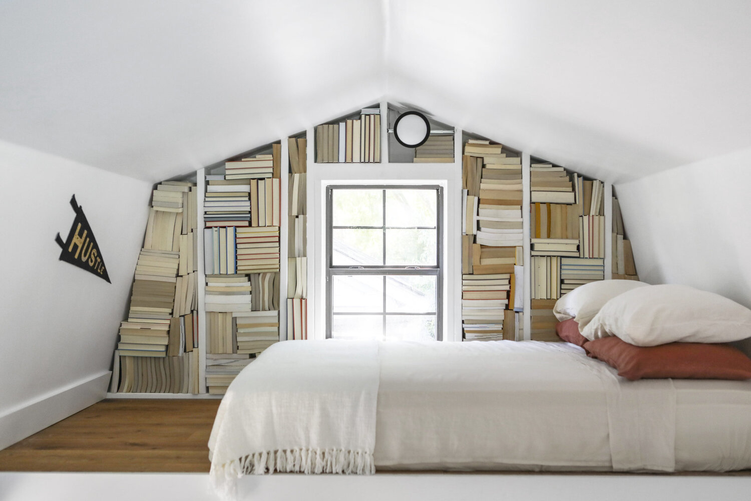
Whether you've seen it on Instagram or in the houses of your friends and family, it's hard to escape the trend for styling books facing 'wrong' way in the last few years. The backward book trend, as we're calling it, has been a popular decorating idea, but not without its fair share of controversy. For some, it's a stylish way to decorate your bookshelves in a more neutral fashion, for others, it's nothing but an impractical fad.
It's easy to see the appeal this idea has, and why it's had such a chokehold on interiors since it started doing the rounds. If you have a more maximalist design in your home then a colorful assortment of books with their spines on display is probably exactly what you want - after all, there's so many creative ways of decorating with books you can try out. However, if you're a fan of a more pared-back, neutral vibe, it's hard to make books work in your scheme without carefully curating the titles you have on show, or else falling victim to a cacophony of color.
Whether you feel strongly about it either way, or whether this is the first you've heard of the idea, we've asked some designers to help settle the debate for good.

Lilith is an expert at following news and trends across the world of interiors. She's committed to helping readers make the best design choices by writing practical tips and guides that help them master an on-trend style in their homes. For this article, she explores the backward book decorating trend and investigates whether it's a stylish minimalist shelving idea or merely an impractical fad...
What is the backward book trend?
If you have no idea what we're talking about, the backward book trend is a way of decorating bookshelves the 'wrong' way round with their pages on display and spines facing inwards. It's a common feature in those moody, sepia-toned Instagram interiors that have probably found their way to you, and many of us are big fans.
For the most part, the idea is a conscious aesthetic decision. The warm tones of the pages, some of which have darkened with age, offer a comfortable coziness that looks right at home in a neutral interior where bright bold spines can look especially jarring.
'One reason I opted for backward books was the aesthetic they create and visual interest they add to the room, as well as being a neutral color palette that compliments any space,' says home renovator and stylist, Nicola Skidmore, who chose the backward book idea for her home. 'It also makes choosing a book more interesting as you are more likely to pick something that you might not ordinarily jump to!'
'The second reason was we inherited a lot of books from a relative and they weren't all to our interest, so turning them around was a storage solution as well as an aesthetic decision,' she adds.
Be The First To Know
The Livingetc newsletters are your inside source for what’s shaping interiors now - and what’s next. Discover trend forecasts, smart style ideas, and curated shopping inspiration that brings design to life. Subscribe today and stay ahead of the curve.
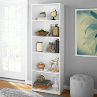
White 5-shelf bookcase, Walmart
Keep things simple with this white bookcase from Walmart, the perfect backdrop for your selection of books (be it colorful or muted!). The sturdy storage unit has a closed-back design with two fixed shelves and three adjustable ones, plus it also comes with a strap kit to attach to your wall.
Why is it controversial?
If you're sat there in dismay, then you won't need an answer to this question. Displaying your books backward has been a hot topic in the design sphere that's split opinions over the world.
For a start, there's the issue of practicality. Being unable to see the books you own really isn't useful when it comes to choosing a new read to get stuck into. Home blogger Laureen Clauson doesn't deny this fact. 'As far as practicality, there is none,' she says. 'I knew when I designed this space that these wouldn't be books I'd be searching for to read. It's purely aesthetic.' In cases where Laureen couldn't find enough books with neutral bindings, she even resorted to painting the cover of the books with chalk paint!
For some people, this is the sort of disorganization they dread to even think about. Most avid readers pride themselves on their book collection too, so facing them the other way so they aren't on display to the world is considered a travesty by some.
Others take issue with the design choice more generally. These tend to be the types of people who think spaces with entirely neutral color schemes are devoid of character and personality and instead prefer a more vibrant style.
That's the view held by Emma Bestley of Move Over Magnolia studio, the co-founder and creative director of YesColours. 'Books have become more than just something to read, they’re a home accessory that help make an interior scheme pop,' she explains. 'Not only this but often the books we choose to have on display have meaning, so why opt to hide them?'
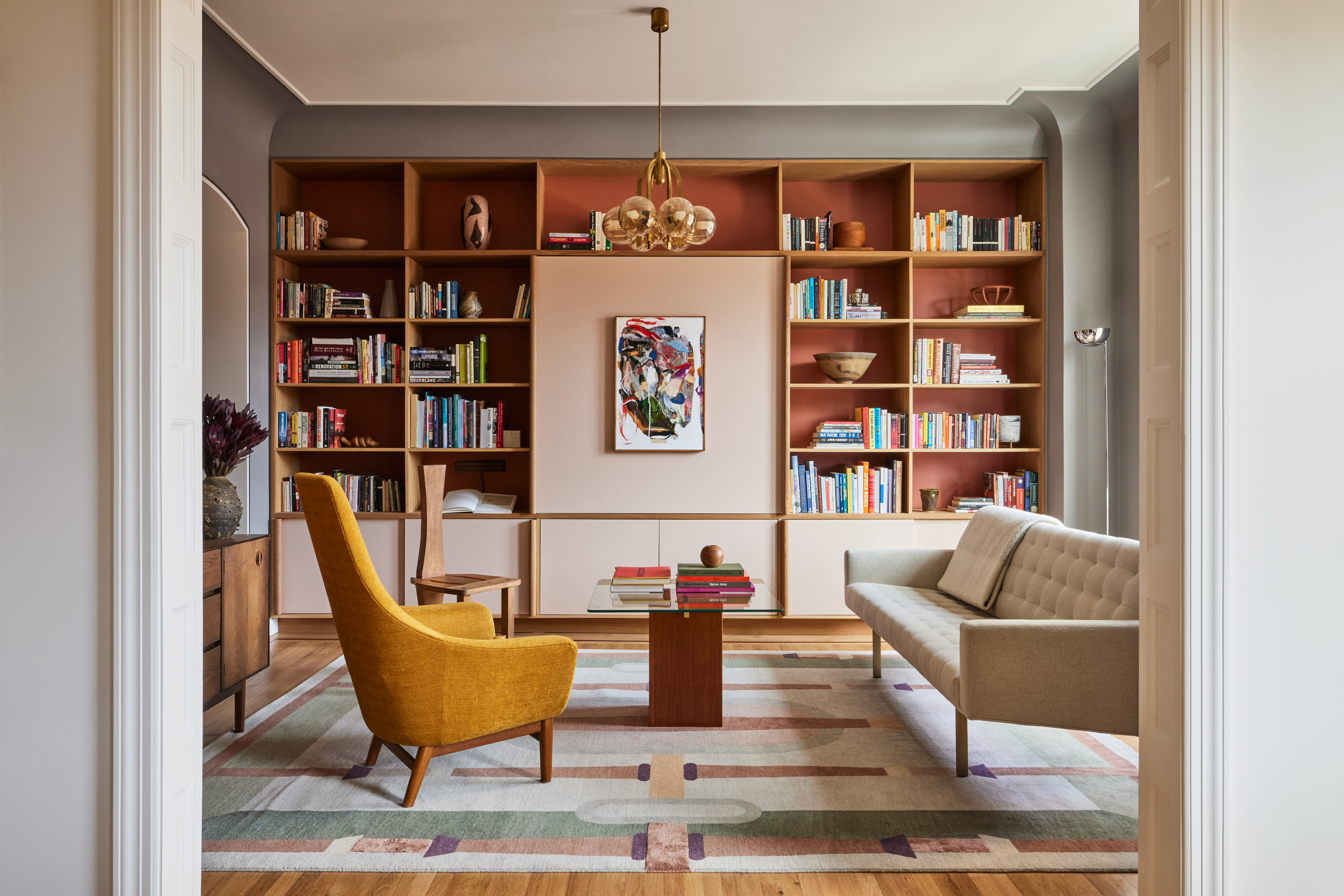
In this living room, books add to the composition of the main accent wall.
For others, their concerns run deeper. Chinese astrologer and Feng Shui consultant Janine Lowe says turning your books so they face the other way can release negative energy.
'The idea of books is to bring positive energy into the house, so be sure to organize them in a way that complements the room and the person entering the room,' she says. 'Facing them backward, however, is considered bad Feng Shui and said to give off negative chi. For example, if you were reading a horror book, by facing the pages toward you the energy is exposed and so it seeps out with all its negative chi. If the book is closed firmly and the spine is facing out the energy is kept within the book.'
Even if the book is a positive one, Janine says there are still risks involved with facing the pages toward you. 'Where was the book open? Was it in a negative area of the house? Was it owned by someone else and their chi is still hidden between the layers of the book?' she questions. 'For positive chi, always close your books and put them away.' For harmonious vibes throughout your space, it's worth researching living room feng shui principles. After all, no one wants the beasts or monsters from the pages of books roaming their home.
Can regular books still look stylish?
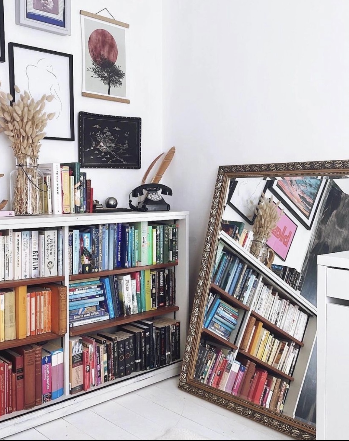
Even if you're an avid defender of the 'normal' way of styling books, there's no denying that the range of sizes, colors and formats can look cluttered when placed together on shelves. For a tidier, more organized space, turning books backward is a simple solution.
That said, a regular bookshelf can certainly still look stylish. The key is to take time to arrange them properly. First, it's a good idea to have books of the same size next to each other so they fit seamlessly together on your shelving for a more cohesive feel. This will also mean separating your hardbacks from your paperbacks. You could also color-coordinate your books if you have the patience, or lay some sideways to mix up the orientation.
You can also use books to add character and individuality in to a space that's lacking such qualities. 'As a renter, you may not have the luxury of being able to paint your walls in a bold color,' says Emma. 'If you’re working with white walls and a minimalist color palette, a stack of colorful spines might just be what you need to add volume and interest to the space. It can create a talking point and your choice of reading material will allow a glimpse of your personality to shine through.'
Which camp wins?
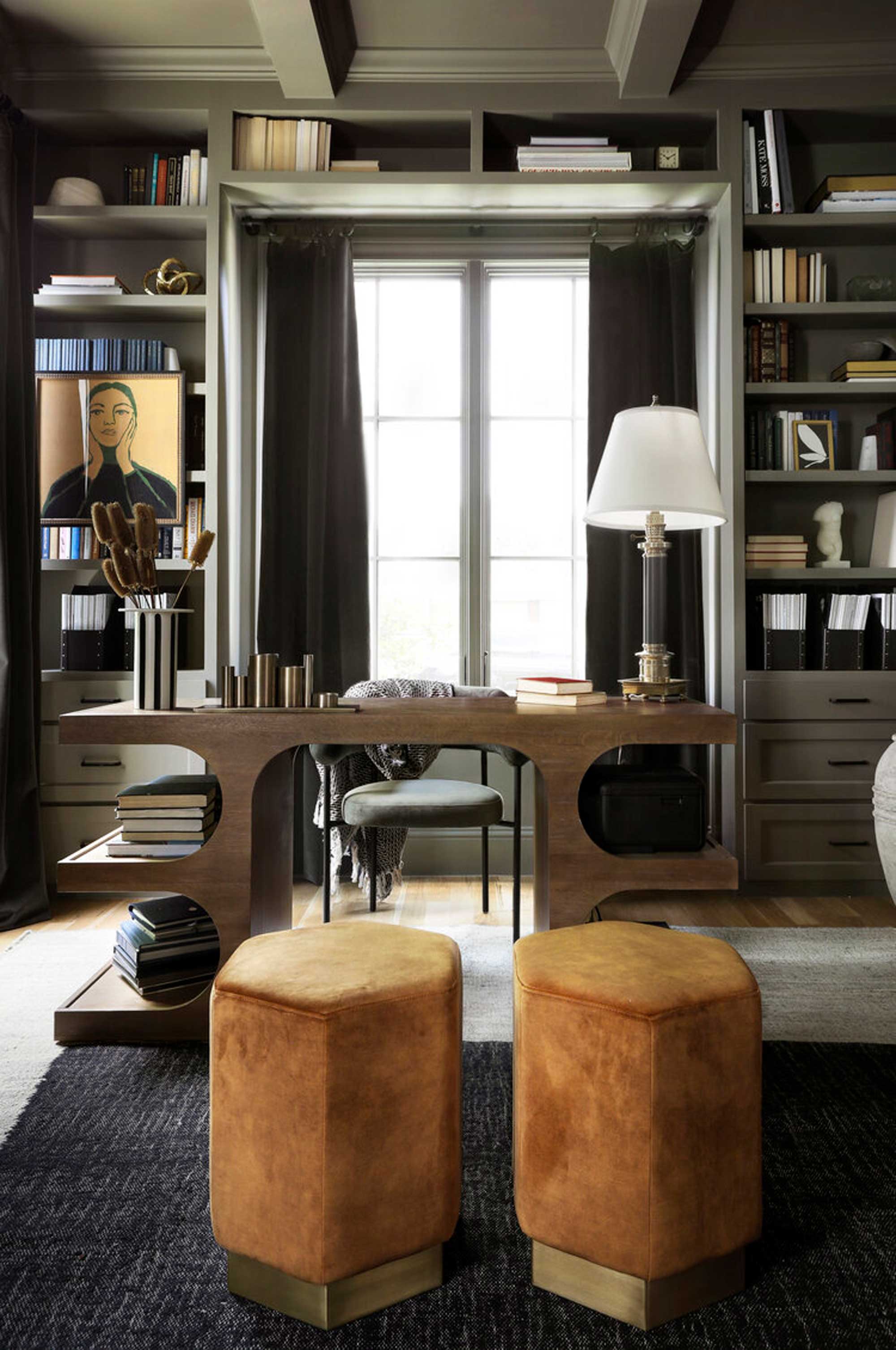
If you're a big reader who's constantly adding to your book collection, from a practical point of view it's difficult to imagine a scenario where backward books would ever work for you. If you've dedicated your home to a neutral haven of muted tones however, then this minimalist look might provide a useful way to style your books while still keeping them on display.
If you have confidence in your design, you can pull off anything, however, be wary that the choice to display your books backwards might illicit a strong response if you have guests round, or showcase your home online. Polling the Livingetc editors, the majority wouldn't choose to display books in this way in their home as a way to create an accent wall, but we're not completely against the idea.
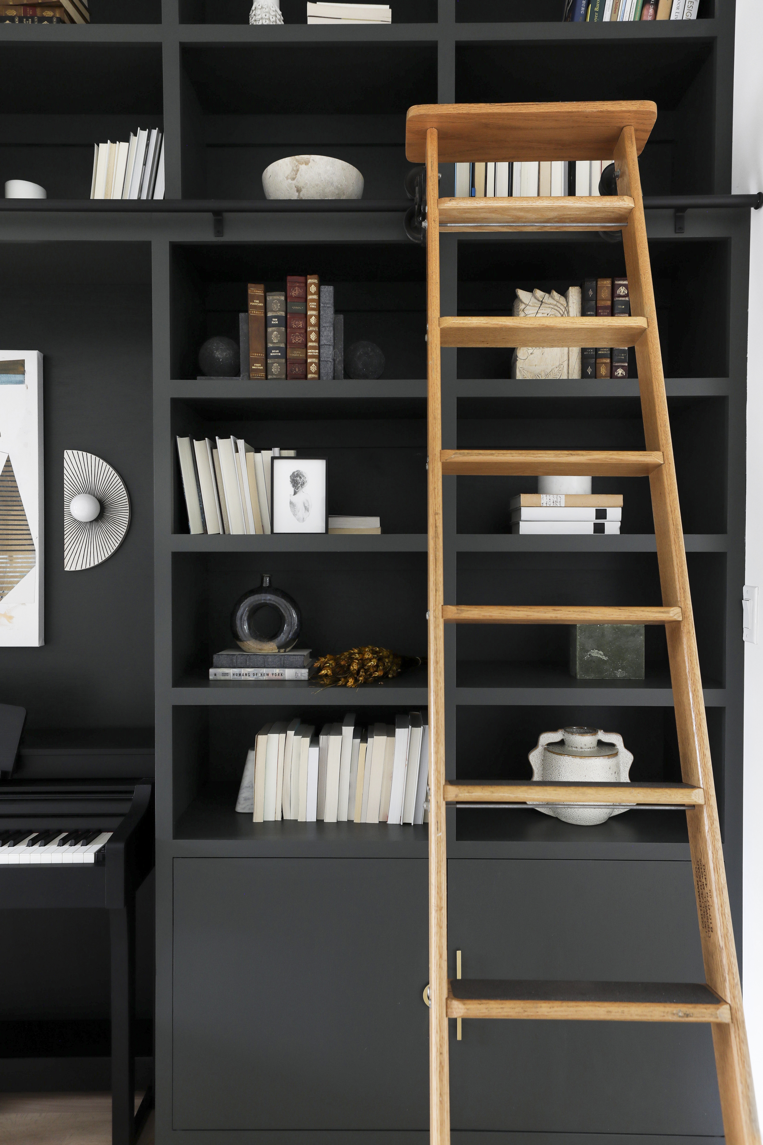
As a compromise, take inspiration from this home office by Urbanology Designs as an example. This bookshelf balances some books which fit the color scheme and aesthetic of the room facing forwards, with some volumes facing backwards. The overall effect is harmonious palette-wise, without highlighting the backwards-facing books as a defining feature of the room.

Lilith Hudson is a freelance writer and regular contributor to Livingetc. She holds an MA in Magazine Journalism from City, University of London, and has written for various titles including Homes & Gardens, House Beautiful, Advnture, the Saturday Times Magazine, Evening Standard, DJ Mag, Metro, and The Simple Things Magazine.
Prior to going freelance, Lilith was the News and Trends Editor at Livingetc. It was a role that helped her develop a keen eye for spotting all the latest micro-trends, interior hacks, and viral decor must-haves you need in your home. With a constant ear to the ground on the design scene, she's ahead of the curve when it comes to the latest color that's sweeping interiors or the hot new style to decorate our homes.
-
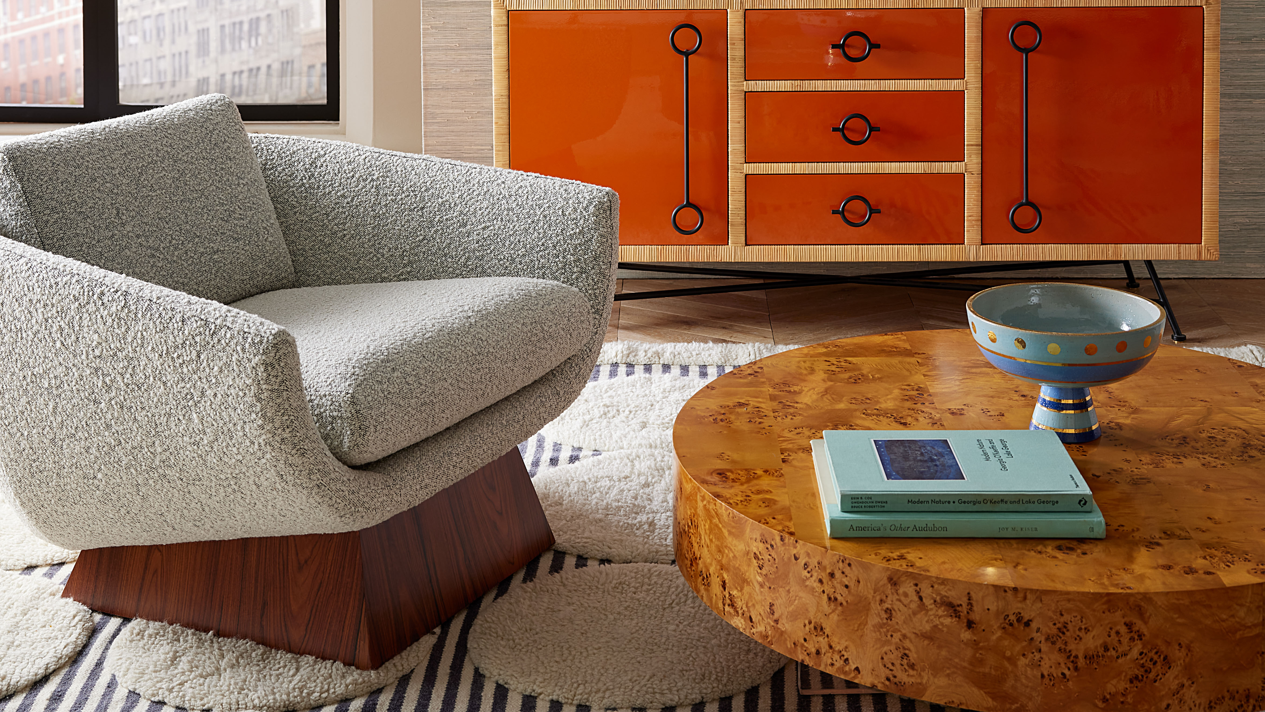 Burl Wood Decor Is 2025’s Most Coveted Comeback — Here’s How to Get the Storied Swirls for Less
Irregularity is the ultimate luxury, but you don’t need an antiques dealer to find it
By Julia Demer Published
-
 5 Garden Features That Instantly Add Value to Your Home — While Making Your Outdoor Space More Practical, too
Get to know all the expert tips and tricks for making your backyard a standout selling point for your home.
By Maya Glantz Published
