5 interior lessons we've learned from Jenna Lyons' apartment that proves she's the most stylish Housewife of New York
Former fashion designer Jenna Lyons has always been a style icon of the Livingetc team - here are 5 lessons we've learned over the years from her New York apartment
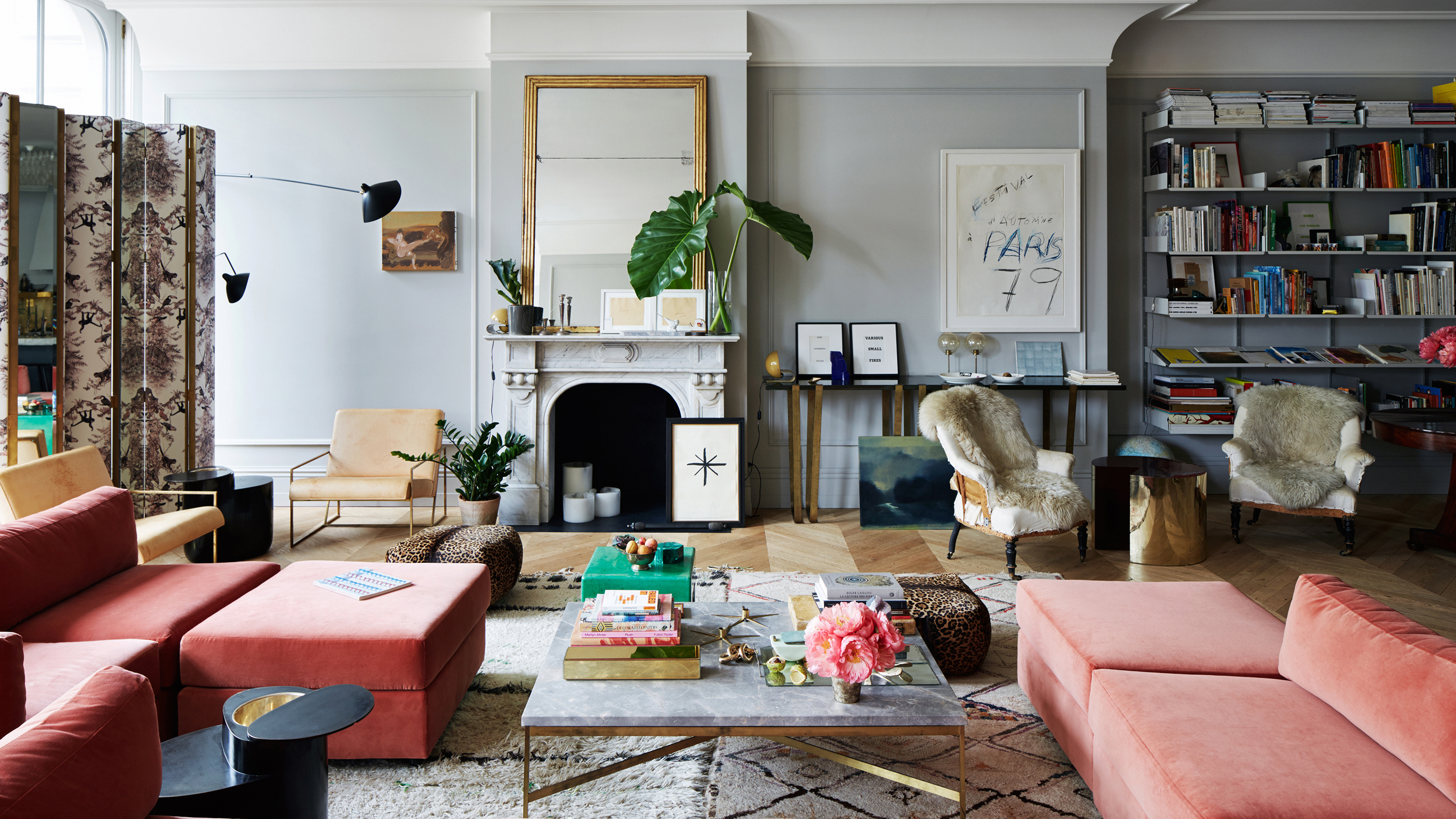
Jenna Lyons might be a new name to many who have tuned in to the reboot of The Real Housewives of New York, but she's been on the Livingetc's radar for some time. We've been keeping up with the fashion designer turned interior designer and business woman's home decorating tips for a while now, and we've learned some interesting things from her New York home.
In Jenna's apartment, you don’t know where to look first, everything’s just beautiful, you want to pick up and touch every object on display. All of the elements make the space a beautifully lived-in home, in the most stylish way you could possibly imagine.
There are books, artworks, and random accessories found on shelves, and it’s all so deliciously satisfying for the interior design aficionado. So many things make the space so unique and full of character. When it comes to who is Jenna Lyons, her apartment gives you a glimpse inside her style. Here are the five lessons we’re taking out to create the most beautifully eclectic style.
1. Mix textures in the most fearless way
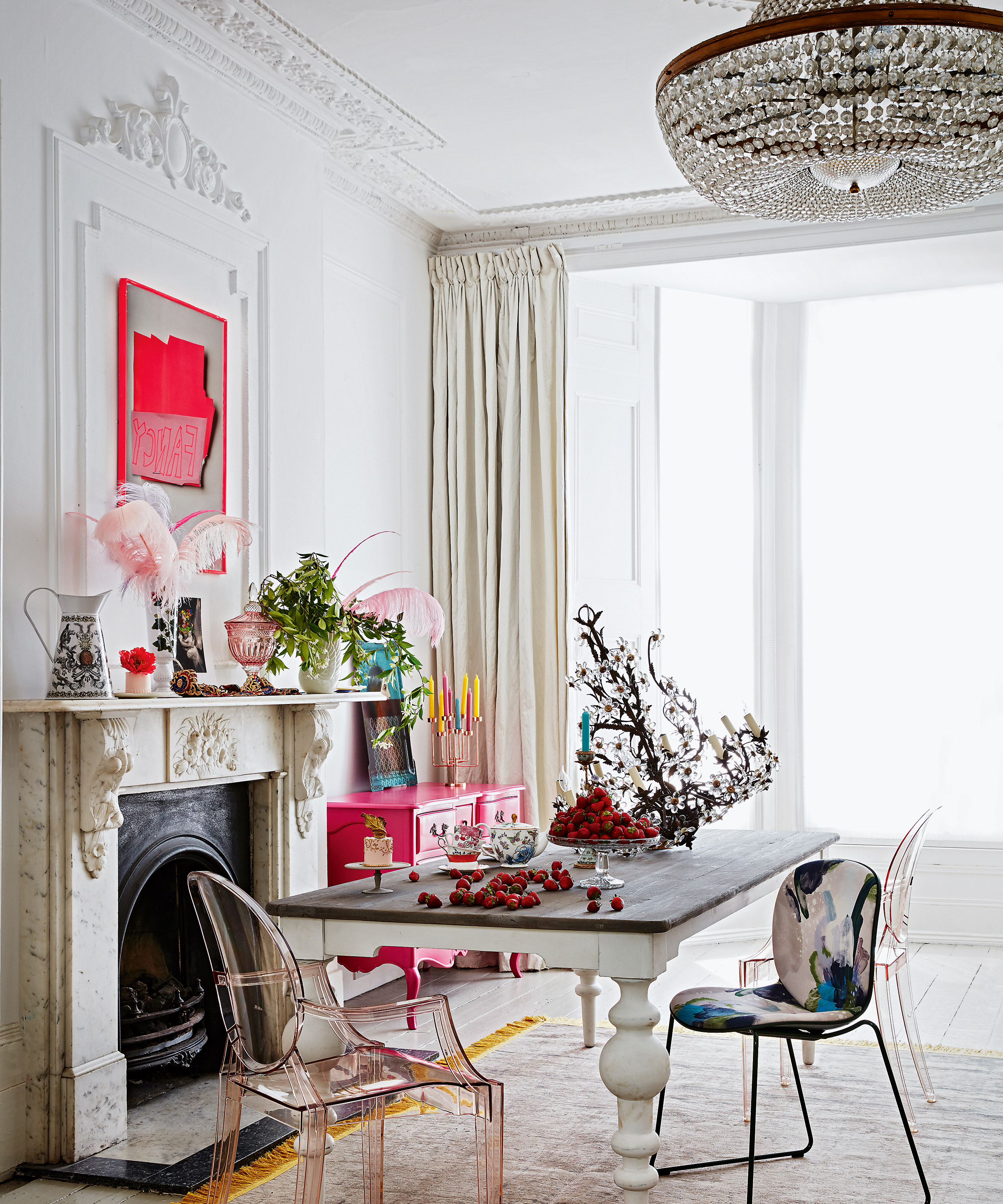
Jenna talks about the similarities between fashion and interior design, and shifting the context of elements to keep it interesting. ‘You can have an entirely neutral room but you still need a balance of materials,’ the designer says in a home tour with textile brand Schumacher, going on to give some examples such as mixing soft with shiny materials, or flat vs textured furniture surfaces to create interest.
We spotted her gorgeous kitchen island which is a perfect example: two-thirds marble mixed with wood for the end piece, with a dovetail effect joining them. It looks exactly as you’d expect. Sublime!
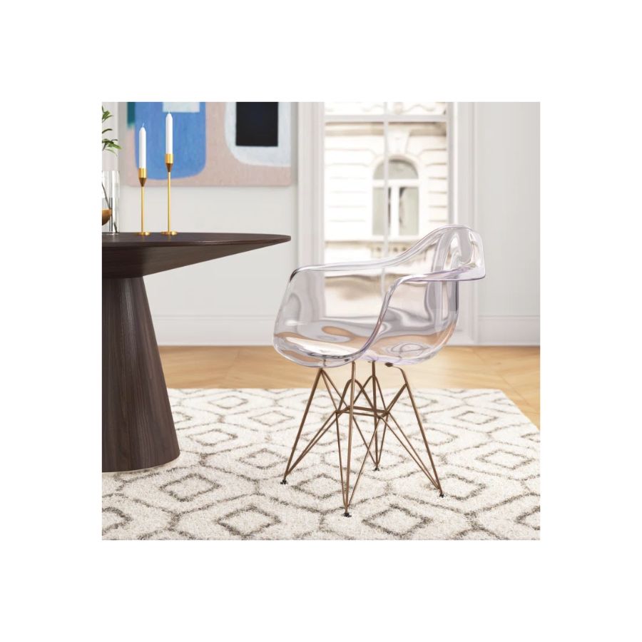
Price: $139
This modern chair with a smooth, transparent surface creates an eclectic mix when paired with a textured rug.
2. Forget the trends, just do you
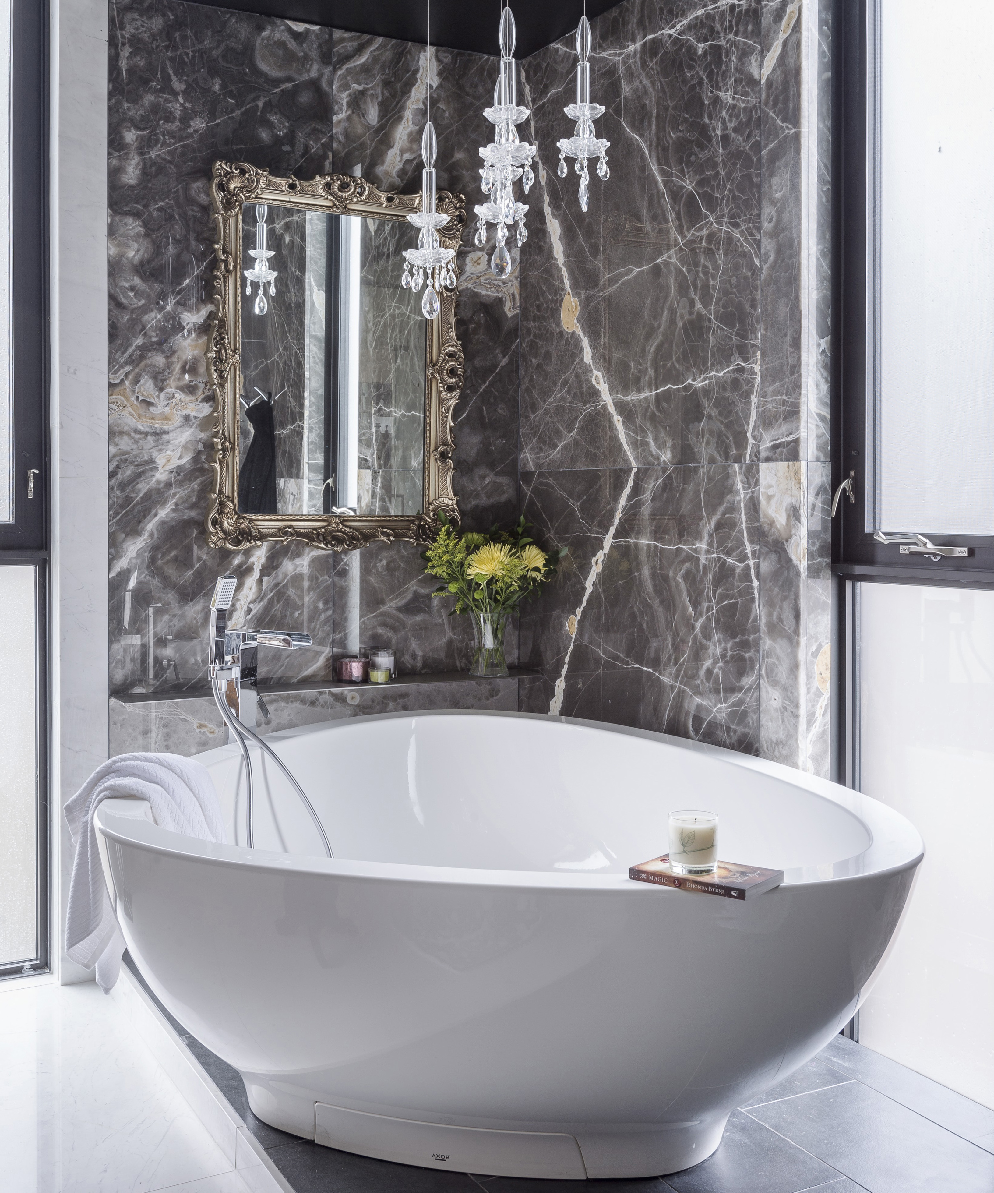
We’re not surprised to hear this from Jenna. For someone with so much creative flair, it’s only expected that they won’t follow the trends, but make their own instead. ‘Whatever is happening, I want the opposite,’ she says.’
If Jenna says so, we might start doing it too. When it came to choosing from the different types of marble for her en-suite bathroom she specifically requested the supplier to provide ‘the ugliest, weirdest marble you’ve got.’ But let us tell you - it’s stunning.
Be The First To Know
The Livingetc newsletters are your inside source for what’s shaping interiors now - and what’s next. Discover trend forecasts, smart style ideas, and curated shopping inspiration that brings design to life. Subscribe today and stay ahead of the curve.
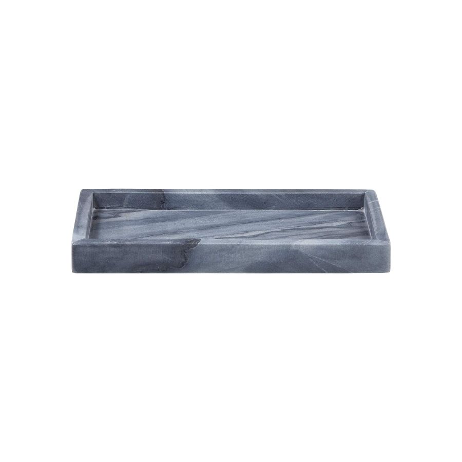
Price: $24
This dark grey marble tray will elevate the look of a vanity or dressing table.
3. Unlacquered brass only

She’s not joking when she says this. Literally only unlacquered brass accents, and goes on to comment: ‘I think I started the brass appreciation community.’
We’re seeing it everywhere from the taps, cabinet handles and knobs, even down to the hinges that hold the walk-in closet shelving and drawers together. Oh, and inside the perfectly organized cutlery drawers too, you'll find brass dividers. It’s all so perfectly unlacquered and gorgeous and really shows the attention to detail that went into the design and the build of the space.
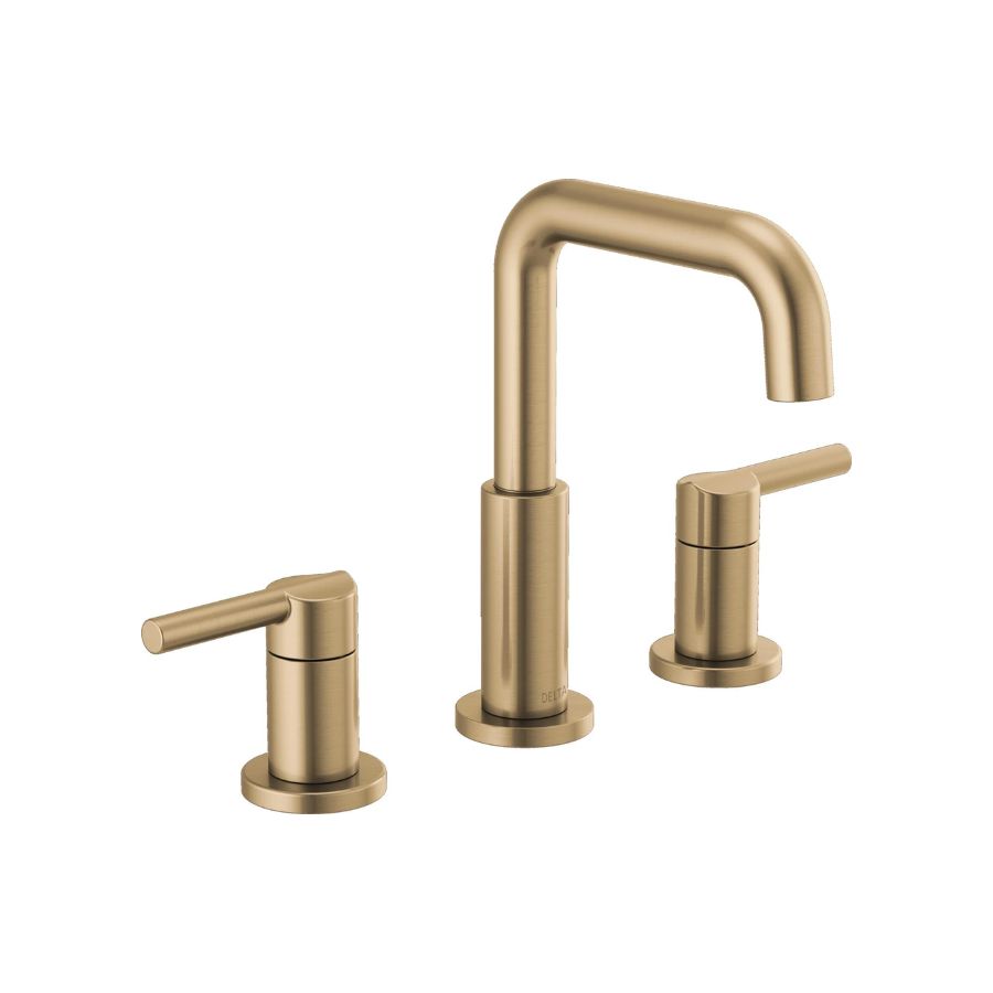
Price: £208
Recreate Jenna's elevated bathroom look with unlacquered brass accessories.
4. The open closet 2.0
This is not your usual walk-in closet idea. Everything (and we mean everything) is on show, super handy, and visible. ‘I wanted to be able to see everything,’ Jenna says. We particularly love the level of detail from the beautiful jewelry pull-out trays to our favorite, the pull-out shelves - a merge between a drawer with no front, and a shelf that pulls out. The one open closet solution we didn’t know we needed but now desperately want.
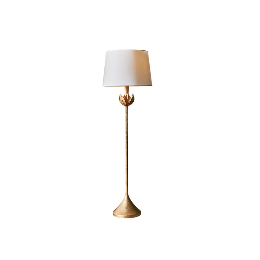
5. Mismatched lamps
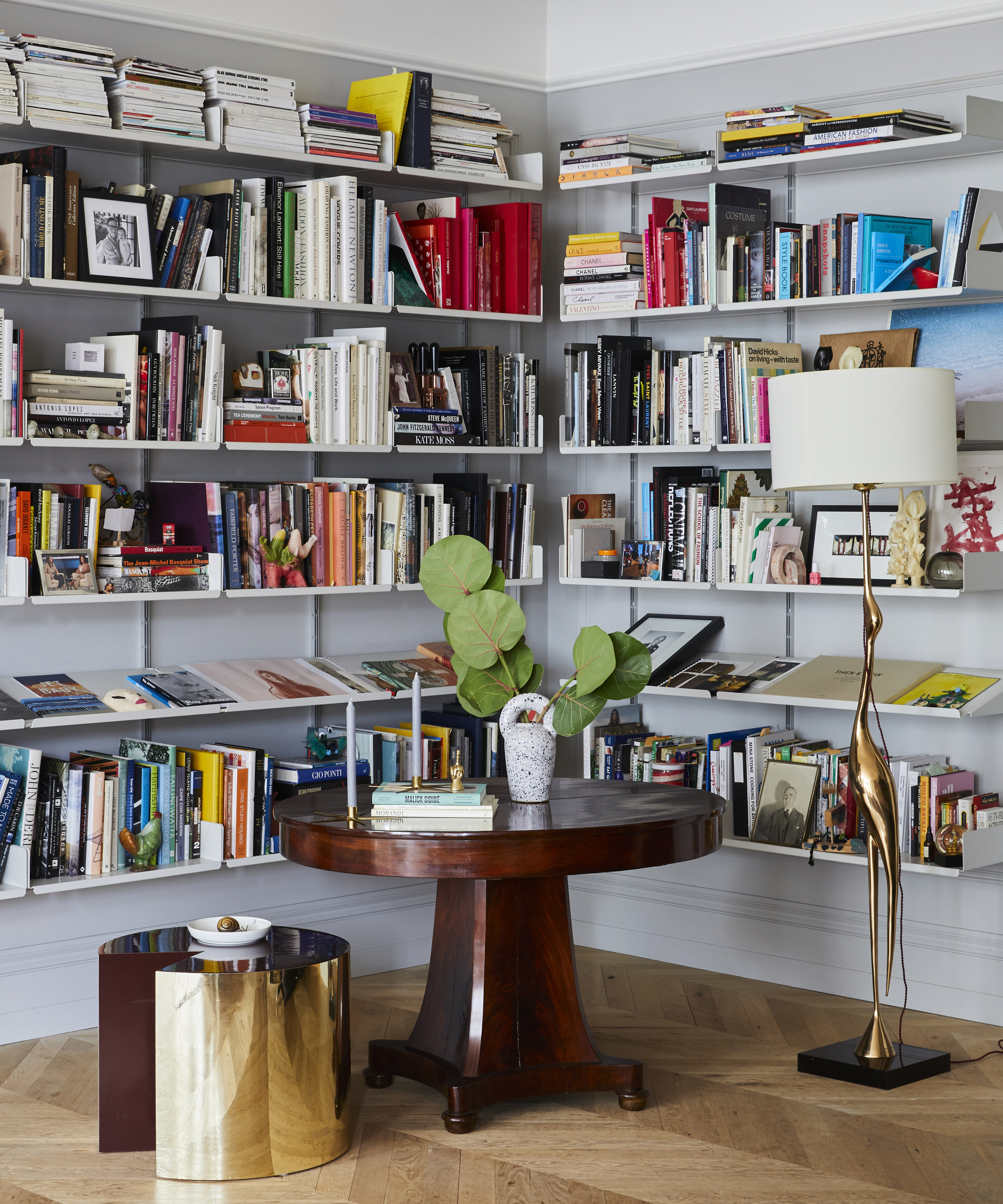
Hold on, Jenna Lyons, you mean not to balance out the design and not have the same matching lamps left and right of our bed? Or fireplace? Or anyplace where symmetry is basically all we've ever known?
Yes, exactly that, and it looks great. Mismatched lamps are the way forward. ‘In my career, I’ve been so controlled and steady, whereas in my house I can take a ton of risks,’ the designer says. And we can totally see that in the eclectic mix of design, art, and fashion that is her home.
Raluca formerly worked at Livingetc.com and is now a contributor with a passion for all things interior and living beautifully. Coming from a background writing and styling shoots for fashion magazines such as Marie Claire Raluca’s love for design started at a very young age when her family’s favourite weekend activity was moving the furniture around the house ‘for fun’. Always happiest in creative environments in her spare time she loves designing mindful spaces and doing colour consultations. She finds the best inspiration in art, nature, and the way we live, and thinks that a home should serve our mental and emotional wellbeing as well as our lifestyle.
-
 My 10 Favorite Designs at Milan Design Week 2025 — Out of the Hundreds of Pieces I Saw
There is a new elegance, color, and shape being shown in Milan this week, and these are the pieces that caught my eye
By Pip Rich
-
 Iridescence Is Chrome’s More Playful, Hard-to-Define Cousin — And You're About to See It Everywhere
This kinetic finish signals a broader shift toward surfaces that move, shimmer, and surprise. Here's where to find it now
By Julia Demer
