"It's a Place for the Eye to Rest and the Brain to Dream" — Jonathan Adler's 3 Secrets for Better-Decorated Walls
The designer's newest collaboration centers on an affordable collection of colorful wall hangings, and this is how he'd use them in his own home
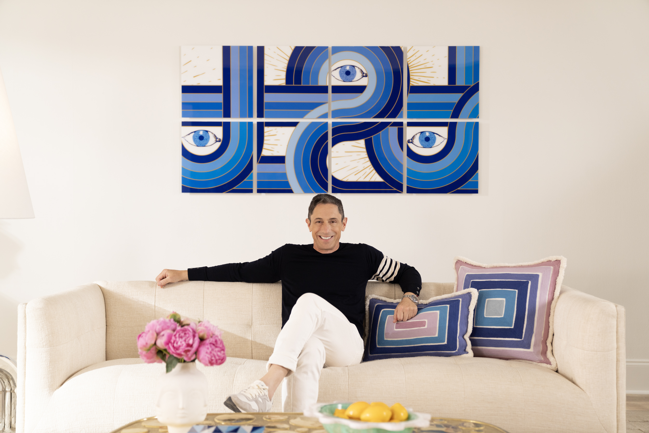

Amongst myriad other things, curating a perfectly balanced space is Jonathan Adler's forte. And, as any designer will tell you, wall art is often the pièce de résistance to a harmonious vignette. Creating a focal point is cardinal to a beautiful room, and that's why Jonathan has designed a brand-new collection of zesty, joyful artworks for us to decorate our homes with. Needless to say, they certainly won't fail to draw the eye.
Collaborating with wall decor brand TilePix, Jonathan has made it easier than ever to embrace his iconic Modern American Glamour style in our homes. Thanks to the brand's magnetic hanging technique, this affordable collection of artworks is 100 percent renter-friendly, and the various sizes available make curating a gallery wall so simple. This collection really does offer some of the best wall art you can find.
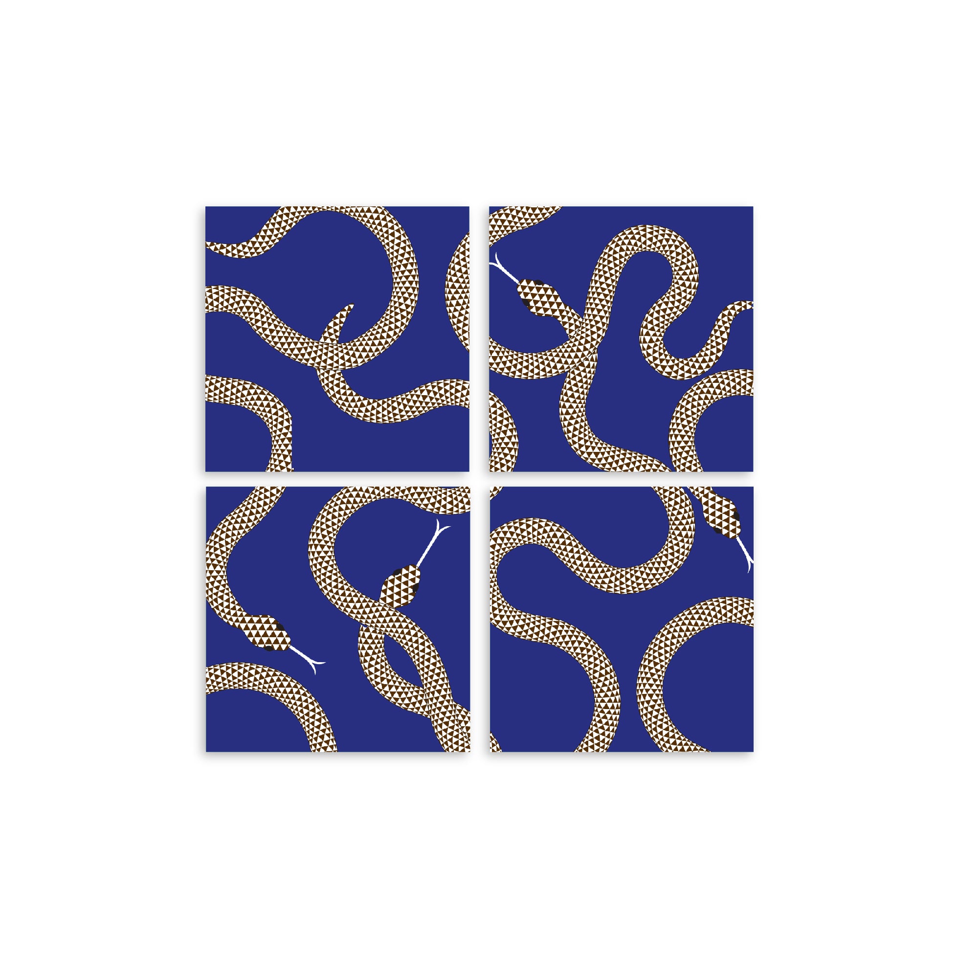
If you're wondering what to expect, think bold, bright, and bodacious. From pop art-inspired motifs and dreamy druggist-inspired graphics to swirling prints inspired by Paris’ Pompidou Center, these artworks encapsulate Jonathan Adler's expressive style perfectly. 'It's like truly disruptive wall art,' Jonathan told us. 'Something about TilePix made me want to work on a really colorful, fun, and ebullient collection. The spirit of them is just very fun and optimistic.'
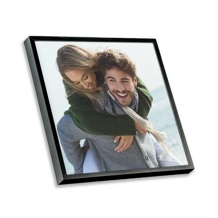
If you're not familiar with TilePix, here's how it works. Originally designed for photos, TilePix frames snap to the wall with removable magnetic pads, and the adhesive backing allows you to reposition the frame and move it around as needed for endless living room wall art configurations.
For designers like Jonathan, this creative freedom is a game-changer. 'As a seasoned designer, I've bashed nails into a billion walls and now I've partnered with TilePix because it's truly a cruelty-free wall art solution at an affordable and friendly price point,' he says.
Hanging artwork is one thing, but styling wall art is a different ball game entirely. To inspire your use of the new collection, we wanted to gather some advice from the man behind it, so we asked Jonathan for his best tips for decorating with it. Here are his three tips that promise to breathe new life onto your walls.
1. Play with scale through modular designs
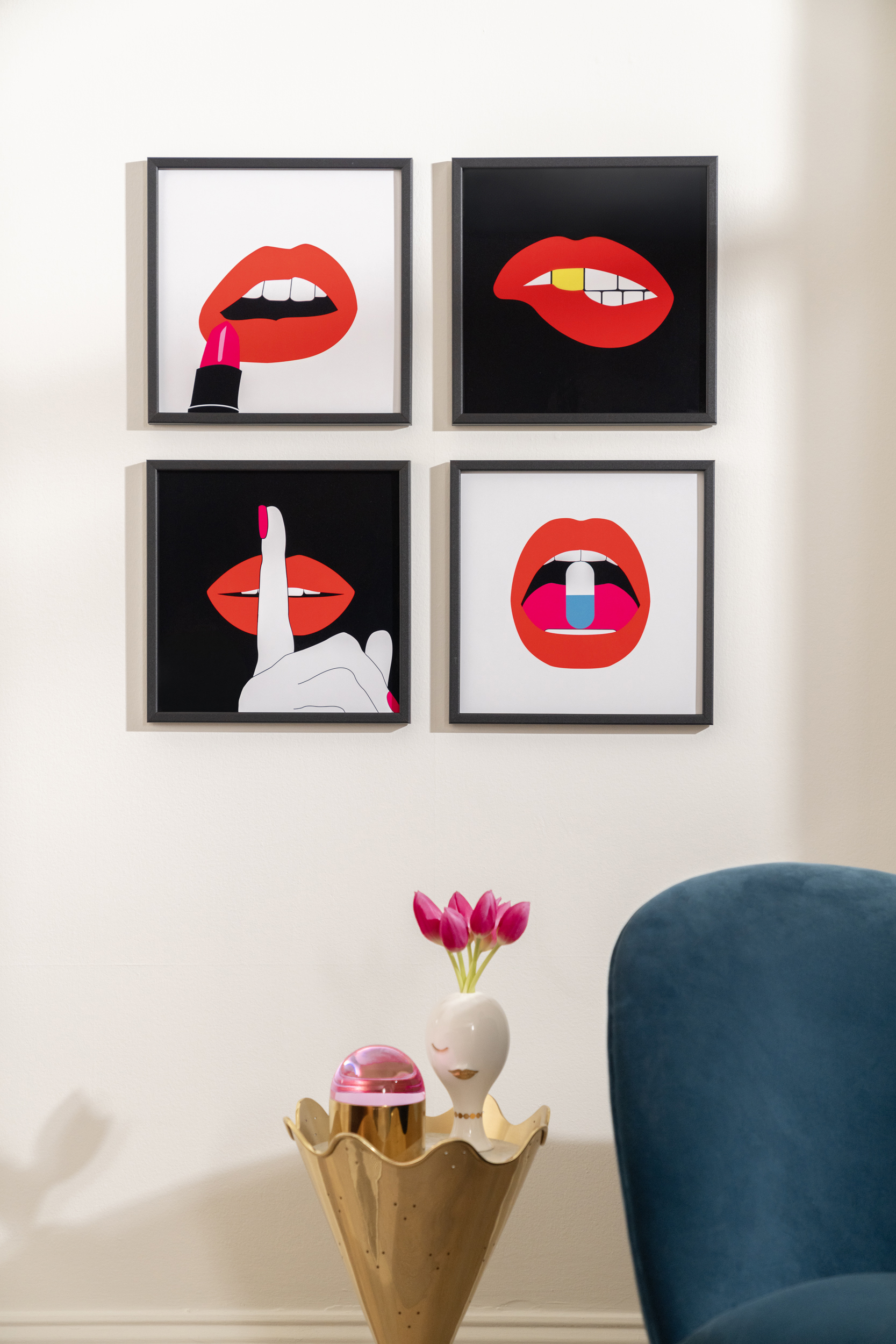
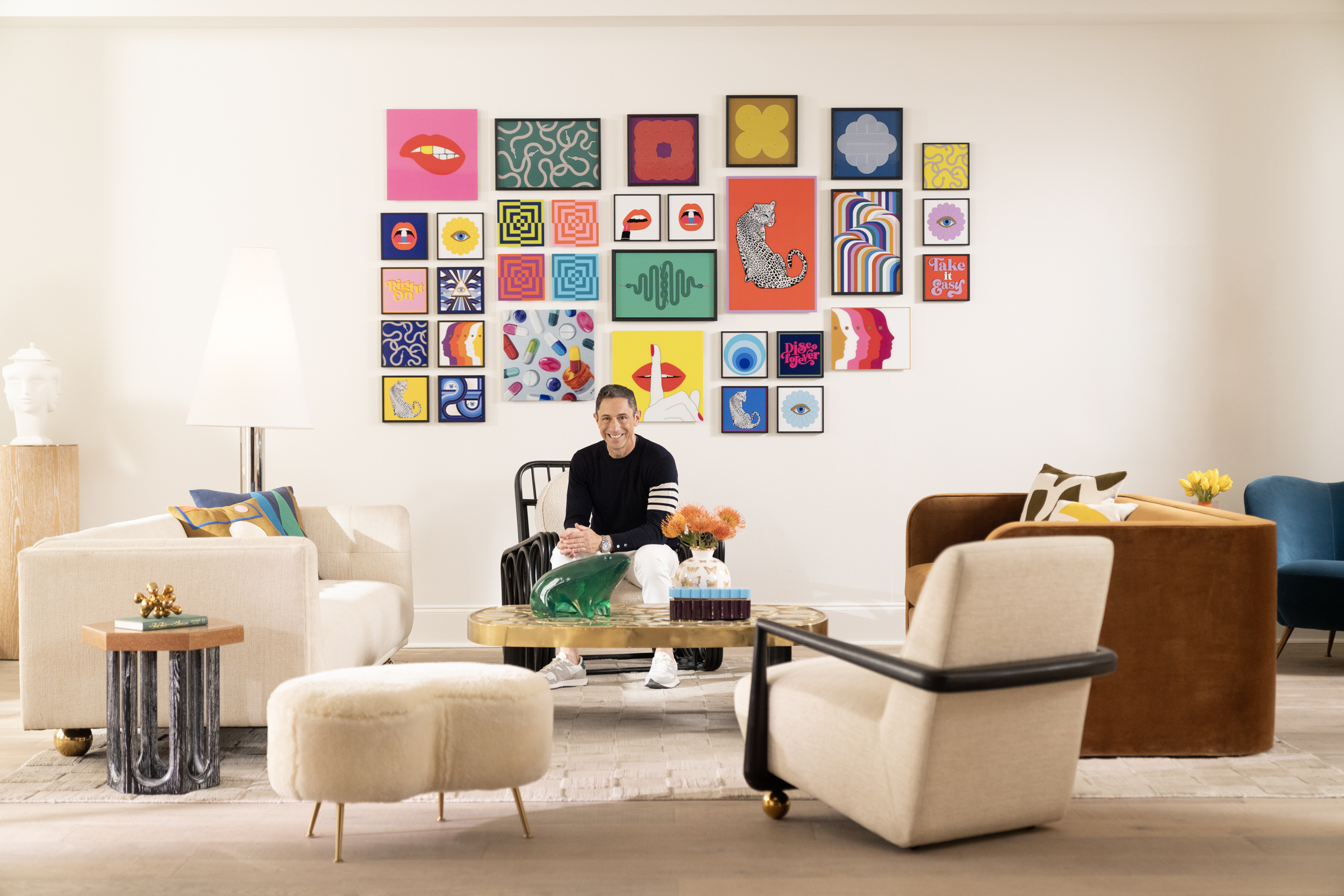
One of the great benefits of the new TilePix collection is its versatility. All the designs come in various-sized 'tiles', but the added beauty is that you can build a larger wall feature by treating them as modular pieces. This allows you to play with scale to enhance the effect of your wall art.
Be The First To Know
The Livingetc newsletters are your inside source for what’s shaping interiors now - and what’s next. Discover trend forecasts, smart style ideas, and curated shopping inspiration that brings design to life. Subscribe today and stay ahead of the curve.
'I know it's considered déclassé to find a piece of art that fits the size of your sofa, but call me déclassé because it's important,' says Jonathan. 'With TilePix you can create your own dimensions to perfectly suit your space.'
Whether you want an imperfect living room gallery wall or a neat, grid-like arrangement, TilePix gives you the freedom to configure your pieces as you please, whether they're matching designs or completely eclectic. Some designs - like the "Animalia" Glass Split - are designed to be used together, or you can use a collection of your choosing for a more personal curation.
'You can do just a single piece to make a great punctuation mark, or you can do one of my larger images as a grid which is giving kind of Gilbert and George vibes,' explains Jonathan. 'I really appreciate the modular nature of it. It's really a decorating solution to so many problems.'
2. Consider your composition to create a focal point
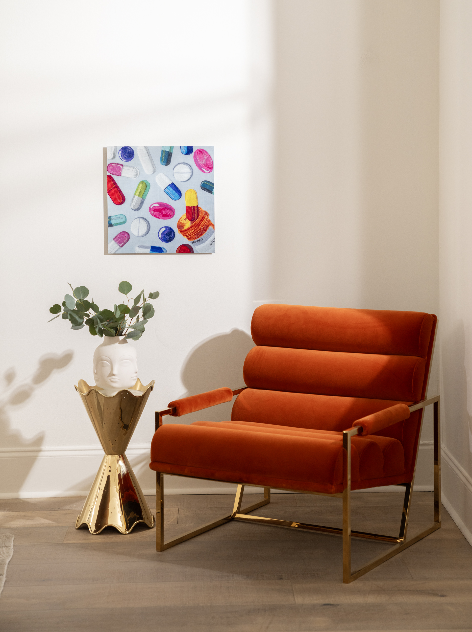
Successful wall art is often the first place your eyes come to rest when you enter the room, whether that's bedroom wall art or a canvas hung in a kitchen. As such, it's key to creating a balanced focal point, and this inevitably goes hand-in-hand with scale.
'As a designer, I'm always thinking about focal points. And so often, art is the focal point,' notes Jonathan. 'Whether it's the pattern of a pot or the composition on the wall, I always think of scale variation. The thing I love about TilePix is that because it's modular, it's easy to create the style that's required for the vignette.'
Besides aesthetic importance, art - by its nature - should grab your attention, so it's even more important to ensure it falls in your eyeline. 'Art is a liminal space between decor and the mind,' says Jonathan. 'Sofas don't tend to be very intellectually communicative, but art is. It's meant to be a punctuation mark and a brain tingler, as well as decor. That's the magic of art; it's a place for the eye to rest and a space for the brain to dream.'
Our top picks from the collection

Price: $27.99
Color: Pink & Red
This is one of Jonathan's favorite designs. The pop-arty design is a great way to add a burst of color to a neutral wall.
3. Harness the unexpected

With Jonathan's comments about art's stimulating effects in mind, be sure to use them in areas of the home where they make for real conversation starters. Think about the parts of your home your guests visit most frequently, and then try to find a more unexpected spot to hang it to really let it sing.
One such spot is, of course, above the toilet in a powder room. Wall art takes center stage in these smaller spaces, and - as strange as it may sound - it's a room that offers us all a quiet moment of reflection.
'Above the toilet is so important - you always need something great above it,' urges Jonathan. 'A nice "Disco Forever" TilePix piece is like an exhortation to enjoy life, and it looks really groovy at the same time. Disco Forever above the toilet is de rigueur.' With TilePix being so easy to interchange, you can also use this small space to embrace all the latest wall art trends as time goes by so there's always something fresh and new to greet your guests.
Wall art is, without a doubt, the jewelry to a room that really brings a design together. And Jonathan's new collection at TilePix has something for everyone so we can all give our walls a much-needed makeover. Follow his tips for impactful styling and your living room will feel like the Louvre before you know it.
Shop The Original TilePix Frame

Lilith Hudson is a freelance writer and regular contributor to Livingetc. She holds an MA in Magazine Journalism from City, University of London, and has written for various titles including Homes & Gardens, House Beautiful, Advnture, the Saturday Times Magazine, Evening Standard, DJ Mag, Metro, and The Simple Things Magazine.
Prior to going freelance, Lilith was the News and Trends Editor at Livingetc. It was a role that helped her develop a keen eye for spotting all the latest micro-trends, interior hacks, and viral decor must-haves you need in your home. With a constant ear to the ground on the design scene, she's ahead of the curve when it comes to the latest color that's sweeping interiors or the hot new style to decorate our homes.
-
 Biophilic Decluttering — What to Take Out of Your Home (and What to Put in) for a More Natural Home
Try your hand at biophilic decluttering to ground your interiors, connect to the environment, and cure chronic clutter in one go. Here's how.
By Amiya Baratan
-
 10 Arrestingly Beautiful Milan Restaurants Locals *Actually* Dine at — Selected for Their Interiors
Brought to you by our community of culture insiders, this edit of the best restaurants in Milan sees authentic Italian food and immersive design unite
By Gilda Bruno
