This perfect new kitchen trend increases the sense of light and decreases the feeling of clutter
Architects love using partitioned walls - or the feeling of one - to create kitchen spaces that feel connected but neatly separate
When open floor plans first made their mark, it seemed no interior wall was safe from elimination (save for the powder room, of course). And while lofty layouts are handy solutions for small-space living, some apartment owners are craving more separation these days – and the open kitchen is ripe for the chopping block.
One change afoot is the rise of partition walls to zone off a modern kitchen, as designers embrace non-load bearing elements to blur the lines between spaces. Anything from interior glass windows to generous arched doorways and strategically placed free-standing cabinetry can give shape and structure to otherwise exposed cooking areas.
And why not embrace a bit of neatness? Like mise en place for your layout, this kitchen trend lends a sense of order – a defined cooking area – while containing clutter; the sight of a messy prep counter, the scent of onions on a skillet, the sound of a food processor.
In effect, you can shape a room within a room. ‘It creates an element of something going on behind the scenes without completely blocking it off, whilst simultaneously reintroducing an element of formality if the spaces aren’t fully open plan,’ says interor designer Tala Fustok.
And of course, like all good architecture trends, the concept isn’t entirely made from scratch. ‘Many see these types of dividers as a new idea, but it has been around for years — for example it was common in Victorian-era homes that had parlors separated by cased openings with huge pocket doors,’ says Chicago-based designer Summer Thornton. ‘It provided visual separation and defined the separate spaces but allowed light to pass through.’
Without losing those breezy sight lines we’ve come to love, here are a few partitioned designs that maintain an overall connected feel.
1. Use the wall to hide appliances
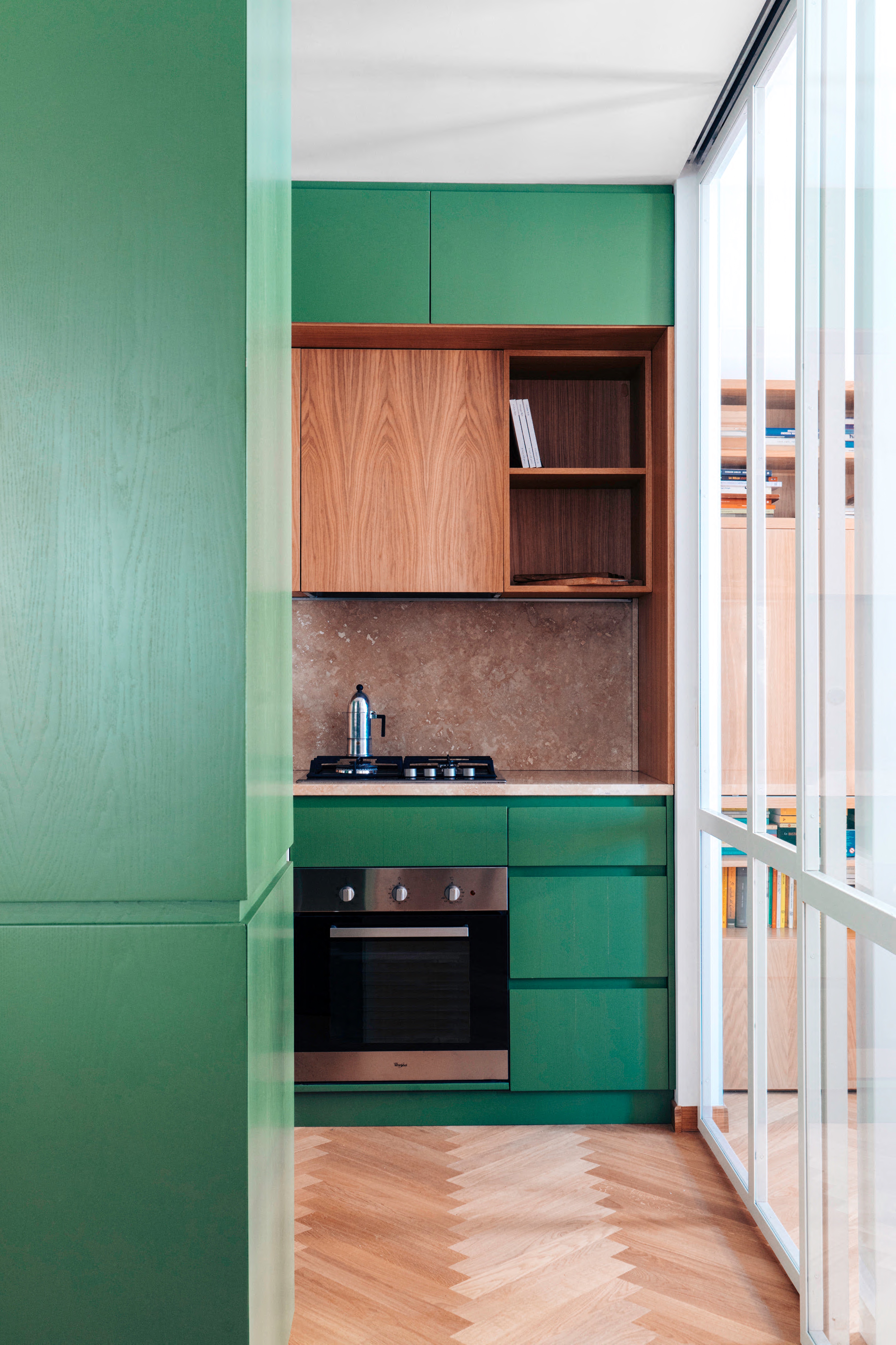
Rome’s Paros Architettura used clever kitchen cabinets and glazing to connect four spaces while filtering the views into the kitchen. ‘On the entrance side, the full-height cabinetry becomes a wardrobe unit,’ says designer Eugenia Rolando.
Be The First To Know
The Livingetc newsletters are your inside source for what’s shaping interiors now - and what’s next. Discover trend forecasts, smart style ideas, and curated shopping inspiration that brings design to life. Subscribe today and stay ahead of the curve.
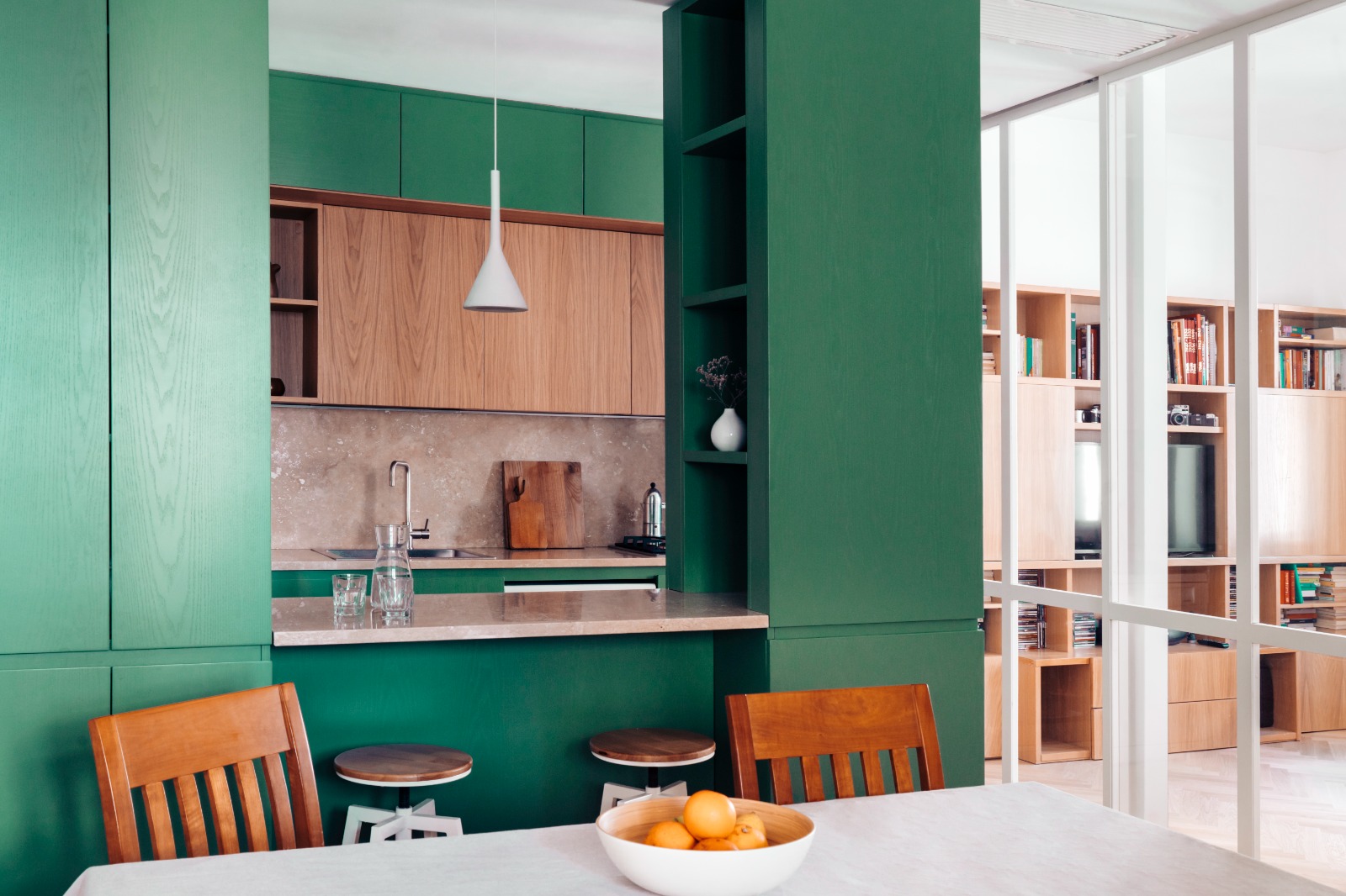
'And on the living room side [seen below], the serving hatch retains visual permeability at eye level, while covering the appliance and storage part of the kitchen; on the guest room side, a sliding glass wall that can be darkened with curtains allows light to enter from the room's window but functionally separates the rooms.’
2. Retain as much light as possible
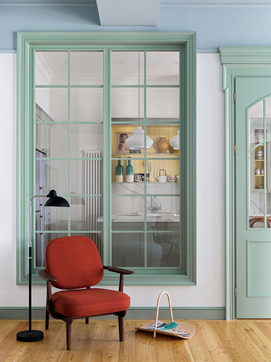
In addition to sliding glass doors that separate an adjoining home office, the other side of this Kazakhstan kitchen helps channel light flow with an adjacent partition facing the living area.
‘There we built a plasterboard partition,’ explains interior designer Elina Mussakulova. ‘The large interior window and the French doors are there to maintain as much transparency (and light!) as possible while making sure that the odors and noises can be masked when needed.’
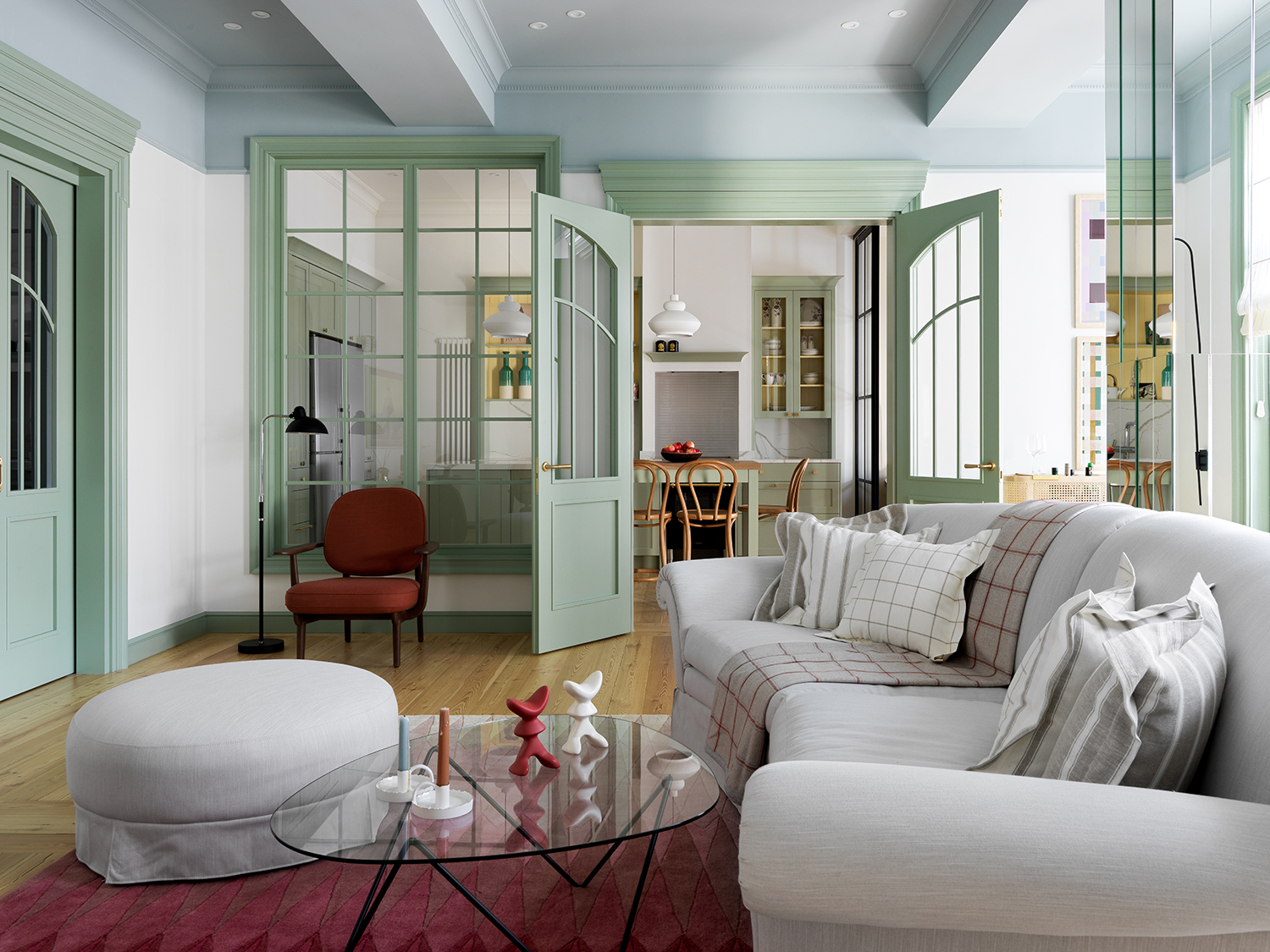
3. Add texture to the glass
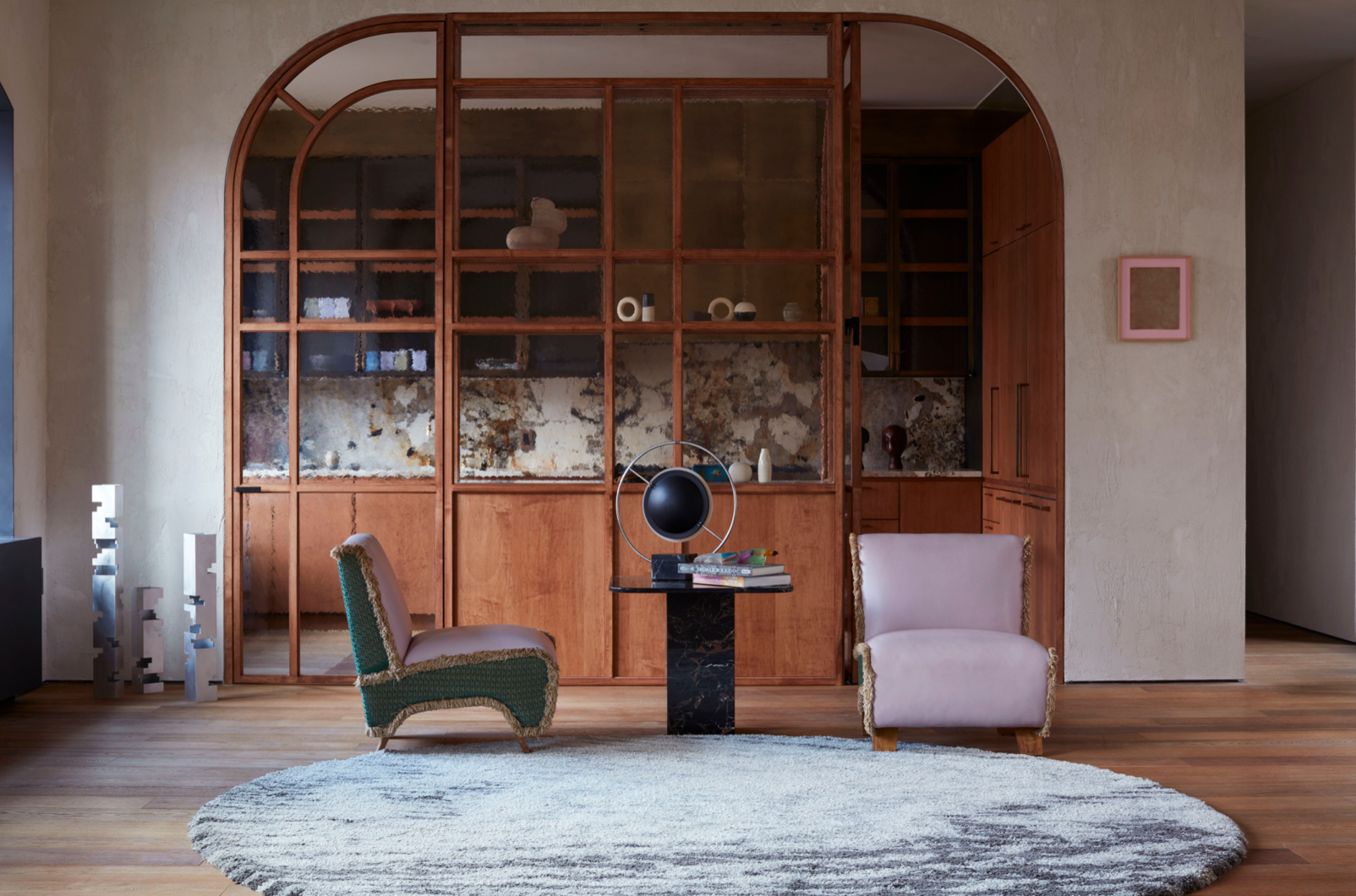
London’s Tala Fustok Studio and New York’s Crina Architecture crafted a textured glass wall – fitted with space-saving shelves – to blur the line between the kitchen and living room while maintaining an open flow that maximises natural light.
‘Partitioned glass-walled kitchens can work in any home, and can be an ideal hosting mechanism to avoid complete separation between the chef and guests, whilst honouring an element of mystery and privacy as the host prepares,’ says Tala.
4. Allow details to draw the eye

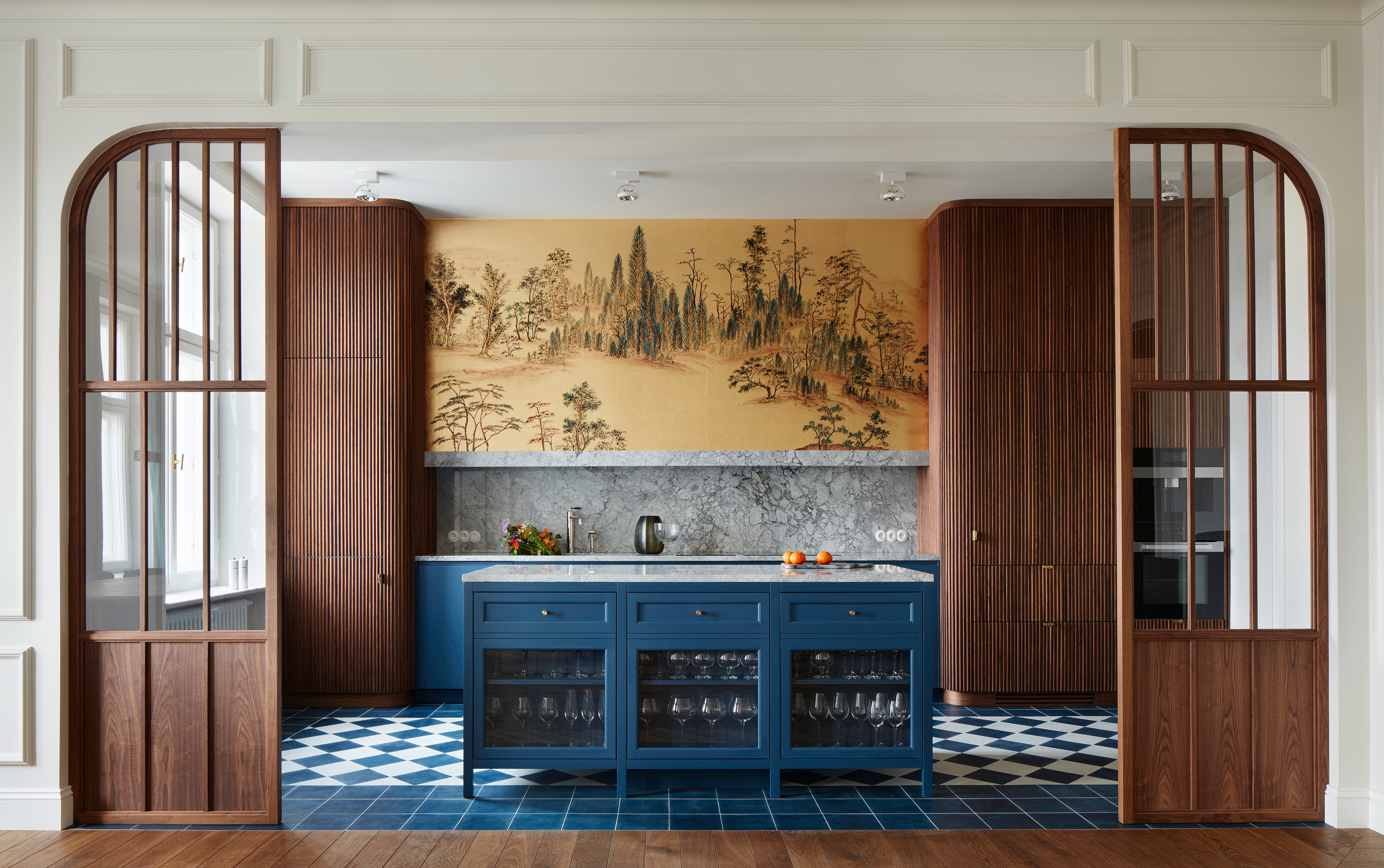
Partitions can obscure areas you want to hide, but they can also focus your eye on those you wish to highlight. In this handsome Warsaw kitchen, Colombe Design created a delicate border, bookending an arched opening in walnut massif and glass dividers that actually draw your view toward the kitchen’s pièce de résistance.
‘It is 'framing' the central part of the kitchen with a very decorative wallpaper, focusing attention on this most important point,’ says designer Marta Chrapka.
5. Let the wall complement the architecture
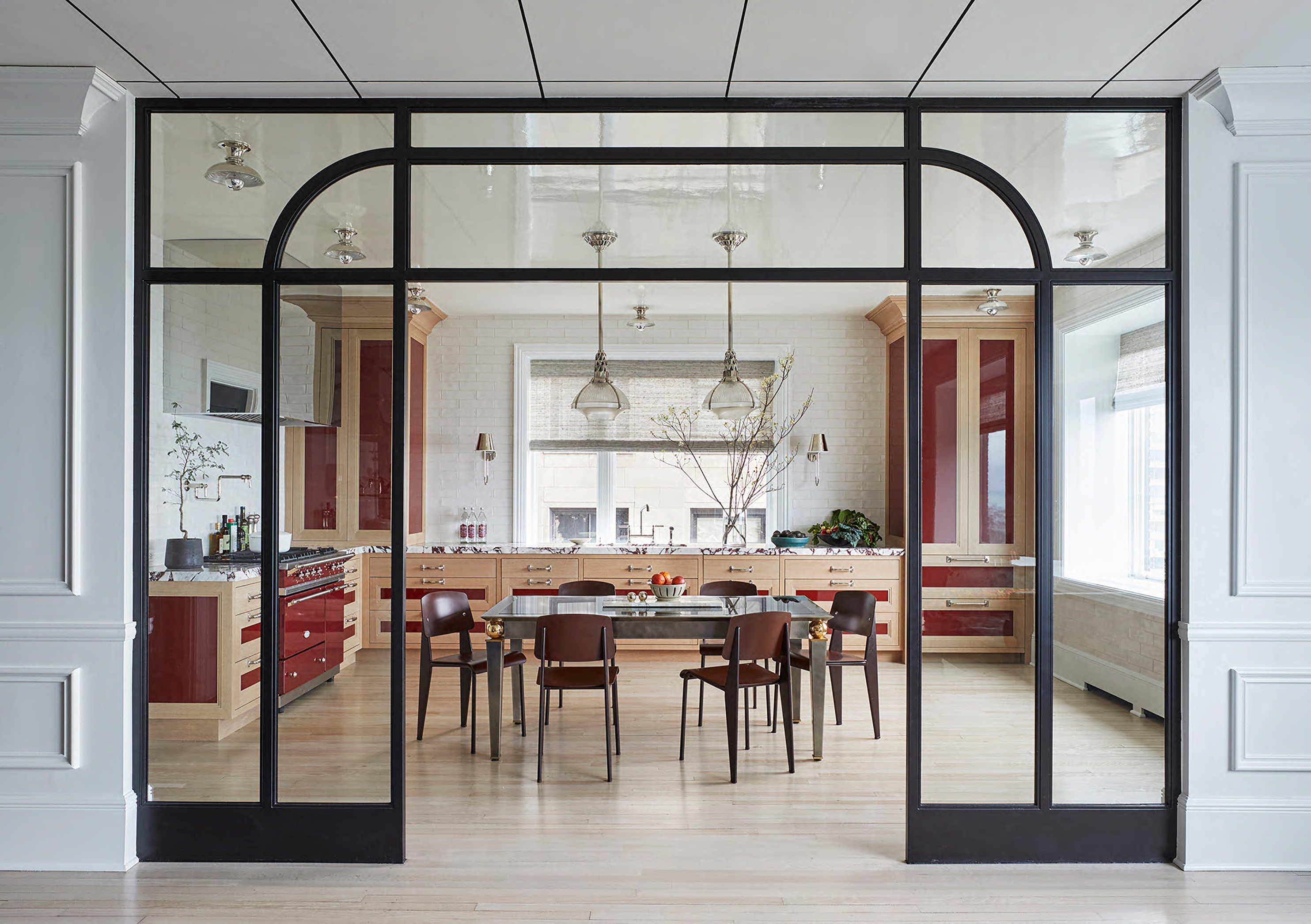
Without losing structure to visually separate the kitchen and living room, designer Summer Thornton dreamed up a glass division that mimics an arched door.
Achieving defined zones without walls that would constrain either space, it enhances sight lines, traffic flow, and natural light. ‘The apartment's architecture was strong so the divider had to have similar aesthetic weight and strength,’ explains Thornton. ‘Steel and glass with just enough detailing would feel modern but not get trumped by the historic architecture.’
6. Imply the sense of a wall with cabinetry
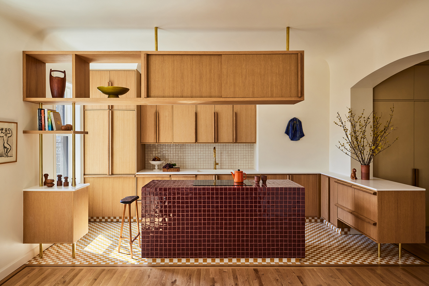
Proving that you can play fast and loose with any interior design trends and imply separation without a single wall, this New York home embraces custom wood kitchen cabinets – raised and suspended with brass legs – to maintain an open feel with a visual border.
‘This language extends to the custom storage unit that hovers above the island,’ explains Rustam Mehta of GRT Architects. ‘It lets the ceiling continue around it, allowing the decorative plaster cove to run uninterrupted and create a sense of separation while leaving actual sight lines open.’
Keith Flanagan is a New York based journalist specialising in design, food and travel. He has been an editor at Time Out New York, and has written for such publications as Architectural Digest, Conde Nast Traveller, Food 52 and USA Today. He regularly contributes to Livingetc, reporting on design trends and offering insight from the biggest names in the US. His intelligent approach to interiors also sees him as an expert in explaining the different disciplines in design.
-
 This Outdoor Lounger Is the Color of the Season for Garden Furniture — And It's on Sale This Weekend
This year, it's all about the contrast, and this bright, sunny hue is the perfect foil to your green outdoor spaces
By Hugh Metcalf
-
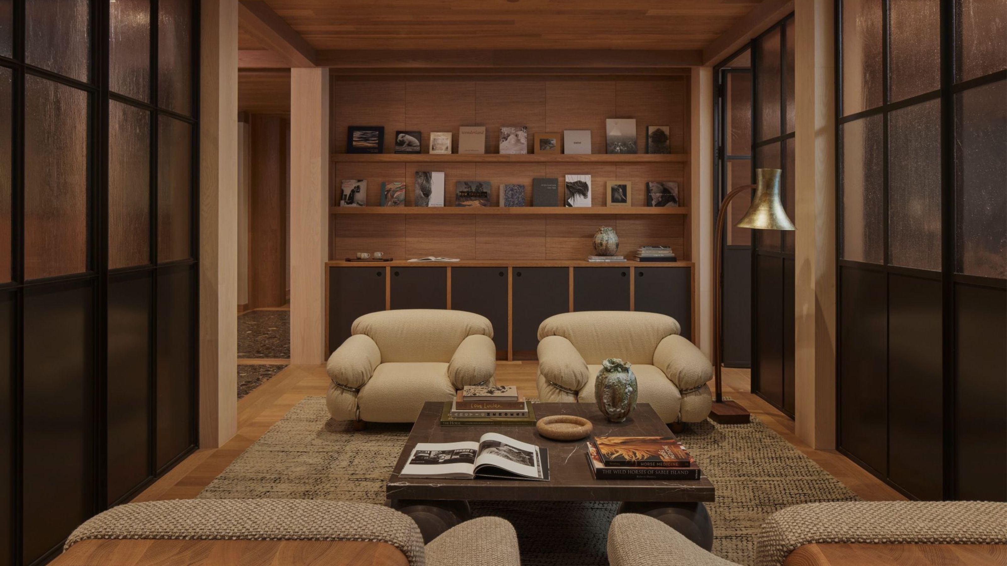 Kelly Wearstler Designed an Animal Hospital Where "Anxiety Just Melts Away", and I'm Taking Notes for My Own Home
The renowned designer's foray into healthcare demonstrates have even the most functional of spaces can still be design-forward
By Devin Toolen