5 things we learned about decorating a small space from Amalia Graziani's Manhattan house project
Real estate expert and interior designer Amalia Graziani transformed an unassuming Manhattan apartment into a chic contemporary home. Here are the most valuable style lessons from her decorating choices
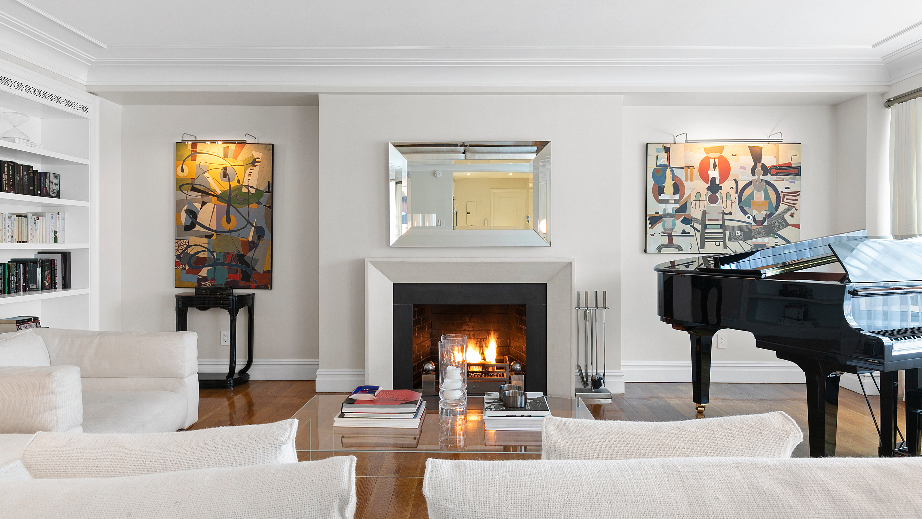

This Upper East Side condo renovation in Manhattan is a masterclass in executing small living room ideas. Manhattan is known for many amazing things, but spacious apartments isn't necessarily one of them. This sensitive and detailed transformation shows that size really doesn't matter to those who know about decorating small spaces with panache.
Residential real estate developer and interior designer Amalia Graziani took on what she calls 'an understated Upper East Side condo and dressed it up by creating custom molding, paneling and window treatments.' She also made some excellent decorating choices – here are five main things we've learned about decorating a compact space from this project.
1. The layout is (almost) everything
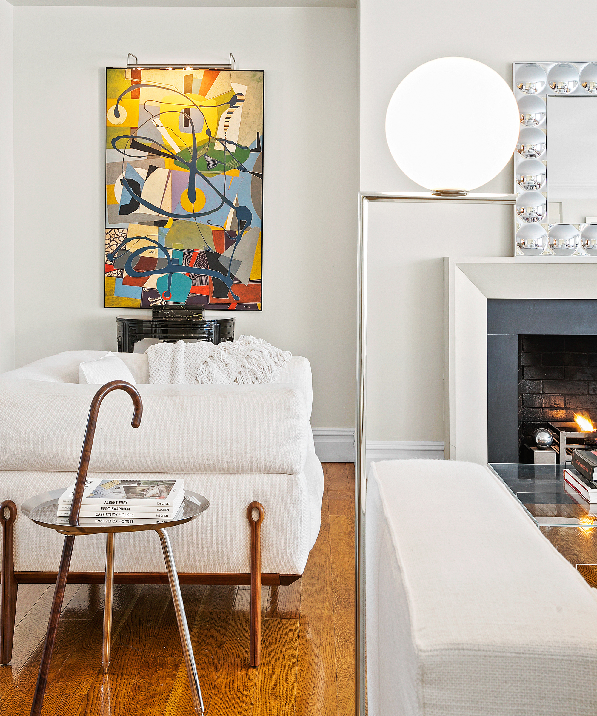
There is nowhere to hide with the furniture layout in a small living room, and the spaces created between the furniture pieces are not to be ignored. Even if that means placing a tiny accent with a small coffee table and a characterful walking stick, as Amalia has done, creating mini zones within the lounge gives it a feeling of spaciousness.
See more small living room layout ideas in our gallery.
2. Always think vertical

In a small room, your wall space is your playground – a principle Amalia has executed impeccably in this lounge. Strong, bold wall art is a must – and it is amplified further with a lighting panel. Amalia also uses the power of books to create a sophisticated look – the monochrome cover arrangement is striking and draws the eye upwards.
Essentially, this project is about amplifying a neutral, perhaps even nondescript space, and elevating it to the level of a sophisticated home with a collector's spirit. From the carefully chosen mid-Century wall art to the prominent book display, this lounge announces its owner as a connoisseur of the arts.
3. Oversized wall art makes all the difference
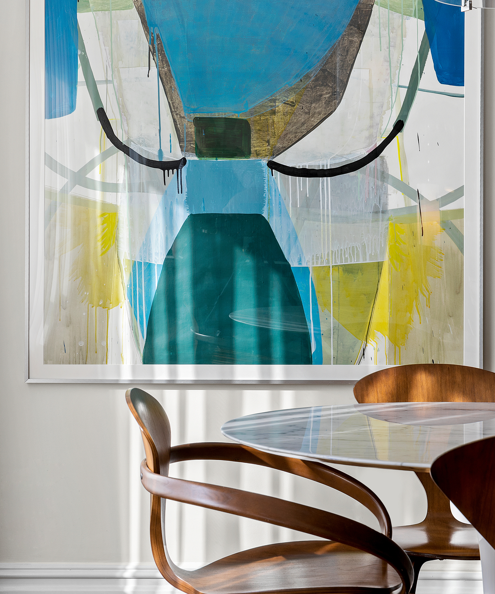
Statement wall art defines this project; instead of gallery wall ideas, it goes to one or two key pieces per room – but they are large, dramatic, and really help the understated furniture choices stand out more.
Be The First To Know
The Livingetc newsletters are your inside source for what’s shaping interiors now - and what’s next. Discover trend forecasts, smart style ideas, and curated shopping inspiration that brings design to life. Subscribe today and stay ahead of the curve.
Dark, sinuous furniture was carefully chosen to provide a counterpoint to the vibrant wall art and to complement the compact rooms. 'This project is a mix of collector’s antiques and casual modern items', says Amalia – the expert blending of furniture in different styles allows for a relaxed look with a bohemian touch.
4. There can never be too much texture
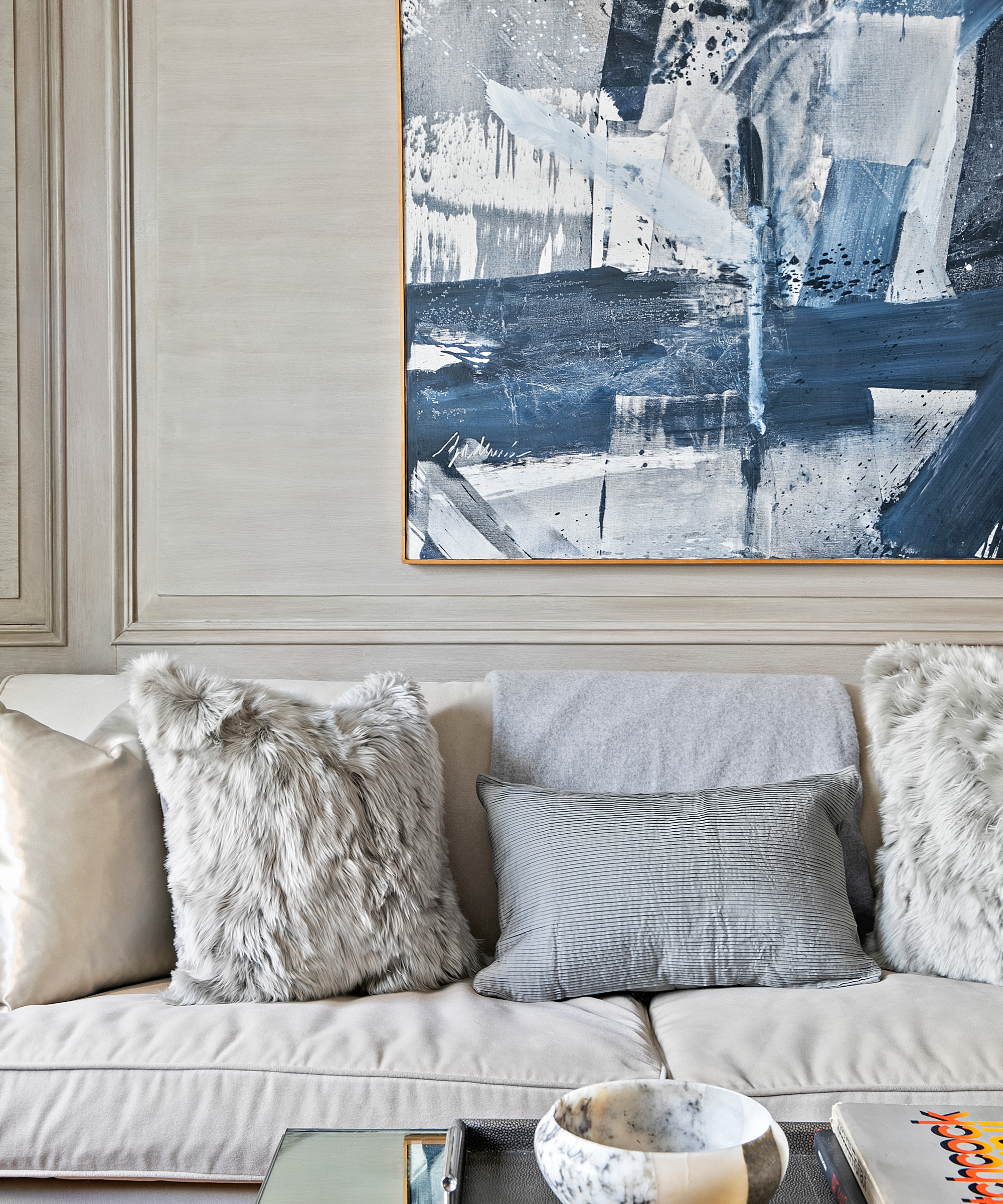
One of the most common small room decorating mistakes people make is shying away from multiple textures for fear of making the space 'too busy'. Actually, an injection of texture really elevates a small space. Amalia has paid close attention to textiles and wall finishes in the Manhattan apartment, but has kept the number of different colors to a minimum to maintain a cohesive look.
5. Save monochrome for bedrooms
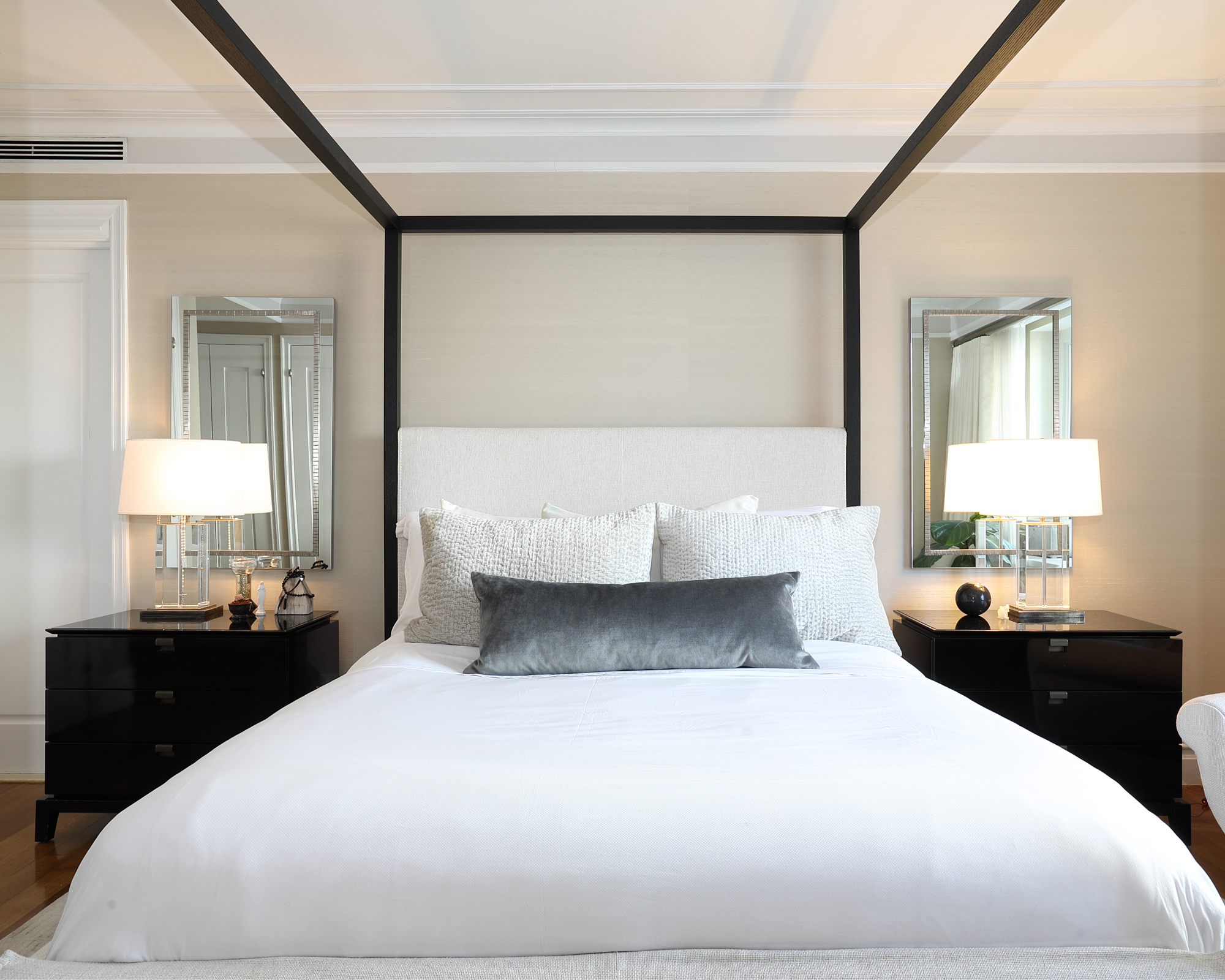
If your favorite color pairing is black and white, save the pairing for small bedroom ideas. Less is often more in bedrooms, and Amalia went for a hotel-style, classic decor in black and white, with the dark four-poster taking center stage. The bedroom is primarily for rest and decorating choices should reflect whatever it is you personally find calming.
For Amalia, the overall result of this project was so pleasing that the Manhattan house is now hers. ''I’m proud of the results, and I loved it enough to make it my home!'

Anna is a professional writer with many years' experience. She has special interests in architecture, photography, and high-end interior design. Her work has appeared in Homes & Gardens, Gardeningetc, and many other publications.
-
 My 10 Favorite Designs at Milan Design Week 2025 — Out of the Hundreds of Pieces I Saw
There is a new elegance, color, and shape being shown in Milan this week, and these are the pieces that caught my eye
By Pip Rich
-
 Iridescence Is Chrome’s More Playful, Hard-to-Define Cousin — And You're About to See It Everywhere
This kinetic finish signals a broader shift toward surfaces that move, shimmer, and surprise. Here's where to find it now
By Julia Demer