The Best Met Gala Looks as Interior Design Trends — What This Year's Looks Say About Decorating in 2024
Fashion and interiors are inextricably linked, so it's no surprise some of the best looks at this year's Met Gala feed into the trends informing our homes right now


The first Monday in May means one thing — it's time for the Met Gala, and I can't help but be glued to a live stream of the red (or this year's case, green) carpet to see the looks arrive. What I noticed while watching outfit after outfit hit those infamous stairs is that the overarching trends we saw this year reflect what we're seeing in interiors, too.
Really, it's the case every year — after all, fashion and interior design tend to go hand in hand to some degree, and it wasn't hard to find on-trend room schemes that reflect some of the best looks that celebrities wore to the 2024 Met.
This year's theme for the fundraiser for the Met's Costume Institute was The Garden of Time, inspired by the Sleeping Beauties: Reawakening Fashion exhibition. We saw lots of literal gardens, as well as lots of archival fashion pieces which reflect the exhibition's theme. However, there were lots of unexpected takes on the theme when it came to both style and color. Here's what that means for the interior design trends we're using this year.
1. Blue and Green Should Always be Seen
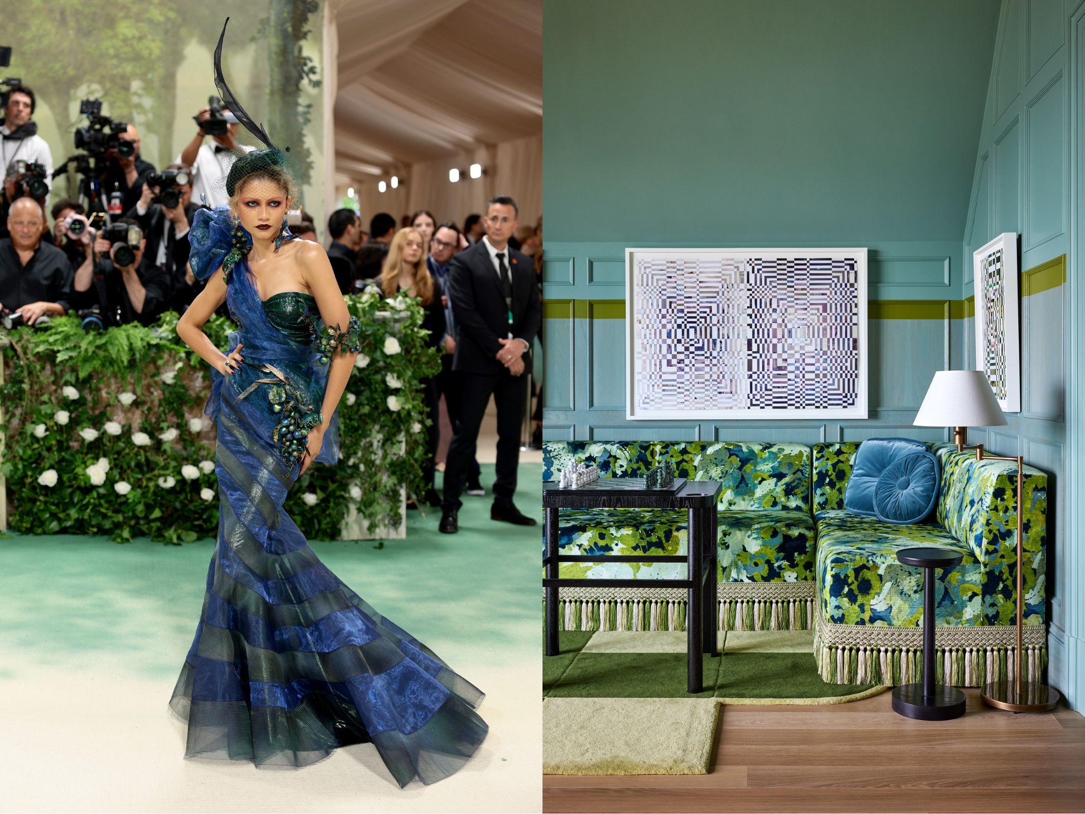
Co-chair of this year's Met Gala (and always getting the looks so right on her recent press calls), Zendaya was always going to be a highlight of this year's carpet. And her Maison Margiela gown for 2024 is channeling a color combination that would have once proved a little controversial.
We've already answered the question: 'do blue and green work together?' and the answer is a resounding yes. It's a color palette that's add freshness to spaces in design right now, and if you need an example of how it works, take a look at this room at this year's San Francisco Decorator Showcase by Jon de la Cruz of De La Cruz Interior Design.
2. Unexpected Red
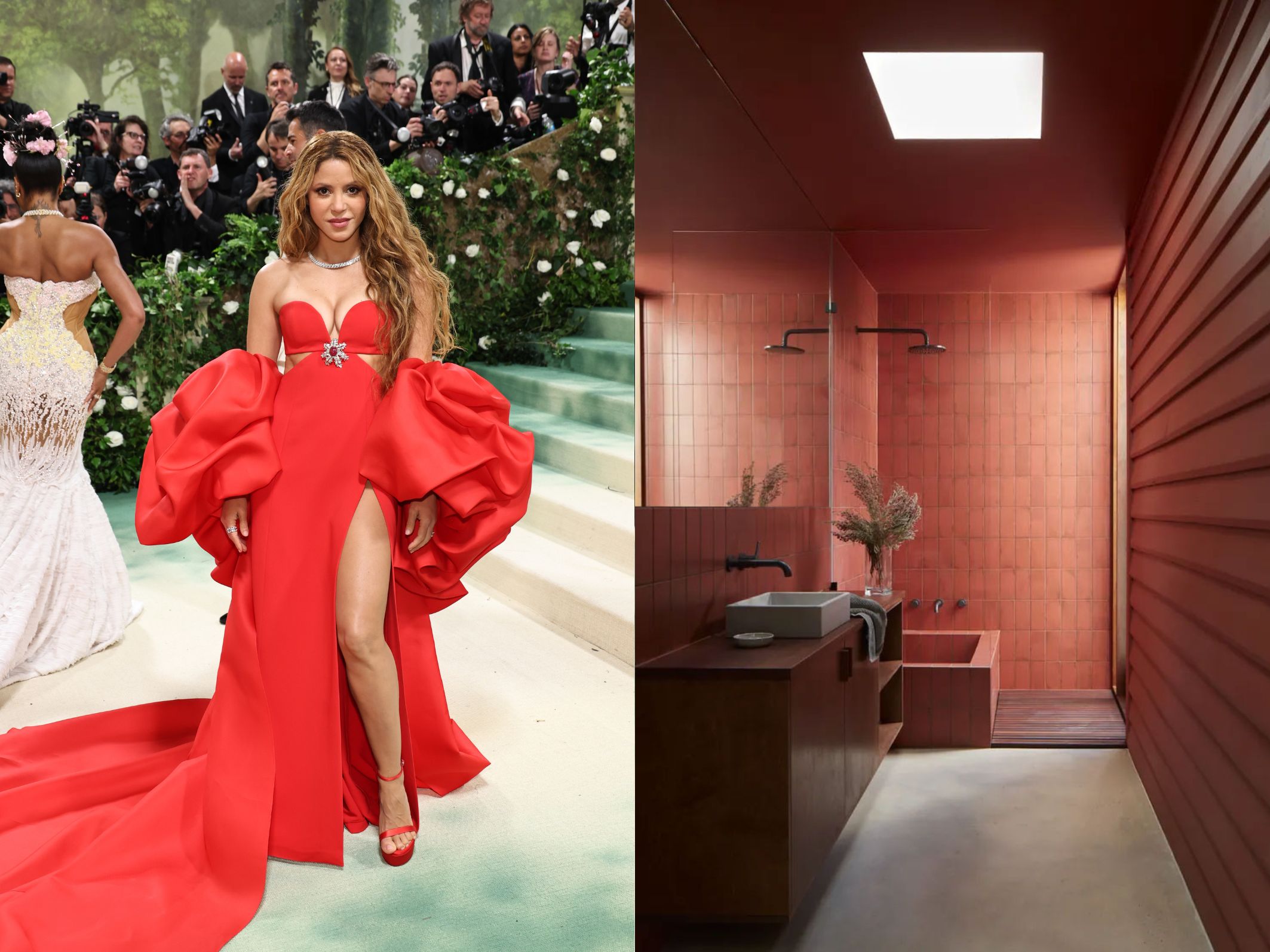
With so many lush green and soft pink floral interpretations of the theme, there's one color that was quite unexpected to see crop up again and again on the Met Gala's carpet — red. Most noticeably sported by Shakira, everybody's favorite fashion influencer Wisdom Kaye and actor Morgan Spector (who you might know best from The Gilded Age), red on red on red was the order of the night.
And it's fair to say this color is making waves in interior design this year, too. We've already seen the 'unexpected red theory' bring red accents to the forefront of decorating as a viral trend, but at the world's biggest design fair in Milan this year, red was also everywhere. So whether you're looking for a pop of red, or want to embrace color drenching like this beautiful bathroom by Australian designers Grotto Studio, red's the color to play with right now.
Be The First To Know
The Livingetc newsletters are your inside source for what’s shaping interiors now - and what’s next. Discover trend forecasts, smart style ideas, and curated shopping inspiration that brings design to life. Subscribe today and stay ahead of the curve.
3. Silver Resurfaces
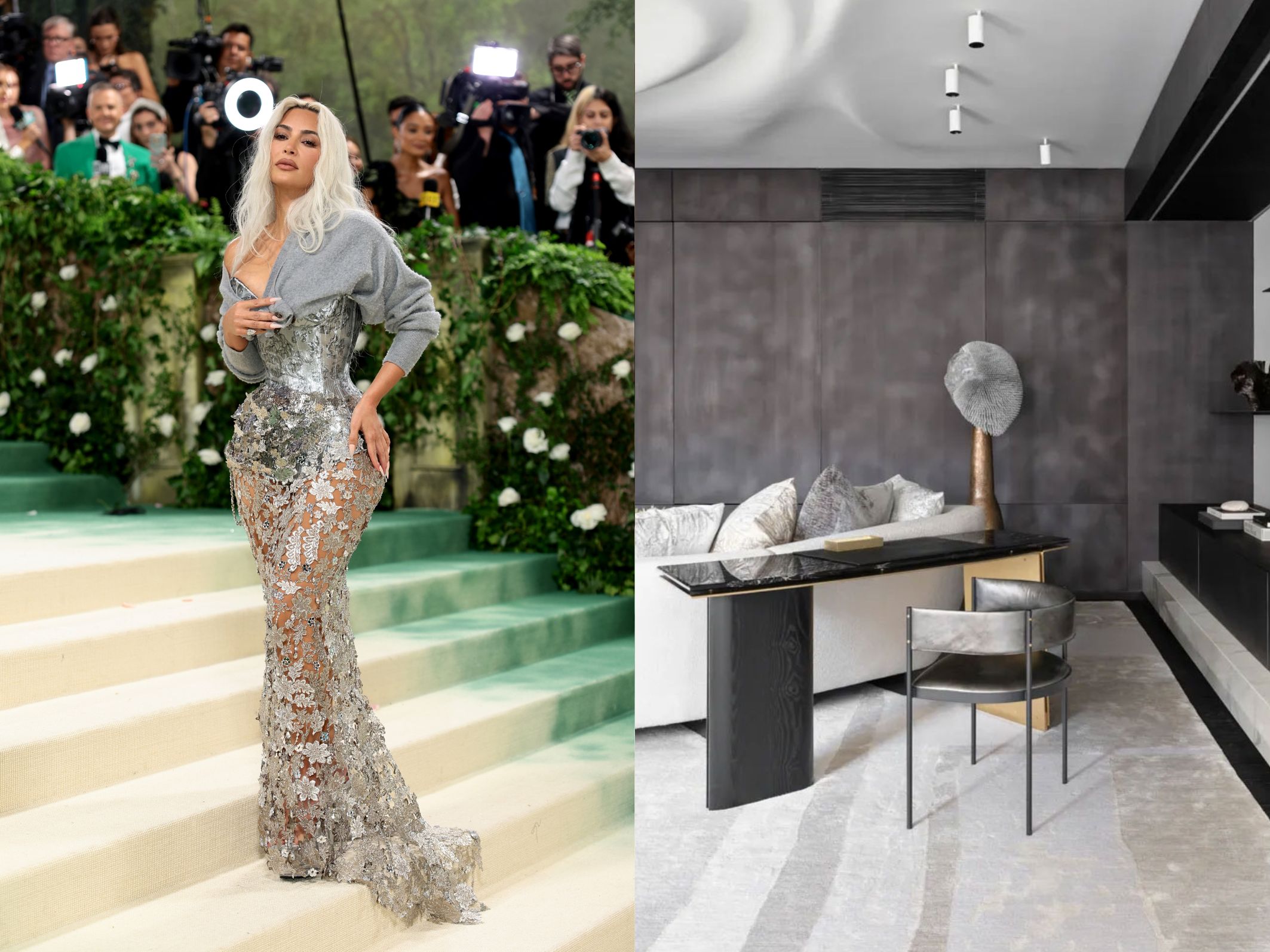
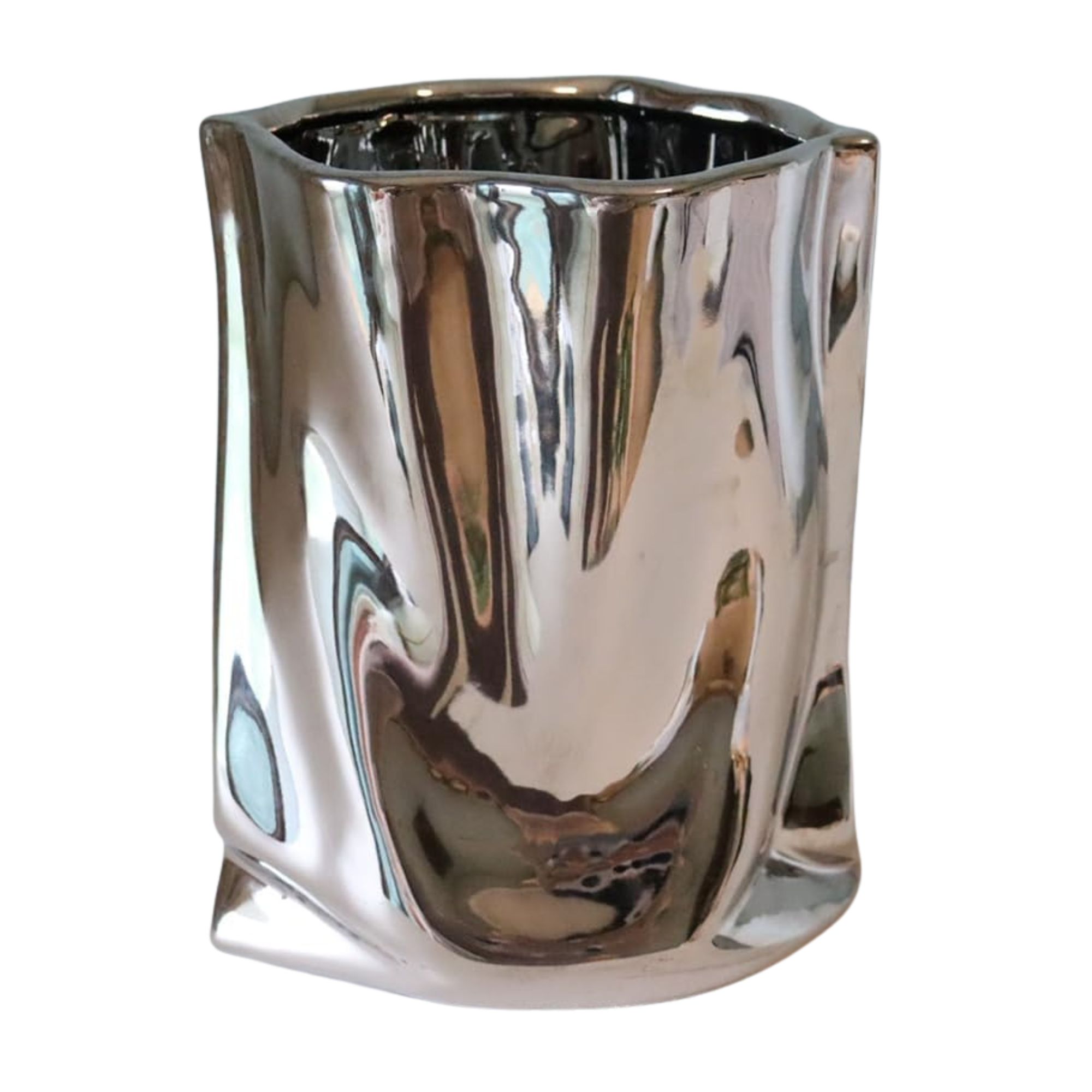
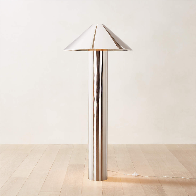
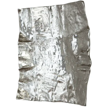
We've been in such a cycle of brass-y gold tones in design for such a long time, that it was inevitable cool metallics would make a comeback. Mixed metallics were all over the carpet last night, you only have to take a look at Serena and Venus Williams gold and silver looks to see that both metal tones are undoubtedly both popular choices right now.
However, it was Kim Kardashian's Maison Margiela look that brought to mind a recent project by Workshop APD that I think says a lot about design right now. The mix of silver and textures of gray (a neutral that dare I say is also due a resurgence) showcase that metallic sheens can be tempered down, while still offering the wow-factor you're after.
4. Modern Gothic

There was an overarching dark, near-gothic aesthetic that was, for me, potentially the most surprising take on the Garden of Time theme this year, however, with a surprisingly dark story by J G Ballard cited as inspiration for the carpet, perhaps it shouldn't have been completely unexpected.
From Gwendoline Christie's bold look above, to dresses worn by Dua Lipa and Kendall Jenner, outfits that were dark, vampy, yet sculptural and textural — something we're seeing in the adoption of dark color trends in interiors now, too. Black on black, alongside deep burgundy and purple, lends itself well to this look we're calling modern gothic, and this jewel box kitchen, designed by Kristen Peña of K Interiors, feels like something new and exciting in the design world right now.
5. Textural Whites
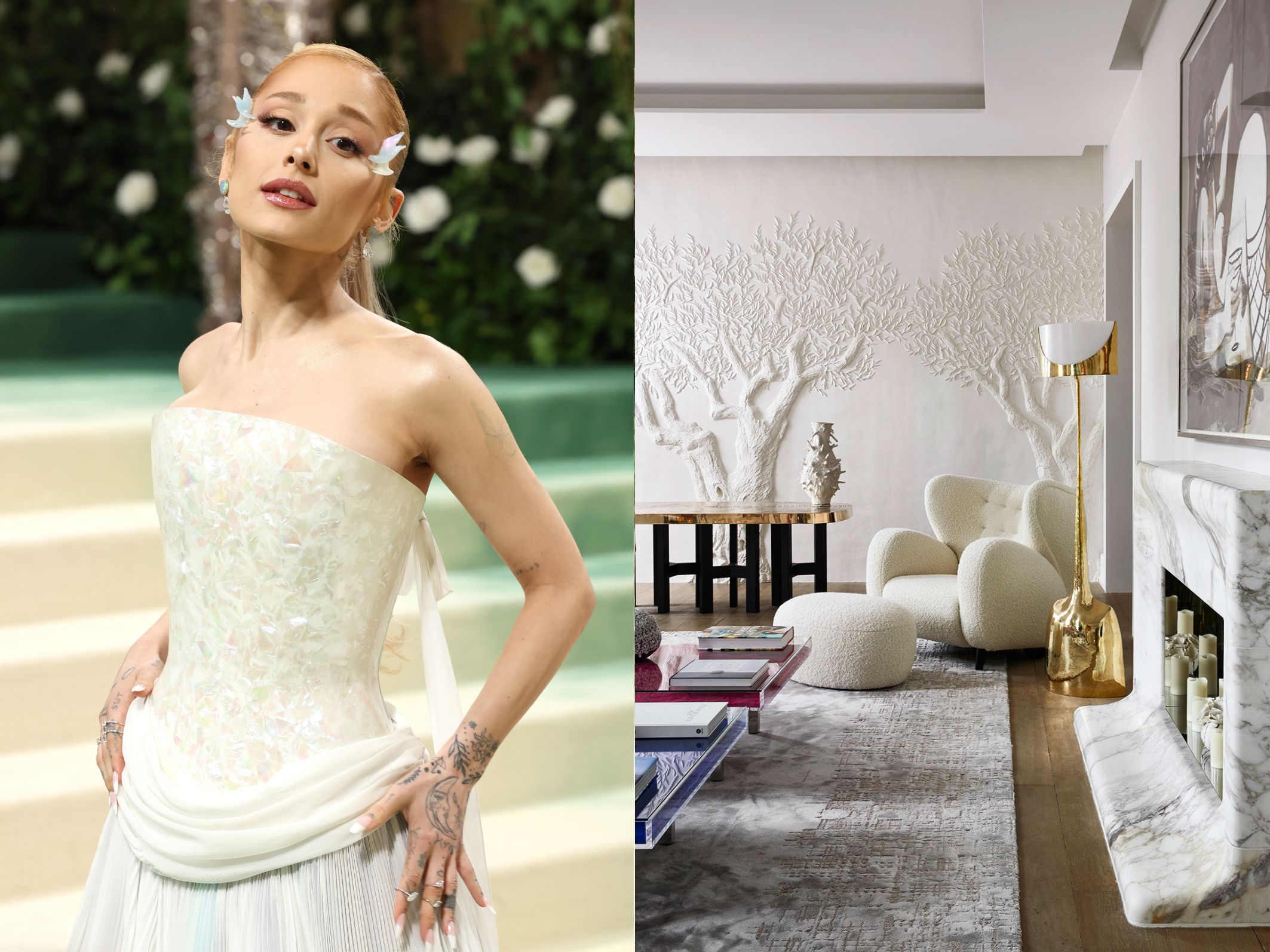
It's undoubtedly a time in interior design where color is being embraced fully, but for those who are doing neutrals so well, there's a lightness and prettiness to their approach which we can see reflected in looks like Ariana Grande's and Sarah Jessica Parker's, and don't skip over the beautiful sheer white dress worn by actress Greta Lee.
Dreamy, romantic, but full of detail, it's a look Livingetc is calling The New Pretty, characterized by ruffles and sheers. The white plaster relief in the Parisian apartment designed by Stephanie Coutas feels particularly app for this year's theme, too.
6. Pastels With Black
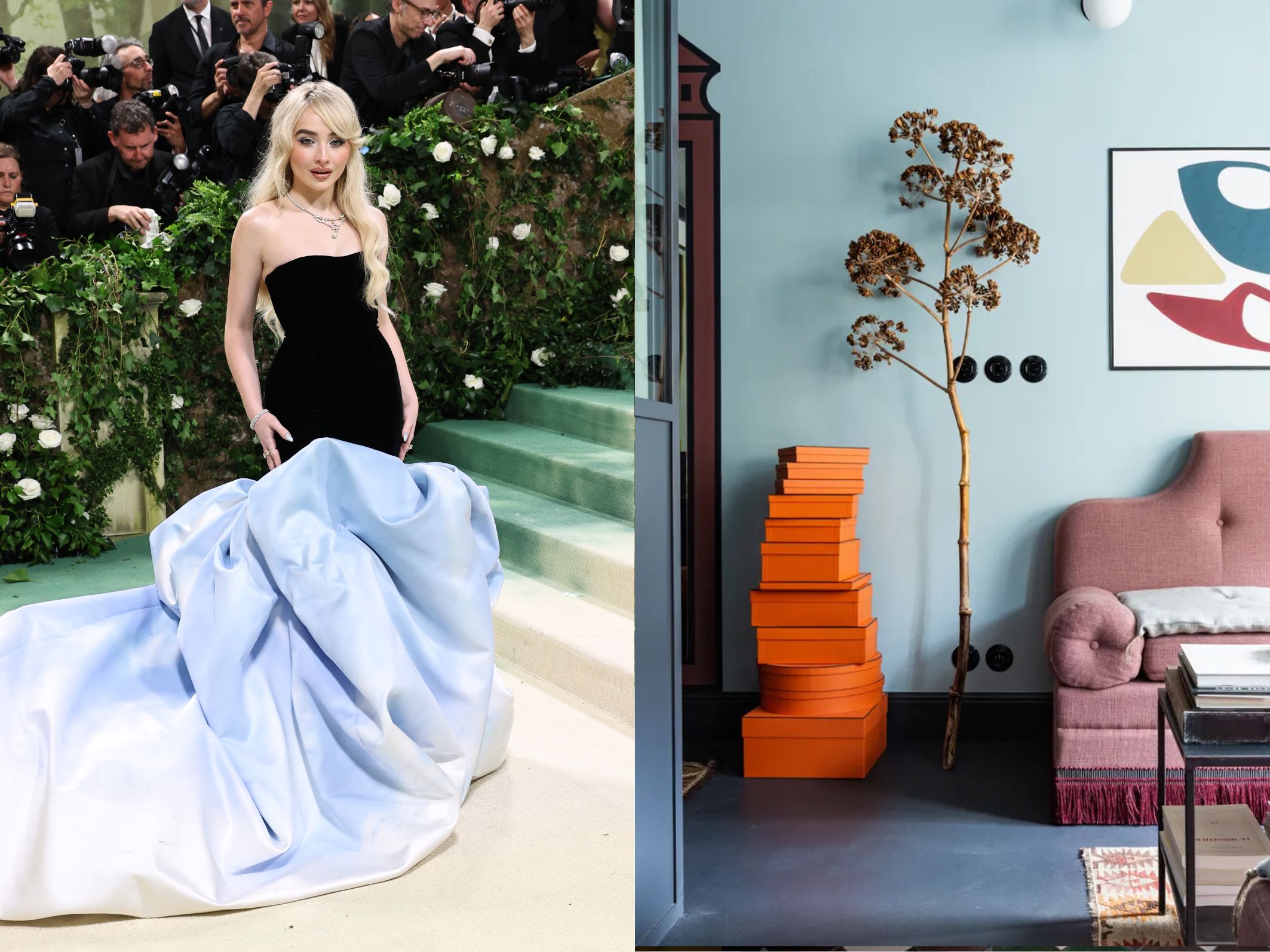
Traditionally, light, chalky hues haven't made comfortable bedfellows with the harshness of black, but not only was this intriguing combination of colors used a lot on the Met Gala's carpet this year to marry the trends of softness and gothic harshness in many of the outfits, but it's something we're seeing in interiors, too.
When it comes to colors that go with light blue, baby pink or even shades of trending lilac, black is being adopted by designers as a way to make decorating with pastels feel more grown-up — these colors feel more contemporary and less kids' bedroom than before in this combination.

Luke Arthur Wells is a freelance design writer, award-winning interiors blogger and stylist, known for neutral, textural spaces with a luxury twist. He's worked with some of the UK's top design brands, counting the likes of Tom Dixon Studio as regular collaborators and his work has been featured in print and online in publications ranging from Domino Magazine to The Sunday Times. He's a hands-on type of interiors expert too, contributing practical renovation advice and DIY tutorials to a number of magazines, as well as to his own readers and followers via his blog and social media. He might currently be renovating a small Victorian house in England, but he dreams of light, spacious, neutral homes on the West Coast.
-
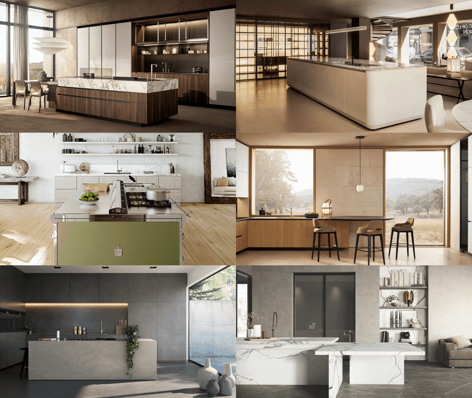 Italian Kitchen Trends — 5 Emerging Ideas From the Chicest Italian Designers That I Predict Will Go Global in 2025
Fresh from Milan Design Week, these are the exciting finishes, styles, and innovative materials I can't wait to see in more kitchens this year
By Faiza Saqib Published
-
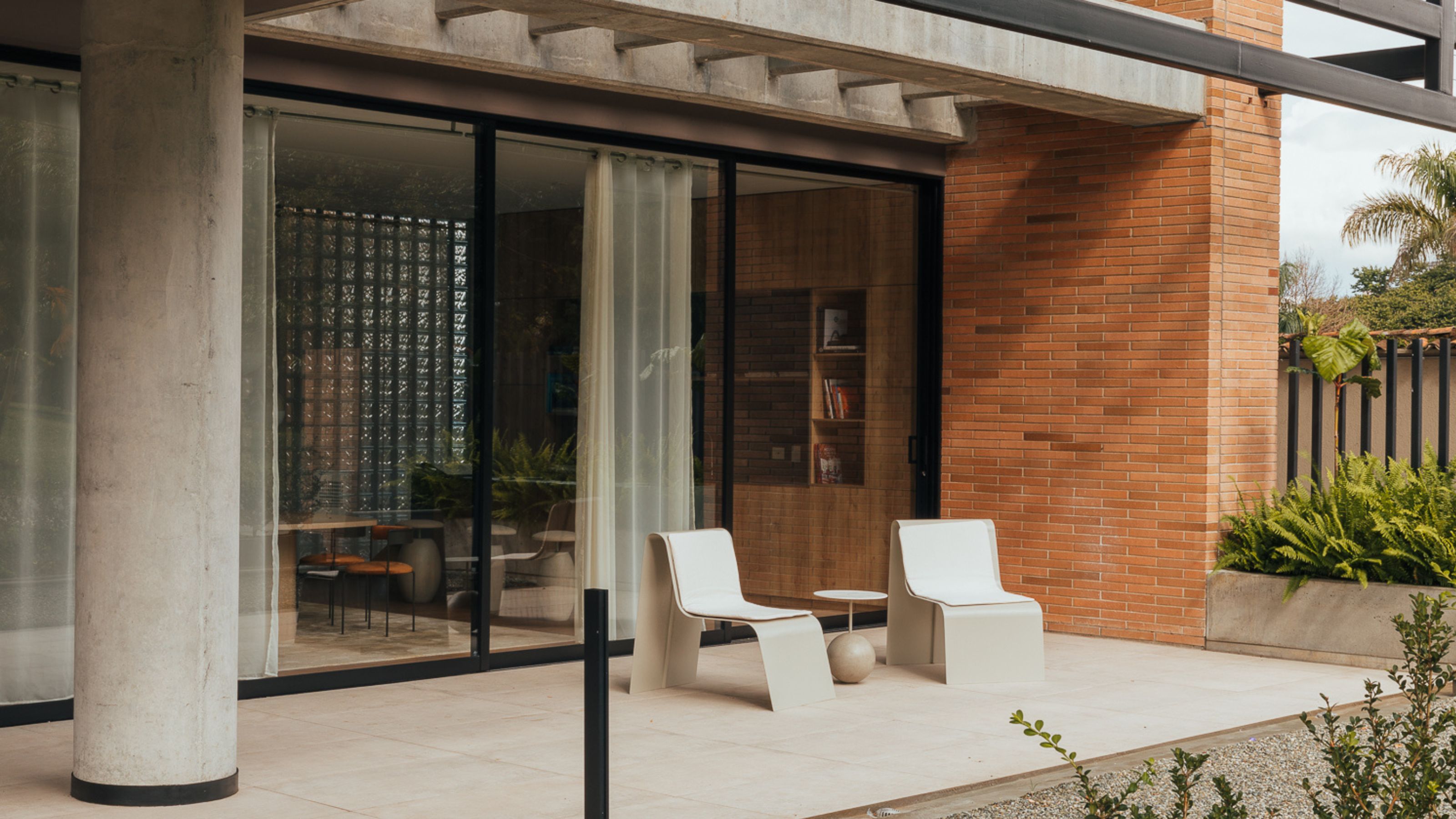 Small Patio Ideas — 8 Clever Ways to Style Up Even the Tiniest of Outdoor Spaces
If you're dreaming of turning your small patio into a dream space the right combination of practical and creative ideas will help you max up its potential
By Sarah Wilson Published
-
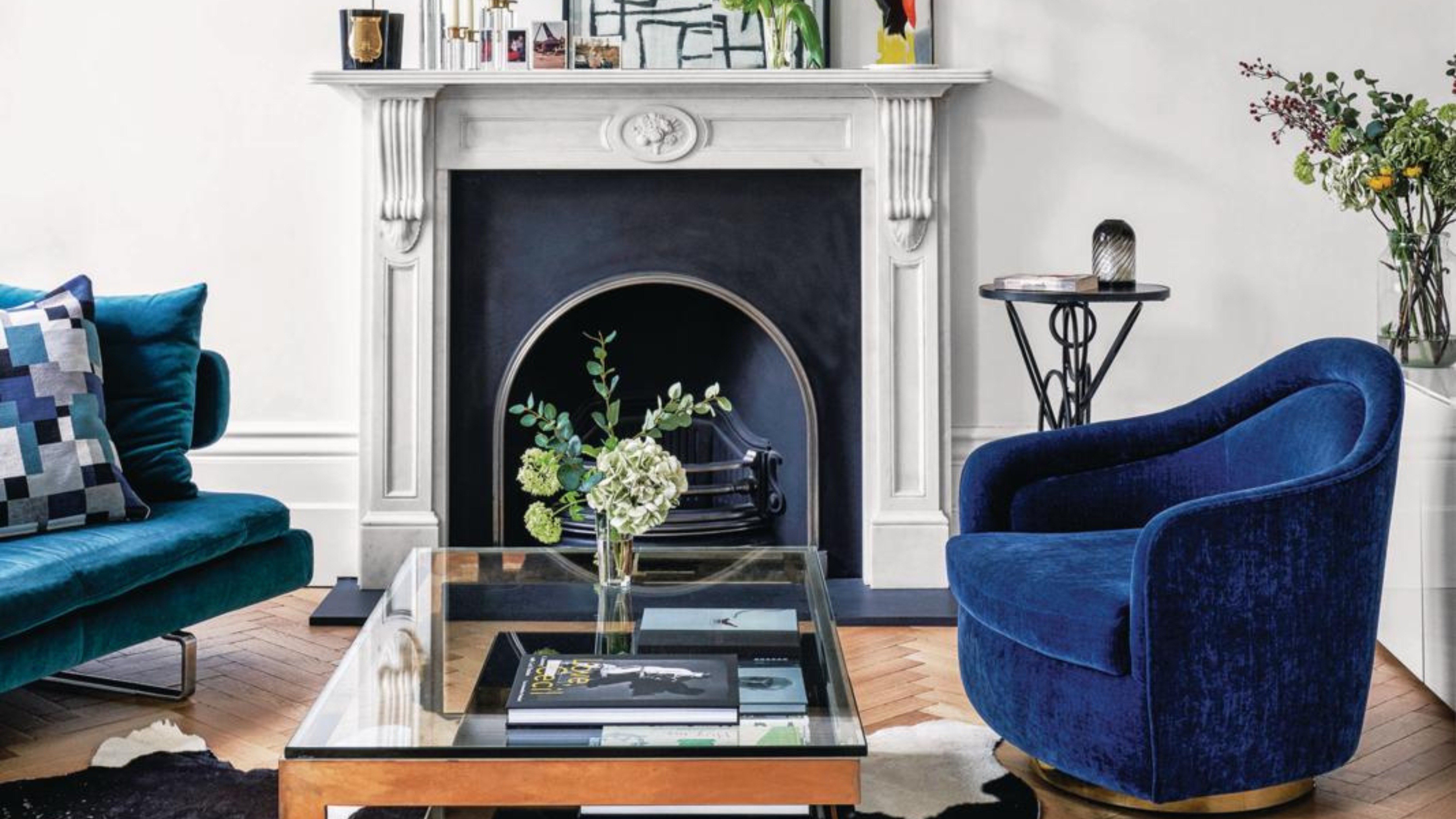 IKEA Reveals Its 2025 Color of the Year — An Electric Blue Hue, That Is Enticingly Bold and Brilliant
Though unexpected, this shade of blue may be my favorite color of the year prediction yet
By Olivia Wolfe Published
-
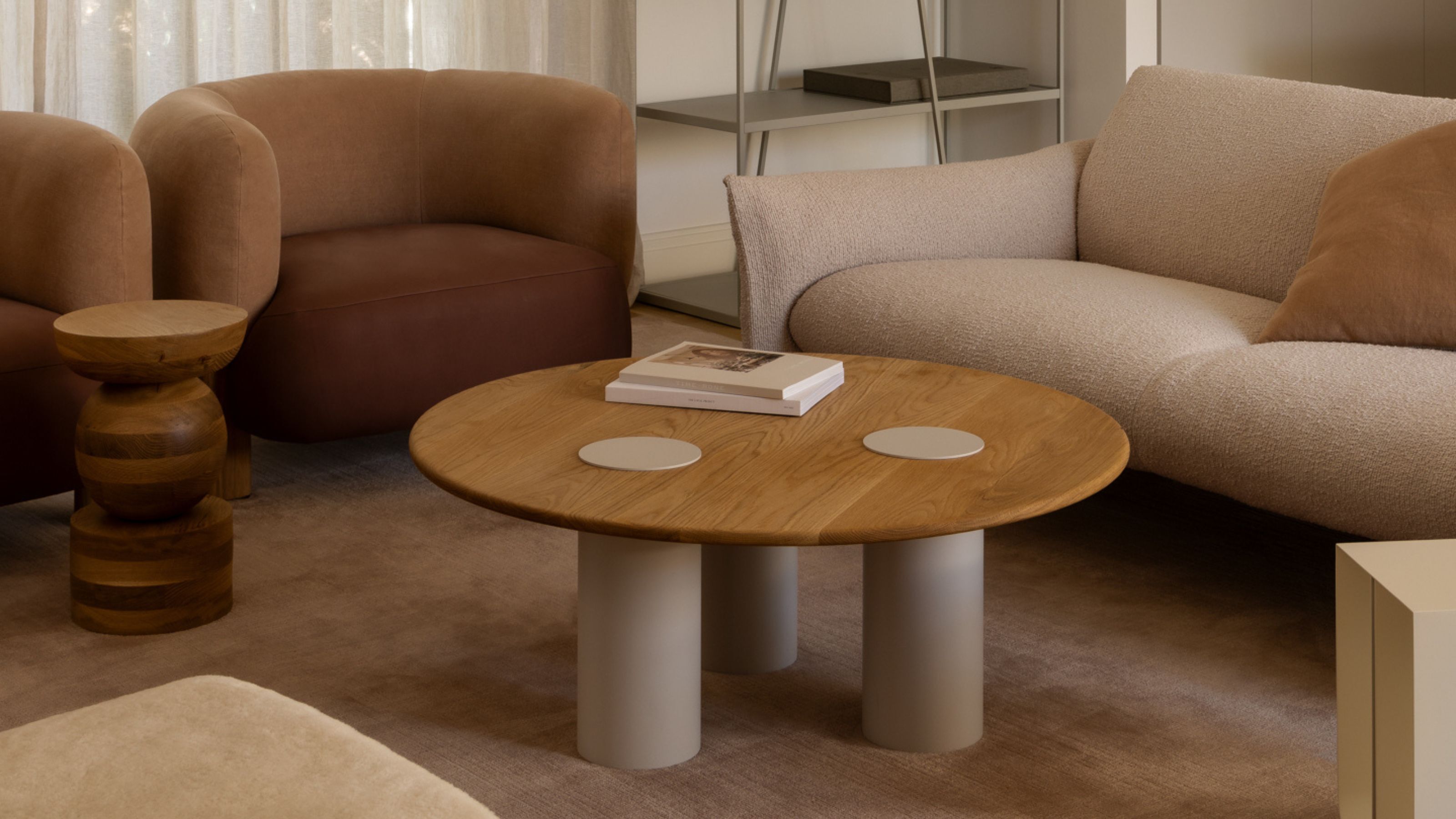 Pantone's Color of the Year for 2025 Has Been Announced — Meet 'Mocha Mousse'
We share how to style it, shop it, and everything else you need to know about the subtle yet elegant soft brown shade
By Olivia Wolfe Published
-
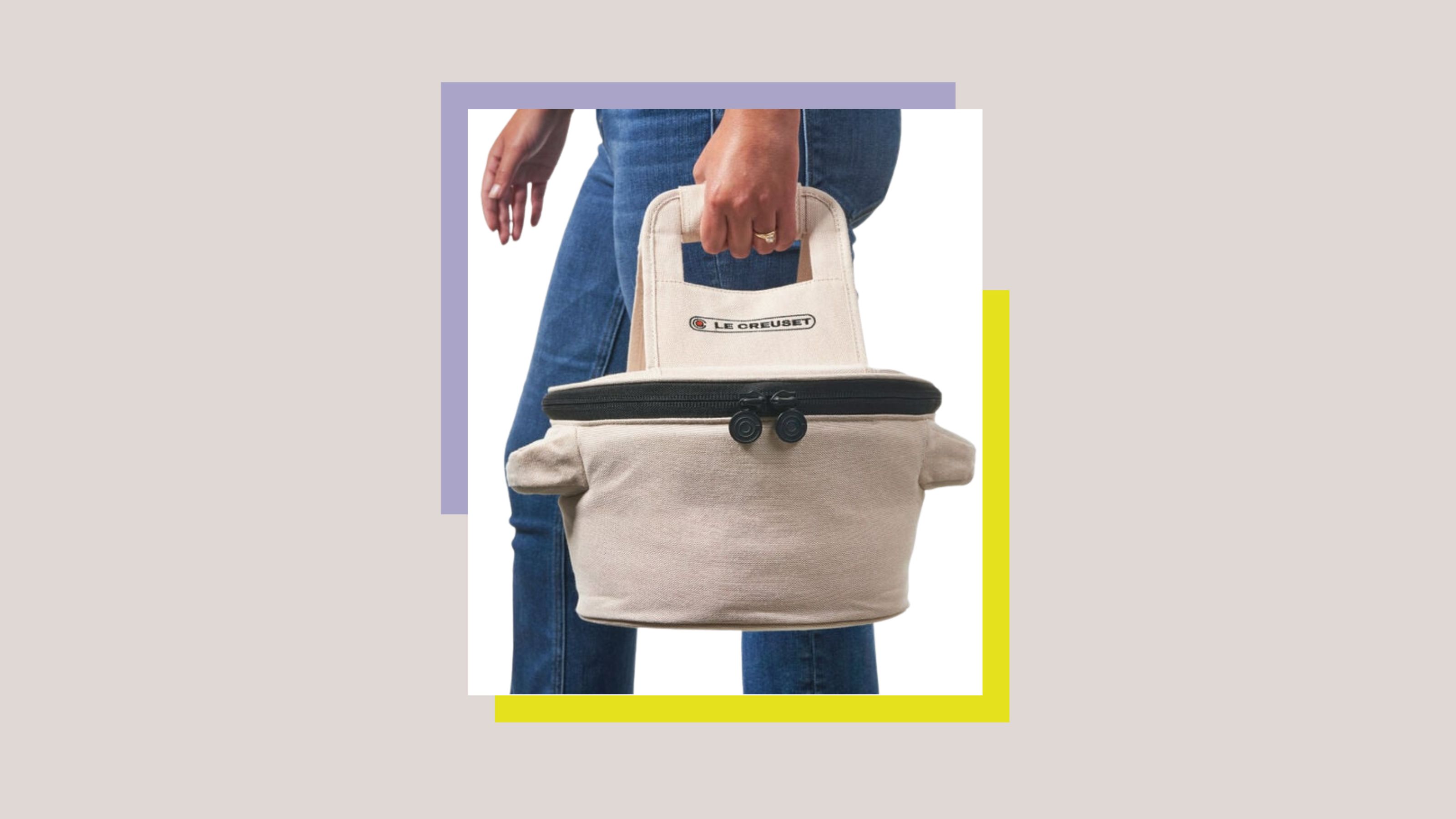 Le Creuset Just Released a Ridiculous Tote Bag for Transporting Their Dutch Oven to Dinner Parties — I'm Obsessed
Whether you need it is certainly not the question, here. But whether you want it... well, why wouldn't you?
By Olivia Wolfe Published
-
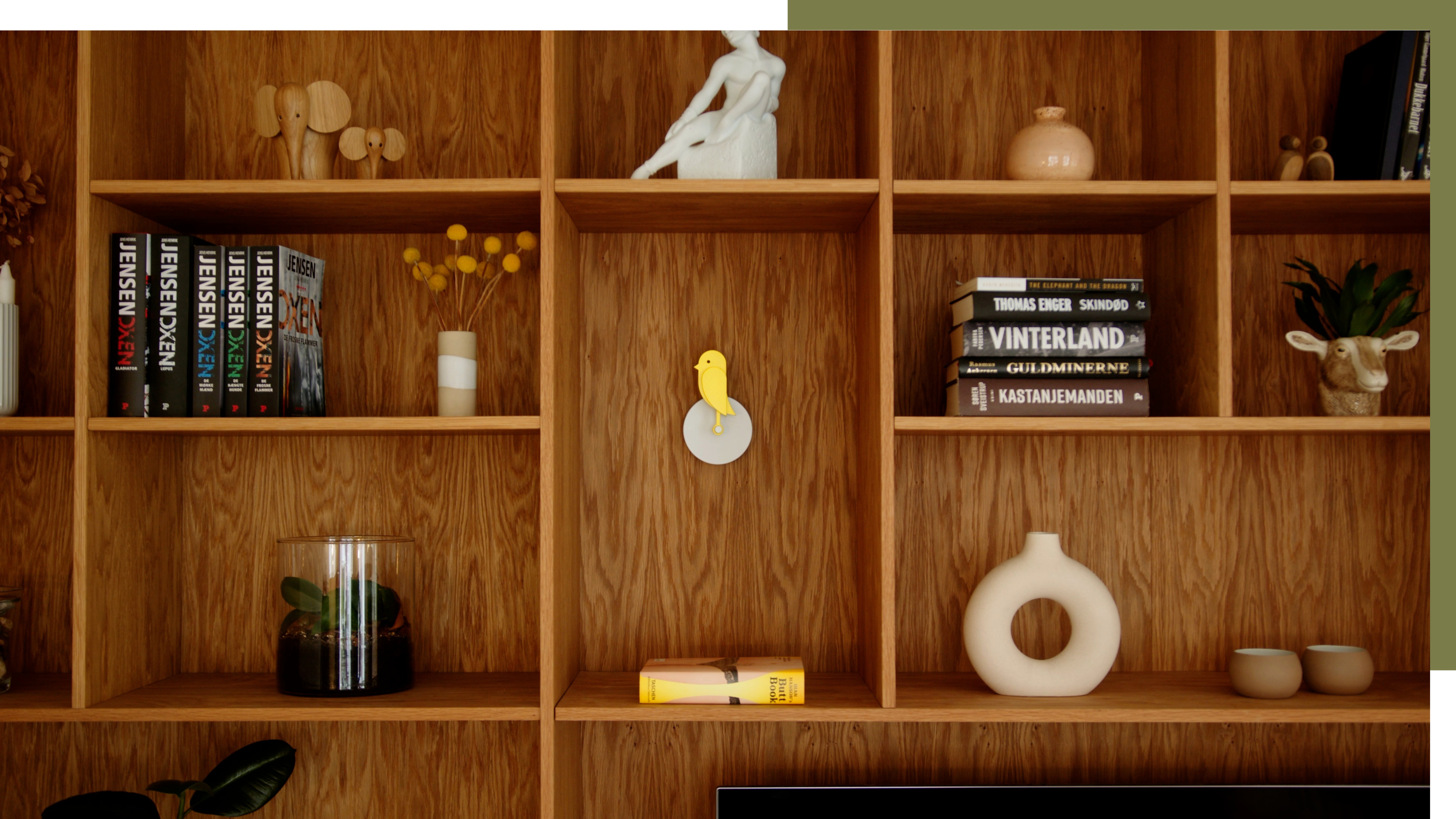 A Little Birdie Said Monitoring Your Air Quality Just Got a Stylish New Look
This Amazon buy is promising a healthier home with no style expense
By Olivia Wolfe Published
-
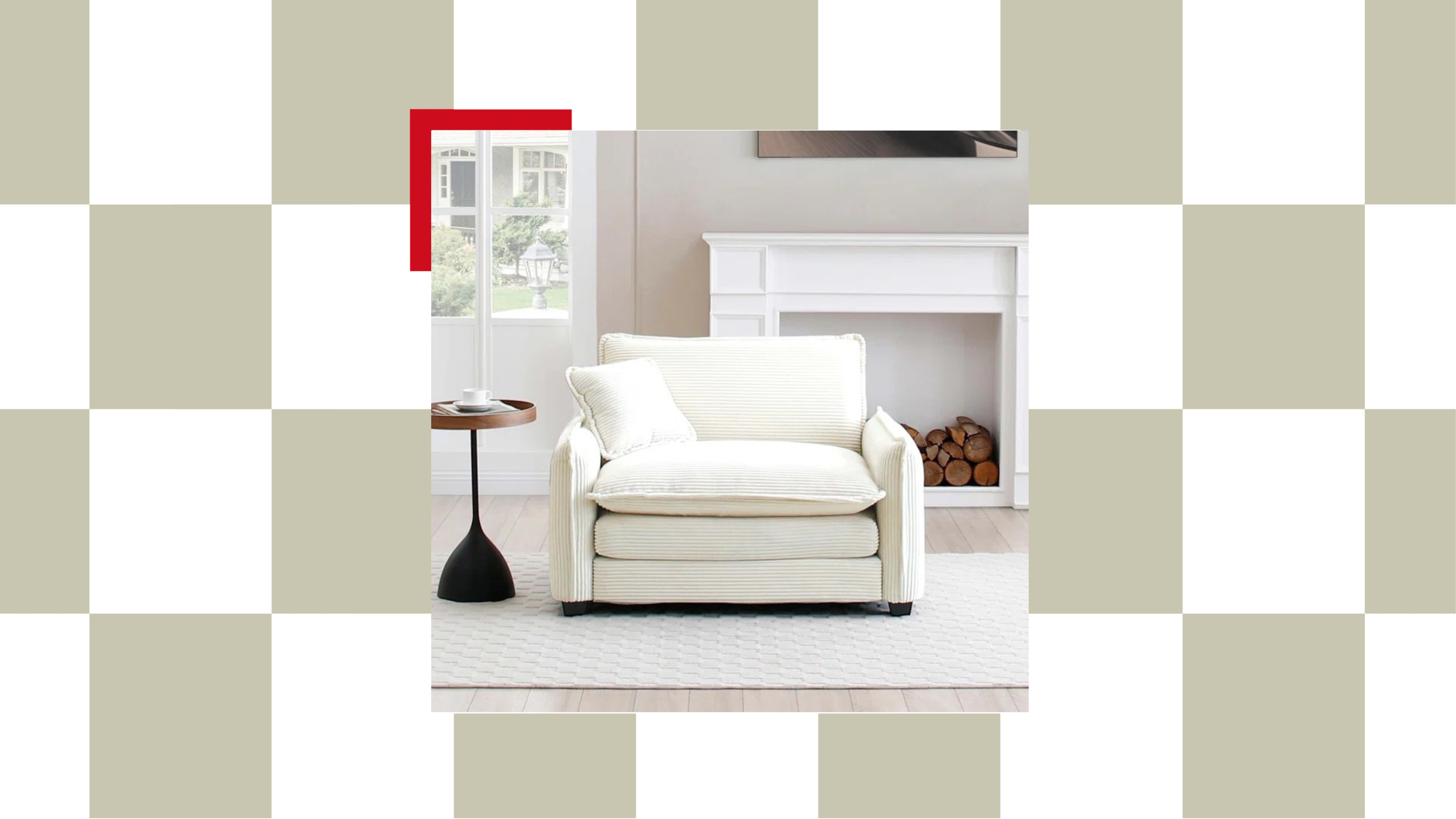 The "Chair-and-a-Half" Is the Goldilocks of Seating — Not Too Big, Not Too Small, but Just Right for Snuggling Up This Season
This accent chair trend is perfect for the cozy season, and it's on sale at Wayfair
By Olivia Wolfe Published
-
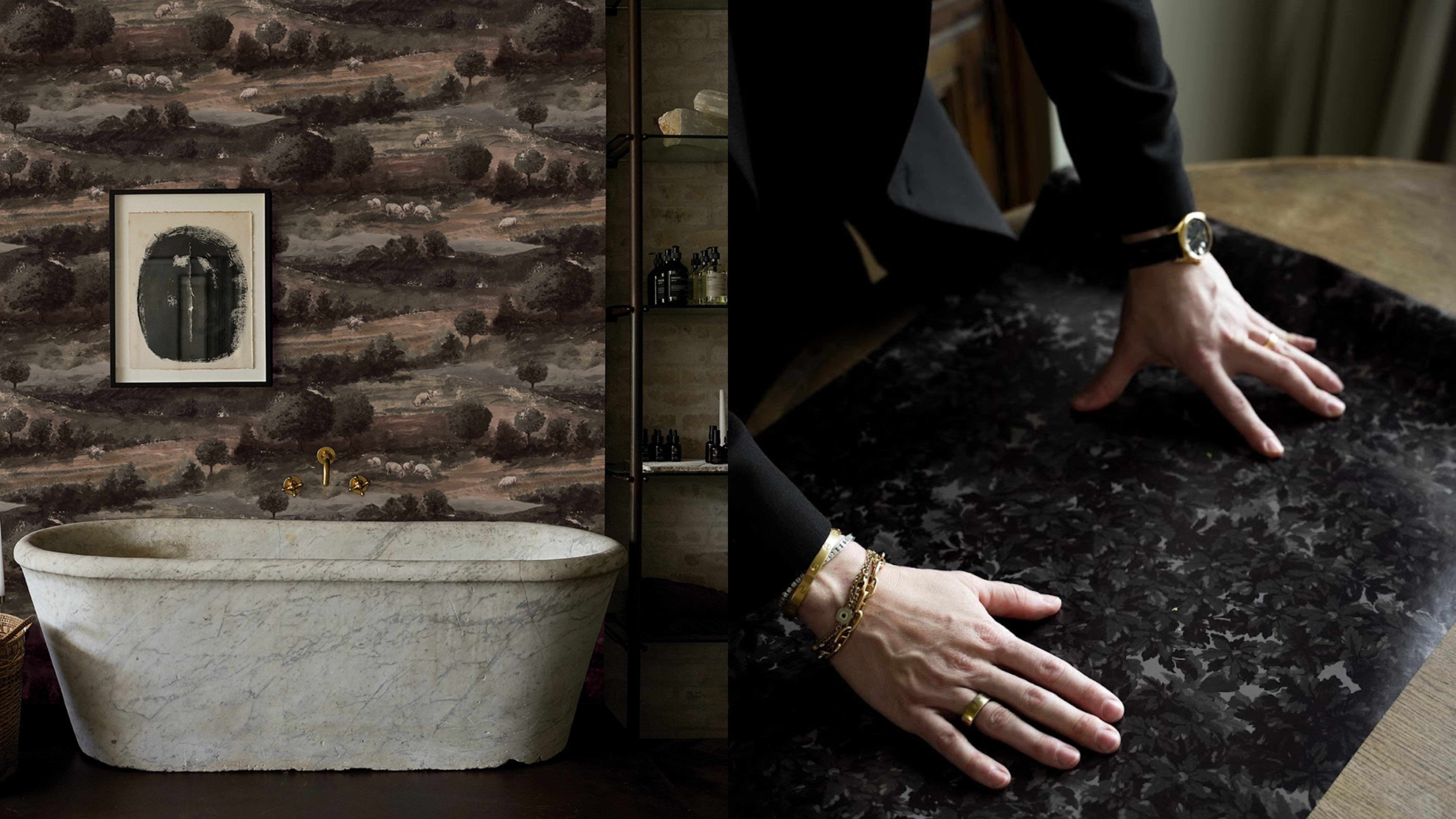 Textured Walls Are Still Trending (And Just Got a Whole Lot More Chic Thanks to This Jeremiah Brent Collaboration)
'Nostalgia' is the name, and texture is the game; this moody new peel-and-stick wallpaper collection is bringing all the fall vibes to interior design
By Olivia Wolfe Published
-
 Ruggable's Latest Collection is Dripping in What We're Calling the Season's Go-To Fruit-Inspired Hue
We're seeing the sunny, mango-inspired shade cropping up in new collections across the design world — and it's surprisingly perfect for fall. Here's why
By Olivia Wolfe Published
-
 Sorry, Sherwin-Williams, We’ve Already Chosen OUR 2025 Color Crush!
You don't paint your whole home in one color, so why settle for just one Color of the Year when you can have a complete capsule?
By Olivia Wolfe Published
