This minimalist wall decor trend is the antidote to fussy gallery walls – I Just love how simple this look is
Minimalists are changing the way they approach wall art, going for this undersized and off-center look
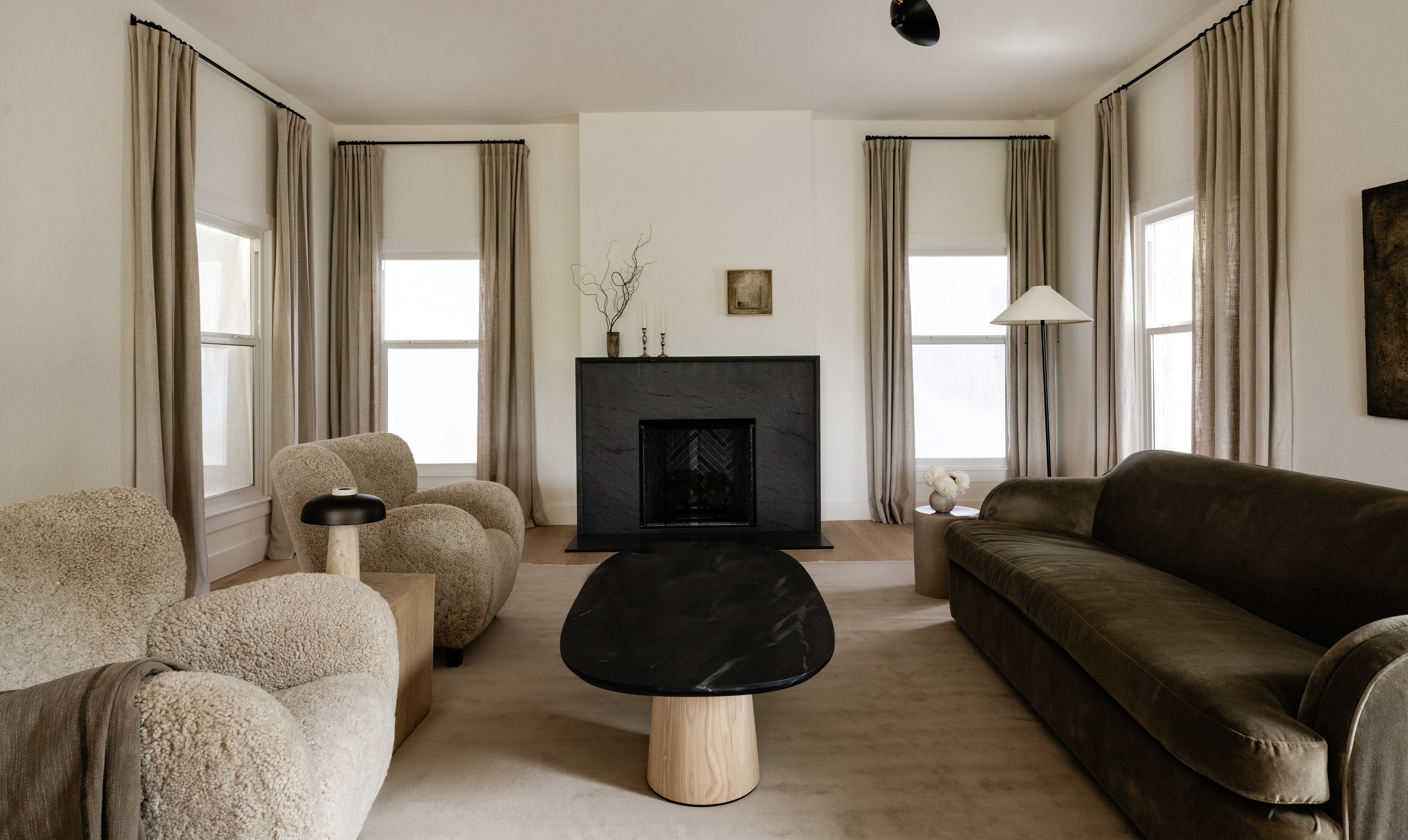

More often a not, there is a wall in every room that is begging for a beautifully framed piece of art. My tendency is to go oversized and centered with my wall art, really driving the focal point of the room. But I'm noticing more and more designers flipping this idea on its head and it's got me rethinking everything I thought about framing and positioning wall art.
Instead of the classic look that dominates that main bedroom wall or living room chimney breast, minimalists in particular are going for undersize frames that are hung off center. The result is subversive yet simple, making a feature of the wall without overwhelming the space. It also draws attention to the color and texture of the wall and the rest of the decor in the room - which in a minimalist scheme is either carefully considered or nonexistent.
It is a clean, minimal aesthetic that feels styled and simple - but is it easy to replicate at home? And are there any drawbacks? I asked the interior designers to find out more about this interior design trend.
What kind of room does this minimalist wall art trend suit?
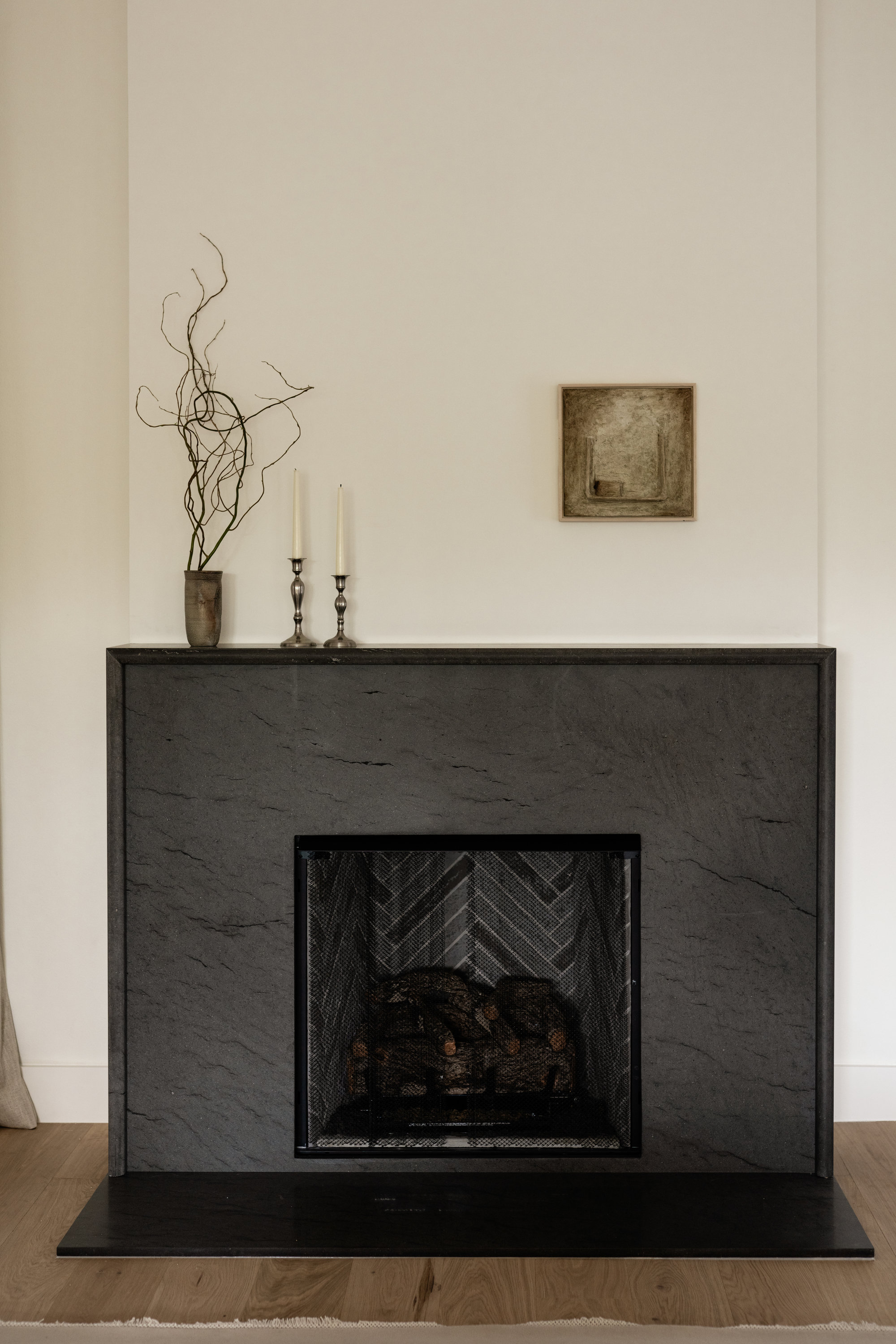
The oversized, off-center look works for a minimalist scheme, and in particular, works well on a chimney breast. Where our eyes are accustomed to seeing large living room wall art, or even TVs, going small makes a statement and draws the eye. This is how designer Emily Brown of Emily Lauren Interiors has dressed this minimalist living room and fireplace.
'We love placing undersized art off-centered,' says Emily. 'The asymmetrical position adds charm and a unique, unexpected quality.' However, it's about more than just copying and pasting the look, as with most minimalist trends, it's about how it makes a room feel.'
'The size also creates an unanticipated pause, drawing you in closer to view the piece, inviting a moment of reflection,' says Emily. In this sense, framing and positioning wall art in this way is helpful to create a calming feel and turn your room into a place of sanctuary. Where large wall art might detract from the relaxing feel of a room with its bold presence, smaller frames feel intimate and cozy.
It's not just limited to living rooms, it's also a great tactic to employ when decorating bedrooms. The off-center, undersized wall art looks above a bed or bedside table too.
Be The First To Know
The Livingetc newsletters are your inside source for what’s shaping interiors now - and what’s next. Discover trend forecasts, smart style ideas, and curated shopping inspiration that brings design to life. Subscribe today and stay ahead of the curve.
Are there any tricks to styling?
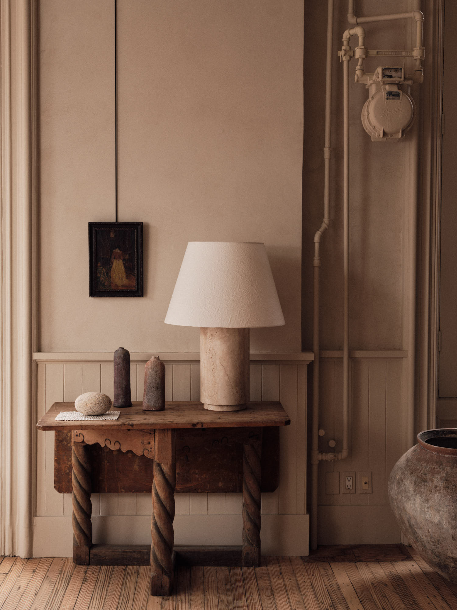
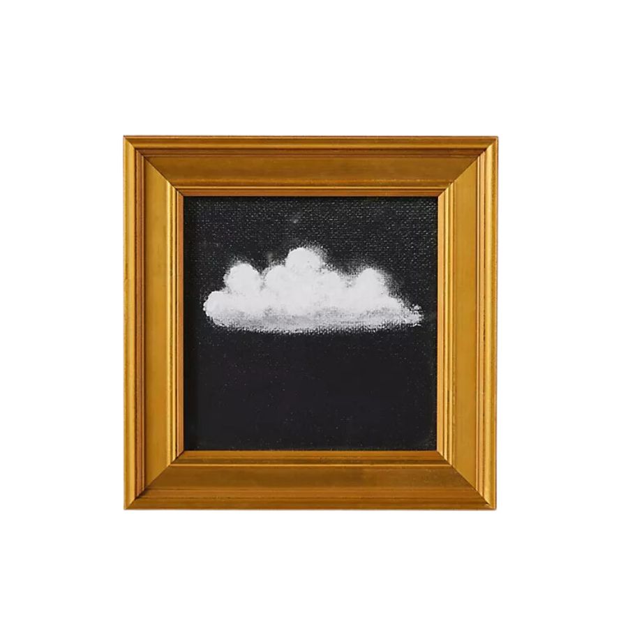
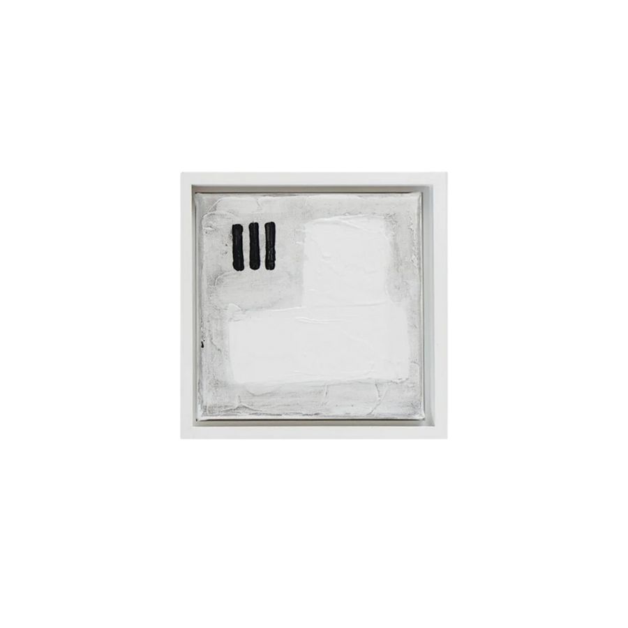
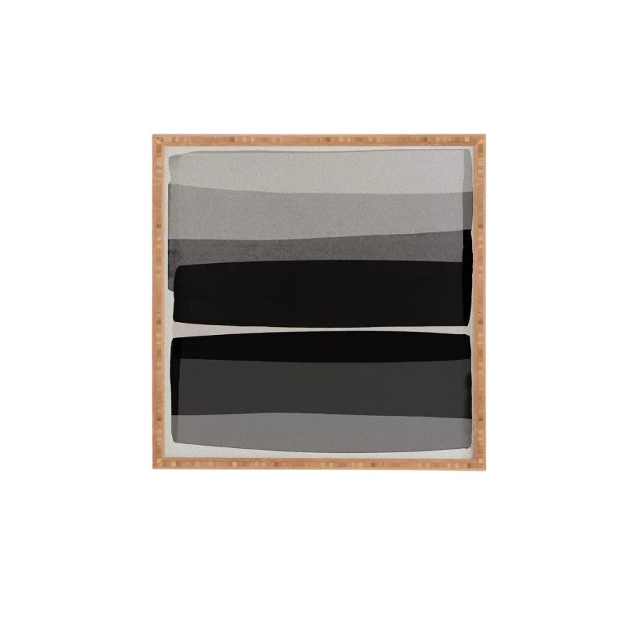
So how do you go about picking the perfect wall art to emulate this particular look? When going minimalist, it's more about shapes and texture instead of overtly detailed and artistic paintings. Remember that it's all about going simple and soothing with minimalism so choose a graphic pattern, linoprints or geometric shapes, and when in doubt, keep your colors muted. Black, dark browns, an inky blue and white might be a good palette to take your cues from.
In minimalist homes, I've also seen framed swatches of fabric or patterns carved from the movement of thick paint or even plaster. Going for textured art can look beautiful in a minimalist living room that must rely so much on texture to provide that necessary depth.
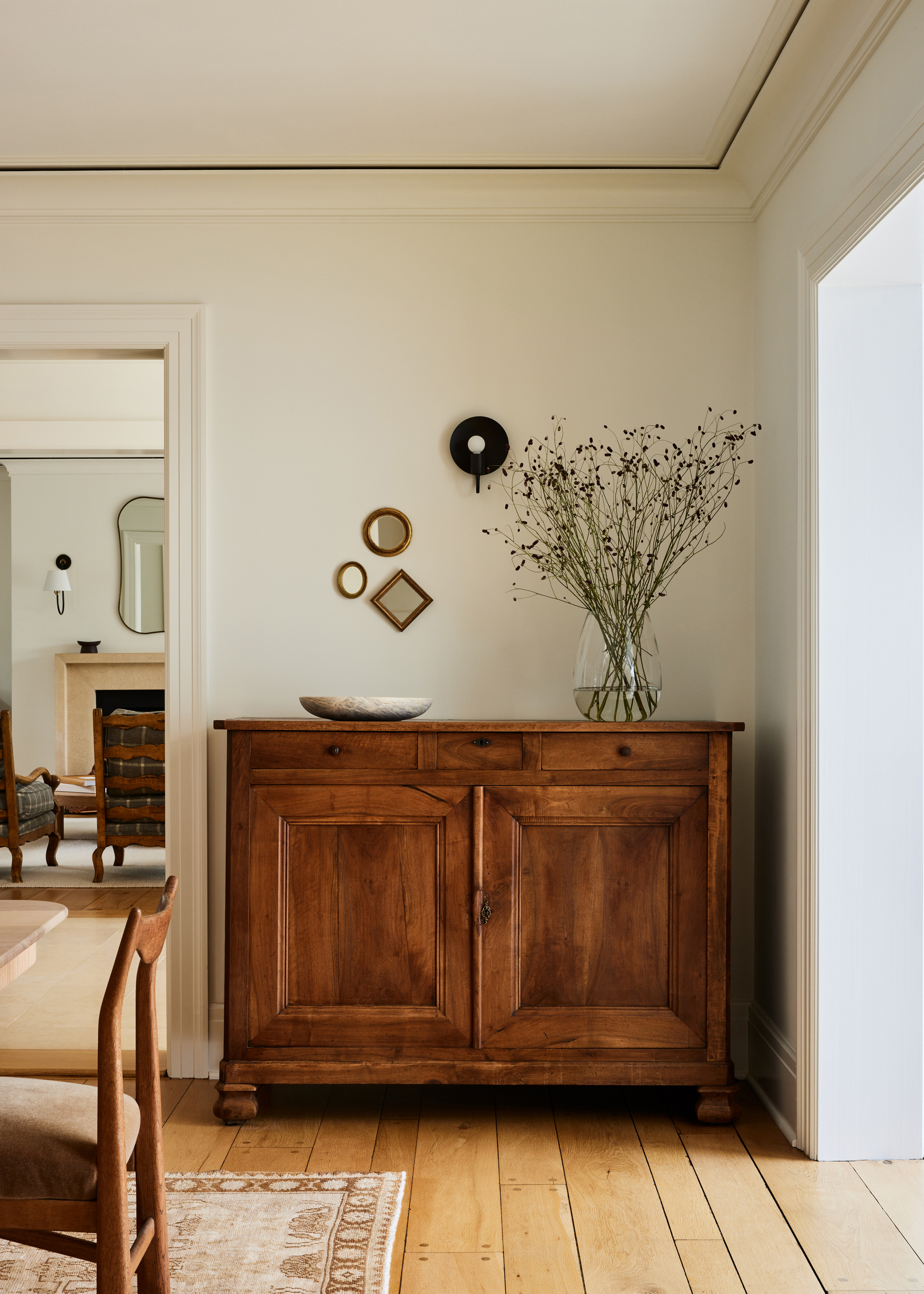
Don't forget that the frame is just as important. When going for wall art on this scale, the frame takes up a lot of the minimal space on offer. I like a chunky dark wood, or for a bit more glitz, a chunky gilded frame can look dramatic. But think about how your chosen frame works with your print.
If you want to recreate the look to bring a minimalist feel, avoid anything colorful and keep to those natural materials. In this example by Ursino Interiors, the look is all about the shape of the frames. The designers have also used a cluster of pieces to create interest through shape and pattern.
‘This particular wall was an opportunity to add a whimsical touch to an otherwise tailored room,’ explains Maureen Ursino from Ursino Interiors. ‘Knowing that a petite contemporary sconce sits center above a symmetrical sideboard, we opted to hang a grouping of small antique Florentine gilded mirrors to add visual interest and an unexpected bit of asymmetry.’
Think about the rest of the scheme too and how it works with the art you've selected. For that calming aesthetic, think limewash paint or micro cement walls that bring that texture and minimalist color.
Are there any drawbacks to this minimalist style?
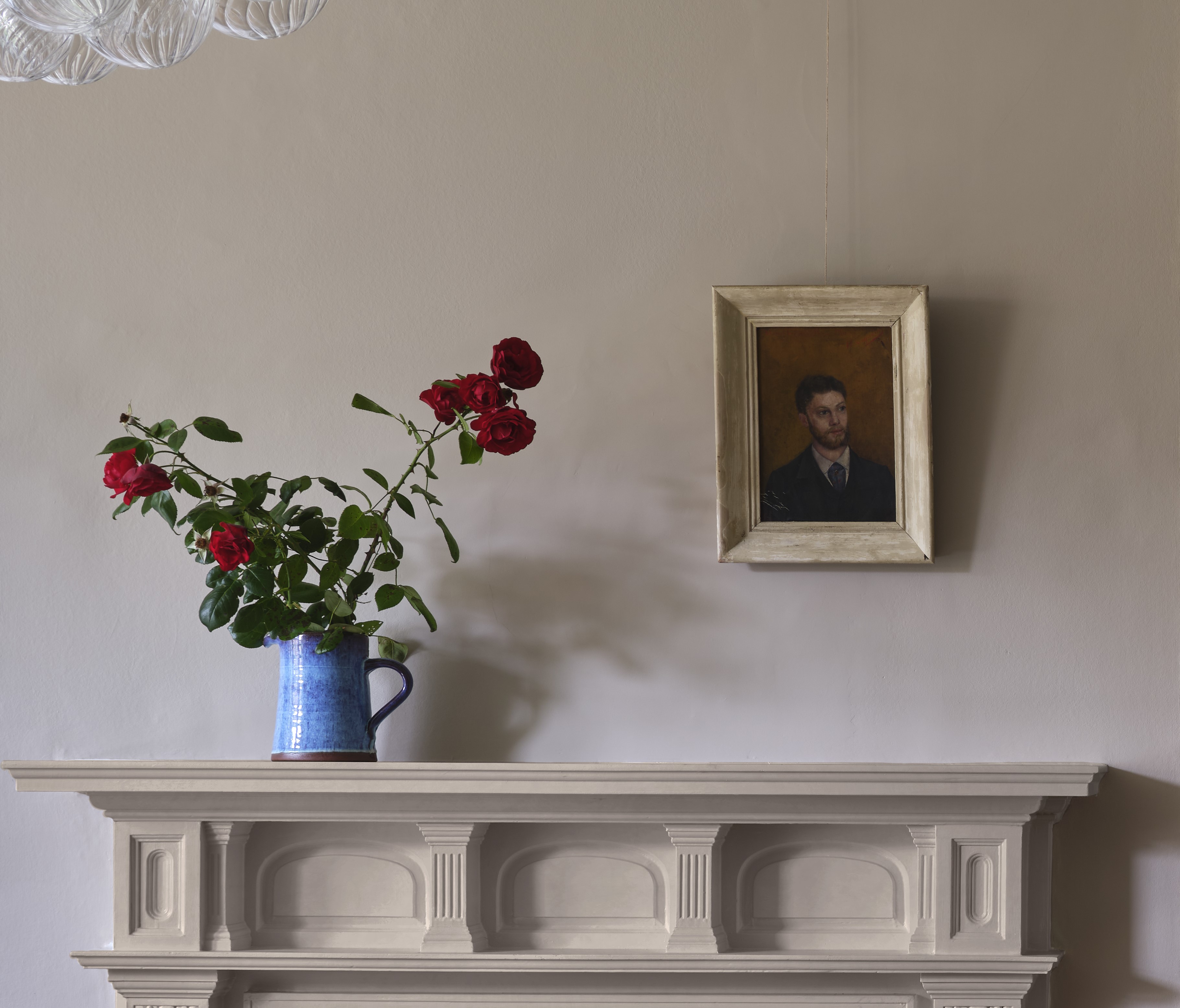
This look might not be for everyone, however, and there are a few drawbacks. There are a few things to consider if you're thinking about going for this look. If your room is already busy and decor-filled - it might end up looking a little odd. Really, it's important to note that this look is only really for minimalist rooms that are sparse in decor and with a muted color palette.
You might also get bored of the look easily. A way to get the best of both worlds in the case of a living room mantelpiece, for example, might be to lean a larger piece of wall art against the chimney breast wall, with a smaller framed piece in front over one of the corners. I like this casual aesthetic and it mixes the two styles in a harmonious way.
3 pieces of minimalist wall art to try now

Former content editor at Livingetc.com, Oonagh is an expert at spotting the interior trends that are making waves in the design world. She has written a mix of everything from home tours to news, long-form features to design idea pieces, as well as having frequently been featured in the monthly print magazine. She is the go-to for design advice in the home. Previously, she worked on a London property title, producing long-read interiors features, style pages and conducting interviews with a range of famous faces from the UK interiors scene, from Kit Kemp to Robert Kime. In doing so, she has developed a keen interest in London's historical architecture and the city's distinct tastemakers paving the way in the world of interiors.
-
 These Are the Flower Crowns I’m Wearing This Spring (Spoiler: They’re Actually for My Door)
Coachella confirmed the comeback of flower crowns. At home, they just go by another name: the spring wreath
By Julia Demer
-
 Bunny Ears, Be Gone — 7 Easter Table Styling Mistakes That Will Take Your Setting from Tawdry to Tasteful
From fussy floral displays that disrupt conversation to over-relying on tacky tropes, don't fall victim to these errors when decorating your Easter table
By Lilith Hudson
-
 IKEA Reveals Its 2025 Color of the Year — An Electric Blue Hue, That Is Enticingly Bold and Brilliant
Though unexpected, this shade of blue may be my favorite color of the year prediction yet
By Olivia Wolfe
-
 Pantone's Color of the Year for 2025 Has Been Announced — Meet 'Mocha Mousse'
We share how to style it, shop it, and everything else you need to know about the subtle yet elegant soft brown shade
By Olivia Wolfe
-
 Le Creuset Just Released a Ridiculous Tote Bag for Transporting Their Dutch Oven to Dinner Parties — I'm Obsessed
Whether you need it is certainly not the question, here. But whether you want it... well, why wouldn't you?
By Olivia Wolfe
-
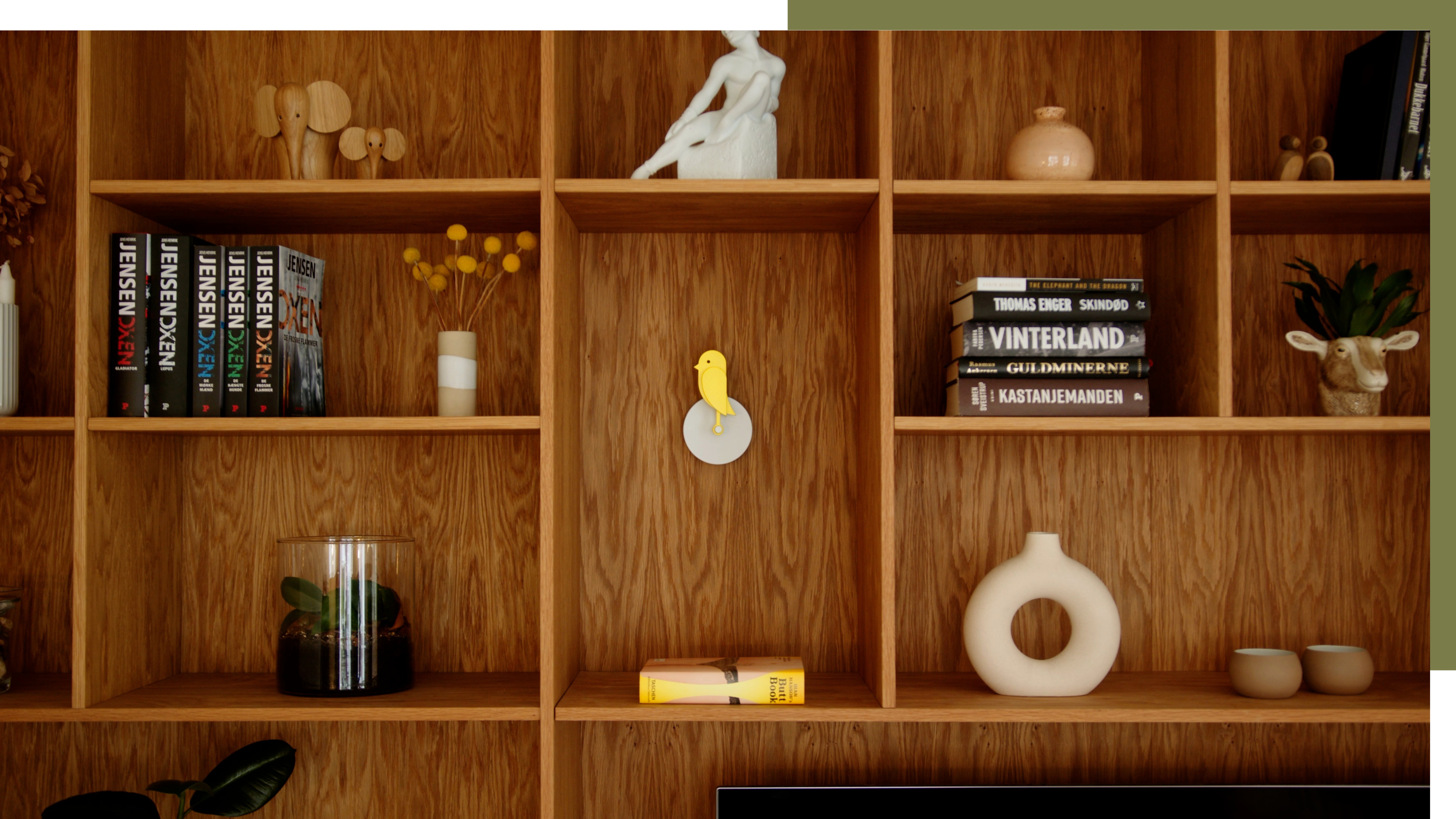 A Little Birdie Said Monitoring Your Air Quality Just Got a Stylish New Look
This Amazon buy is promising a healthier home with no style expense
By Olivia Wolfe
-
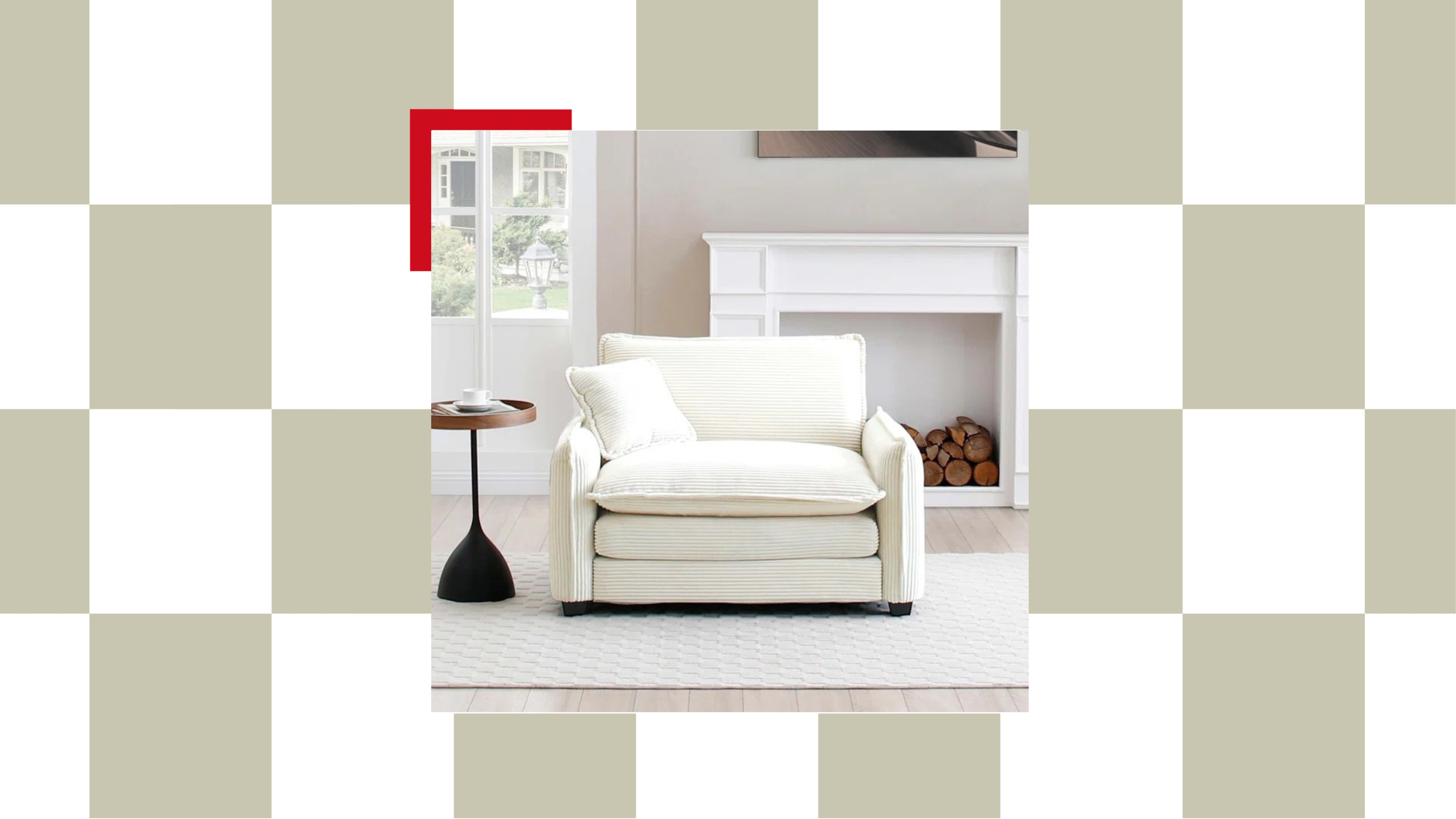 The "Chair-and-a-Half" Is the Goldilocks of Seating — Not Too Big, Not Too Small, but Just Right for Snuggling Up This Season
This accent chair trend is perfect for the cozy season, and it's on sale at Wayfair
By Olivia Wolfe
-
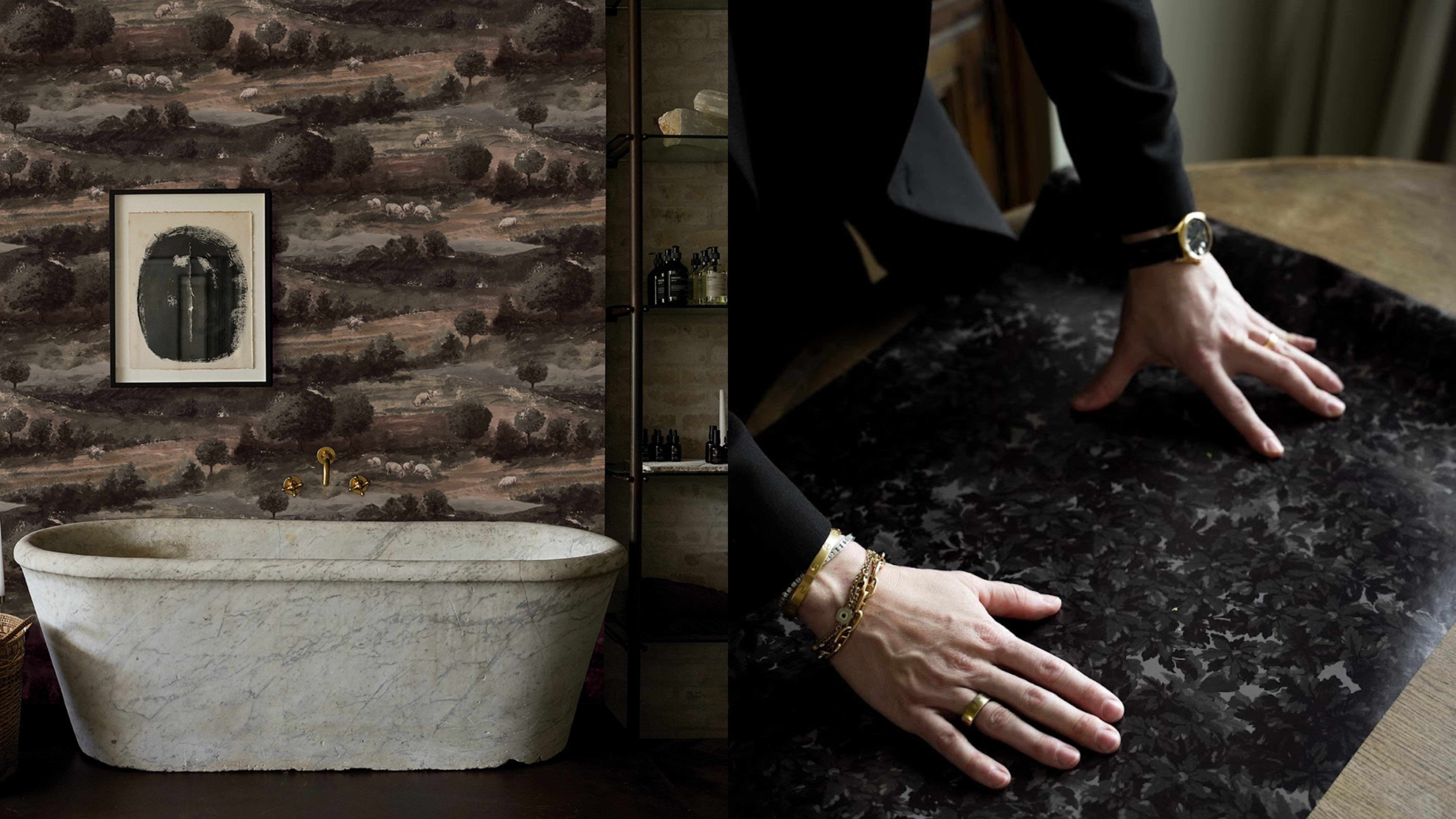 Textured Walls Are Still Trending (And Just Got a Whole Lot More Chic Thanks to This Jeremiah Brent Collaboration)
'Nostalgia' is the name, and texture is the game; this moody new peel-and-stick wallpaper collection is bringing all the fall vibes to interior design
By Olivia Wolfe
-
 Ruggable's Latest Collection is Dripping in What We're Calling the Season's Go-To Fruit-Inspired Hue
We're seeing the sunny, mango-inspired shade cropping up in new collections across the design world — and it's surprisingly perfect for fall. Here's why
By Olivia Wolfe
-
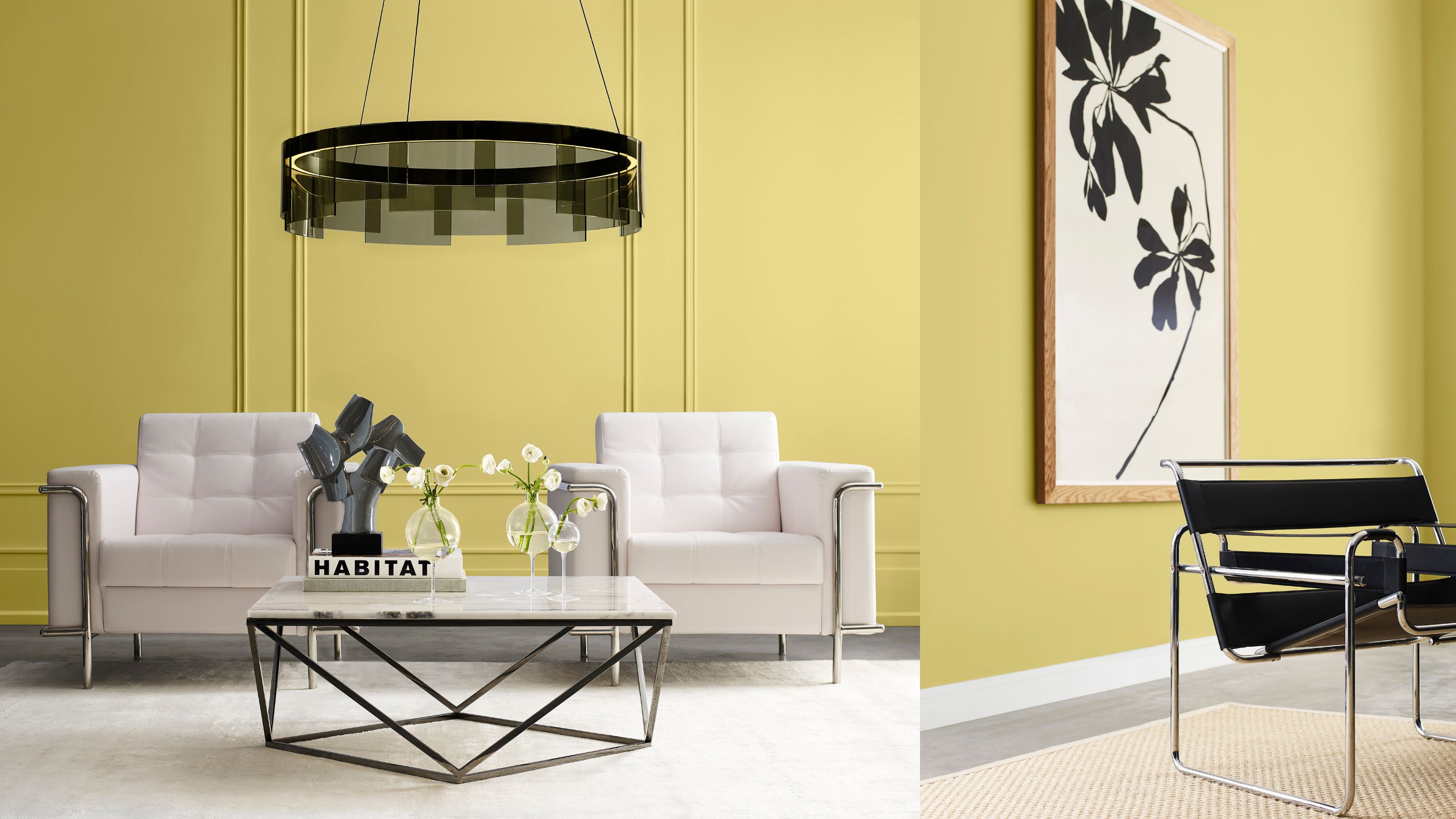 Sorry, Sherwin-Williams, We’ve Already Chosen OUR 2025 Color Crush!
You don't paint your whole home in one color, so why settle for just one Color of the Year when you can have a complete capsule?
By Olivia Wolfe
