Mixing warm and cool colors is the new shortcut to an on-trend palette – here's how interior designers do it
Designers are creating unexpected combinations by mixing warm and cool colors in surprisingly complementary ways

Combining colors in an interiors scheme is a skill, but making a cohesive palette from hues that don't necessarily feel like they belong together is an ever greater talent. And that's part of the reason why the best and boldest interior designers are mixing warm and cool colors together for modern, design-forward interiors.
It's not that warm and cool colors don't belong together inherently. In fact, if you look a color theory, you'll quickly see that each warm color has a cold complement on the color wheel. Think red and green, orange and blue – technically these colors go together perfectly. However, while these color palettes might be striking, there's a reason these complementary colors are used more for logos and adverts than they are for interior color schemes. They contrast in a way that can be challenging for those who don't want their homes to give them a headache.
Yet, as well as contrast, mixing warm and cool colors also promises another quality to your space – balance. But what is the magic in getting it right? I talked to some talented interior designers who make it look easy.
Luke is a design writer and award-winning blogger, who specializes in luxury interiors. Here, he investigates the color trend for mixing warm and cool colors, and how designers get it right.
How are designers mixing warm and cool colors?
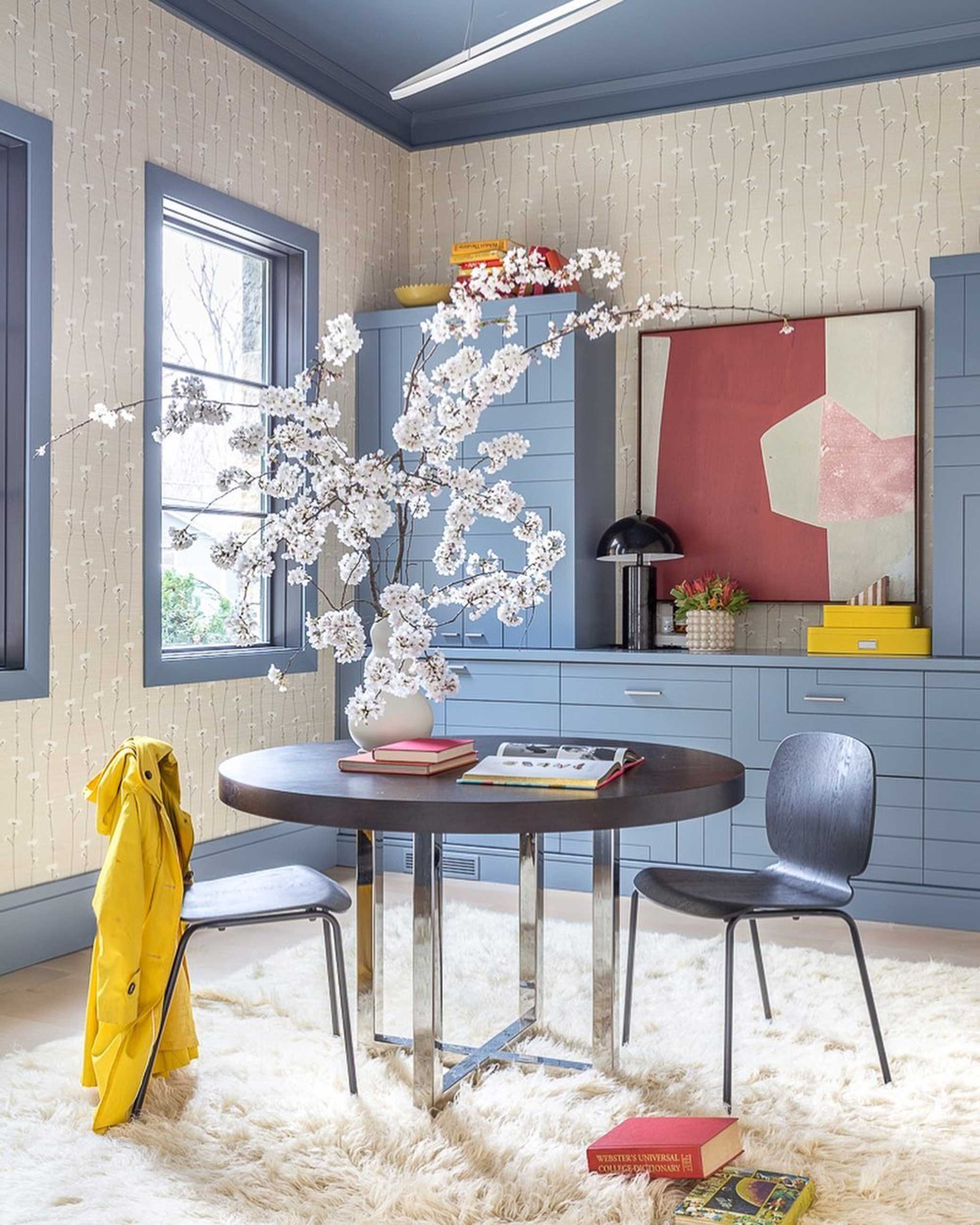
The mixing of warm and cool colors is something that's caught my attention recently. Particularly, I'm seeing rooms with walls and ceilings bathed in enticing blues, punctuated by small quantities of red and oranges for a creative contrast.
'There are so many ways to mix colors but one of my favorite approaches is to bath a room in a color,' interior designer Jewel Marlowe, founder of Jeweled Interiors, tells me. 'Visually, this will take up about 50-60% of the room, then I leave about 30%, give or take, for neutrals or another color of choice.'
'The magic happens when you leave about 10% for a really punchy accent color,' Jewel continues. 'This is a great time to pull something from the other side of the color wheel.'
This trend is a version of the classic 60-30-10 rule for decorating, but one that works to create a space with a calming atmosphere without feel dull or uncolorful. 'A design like this results in a room that is soothing, yet visually interesting,' Jewel agrees.
Be The First To Know
The Livingetc newsletters are your inside source for what’s shaping interiors now - and what’s next. Discover trend forecasts, smart style ideas, and curated shopping inspiration that brings design to life. Subscribe today and stay ahead of the curve.
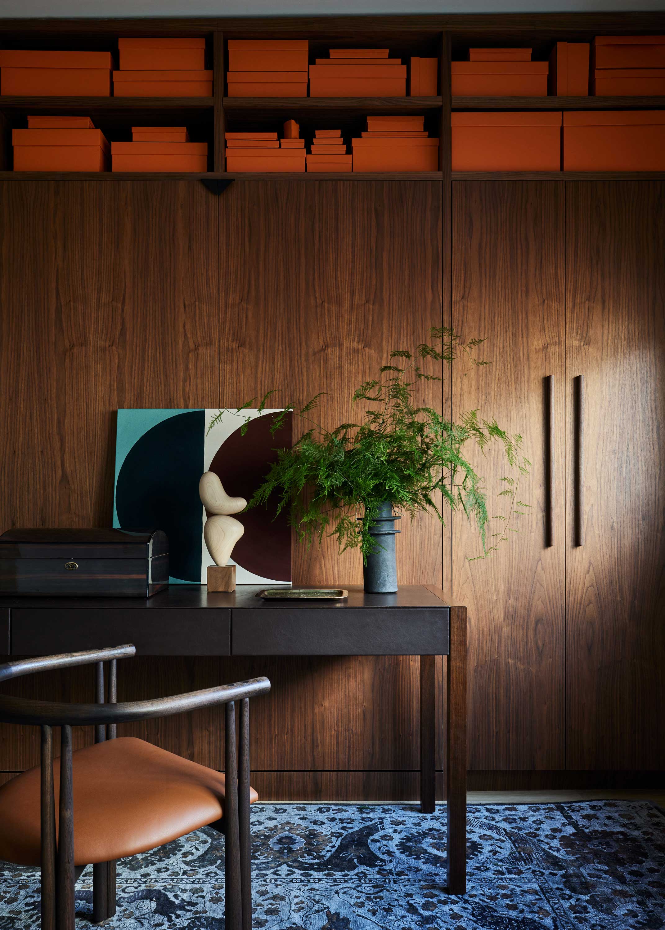
Of course, you can flip the idea, too, using cool colors to bring a place for the eye to rest in a warm color scheme. 'The same concept can be applied to a warm colored room,' Jewel tells me, 'but I would use cool accents to keep the space from visually "heating up" too much.'
In this home office designed by Brooklyn-based design studio Le Whit, a blue floor rug brings a relief to the warm-toned wood millwork, tan leather and orange decor, ensuring the space ultimately feels balanced. Its coolness brings a fresh edge to the design that stops the walls feel like they're closing in.
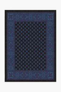
Anna Sui Belle Epoche electric blue rug, Ruggable
I love the idea of a Persian-style rug reinvented in a bold energetic blue used in this home office design. This rug from Anna Sui's collection for Ruggable is more of an electric blue, but will bring a jolt of energy to your room.
How do you get the color palette right?
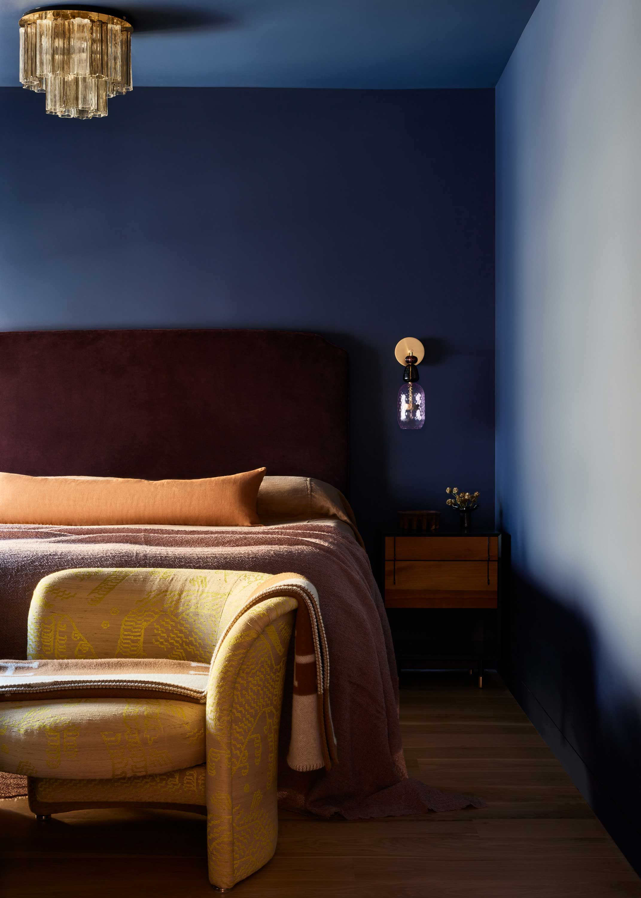
The trick to pairing this color trend appears to be in choosing shades that have the same personality. Jewel-like midnight blues are paired with equally rich burgundy reds and turmeric oranges, while sky blues find the perfect partner in softer reds ('I might even opt for a shade of pink because it is less intense and easier to live with,' Jewel says.) Think about colors that bring the same energy, whether that's playful or serious, sophisticated or cute.
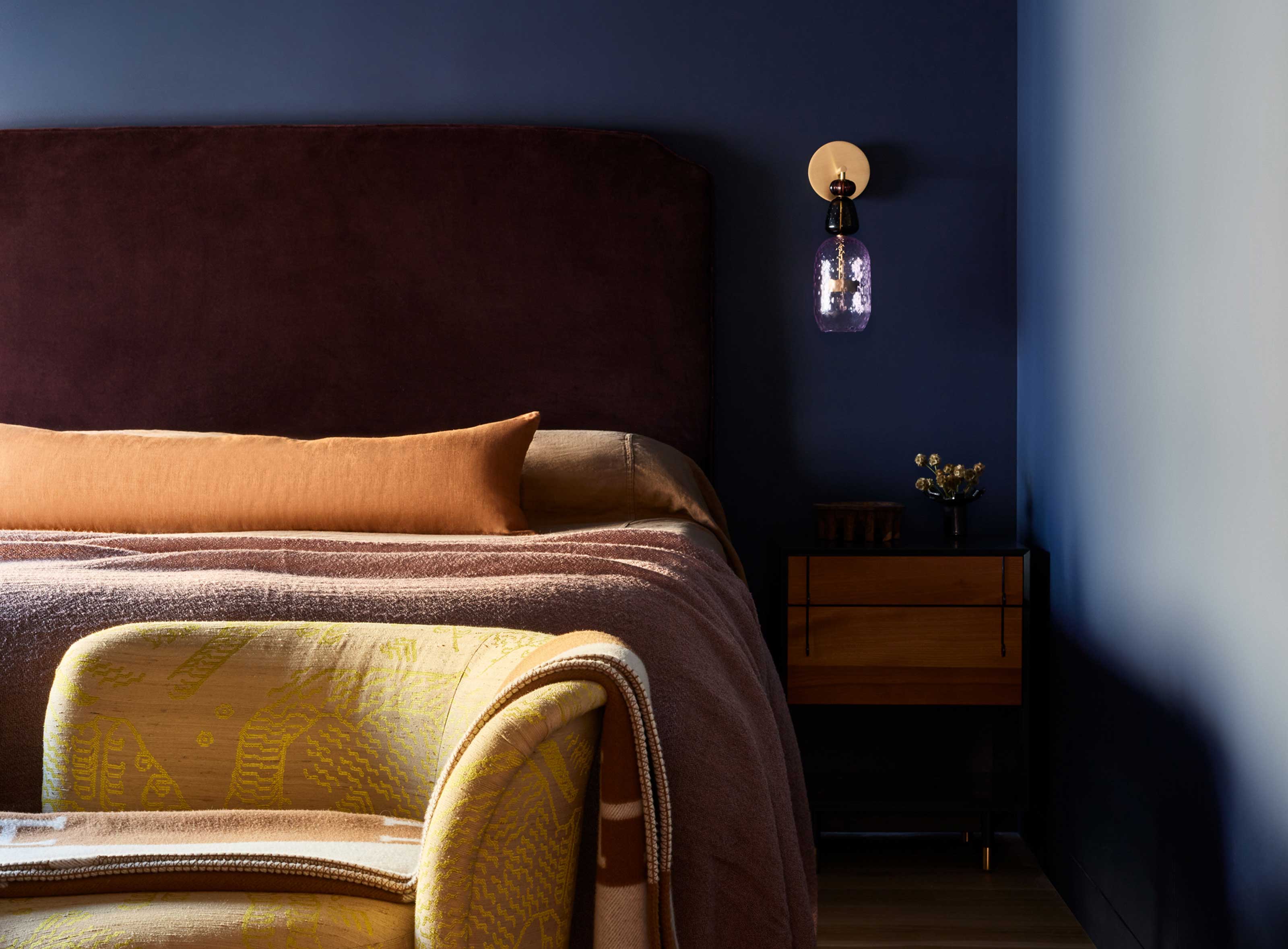
Another approach is to look at instances where warm and cool colors mix in nature, as in this stylish bedroom designed by New York studio Le Whit. 'Many of the home's rooms feature more dedicated color palettes, so with the bedroom, we were excited to mix and match a little,' explain Corey Kingston and Liza Curtiss, principles of Le Whit. 'Tonally, we played off the sunlight coming through the bedroom's window, which overlooks the Hudson River. That sense of day was evoked through the warmer layers, which complemented the more established foundation of deep blues, skewing more nighttime in inspiration.'
How else can I mix warm and cool colors to make an impact?
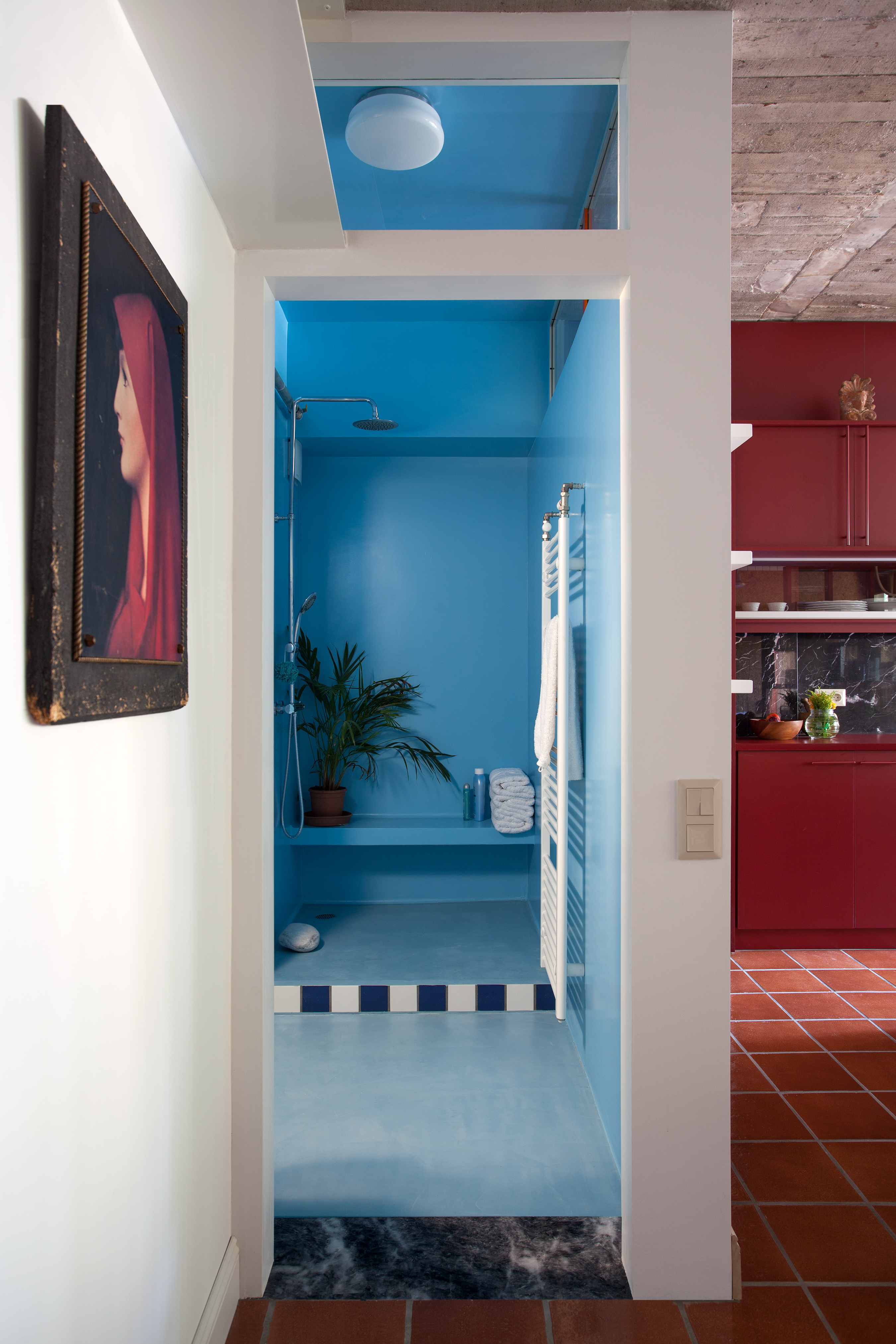
One last idea for mixing warm and cool colors is to consider your house holistically, and make a bold contrast from room to room. 'Another trick I love is to pay attention to the transition from room to room,' interior designer Jewel says. 'If a blue room had red accents, it would be fun to have the attached room be a shade or red (especially if it were a small intimate space).'
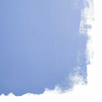
Stromboli Chess Club, Backdrop Paint
This blue bathroom has such an uplifting energy. Try this paint color from Backdrop to emulate its mood-boosting qualities.

Luke Arthur Wells is a freelance design writer, award-winning interiors blogger and stylist, known for neutral, textural spaces with a luxury twist. He's worked with some of the UK's top design brands, counting the likes of Tom Dixon Studio as regular collaborators and his work has been featured in print and online in publications ranging from Domino Magazine to The Sunday Times. He's a hands-on type of interiors expert too, contributing practical renovation advice and DIY tutorials to a number of magazines, as well as to his own readers and followers via his blog and social media. He might currently be renovating a small Victorian house in England, but he dreams of light, spacious, neutral homes on the West Coast.
-
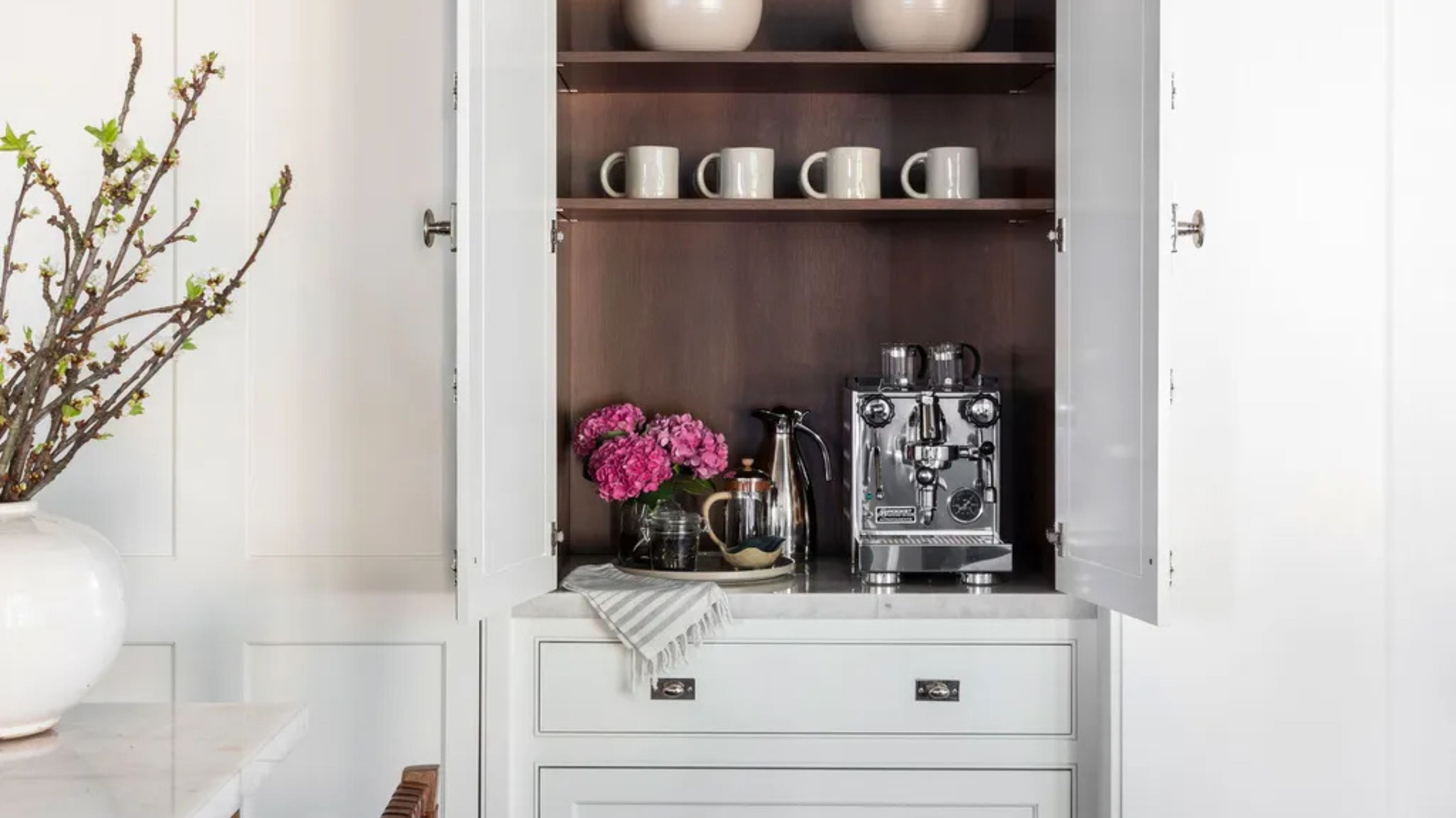 Turns Out the Coolest New Café is Actually In Your Kitchen — Here's How to Steal the Style of TikTok's Latest Trend
Goodbye, over-priced lattes. Hello, home-brewed coffee with friends. TikTok's 'Home Cafe' trend brings stylish cafe culture into the comfort of your own home
By Devin Toolen Published
-
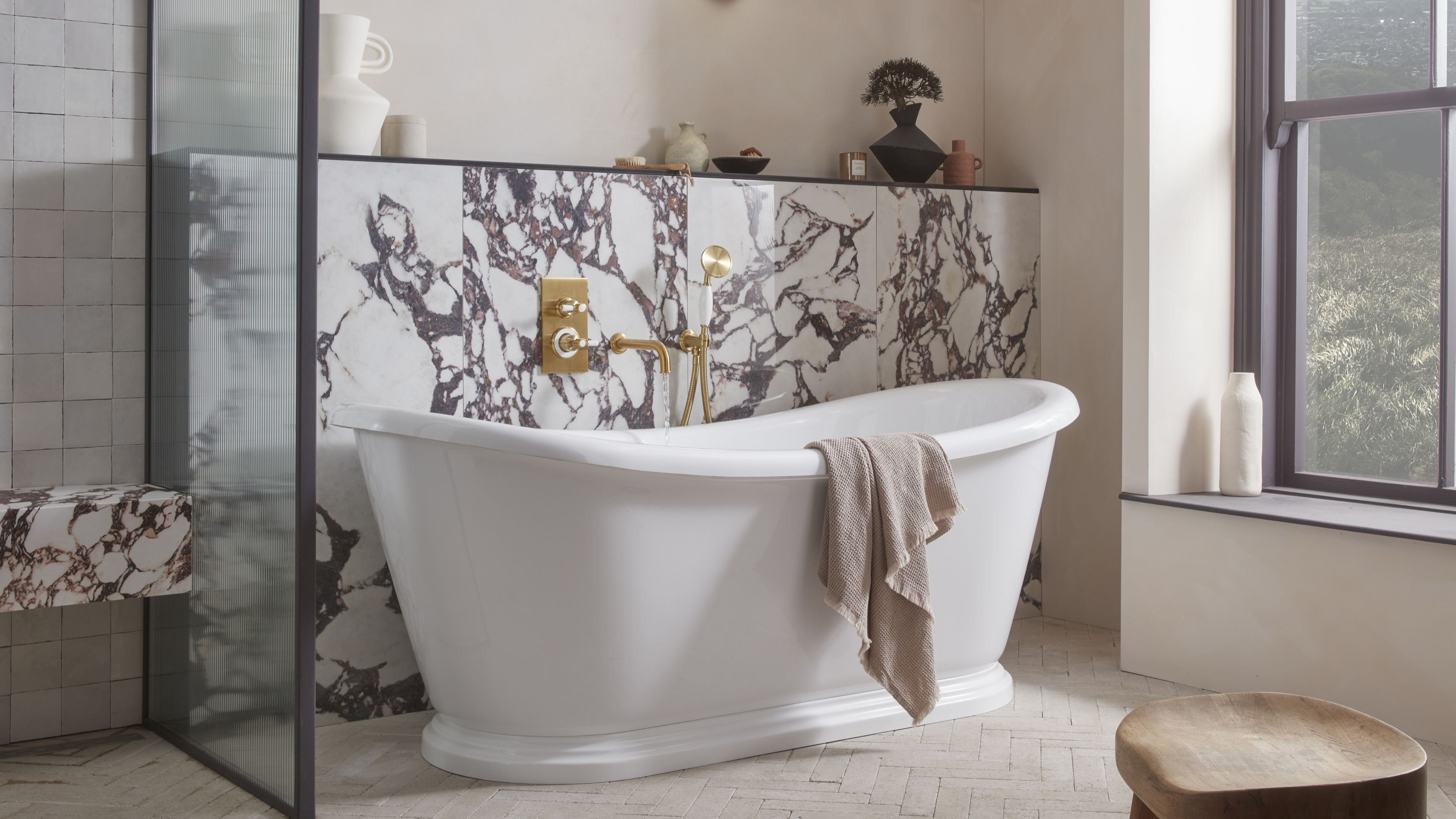 5 Bathroom Layouts That Look Dated in 2025 — Plus the Alternatives Designers Use Instead for a More Contemporary Space
For a bathroom that feels in line with the times, avoid these layouts and be more intentional with the placement and positioning of your features and fixtures
By Lilith Hudson Published
