This kitchen trend is breaking all the rules, and Molly Baz's own kitchen is my very favorite version of it
This kitchen look is seriously different - it gives lifestyle vibes that make you want to spend time in there, get cooking and looking chic
There are plenty of kitchen ideas you’ll see everywhere and you get the drill: usually, we see a contrast between the color of your units and the worktops, preferably off-white walls, and plenty of task lighting. Which is all perfectly fine, of course.
Forget everything you thought you knew about kitchen color ideas. This new design is one of the latest kitchen trends and is breaking all the rules. There is very low to no contrast, it’s all basically different shades of the same color, there’s no true white in sight, and the atmosphere is, well… incredibly calming.
I’m talking about Molly Baz’s kitchen designed by the interior design studio Another Human. It’s really giving lifestyle vibes that are more often seen in a cozy living room. And I’m saying this in the best possible way. I spoke to Leah Ring, Principal at Another Human to tell me all about why it works so incredibly well.
Monochromatic is the way forward for a relaxing vibe
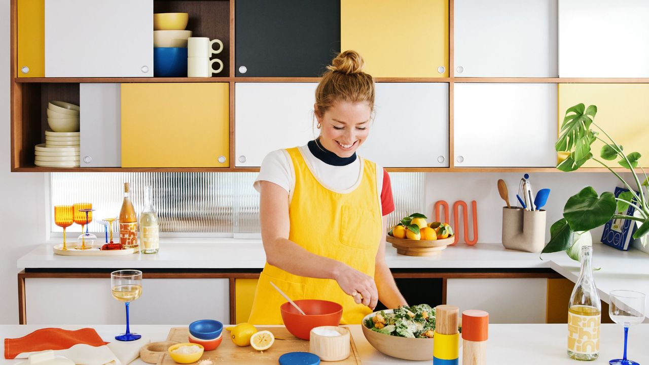
The kitchen of chef and food writer Molly Baz is all decorated in a beautiful, buttery yellow. From the units to the worktops, island, tiles, and chairs, there’s only slight variation in tones of the same color.
It creates a very serene feel, almost like you’re surrounded by warm sunshine. Leah Ring, Principal at design studio Another Human explains why it all feels so calming.
‘Monochromatic rooms in general have a calming effect visually, as our eye isn't distracted jumping between high-contrast shapes and colors.’
She continues by explaining that when a color is consistent throughout, it allows us to appreciate the form and materiality of all the elements.
Be The First To Know
The Livingetc newsletter is your shortcut to the now and the next in home design. Subscribe today to receive a stunning free 200-page book of the best homes from around the world.
The surprising inspiration behind the design
This one really surprised me, because food itself is not something I’ve ever heard of as triggering inspiration in interior design. The thought of it might give you doubts, but Molly’s kitchen was indeed inspired by a food ingredient: butter! And it looks great!
‘Because the client is a cookbook author, all of the color references in the project were inspired by foods. We had some early reference images of soft yellow rooms that the client really gravitated toward. It allows her food and her cooking to be the star of the show,’ Leah tells me. You can see more of Molly's kitchen in the video below.
We've seen yellow kitchen ideas before, but they're usually limited to a yellow element of design, not the whole space.
This is just so refreshing as a concept and it shows how far inspiration can take us when it comes to design. You can take anything that is personal, has meaning, and is important to you (in this case, food), and translate it into an interior that reflects who you are and what you love. And this project by Another Human has been done very tastefully (pun not intended but it totally works).
This is how to keep a monochromatic scheme interesting

Now it is tricky, however, to decorate in a monochromatic color scheme. This is not to put you off but to make you aware that you need to think of much more than what one color to use. You’ll really need to think of textures and materials so you avoid ending up with a rather underwhelming look.
Leah explains that you need a good amount of variation in textures and materials to keep things visually interesting. ‘In this kitchen, we have the vertical slats on the island which stand out from the flat panel cabinets behind, and the gridded tile with a bit of a sheen adds a nice visual element that differs from the rest of the matte palette,’ she tells me.
If you're planning to try this look at home, think about how you’d like to feel in your space, or something that inspires you, and pick a color that reminds you of that. Then start thinking of the different variations of the color you could pull out, and what textures and materials you can bring in to keep your design interesting.
Raluca formerly worked at Livingetc.com and is now a contributor with a passion for all things interior and living beautifully. Coming from a background writing and styling shoots for fashion magazines such as Marie Claire Raluca’s love for design started at a very young age when her family’s favourite weekend activity was moving the furniture around the house ‘for fun’. Always happiest in creative environments in her spare time she loves designing mindful spaces and doing colour consultations. She finds the best inspiration in art, nature, and the way we live, and thinks that a home should serve our mental and emotional wellbeing as well as our lifestyle.
-
 These Privacy Screens From QVC Are Just What You Need to Make Any Outdoor Space Feel More Secluded
Your outdoor space should feel like a secluded sanctuary. With privacy screens from QVC, you can make that happen in the most stylish way possible
By Devin Toolen Published
-
 70s Color Palettes That Work for 2025 — 4 Designer-Approved Color 'Recipes' That Feel Modern Enough for Homes Today
It's time to bring out your paisley print and disco shoes — the golden yellows, olive greens, and deep purples of 70s color palettes are making a comeback
By Olivia Wolfe Published
