This new build house in the Hamptons has eccentricity and luxury as happy bedfellows
This urban-cool meets country-style new build house in the Hamptons has a surprising number of house guests – 31 pigeons, four flamingoes, three squirrels, two poodles and a real-life bulldog…
THE PROPERTY
A 330-sq m new build house in the Hamptons, New York. The modern home comprises two box-shaped structures linked by a glazed entrance hall. The largest box has an open-plan kitchen/diner/living area, plus a study, wine cellar and combined spa/shower room. The smaller box has four bedrooms and two bathrooms.
See more super-chic modern homes
LIVING SPACE
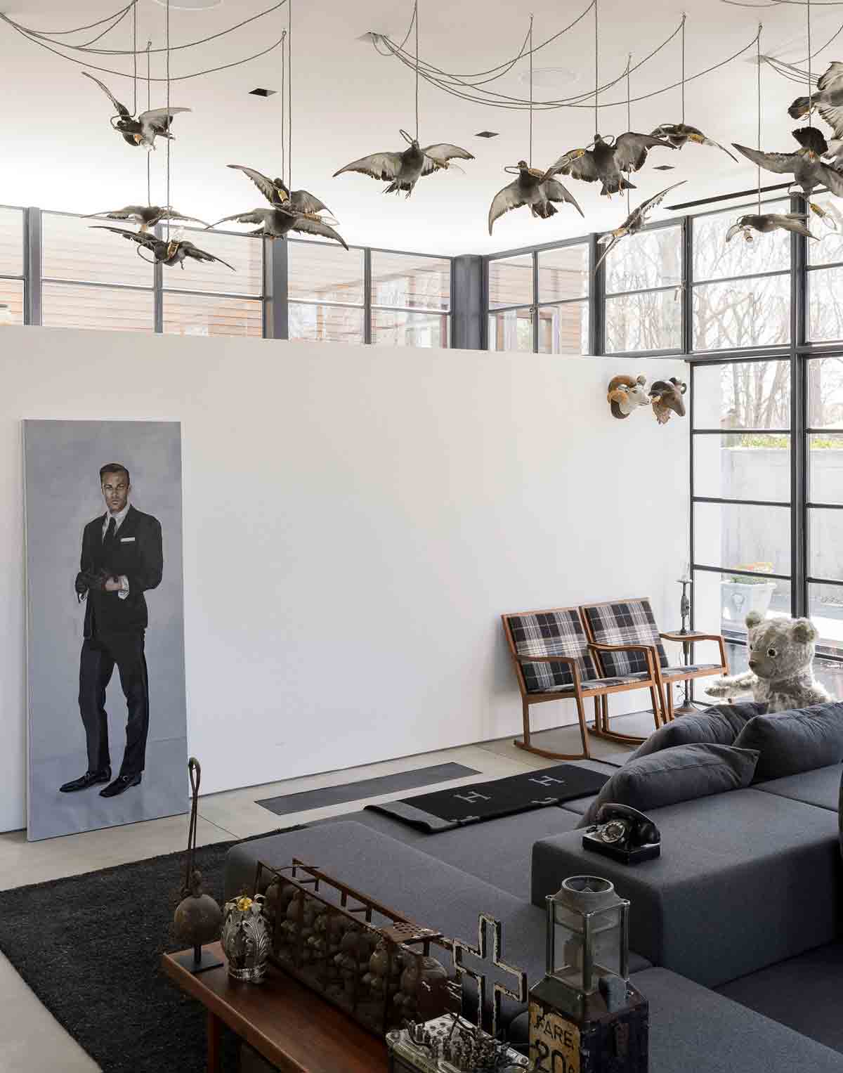
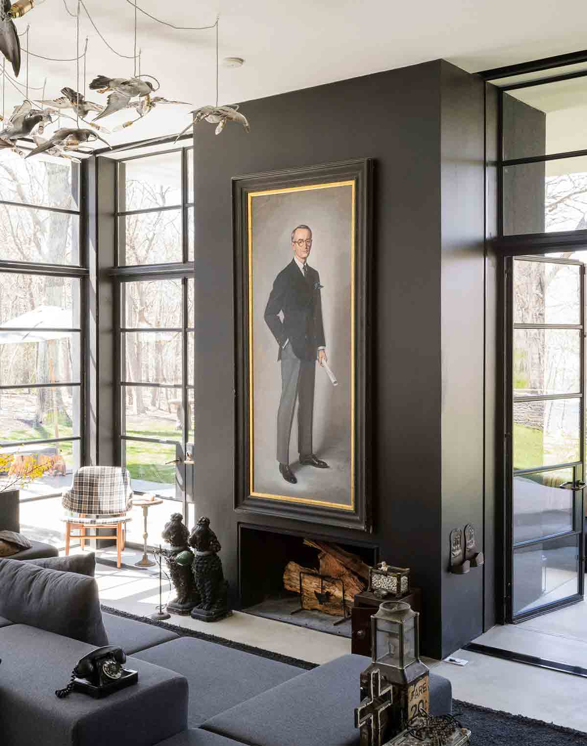
Doctor Dolittle would love this home in the Hamptons. In addition to resident pet bulldog, there are four concrete flamingoes in the courtyard, three taxidermy squirrels crawling up his bedroom wall, a pair of concrete poodles in the living room, and a chandelier of 31 taxidermy pigeons suspended above them, each with a light bulb stuffed in its beak.
It’s a 12-foot-high ceiling, so it needed something dramatic. As you come in, they are turning away, so you get the impression that they are flying outside. The chandelier is by British designer Alex Randall and took three days to install. The house, called 31 Pigeons, was named after them.

It’s hardly what you’d expect in the Hamptons, where quaint timber cladding is as much a part of the landscape as Ralph Lauren polo shirts. But this home is hardly conformist.
By placing a modular sofa in the centre, a dynamic lounging area is created in which you couldwatch TV on one side, or warm yourself near the fireplace on the other.
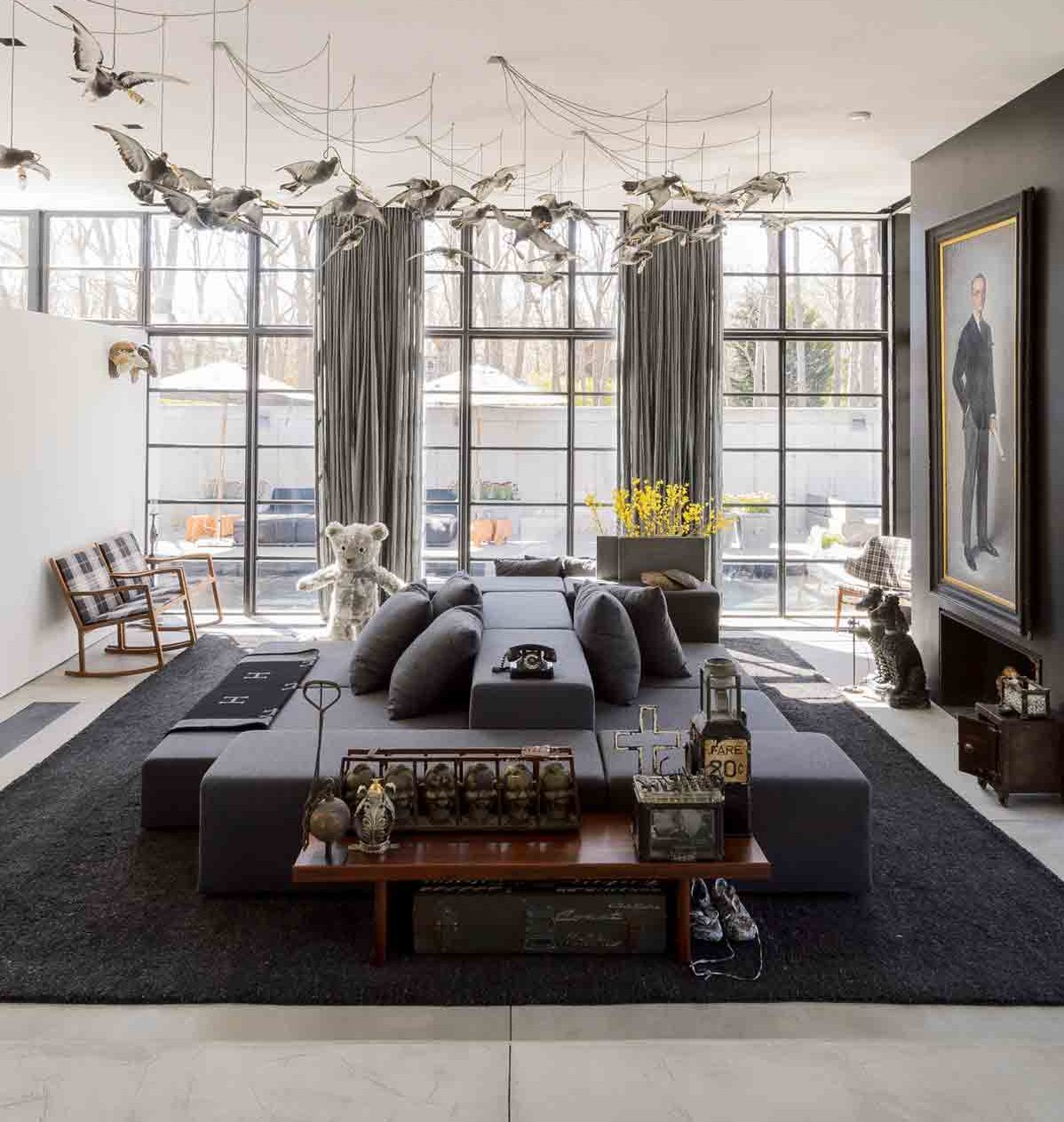
Behind the vintage touches, this house has some serious gadgetry, including speakers concealed in the ceiling and a TV that retracts into the floor. The double-sided sofa provides a flexible island for lounging, and gets around the problem of looking at the back of a sofa.
Be The First To Know
The Livingetc newsletters are your inside source for what’s shaping interiors now - and what’s next. Discover trend forecasts, smart style ideas, and curated shopping inspiration that brings design to life. Subscribe today and stay ahead of the curve.
DINING
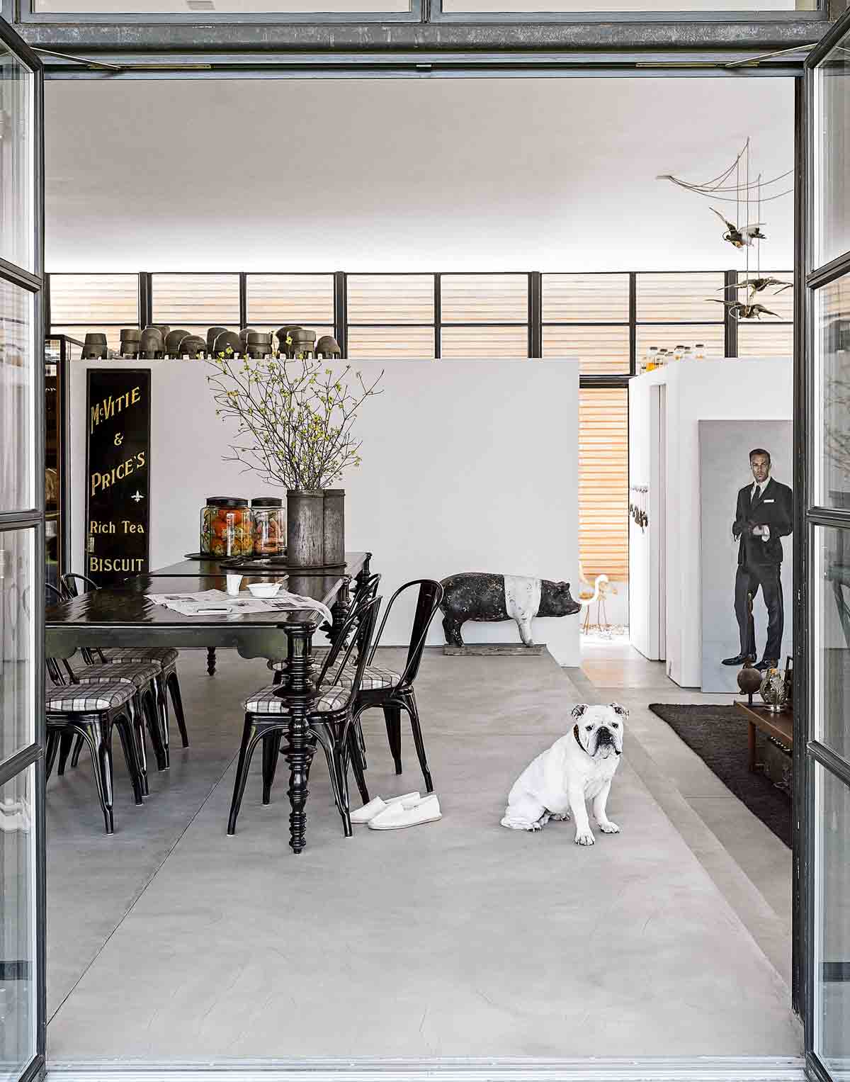
There's a clever and subtle use of levels to distinguish the different spaces in this home, with steps marking a shift between the living / dining / kitchen space, and lower ceilings in the bedrooms to make them feel cosier.
The open-plan space allows for effortless entertaining, offering an easy transition from the meals at the dining table to coffee on the sofa, with steps providing a subtle division between the two spaces.
See Also: Laid-back Luxe Dining Room Ideas
COURTYARD
The concrete floor in the living area also extends outside to make the interior and exterior feel more like one space, and a double-sided fireplace, with one half inside and the other half outside, reinforces this sense of indoor-outdoor fluidity. This is a house as comfortable with open-air barbecues as it is with fireside huddles.In the summer, you can open all the doors up, but it’s also extremely comfortable in the winter.
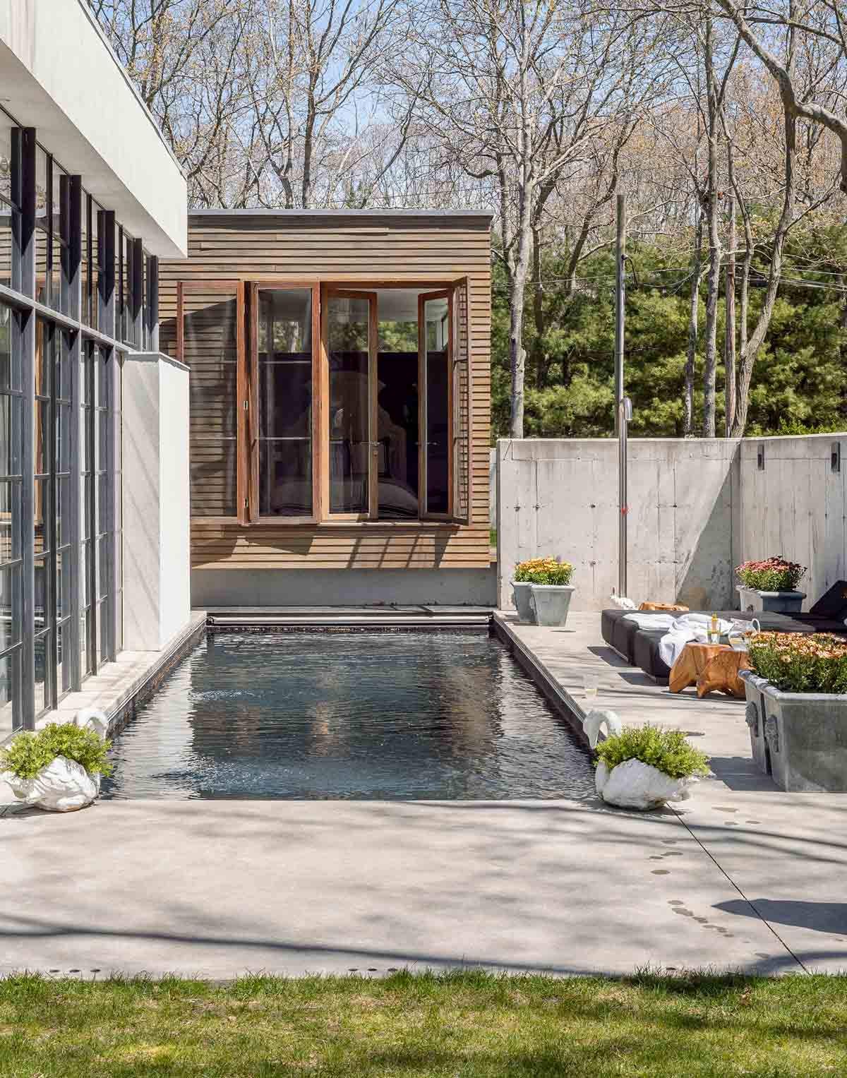
This is a house that opens up to its surroundings, with flooring that extends out to the terraces, and a double-sided fireplace with one half inside and the other half outside.A narrow courtyard between the home’s two wings offers a welcome sense of enclosure in the outdoor space, providing a perfect spot for breakfast. Its vintage factory table has 12 integrated fold-out seats.
Concrete flooring extends outside to the terraces, blurring the boundary between indoors and outdoors. In the summer, it creates the illusion that the living room is continuing outside. That’s also the reason why you have the same furniture outside, just in different fabric.
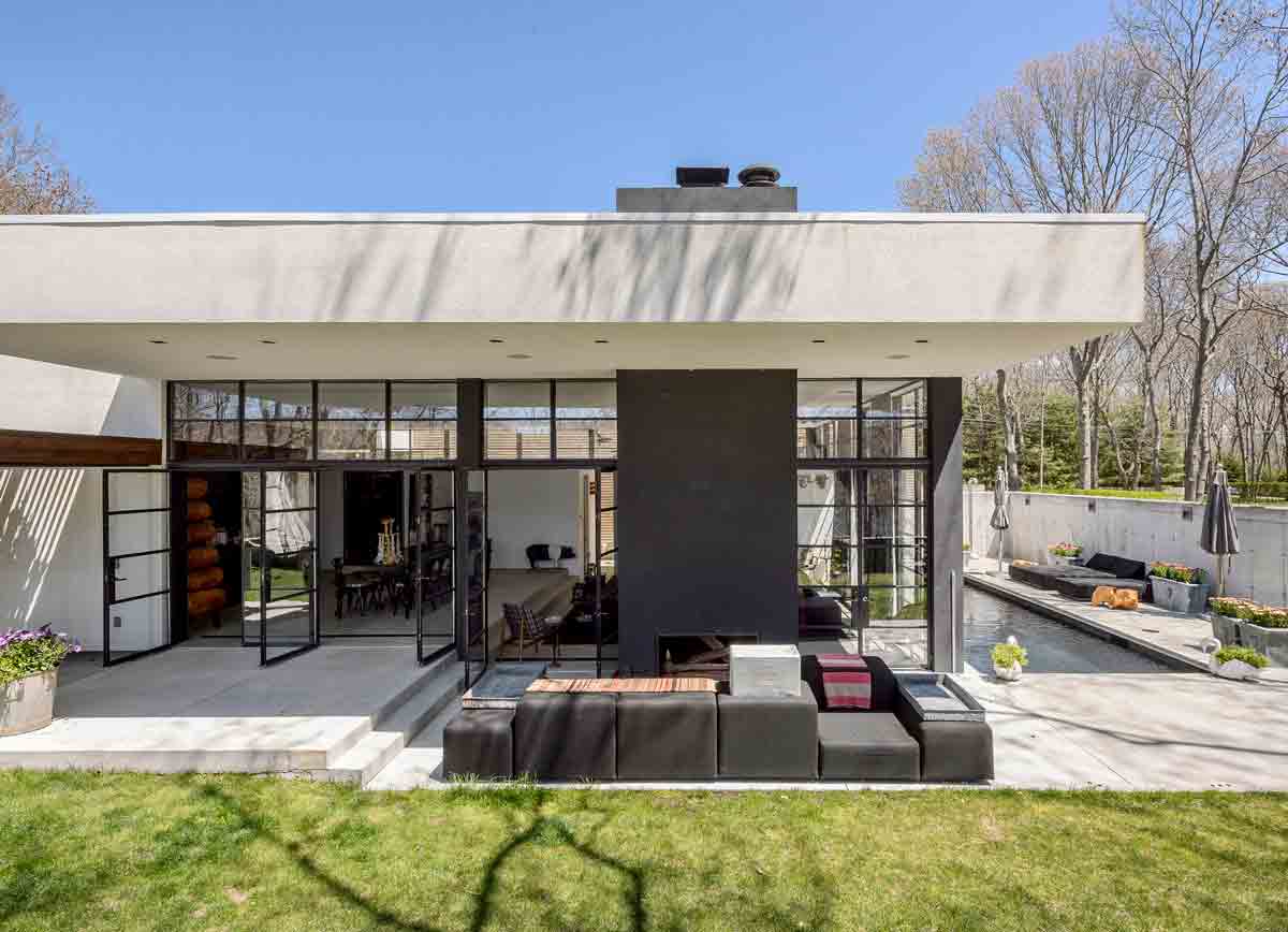
Architect Thomas Warnke of Space4a came on board to design the house, which has a large concrete box with full-height metal-framed windows for the main living space, and a cosier timber box next to it with four bedrooms, each with its own external entrance so guests can come and go as they please.
The design marries country and urban styles – the private space is country-style, enveloped in wood, and the more public space is urban, with steel and glass and concrete flooring.
The design of the house features two rectangular boxes – one clad in wood for the bedrooms, and the other surrounded by steel-framed windows for the main living space. Both enjoy views of a salt-water pool.
KITCHEN
Inside, steps subtly divide the lounge from the dining area and kitchen, where there's another offbeat find – 150 hand-painted papier-mâché dolls, picked up from a toy factory that was closing down in Portugal.
Usually, you would see dishes and pots on these shelves, but with the dolls, it feels more integrated with the rest of the space – less like a kitchen, more like a display space.
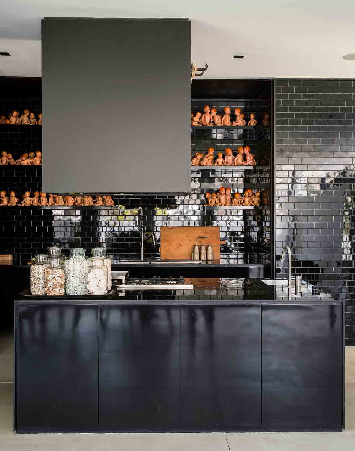
A black kitchen might seem like a bold choice, but black can actually help a bulky feature in an open-plan space recede like a shadow when it’s not in use. We think it works a treat.
Given that the rest of the space is bathed with light from the glass walls, going dark in the kitchen was a risk worth taking. Appliances are concealed in black lacquered cabinets, matched by black tiles for the walls.
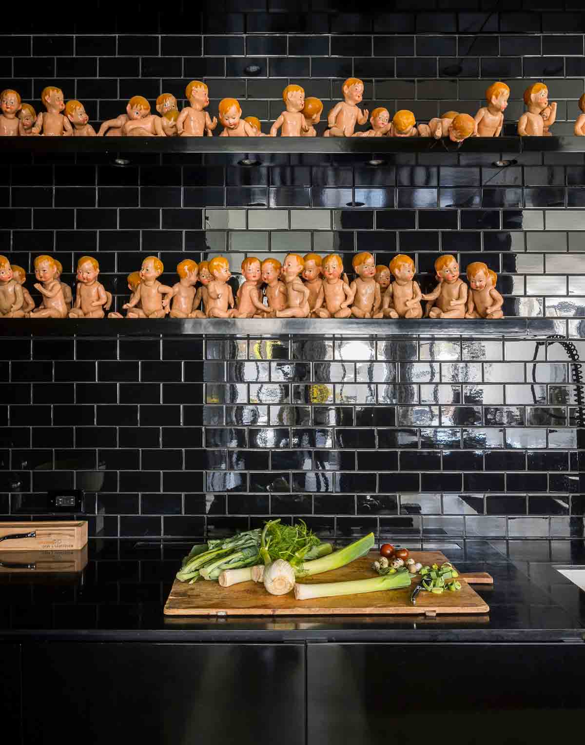
Using black also helps to separate the kitchen from the dining room – the kitchen kind of disappears in the space, while also being omnipresent.
STUDY
Next to the kitchen there's a small timber study – a room within a room – to provide space for a collection of vintage cigar boxes.
The whole concept behind the study is it’s a big cigar box, with many little cigar boxes inside, some of which are 300 to 400 years old.
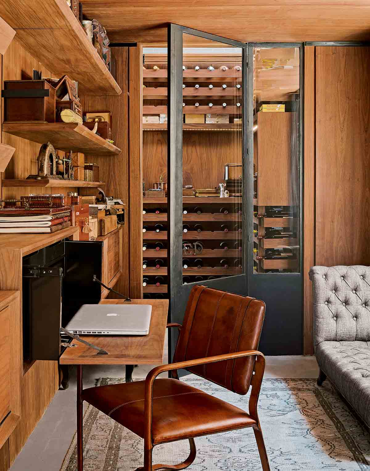
A study and adjoining wine cellar have been designed as self-contained rooms within the larger open-plan kitchen/dining/living area. The lower ceiling height and oiled American walnut wood lining the walls offer a cosy contrast to the vastness of the surrounding space, providing a sense of retreat.
MASTER BEDROOM
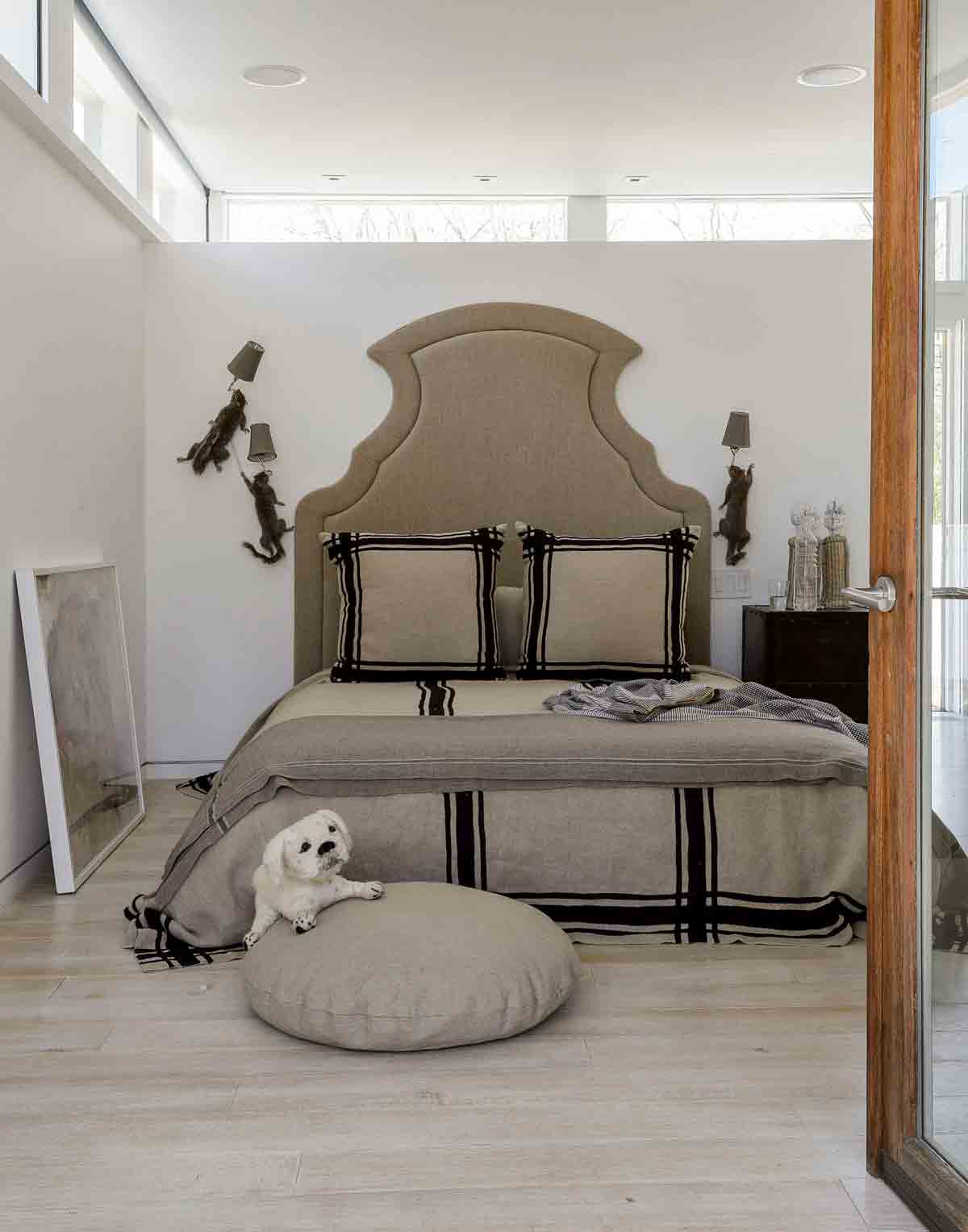
In addition to the chandelier of taxidermy pigeons in the living room, British designer Alex Randall was commissioned to install taxidermy squirrel lights crawling up the wall of the master bedroom.
GUEST BEDROOM
A change in level and flooring – from polished concrete to bleached white oak – marks the transition from public to private spaces in the home.
Quirky collectables add a sense of fun to a serious design. Every surface is fair game for collections of offbeat objects, from vintage hat moulds to old walking canes. There are surprises around every corner.
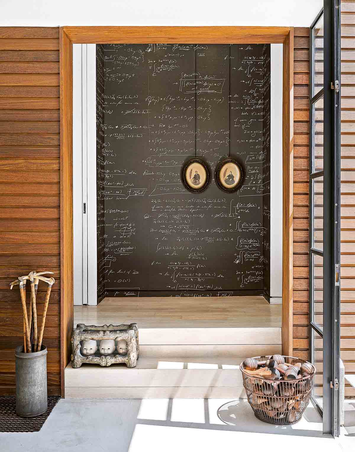
A limited-edition wallpaper designed by designer Pol Theis, which features the scribblings of a mathematician, also helps give this cosier part of the house a more artisanal feel, in contrast to the more industrial-style steel, glass and greys in the living space.

SECOND GUEST BEDROOM
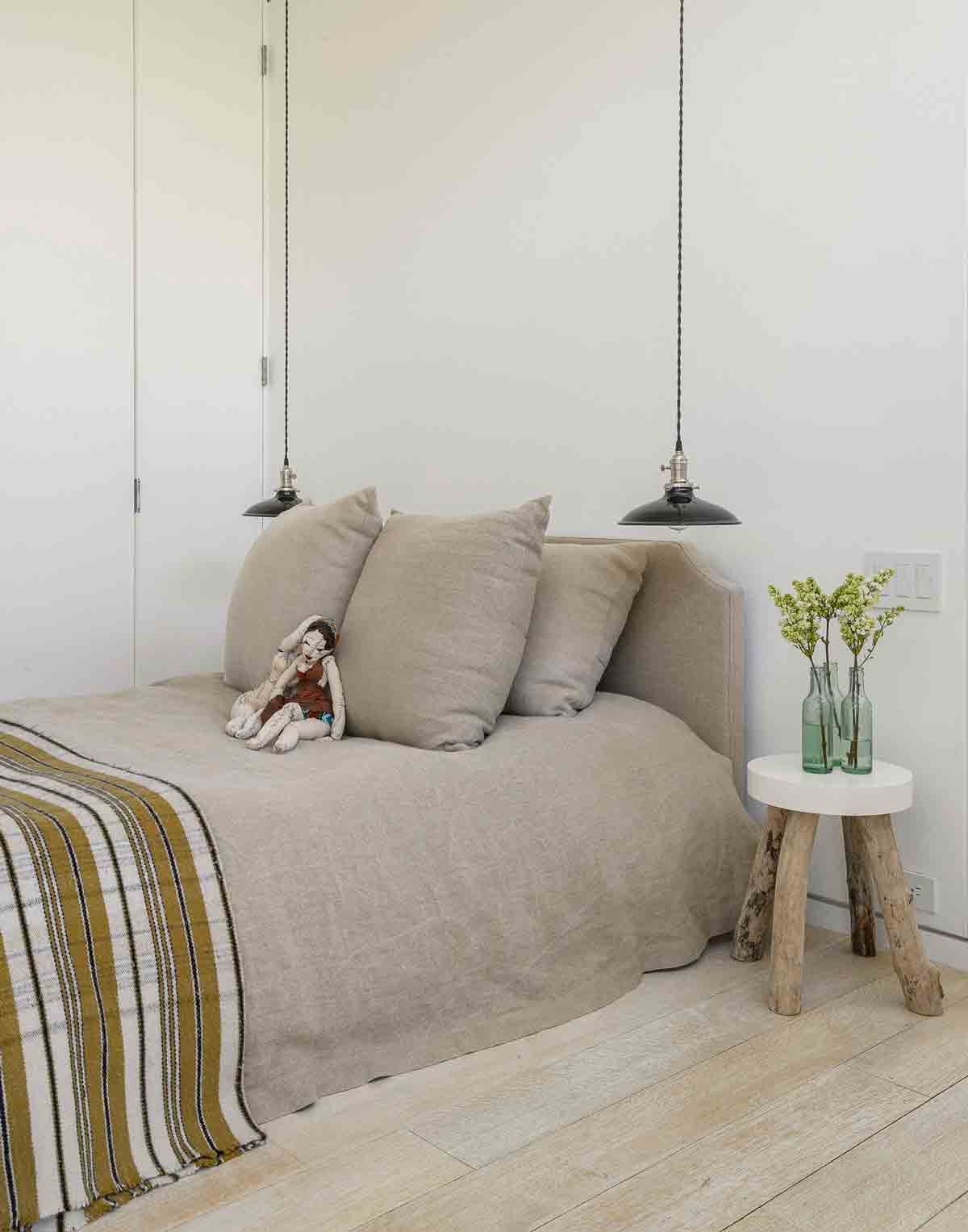
Softer colours and materials were used for the guest bedrooms, such as brown and taupe, and linen and cashmere. The private part of the house, with the bedrooms, is completely opposite to the public part of the house, in terms of fabric and colour. The home’s four bedrooms are separated by sliding doors, which can be opened up to create a more free-flowing space when there are no guests staying.
BATHROOM
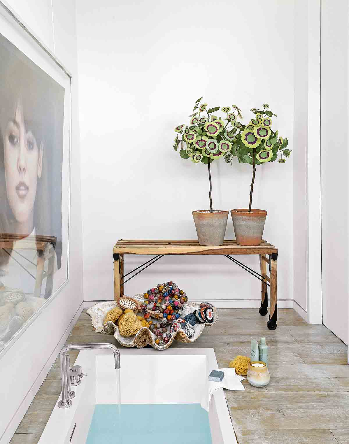
The modern bathroom features a sunken bath to make the space feel bigger. Private spaces such as powder rooms and bathrooms are a crucial cog in the overall scheme of a house. Powder rooms are intimate, and it’s the one place where guests are always on their own and have the time to take things in.
SPA AND SHOWER ROOM
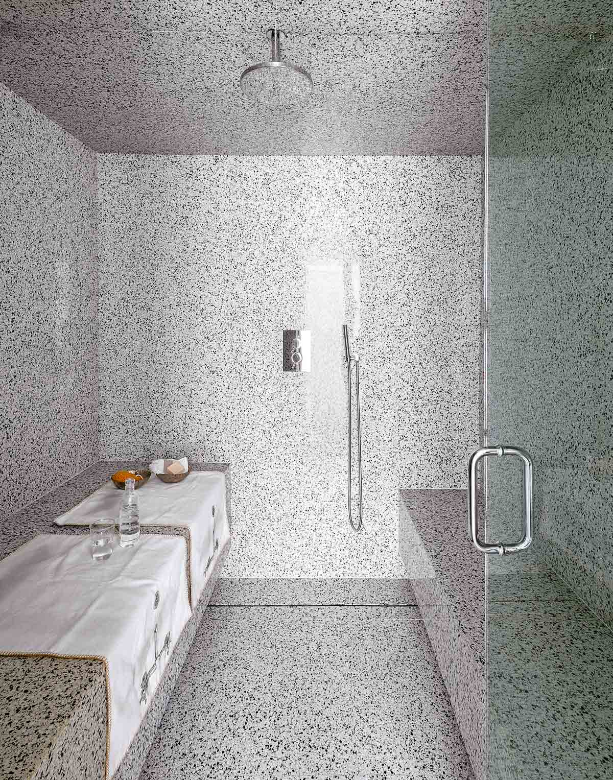
The home owner worked with the smaller dimensions of this spa and shower room by covering it floor-to-ceiling in terrazzo slabs, which give the space a sense of luxury. Integrated seating is raised above the floor, making these heavier details appear lighter.
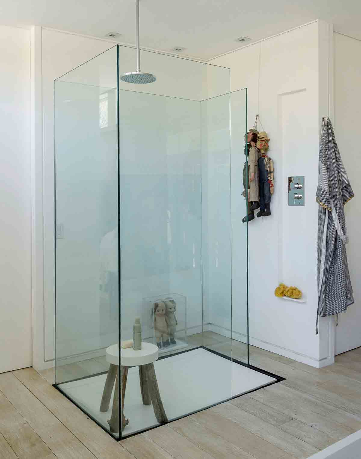
A ceiling-hung shower keeps the walls free of visual clutter, offering a wet room experience in the small bathroom. The glass enclosure protects the wood floor from splashes, while enhancing the sense of openness and light in the space.
EXTERIOR
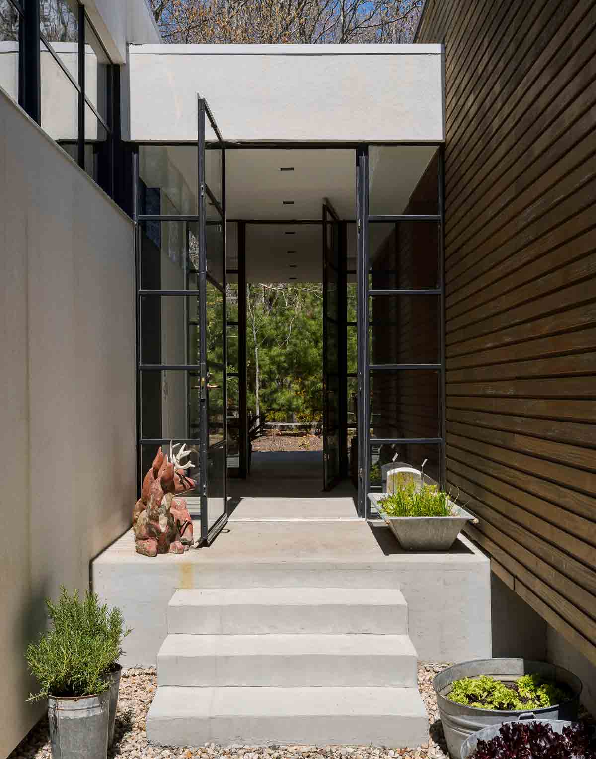
A glazed entrance provides a link between the home’s two box-shaped structures, one for the home’s social areas – the kitchen/dining/living space – and the other for the more private bedrooms and bathrooms.
See more of the designer's work at pandtinteriors.com. See more of Thomas Warnke’s work at space4a.com
Photography – Matthew Williams
See Also: Stunning shower room ideas - drenched with style
The homes media brand for early adopters, Livingetc shines a spotlight on the now and the next in design, obsessively covering interior trends, color advice, stylish homeware and modern homes. Celebrating the intersection between fashion and interiors. it's the brand that makes and breaks trends and it draws on its network on leading international luminaries to bring you the very best insight and ideas.
-
 The Easiest Way to Turn Your Designer Scarf Into Wall Art — No Frame, No Fuss, No Regrets
Because silk this pretty should never stay in a drawer
By Julia Demer Published
-
 Italian Kitchen Trends — 5 Emerging Ideas From the Chicest Italian Designers That I Predict Will Go Global in 2025
Fresh from Milan Design Week, these are the exciting finishes, styles, and innovative materials I can't wait to see in more kitchens this year
By Faiza Saqib Published