
There's no month in the interior designer's calendar more exciting than September, especially when it comes to color. As the year draws to a close, paint brands and color forecasters are looking to the year ahead and releasing new shades that speak to the mood of 2023. This year, it's all about tones that transform our homes into restful yet characterful spaces.
This year's also extra exciting for color-lovers, as Farrow & Ball is releasing new colors - something the British paint brand only does every two-three years. We're sure these are set to be the biggest interior design trend of the new year.
'Our relationship with our home has changed so much over the last few years, it felt like the perfect time to introduce these new colors,' says Joa Studholme, Color Curator for Farrow & Ball. 'We all feel ready to show off our spaces and personal style. Our palette is made even more relevant through the introduction of these gentle lights and dramatic and atmospheric darks.'
From neutral taupes and powdery pinks, to rich smoky greys and fresh greens, these new colors form an indulgent palette that we think Farrow & Ball fans will love. But don't just take our word from it - we've asked a few top designers for their opinions, favorite shades, and advice on how to use them to create a color palette.

Lilith is an expert at following news and trends across the world of interior design. She regularly shares color stories with readers to help them keep up-to-date with ever-changing trends that promise to add personality into the home. For this article, she spoke with leading designers to gather advice on how to use Farrow & Ball's new color range in our homes.
Eva Sonaike

Bedroom with walls painted in Eddy.
Interior designer Eva Sonaike knows a thing or two about using color. Although she's renowned for using bolder colors than those in Farrow & Ball's new palette, she praises the range of shades for their compatibility.
'What I love about the colors in the new Farrow & Ball collection is that they're all really complimentary, you can mix and match almost all of them,' she says. 'They all have Farrow & Ball's unmistakeable powdery softness to them which makes them warm, elegant and very versatile.'
While she's not usually one to be drawn towards calmer colors, she chooses Eddy as her favorite. 'It's so fresh and elegant, I can see it working as a neutral among brighter colors.' Hopper Head however is one color she'd probably avoid due the notorious difficulty of greys. 'To incorporate such a dark color in my designs, I'd use it for proportional work, a feature wall, or shelving to add depth to a space.'
Amy Youngblood

Walls painted in Tailor Tack and All White.
Amy Youngblood knows the power a calming neutral color scheme can hold over a room, and she believe these colors lend themselves well to the increasingly popular nature-inspired interior.
'I believe that the organic modern style that is very in will continue to rise in popularity in 2023, which this color palette represents,' she explains. 'These warmer toned cool colors pair well with natural woods and stones which we are seeing more and more of.'
For Amy, the colors strike the perfect balance of playful yet calming. 'The more neutral colors are great for an all-over paint color while the more colorful make for a great accent wall.'
Pip Rich

Walls painted in Templeton Pink and lower third and woodwork in Bamboozle.
Livingetc's Editor, Pip Rich, has seen many a Farrow & Ball color come and go during his time on the magazine and, as such, he has an eye for which colors are likely to stand the test of time.
'It’s always noteworthy when Farrow & Ball release a new set of colors,' he says. 'Happening once in a blue moon (now, there’s a good name for a paint), each collection ends up including at least two shades which set the tone for how we all want to decorate our homes.'
So, being familiar with the best Farrow & Ball paint colors so far, he asks what will be the new Stiffkey Blue, launched in 2014, or Jitney, from 2018? 'Both have ended up in my house, and countless other homes we feature in Livingetc. From this lot, my money is on Templeton Pink, a slightly duskier version of Sulking Room Pink, but it could also be the soft blue grey of Kittiwake to the comforting richness of Wine Dark. I'll be using both, immediately, I am sure.'
Anastasia Casey

Walls painted in Whirlybird and cabinet in Beverly.
As a master of naturally calming designs, Anastasia Casey of Identite Collective is more attuned to neutral hues. However, she's keen to experiment with the new colors on offer from Farrow & Ball.
'We're seeing a shift away from light, bright spaces and toward a cozier aesthetic with plenty of European vibes,' she explains. 'Mid- and dark-toned blues and greens continue to be popular because they are extremely livable and pair well with natural materials and neutral shades.'
With that in mind, Anastasia suggests using Selvedge or Beverly for a painted kitchen cabinets to add color to your home while still retaining a fresh, timeless look. 'When it comes to walls, white isn't going away for good, so to update the look, we're seeing subtle contrast on millwork and trim,' she adds. 'Stirabout is the ideal not-beige, not-grey warm neutral for that task.'
Bethany Adams

Panelled walls painted in Kittiwake.
As a big Farrow & Ball fan, Bethany, of Bethany Adams Interiors, is itching to decorate with these new shades. She believes the nurturing tones are exactly what we're all looking for now that we're all spending more time in our homes.
'I think after a season of finally being free to leave our homes, people are starting to look inwards again and want spaces that evoke calm, creativity, and comfort which is what every color in this collection provides,' she explains.
'Tailor Tack and Templeton Pink prove that blush hues aren't strictly millennial, they're here to stay, but I'll never say no to more gorgeous greens and blues so Kittiwake and Eddy are particularly inspiring to me.'
Cristina Lehman

Walls painted in Wine Dark and Kittiwake.
Pairing neutrals with smoky hues is a common theme in Cristina's designs at C.Lehman Home, and so, Farrow & Ball's new palette is giving her lots to work with.
'I like the 'grown-up' and more muted takes on these classic colors,' she says. 'I'm really loving all the neutral colors (Stirabout, Tailor Tack and even Templeton Pink) and the cool and calming colors (Kittiwake, Eddy, Whirlybird and Selvedge) for offices and bedrooms, especially in kid spaces.'
Never one to shy away from a grey paint idea, Cristina loves the darker tones within the palette. 'For moody spaces, I think the Hopper Head and Wine Dark are great new options. I've always been a fan of Farrow & Ball's Railing and Down Pipe, so the fact that Hopper Head sits between those two shades makes it a great option,' she notes. 'I could see these making a big impact in an entryway, study/office or even small powder rooms.'

-
 The 'New British' Style? This Victorian London Home Embraces Its Owners' Global Background
Warm timber details, confident color pops, and an uninterrupted connection to the garden are the hallmarks of this relaxed yet design-forward family home
-
 Muji Living Room Ideas — 5 Ways to Harness The Calming Qualities of This Japanese Design Style
Inspired by Japanese "zen" principles, Muji living rooms are all about cultivating a calming, tranquil space that nourishes the soul


-
 Farrow & Ball Just Brought Back 3 "Archive" Colors — Here's Why They're Important in Design Right Now
The British paint brand has reintroduced some cult classics, and they feel more relevant than ever
-
 12 new Farrow & Ball paint colors that launch today – including an off-white we predict everyone's going to use
The new collaboration with fashion designer Christopher John Rogers is full of exuberant, cheerful colors – but we've got our eye on one new neutral in the bunch in particular
-
 Farrow & Ball has just launched a new paint – and it's going to change how you think about painting your walls
Perfect for rich, color-drenched spaces, Dead Flat is an ultra-matte finish with just a 2% sheen
-
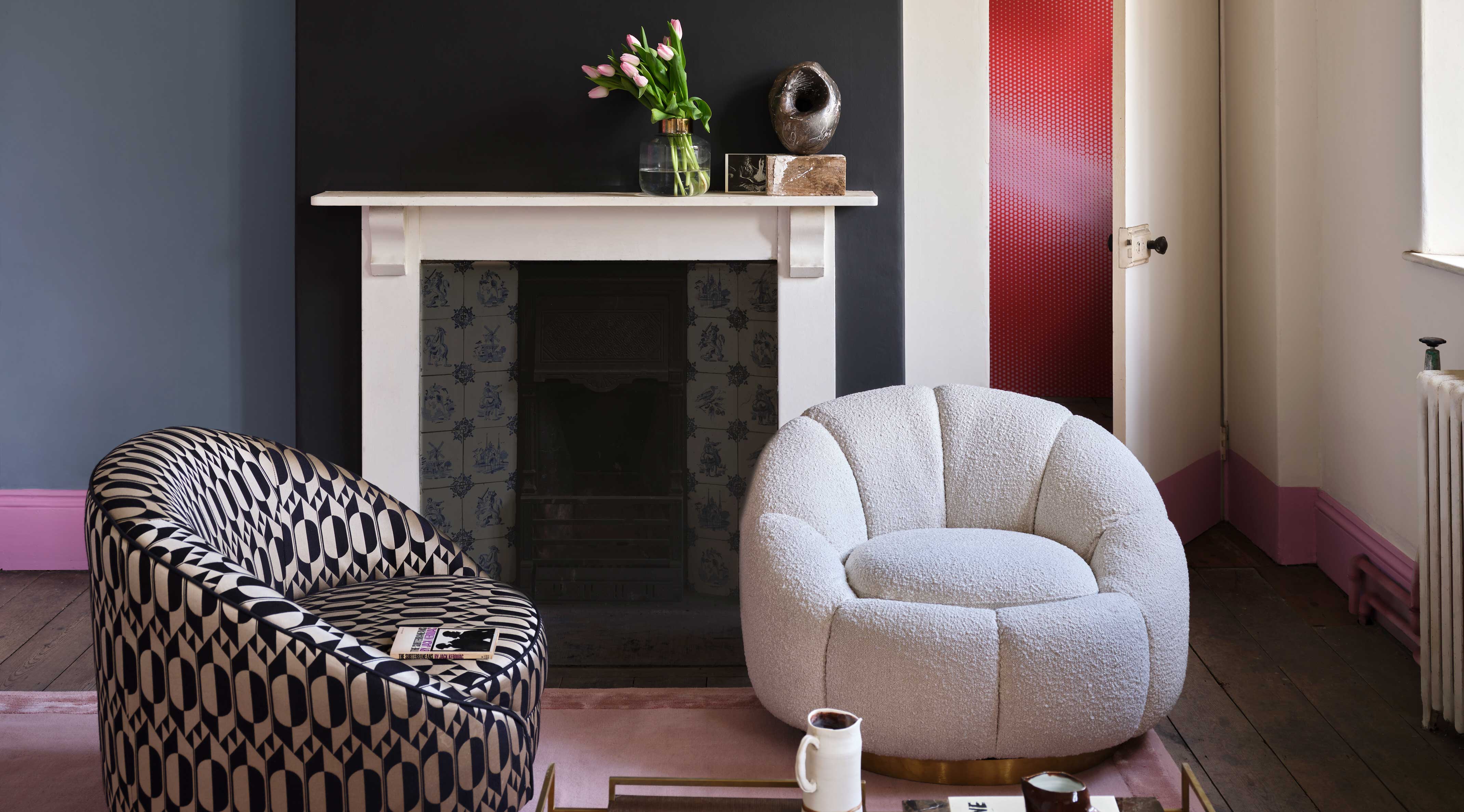
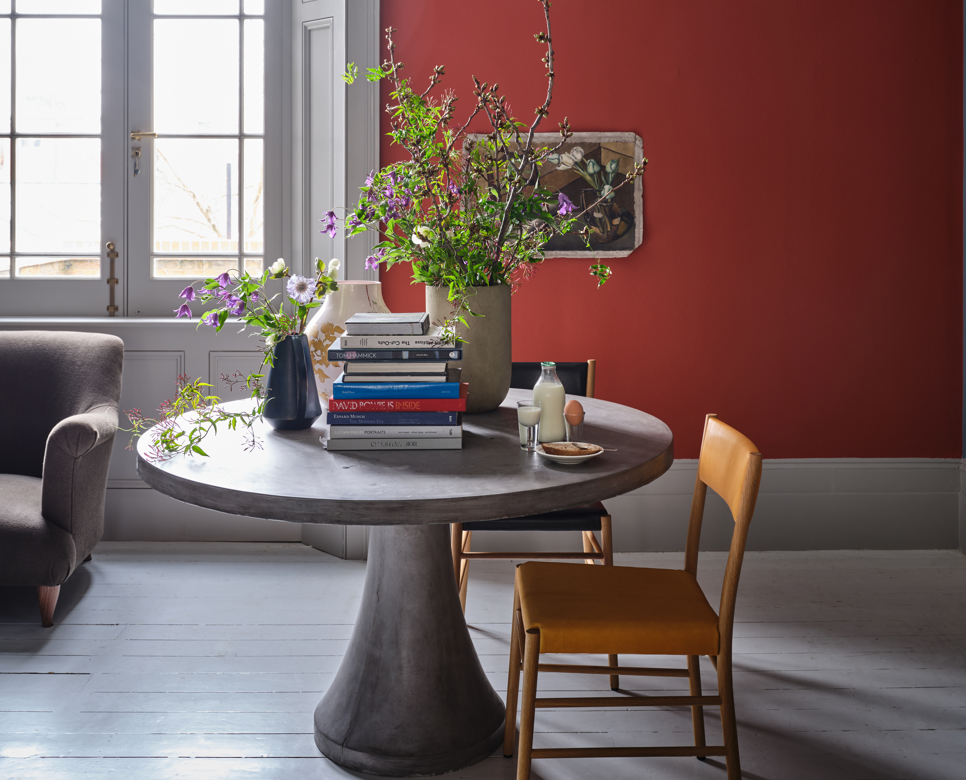 Bold reds are a big new design trend so Farrow & Ball's Joa Studholme explains how to use it
Red tones are trending, but why are they set to dominate designs in 2023? And how should we be using them to decorate?
-
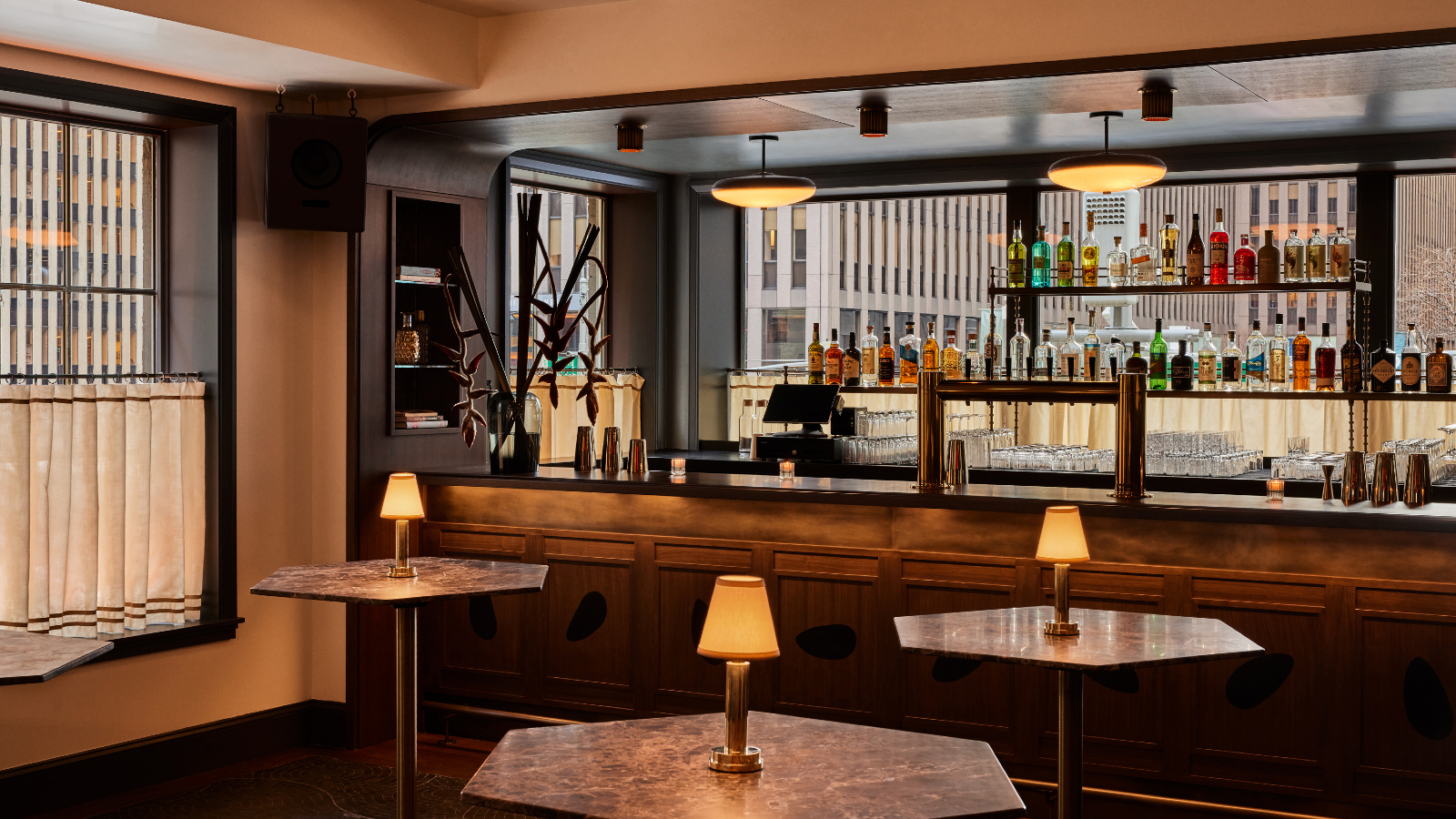 The Farrow & Ball paint in this New York bar will make you look good
Manhattan’s hot new hangout will make you look as good as possible – and you can recreate its aura in your home
-
 Farrow & Ball has predicted the exact green shade that will be big news in 2022
Their color curator has named the tone that will set trends in the year ahead – this is how to get ahead of the craze
-
 Farrow & Ball's Joa Studholme reveals the new neutral shade that will set the tone for 2021
The color curator urges us to look beyond beloved gray tones and embrace a stylish & subtle new hue


