6 New Ways Designers Are Using Curtains — Fill Awkward Corners, Soften Spaces, Create Privacy Zones
Designers are using curtains in ever more creative ways, bringing them into room to create elevated spaces that are zoned and luxe
Curtains aren’t just for windows. In a pinch – or shall we say cinch – statement curtains and drapes can stand in for heftier renovations like partition walls, sliding panels, hinged doors, and more. And many designers lean into their flexible architectural qualities, softening the lines of rigid contemporary layouts whilst adding a gentle dose of drama.
Think of this as a new interior design trend. ‘I think that embracing the idea that a ‘wall’ can be made out of something soft, like a curtain, seems very of the moment – this notion that space can be defined with materials that are impermanent,’ says Adam Charlap Hyman, Principal at New York’s Charlap Hyman & Herrero.
Modern track systems can even create soft, flowing curved walls and straight walls alike, simply installed and manipulated without an architectural degree, making it one of the easier DIY room divider ideas. But designers using curtains, or drapes, beyond the window frame can nevertheless expertly change the flow and form of layouts, particularly in open plan living spaces in need of articulated zones.
‘Utilising curtains as space dividers contributes to a softened ambiance and introduces an element of warmth within the environment,” says Joyce Li of Design Pair. ‘The extensive range of fabric colors and textures further enhances the versatility of this design choice.’
Certainly, using a statement fabric as a strong yet not-entirely-structural element creates an entirely softer feeling compared to a permanent wall — and along with it, a range of decorative variations (from patterns to colors and folds) that offer a dash of style at the same time.
1. use to soften the light
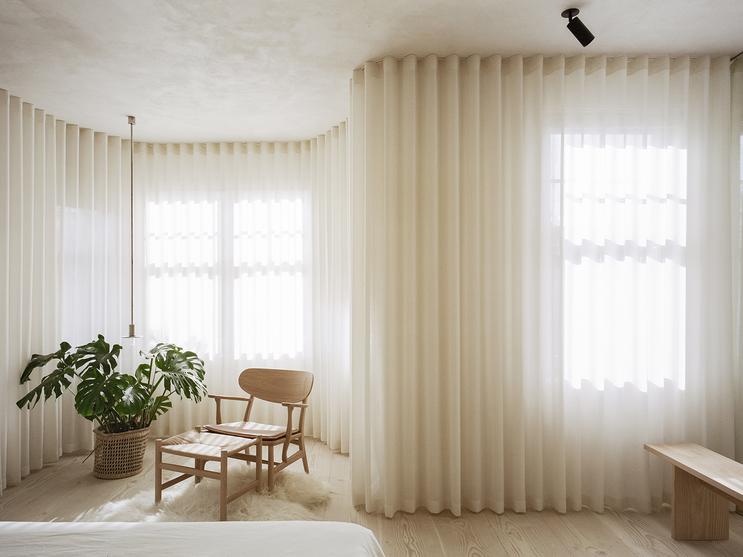
Stretching the limits of curtains, this serenely filtered bedroom envelopes an entire expanse with translucent, billowing Kvadrat fabric along a Silent Gliss track system. ‘The curtains help to really soften the angular lines of the space,’ says Ben Ridley, Founder of Architecture for London. ‘The system used is an ‘S-wave’ track, which keeps the curtains in neat folds so they still feel ‘architectural’. The curtains extend right the way along the front of the room, and meet a full height mirror at the side wall, creating the illusion that the curtains continue even further.’
As an elegant way to bring texture to walls (especially those punctuated by windows) the curtains also serve more conventional purposes, softening light as it enters the room while also creating an altogether different filter. ‘The view from this room isn’t the best either (towards the back of a restaurant and some air conditioning units, etc!) so the curtains also solved this issue,’ adds Ben.
Be The First To Know
The Livingetc newsletters are your inside source for what’s shaping interiors now - and what’s next. Discover trend forecasts, smart style ideas, and curated shopping inspiration that brings design to life. Subscribe today and stay ahead of the curve.
2. Hide bed areas
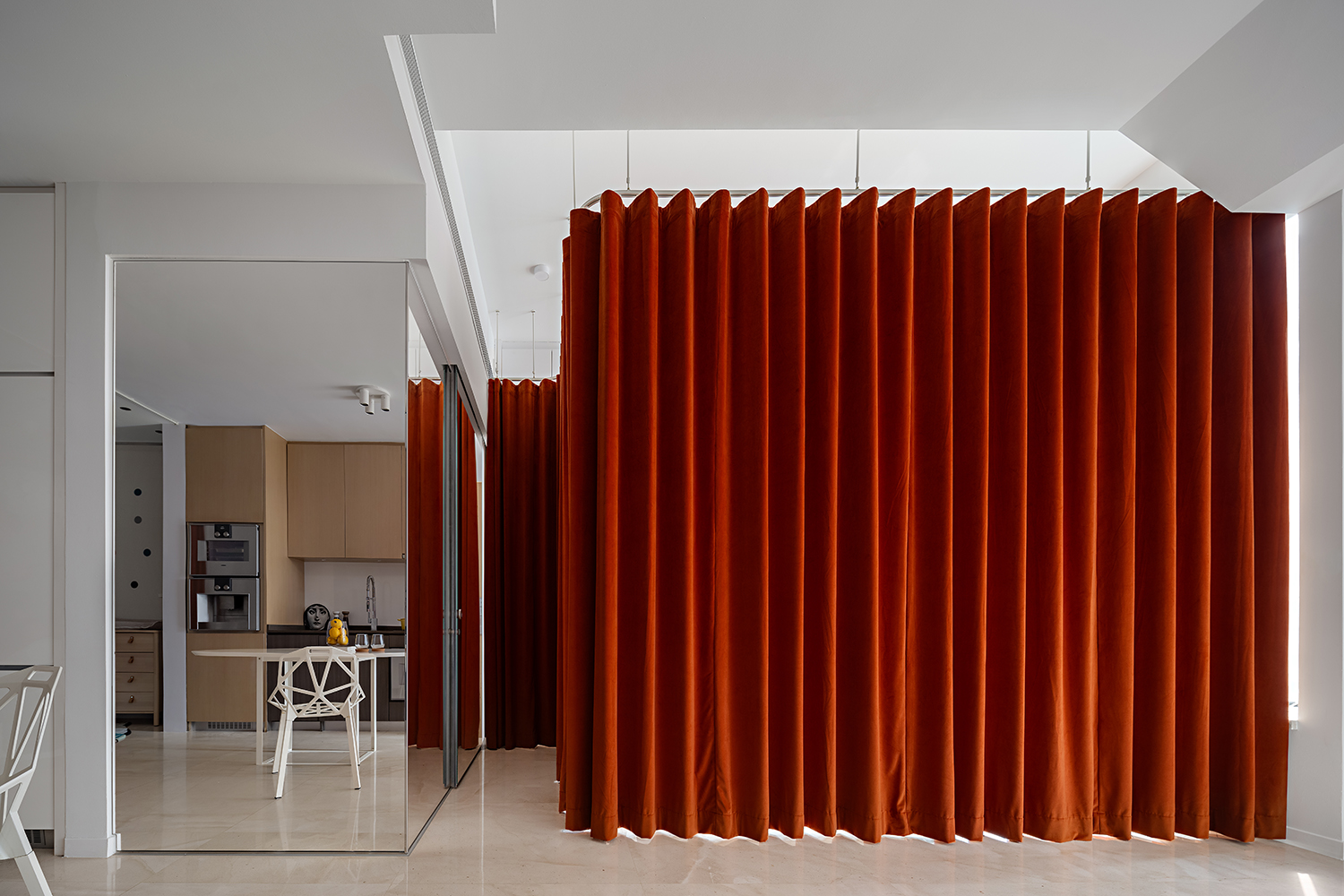
Bringing a theatrical touch to a growing family’s Singapore studio, burnt orange velvet curtains, positioned on either side of the room, reveal – or hide – separate bed and crib areas when not in use. But the soft transition, according to the designer, requires an extra layer. ‘When selecting fabrics, bear in mind that when using curtains as room dividers, two layers of fabric are required since both the front and back will be visible,” says Joyce Li of Design Pair. ‘This is in contrast to using curtains for window treatments where typically only one side is exposed.’
Unlike a permanent wall, a curtain divider is more flexible, and in more ways than one; it can adapt to the situation, whether fully open or closed, or even half open. “Considering our dynamic preferences, we also value the ease with which the atmosphere can be refreshed in the future,” adds Joyce. “A simple alteration of the curtain fabric allows for a seamless transformation, ensuring the adaptability and longevity of the design.”
3. Unite the space with a mono color scheme
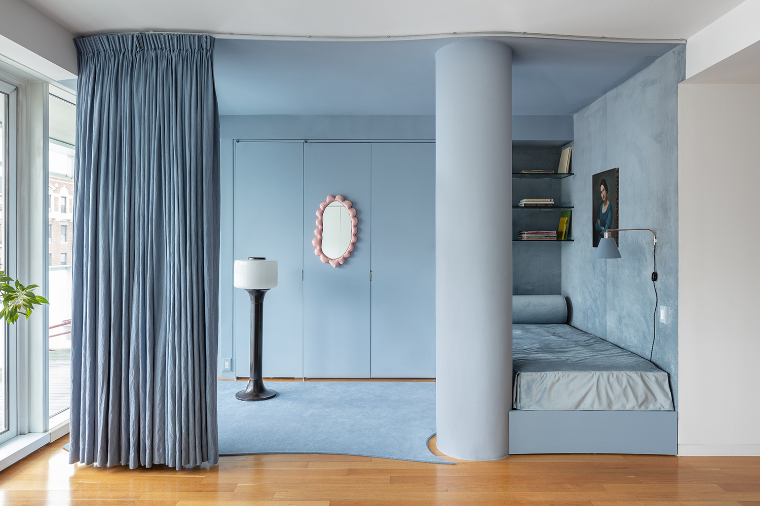
Using a flexible curtain partition helps blur the lines in this dual-purpose living space. The gentle transition allows a spacious niche to feel just as much like a sitting area by day, and a proper guest room by night. For Charlap Hyman & Herrero, a monochromatic color scheme, in soft blue, was key to uniting the zones. ‘The idea was that by masking the space entirely in one color, we could create a more expansive experience when the curtain was closed,’ says Adam Charlap Hyman.
Thanks to a curvy track system, the curtains also allowed the designers to circumvent a cumbersome architectural feature. “We made the curtain wavy because we were contending with a column that was half in and half out of the zone that we were dealing with – it was the solution to an odd architectural condition,” adds Adam. “There's no need to constrain your design within practical materials and hardware – the curtain track we used here was something we found online that was relatively inexpensive, and we were able to bend it into shape ourselves, on site."
4. Contrast the architecture

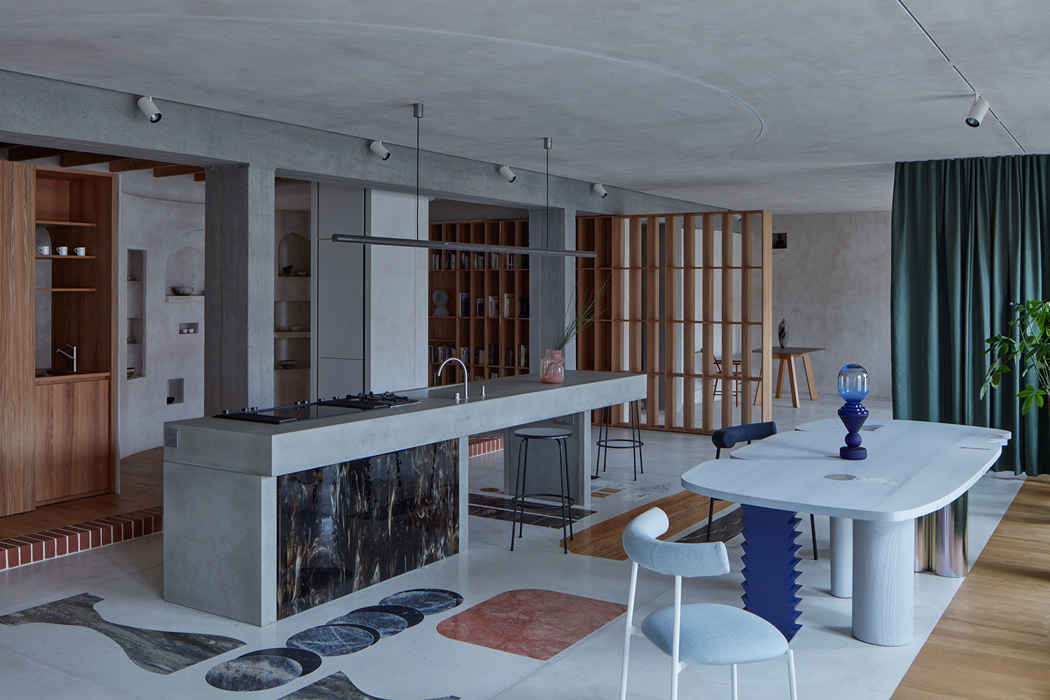
One of the key rules for creating balance in interior design is proper use of visual weight, and this highly curated Prague apartment measures up. ‘In our particular case, the curtain works well as a contrast to the solidly embedded architecture,’ says Jakub Červenka, partner at Objektor architekti, noting how the green fabric partition, a visibly lighter material, balances out the room’s heavy concrete surfaces. ‘We enjoy the idea of possible movement – the creation of new, unexpected views, zones and filters.’
Beyond visual weight, the architects also established balance by creating comopositional harmony. Directly across the room, a fixed wooden partition – roughly the same dimensions as the fabric partition, and with similar visual weight thanks to openings in the design – creates symmetry with the curtain.
5. Create a curtain headboard
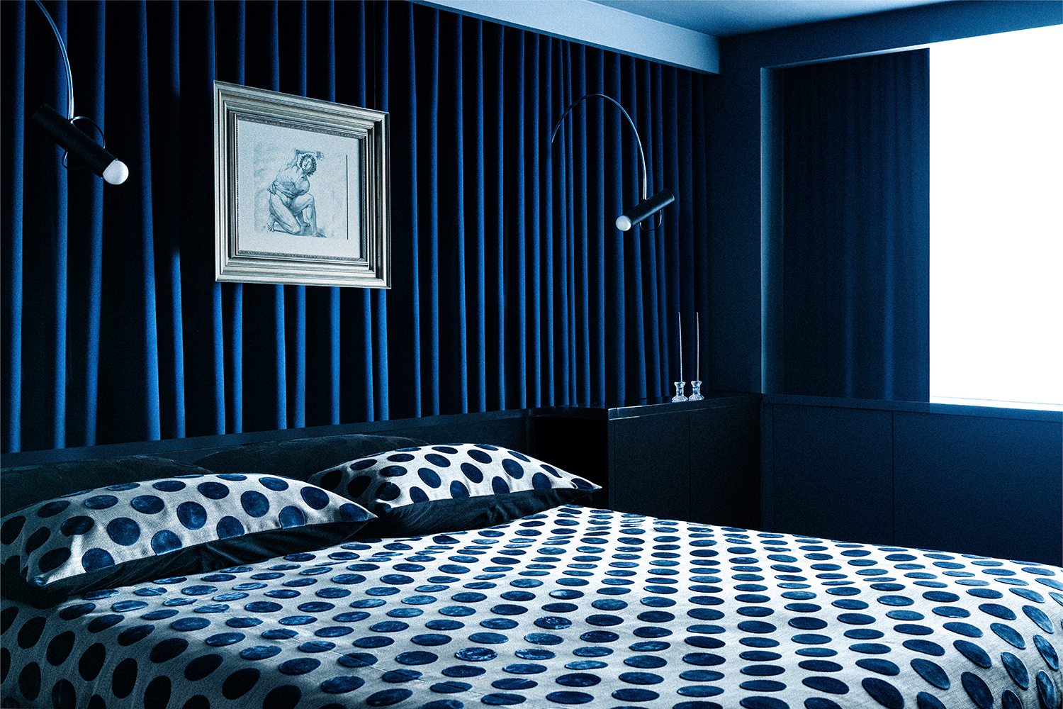
Wall-to-wall drapery is having a moment in the bedroom, particularly as a bold yet minimal backdrop for the bed. ‘I will often employ this trick with lower headboards, as the vertically of the drapery draws the eye upwards and provides a necessary contrast,’ says Darren Jett of NYC’s JETT Projects. You can also add an extra dose of drama by floating a piece of artwork in front of the curtain itself. ‘This is easily installed with strong transparent fishing wire hung from a miniscule hook in the ceiling,’ he adds. ‘A true trick of the eye, that one never forgets.’
And the dramatic look doesn’t necessarily lead to a dramatic price tag. ‘The great thing about curtains is they can be as expensive as you want,’ says Darren. ‘Linen can be bought for 10 dollars a yard, with velvets and embroideries going up from there. A seamstress can sew a panel for less than $100, or it can be an easy weekend project for those who have more craft in their fingers than me.’
6. Fill an awkward area
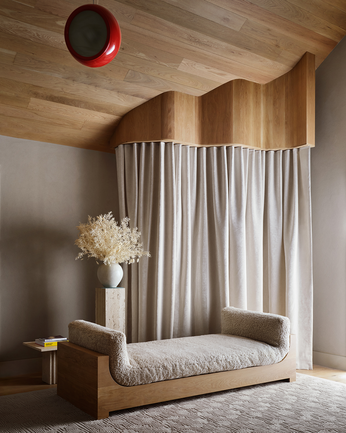
The curtains in this Hamptons home smooth over an awkward corner while infusing in a dash of style thanks to a bespoke wooden cornice, cleverly editing the room’s architecture. ‘Curtains can act as a cinematic backdrop for a space, but of course they can also close off smaller areas or hide select elements to increase a sleek sense of organization,’ says NY-based Timothy Godbold. ‘Curtains specifically are elegant; they aren’t fixed or static but move and follow long gestural lines.’
The unique design not only resolves the dreaded dead living room corner, but also establishes rhythm with the home’s overall design theme. ‘In this particular lounge bar nook, the curved, rounded curtains provide aesthetic juxtaposition to the geometric lines of the daybed,’ adds Timothy. ‘The curtains’ support – a built in organically shaped wooden frame – follows an abstract outline and shape, which fits in with the postmodern eccentricity I wished to evoke in the overall design of this home.’
Keith Flanagan is a New York based journalist specialising in design, food and travel. He has been an editor at Time Out New York, and has written for such publications as Architectural Digest, Conde Nast Traveller, Food 52 and USA Today. He regularly contributes to Livingetc, reporting on design trends and offering insight from the biggest names in the US. His intelligent approach to interiors also sees him as an expert in explaining the different disciplines in design.
-
 These Are the Flower Crowns I’m Wearing This Spring (Spoiler: They’re Actually for My Door)
Coachella confirmed the comeback of flower crowns. At home, they just go by another name: the spring wreath
By Julia Demer
-
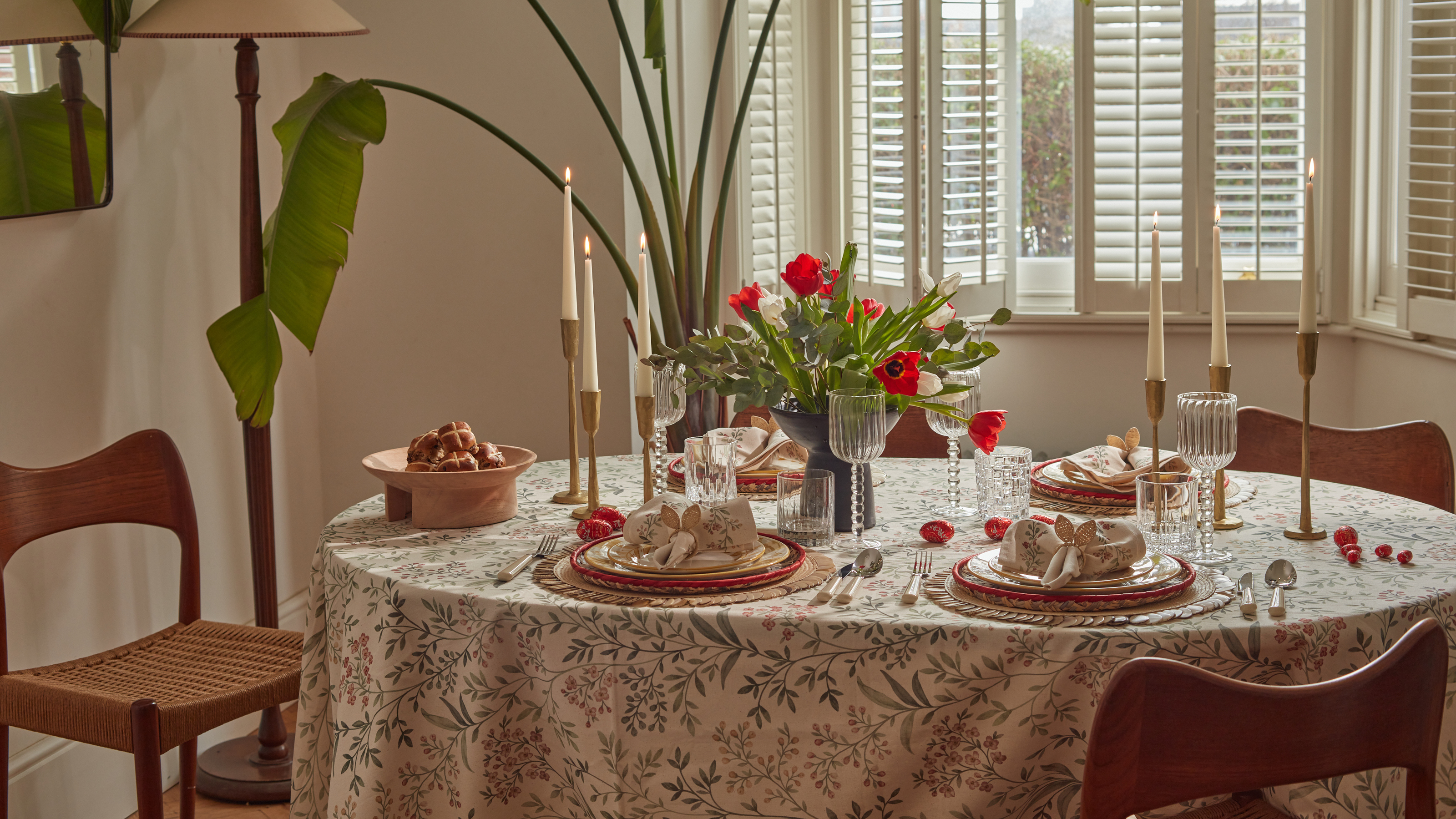 Bunny Ears, Be Gone — 7 Easter Table Styling Mistakes That Will Take Your Setting from Tawdry to Tasteful
From fussy floral displays that disrupt conversation to over-relying on tacky tropes, don't fall victim to these errors when decorating your Easter table
By Lilith Hudson