Spotted at New York Design Week — The 5 Lights and Lamps You Need to Know About in 2024
This year offered no shortage of bright ideas, according to our style editor. This is her pick of the best NYC Design Week had to offer

NYC Design Week is always full of bright ideas, but this year, those that were most illuminating took the sentiment literally. I spotted quite a few compelling lighting creations — from elevated everyday table lamps to a mobile 13-foot pendant light (more on that later).
With so many exhilarating NYC Design Week trends this year, I have to say that narrowing down the best was difficult — to me, lights are the jewelry of the home, and I never met a ring I didn’t like. But after much discernment, I’ve arrived at a few definitive favorites, all of which are waiting to inspire below.
'31 Days' by Dumais Made: Day 8, 19, and 30
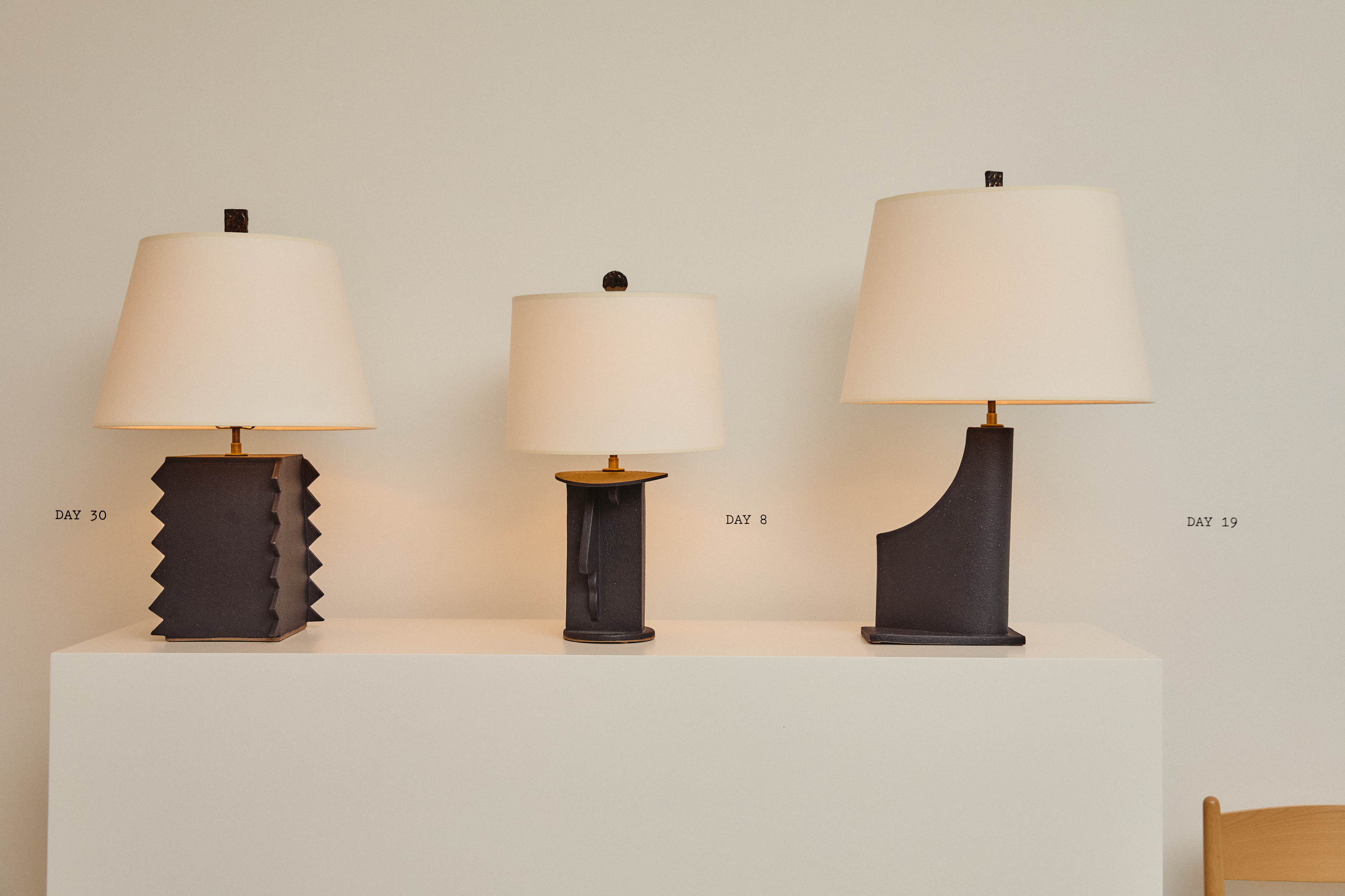
For his 31 Days exhibition, ceramicist Charlie Dumais had one goal: to create — simply, and without judgment. Hence the title, Charlie crafted two ceramic lamps a day for 31 days — no exceptions. The result was 62 different, though still very cohesive ceramic creations, each taking cues from brutalist architecture and industrial design.
As one might imagine given the fickle nature of ceramics and this level of output, natural imperfections emerged. Leaning into the highs and lows of his creative process, Charlie showed every lamp, cracks and all. Personally, I quite liked this. Imperfections and asymmetries imply that something has been handmade — you can get machine perfect lamps anywhere. I found the lamps’ quirks not only more compelling than others on the market, but actually, more elevated.
So which is my favorite? Well, in the spirit of each lamp being part of a group, I actually have three: created on day 30, day 8, and day 19 of the project. I was struck by their complementary black shapes, which would lend fantastic drama to a credenza, long dining table, or really, anything horizontal. Though, I encourage journeying through 31 Days yourself to discover your own — definitely worth a peak.
SCOPO by David Weeks
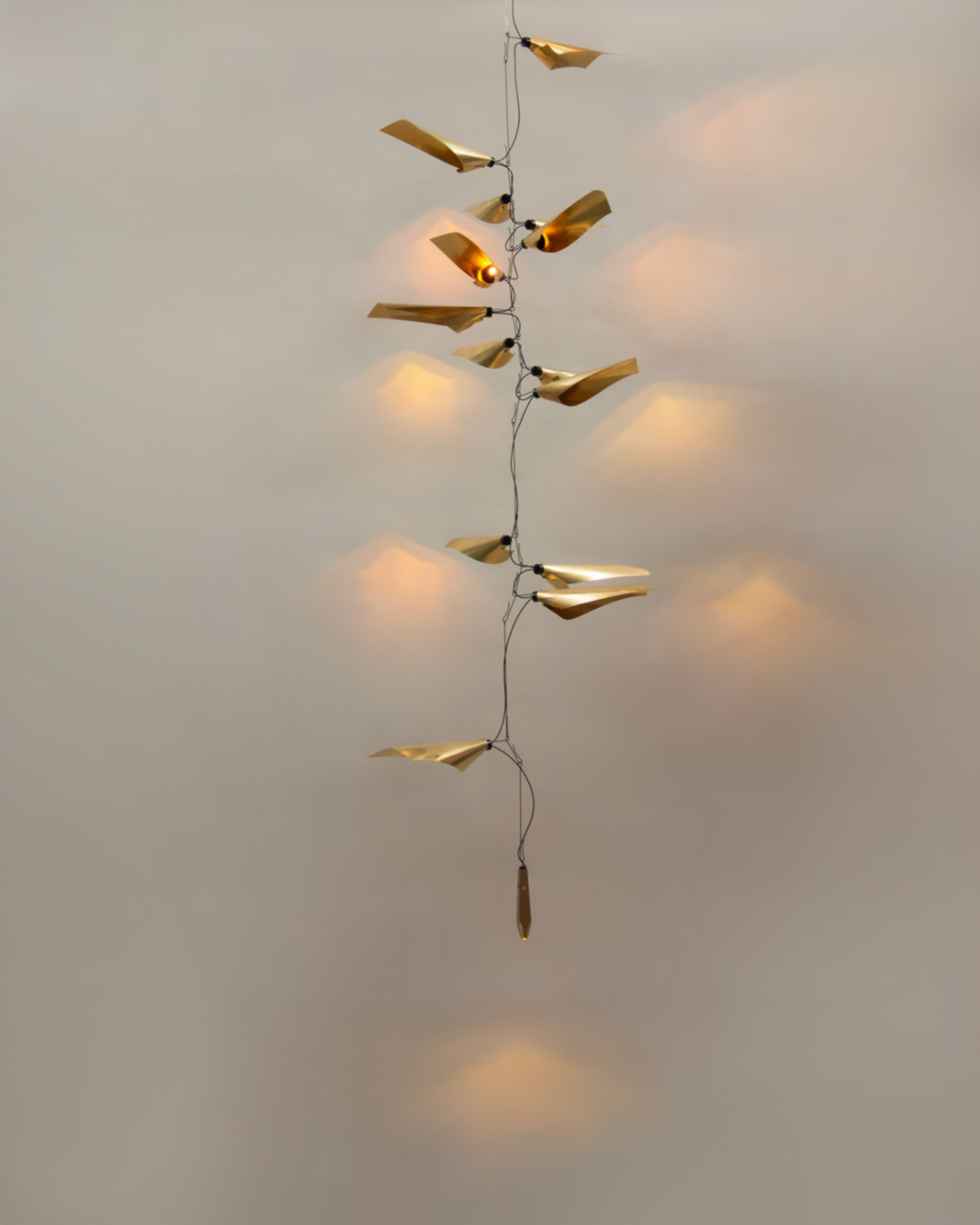
This is the 13-foot lighting pendant I mentioned earlier: SCOPO — a piece that’s show stopping on-screen and even more so in-person. I spoke to the designer David Weeks about the design, which he developed during a six-month fellowship at the American Academy in Rome.
According to David, the project began as a humble prototype of wire clothing hangers, paper, and flashlights, but is now composed of thin brass sheets. Fitting given its dramatic scale, SCOPO houses a whopping total of 14 light sources which project onto the surrounding walls, taking on a disco ball-like effect. This is further enhanced by the fact that the light is set on a pendulum, subtly pivoting from the top of the ceiling to just above the floor.
Be The First To Know
The Livingetc newsletters are your inside source for what’s shaping interiors now - and what’s next. Discover trend forecasts, smart style ideas, and curated shopping inspiration that brings design to life. Subscribe today and stay ahead of the curve.
SCOPO’s spine-like curvature is brilliantly simple, yet spares no detail (its plum bulb’s built-in level forgoes an oil filling in favor of 35-year old whiskey). As is typical of David Weeks, the design is best described as extravagantly minimalist.
Zoe Lamp by Jayson Home
Jayson Home is where you go when you can’t pay some fabulous decorator to travel the world and curate their favorite home decors for you, but crave the same niche, worldly appeal. As is typical of the premiere home furnishings and accessories store, their Design Week pop-up at NYC landmark Bergdorf Goodman (a.k.a. my second home) offered no shortage of inspiration.
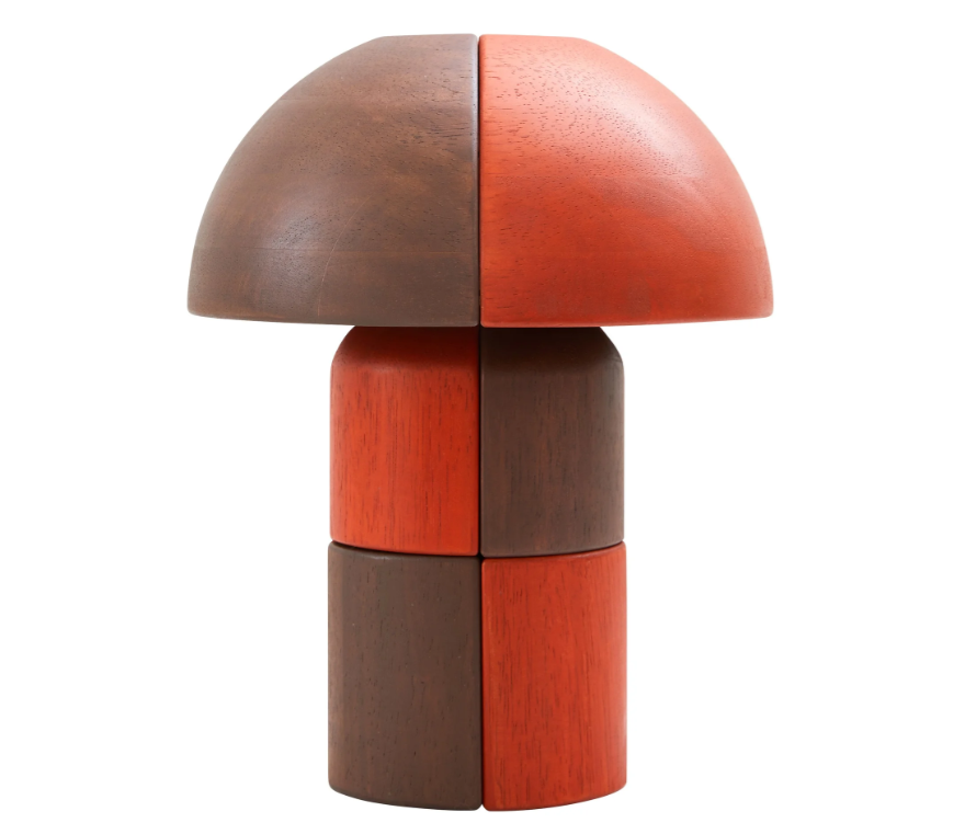
Among the treasure trove of vintage and vintage-inspired pieces, I spotted something striking from across the room: the 'Zoe Lamp,' so I learned. It’s quite unusual with its blend of contrasting curved and straight tiles, which are crafted from sustainably-harvested rubber wood. That checkerboard-ish, patchwork-like pattern you see is actually thanks to binding with a stretchy elastic thread, rather than glue, which only adds to its dimensionality.
I’m partial to the rich, earthy quality to the Sepia colorway, though it’s incredibly striking in Moss as well. Unlike most of the lights I saw this week, the Zoe Lamp is currently available (for a reasonable price, I might add). Scoop it up now for the sense of play you never knew you needed, the perfect pop of pattern on a bookshelf or desk.
One Dot Sconce by Stickblub
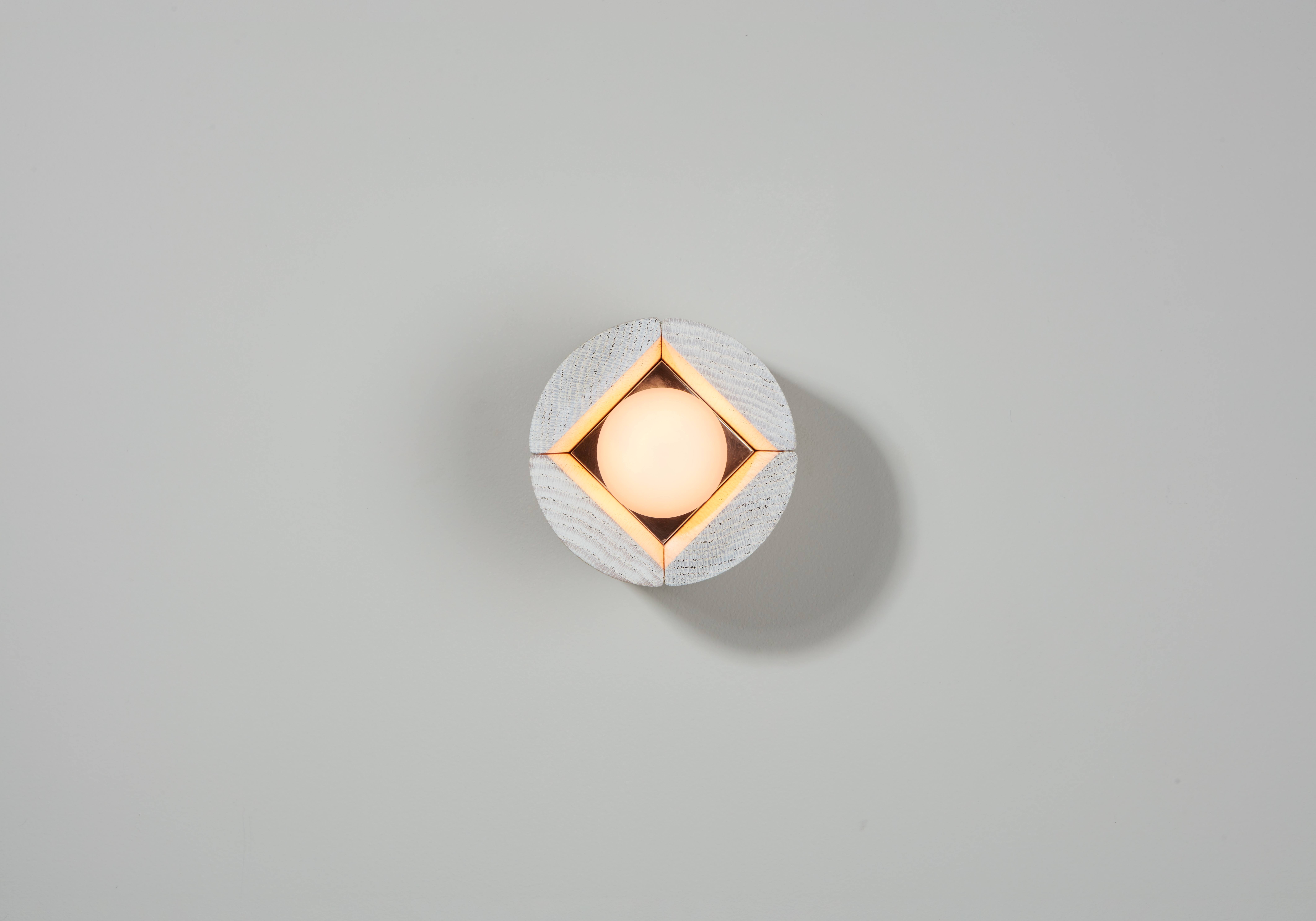
Stickbulb’s Pillar Collection is quite the departure from the brand’s usual linearity. Its assortment instead takes on a softer look, with each featuring a distinct curvature. They’re wooden lights crafted with reclaimed wood from fallen trees in New York City’s urban forest — materials that would otherwise go to a landfill.
The concept is not only right on trend with the recent uptick in sustainability, but also, is exactly what’s needed: designs that are eco-conscious and beautiful in equal measure. It seems I wasn’t the only editor impressed by the sentiment or the refreshingly minimalist designs, because The Pillar Collection earned the ICFF Editors Award for Best Lighting and Best in Show.
My favorite of the bunch is the One Dot Sconce — both the smallest and the simplest. It’s a single white matte glass LED bulb housed within a small wooden box. You’d never know it was salvaged — which to me, is indicative of a job well done.
Sắn Light by Vy Voi

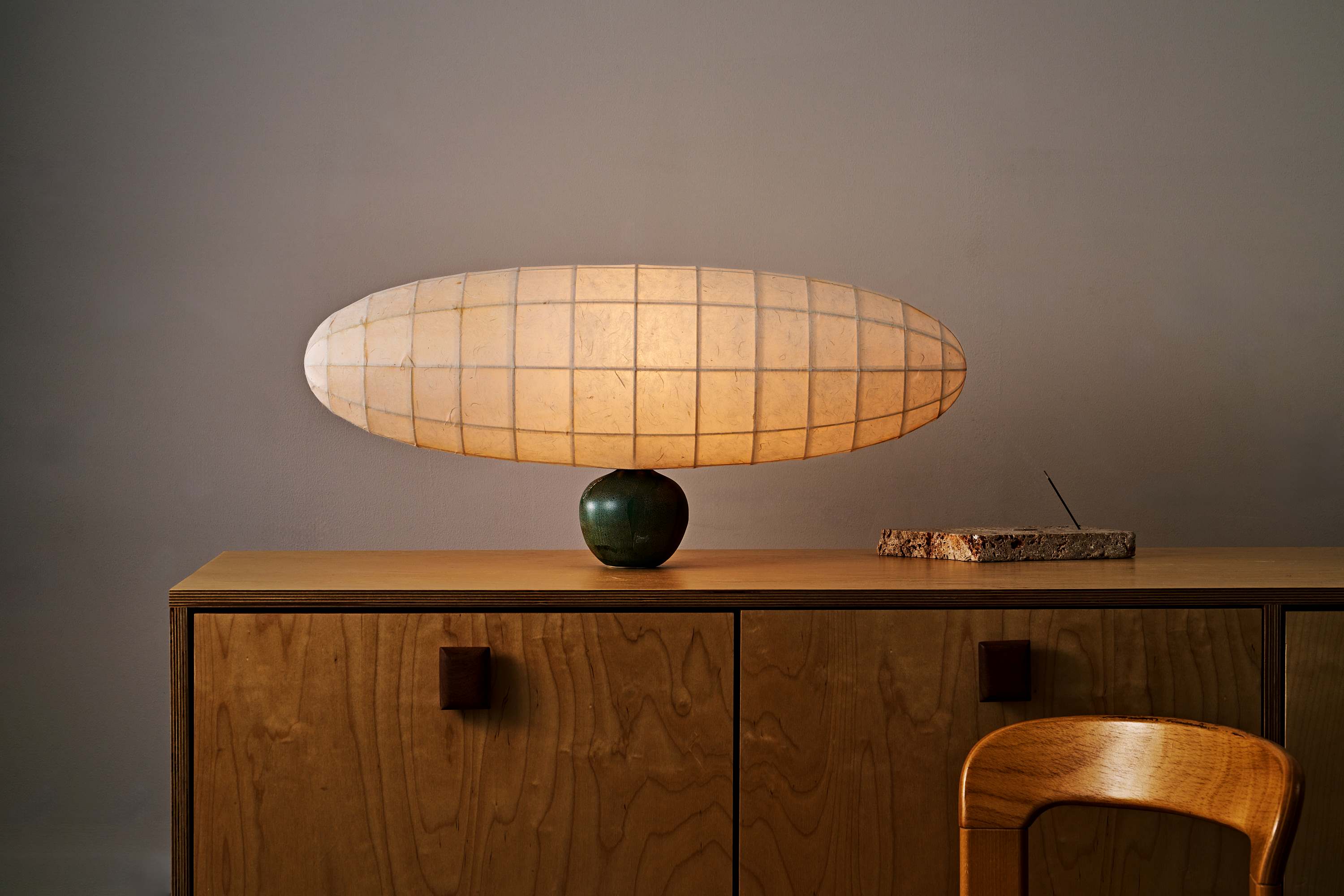
New York-based design studio Vy Voi also made its debut at ICFF this year with the Rễ Cây collection: a small, but impactful assortment of five lights, each of which utilize unexpected proportions whilst maintaining a sense of balance. Juxtapositions like these are central to Rễ Cây: weightless yet grounded, comfortable but restricted.
The lampshades are soft to the touch, constructed of Dó, a historic paper handmade in Bắc Ninh, Vietnam. They appear balloon-ish, as if sprouted from their hand-thrown porcelain bases. A closer look will reveal the pieces' softness, grounded in organic textures, which is not only timeless, but also apt to the design mood projected for 2025 and beyond.
I wish I could have taken all five home with me (they look so good displayed as a set), though, my favorite has to be the Sắn Light, which is arguably the most dramatic of the bunch with its ultra-oversized, horizontally oriented shade and petite rounded base. It reminds me of a blimp, which feels incredibly nostalgic, though the piece is up to interpretation.

Formerly covering fashion at L’Officiel USA, style maven Julia Demer brings her love of design to Livingetc’s world of interiors. As the title’s New York-based Style Editor, Julia's work reflects a sharp eye for detail and an innate passion for aesthetics. Her journey began with a strong foundation in design, honing her craft at renowned establishments like The Row and even establishing her own eponymous fashion brand. Julia’s design background is evident in the way she thoughtfully curates shopping edits, always maintaining a focus on emerging trends while preserving timeless sensibilities. For Julia, fashion and interiors go hand in hand, reflecting her lifelong commitment to perfecting the art of style.
-
 The Weighted Blanket That Doesn’t Make You Sweat (and the Eye Mask to Match)
Luxury has weight. And apparently, volcanic minerals
By Julia Demer
-
 What Is Biophilic Interior Design? I'm an Actual Biophilic Designer, and This Is How to Apply It to Your Home
A biophilic designer explains the core principles of this practice, and the easy ways you can apply it to your home's design
By Marianna Popejoy